AI Art Prompt Formula: A Repeatable Structure for Better Composition and Style Control 한국어 요약
이 페이지는 ZView Space의 영어 원문을 한국어 검색 사용자도 이해할 수 있도록 정리한 SEO 요약입니다. 핵심은 단순한 얼굴 중심 이미지가 아니라 패션 에디토리얼, 룩북, 아웃핏, 프롬프트 테스트, 이미지 생성 워크플로우를 실제로 어떻게 구성할지입니다.
핵심 요약
- 원문 주제: AI Art Prompt Formula: A Repeatable Structure for Better Composition and Style Control
- 목적: AI 이미지 생성에서 outfit, silhouette, fabric, pose, location, camera framing을 더 명확하게 설계합니다.
- 활용 범위: Z-Image Turbo, Krea2 Turbo, Qwen Image, Anima, SeedVR2 같은 이미지 생성 및 업스케일 워크플로우에 적용할 수 있습니다.
- SEO 관점: 제목, 설명, 이미지 alt, 프롬프트 예시가 실제 검색 의도와 맞아야 색인 가능성이 높아집니다.
한국어 사용자를 위한 체크포인트
1. 프롬프트가 얼굴 묘사에만 머물지 않고 전체 스타일과 의상 구성을 설명하는지 확인합니다. 2. 패션 이미지라면 상의, 하의, 아우터, 신발, 액세서리, 소재감, 촬영 장소를 분리해서 씁니다. 3. 생성 결과는 바로 게시하지 말고 디테일, 손, 의상 형태, 배경 일관성, 이미지 품질을 비교합니다. 4. 글 본문에는 실제 테스트 기준과 실패를 줄이는 방법이 들어가야 검색엔진에서 얇은 콘텐츠로 보일 가능성이 줄어듭니다.
원문 미리보기
A good AI art prompt formula is less about writing longer prompts and more about putting the right visual decisions in the right order. In this test, I used the same core structure across portraits, product shots, cinematic scenes, anime style frames, and beau
---
A good AI art prompt formula is less about writing longer prompts and more about putting the right visual decisions in the right order. In this test, I used the same core structure across portraits, product shots, cinematic scenes, anime-style frames, and beauty/editorial images to see what actually improves composition and style control.
The result was fairly consistent: prompts performed better when the subject, image genre, camera language, lighting, location, and art direction were explicitly separated before being merged into one final instruction. The strongest result was not "more detail" in general. It was better hierarchy. Models handled scenes more reliably when they knew what mattered first, what defined the mood, and what should stay visually stable.
What was tested
In this test, I used a repeatable six-part prompt structure:
1. Topic — the actual subject 2. Genre — the image type or visual use case 3. Camera — capture language that influences rendering behavior 4. Lens — focal length and aperture for composition cues 5. Lighting — scene shape, contrast, and time-of-day behavior 6. Location — setting and contextual anchors 7. Style — art direction and finish 8. Final Prompt — a merged production-ready instruction
I tested this structure against common image goals:
- face stability
- outfit clarity
- background consistency
- product readability
- hand risk in lifestyle scenes
- style lock across different genres
- composition control using lens and camera cues
The useful pattern was simple: when one ingredient was weak or vague, the model often filled that gap with clichés. When each ingredient was concrete, outputs became easier to steer and easier to revise.
The prompt formula I would actually use
Here is the working formula that held up best:
Subject + visual use case + capture language + composition cue + light behavior + scene context + art direction + quality/detail constraints
In plain English, that means:
- Start with what the image is about
- Define what kind of image it is pretending to be
- Add camera and lens to influence framing and depth
- Add lighting to shape the subject
- Add location so the background stops drifting
- Add style direction so the model picks one visual lane
- Finish with specific visual details like pose, palette, texture, and atmosphere
The weak point in shorter prompts is usually not lack of adjectives. It is lack of structure. If you say "fashion portrait, cinematic, beautiful lighting" you are asking the model to make too many decisions for you. If you specify 85mm portrait framing, golden backlight, luxury campaign styling, resort setting, neutral cream palette, composition becomes more predictable.
Why these prompt ingredients matter
Topic keeps the subject from drifting
Topic is not just "woman" or "car." It should define the exact subject you want rendered. The more precise the subject, the fewer substitutions the model makes.
A weak topic:
- stylish woman in summer clothes
A stronger topic:
- Korean fashion model wearing tailored ivory resortwear with wide-brim straw hat and gold jewelry
The second version gives the model better anchors for wardrobe, silhouette, and styling.
Genre controls image behavior
Genre acts like a visual contract. "Fashion editorial" and "product editorial" can feature the same bag, but the framing priorities are different. In this test, genre had a bigger effect than many people expect.
- Fashion editorial favored pose, wardrobe flow, and attitude
- Beauty campaign favored skin, face symmetry, and close-up detail
- Product editorial improved item clarity and branding space
- Anime key visual pushed shape language and color blocking harder than realism prompts
When this setup works, genre reduces identity drift because the model understands what kind of image it should imitate.
Camera and lens improve composition more than realism
A real camera body name by itself does not magically create realism. What helped more was the lens choice. Lens information nudged framing behavior in ways that were visible in the output.
Observed pattern:
- 35mm gave more environmental storytelling but increased edge distortion risk
- 50mm was balanced and useful for lifestyle scenes
- 85mm produced stronger portraits with cleaner subject separation
- 100mm macro improved product texture and beauty close-ups
- 24mm helped architecture and dramatic travel scenes, but could deform people if the pose was too close to frame edge
So if your goal is better AI prompt composition, lens choice is one of the easiest practical levers.
Prompt example 1: portrait composition with strong face priority
This first test checks whether the formula can hold a clean portrait composition without the background overpowering the face. I chose an 85mm lens and a fashion editorial genre because that combination usually gives the model a clear center of interest.
Topic: Korean fashion model in refined summer resortwear
Genre: Fashion Editorial
Camera: Sony A7R V
Lens: 85mm f/1.4
Lighting: Golden hour backlight with soft fill
Location: Quiet stone terrace overlooking the sea in Jeju
Style: Luxury fashion campaign
Final Prompt: Korean fashion model wearing tailored ivory summer resortwear, wide-brim straw hat, delicate gold earrings, and leather sandals, standing on a quiet stone terrace overlooking the sea in Jeju, relaxed elegant pose with one hand touching the hat, calm confident expression, warm golden hour backlight with soft fill on the face, ocean breeze moving the fabric slightly, luxury fashion campaign styling, shot on Sony A7R V, 85mm f/1.4 portrait compression and shallow depth of field, clean horizon line, premium neutral color palette of ivory, sand, pale blue, natural skin texture, polished magazine composition, high fabric detail, cinematic realism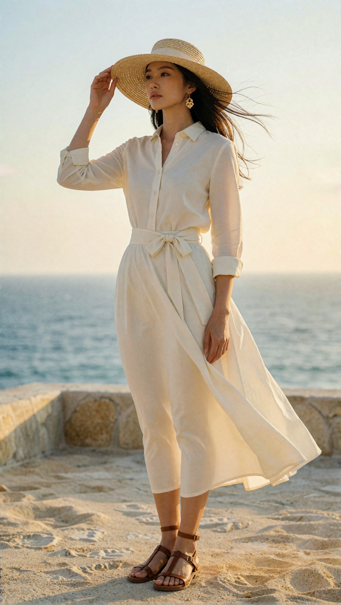
Inspect whether the face stays dominant, whether the hat and jewelry remain coherent, and whether the background reads as a location rather than random coastal blur. In my tests, the strongest result came from keeping the wardrobe palette narrow and the pose simple.
How the formula affects composition
The reason this prompt structure works is that each field answers a different visual problem:
- Topic answers: what am I looking at?
- Genre answers: what image language should it follow?
- Camera and lens answer: how close, how compressed, how intimate?
- Lighting answers: where is the contrast and where should attention go?
- Location answers: what keeps the background honest?
- Style answers: what final visual lane should the model stay inside?
In this test, composition improved most when I paired lens with pose and background simplicity. Without that combination, the model sometimes obeyed the style but lost scene hierarchy.
Prompt example 2: environmental storytelling without losing the subject
This test checks whether a wider lens can keep more environment while still giving a readable human subject. The main risk is background clutter or body distortion.
Topic: solo traveler crossing a rain-soaked alley at night
Genre: Cinematic Travel
Camera: Canon EOS R5
Lens: 35mm f/1.8
Lighting: Neon rim light with wet street reflections
Location: Narrow Tokyo backstreet with ramen signs and vending machines
Style: Cinematic realism
Final Prompt: Solo traveler in a charcoal trench coat carrying a transparent umbrella, walking through a narrow Tokyo backstreet at night, rain-soaked pavement reflecting red and cyan neon signs, vending machines and small ramen shop lights in the background, three-quarter body composition, slightly turned head, thoughtful expression, cinematic realism, shot on Canon EOS R5 with 35mm f/1.8 for environmental storytelling, neon rim light outlining the figure, damp fabric texture, layered urban depth, balanced composition with leading lines from the alley, restrained red-cyan color palette, fine rain detail, realistic atmosphere, crisp focus on the subject with softly receding background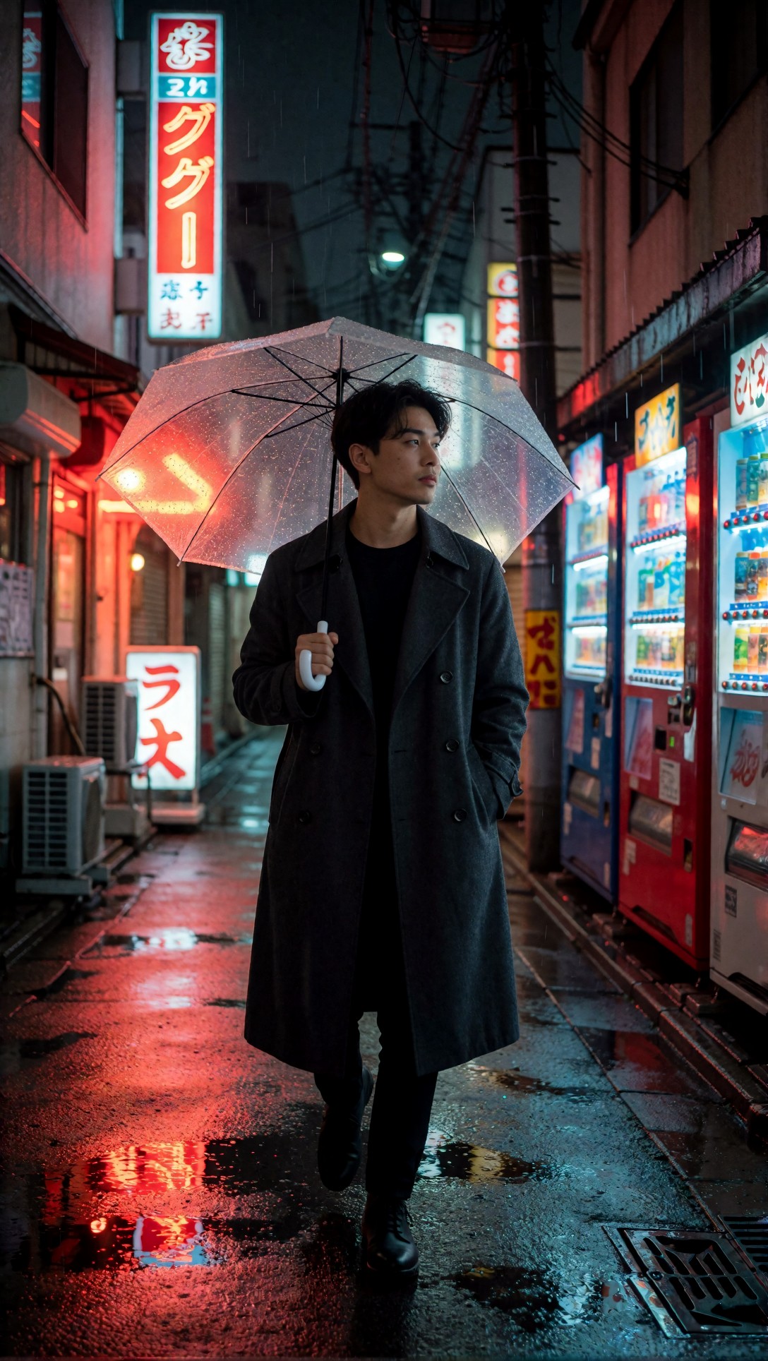
Look for stretched limbs near the frame edges and for background objects that compete with the subject. When this setup works, the alley guides the eye toward the traveler instead of turning into visual noise.
Strengths of a repeatable AI art prompt formula
1. It makes revisions easier
The biggest practical benefit was not the first render. It was the second and third revisions. If a result failed, I could change one layer at a time.
Examples:
- weak face separation -> change lens from 35mm to 85mm
- flat skin and dull contrast -> change lighting from overcast to butterfly light
- generic background -> make location specific, not just "city street"
- style drift -> tighten genre and style labels
This is much easier than rewriting an entire paragraph prompt every time.
2. It reduces mixed-style artifacts
A lot of bad outputs happen because prompts contain incompatible signals. For example, asking for documentary realism, fantasy costume design, soft beauty retouching, and gritty street composition all at once often creates a mushy result.
The formula forces cleaner choices. In this test, that improved style lock noticeably.
3. It creates better prompts across different image categories
The same structure worked for:
- portraits
- product images
- beauty close-ups
- anime visuals
- travel frames
- lifestyle shots
The wording changed, but the scaffolding stayed reliable.
Prompt example 3: product clarity and material realism
This test is meant to check product readability, edge definition, and material detail. Product shots often fail when the model over-stylizes the environment and under-describes the object.
Topic: premium skincare bottle with frosted glass and silver cap
Genre: Product Editorial
Camera: Nikon Z7 II
Lens: 100mm macro f/2.8
Lighting: Softbox key light with controlled side highlights
Location: Minimal stone vanity with soft shadow falloff
Style: Clean commercial look
Final Prompt: Premium skincare serum bottle made of frosted glass with a brushed silver cap, placed upright on a minimal beige stone vanity, subtle condensation droplets, soft folded hand towel in the background, clean commercial product editorial, shot on Nikon Z7 II with 100mm macro f/2.8 for precise texture detail, softbox key light with controlled side highlights shaping the bottle edges, front-facing hero composition with slight three-quarter turn, muted palette of beige, silver, and milky white, crisp label area, premium packaging clarity, realistic reflections, refined shadow falloff, luxury skincare campaign finish, high micro-detail, uncluttered background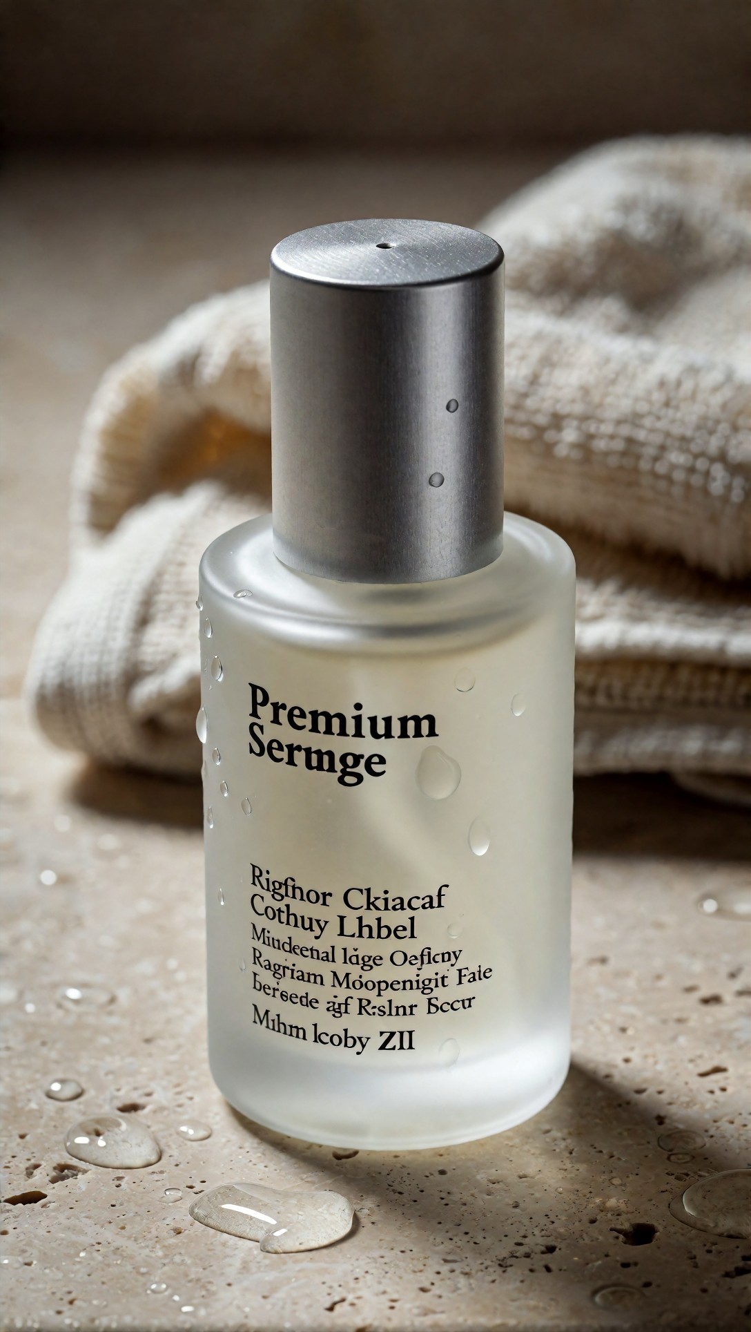
Inspect the cap symmetry, label area cleanliness, and whether reflections feel intentional rather than chaotic. The weak point here is usually text corruption, so the goal is believable packaging form rather than perfect readable typography.
A practical rule for writing better AI prompts
If the model keeps producing "nice" images that are not usable, you probably have one of these problems:
- the subject is broad
- the genre is missing
- the location is generic
- the lens does not match the composition you want
- the style conflicts with the lighting or scene
A useful prompt is not just descriptive. It is selective.
Prompt example 4: beauty close-up for skin, symmetry, and texture
This test checks close facial framing, makeup detail, and whether skin texture stays realistic instead of turning waxy. Beauty prompts respond strongly to lens and lighting choices.
Topic: beauty close-up with luminous skin and coral makeup
Genre: Beauty Campaign
Camera: Phase One XF IQ4
Lens: 120mm macro f/4
Lighting: Studio butterfly light with soft reflector fill
Location: Seamless warm nude studio backdrop
Style: High-end beauty advertising
Final Prompt: Tight beauty close-up of a model with luminous natural skin, coral eyeshadow, glossy lips, softly groomed brows, and clean slicked-back hair, facing camera with calm poised expression, seamless warm nude studio backdrop, high-end beauty advertising style, captured on Phase One XF IQ4 with 120mm macro f/4 for refined facial detail and flattering compression, studio butterfly light with soft reflector fill shaping cheekbones and nose line, centered composition, elegant neck line, minimal jewelry, warm peach and nude palette, realistic pores and skin texture, polished cosmetic finish, premium magazine retouch look without plastic skin, crisp catchlights, controlled shadows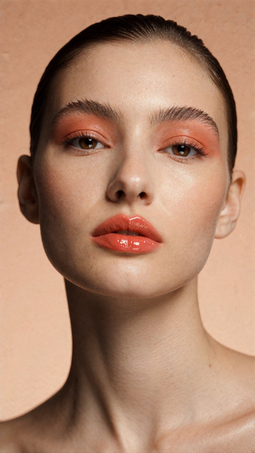
Look closely at pore texture, lip edges, eyebrow consistency, and eye symmetry. In this setup, the strongest result usually has restrained makeup wording; too many cosmetic details can cause muddiness around the eyes.
How to write ai art prompts without overloading them
One thing I noticed in this test: adding more descriptors after the scene is already complete often hurts consistency. The model starts averaging instead of prioritizing.
What helped most was this order:
1. subject 2. image type 3. lens/composition 4. light 5. location 6. style finish 7. a few high-value details
What I would change next if a render fails:
- remove duplicate adjectives
- simplify wardrobe colors
- reduce competing mood words
- replace vague style labels with one clear editorial direction
Prompt example 5: lifestyle scene with hand risk and object interaction
This test checks hand anatomy and natural object interaction, which is where many otherwise good prompts break. I kept the action simple and made the cup central to the scene.
Topic: woman holding a ceramic coffee cup by a window on a quiet morning
Genre: Lifestyle Portrait
Camera: Fujifilm GFX100S
Lens: 50mm f/2.5
Lighting: Overcast window diffusion
Location: Minimal apartment with linen curtains and oak table
Style: Editorial everyday realism
Final Prompt: Woman in a soft grey knit set standing beside a large window in a minimal apartment, holding a warm ceramic coffee cup with both hands, relaxed shoulders, gentle contemplative expression, linen curtains, oak table, and a small vase with dried branches nearby, editorial everyday realism, captured on Fujifilm GFX100S with 50mm f/2.5 for balanced natural perspective, overcast window diffusion creating soft skin tones and quiet morning mood, neutral palette of grey, oat, and warm wood, medium shot composition, natural hair texture, subtle steam from the cup, realistic fingers and hand placement, calm domestic atmosphere, clean uncluttered background, refined but believable lifestyle image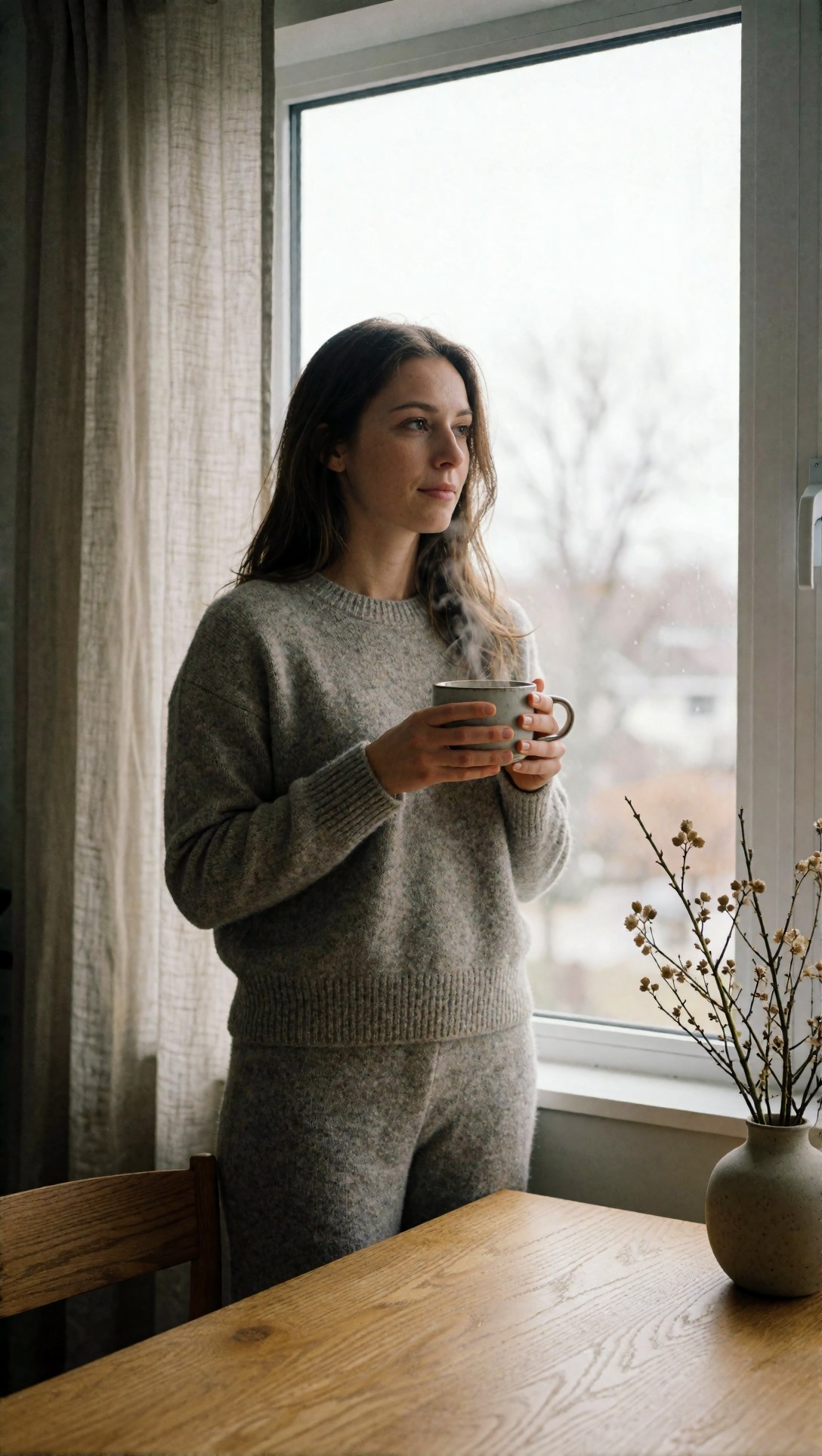
Inspect the fingers first, then the cup shape, then whether the steam and curtain folds stay coherent. If hands fail here, reducing hand complexity is usually more effective than adding extra anatomy instructions.
Limitations and failure risks
A repeatable prompt formula helps, but it does not remove model-specific weaknesses.
1. The formula cannot fix poor anatomy by itself
You can improve odds with simpler poses, clearer framing, and object placement, but if the model struggles with hands or full-body motion, prompt structure only goes so far.
2. Camera labels can become decorative
Some models respond strongly to camera language. Others mostly ignore the body name and respond to focal length, lighting, and style. In this test, lens and lighting mattered more than camera brand.
3. Style labels can overpower the subject
If you write "luxury campaign" or "cinematic realism" without grounding the scene, the model may output a polished but generic image. The formula works best when style sits on top of a specific subject, not in place of one.
4. Too many details can flatten hierarchy
This is a common failure mode in long prompts. If every noun is equally important, the output often feels busy. Better AI prompt composition comes from ranking decisions, not collecting adjectives.
Prompt example 6: anime style lock with clear cinematic staging
This test checks whether the same formula can work outside realism. Anime models often need strong staging and color separation to avoid flat or overly chaotic frames.
Topic: swordswoman standing on a train platform before departure
Genre: Anime Key Visual
Camera: cinematic cel-animation framing
Lens: 50mm equivalent f/2.0
Lighting: Sunset backlight with station practical lights
Location: Quiet rural train platform in late summer
Style: Premium anime film poster
Final Prompt: Young swordswoman in a navy school uniform layered with a light travel cloak, standing on a quiet rural train platform in late summer, one hand resting on the sword case, the other holding a paper ticket, wind lifting loose strands of hair, determined but restrained expression, train waiting in the background with warm interior lights, premium anime film poster style, cinematic cel-animation framing with 50mm equivalent perspective and balanced mid-shot composition, sunset backlight mixing with station practical lights, rich orange and deep blue color contrast, detailed clouds, clean silhouette design, polished linework, textured painterly sky, emotionally charged but uncluttered scene, strong focal separation, high detail anime key visual
Check whether the silhouette reads clearly at a glance and whether the sword case, ticket, and train remain distinct rather than blending into one shape. The weak point in this category is over-detailing the background until it competes with the character.
Which workflow is best for which situation
Use the full formula when:
- you need repeatable composition
- you are generating for editorial, product, client, or brand use
- you want clearer revision steps
- you are testing multiple styles with the same subject
Use a lighter version when:
- you are exploring ideas quickly
- you want happy accidents
- style discovery matters more than precision
- the model already has a strong built-in visual bias you like
A practical split I found useful:
- Exploration phase: Topic + Genre + Style
- Production phase: full formula with lens, lighting, and location
That way, you do not spend too much time specifying scenes before you know the direction is worth pursuing.
Prompt example 7: wide cinematic architecture with human scale
This test checks whether the formula can manage a large location while keeping the person readable. Wide scenes often lose the human anchor unless the composition is explicit.
Topic: lone figure entering a monumental desert museum courtyard
Genre: Cinematic Travel
Camera: ARRI Alexa 35
Lens: 24mm T2.8
Lighting: Late afternoon hard sun with long shadows
Location: Sandstone museum courtyard in Abu Dhabi
Style: Architectural cinematic realism
Final Prompt: Lone figure in a structured black linen outfit walking into a monumental sandstone museum courtyard in Abu Dhabi, dwarfed by geometric walls and high archways, architectural cinematic realism, captured with ARRI Alexa 35 look and 24mm T2.8 wide framing, late afternoon hard sun creating long graphic shadows across the ground, carefully balanced composition with the subject placed low and slightly off-center for scale, warm sandstone palette against black wardrobe contrast, minimal visitors, dry air haze, precise clean lines, strong depth cues, premium travel editorial mood, large negative space, crisp textures, immersive but disciplined scene design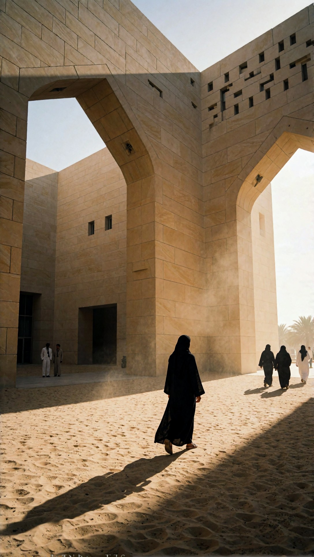
Inspect whether the architecture feels intentional and whether the person remains easy to find within the frame. The strongest result usually comes from clear contrast between wardrobe color and environment tone.
Practical recommendations from the test
Keep each ingredient concrete
Instead of:
- nice lighting
- pretty background
- high fashion vibe
Use:
- golden hour backlight with soft fill
- stone terrace overlooking the sea
- luxury fashion campaign
Choose one primary visual goal per prompt
Before writing the prompt, decide what you are optimizing for:
- face
- outfit
- product
- hands
- scene scale
- style lock
The prompt gets better when one goal leads the others.
Use lens choice deliberately
If you want:
- portraits -> start with 85mm
- lifestyle -> start with 50mm
- environmental scenes -> start with 35mm
- products/beauty close-ups -> start with 100mm macro
- architecture/drama -> start with 24mm
This was one of the most repeatable levers in the entire test.
Simplify color palettes
When the wardrobe, location, and lighting all introduce different color families, the model often loses visual coherence. Narrow palettes produced cleaner outputs and better composition.
Prompt example 8: fashion movement shot with fabric, wind, and background control
This last test checks motion, fabric behavior, and whether the model can maintain elegance without turning the scene chaotic. Movement prompts are useful because they expose weak composition fast.
Topic: runway-inspired street style portrait with moving coat
Genre: Street Style
Camera: Leica SL2-S
Lens: 75mm f/2
Lighting: Overcast diffusion with subtle wet pavement bounce
Location: Paris side street after light rain
Style: Modern luxury editorial
Final Prompt: Fashion-forward woman striding through a quiet Paris side street after light rain, wearing a long camel coat flowing in motion over a black turtleneck and tailored trousers, pointed leather boots, structured handbag, confident forward gaze, modern luxury editorial style, captured on Leica SL2-S with 75mm f/2 for flattering street portrait compression, overcast diffusion with subtle wet pavement bounce for soft contrast, clean stone facades and blurred cafe awnings in the background, dynamic mid-step pose, coat movement controlled and elegant, muted palette of camel, black, slate grey, and soft cream, realistic fabric folds, premium street style composition, crisp subject separation, refined magazine finish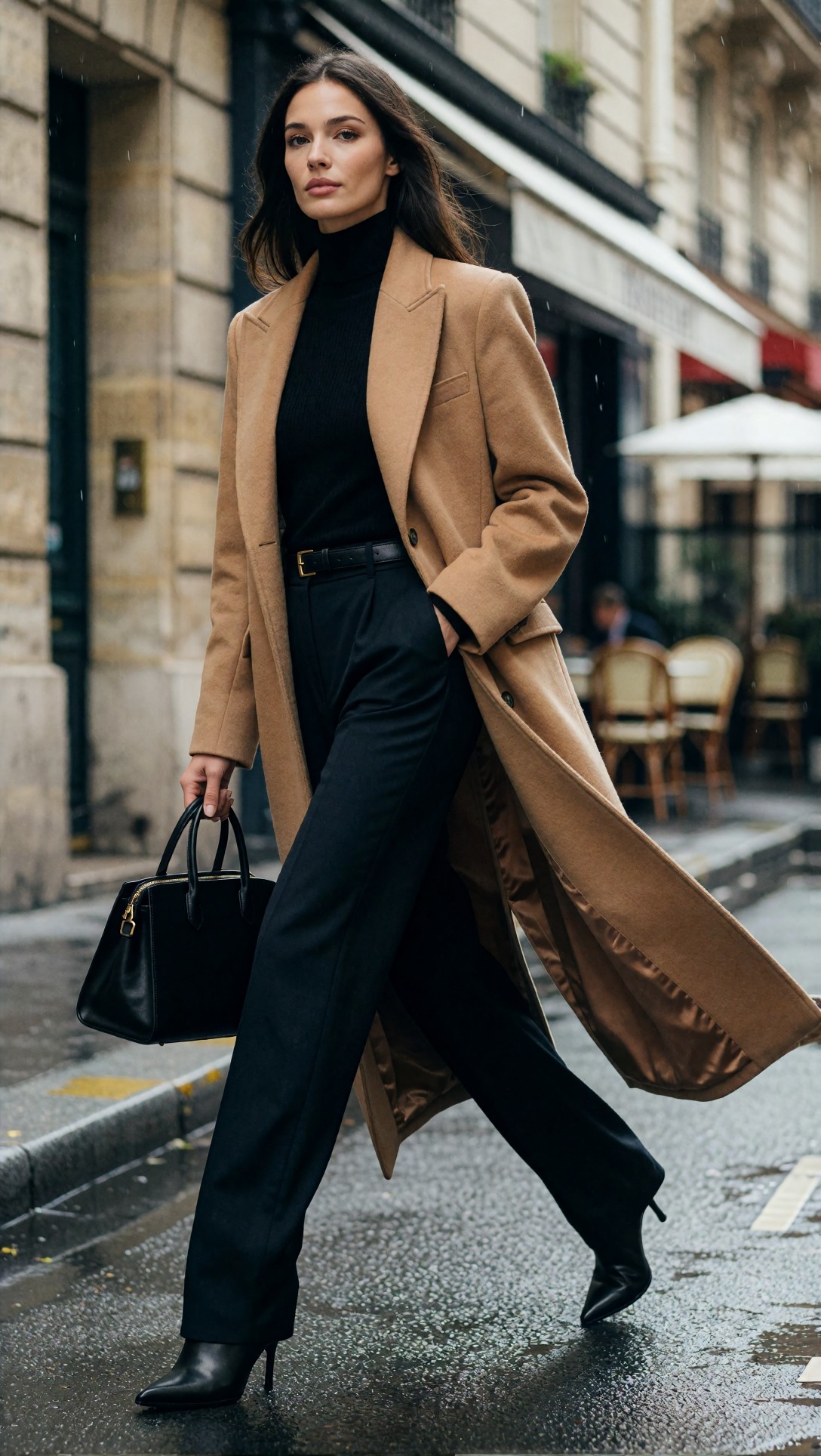
Inspect the coat hem, legs, and handbag geometry first, then see whether the background stays secondary. If the motion looks broken, reducing stride intensity often fixes more than adding complexity.
Short checklist based on observed output quality
Use this before you call a prompt finished:
- Is the subject specific enough to prevent substitution?
- Does the genre match the intended image use?
- Does the lens support the composition you want?
- Is the lighting concrete and visually directional?
- Is the location specific enough to stabilize the background?
- Does the style point to one clear visual lane?
- Are wardrobe and palette simple enough to stay coherent?
- Is there one obvious focal priority in the frame?
- If hands or products matter, is the interaction simple and inspectable?
- Could you remove two adjectives without losing meaning?
The main tradeoff
The tradeoff with a structured AI art prompt formula is speed versus control.
If you are moodboarding or experimenting, this structure can feel slower than a loose sentence prompt. But if you are trying to generate a usable image with consistent framing and style, the extra setup pays for itself. In this test, the full formula did not always create the most surprising image, but it produced more images that were easier to keep, refine, and reproduce.
Editorial conclusion
This workflow is best for people who need repeatable results: editors, marketers, prompt builders, image testers, and anyone comparing models or prompt variants in a disciplined way. It is also useful for creators who keep getting attractive but unusable images and need better control over composition.
I would avoid this full structure for pure ideation sessions where randomness is the point. In those cases, a lighter prompt can be faster and more playful.
If I had to keep just one setting from this entire test, it would be the lens choice tied to a clear subject priority. That detail affected composition more reliably than camera brand, and often more than extra style adjectives. The best AI art prompt formula is not the longest one. It is the one that tells the model exactly what the image is about, how it should be framed, and which visual decision matters most.