AI Fashion Photography for Korean Streetwear: Best Prompt Structures for Campaigns, Lookbooks, and Product Pages 한국어 요약
이 페이지는 ZView Space의 영어 원문을 한국어 검색 사용자도 이해할 수 있도록 정리한 SEO 요약입니다. 핵심은 단순한 얼굴 중심 이미지가 아니라 패션 에디토리얼, 룩북, 아웃핏, 프롬프트 테스트, 이미지 생성 워크플로우를 실제로 어떻게 구성할지입니다.
핵심 요약
- 원문 주제: AI Fashion Photography for Korean Streetwear: Best Prompt Structures for Campaigns, Lookbooks, and Product Pages
- 목적: AI 이미지 생성에서 outfit, silhouette, fabric, pose, location, camera framing을 더 명확하게 설계합니다.
- 활용 범위: Z-Image Turbo, Krea2 Turbo, Qwen Image, Anima, SeedVR2 같은 이미지 생성 및 업스케일 워크플로우에 적용할 수 있습니다.
- SEO 관점: 제목, 설명, 이미지 alt, 프롬프트 예시가 실제 검색 의도와 맞아야 색인 가능성이 높아집니다.
한국어 사용자를 위한 체크포인트
1. 프롬프트가 얼굴 묘사에만 머물지 않고 전체 스타일과 의상 구성을 설명하는지 확인합니다. 2. 패션 이미지라면 상의, 하의, 아우터, 신발, 액세서리, 소재감, 촬영 장소를 분리해서 씁니다. 3. 생성 결과는 바로 게시하지 말고 디테일, 손, 의상 형태, 배경 일관성, 이미지 품질을 비교합니다. 4. 글 본문에는 실제 테스트 기준과 실패를 줄이는 방법이 들어가야 검색엔진에서 얇은 콘텐츠로 보일 가능성이 줄어듭니다.
원문 미리보기
This test is about one specific buying question: how to get usable ai fashion photography korean streetwear images for campaigns, lookbooks, and product pages without wasting time on pretty but unusable outputs . After comparing two prompt workflows across out
---
This test is about one specific buying question: how to get usable ai fashion photography korean streetwear images for campaigns, lookbooks, and product pages without wasting time on pretty but unusable outputs. After comparing two prompt workflows across outfit editorials, catalog shots, detail crops, and retail scenes, the plain verdict is simple: a styling-first prompt structure wins for campaign and lookbook work, while a product-first workflow is safer for PDP and catalog consistency.
If you run a Korean streetwear label, or you are building visuals for one, the difference matters. In this test, broad aesthetic prompts often gave mood-rich Seoul street scenes but dropped garment accuracy. Structured prompts that listed silhouette, layers, fabric, footwear, and retail use case produced fewer surprises and were much easier to iterate.
Quick answer
- For campaign images, start with shot type + styling system + Seoul context + camera direction.
- For product pages, put garment clarity, front view, fabric detail, and background control ahead of atmosphere.
- If the model keeps drifting, lock the outfit logic in this order: outerwear, top, bottom, shoes, bag, accessories, fabric, palette.
- Korean street fashion prompts perform better when the location is specific, like Hongdae side street, Seongsu showroom, or minimal retail studio, instead of vague “urban fashion” wording.
- The biggest failure risk is not faces. It is hems, pocket placement, shoe shape, and accidental extra layers.
What was tested
I tested two prompt approaches for the same visual goal set:
1. Option A: styling-first editorial prompt structure Built around shot type, silhouette, layering, fabric, accessories, Seoul scene, and campaign mood.
2. Option B: product-first commercial prompt structure Built around garment visibility, front/three-quarter angle, clean background, textile detail, and layout consistency.
The image checks were simple and practical:
- Can you read the outfit quickly?
- Are the layers believable and complete?
- Do pants, sleeves, cuffs, and shoes hold shape?
- Does the image fit a campaign, a lookbook, or a product page?
- How much fixing would it need before use?
I also paid attention to common failure points: tangled hands near bags, collapsing hood shapes, invented seams, unreadable graphics, and jackets merging into the background.
If you want to test your own variants, the fastest workflow is to generate in [/create](/create), store keepers in a board or set via [/gallery](/gallery), and refine your wording in [/promptlab](/promptlab).
The two workflows at a glance
| Use case | Option A: Styling-first editorial | Option B: Product-first commercial | |---|---|---| | Streetwear campaign hero | Strong | Medium | | Lookbook full-body outfit | Strong | Strong | | Product detail page | Medium | Strong | | Catalog grid consistency | Medium | Strong | | Retail/storefront scene | Strong | Medium | | Garment texture accuracy | Medium | Strong | | Mood and trend signal | Strong | Medium | | Fast iteration for one SKU | Medium | Strong |
Why Option A was strongest for campaign visuals
The best campaign outputs came from prompts that treated the image like a fashion editor’s shot brief, not a product listing. Korean streetwear depends on silhouette logic: cropped outerwear over a longline layer, wide trousers with visible break, technical sneakers, crossbody bag, silver hardware, washed nylon, matte cotton, charcoal and asphalt palettes.
When those ingredients were explicit, the model made stronger outfit decisions. The scene also mattered. “Seoul street” was too loose. “Seongsu industrial side street after light rain” gave better pavement texture, signage scale, and tonal control.
Prompt test 1: street-style campaign hero
This first test checks whether the model can hold a full head-to-toe silhouette while still feeling like a trend-led Korean street fashion campaign.
Topic: Korean streetwear campaign hero outfit with layered black and slate technical styling
Genre: Street Style
Camera: Fujifilm GFX100S
Lens: 45mm f/2.8
Lighting: Overcast diffusion with soft pavement bounce
Location: Seongsu side street with concrete walls, utility signage, and light rain residue
Style: Korean magazine streetwear campaign
Final Prompt: Street-style full body fashion image for a Korean streetwear campaign, head-to-toe outfit visibility, model walking across a Seongsu side street, layered cropped technical bomber jacket in washed black over an ash grey long sleeve top, wide charcoal parachute pants with articulated knees, matte black trail sneakers, compact crossbody bag, silver rings, clean beanie, strong full-body silhouette, relaxed forward motion, outfit structure clearly readable from shoulders to shoes, damp concrete reflections, muted black grey slate palette, editorial framing with negative space for campaign text, realistic fabric texture in nylon, cotton jersey, and ripstop, Korean magazine streetwear direction, Fujifilm GFX100S look, 45mm documentary fashion framing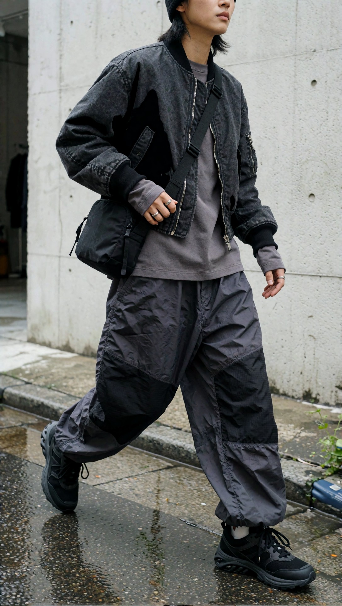
Inspect whether the bomber hem, trouser volume, and sneaker proportion stay separate. In this test, the strongest outputs kept the outfit readable even when the background carried a lot of texture.
Prompt test 2: three-quarter editorial for layer logic
This one is meant to expose whether the model understands streetwear layering rather than just producing a cool face and jacket.
Topic: Korean streetwear three-quarter editorial emphasizing layered silhouette and accessory balance
Genre: Fashion Editorial
Camera: Sony A7R V
Lens: 50mm f/1.8
Lighting: Soft north-light style diffusion with subtle silver bounce
Location: Hongdae alley with poster walls and narrow sidewalk depth
Style: Trend-led urban editorial
Final Prompt: Three-quarter outfit editorial image for a Korean streetwear brand, visible styling system from outerwear to footwear, oversized washed olive field jacket layered over a striped knit top and long white tee, loose black straight-leg trousers, vintage-inspired skate shoes, nylon shoulder bag tucked under the arm, metal chain necklace and cap, relaxed off-center pose against a Hongdae alley poster wall, expression neutral, framing from head to below shoes with full outfit logic preserved, emphasis on hem lengths, sleeve stacking, fabric weight contrast, urban Korean street fashion mood, soft diffused daylight, Sony A7R V realism, 50mm editorial composition, clean but lived-in city background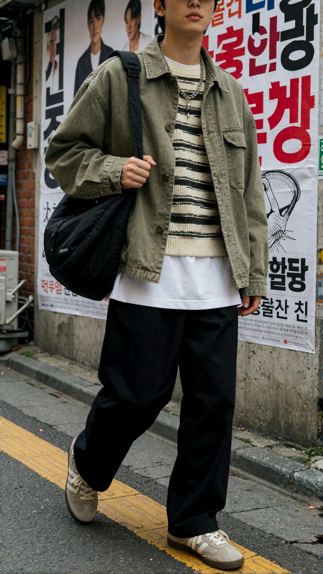
Look for sleeve stacking and shirt hem separation. Weak generations often merge the knit and tee into one flat layer, which makes the styling feel fake even when the image is attractive.
Where Option A failed
The weak point of the styling-first method was product truthfulness. If a brand needs exact SKU representation, editorial prompts can invent better-looking but wrong clothes.
In this test, the most common problems were:
- zipper count changing between images
- made-up seam lines on cargos
- logos turning into abstract marks
- puffers becoming wool coats under softer lighting
- shoe soles shifting shape between angles
So for campaign work, Option A is the strongest result. For catalog or PDP, it needs tighter controls.
Why Option B worked better for product pages and lookbook grids
Product-first prompts performed better when the goal was simple commercial utility: clean background, reliable framing, visible garment edges, and repeatable output across multiple SKUs.
The images were less atmospheric, but they wasted less time. That matters if you need 20 hoodie colors, front and three-quarter views, and consistent crop ratios for an ecommerce page.
Prompt test 3: head-to-toe lookbook frame for one SKU
This test checks whether a cleaner commercial setup can preserve Korean streetwear proportion without flattening the outfit into a mannequin-like image.
Topic: Head-to-toe Korean streetwear lookbook image for a minimalist ecommerce collection
Genre: Fashion Editorial
Camera: Canon EOS R5
Lens: 40mm f/2.8
Lighting: Large softbox key with even studio fill
Location: Minimal off-white studio with soft floor shadow
Style: Clean commercial lookbook
Final Prompt: Head-to-toe lookbook image for a Korean streetwear collection, full-body front-facing pose with slight turn, styling centered on a boxy stone-grey zip hoodie layered over a ribbed white tee, wide indigo denim with clean drape, white leather low-top sneakers, black mini shoulder bag, simple silver earrings, neutral stance, complete outfit visible from head to toe, generous edge separation around sleeves, cuffs, waistband, and hem, off-white studio background, soft natural commercial shadows, clean commercial lookbook direction, Korean fashion retail styling, Canon EOS R5 clarity, 40mm balanced body proportions, crisp textile detail and true garment structure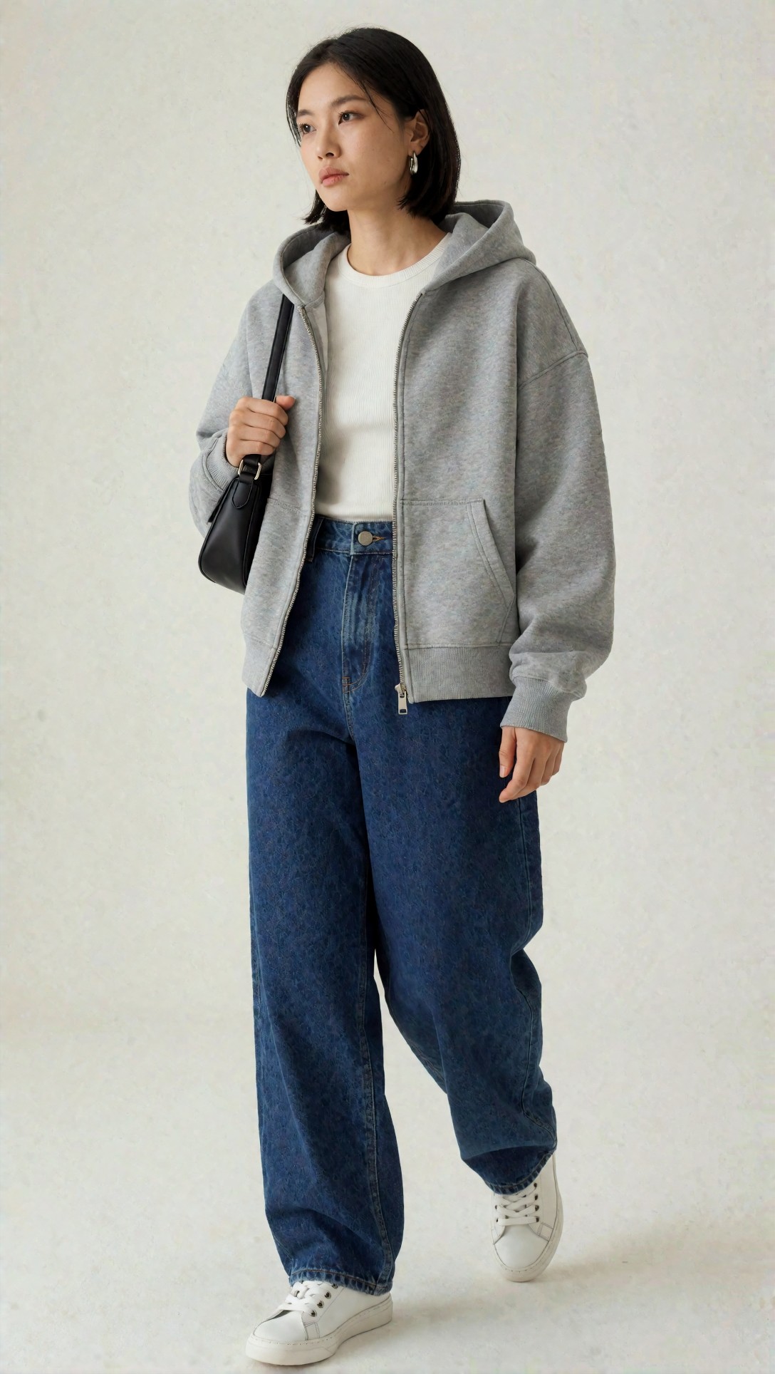
Check the drape of the denim and the hoodie shoulder line. In this test, this structure gave fewer anatomy problems and much more usable image cropping for a lookbook sequence.
Prompt test 4: catalog grid page consistency
This prompt is aimed at consistency, not mood. It tests whether the model can create an image that belongs in a multi-item product grid.
Topic: Korean streetwear catalog grid page with consistent apparel presentation
Genre: Product Editorial
Camera: Nikon Z7 II
Lens: 70mm f/4
Lighting: Even studio softbox with shadow control
Location: Neutral ecommerce studio set
Style: Clean commercial catalog
Final Prompt: Catalog grid page style image for Korean streetwear apparel, straight clean three-quarter standing view, model wearing a navy coach jacket over a white graphic tee, relaxed khaki cargos, black skate sneakers, compact nylon belt bag, outfit presented with high clarity for ecommerce use, simple neutral expression, body positioned to show jacket length, pocket placement, sleeve cuffs, trouser shape, and shoe profile, light warm-grey backdrop, even lighting with controlled shadow under shoes, minimal distraction, commercial catalog consistency, Nikon Z7 II sharpness, 70mm clean compression, realistic textile surfaces and readable construction details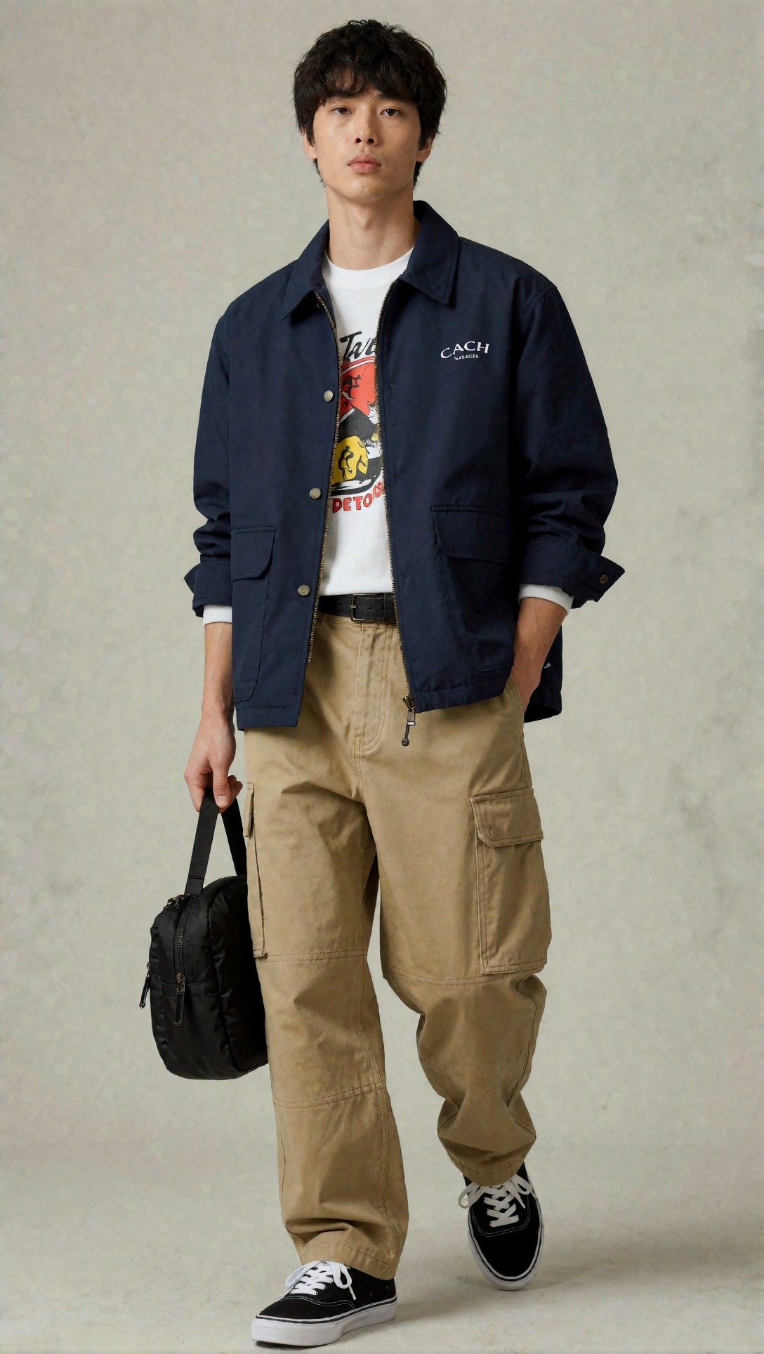
Inspect the jacket length, cuff symmetry, and cargo pocket placement. If those stay stable, the workflow is suitable for SKU-page image generation or mockups.
The alternative workflow nobody should skip: product and detail inserts
A useful middle path came from mixing the two structures. Hero campaign images sold the mood, but the strongest content set included detail inserts and flat lays built with product-first language.
That combination felt more believable because viewers could see both the styling concept and the material evidence.
Prompt test 5: garment detail macro for fabric truth
This test is for texture credibility. Korean streetwear often leans on washed cotton, technical nylon, brushed fleece, and hardware. If those fail, the brand look falls apart.
Topic: Technical fabric and hardware detail for Korean streetwear outerwear
Genre: Product Editorial
Camera: Sony A1
Lens: 85mm f/2
Lighting: Controlled side softbox with narrow rim highlight
Location: Studio tabletop garment setup
Style: Premium material detail study
Final Prompt: Garment detail macro image for a Korean streetwear outerwear piece, close controlled crop showing washed black technical nylon jacket fabric, matte zipper tape, metal puller, stitched pocket edge, elastic cuff, subtle wrinkling and seam construction, no face, no body emphasis, pure focus on material character and build quality, premium Korean street fashion product detail, dark neutral tabletop background, directional side softbox to reveal weave and surface texture, Sony A1 high-resolution product realism, 85mm controlled macro-like framing, crisp micro contrast and accurate hardware reflections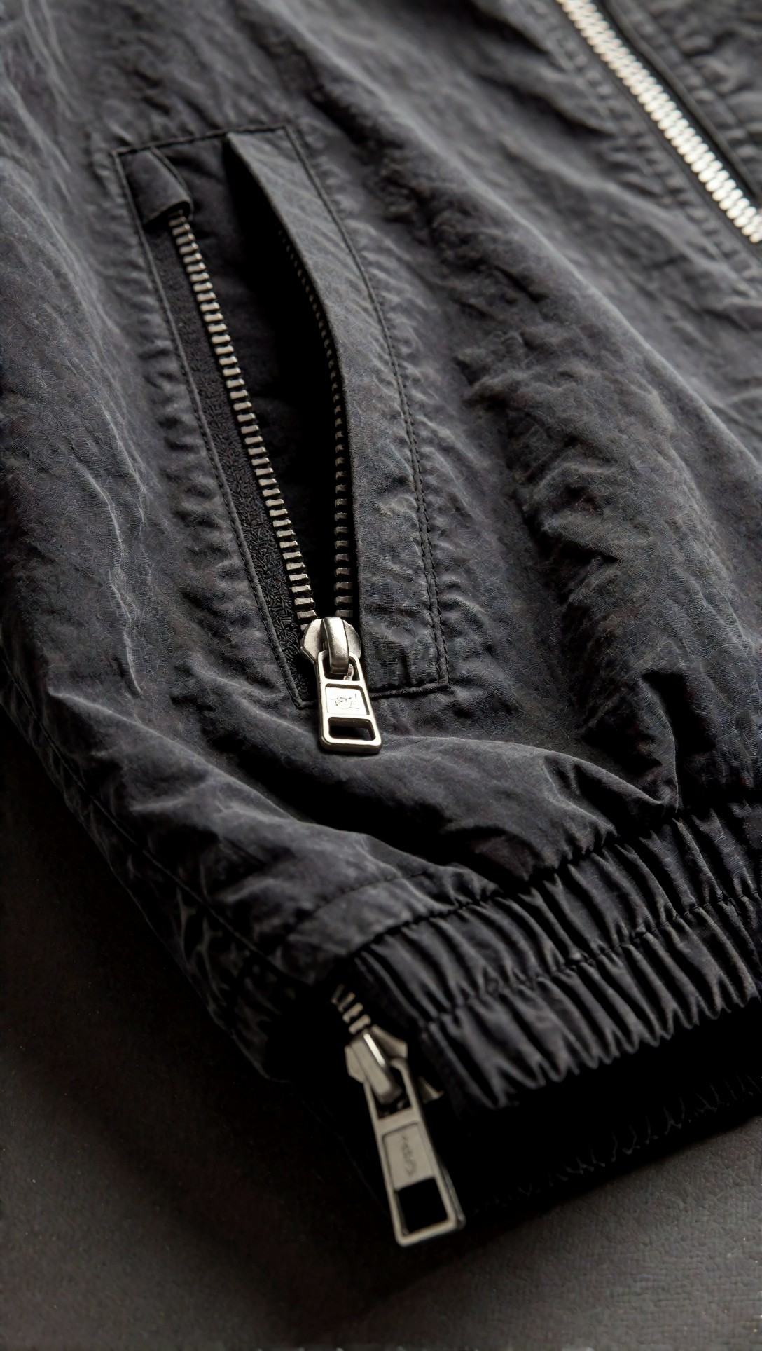
Check whether the weave, zipper, and seam thickness make physical sense. If the material reads like generic plastic, the hero image above it will also feel less convincing.
Prompt test 6: product flat lay for merchandising support
This one checks if the workflow can produce support assets for collection launches, mood boards, and retail email layouts.
Topic: Korean streetwear outfit flat lay with full styling system
Genre: Product Editorial
Camera: Hasselblad X2D 100C
Lens: 55mm f/2.5
Lighting: Soft overhead diffusion
Location: Clean studio floor set
Style: Fashion merchandising flat lay
Final Prompt: Product flat lay image for a Korean streetwear outfit build, carefully arranged cropped black windbreaker, off-white heavyweight tee, faded olive wide-leg cargos, grey technical sneakers, black sling bag, silver chain, beanie, folded socks, all pieces visible and neatly spaced, styling logic clear from top layer to accessories, premium merchandising composition, soft overhead diffusion, light concrete-toned floor, restrained black olive grey palette, Korean fashion collection planning aesthetic, Hasselblad X2D precision, 55mm top-down flat lay realism, crisp fabric folds and distinct material separation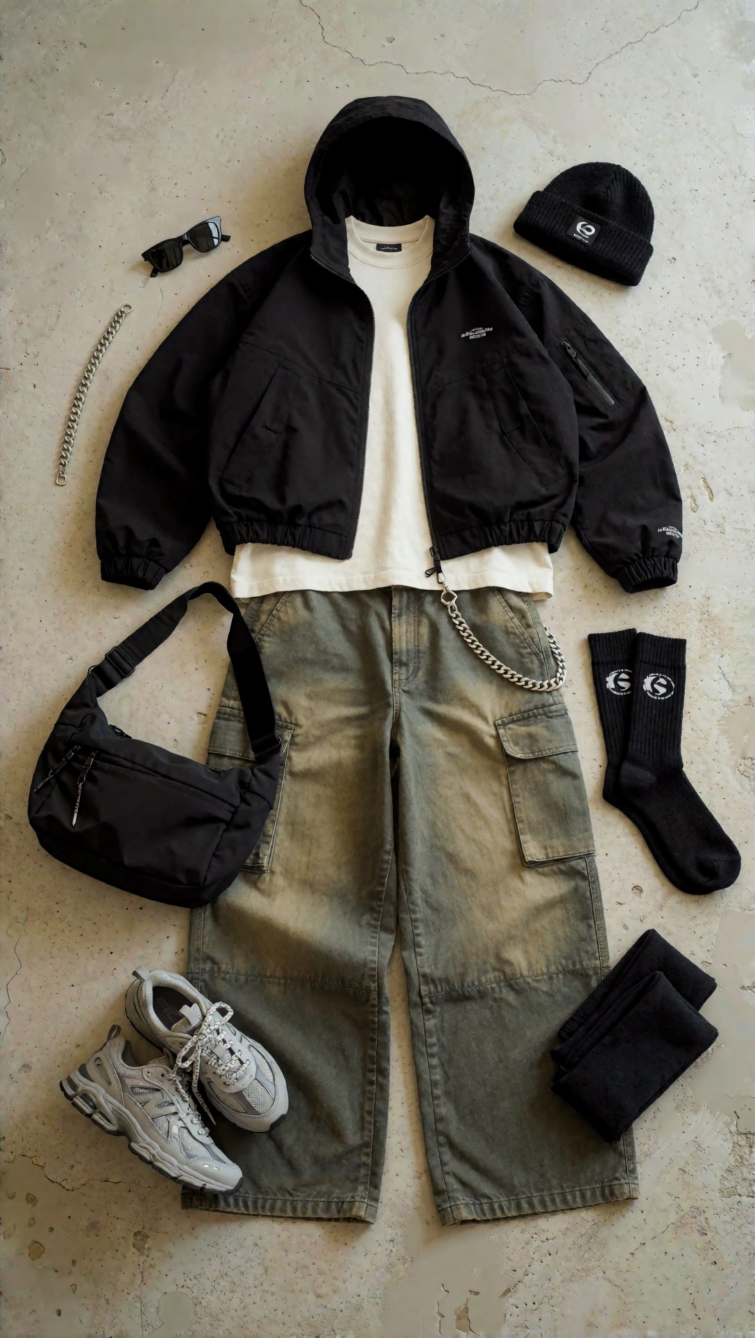
Inspect spacing, scale, and whether shoes and bag look like they belong to the same collection. This kind of image is useful when campaign outputs feel too loose and you need visual structure around the launch.
Side-by-side tradeoffs that showed up repeatedly
After several rounds, the pattern was consistent.
Option A: styling-first editorial
Strengths
- Better at trend signal and Seoul fashion context
- Stronger layered silhouettes
- More natural campaign energy
- Better for social, homepage hero, and seasonal storytelling
Limitations
- More likely to drift from exact product details
- Harder to keep logos and graphic prints stable
- Can over-prioritize atmosphere over garment clarity
Option B: product-first commercial
Strengths
- Better garment readability
- Easier batch consistency for multiple SKUs
- Safer for ecommerce and marketplace-style needs
- Cleaner edge separation and simpler retouching
Limitations
- Can feel generic without scene context
- Often loses the streetwear attitude that brands actually want
- Less convincing for premium campaign storytelling
Prompt structures that exposed the difference most clearly
The easiest way to see the difference was to test the same collection idea in different image types.
Prompt test 7: storefront display for campaign atmosphere
This test asks for a retail scene, where mood matters but clothes still need to read as merchandise.
Topic: Korean streetwear storefront visual merchandising display
Genre: Luxury Campaign
Camera: Leica SL2-S
Lens: 35mm f/2
Lighting: Evening window glow with interior track lighting
Location: Seongsu boutique storefront with glass facade and concrete interior
Style: Contemporary retail fashion campaign
Final Prompt: Storefront display image for a Korean streetwear brand in Seongsu, visible retail merchandising through a glass facade, mannequins and styled rails showing oversized varsity jacket, layered hoodies, wide denim, technical bags, low-profile sneakers, folded knit accessories, polished concrete floor, brushed steel fixtures, evening city reflections on glass, campaign-ready retail atmosphere, trend-led Korean street fashion direction, 35mm documentary storefront framing, Leica SL2-S realism, balanced view between product visibility and mood, black navy cream palette, premium but youth-oriented visual merchandising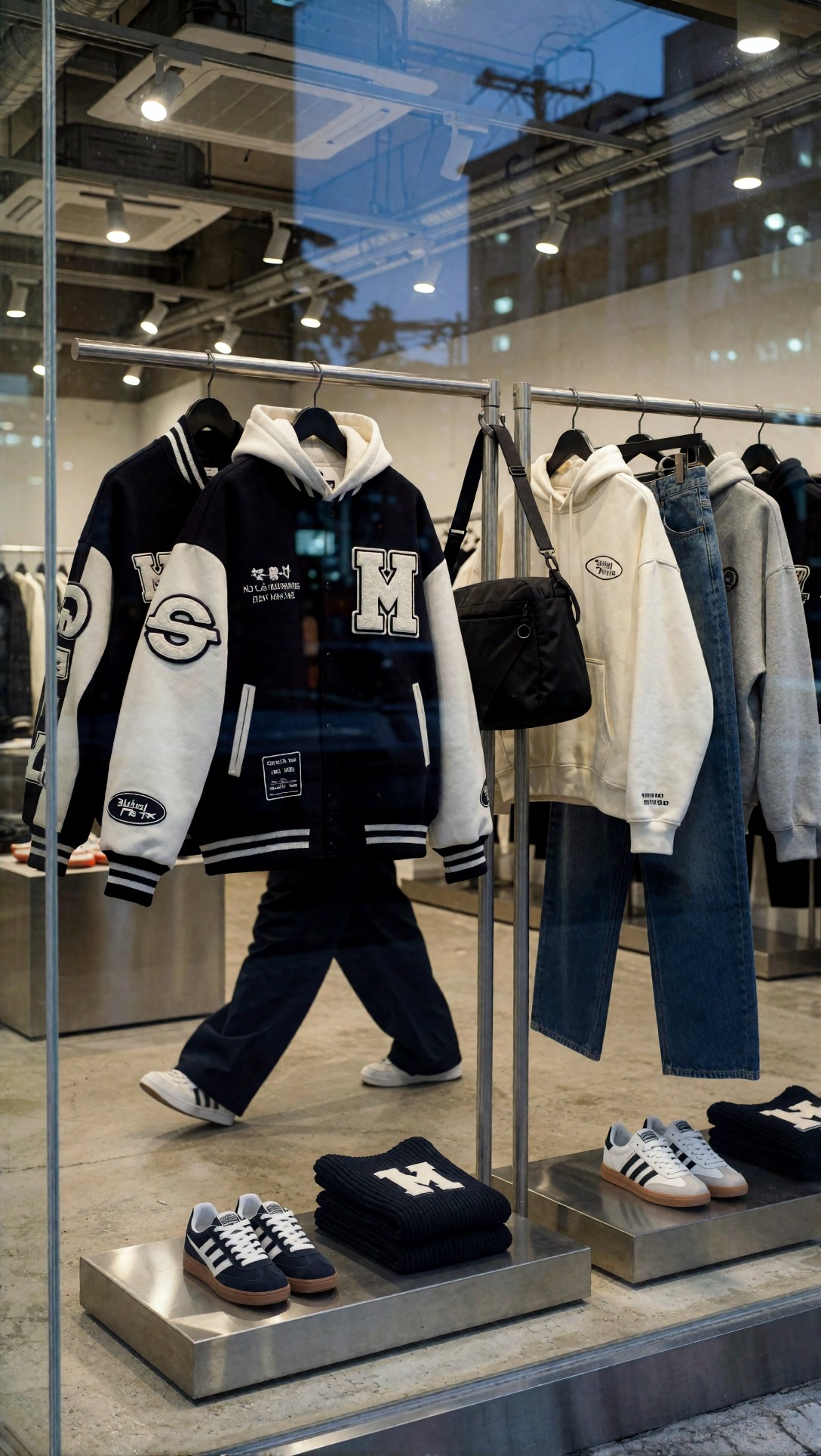
Look for how clearly the garments read through reflections. A weak image turns into generic lifestyle retail. A stronger image still shows silhouette, styling tiers, and merchandising logic.
Prompt test 8: accessories close-up for PDP support
This final prompt tests whether accessories can keep Korean streetwear identity without becoming glossy luxury product shots that no longer match the collection.
Topic: Korean streetwear accessories close-up for ecommerce and campaign support
Genre: Product Editorial
Camera: Canon EOS R3
Lens: 85mm f/1.8
Lighting: Softbox key with subtle edge light
Location: Minimal grey studio plinth setup
Style: Clean contemporary accessory campaign
Final Prompt: Accessories close-up image for a Korean streetwear collection, matte black crescent shoulder bag styled with silver chain bracelet, folded black cap, key ring hardware, and technical wallet, arranged on a low grey plinth with slight overlap and practical styling, streetwear not luxury-jewelry mood, visible zippers, nylon grain, buckle details, restrained black graphite silver palette, commercial clarity with editorial restraint, Canon EOS R3 look, 85mm controlled product composition, clean softbox light with subtle edge highlight, premium ecommerce support image matching a modern Korean streetwear brand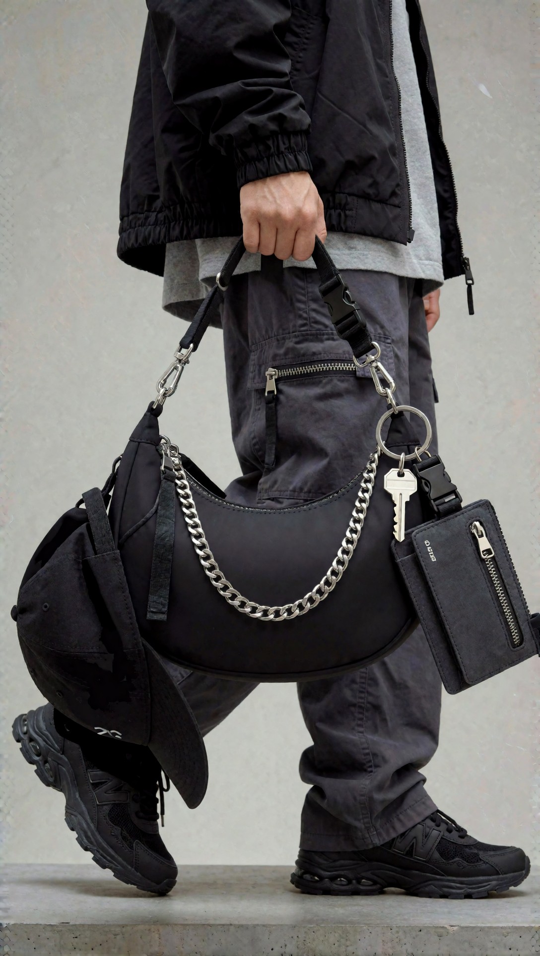
Inspect hardware shape, zip realism, and nylon grain. If those are stable, accessories can act as a bridge between campaign mood and product-page trust.
What I would use for each brand asset
For a seasonal campaign
Use Option A first. Start with a street-style full body shot or a three-quarter editorial. Build around one strong silhouette and one location in Seoul.
Best ingredients:
- named shot type
- one outerwear anchor piece
- one trouser shape
- one bag or accessory system
- one exact location cue
- one narrow palette
For a lookbook
Use a hybrid.
Lead with Option B framing for consistency, then add just enough editorial detail from Option A to stop the images from feeling sterile. In practice, that means keeping the background minimal but still naming the styling logic and fabric behavior.
For product pages
Use Option B.
Keep the prompt short enough to preserve control, but detailed enough to protect garment structure. Product page images benefit from less mood, less motion, and more front/three-quarter readability.
For launch support assets
Mix in flat lays, detail macros, and accessory crops. These were the most reliable way to support campaign images that looked good but could not prove textile quality.
Beginner checklist for better AI clothing product photography
Before you hit generate, check these:
- Did you name the shot type first?
- Did you specify outerwear, top, bottom, shoes, bag, accessories in order?
- Did you mention fabric and not just color?
- Did you choose a real location instead of “urban street”?
- Did you state full-body visibility when the whole outfit matters?
- Did you control lighting so black garments do not collapse into one shape?
- Did you ask for pocket placement, cuffs, hem, or hardware when selling product detail?
FAQ
What is the best prompt format for ai fashion photography korean streetwear?
For most brands, the best format is shot type + outfit structure + fabric + location + lighting + intended commercial use. That order helps the model understand both style and purpose.
Can AI images work for Korean streetwear product pages?
Yes, but only if the prompt is product-first. Campaign-style prompts often invent seams, graphics, or hardware. For PDP work, use cleaner backgrounds, stable angles, and explicit garment details.
How do I make AI fashion images look more like Korean street fashion?
Use specific context: Hongdae, Seongsu, minimal retail showroom, poster-lined alley, concrete boutique, utility street signage. Also prioritize layered silhouette and accessories over facial beauty language.
What camera and lens choices work best for streetwear prompts?
In this test, 35mm, 40mm, 45mm, and 50mm gave the best full-outfit readability. 85mm worked better for details and accessories than for full-body styling.
How can I improve texture before publishing?
Generate a dedicated detail insert, then refine or enlarge it using an upscaling step in [/upscaler](/upscaler). For prompt revisions, tighten fabric wording in [/promptlab](/promptlab) before rerunning.
Best choice by use case
If your goal is a brand campaign, choose the styling-first editorial workflow. It gives the strongest fashion read, the clearest Korean street fashion mood, and the most useful hero images.
If your goal is a lookbook, use a hybrid. Start commercial, then add selective editorial direction so the lineup still feels like streetwear and not generic catalog photography.
If your goal is a product page, choose the product-first workflow. It is less exciting, but it is more dependable where it counts: hems, pockets, layers, and fabric clarity.
My overall recommendation is simple: use AI fashion photography Korean streetwear workflows only when you know which asset you are generating. Do not ask one prompt to do campaign, lookbook, and ecommerce at the same time. The setting that matters most is not the camera line. It is the shot purpose. Once that is clear, the right prompt structure becomes much easier to build.
For teams comparing more prompt patterns, it is worth browsing related tests on [/articles](/articles) and saving successful structures into repeatable templates in [/tools](/tools).
Editorial conclusion: use the styling-first workflow if you need mood, trend signal, and a believable Seoul streetwear story. Avoid it when exact product truth is the priority. Use the product-first workflow if you need reliable SKU support, clean lookbook frames, or accessory detail. The single prompt detail that matters most is the full outfit logic in order—outerwear, top, bottom, shoes, bag, accessories, and fabric—because that is what kept the strongest images from drifting into generic fashion output.