How to Use AI Image Generation for Trend Mood Boards Across Fashion, Beauty, and Packaging 한국어 요약
이 페이지는 ZView Space의 영어 원문을 한국어 검색 사용자도 이해할 수 있도록 정리한 SEO 요약입니다. 핵심은 단순한 얼굴 중심 이미지가 아니라 패션 에디토리얼, 룩북, 아웃핏, 프롬프트 테스트, 이미지 생성 워크플로우를 실제로 어떻게 구성할지입니다.
핵심 요약
- 원문 주제: How to Use AI Image Generation for Trend Mood Boards Across Fashion, Beauty, and Packaging
- 목적: AI 이미지 생성에서 outfit, silhouette, fabric, pose, location, camera framing을 더 명확하게 설계합니다.
- 활용 범위: Z-Image Turbo, Krea2 Turbo, Qwen Image, Anima, SeedVR2 같은 이미지 생성 및 업스케일 워크플로우에 적용할 수 있습니다.
- SEO 관점: 제목, 설명, 이미지 alt, 프롬프트 예시가 실제 검색 의도와 맞아야 색인 가능성이 높아집니다.
한국어 사용자를 위한 체크포인트
1. 프롬프트가 얼굴 묘사에만 머물지 않고 전체 스타일과 의상 구성을 설명하는지 확인합니다. 2. 패션 이미지라면 상의, 하의, 아우터, 신발, 액세서리, 소재감, 촬영 장소를 분리해서 씁니다. 3. 생성 결과는 바로 게시하지 말고 디테일, 손, 의상 형태, 배경 일관성, 이미지 품질을 비교합니다. 4. 글 본문에는 실제 테스트 기준과 실패를 줄이는 방법이 들어가야 검색엔진에서 얇은 콘텐츠로 보일 가능성이 줄어듭니다.
원문 미리보기
In this test, I used AI image generation trend mood boards as a practical workflow rather than a buzzword exercise. The goal was simple: build early stage visual research boards for fashion, beauty, and packaging that look coherent enough to guide a team, whil
---
In this test, I used AI image generation trend mood boards as a practical workflow rather than a buzzword exercise. The goal was simple: build early-stage visual research boards for fashion, beauty, and packaging that look coherent enough to guide a team, while still being fast enough to iterate in a single session.
What surprised me most was not how easy it was to get "pretty" images. That part is common. The useful part was learning which prompt ingredients kept a board on-theme, and which ones caused drift, fake product details, or mixed aesthetics that would confuse a client review.
What was tested
I tested a mood board workflow across three common categories:
- Fashion trend boards for silhouette, color, styling, and setting
- Beauty concept boards for skin finish, makeup texture, lighting, and campaign direction
- Packaging boards for material feel, color systems, label hierarchy, and shelf presence
The workflow was based on generating small image sets around one trend direction instead of asking for one giant collage first. In this setup, AI performed better when each image represented a single tile of the board with a controlled visual role: hero shot, texture crop, lifestyle context, detail image, and product close-up.
I also compared two approaches:
1. Direct collage prompts: asking the model for a complete mood board in one image 2. Tile-by-tile generation: generating individual visuals, then arranging them manually
The strongest result was tile-by-tile generation. Direct collage prompts often produced awkward text scraps, inconsistent composition, and random object duplication. When this setup works, it is because each generated image has one job.
Why AI works for trend mood boards
For early concepting, AI is useful when you need to answer questions like:
- What does this color trend feel like in context?
- Does this packaging direction read premium or mass-market?
- Can fashion styling, beauty finish, and product materials belong to the same world?
- Is the trend actually clear, or is it just a mix of references?
In this test, AI was best at atmosphere, color alignment, material suggestion, and editorial styling cues. It was weaker at exact logos, precise label copy, and multi-panel layouts with clean graphic design logic.
That makes it a good fit for visual research, not final production artwork.
The workflow I would actually use
Here is the workflow that produced the most usable boards.
1. Define one trend sentence first
Before prompting, I wrote a one-line trend statement. For example:
- sun-faded resort minimalism with sea-salt neutrals
- biotech beauty with translucent pastel lab textures
- nostalgic pantry packaging with matte paper and fruit-ink colors
This mattered more than I expected. The weak point in vague prompting was aesthetic mixing. If the trend statement was broad, the model combined luxury fashion, social media beauty, and generic ecommerce packaging into one muddy output.
2. Split the board into image roles
For each board, I planned 4 to 6 image roles:
- hero editorial image
- detail crop or texture image
- product-focused image
- environment or lifestyle context
- color/material close-up
- optional contrast image for balance
This reduced drift because every prompt had a narrow purpose.
3. Lock recurring ingredients
Across each mini-series, I kept these stable:
- color palette words
- material language
- lighting family
- camera distance and lens intent
- style label such as clean commercial look or luxury campaign
The strongest result came from keeping lighting and material vocabulary consistent. Those two details did more to unify the board than adding lots of trend adjectives.
Fashion mood boards: what worked best
Fashion prompts performed well when the styling direction was specific and the environment matched the clothing story. The model responded well to fabric, silhouette, and mood words, but it drifted when I overloaded the prompt with too many trend references.
A useful pattern was pairing one wardrobe story with one location story. That created images that could sit together on a board without feeling copied.
This first prompt tests whether the model can establish a clear fashion trend anchor with controlled palette, fabric movement, and editorial composition.
Topic: Coastal Minimalist Resort Wear Trend Board Hero
Genre: Fashion Editorial
Camera: Sony A7R V
Lens: 85mm f/1.4
Lighting: Golden hour backlight with soft ocean bounce
Location: Quiet limestone beach club terrace overlooking pale blue water
Style: Luxury fashion campaign
Final Prompt: A fashion editorial hero image for a trend mood board showing coastal minimalist resort wear, model wearing layered ivory linen separates, a sand-toned oversized blazer, fluid wide-leg trousers, leather flat sandals, and sculptural gold jewelry, relaxed upright pose with one hand resting on a stone railing, calm confident expression, wind lifting fabric softly, framed three-quarter length, pale limestone architecture and muted sea in the background, palette of chalk white, dune beige, sea-glass blue, and brushed gold, premium fabric texture, natural skin detail, glossy magazine composition, refined negative space, cinematic realism, Sony A7R V look, 85mm f/1.4 depth separation, polished editorial color grading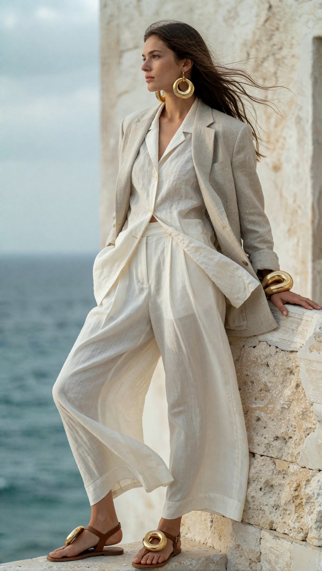
Inspect whether the wardrobe, location, and palette feel like the same trend rather than separate ideas. I would also check if the model keeps the jewelry elegant and avoids overdecorating the outfit.
This second fashion test checks texture detail and whether the model can create a supporting image for the same board without simply repeating the hero pose.
Topic: Coastal Minimalist Resort Wear Texture Detail
Genre: Luxury Campaign
Camera: Canon EOS R5
Lens: 50mm f/2
Lighting: Overcast diffusion
Location: Textured stone corridor in a Mediterranean boutique hotel
Style: Clean commercial look
Final Prompt: A supporting fashion mood board image focused on texture and styling detail for a coastal minimalist resort trend, close crop of a model seated on a pale stone bench wearing an oatmeal linen shirt half-buttoned over a silk bandeau and pleated cream shorts, hands relaxed in frame, soft leather slides visible near the floor, woven tote, brushed metal cuff, fabrics slightly creased in a realistic way, muted beige and shell-white palette with a hint of dusty aqua, quiet luxury mood, soft overcast light revealing weave and drape, editorial crop with architectural shadows, Canon EOS R5 realism, 50mm f/2 natural perspective, premium catalog-meets-magazine finish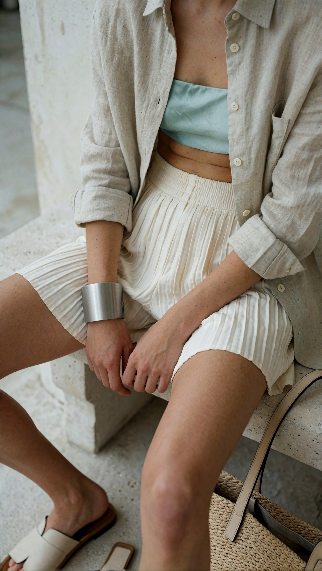
Look closely at fabric weave, natural folds, and hand rendering. In this test, detail shots often revealed whether a model could support a professional-looking board or whether it would collapse into waxy textiles and broken fingers.
What I learned from the fashion tests
- Specific fabrics like linen, silk, denim, organza, and brushed cotton improve output quality.
- Lifestyle context matters. Resort wear in a studio felt generic; the same styling near stone, sea, and sun instantly became board-worthy.
- Too many fashion buzzwords caused style collisions. "Quiet luxury, coastal cowgirl, retro sport, Y2K" in one prompt was a reliable failure pattern.
The strongest result was a board where every image repeated the same few cues: pale neutrals, natural stone, low-contrast light, and fabric movement.
Beauty mood boards: where AI is strong and where it breaks
Beauty concept boards were some of the most visually convincing results in this test. AI handles skin glow, color cosmetics, glass textures, and campaign atmosphere well. But the weak point was product accuracy. Bottles, labels, and applicators often mutated unless the prompt clearly favored campaign imagery over literal packshot fidelity.
That means AI is excellent for beauty direction, but risky for final packaging approval.
This prompt checks skin finish, makeup texture, and color atmosphere for a biotech-inspired beauty trend board.
Topic: Biotech Pastel Beauty Campaign Portrait
Genre: Beauty Campaign
Camera: Phase One XF IQ4
Lens: 110mm f/2.8
Lighting: Studio butterfly light with translucent acrylic bounce
Location: Minimal pastel laboratory set with frosted acrylic panels
Style: High-end beauty advertising
Final Prompt: A beauty campaign portrait for a trend mood board inspired by biotech pastels, close-up of a model with luminous skin, translucent lilac and ice-pink eye gloss, barely-there brows, hydrated lips, sleek pulled-back hair, direct serene gaze, shoulders wrapped in a clear iridescent organza veil, set against frosted acrylic panels and blurred glass vessels, palette of pearl white, lilac mist, cool pink, and sterile silver, soft reflective surfaces, precise skin texture, premium cosmetic finish, centered composition with luxury negative space, high-end beauty advertising style, Phase One medium-format clarity, 110mm f/2.8 refined depth, crisp but soft editorial retouching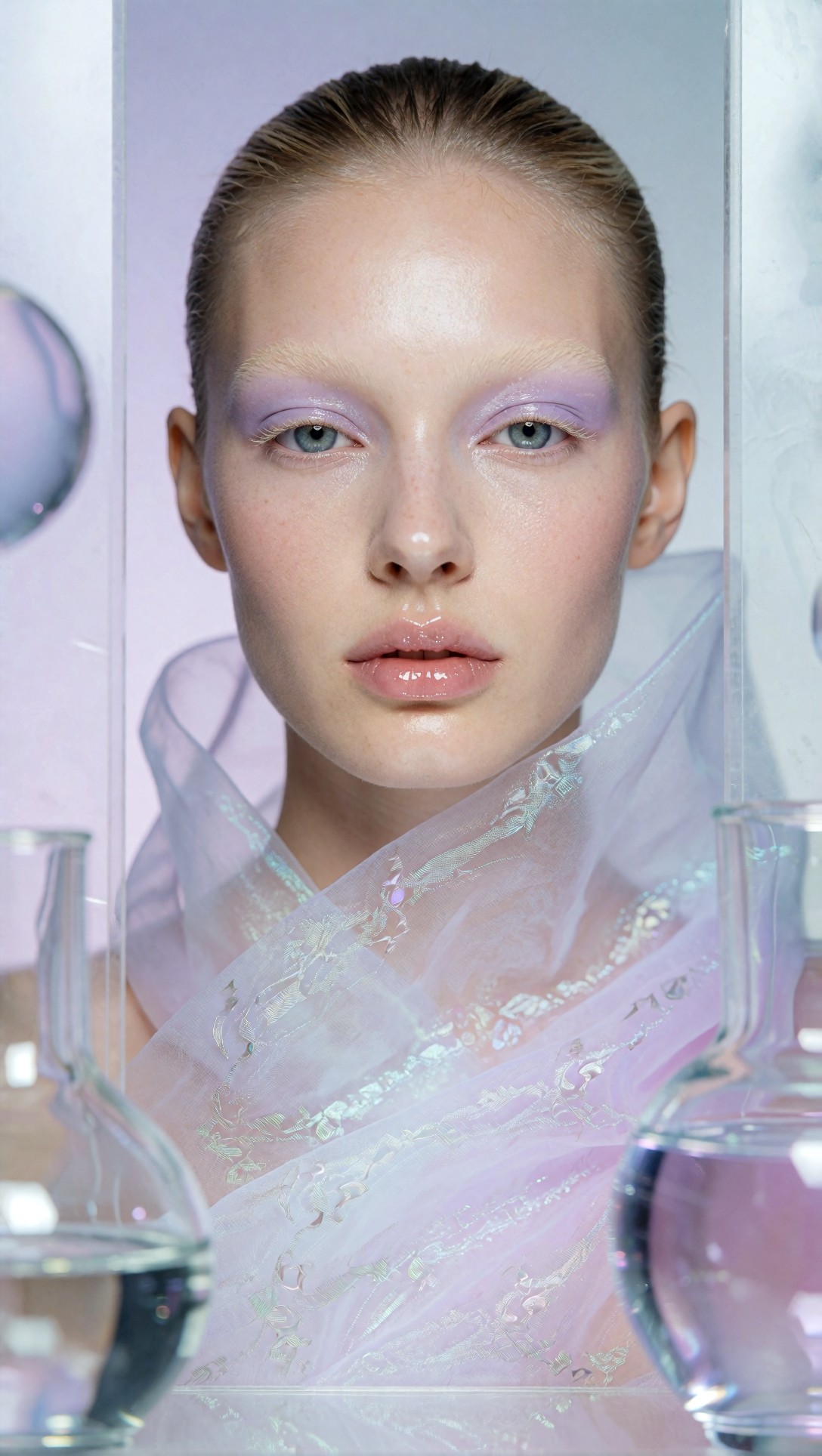
Inspect the skin carefully. The good version should retain pores and believable highlight placement, while the bad version will look airbrushed in a plastic way or introduce asymmetry around the eyes.
This next test checks whether the model can create a product-adjacent image with material storytelling rather than forcing fake label text.
Topic: Biotech Skincare Still Life Mood Board Tile
Genre: Product Editorial
Camera: Nikon Z8
Lens: 105mm macro f/2.8
Lighting: Softbox key light with cool edge reflection
Location: Frosted glass tabletop in a clean studio lab environment
Style: Elegant commercial editorial
Final Prompt: A product editorial still life for a beauty trend mood board, translucent skincare bottle and rounded serum jar without readable branding, arranged on frosted glass with scattered water droplets, chrome spatula, gel smear, and semi-transparent acrylic blocks, cool pastel palette of milky white, pale mint, lilac, and silver, directional softbox light revealing gloss and condensation, composition designed for editorial research rather than ecommerce, luxurious lab-inspired atmosphere, clean shadows, crisp macro detail, Nikon Z8 look, 105mm macro f/2.8 texture emphasis, premium magazine beauty still life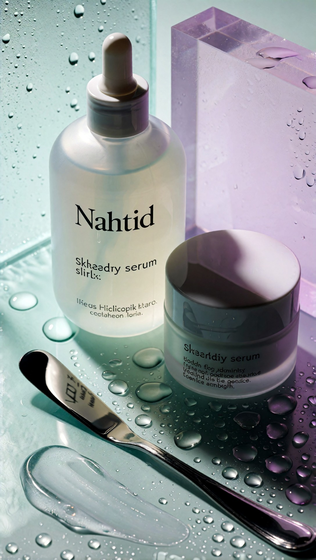
What to inspect here is material believability: glass thickness, gel texture, droplet behavior, and cap symmetry. If those are convincing, the image works well as a concept tile even if the label is intentionally abstract.
What I learned from the beauty tests
- AI is very good at mood-rich cosmetic storytelling.
- It is less reliable for specific product design claims, especially pumps, serif label copy, and exact branding structure.
- Beauty boards became more useful when I prompted for surface, finish, and light behavior instead of named products.
When this setup works, the board helps a creative team decide whether the trend is glossy, clinical, dewy, romantic, metallic, or soft-focus.
Packaging mood boards: the hardest category
Packaging was the most difficult area in this test. AI can suggest material and shelf mood very well, but it often struggles with exact dielines, clean typography, and repeated pack families.
So I would divide packaging board use into two buckets:
- Very useful for color/material/concept exploration
- Not reliable for print-ready pack systems or label approvals
The first packaging test checks whether AI can express a premium material direction for wellness packaging without getting trapped in broken text.
Topic: Mineral Wellness Packaging Concept Board Hero
Genre: Product Editorial
Camera: Fujifilm GFX100S
Lens: 80mm f/1.7
Lighting: Soft side light with subtle shadow falloff
Location: Stone plinth studio set with raw travertine and tinted glass
Style: Premium wellness branding
Final Prompt: A packaging concept mood board hero image for a mineral wellness brand, a family of cylindrical jars and tall bottles with minimal abstract labels and matte surfaces, arranged on layered travertine plinths beside smoky translucent glass panels, palette of clay beige, mineral grey, eucalyptus green, and off-white, tactile paper labels, brushed aluminum caps, calm premium composition with generous spacing, editorial perspective rather than straight packshot, subtle botanical shadow patterns, material-focused image for brand direction, Fujifilm GFX100S medium-format realism, 80mm f/1.7 shallow depth, sophisticated commercial styling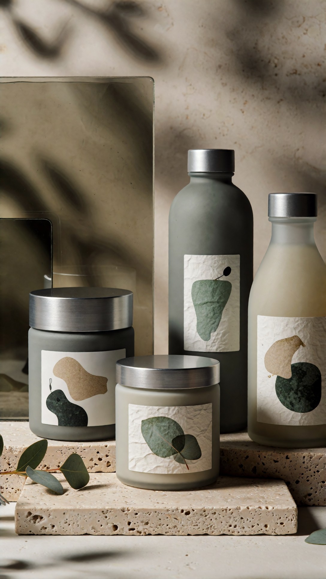
Inspect family consistency across the containers. In this test, the strongest result kept cap finish, label placement, and silhouette logic similar across products, even if the tiny text remained unusable.
This next prompt tests a more nostalgic food or pantry packaging direction where color and print feel matter more than exact copy.
Topic: Nostalgic Fruit Pantry Packaging Mood Tile
Genre: Commercial Still Life
Camera: Canon EOS R3
Lens: 35mm f/2
Lighting: Warm window light with soft reflector fill
Location: Sunlit kitchen shelf with painted wood backdrop
Style: Vintage-inspired clean commercial look
Final Prompt: A packaging mood board tile showing nostalgic pantry branding direction, assortment of jam jars, tea tins, and paper cartons with simplified illustrated fruit motifs, matte printed paper textures, imperfect hand-crafted edge details, arranged on a painted kitchen shelf with linen cloth and ceramic bowl of fresh apricots, palette of faded apricot, cream, leaf green, berry red, and butter yellow, warm morning light, cozy but art-directed composition, tactile print feel, commercial still life realism, Canon EOS R3 look, 35mm f/2 environmental perspective, editorial packaging research image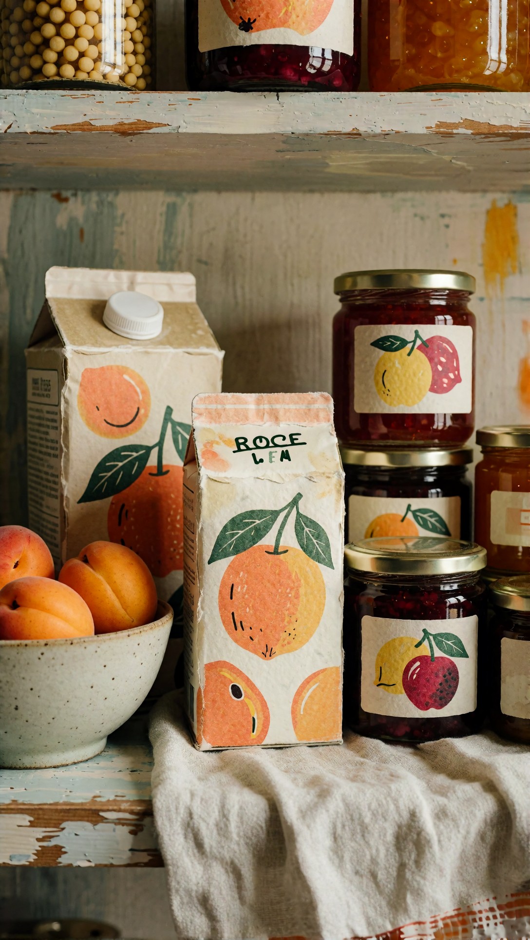
Check whether the packaging feels like a believable family instead of random props. I would also look for whether the fruit illustration style stays consistent across jars, tins, and cartons.
What I learned from the packaging tests
- Abstracted labels work much better than asking for exact text.
- Material cues like matte paper, foil, embossed caps, frosted glass, corrugate, or gloss varnish give the board practical value.
- Shelf-style scenes are often stronger than straight-on product lineups because they hide minor structural inconsistencies.
The weak point was always typography. If your project depends on legible packaging copy, use AI for concept atmosphere only.
Direct collage vs tile-by-tile generation
I tested both because many beginners want one prompt that outputs a complete trend board. It can work for rough inspiration, but the quality ceiling is lower.
Direct collage prompts
Best for: speed, internal ideation, loose Pinterest-style exploration
Observed issues:
- panel boundaries melt together
- text fragments appear where headlines should be
- duplicate faces or products sneak into adjacent sections
- different tiles ignore the same color palette
This prompt checks whether a one-image collage can hold a unified fashion-beauty board without becoming visually noisy.
Topic: Fashion and Beauty Trend Mood Board Collage Test
Genre: Editorial Collage
Camera: Mixed magazine tear-sheet aesthetic
Lens: Mixed focal lengths simulated in layout
Lighting: Soft daylight with studio beauty highlights
Location: Multi-panel editorial layout on an off-white board background
Style: Contemporary magazine mood board
Final Prompt: A curated editorial collage mood board for a fashion and beauty trend direction, featuring six balanced panels including a coastal neutral fashion portrait, a linen texture close-up, a dewy biotech beauty portrait, a frosted skincare still life, color swatches in shell, stone, lilac, and silver, and a cropped lifestyle scene, arranged with clean spacing on an off-white background, premium magazine tear-sheet feel without visible branding, cohesive palette, sophisticated contemporary layout, soft shadows, tactile paper-board presentation, visually organized rather than chaotic, suitable for creative direction review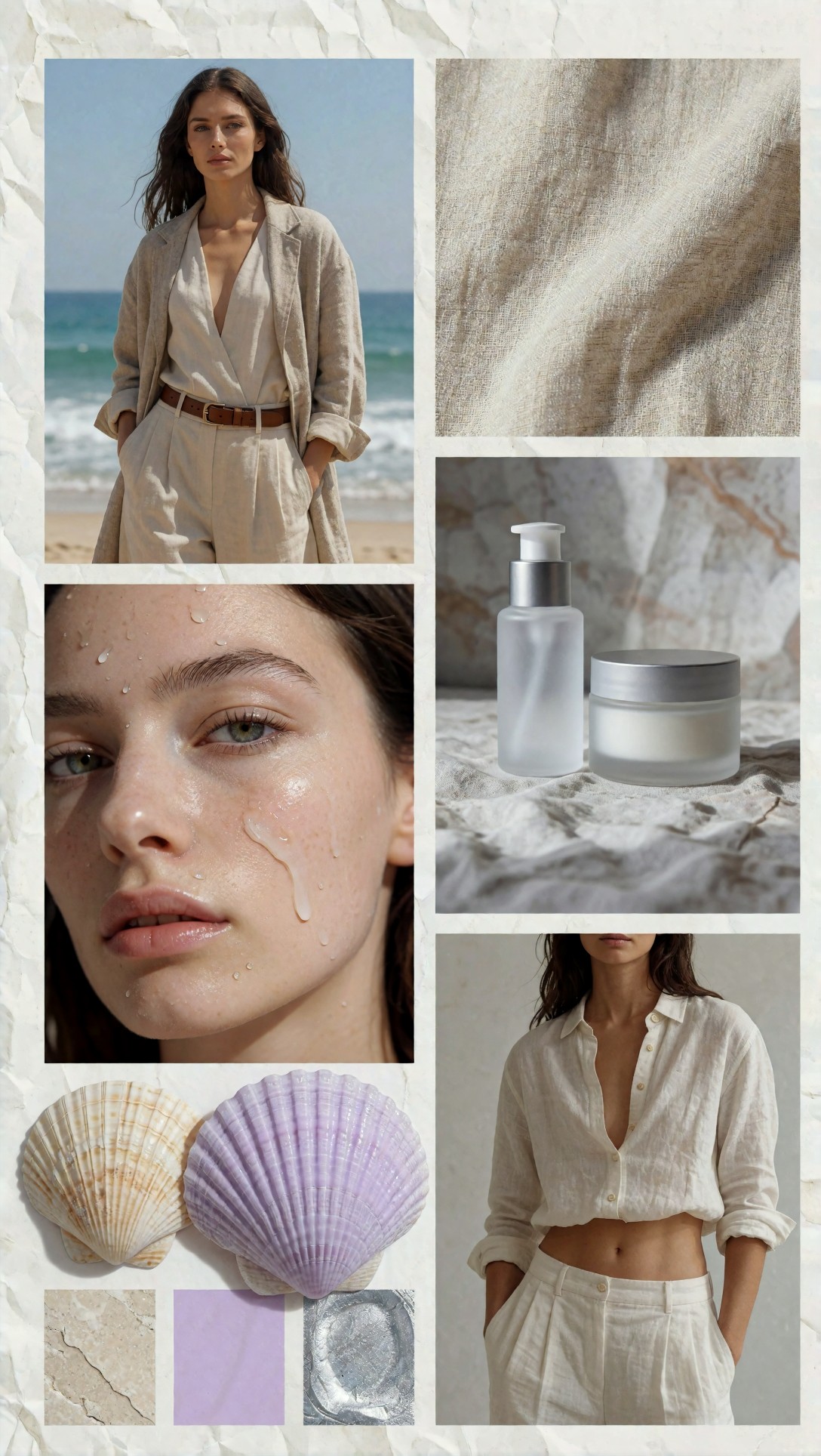
Inspect the layout discipline more than the individual image beauty. In this test, the collage only worked if each tile stayed distinct and the background did not fill with random decorative clutter.
Tile-by-tile generation
Best for: client-facing research boards, cleaner visual systems, category-specific concept work
Observed strengths:
- better control of style lock
- easier to reject weak images
- stronger consistency when arranging boards manually
- cleaner category mixing across fashion, beauty, and packaging
In practice, I would only use direct collage generation for the first five minutes of ideation. For anything I planned to show outside my own screen, tile-by-tile was the better workflow.
Prompt ingredients that mattered most
Across all categories, these ingredients had the biggest effect on board quality.
1. Palette words
Not just "pastel" or "neutral," but combinations like:
- shell white, dune beige, sea-glass blue
- pearl white, lilac mist, sterile silver
- clay beige, mineral grey, eucalyptus green
These gave the model tighter color logic.
2. Surface and texture words
Words like:
- matte paper
- frosted glass
- brushed aluminum
- hydrated skin
- creased linen
- acrylic reflection
This was one of the strongest control levers in the whole test.
3. Lighting family
If the board mixed hard flash, sunset glow, top-lit ecommerce, and neon all at once, coherence disappeared. Keeping lighting within one family made the images look intentionally related.
This prompt tests whether a texture-led board tile can strengthen consistency across categories by focusing on materials rather than people or products.
Topic: Cross-Category Material and Color Trend Tile
Genre: Product Editorial
Camera: Hasselblad X2D 100C
Lens: 90mm f/2.5
Lighting: Diffused skylight with soft shadow edges
Location: Minimal studio tabletop with layered paper and stone samples
Style: Refined visual research still life
Final Prompt: A trend mood board tile focused on cross-category material research for fashion, beauty, and packaging, featuring draped ivory linen, frosted glass fragments, matte paper cartons, brushed metal cap detail, translucent gel smear, and sea-worn stone samples arranged in a refined flat-lay still life, palette of shell white, dune beige, pale eucalyptus, and misty lilac, soft diffused skylight, quiet luxury composition, emphasis on tactile surfaces and color harmony, visual research image for concept board building, Hasselblad X2D 100C realism, 90mm f/2.5 crisp detail, elegant editorial styling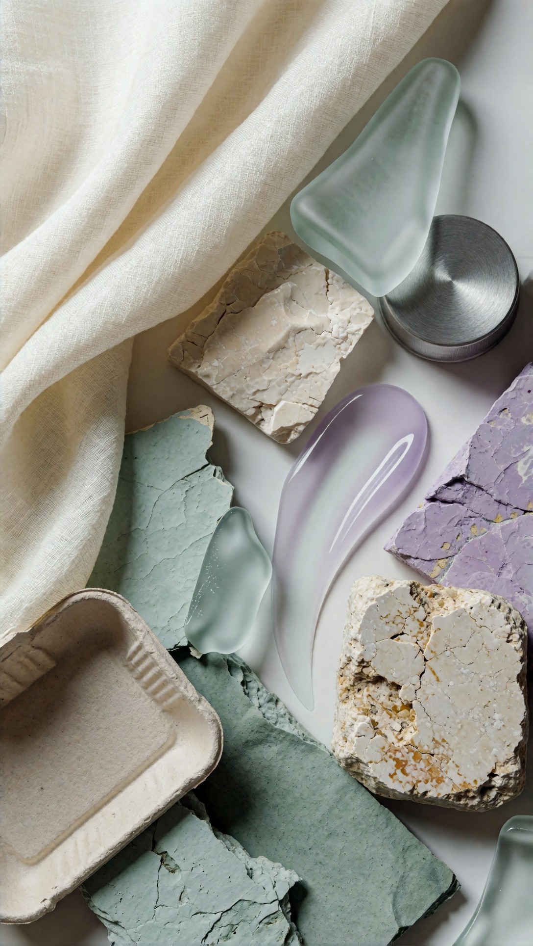
Inspect whether the materials feel connected enough to bridge categories. In this test, these material tiles were often the glue that made a mixed fashion-beauty-packaging board feel deliberate.
Failure risks and limitations
This workflow is useful, but there are clear failure patterns.
Brand confusion
If you ask for specific branded packaging, exact celebrity-inspired beauty, or recognizable campaign language, outputs can become derivative or visually muddy. For concept work, I would keep prompts brand-adjacent rather than brand-dependent.
Overly broad trend language
The weak point in most failed boards was prompt sprawl. Too many trend labels created mixed decades, mixed markets, and mixed lighting.
Fake precision
AI can look convincing at thumbnail size while failing at close inspection. This is especially true for:
- hands in fashion detail shots
- mascara wands and droppers in beauty
- cap threading, seals, and label edges in packaging
- typography everywhere
This prompt deliberately tests a risk area: multi-product beauty and packaging crossover with small detail complexity.
Topic: Beauty and Packaging Crossover Shelf Test
Genre: Commercial Editorial
Camera: Sony A1
Lens: 70mm f/2.8
Lighting: Controlled studio side light with reflector fill
Location: Minimal retail-inspired shelf display in a soft grey studio
Style: Modern premium retail campaign
Final Prompt: A commercial editorial image for a trend mood board showing a beauty and packaging crossover display, featuring coordinated serum bottles, cream jars, folding cartons, and a single makeup compact arranged on a clean retail shelf, palette of soft grey, dusty rose, translucent white, and brushed silver, modern premium branding feel without readable text, careful spacing, reflective acrylic risers, soft controlled side light, realistic material variation between glass, paperboard, and metal, polished but believable store-display composition, Sony A1 clarity, 70mm f/2.8 commercial depth, contemporary campaign styling
Inspect the small construction details here: compact hinges, jar lids, carton folds, and shelf alignment. If those break down, the image may still work as a board tile, but not as evidence of packaging readiness.
Practical recommendations from the test
If you are new to AI mood board generation, this is the setup I would recommend.
Use AI for these tasks
- early trend exploration
- visual alignment before a shoot
- concept board drafts for internal review
- cross-category palette and material research
- creating missing reference types when stock searches are too narrow
Avoid using AI alone for these tasks
- final packaging sign-off
- exact product shape approvals
- boards that depend on legible copy
- technical manufacturing decisions
- any project where image authenticity must be documented
Best workflow by situation
For fashion teams: use AI to test silhouette, styling mood, and location fit before sourcing references manually.
For beauty teams: use AI to explore finish, skin mood, and campaign atmosphere, then replace product visuals with real pack renders later.
For packaging teams: use AI for material storytelling and shelf-world concepts, not final label systems.
A beginner checklist based on output quality
Before adding any image to your trend board, check:
- Does it match the trend sentence in under three seconds?
- Does the palette repeat your chosen 3 to 5 core tones?
- Is the lighting consistent with the rest of the board?
- Are textures believable at full size, not just thumbnail size?
- Do faces, hands, containers, and edges hold up on inspection?
- Does the image play a clear role: hero, texture, product, or context?
- Is there any fake text or distorted object that would distract a client?
- Would this image still make sense if shown beside the other categories?
If an image fails two or more of these checks, I would regenerate rather than try to justify it.
A simple AI concept board workflow you can repeat
1. Write one trend sentence. 2. Choose one category first: fashion, beauty, or packaging. 3. Generate 4 to 6 single-purpose tiles. 4. Keep palette, lighting, and texture words consistent. 5. Add one material tile to bridge categories. 6. Arrange manually in Canva, Figma, Keynote, or Photoshop. 7. Replace weak AI product shots with real references if needed.
This final prompt tests a full board anchor image for packaging-led trend work with enough environment to feel editorial, while staying broad enough for concepting.
Topic: Sustainable Tea Packaging Trend Board Hero
Genre: Lifestyle Product Editorial
Camera: Leica SL2-S
Lens: 50mm f/1.4
Lighting: Morning window light with soft atmospheric haze
Location: Calm apothecary-style tea shop with oak shelving and handmade ceramics
Style: Art-directed natural premium branding
Final Prompt: A lifestyle product editorial hero image for a sustainable tea packaging trend mood board, featuring kraft paper tea boxes, foil-lined sachets, matte illustrated tins, and loose-leaf glass jars arranged on an oak counter beside handmade ceramic cups and dried botanicals, palette of oat, moss green, black tea brown, parchment cream, and muted terracotta, peaceful handcrafted atmosphere, packaging feels premium but natural, subtle steam in the background, layered composition with foreground detail and soft shelf depth, tactile paper fibers and printed textures visible, Leica SL2-S realism, 50mm f/1.4 intimate perspective, refined lifestyle branding aesthetic
What to inspect is whether the packaging, props, and environment all support the same retail story. In this test, lifestyle packaging scenes like this were often more persuasive than isolated object shots.
Final verdict
AI image generation trend mood boards are most useful for early visual direction, especially when you need to connect fashion, beauty, and packaging under one trend story. In this test, the strongest result came from generating individual tiles with a shared palette, material language, and lighting approach, then arranging the board manually.
Who should use this workflow: creative strategists, brand designers, art directors, founders, and junior teams building fast concept boards for discussion.
Who should avoid relying on it alone: teams that need exact packaging execution, legal-safe brand mimicry, or technically accurate product visuals.
The prompt detail that mattered most was not a fancy style phrase. It was clear control over color palette, texture vocabulary, and lighting family. If those three stay stable, the board usually reads like a trend. If they drift, it reads like random AI images pretending to be research.