AI Image Generator Prompt Mistakes: 15 Reasons Your Results Still Look Generic 한국어 요약
이 페이지는 ZView Space의 영어 원문을 한국어 검색 사용자도 이해할 수 있도록 정리한 SEO 요약입니다. 핵심은 단순한 얼굴 중심 이미지가 아니라 패션 에디토리얼, 룩북, 아웃핏, 프롬프트 테스트, 이미지 생성 워크플로우를 실제로 어떻게 구성할지입니다.
핵심 요약
- 원문 주제: AI Image Generator Prompt Mistakes: 15 Reasons Your Results Still Look Generic
- 목적: AI 이미지 생성에서 outfit, silhouette, fabric, pose, location, camera framing을 더 명확하게 설계합니다.
- 활용 범위: Z-Image Turbo, Krea2 Turbo, Qwen Image, Anima, SeedVR2 같은 이미지 생성 및 업스케일 워크플로우에 적용할 수 있습니다.
- SEO 관점: 제목, 설명, 이미지 alt, 프롬프트 예시가 실제 검색 의도와 맞아야 색인 가능성이 높아집니다.
한국어 사용자를 위한 체크포인트
1. 프롬프트가 얼굴 묘사에만 머물지 않고 전체 스타일과 의상 구성을 설명하는지 확인합니다. 2. 패션 이미지라면 상의, 하의, 아우터, 신발, 액세서리, 소재감, 촬영 장소를 분리해서 씁니다. 3. 생성 결과는 바로 게시하지 말고 디테일, 손, 의상 형태, 배경 일관성, 이미지 품질을 비교합니다. 4. 글 본문에는 실제 테스트 기준과 실패를 줄이는 방법이 들어가야 검색엔진에서 얇은 콘텐츠로 보일 가능성이 줄어듭니다.
원문 미리보기
I ran this test the way most users actually work: one idea, several text to image models, then repeated prompt edits until the images stopped looking like stock filler. The first pass looked polished at thumbnail size, but once I inspected faces, material deta
---
I ran this test the way most users actually work: one idea, several text-to-image models, then repeated prompt edits until the images stopped looking like stock filler. The first pass looked polished at thumbnail size, but once I inspected faces, material detail, backgrounds, and pose logic, the generic patterns were easy to spot.
This report focuses on AI image generator prompts that technically work but still produce bland, repetitive, or low-believability results. The useful lesson was not that prompts need to be longer. It was that the right details need to do specific jobs.
Test setup
In this test, I compared prompt behavior across general-purpose image models that are strong at photographic realism, stylized editorial scenes, and product-style compositions. I used the same core subject ideas and changed only prompt structure, specificity, and a few common generation settings.
What I checked on each run:
- subject clarity at first glance
- face and hand stability
- background consistency
- clothing and texture detail
- lighting logic
- whether the image looked like a distinct shot or a recycled model default
- whether the prompt could be reused reliably with small edits
The strongest result usually came from prompts that specified visual hierarchy: subject first, then camera, then lighting, then material or environment cues. The weak point in generic outputs was almost always the same: too many aesthetic labels, not enough scene logic.
What looked good right away
A few things improved image quality immediately, even before fine-tuning.
1. Clear subject framing
When the prompt made the subject type unambiguous, models committed faster. “A woman in a city” stayed generic. “A tired bakery owner closing up after rain, flour on apron, warm interior spill light” gave the model something to stage.
2. Lighting with purpose
Specific lighting setups produced more believable depth than general mood words. “Moody” varied wildly. “Single softbox key light with weak ambient fill” gave more repeatable structure.
3. Material language
Texture words such as brushed aluminum, wet asphalt, raw linen, oxidized steel, condensation on glass, and cracked leather improved realism more than adding another style keyword.
4. Composition cues
Prompting for medium shot, low-angle three-quarter view, centered product framing, or wide environmental portrait reduced the floating-subject problem.
Where the images still broke
The first batch also showed the usual reasons AI images look bad even when the prompt seems detailed.
1. The prompt described a vibe, not an image
This is the most common failure. Users write “cinematic, dramatic, ultra detailed, beautiful” and assume the model will infer a scene. It usually fills the gaps with generic defaults.
2. Too many style labels competed with each other
When I stacked “editorial, cinematic, luxury, analog, futuristic, hyperreal” into one line, models often averaged them into a safe middle. The output looked competent but anonymous.
3. No subject priority was established
If the prompt mentions wardrobe, lighting, weather, architecture, expression, props, and camera without telling the model what matters most, attention gets spread thin. The result becomes busy but not specific.
4. Backgrounds had no job
A weak location prompt creates wallpaper backgrounds. Once location affected the story or color contrast, images gained intent.
5. The prompt ignored physical plausibility
Hands on transparent objects, extreme jewelry overlap, mirror reflections, crowded props, and layered fabrics all raised failure risk. Generic images often hide these weaknesses with blur or shallow depth of field.
The 15 prompt mistakes behind generic results
1. Using adjectives instead of visual facts
“Beautiful” and “epic” are weak instructions. A model can only render what it can stage.
2. Leaving the subject archetype too broad
“Man standing in a studio” will often produce a default fashion-commercial pose, not a memorable image.
3. Forgetting time of day
Light direction is one of the biggest separators between generic and intentional outputs.
4. Not specifying camera distance
Without framing guidance, models drift between portrait, medium shot, and environmental composition.
5. Treating style as a substitute for composition
“Magazine style” does not tell the model where to place the body, horizon, props, or negative space.
6. Overloading the prompt with references
Five influences can cancel each other out. In this test, one strong direction plus one supporting texture or mood reference worked better.
7. Ignoring what the background should contribute
Background is not filler. It should support color contrast, story, scale, or product context.
8. Asking for too many micro-details at once
If every object has equal importance, the model often simplifies all of them.
9. Using the same prompt skeleton for every subject
Some models handle portraiture, products, interiors, and action scenes differently. Better prompts for text to image AI change based on the scene type.
10. Not describing materials
If texture is absent, surfaces become smooth and artificial.
11. Omitting pose logic
A body doing “something” is usually better than a body merely “standing.”
12. Forgetting expression and gaze
Neutral default faces are one of the fastest routes to generic output.
13. Asking one model to do a job it is weak at
Some models handle typography-like product layouts poorly, while others flatten skin texture in portraits.
14. Keeping settings fixed when the image problem is structural
If compositions keep collapsing, changing CFG, stylization, or aspect ratio can matter more than adding another sentence.
15. Not inspecting at full size
At thumbnail scale, many images look fine. Full-size inspection reveals malformed hands, merged accessories, muddy textiles, and incoherent reflections.
Prompt ingredients that actually changed the result
In this test, four ingredients consistently improved quality.
Subject role
Not just who is in the image, but what they are doing. Occupation, task, and emotional state reduced generic character design.
Light source plus direction
This was more useful than abstract mood tags. Side window light, sodium vapor street light, overcast diffusion, and backlit sunset all led to distinct image structures.
Surface and material cues
This helps the model choose texture behavior. Leather, fogged glass, peeling paint, wool, chrome, and damp concrete gave the frame tactile separation.
One dominant style decision
Instead of stacking aesthetic labels, I got better results by choosing one controlling style and one supporting qualifier. For example: clean commercial look + muted winter palette.
Session notes: examples that fixed generic outputs
Test 1: Replace vague portrait language with role, setting, and light
This prompt checks whether a broad character concept becomes more distinct when the person has a job, a task, and a believable location. It is useful for testing face stability and whether wardrobe details support the story.
Topic: Night-shift bakery owner closing the shop after rain
Genre: Lifestyle Portrait
Camera: Canon EOS R5
Lens: 50mm f/1.8
Lighting: Warm interior practicals with cool rainy street reflections
Location: Small neighborhood bakery storefront at night
Style: Cinematic Realism
Final Prompt: A tired bakery owner locking the front door of a small neighborhood bakery after a rainy night shift, flour dust on a dark apron, rolled sleeves, slightly slouched posture, keys in hand, warm tungsten light spilling from the shop interior onto wet pavement, cool blue reflections from the street outside, trays and paper bags visible through the glass, honest expression, subtle eye bags, natural skin texture, medium shot, realistic condensation on windows, cinematic realism, Canon EOS R5 look, 50mm f/1.8 depth, grounded urban color palette, high detail in fabric and wet surfaces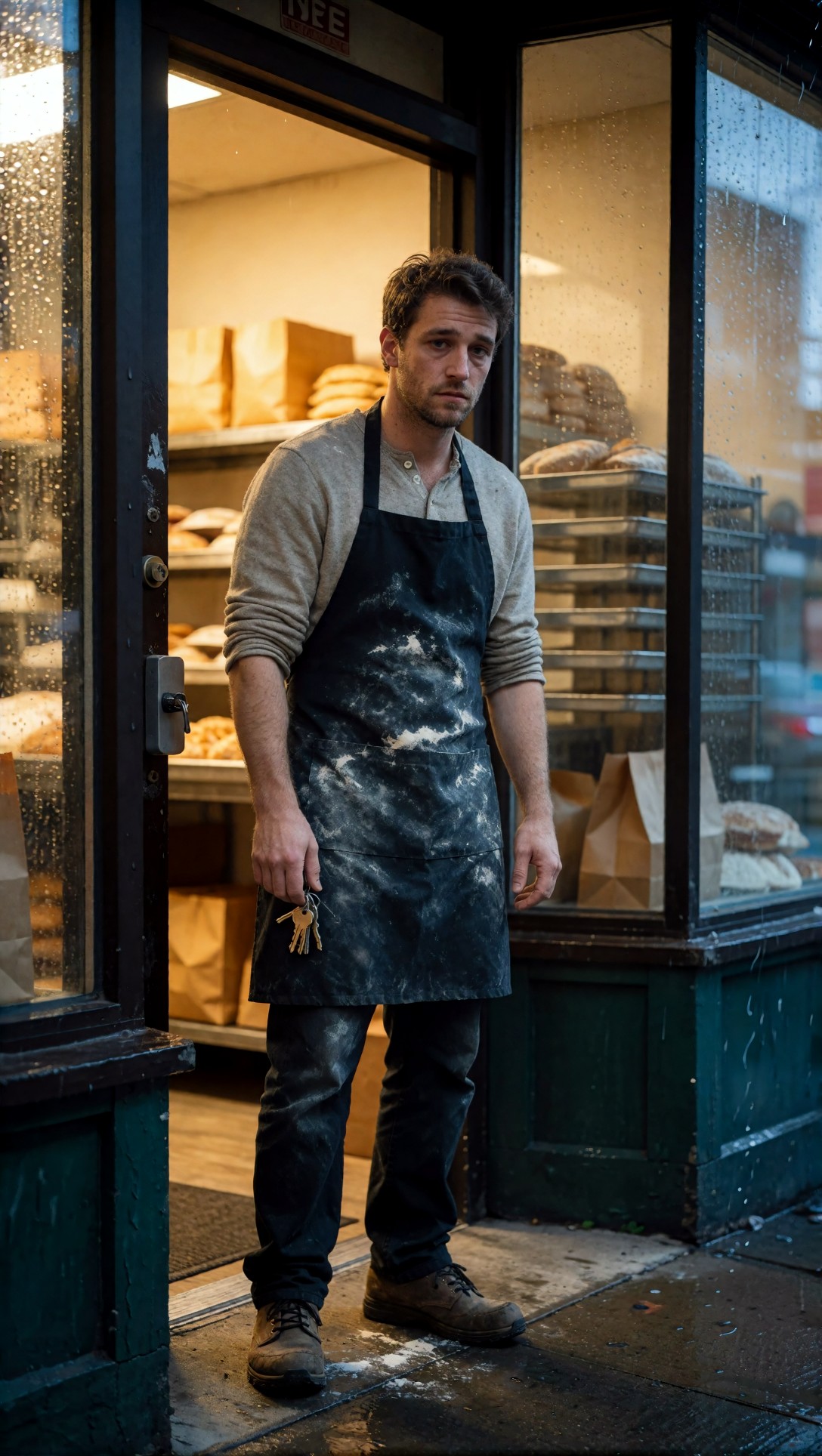
Inspect whether the image gives the subject a believable role instead of a generic portrait pose. The strongest result should show contrast between warm interior light, cool rain reflections, and the tactile details of apron, glass, and pavement.
Test 2: Add composition control to avoid default center-frame portraits
This test checks whether camera angle and shot type reduce “AI stock photo” symmetry. I used it when models kept placing the subject in the same polished pose.
Topic: Architect reviewing a rooftop model at dawn
Genre: Editorial Portrait
Camera: Nikon Z8
Lens: 35mm f/2
Lighting: Dawn ambient light with soft skylight and city haze
Location: Rooftop terrace overlooking a dense city skyline
Style: Clean Commercial Look
Final Prompt: An architect reviewing a foam-and-acrylic building model on a rooftop terrace at dawn, three-quarter body composition from a slightly low angle, charcoal coat over a pale knit top, wind lifting loose papers, one hand steadying the model, thoughtful expression looking toward the skyline instead of the camera, soft blue-gray dawn light, distant towers fading into haze, clean commercial editorial styling, realistic urban textures, negative space on one side of the frame, Nikon Z8 look, 35mm f/2 environmental depth, restrained color palette, sharp structural detail without over-stylization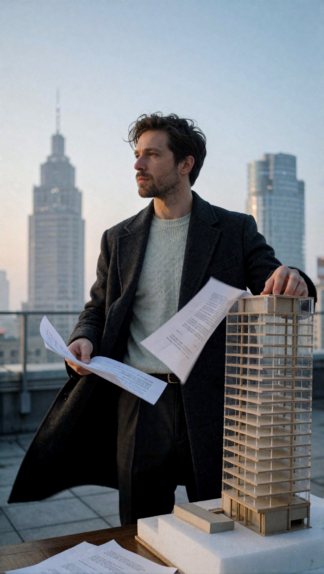
Check if the subject interacts with the environment instead of floating in front of it. Look at paper edges, hand placement on the model, and whether the skyline feels like part of the composition rather than a pasted background.
Test 3: Use materials to fix flat product imagery
This prompt checks product clarity and surface realism. Generic product prompts often produce smooth, plastic-looking materials with weak separation from the background.
Topic: Luxury mechanical watch with weathered travel context
Genre: Product Editorial
Camera: Sony A7R V
Lens: 90mm macro f/2.8
Lighting: Single softbox key light with weak warm bounce fill
Location: Worn leather map case on a dark walnut desk
Style: High-End Product Advertising
Final Prompt: A luxury mechanical wristwatch resting half-open on a weathered brown leather map case on a dark walnut desk, brushed steel bezel, sapphire crystal with subtle reflections, textured dial, stitched leather strap, faint travel notes and a brass compass in the background, controlled macro composition, single softbox key light shaping the metal edges with a soft warm bounce fill, premium advertising look, Sony A7R V macro detail, 90mm f/2.8 precision, rich but realistic contrast, visible grain in the leather, restrained reflections, ultra-clean product separation without looking sterile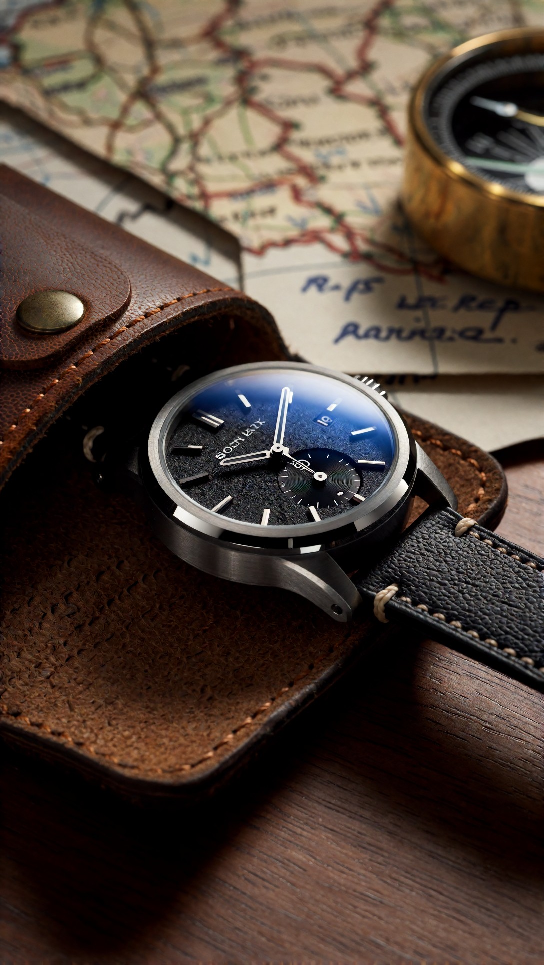
Inspect the edges of the watch hands, crystal reflections, and leather grain. If the image still feels generic, the weak point is usually uncontrolled reflections or a background that competes with the product.
Test 4: Give the environment a storytelling job
This test is for prompts that technically render well but feel empty. The goal is to make the location reinforce the image instead of acting like generic scenery.
Topic: Solo traveler waiting at a rural train stop in winter
Genre: Cinematic Travel
Camera: Fujifilm GFX100S
Lens: 63mm f/2.8
Lighting: Overcast diffusion with cold ambient bounce
Location: Snow-dusted rural train platform with faded signage
Style: Quiet European Cinema
Final Prompt: A solo traveler waiting at a nearly empty rural train stop in winter, long wool coat, knit scarf, worn leather weekender bag at their feet, visible breath in the cold air, faded station signage, snow dusting the platform edges, muted green bench, distant tracks disappearing into fog, calm introspective expression, medium-wide composition, overcast diffused light with soft low-contrast shadows, quiet European cinema tone, Fujifilm GFX100S realism, 63mm f/2.8 natural perspective, subdued blue-gray and moss color palette, crisp textile detail and atmospheric depth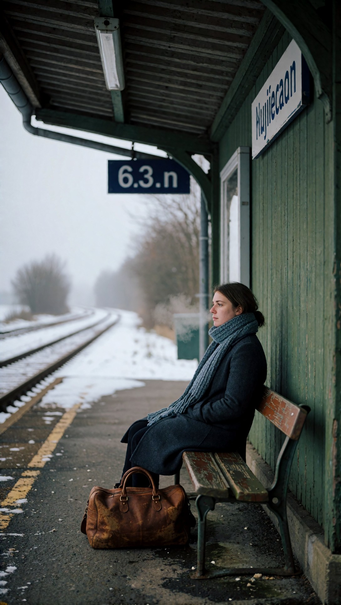
Check whether the station details support the traveler story. Good output should make the bench, fog, and signage feel intentional rather than randomly generated filler.
What needed correction after the first strong outputs
Even improved prompts still ran into recurring issues.
Faces became polished but emotionally empty
A better face is not automatically a better image. In this test, adding expression, gaze direction, and context mattered more than adding “highly detailed face.”
Hands failed when props became complex
Cups, umbrellas, jewelry, transparent objects, and layered fingers still broke in otherwise good compositions. If hands are central, simplify the action.
Clothing drifted toward model defaults
Even with detailed wardrobe prompts, some models replaced practical clothing with glossy fashion styling. This happened most often when the prompt mixed documentary context with luxury editorial terms.
Background coherence dropped in wide shots
The larger the scene, the more likely signs, architecture, and distant figures became incoherent. Generic wide images often look fine until you inspect the edges.
More prompt tests and inspection notes
Test 5: Fix expressionless beauty prompts with action and imperfect realism
This test checks whether a portrait gains character when skin, posture, and expression are allowed to look human instead of cosmetically uniform.
Topic: Ceramic artist pausing mid-process in a daylight studio
Genre: Artist Portrait
Camera: Leica SL2
Lens: 75mm f/2
Lighting: North window daylight with soft interior shadow falloff
Location: Clay workshop with shelves of unfinished ceramics
Style: Natural Editorial Realism
Final Prompt: A ceramic artist pausing mid-process in a daylight studio, traces of clay on hands and forearms, off-white work shirt with rolled cuffs, hair loosely tied back, focused slightly distant expression, seated beside a pottery wheel with unfinished bowls on open shelves behind, north window daylight shaping the face from one side, soft shadow falloff across the room, natural editorial realism, Leica SL2 rendering, 75mm f/2 intimate portrait compression, earthy neutral palette, visible skin texture, matte clay surfaces, honest craftsmanship atmosphere without glamour retouching
Inspect whether the face still looks human once texture and work context are added. Hands and clay residue are the main risk area; if they collapse, simplify the hand position in the next run.
Test 6: Improve busy street scenes by controlling visual hierarchy
This prompt checks whether a dynamic setting can stay readable when the subject is clearly prioritized. It is useful when urban prompts become cluttered and lose the main story.
Topic: Street food vendor serving late-night customers
Genre: Street Documentary
Camera: Panasonic Lumix S5II
Lens: 28mm f/1.7
Lighting: Mixed neon signage and warm stall practicals
Location: Narrow night market alley after light rain
Style: Gritty Contemporary Photojournalism
Final Prompt: A street food vendor serving skewers to late-night customers in a narrow night market alley after light rain, vendor in sharp focus at the center-left of the frame, hand reaching over a smoking grill, warm stall bulbs illuminating steam and food texture, neon signs reflecting in wet pavement behind, blurred queue of customers creating depth, candid expression, documentary energy, Panasonic Lumix S5II look, 28mm f/1.7 wide environmental perspective, gritty contemporary photojournalism style, red-amber and teal palette, realistic smoke behavior, readable stall details without turning the frame into visual noise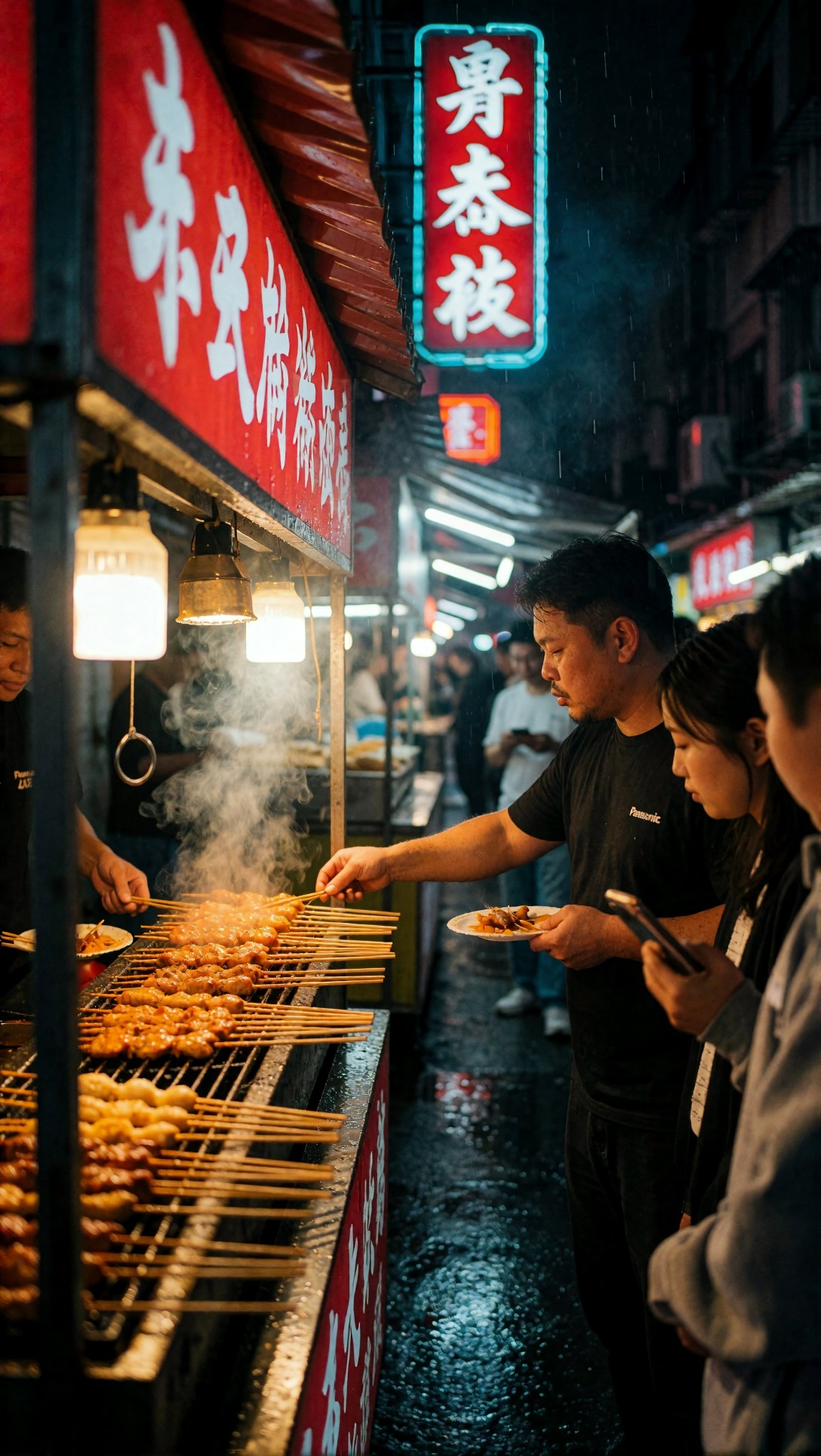
Check whether the vendor remains the main subject even with signage, smoke, and customers in frame. The weak point is often text-like neon details or confused hands near the grill.
Test 7: Avoid generic fantasy by grounding the world physically
This test shows how fantasy prompts improve when costume materials, weather, and terrain are specified. Otherwise, many models default to glossy concept-art clichés.
Topic: Ranger crossing a wind-beaten cliff path before a storm
Genre: Fantasy Key Visual
Camera: ARRI Alexa 35 cinematic capture
Lens: 40mm anamorphic at T2.8
Lighting: Storm pre-light with low sun breaking through clouds
Location: Coastal cliff trail with wet stone and rough grass
Style: Dark Adventure Cinema
Final Prompt: A lone ranger crossing a wind-beaten coastal cliff path before a storm, heavy weatherproof cloak over layered leather and wool garments, damp boots on slick stone, one hand gripping a lantern shielded from the wind, distant sea spray rising below the cliffs, low sun breaking through dark storm clouds from behind, determined expression, cinematic wide-medium framing, dark adventure cinema style, ARRI Alexa 35 look, 40mm anamorphic depth and subtle lens character, desaturated greens and slate blues, realistic wet fabric behavior, textured rock, grounded fantasy atmosphere without ornamental excess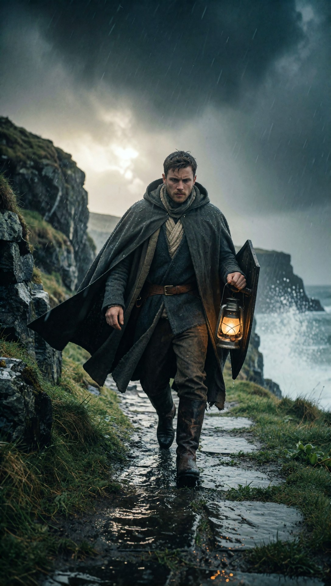
Inspect whether the costume reads as weathered and functional rather than decorative costume collage. Also look for believable light direction on the cloak folds and rock surfaces.
Test 8: Correct interior prompts that feel like catalog renders
This test focuses on space realism, especially when interiors come out too symmetrical or too perfect. The fix is usually lived-in detail plus light variation.
Topic: Small apartment kitchen during early morning coffee prep
Genre: Interior Lifestyle
Camera: Canon EOS R6 Mark II
Lens: 24mm f/2.8
Lighting: Early morning window light with soft practical lamp fill
Location: Compact city apartment kitchen with open shelving
Style: Warm Minimal Realism
Final Prompt: A compact city apartment kitchen during early morning coffee prep, half-open curtains letting in pale morning light, enamel kettle steaming on the stove, mug beside scattered notes, open shelving with mismatched ceramics, cutting board, folded dish towel, soft practical lamp glow balancing the cool window light, slightly imperfect lived-in arrangement, clean but not staged, wide interior composition, warm minimal realism, Canon EOS R6 Mark II look, 24mm f/2.8 spatial depth, gentle cream, oak, and muted gray palette, realistic reflections on tile and metal, believable domestic atmosphere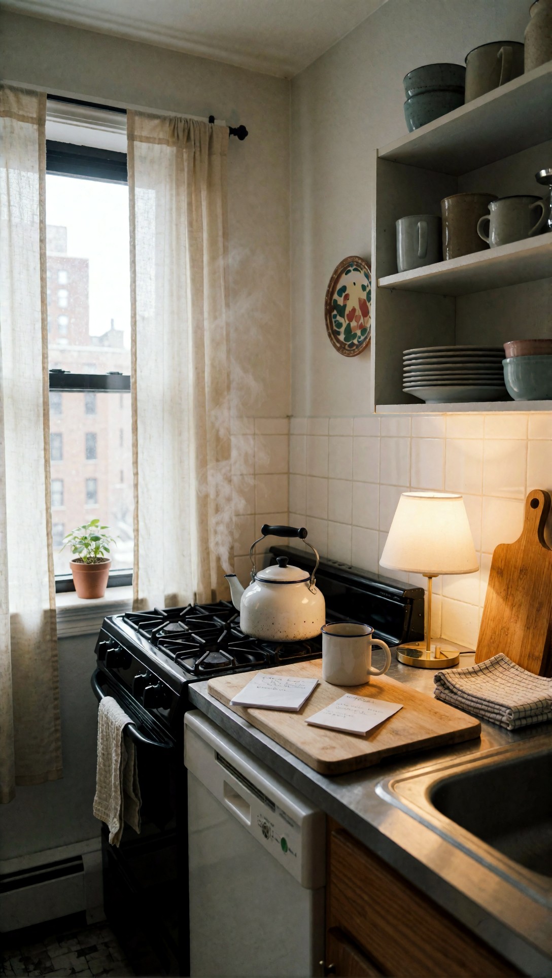
Inspect corners, shelves, and object spacing. If everything looks too showroom-clean, the prompt needs more asymmetry or signs of use, not more quality adjectives.
Why these prompt ingredients worked
Across all eight examples, the better outputs came from prompts that answered these five questions:
1. Who or what is the image really about? 2. What is happening in the moment? 3. Where is the light coming from? 4. Which surfaces should feel tactile? 5. What should the viewer notice first?
That is the practical core of improving AI image generator prompts. Not length for its own sake, but scene decisions that reduce model guesswork.
When to switch models or settings instead of rewriting the prompt
Prompt improvement has limits. In this test, some failures were not really prompt failures.
Switch models when:
- portraits keep getting waxy skin despite realistic texture cues
- product edges smear under reflective lighting
- wide architectural scenes lose geometric consistency
- stylized scenes flatten into generic illustration regardless of specificity
- hands remain unstable even after simplifying the action
Change settings when:
- the composition keeps crowding the frame: try a wider aspect ratio
- details become chaotic: reduce stylization or guidance intensity
- the image is too literal and stiff: allow more variation with lower guidance
- backgrounds overpower the subject: crop tighter or raise subject emphasis through framing terms
- textures look muddy: increase resolution or use a stronger upscale pass instead of stuffing in more adjectives
Best-fit workflow by scene type
- Photoreal portraits: use models that preserve skin texture and natural lighting transitions
- Product/editorial objects: use models with strong edge control and reflection handling
- Cinematic travel or documentary scenes: use models that maintain environmental depth without over-beautifying faces
- Fantasy or stylized scenes: choose models that understand costume layering and atmospheric effects without turning every frame into concept-art sludge
Quick checklist for better prompts based on output quality
Before generating, I would check:
- Is the subject role clear?
- Is there a visible action or just a vague pose?
- Does the lighting setup have a source and direction?
- Did I name at least two tactile materials?
- Does the background contribute to story or contrast?
- Did I choose one dominant style instead of five competing ones?
- Is the camera distance clear?
- Are hands, props, reflections, or layered accessories likely failure points?
- Would this prompt still make sense if I removed all generic adjectives?
If the answer to the last question is no, the prompt is probably under-specified where it matters.
Practical advice I would use on the next session
If your images still look generic, do not begin by making the prompt twice as long. In this test, the most reliable fix was to replace abstract quality words with operational details:
- swap “cinematic” for a real lighting condition
- swap “beautiful portrait” for a role, action, and expression
- swap “detailed background” for a place with functional objects
- swap “high quality textures” for named materials
- swap “editorial style” for composition and wardrobe logic
When this setup works, the image looks like a captured moment rather than a model default. When it fails, the failure is usually traceable: overloaded style cues, weak subject hierarchy, or asking the wrong model to solve the shot.
Conclusion
This workflow is best for users who want repeatable, evidence-based improvement in AI image generator prompts rather than lucky one-off results. It is especially useful for creators making portraits, product scenes, travel imagery, and editorial-style visuals where small prompt choices affect realism and identity.
I would avoid this approach only if the goal is pure exploratory chaos or abstract experimentation, where ambiguity is the point. For everyone else, the prompt detail that matters most is scene logic: who is there, what they are doing, where the light is coming from, and which materials should carry the realism. If those four parts are solid, the image has a much better chance of looking specific instead of generic.