Short answer: for most images, generate at a size your model handles cleanly, pick the frame with the right structure, and upscale only that one. Raising the native size does not repair what is wrong in a frame, and an upscaler does not either. I can only back part of this with files I opened, so this page separates what the images show from general guidance I have not verified here.
What the eight test files can and cannot tell you
An earlier version of this page claimed a three-way comparison of "generate bigger", "upscale later" and "both". That comparison cannot be supported. I opened the eight Krea2 Turbo images it was built on, and every one is 1088 x 1928 pixels, generated on 11 July 2026 within about seven minutes of each other. There is no larger native render and no upscaled version of any of them. So there is no evidence here about how a bigger canvas changes a result, and I will not describe one.
What the files do show is what a 1088 x 1928 render (about 2.1 megapixels) looks like for different subjects, and which problems are present at that size. Those problems are the ones to settle before you spend time on either larger generation or upscaling.
One more caveat about the source. Each generation record contains the subject prompt followed by the same appended fashion-styling text ("street-style full-body shot plan ... shoes and bag visible ... natural pose or walking action ..."). That suffix is visible in the results, as the sections below show. The prompts in the old article did not include it, so they were not the prompts that produced these images.
Wide scenes: what a 1088 x 1928 frame holds
The courtyard render is the best case for this size. The limestone block joints, the wrought-iron balcony rail, the hanging lantern and the stair treads are all clear, and the wet terracotta floor shows reflections that follow the tile lines.
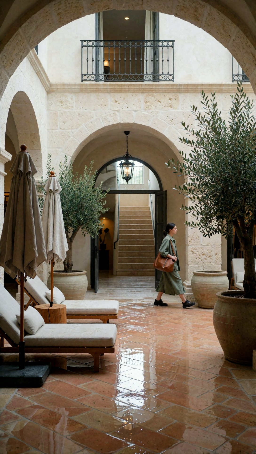
Two things to note. The woman walking through the middle of the scene was not in the subject prompt, which said no people in the foreground. The appended "walking action" text is the likely cause, but the record cannot prove it. And the scene's repeated elements (umbrellas, pots, chairs) did not clone into each other in this frame. Whether a larger native canvas would have added detail or started duplicating objects is exactly the question these files cannot answer.
Text is where pixels do not help
The two images below are the clearest case for not expecting resolution to fix a problem. The first prompt asked for a skincare bottle with "precise label placement":
premium skincare serum bottle on a travertine stone plinth, frosted glass packaging with metallic cap, soft beige matte background, precise label placement, elegant shadow falloff, controlled specular highlights, subtle condensation, no clutter, centered luxury product composition, Nikon Z7 II look, 105mm macro f/2.8 precision, commercial studio lighting, sharp glass edges, realistic reflections, refined neutral palette, beauty retail campaign quality, photoreal packaging detail, street-style full-body shot plan, three-quarter outfit editorial framing, shoes and bag visible, layered garments and silhouette clearly readable, trend led fashion mood, outfit-first fashion editorial, complete styling system, visible fabric texture, accessories, shoes, bag, scene context, natural pose or walking action, 35mm editorial photography, realistic street, runway, retail, or lookbook setting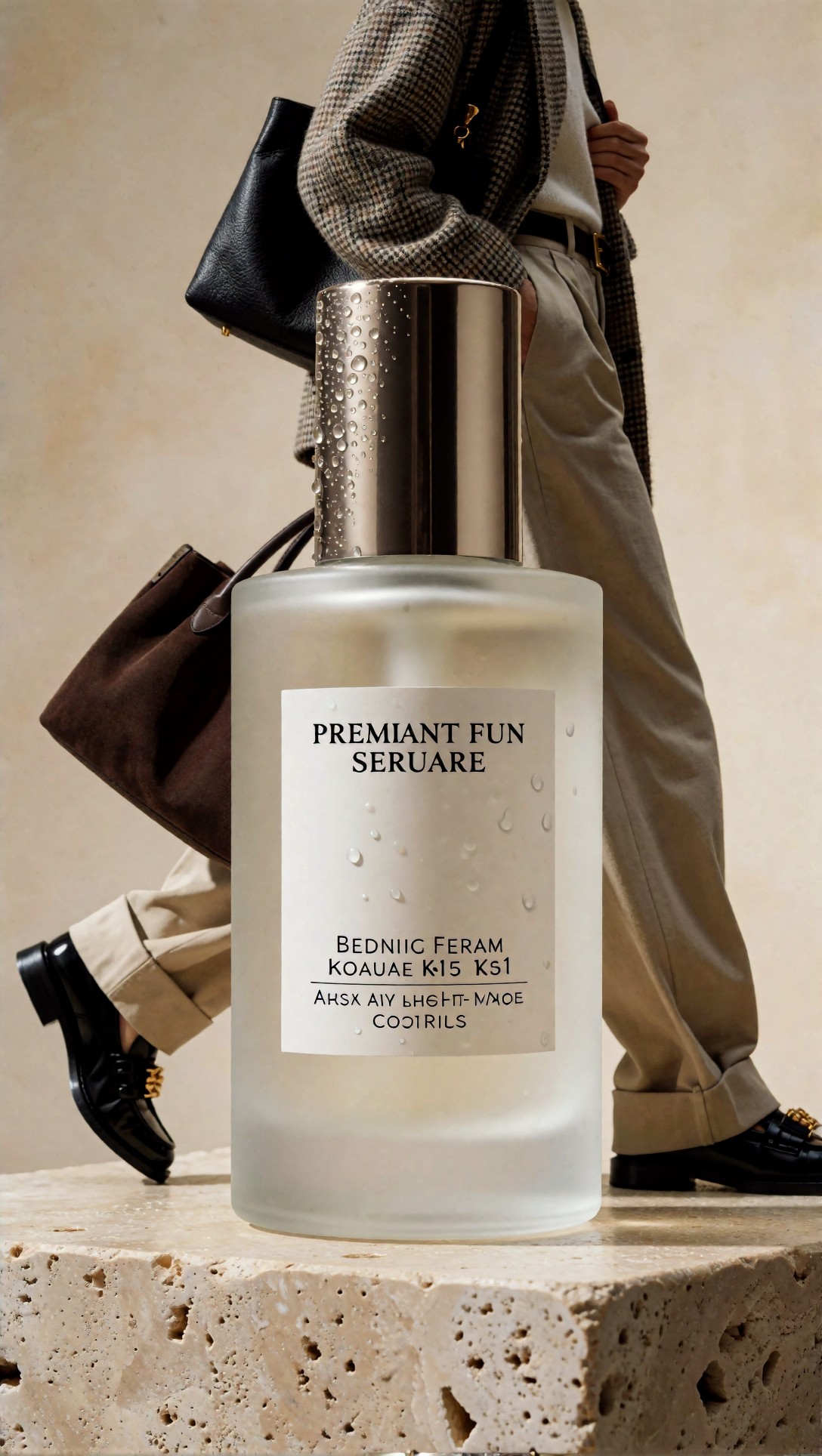
The bottle body, cap and condensation droplets are convincing. The label is not: the printed lines read "PREMIANT FUN SERUARE", "BEDNIIC FERAM KOAUAE K-15 KS1" and similar nonsense. The fashion suffix also put a walking person in a tweed jacket and two handbags behind a product shot, so the bottle is no longer the only subject.
The storefront prompt asked for "visible hanging sign and front window lettering" and "composition emphasizing signage clarity":
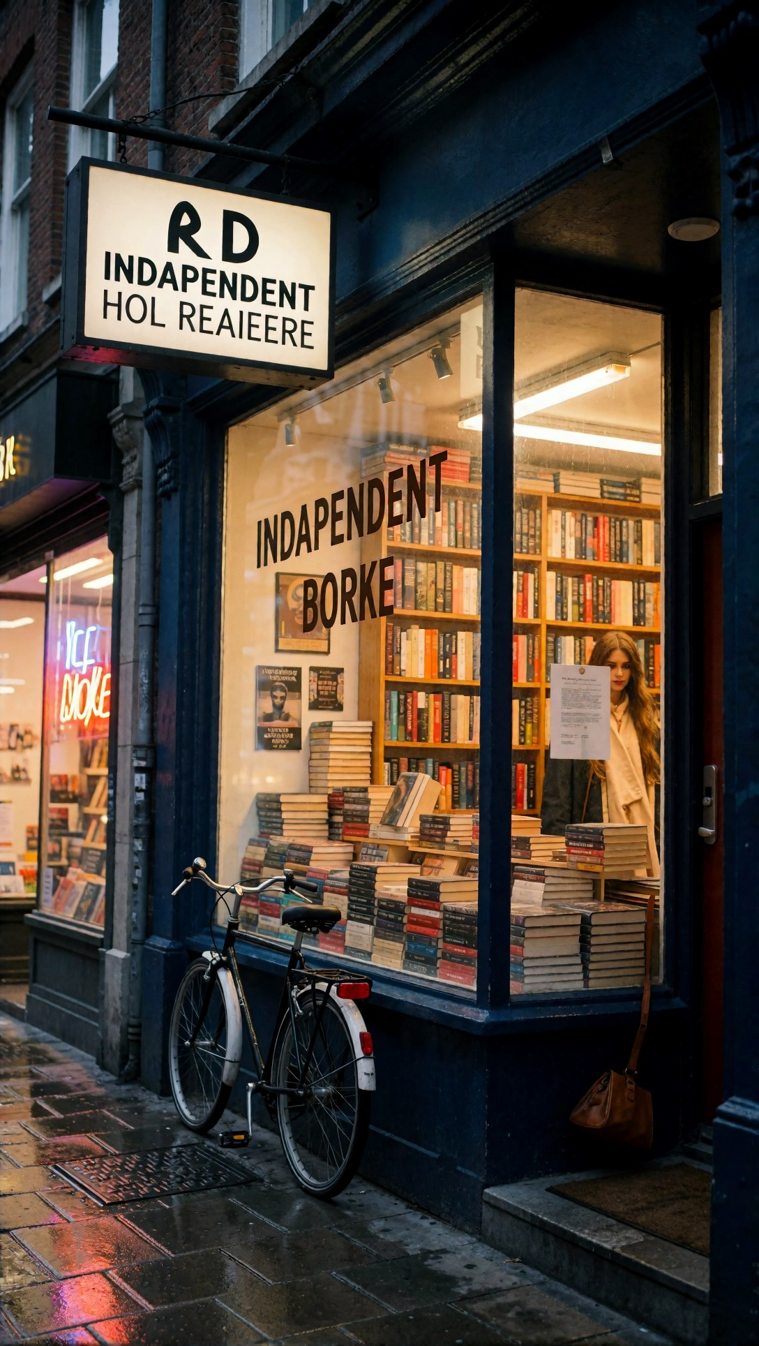
The storefront, bicycle, wet pavement and book stacks are coherent. Both the hanging sign and the window lettering are misspelled ("INDAPENDENT", "BORKE", "HOL REAIEERE"). Larger output would make these wrong letters bigger, not right. This matches the general guidance that text in generated images should be treated as a placeholder and replaced in a design tool (general guidance, not tested here).
Faces, hands and fabric at this size
Three of the files are useful as a checklist of what to zoom into before deciding a frame is worth upscaling.
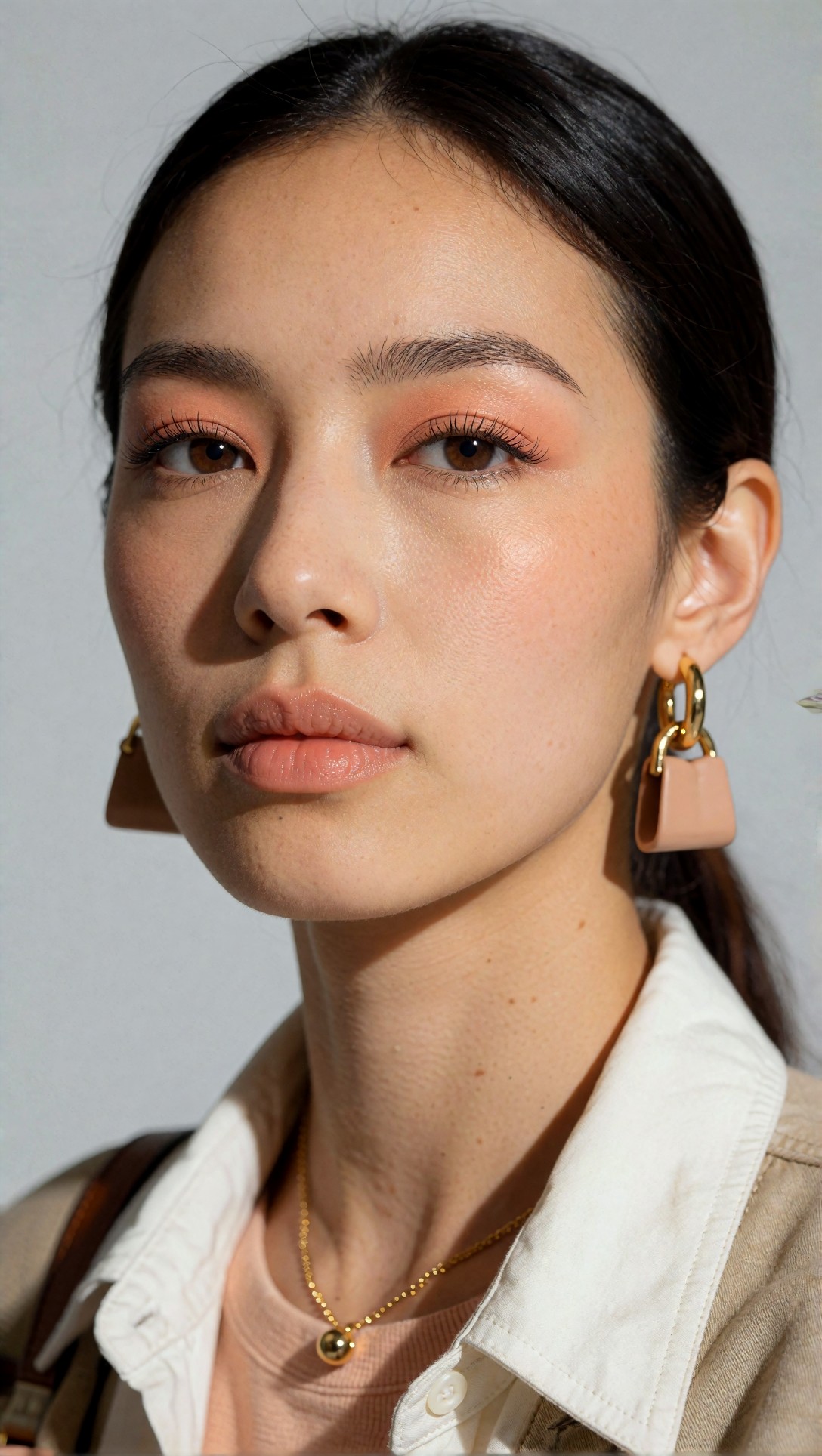
The beauty close-up has convincing skin texture, eyelashes and eyebrow hairs at the full 1088 x 1928 size. The flaw is the jewellery: both earrings are pink handbag-shaped charms, a side effect of the "bag" text in the appended suffix rather than anything a resolution setting would change. The prompt asked for "minimal gold jewelry".
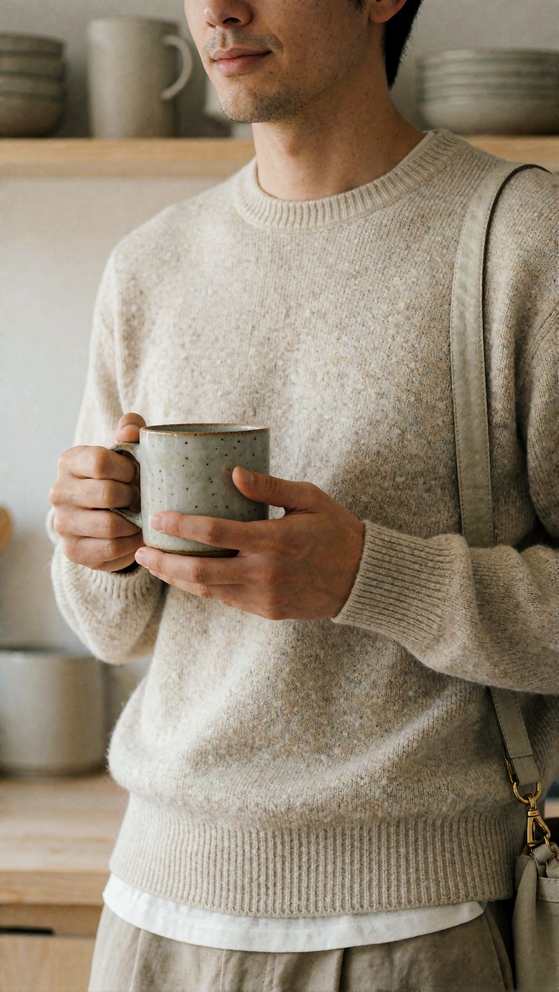
In the mug image, both hands have the expected fingers and the mug rim is round. The knit has visible flecks and ribbed cuffs. The crop cuts the face at the nose, and a shoulder strap appears that the subject prompt does not mention.
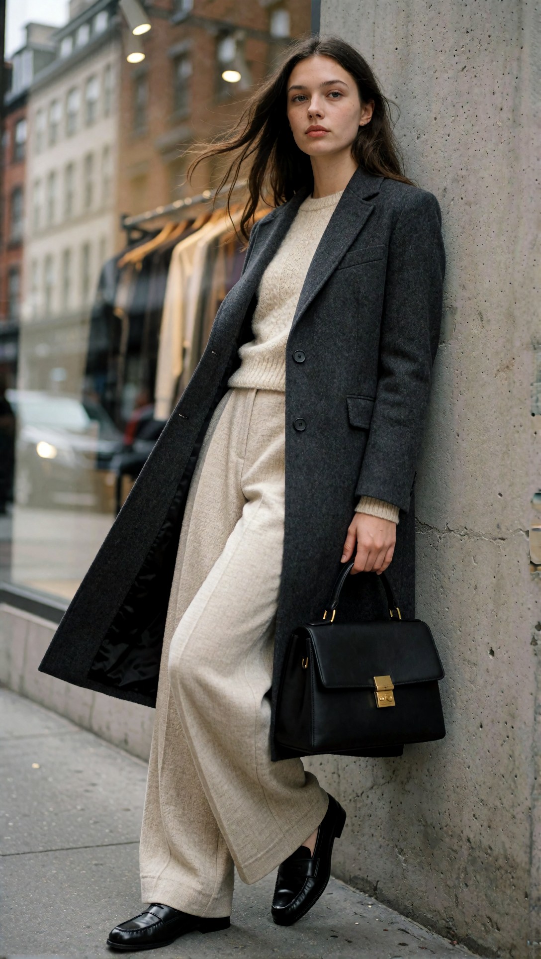
The full-body street image shows coat lapels, buttons, bag hardware and loafer shape clearly, with no visible structural errors in what I looked at. Because the structure is already right, this is the kind of frame that would be worth upscaling; one that looks like the bottle label or the sign would not be.
When larger native generation or upscaling is the better choice
The points below are general guidance, not results from these files.
- A bigger native canvas is usually considered for wide scenes that need more layout room. Memory use and generation time rise with pixel count, and exact limits depend on your GPU and model, so check what your setup handles. Models can also behave less predictably far from the sizes they were trained on.
- Upscaling after selection lets you reject weak frames at the cheap size and spend the expensive step on one. The [ZView upscaler](/upscaler/en) is built for that step.
- Both: generate at a solid size, then upscale, for images that must survive heavy cropping. The risk is over-sharpened or waxy texture, which I have not measured here.
If you want to see what a particular upscaler adds on fashion images, [SeedVR2 3B vs 7B on fashion portraits](/articles/seedvr2-3b-vs-7b-outfit-portrait-upscaling-en/en) compares real 2x outputs. It found that upscaling left existing flaws in place, which fits the examples above.
A test that would settle the question
Take one prompt, fix the seed, render it at three sizes, then upscale the smallest by 2x. Compare all four at 100% on the same crop. This is a proposal, not something I have run, and the larger sizes depend on what your model and GPU allow. You can draft and clean up the prompt in [Prompt Lab](/promptlab/en) first. Keep the prompt free of unrelated styling text, because the suffix in these records caused extra people and bags.
FAQ
Will a higher resolution setting fix a garbled label or sign? In the two examples above, no reason to expect it. The letters are wrong as shapes, so a larger render would show wrong letters in more detail. Replace important text afterwards.
How do I know a frame is worth upscaling? Zoom to 100% on faces, hands, edges, labels and repeated patterns. If these are wrong, regenerate instead.
Evidence for this page
- Model: Krea2 Turbo, per the generation records of all eight source images.
- Generated: 11 July 2026.
- Checked: I opened all eight images. All eight are 1088 x 1928 pixels. I used six here. None is an upscaled file, and there is no larger-size version to compare.
- Not checked: any bigger-versus-upscale difference, VRAM or speed figures, and any claim about upscaling these particular files.