AI Image Generator Resolution Test: Generate Bigger, Upscale Later, or Both? 한국어 요약
이 페이지는 ZView Space의 영어 원문을 한국어 검색 사용자도 이해할 수 있도록 정리한 SEO 요약입니다. 핵심은 단순한 얼굴 중심 이미지가 아니라 패션 에디토리얼, 룩북, 아웃핏, 프롬프트 테스트, 이미지 생성 워크플로우를 실제로 어떻게 구성할지입니다.
핵심 요약
- 원문 주제: AI Image Generator Resolution Test: Generate Bigger, Upscale Later, or Both?
- 목적: AI 이미지 생성에서 outfit, silhouette, fabric, pose, location, camera framing을 더 명확하게 설계합니다.
- 활용 범위: Z-Image Turbo, Krea2 Turbo, Qwen Image, Anima, SeedVR2 같은 이미지 생성 및 업스케일 워크플로우에 적용할 수 있습니다.
- SEO 관점: 제목, 설명, 이미지 alt, 프롬프트 예시가 실제 검색 의도와 맞아야 색인 가능성이 높아집니다.
한국어 사용자를 위한 체크포인트
1. 프롬프트가 얼굴 묘사에만 머물지 않고 전체 스타일과 의상 구성을 설명하는지 확인합니다. 2. 패션 이미지라면 상의, 하의, 아우터, 신발, 액세서리, 소재감, 촬영 장소를 분리해서 씁니다. 3. 생성 결과는 바로 게시하지 말고 디테일, 손, 의상 형태, 배경 일관성, 이미지 품질을 비교합니다. 4. 글 본문에는 실제 테스트 기준과 실패를 줄이는 방법이 들어가야 검색엔진에서 얇은 콘텐츠로 보일 가능성이 줄어듭니다.
원문 미리보기
If you are trying to decide between generating at a larger native size, generating smaller and upscaling later, or combining both, this test is about the practical answer. I ran the same subjects through multiple AI image generator resolution workflows and com
---
If you are trying to decide between generating at a larger native size, generating smaller and upscaling later, or combining both, this test is about the practical answer. I ran the same subjects through multiple AI image generator resolution workflows and compared where detail actually improved, where composition drifted, and where upscaling only made defects bigger.
The short version: generating bigger helps when the model can still hold structure at that size, upscaling later is usually the safer path for clean composition, and the strongest workflow for many use cases is moderate native generation followed by selective upscaling. The weak point is assuming more pixels automatically means more truth. In this test, they often did not.
Quick answer: what to know first
- For most text-to-image work, a balanced native size usually beats pushing the model to its maximum canvas.
- If faces, hands, typography, or products need to stay stable, generate at a moderate resolution first and upscale the best frame later.
- Native larger generation can add scene information, but it also increases the chance of soft details, repeated textures, and composition drift.
- Upscaling improves print or export flexibility, but it does not reliably fix bad anatomy, wrong objects, or broken text.
- The best size for AI image generation depends on the subject: portraits tolerate upscaling well, product shots expose fake detail faster, and wide scenes benefit more from larger initial canvases.
What was tested
I compared three common workflows:
1. Generate small-to-medium, then upscale 2. Generate bigger from the start 3. Generate medium, then upscale, then do a second refinement pass if needed
I looked for:
n- hand accuracy
- face stability
- fabric and surface detail
- product edge clarity
- background consistency
- text and signage failure rate
- crop flexibility for social, web, and print-style export
This is the kind of workflow you can run with outputs from [Create](/create), then inspect prompts in [Prompt Lab](/promptlab), and send selected images through an [AI upscaler](/upscaler) when the base composition is strong.
Before you generate: preparation checklist
Before touching the resolution settings, set up the test so the comparison means something.
Preparation checklist for AI image generator resolution tests
- Use the same seed if your model supports it.
- Keep the prompt stable and change only the size or workflow.
- Test at least one portrait, one product image, one wide scene, and one text-heavy scene.
- Save outputs with clear filenames that include native resolution and upscale factor.
- Inspect at fit-to-screen first, then at 100%, then at your target crop.
- Decide the final use before testing: social post, marketplace image, banner, or print mockup.
- Do not judge quality only by sharpness. Check structure first.
Comparison table: when each workflow makes sense
| Workflow | Best for | Strongest result in this test | Main risk | |---|---|---|---| | Generate bigger natively | Landscapes, architecture, wide editorial scenes | More environmental information and cleaner wide composition | Detail can become soft or invented | | Generate smaller, upscale later | Portraits, products, ad creatives, controlled scenes | Better subject stability and easier image selection | Upscaler can exaggerate texture artifacts | | Generate medium, upscale, then refine selectively | Hero images, campaign key art, images that need cropping | Best balance of structure and export flexibility | More steps, easier to overprocess |
Step-by-step workflow: generate bigger, upscale later, or both?
Step 1: Start with a controlled baseline size
In this test, the most useful baseline was not the smallest setting and not the largest. A medium native resolution gave the model enough room for composition while still keeping the subject coherent. This is where I would start if you are unsure about the best size for AI image generation.
For portraits, medium native resolution tended to preserve face proportions better than very large first-pass generations. The strongest result was a clean base image with believable skin texture and consistent eyes, then a later upscale for delivery.
This first prompt is meant to check face stability and micro-detail without overwhelming the model with a huge canvas.
Topic: Studio beauty portrait for resolution baseline testing
Genre: Beauty Campaign
Camera: Canon EOS R5
Lens: 85mm f/1.8
Lighting: Studio butterfly light with soft fill reflector
Location: Neutral gray seamless studio with polished cosmetic-ad mood
Style: High-end beauty advertising
Final Prompt: close-up beauty campaign portrait of a woman with clean natural makeup, direct confident gaze, relaxed mouth, smooth but realistic skin texture, subtle peach and beige color palette, minimal gold jewelry, shoulders visible, centered composition, soft shadow control, neutral gray seamless background, premium cosmetic ad styling, Canon EOS R5 look, 85mm f/1.8 shallow depth of field, crisp eyelashes, accurate pores, balanced highlights, photoreal, controlled composition, high image fidelity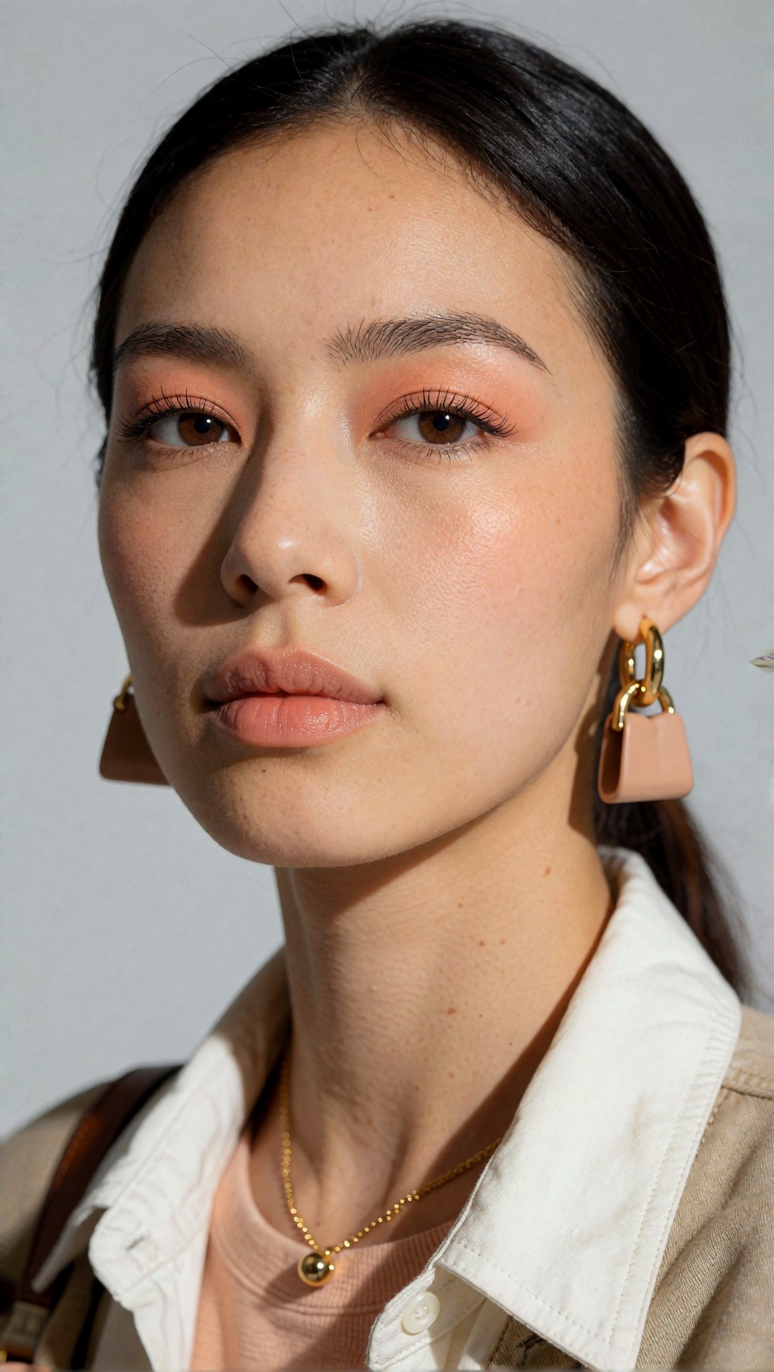
Inspect the eyes, eyelashes, hairline, and skin transitions. If the face breaks at medium resolution, generating larger will usually not save it.
Step 2: Test a larger native canvas on scenes that need spatial detail
Large native generation helped most when the scene itself needed room: interiors, street scenes, travel frames, and architecture. The gain was not always finer detail. More often, it was better environmental storytelling.
The weak point was local accuracy. Windows, repeated objects, distant people, and signage failed more often at larger native sizes.
This prompt is meant to check whether increasing native resolution improves wide-scene organization instead of just creating more fake texture.
Topic: Boutique hotel courtyard with layered architectural detail
Genre: Cinematic Travel
Camera: Sony A7R IV
Lens: 35mm f/2
Lighting: Overcast diffusion after light rain
Location: Mediterranean stone courtyard with arches, olive trees, and patterned tiles
Style: Cinematic realism
Final Prompt: wide cinematic travel image of a boutique hotel courtyard after light rain, pale limestone arches, wet terracotta tiles reflecting soft daylight, olive trees in ceramic planters, linen lounge chairs, folded umbrellas, distant staircase, open balcony doors, muted sand and sage palette, no people in foreground, carefully layered depth, Sony A7R IV look, 35mm f/2 environmental perspective, realistic stone texture, restrained contrast, premium editorial travel composition, coherent architecture, natural puddle reflections, photoreal detail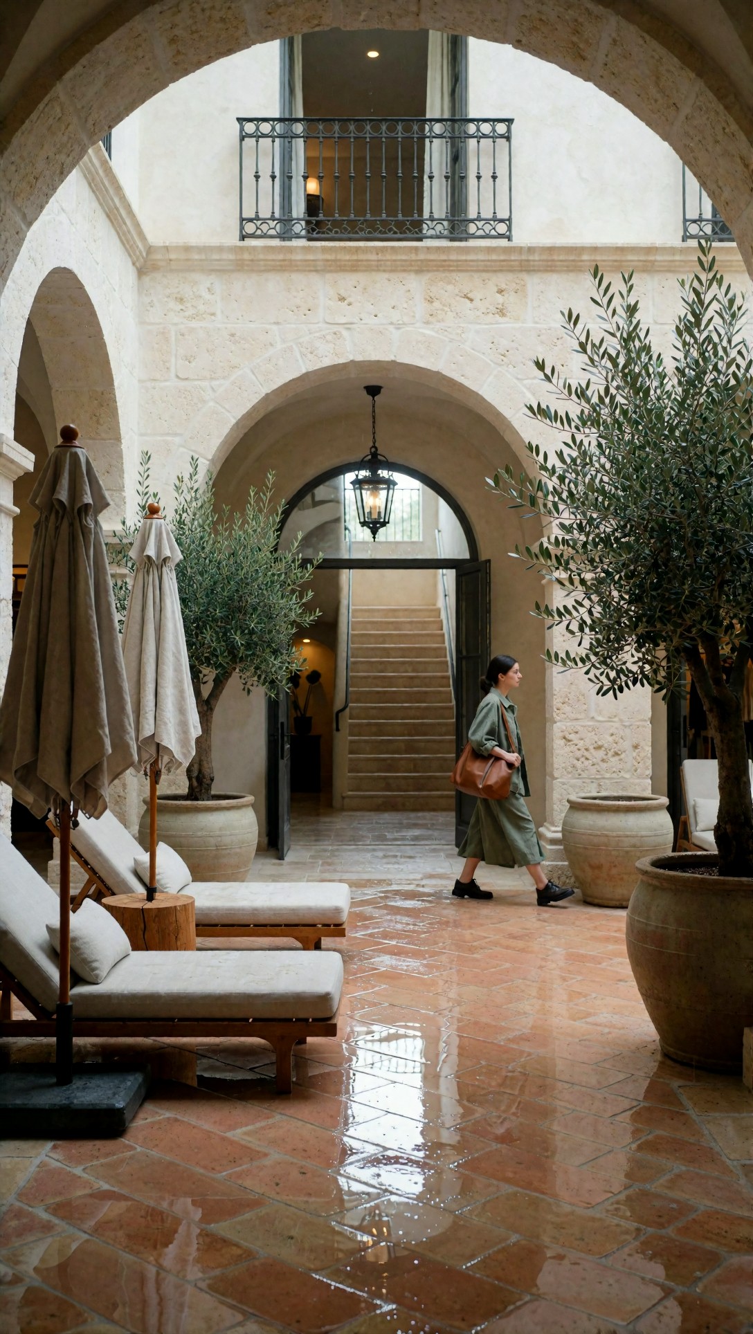
Check whether the tile lines stay logical, the arches remain symmetrical enough, and background objects do not duplicate strangely. In this test, large native resolution was useful here, but only when the composition was already stable.
Step 3: Use smaller-to-medium native generation for product clarity
Products exposed fake detail faster than almost any other subject. Bottles, packaging edges, watch faces, and labels often looked sharper at first glance after upscaling, but at 100% the details were invented rather than resolved.
For product work, I got better results by generating a clean medium-size image with clear lighting and simple surfaces, then upscaling only the chosen frame.
This prompt is meant to test edge discipline, reflections, and whether export quality survives upscaling.
Topic: Luxury skincare bottle on stone plinth for product clarity testing
Genre: Product Editorial
Camera: Nikon Z7 II
Lens: 105mm macro f/2.8
Lighting: Softbox key light with narrow rim light
Location: Minimal studio set with travertine plinth and matte backdrop
Style: Clean commercial look
Final Prompt: premium skincare serum bottle on a travertine stone plinth, frosted glass packaging with metallic cap, soft beige matte background, precise label placement, elegant shadow falloff, controlled specular highlights, subtle condensation, no clutter, centered luxury product composition, Nikon Z7 II look, 105mm macro f/2.8 precision, commercial studio lighting, sharp glass edges, realistic reflections, refined neutral palette, beauty retail campaign quality, photoreal packaging detail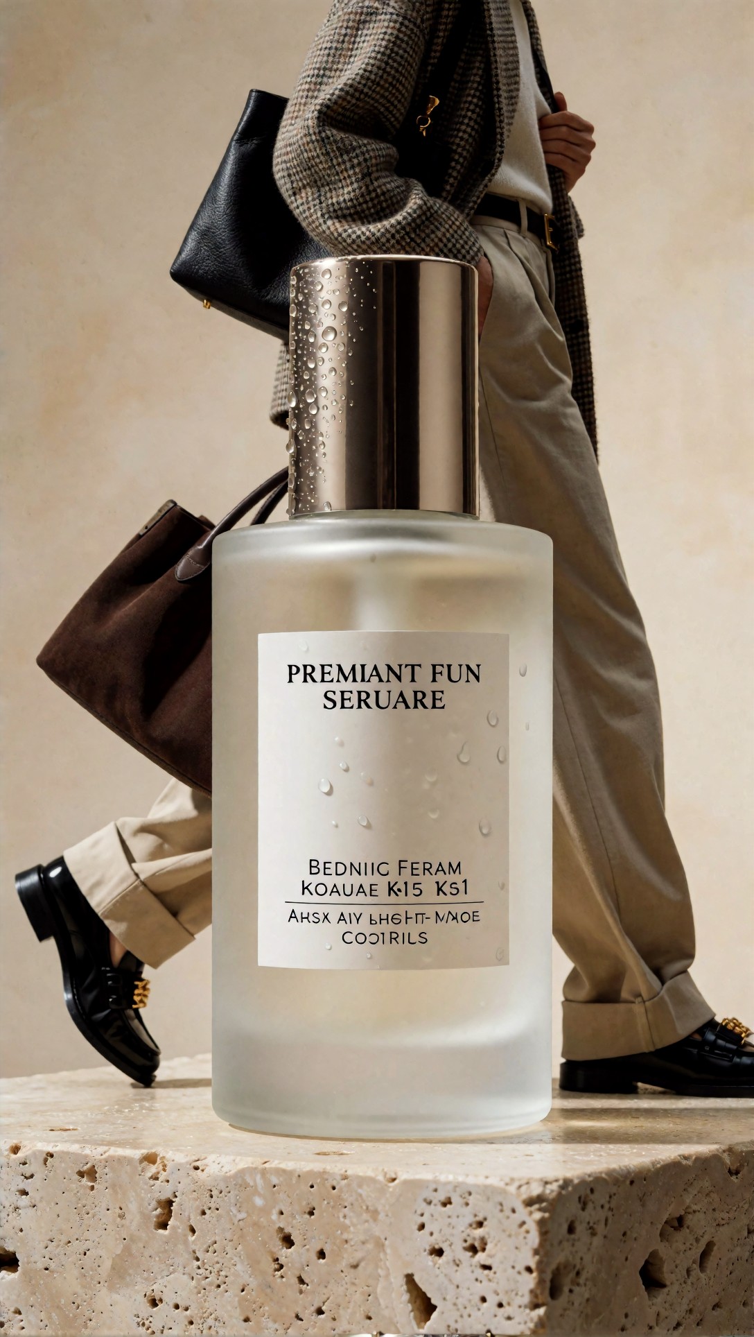
Inspect bottle edges, cap symmetry, label alignment, and reflection cleanliness. If those are wrong before upscaling, the upscaler usually amplifies the error instead of fixing it.
Step 4: Upscale later when the composition is already right
This was the most reliable workflow across categories. Once the subject, pose, and lighting were right, upscaling gave me more crop options and cleaner export quality without forcing the generator to solve too many things at once.
The important distinction: upscaling improved deliverability more than truthfulness. It made a good image more useful. It did not make a weak image correct.
This prompt is meant to produce a portrait where pose and styling matter more than background complexity, making it ideal for generate-first, upscale-later workflow testing.
Topic: Street style portrait with layered fabric detail
Genre: Street Style
Camera: Fujifilm GFX 100S
Lens: 80mm f/1.7
Lighting: Late afternoon side light with soft bounce
Location: Quiet city side street with concrete wall and muted storefront reflections
Style: Editorial fashion realism
Final Prompt: full-body street style portrait of a young woman leaning slightly against a concrete wall, tailored charcoal coat over cream knit top and wide-leg trousers, structured leather bag, polished black loafers, relaxed but deliberate pose, calm expression, wind moving coat hem slightly, muted gray and oatmeal palette, subtle storefront reflections in background, Fujifilm GFX 100S look, 80mm f/1.7 shallow depth, premium editorial framing, visible fabric weave, realistic skin texture, natural hands, clean silhouette separation, photoreal fashion detail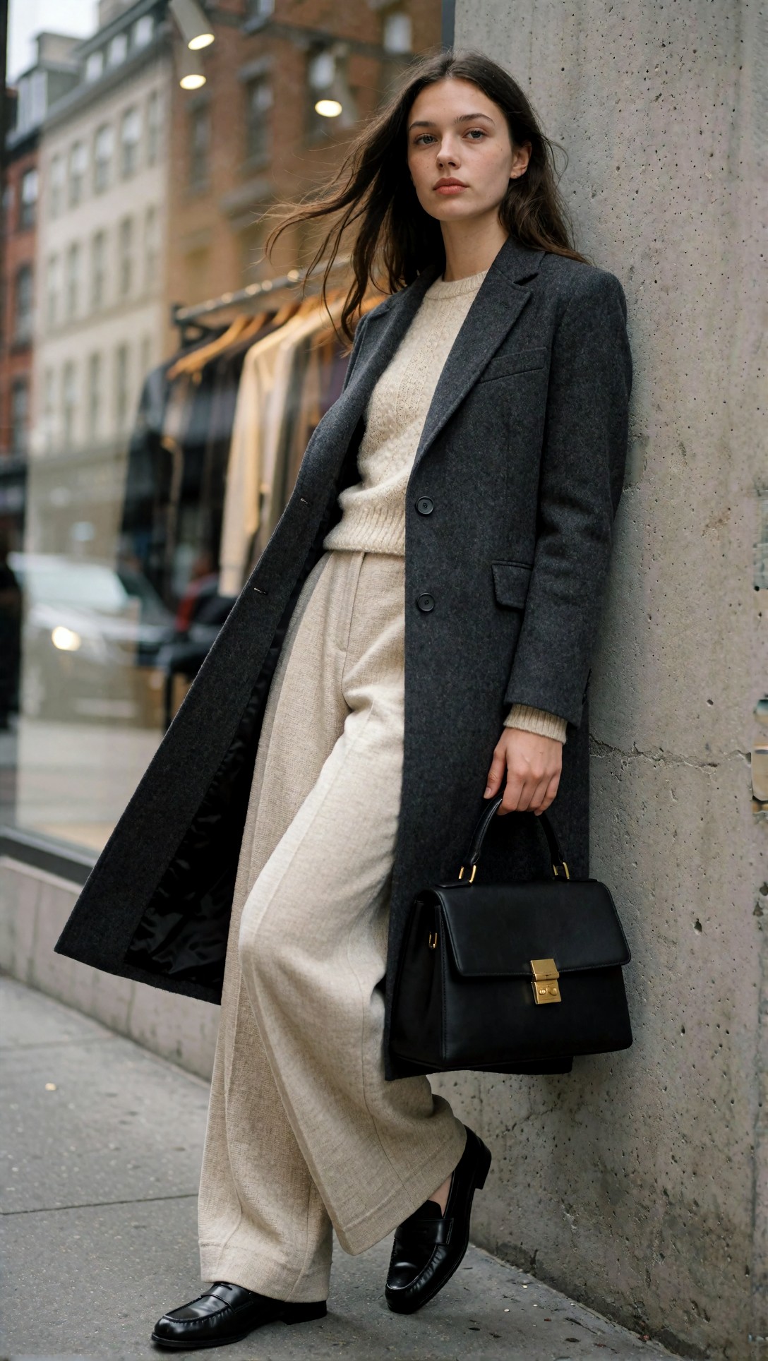
Look at the knit texture, coat edges, fingers, and shoe shape before and after upscale. In this test, portraits like this held up well because the composition was simple and the subject was dominant.
Step 5: Combine both only when you need crop flexibility
The hybrid method worked best for hero images. I generated at a moderate-to-large native size, selected the frame with the best structure, then upscaled for final export. Sometimes I ran a restrained second pass to recover local contrast or surface realism.
This is not my default workflow for bulk generation. It is slower, and the failure mode is overprocessing: waxy skin, crunchy hair, or surfaces that look hyper-detailed but wrong.
This prompt is meant to test whether a medium-large starting size plus upscale gives enough room for different crops without losing subject integrity.
Topic: Cinematic café scene for crop-flexible hero image testing
Genre: Lifestyle Portrait
Camera: Leica SL2-S
Lens: 50mm f/1.4
Lighting: Window light with warm practical lamps
Location: Quiet European café with wood tables and textured walls
Style: Cinematic lifestyle editorial
Final Prompt: seated lifestyle portrait in a quiet café, subject in dark green wool blazer over soft cream shirt, hands around a ceramic cup, thoughtful sideways glance, warm practical lamps behind, daylight from side window shaping face, wood grain tables, textured plaster walls, muted amber and olive palette, layered foreground bokeh, Leica SL2-S look, 50mm f/1.4 intimate framing, cinematic realism, clean hand anatomy, realistic steam, detailed textiles, premium editorial atmosphere, enough negative space for flexible crop options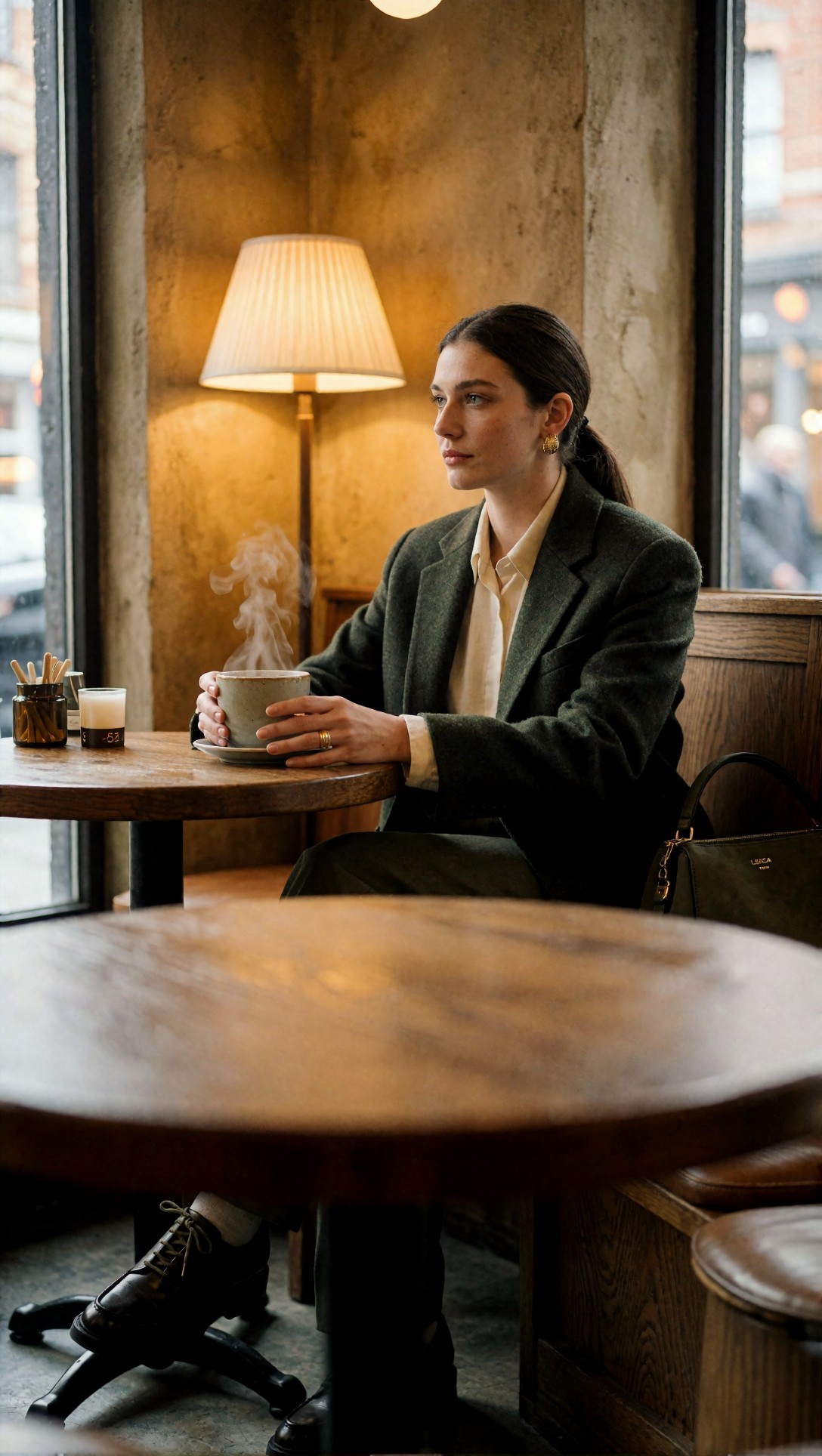
Check whether the face remains consistent across crop positions and whether background lamps smear into strange shapes. If the base frame is coherent, the hybrid method gives the best publishing flexibility.
Prompt examples inside the workflow: tests that exposed weak spots
Some subjects fail in predictable ways at different text to image resolution settings. These next prompts target those weak spots directly.
Hands and object interaction
Hands often broke faster when I pushed native size too high. The model seemed to add more visible finger information, but not better finger structure.
This prompt is meant to stress hand accuracy, cup geometry, and sleeve texture at different generation sizes.
Topic: Hand interaction portrait holding ceramic mug
Genre: Lifestyle Portrait
Camera: Panasonic Lumix S5II
Lens: 85mm f/2
Lighting: Soft morning window light
Location: Apartment kitchen with pale wood shelves and neutral ceramics
Style: Clean commercial lifestyle look
Final Prompt: waist-up lifestyle portrait of a man holding a handmade ceramic mug with both hands, soft oatmeal sweater with ribbed cuffs, neutral kitchen setting with pale wood shelves and matte ceramic objects, gentle morning window light from left side, calm expression, slight smile, natural posture, Panasonic Lumix S5II look, 85mm f/2 soft separation, realistic fingers and knuckles, visible mug rim geometry, fine knit texture, muted cream and clay palette, photoreal domestic editorial composition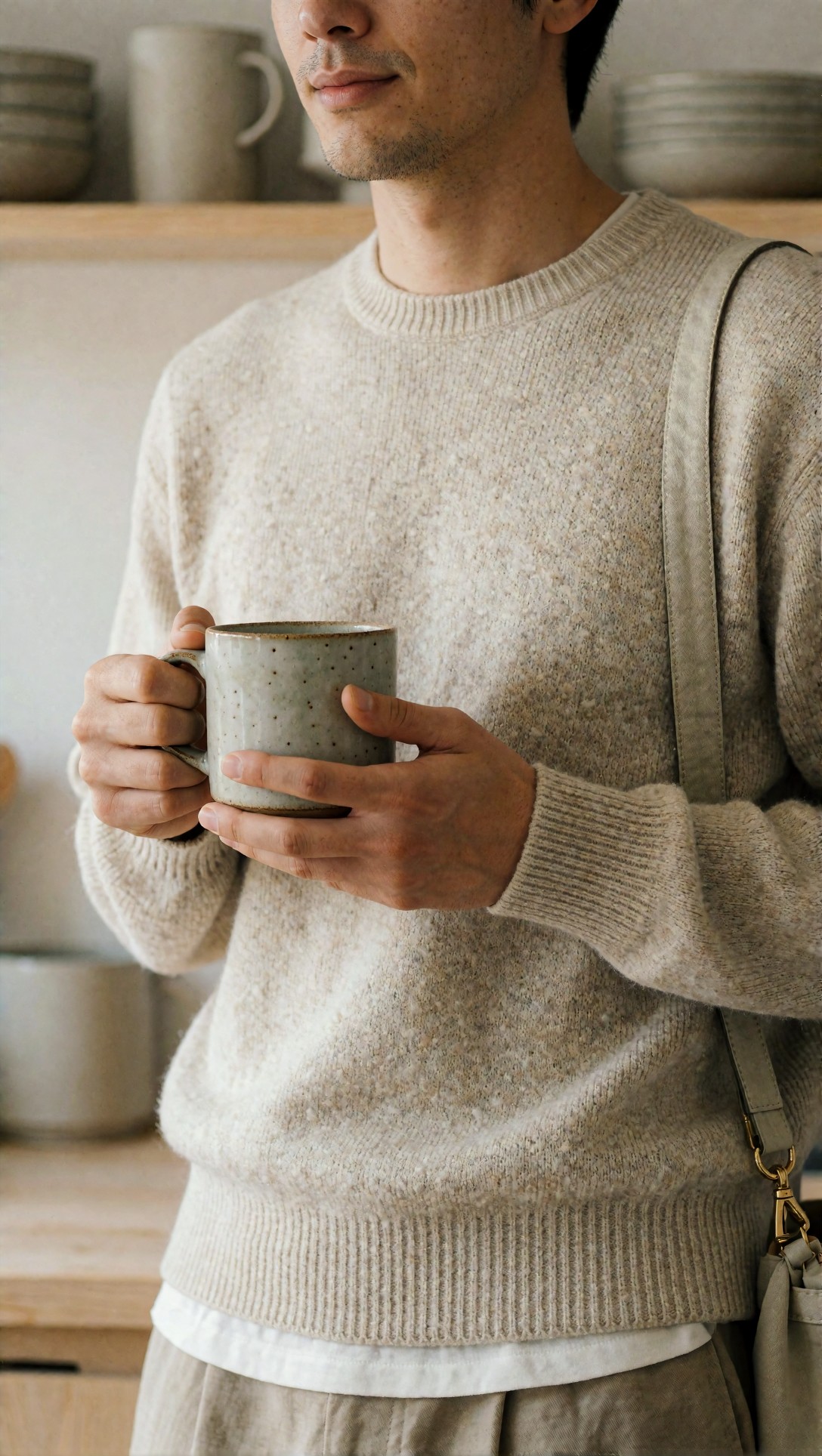
Inspect the number of fingers, grip logic, mug symmetry, and cuff detail. In this test, smaller-to-medium native generation plus upscale later gave the most believable hands.
Dense texture and repeating patterns
Large native generation sometimes produced impressive texture at first glance, but repeating patterns could break into cloned areas. Fabric, tile, brick, and foliage were common failure zones.
This prompt is meant to check whether native size improves real texture or only creates noise that resembles detail.
Topic: Textile-heavy interior fashion scene with repeating patterns
Genre: Fashion Editorial
Camera: Hasselblad X2D 100C
Lens: 55mm f/2.5
Lighting: Soft skylight diffusion
Location: Vintage apartment with patterned rug, velvet sofa, and bookshelves
Style: Luxury magazine editorial
Final Prompt: editorial fashion scene in a vintage apartment, model seated on a deep olive velvet sofa wearing a textured jacquard dress and tall leather boots, patterned rug in foreground, bookshelves and framed art behind, soft skylight diffusion, composed three-quarter body pose, introspective expression, rich forest, rust, and cream palette, Hasselblad X2D 100C look, 55mm f/2.5 medium-format depth and detail, visible fabric weave, coherent repeating rug pattern, realistic velvet sheen, luxury magazine styling, photoreal interior richness without clutter collapse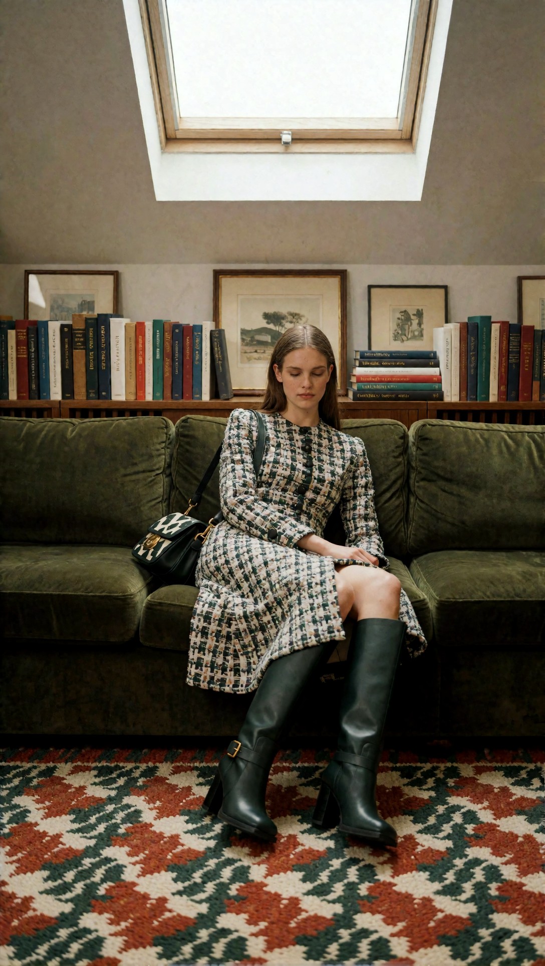
Check the rug pattern, bookshelf repetition, and velvet transitions. The strongest result was not the largest native size, but the cleanest structured frame before enlargement.
Text and signage stress test
If you need readable type, do not rely on bigger generation alone. In this test, larger canvases often produced more text-like shapes, not more correct text.
This prompt is meant to reveal whether signage benefits from generation size or needs later manual correction in design software.
Topic: Storefront with visible signage for text accuracy testing
Genre: Urban Editorial
Camera: Canon EOS R6 Mark II
Lens: 35mm f/1.8
Lighting: Blue hour ambient with neon accents
Location: Narrow city street with independent bookstore storefront
Style: Cinematic commercial realism
Final Prompt: evening urban editorial image of an independent bookstore storefront on a narrow city street, warm interior light spilling onto wet pavement, visible hanging sign and front window lettering, stacks of books inside, bicycle near entrance, subtle neon glow from nearby shop, deep blue and amber palette, Canon EOS R6 Mark II look, 35mm f/1.8 street perspective, cinematic realism, clean storefront geometry, believable but not exaggerated reflections, composition emphasizing signage clarity and architectural lines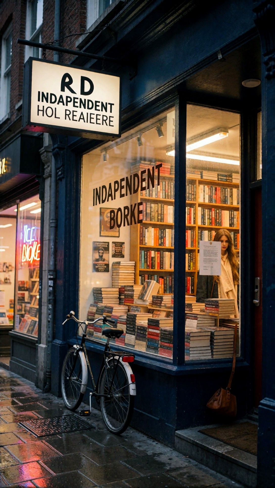
Inspect the lettering carefully at 100%. My recommendation here is simple: generate for composition, then replace important text manually if the image will ship.
Quality-control checklist for AI image export quality
Once you have a candidate image, use this checklist before deciding whether to regenerate, upscale, or stop.
Pass/fail checklist
- Subject structure: face, hands, product geometry, or architecture still make sense at 100%
- Local detail: hair, fabric, metal, glass, and foliage look varied rather than stamped
- Edge behavior: outlines are clean and not melting into the background
- Texture honesty: detail looks plausible, not crunchy or airbrushed
- Background stability: no duplicated objects, broken horizons, or impossible reflections
- Crop tolerance: image still works in vertical, square, or wide crops you actually need
- Export readiness: after upscaling, no halos, oversharpening, or strange smoothing appear
If an image fails structure, regenerate. If it passes structure but needs delivery size, upscale. If it passes both, stop editing.
Strengths observed in each workflow
When generating bigger worked
- Better for wide scenes with real spatial layering
- More room for environmental storytelling
- Useful when the final image needs a loose crop with lots of negative space
When upscaling later worked
- Better subject stability in portraits and products
- Cleaner workflow for batch generation
- More predictable final exports for web, social, and marketplace use
When the hybrid approach worked
- Best for hero images that must survive multiple crops
- Strong for campaign art where one image may be used across placements
- Good when the base frame is already strong and only needs more delivery headroom
You can compare output variants visually in your own archive or reference set through a saved [gallery](/gallery) workflow, especially when you want to judge crop resilience rather than only pixel sharpness.
Troubleshooting weak outputs
If your images look bigger but not better, one of these issues is usually the cause.
Problem: larger native images look soft
What happened in this test: the model added more area, not more reliable detail.
What I would change next:
- reduce scene complexity
- move to a medium base resolution
- specify fewer competing objects
- ask for clearer lighting and simpler backgrounds
Problem: upscaling makes skin or textures look fake
What happened in this test: the upscaler amplified synthetic micro-texture.
What I would change next:
- start from a cleaner base image
- use lower upscale intensity if adjustable
- avoid double sharpening in multiple tools
- choose images with natural tonal transitions, not already-crunchy detail
Problem: product edges and labels break
What happened in this test: the model never really solved the object geometry.
What I would change next:
- simplify the prompt
- use front-facing product compositions
- reduce reflective complexity
- regenerate instead of trying to rescue with upscale
Problem: text is still unreadable at higher resolution
What happened in this test: resolution increased text-like marks, not accurate typography.
What I would change next:
- treat text as a compositional placeholder
- add final lettering manually in post
- keep signage larger and more isolated if you want better draft readability
You can also iterate the wording in [Prompt Lab](/promptlab) before spending time on another upscale pass. In this workflow, prompt cleanup usually beat post-processing when the core image was weak.
FAQ
What is the best AI image generator resolution to start with?
A medium native size is usually the safest starting point. It gives enough room for composition while keeping faces, products, and hands more stable than very large first-pass generations.
Is it better to generate bigger or upscale later?
For most controlled subjects, upscale later. For wide scenes or images needing lots of crop flexibility, larger native generation can help. The strongest general workflow in this test was medium native generation followed by upscale.
Does upscaling improve actual image detail?
It improves usable output size and can enhance perceived sharpness, but it does not reliably create true missing detail. If anatomy, geometry, or text is wrong, upscaling usually makes the problem more visible.
What subjects benefit most from larger native generation?
Landscapes, interiors, architecture, and broad editorial scenes benefited most because they needed spatial coverage more than perfect micro-accuracy.
What subjects should avoid aggressive native resolution increases?
Products, beauty close-ups, hands, and text-heavy images. These subjects expose fake detail and structural errors quickly.
Summary recommendation
If your question is whether to generate bigger, upscale later, or both, the answer is conditional but clear.
Use medium native generation plus upscale later if you care about subject integrity, fast selection, and dependable export quality. That is the workflow I would recommend for portraits, product images, lifestyle ads, and most publishable web visuals.
Use larger native generation if the scene genuinely needs more environmental complexity or negative space, especially for architecture, travel, and wider editorial compositions.
Use both only for hero assets where crop flexibility matters enough to justify extra review time.
Who should use this workflow: creators making social ads, e-commerce images, editorial visuals, thumbnails, and campaign art that needs clean crops.
Who should avoid the hybrid method: anyone generating large batches quickly or trying to rescue weak base images through post-processing.
The setting that mattered most in this test was not maximum size. It was choosing a native resolution the model could still manage cleanly, then only upscaling images that already had the right structure. That is the difference between bigger files and better images.