AI Image Generator Styles Compared: Which Models Handle Realistic, Anime, and Illustration Prompts Best? 한국어 요약
이 페이지는 ZView Space의 영어 원문을 한국어 검색 사용자도 이해할 수 있도록 정리한 SEO 요약입니다. 핵심은 단순한 얼굴 중심 이미지가 아니라 패션 에디토리얼, 룩북, 아웃핏, 프롬프트 테스트, 이미지 생성 워크플로우를 실제로 어떻게 구성할지입니다.
핵심 요약
- 원문 주제: AI Image Generator Styles Compared: Which Models Handle Realistic, Anime, and Illustration Prompts Best?
- 목적: AI 이미지 생성에서 outfit, silhouette, fabric, pose, location, camera framing을 더 명확하게 설계합니다.
- 활용 범위: Z-Image Turbo, Krea2 Turbo, Qwen Image, Anima, SeedVR2 같은 이미지 생성 및 업스케일 워크플로우에 적용할 수 있습니다.
- SEO 관점: 제목, 설명, 이미지 alt, 프롬프트 예시가 실제 검색 의도와 맞아야 색인 가능성이 높아집니다.
한국어 사용자를 위한 체크포인트
1. 프롬프트가 얼굴 묘사에만 머물지 않고 전체 스타일과 의상 구성을 설명하는지 확인합니다. 2. 패션 이미지라면 상의, 하의, 아우터, 신발, 액세서리, 소재감, 촬영 장소를 분리해서 씁니다. 3. 생성 결과는 바로 게시하지 말고 디테일, 손, 의상 형태, 배경 일관성, 이미지 품질을 비교합니다. 4. 글 본문에는 실제 테스트 기준과 실패를 줄이는 방법이 들어가야 검색엔진에서 얇은 콘텐츠로 보일 가능성이 줄어듭니다.
원문 미리보기
If you want to know which model to reach for before you start prompting, this test is meant to save you time. I ran the same style intent across realistic, anime, and illustration workflows and compared where each model class holds up, where it drifts, and wha
---
If you want to know which model to reach for before you start prompting, this test is meant to save you time. I ran the same style intent across realistic, anime, and illustration workflows and compared where each model class holds up, where it drifts, and what prompt ingredients actually improve the output.
The short version: realistic models usually win on lighting, skin, and lens behavior; anime-tuned models win on style lock and line economy; illustration-friendly models sit in the middle and are often the easiest to direct for editorial scenes. The catch is that the best result depends less on brand names than on whether the model is trained to protect the visual language you are asking for.
What was tested
In this test, I compared three practical model groups rather than treating all text-to-image systems as interchangeable:
- Photoreal models for realistic portrait, travel, and product-style scenes
- Anime-tuned models for cel shading, character design, and stylized environments
- General illustration models for painterly, poster-like, and editorial illustration outputs
I used the same prompt structure for all three groups, then adjusted only the style-critical language when a model clearly needed stronger anchoring. The goal was not to crown one model as universally best. It was to answer a more useful question: which type of model handles which prompt style with the least fighting?
Outcome you should get from this comparison
By the end, you should be able to:
- choose the right model family for realistic, anime, or illustration prompts
- spot early signs that a model is fighting your style request
- write prompts that lock style faster instead of adding random detail
- troubleshoot weak outputs before wasting more generations
Before generating: the preparation checklist
Before I compared outputs, I standardized a few variables. This mattered more than I expected, because weak comparisons often come from inconsistent prompt framing rather than real model differences.
Prep checklist
- Use the same subject across model groups where possible
- Keep composition goals stable: portrait, mid-shot, full scene, product framing
- Specify a style target directly instead of hoping the model infers it
- Include camera and lighting only when testing realism or cinematic control
- For anime and illustration, replace camera-heavy language with render-language that matches the medium
- Run at least 4 variations per prompt before judging a model
- Inspect hands, background logic, material detail, and style consistency separately
The strongest result in this test came when the prompt described both the subject and the visual system around it. The weak point in many failed generations was that the prompt asked for a style label but not the image behavior that style should produce.
Step 1: Start with a realism test before anything else
I always begin with a realistic prompt, even if the final project is stylized. It tells you whether the model understands anatomy, lighting direction, texture hierarchy, and scene coherence. If a model cannot hold those basics together, it usually struggles even more when pushed into niche style territory.
This first prompt is meant to check skin realism, glass reflections, depth separation, and whether the background behaves like a real location instead of a texture collage.
Topic: urban cafe portrait with realistic styling
Genre: lifestyle portrait
Camera: Sony A7R V
Lens: 50mm f/1.8
Lighting: overcast diffusion through front window
Location: narrow corner cafe with concrete walls, wood counter, street reflections on glass
Style: cinematic realism
Final Prompt: a realistic lifestyle portrait of a woman seated near the front window of a narrow urban cafe, dark wool coat over a cream knit top, one hand around a ceramic cup, relaxed but alert expression, soft natural pose, overcast daylight diffused through glass, subtle street reflections, concrete wall and warm wood textures behind her, cinematic realism, Sony A7R V look, 50mm f/1.8 depth of field, natural skin texture, believable eye detail, clean hands, layered mid-gray and espresso color palette, editorial composition, high texture fidelity, realistic lighting falloff, no exaggerated beauty retouching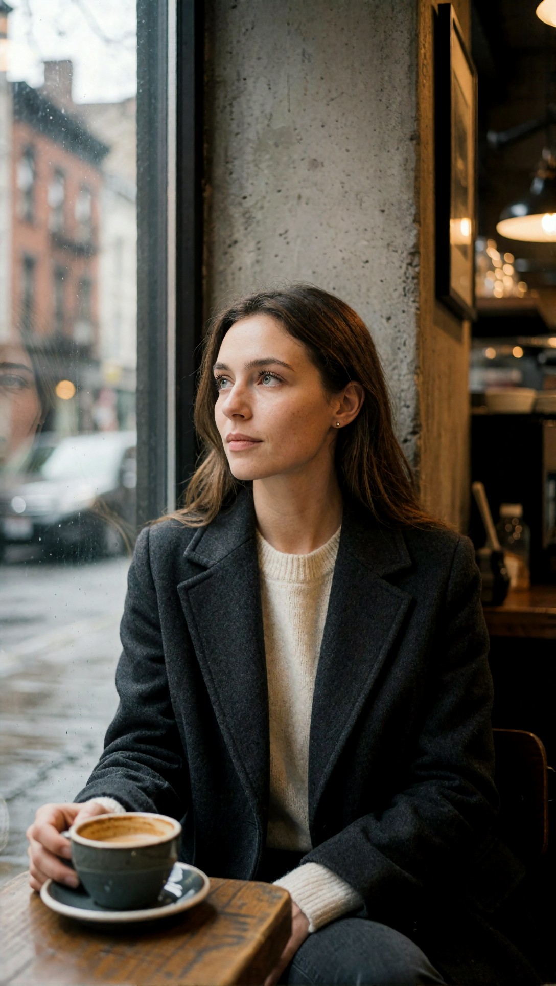
Inspect whether the skin texture stays natural or turns waxy, whether fingers merge into the cup, and whether the cafe reads as a coherent place. In this test, photoreal models handled the window light best, while general illustration models often translated the scene into a painted approximation even when asked for realism.
The second realism test pushes harder on environment complexity and clothing texture. I used it to see whether the model could keep a believable person inside a visually busy scene.
Topic: rainy crosswalk fashion scene
Genre: street style
Camera: Canon EOS R5
Lens: 35mm f/1.4
Lighting: rainy dusk with neon reflections
Location: Shibuya-style crosswalk with wet pavement, storefront glow, umbrellas in background
Style: clean commercial look
Final Prompt: full-body street style image of a woman crossing a busy neon-lit crosswalk at rainy dusk, tailored charcoal trench coat, black ankle boots, structured leather bag, subtle movement in the hem, confident forward stride, wet pavement reflecting pink and cyan signage, blurred umbrellas and storefronts behind her, Canon EOS R5 look, 35mm f/1.4 environmental framing, realistic proportions, clean commercial look, precise garment folds, natural face, believable rain atmosphere, crisp boot texture, high detail without oversharpening, premium editorial color control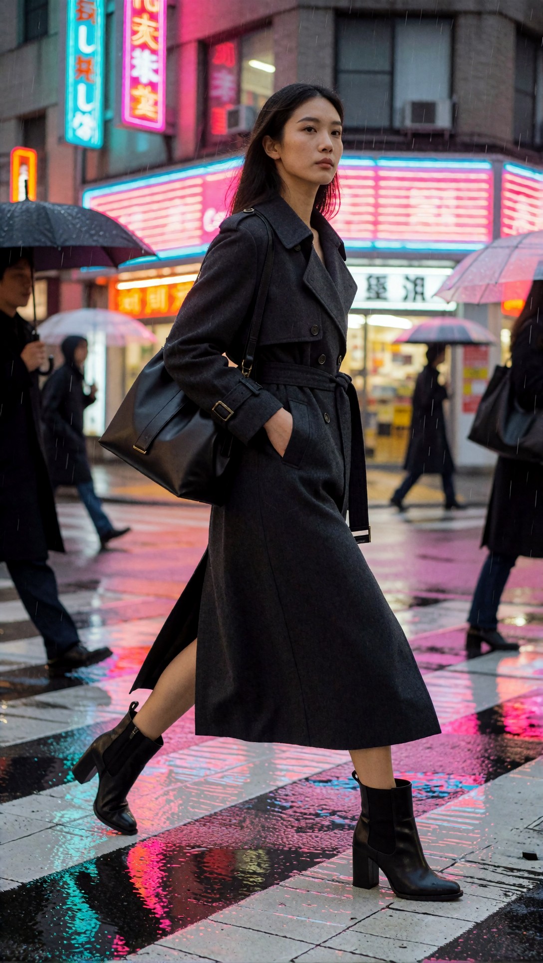
What to inspect here is motion logic and garment behavior. The strongest realistic models kept the trench silhouette believable and maintained clean legs and feet. The weak point was often background over-detail, where signage turned into unreadable noise that distracted from the subject.
What realism models did best
- More believable light direction
- Better skin and fabric microtexture
- Cleaner lens-style separation between foreground and background
- More usable outputs for product, portrait, and ad-like scenes
Where realism models failed
- They often resist strong anime cues unless the model is hybrid-tuned
- Some produce overprocessed skin if the prompt uses too much beauty language
- Hands improve, but crowded props still cause frequent errors
Step 2: Test anime style lock with a scene that can break easily
Anime prompts are a good stress test because a model either locks into the visual grammar quickly or starts leaking realism, painterly textures, or generic game-art rendering. In this test, anime-tuned models were much more stable than photoreal models asked to "do anime."
This first anime prompt is meant to check line clarity, eye rendering, wardrobe readability, and background integration without turning into a noisy fantasy poster.
Topic: rooftop school uniform anime key visual
Genre: anime key visual
Camera: cinematic capture style
Lens: 50mm equivalent f/2.0
Lighting: sunset backlight with soft rim light
Location: Japanese school rooftop with chain-link fence, distant city skyline, wind movement
Style: polished modern anime poster
Final Prompt: anime key visual of a high school student standing on a rooftop at sunset, navy school blazer over white shirt, loose ribbon tie, pleated skirt moving in the wind, one hand holding the fence, thoughtful sideways gaze, warm sunset backlight creating a soft rim around the hair, distant city skyline and pastel clouds, clean cel shading, controlled linework, expressive eyes, balanced composition, polished modern anime poster style, gentle orange and blue palette, crisp silhouette separation, subtle atmospheric depth, elegant but not overly glossy rendering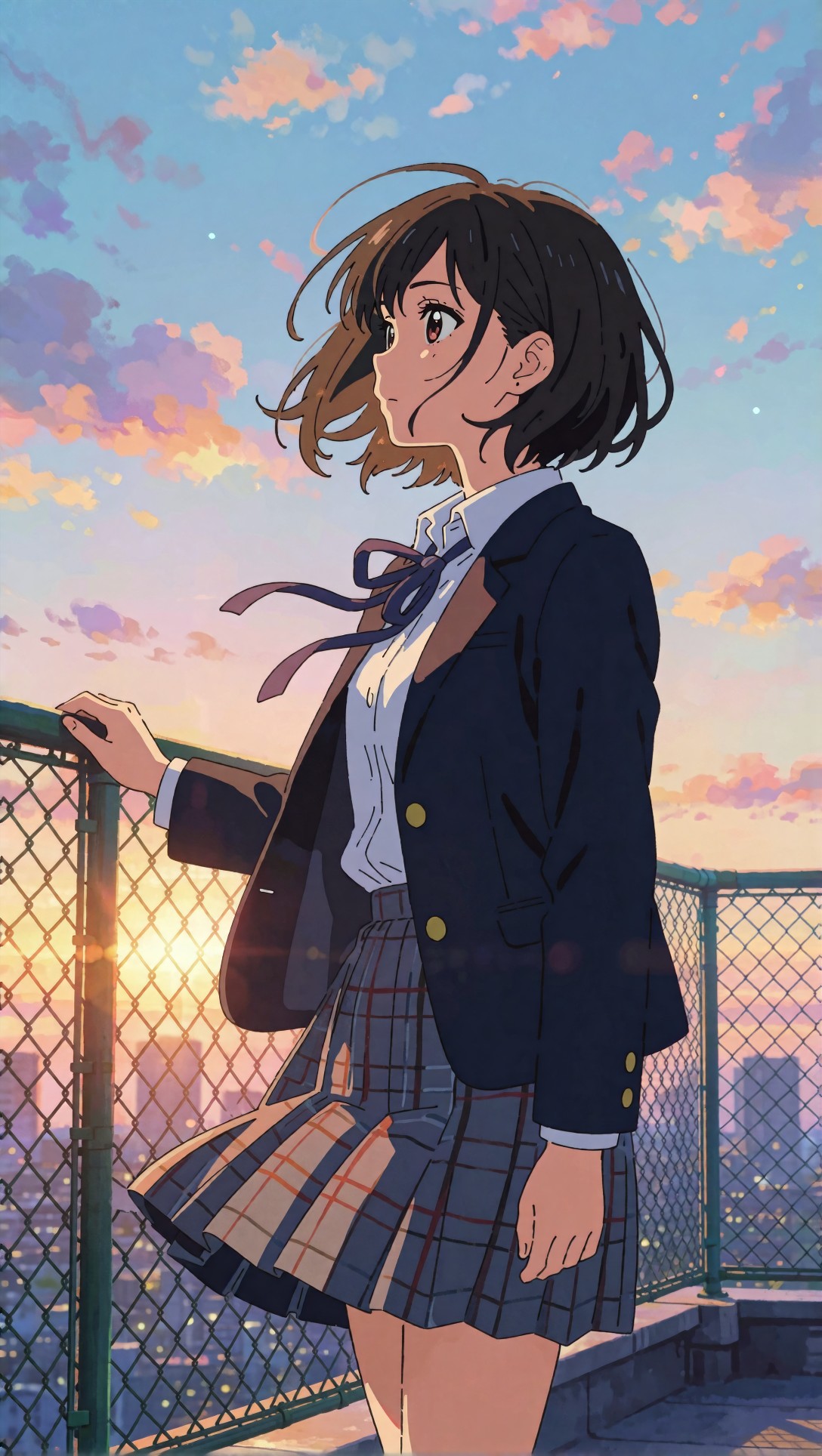
Check whether the face stays consistent with the age and style target, and whether the fence and hands remain readable. In this test, anime-tuned models held the eyes, hair shapes, and cel-shaded clothing folds much better than general-purpose models, which often blurred the style into semi-real digital painting.
The next anime prompt tests action and composition pressure. This is where weaker models lose anatomy or overcomplicate the frame.
Topic: cyberpunk courier on motorbike anime scene
Genre: cinematic travel
Camera: animated feature frame capture
Lens: 28mm equivalent f/2.8
Lighting: neon rim light with wet-street reflections
Location: elevated highway in a futuristic city at night
Style: high-energy anime action frame
Final Prompt: dynamic anime scene of a young courier paused on a compact motorbike on an elevated highway at night, short silver jacket with reflective strips, dark cargo pants, visor helmet lifted, determined expression, one foot on the ground, futuristic city towers behind with layered neon signage and magenta-blue haze, wet road reflections, dramatic perspective, high-energy anime action frame, strong silhouette, clean cel shading, controlled motion cues, readable mechanical design, sharp composition, rich contrast without realism creep, expressive but anatomically stable hands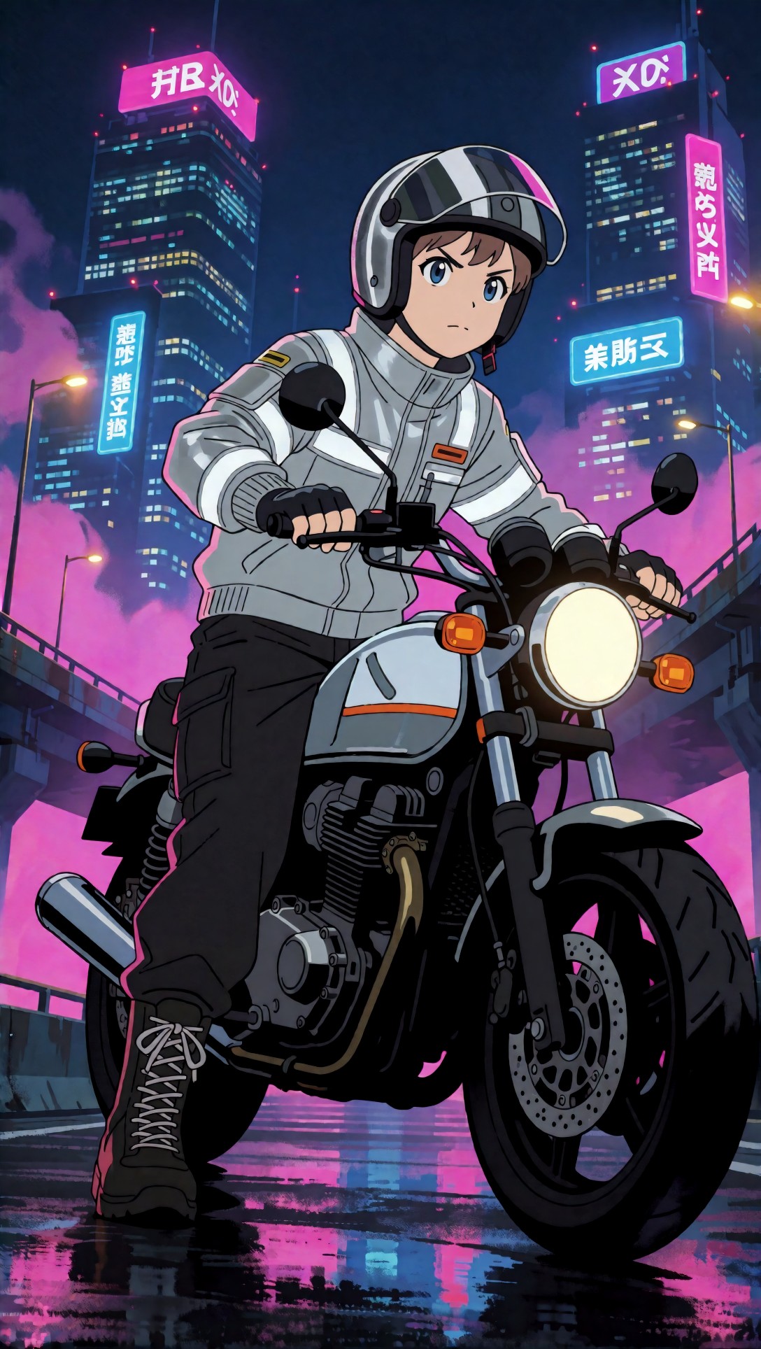
Inspect the bike geometry, the feet placement, and whether the neon remains graphic rather than photoreal mush. The strongest anime result kept the composition legible and treated reflections as stylized shapes instead of trying to simulate camera physics.
What anime-tuned models did best
- Strong style lock from the first generation
- Cleaner cel shading and line discipline
- Better character appeal and silhouette readability
- More reliable outputs for posters, key visuals, VTuber concepts, and character scenes
Where anime models fell short
- Product realism and material physics were weaker
- Crowded mechanical detail could become decorative noise
- If the prompt included too much camera realism, some outputs drifted toward 3D game art
Step 3: Use illustration models when you need art direction more than realism
General illustration models were the most flexible in this comparison. They did not beat photoreal models on skin realism or anime models on line purity, but they were often the easiest to steer toward book-cover, editorial, and campaign-style artwork.
This first illustration test checks whether the model can create a coherent visual concept with shape language, palette control, and layered storytelling.
Topic: editorial illustration of a florist in morning market
Genre: product editorial
Camera: Hasselblad X2D 100C
Lens: 80mm f/2.8
Lighting: softbox key light blended with natural morning ambient
Location: covered flower market with buckets of ranunculus, tulips, and eucalyptus
Style: contemporary editorial illustration
Final Prompt: contemporary editorial illustration of a florist arranging wrapped bouquets in a covered morning market, linen apron over a muted green dress, paper textures, flower buckets arranged in repeating shapes, focused expression, hands mid-action tying ribbon around stems, soft pink, sage, cream, and terracotta palette, layered depth, elegant compositional rhythm, subtle grain, stylized but believable anatomy, refined edges, magazine-quality visual storytelling, Hasselblad-inspired framing, premium commercial polish without photoreal rendering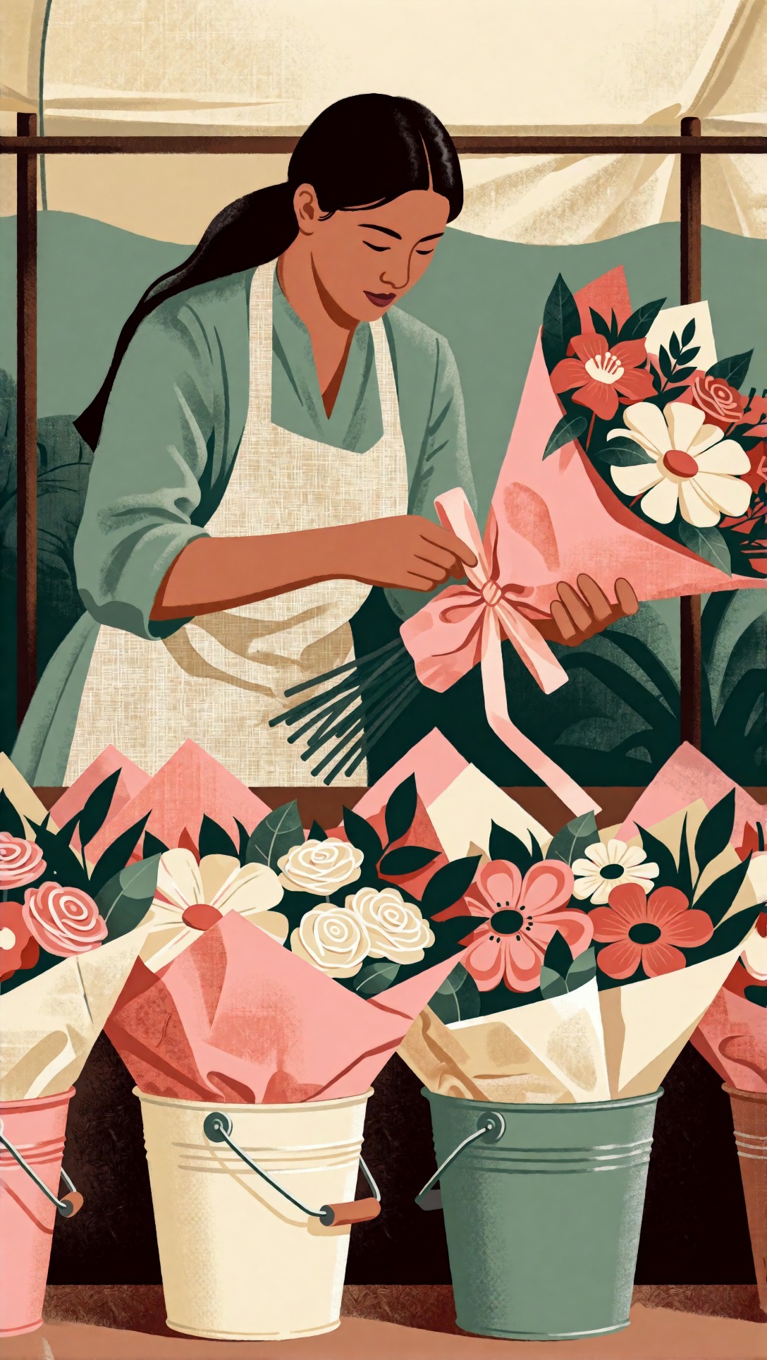
Inspect whether the flowers form readable clusters and whether the hands remain clear while tying ribbon. In this test, illustration models did well with palette harmony and shape grouping, but some lost precision in small botanical details when the prompt got too dense.
The next one tests poster-like composition and whether the model can hold a stylized environment without flattening everything into one plane.
Topic: coastal travel poster with illustrated figure
Genre: cinematic travel
Camera: Leica SL2-S
Lens: 35mm f/2
Lighting: bright noon sun with sea haze
Location: Mediterranean cliff town overlooking a turquoise harbor
Style: vintage-modern travel illustration
Final Prompt: travel illustration of a woman standing on a sunlit terrace above a Mediterranean harbor, wide straw hat, cream shirt dress, leather sandals, hand resting on a whitewashed wall, turquoise water below, fishing boats, terracotta roofs, bougainvillea spilling over stone steps, vintage-modern travel illustration style, simplified but elegant forms, poster-like composition, restrained grain, high color separation, warm cream and cobalt palette, airy atmosphere, readable figure silhouette, balanced foreground and background depth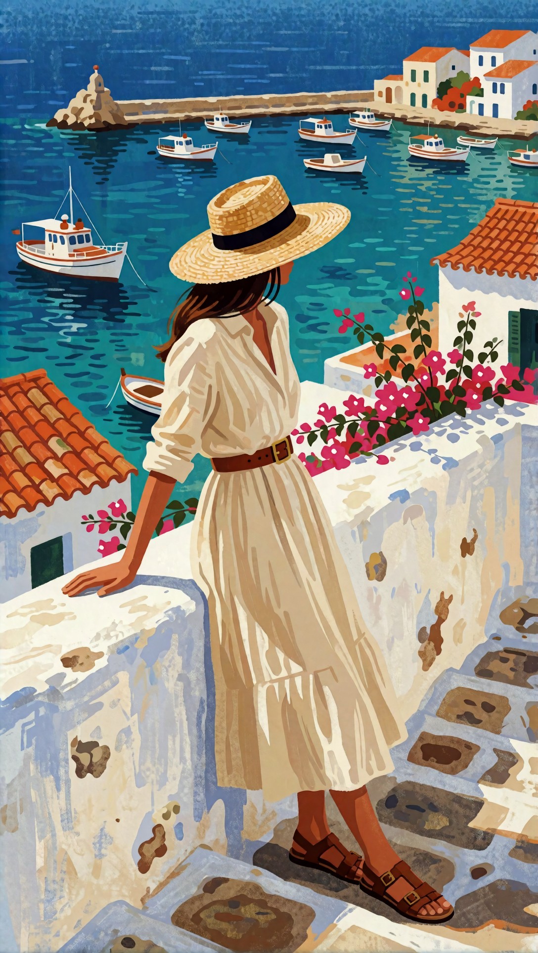
Check whether the harbor layers remain distinct and whether the figure still feels integrated into the environment. The strongest result from illustration models kept the travel-poster feel without collapsing into clip-art flatness.
Where illustration models fit best
- Editorial artwork
- Book cover concepts
- Ad-like visuals that need stylization without anime coding
- Story scenes where palette and composition matter more than realism
The weak point
When this setup fails, it usually fails by becoming too decorative. You get attractive color, but weak anatomy, vague hands, and soft object boundaries that make the image less usable for production.
Step 4: Run a cross-style prompt to expose model drift
A useful comparison trick is to ask each model family for the same subject with a different style target. This exposes how stubborn the model really is. In this test, hybrid prompts were where the differences became obvious fastest.
This prompt checks whether a realistic or illustration model can preserve fashion styling while shifting into a graphic image language.
Topic: fashion boutique window scene in illustrated-commercial style
Genre: fashion editorial
Camera: Nikon Z8
Lens: 85mm f/1.8
Lighting: studio butterfly light mixed with storefront ambient glow
Location: luxury boutique window display on a quiet evening street
Style: elegant commercial illustration
Final Prompt: elegant commercial illustration of a fashion editor adjusting a mannequin in a luxury boutique window display, tailored black blazer, ivory silk blouse, wide-leg trousers, polished loafers, glass reflections framing the scene, curated accessories on plinths, warm storefront ambient glow mixed with a soft butterfly-style key light, confident posture, selective detail on garments and accessories, chic monochrome palette with gold accents, refined editorial composition, believable retail depth, stylized but controlled anatomy, premium magazine art direction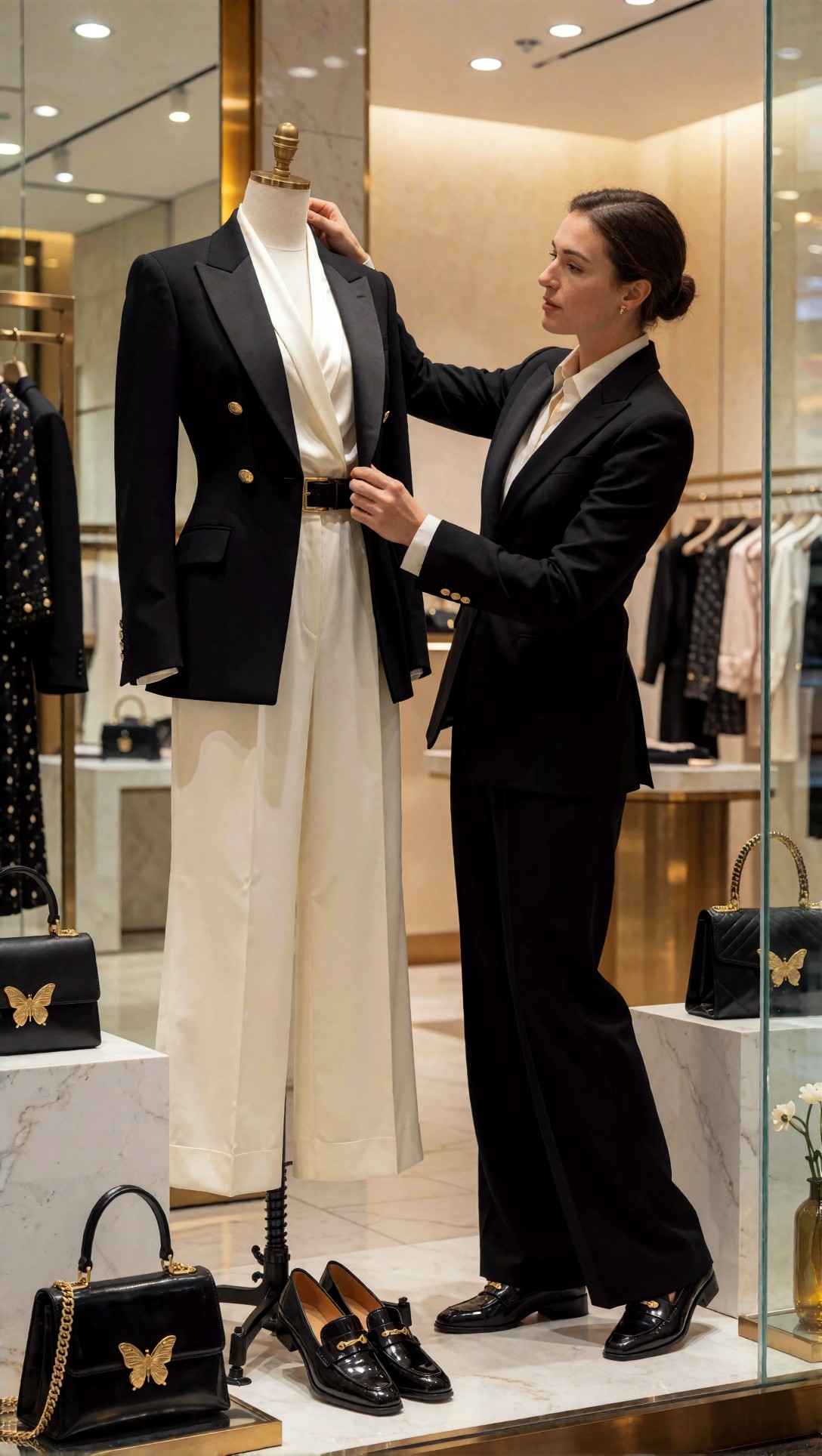
Inspect accessory clarity, mannequin geometry, and reflection control. In this test, illustration-friendly models handled the scene most gracefully. Photoreal models often made the mannequin too human-like, while anime models exaggerated the proportions and weakened the boutique realism.
The next hybrid prompt checks the opposite direction: whether a stylized model can handle realism-adjacent product clarity.
Topic: premium watch product hero with human hand interaction
Genre: luxury campaign
Camera: Phase One XF IQ4
Lens: 120mm macro f/4
Lighting: narrow strip softboxes with controlled specular highlights
Location: dark stone tabletop studio set with minimal reflective props
Style: high-end beauty advertising
Final Prompt: luxury campaign image of a premium steel wristwatch being placed on a dark stone tabletop by a carefully posed hand, controlled specular highlights across the bezel, deep charcoal and silver palette, minimal reflective props, crisp dial markings, visible brushed metal texture, elegant macro composition, Phase One XF IQ4 look, 120mm macro precision, high-end beauty advertising style, premium studio restraint, clean negative space, realistic hand anatomy, subtle shadow falloff, sharp product edges without harsh clipping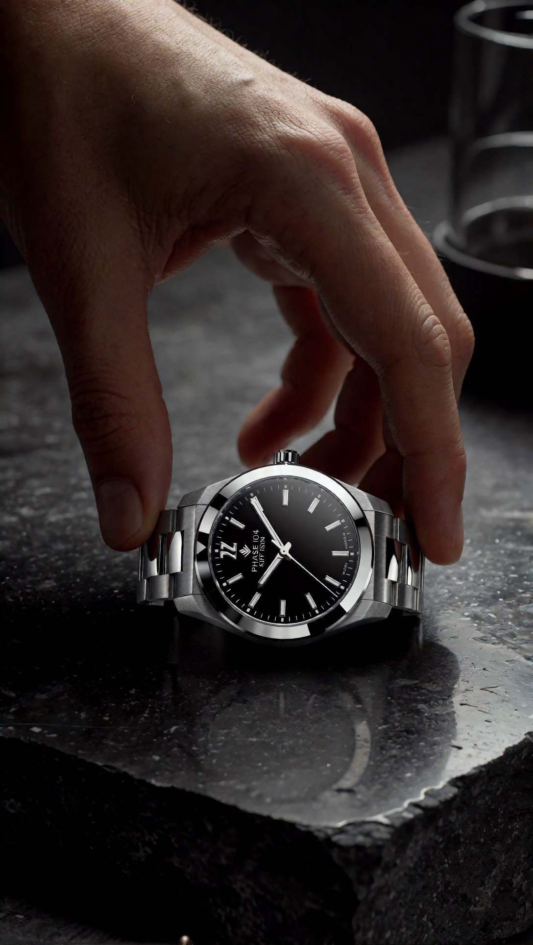
Look closely at finger anatomy, dial readability, and reflection discipline. The strongest result came from photoreal models. Anime and illustration models could make this image attractive, but not reliably commercial-grade.
Step 5: Compare portrait behavior across all three style families
Portraits reveal style strengths quickly because the human eye notices errors fast. I used one portrait concept in three directions: realistic magazine cover, anime character visual, and illustrated cover art. Below are the anime and illustration style tests that most clearly showed model behavior.
This anime portrait prompt checks face stability and whether the model can keep a polished key-art look without adding random fantasy clutter.
Topic: pop idol close-up anime portrait
Genre: beauty campaign
Camera: animated promotional still
Lens: 85mm equivalent f/1.4
Lighting: soft frontal glow with pink neon rim light
Location: minimal concert backstage set with blurred light panels
Style: polished idol anime cover
Final Prompt: close-up anime portrait of a pop idol looking into camera, glossy black hair with soft movement, crystal earring, satin stage jacket with subtle embroidery, calm confident expression, soft frontal glow on the face, pink neon rim light from behind, minimal backstage light panels blurred into graphic shapes, polished idol anime cover style, clean linework, luminous eyes, elegant skin shading, controlled highlights, balanced composition, premium poster finish, restrained palette of black, rose, and silver
Inspect eye symmetry, earring rendering, and whether the satin jacket reads as fabric instead of metallic plastic. In this test, anime-tuned models were the only ones that kept the face fully in-style without drifting toward doll-like realism.
This illustration portrait prompt is meant to test editorial personality and brush economy rather than photoreal beauty.
Topic: magazine-cover portrait in painterly editorial style
Genre: beauty campaign
Camera: Fujifilm GFX100 II
Lens: 110mm f/2
Lighting: soft north-window light
Location: quiet studio with textured paper backdrop in muted ochre
Style: painterly editorial portrait
Final Prompt: painterly editorial portrait of a woman seated against a muted ochre paper backdrop, sculptural white blouse with gathered sleeves, direct thoughtful expression, hair tied back with a few loose strands, soft north-window light across the face, visible brush-informed texture in the rendering, selective detail around eyes and lips, simplified but elegant garment folds, refined color transitions, magazine-cover composition, warm ochre, ivory, and chestnut palette, artistic restraint, sophisticated illustration finish with believable anatomy
Check whether the face remains expressive without becoming blurry, and whether the blouse keeps enough structural detail to feel designed. The best illustration models delivered a strong cover image here, but weaker ones softened the eyes too much and lost edge definition.
Quality-control checklist after generation
Once I had batches from each style family, I judged them with the same checklist. This is the part many style comparisons skip, and it is where weak outputs stop looking "pretty enough" and start looking unreliable.
Output review checklist
- Style lock: does the image fully commit to realistic, anime, or illustration language?
- Anatomy: hands, elbows, leg length, neck transitions, finger count
- Material clarity: skin, metal, glass, hair, cotton, satin, paper, foliage
- Background logic: is the scene coherent or assembled from unrelated fragments?
- Composition: subject placement, negative space, horizon behavior, prop balance
- Face stability: symmetrical eyes, believable mouth, expression matching the brief
- Texture discipline: enough detail to feel intentional, not so much that it becomes noisy
- Prompt obedience: did the key wardrobe, mood, and location survive?
In this test, style lock was the main separator. A technically clean image was still a weak result if it drifted away from the requested visual language.
Troubleshooting weak outputs
When a model underperformed, the fix was rarely "add more adjectives." Usually the better move was to remove conflicting instructions and strengthen the style system.
If realistic images look synthetic
- Reduce glamor words like "perfect skin" and "ultra-detailed beauty"
- Add practical anchors: window light, lens choice, garment material, natural skin texture
- Simplify crowded backgrounds
- Avoid mixing too many cinematic cues with product-level detail asks
If anime outputs drift toward semi-real game art
- Remove brand-camera language unless it supports framing only
- Use anime-native terms like cel shading, linework, key visual, silhouette, graphic lighting
- Limit material microdetail requests
- Keep the color palette and mood explicit
If illustration outputs become vague
- Ask for shape hierarchy and edge behavior
- Specify a palette with 3 to 5 core colors
- Add one clear compositional instruction, such as poster-like framing or layered foreground-background depth
- Reduce prop count so the model can spend detail where it matters
What I would change next when a prompt misses
In this test, the most effective revision pattern was:
1. keep the subject the same 2. cut 20 to 30 percent of descriptive clutter 3. strengthen the style phrase 4. restate one or two visual priorities such as clean hands, cel shading, or realistic fabric texture
That produced better second-pass generations than simply making the prompt longer.
Best use case for each model type
Choose photoreal models if you need
- realistic portraits
- luxury product shots
- fashion editorials
- ad creatives where material truth matters
These models are the best AI image generator for realistic images when your goal is believable light and surface response. Their weak point is that they can resist stylization unless they are explicitly hybrid-trained.
Choose anime-tuned models if you need
- character key visuals
- stylized posters
- VTuber branding
- clean cel-shaded scenes
These are the best AI image generator for anime tasks when style lock matters more than real-world optics. They usually need less prompting to look correct.
Choose illustration-oriented models if you need
- book cover concepts
- editorial spot art
- travel poster aesthetics
- stylized campaign comps
These are the most forgiving when you want art direction and mood without committing to pure anime or strict realism.
Practical recommendation: the workflow I would actually use
If I were building a production workflow around AI image generator styles, I would not force one model to do everything.
The setup that works best
- Use a photoreal model for concept validation of lighting, wardrobe, products, and scene realism
- Switch to an anime model only when the final deliverable truly needs anime grammar
- Use an illustration model for editorial campaigns, covers, or poster-friendly scenes where stylization is part of the brief
For mixed teams, this division is more efficient than trying to tune one prompt endlessly across incompatible model behavior.
Final recommendation
After this comparison, my editorial view is simple: the best workflow for AI image generator styles is to match the model family to the image language first, then refine prompt detail second.
If you need believable people, product surfaces, or fashion materials, use a photoreal model and keep the prompt grounded in lighting, lensing, and texture. If you need line-stable characters and clean cel shading, use an anime-tuned model and avoid overloading it with camera realism. If you need flexible art direction for covers, campaigns, or poster-like scenes, illustration models are often the most cooperative.
Who should use this workflow: creators comparing tools, marketers building mixed visual campaigns, prompt operators trying to reduce wasted generations, and anyone running a text to image style test across multiple deliverables.
Who should avoid it: users who want one-click consistency across every style category from one model alone. In this test, that expectation caused more frustration than bad prompting.
The setting or prompt detail that mattered most was style lock language. Not just naming the style, but describing how that style should behave: cel shading versus skin texture, poster composition versus lens realism, graphic palette versus optical depth. That one change produced the clearest difference in output quality across every model group.