AI Image Generator for Website Hero Images: Tested Prompt Recipes for Cleaner Above-the-Fold Visuals 한국어 요약
이 페이지는 ZView Space의 영어 원문을 한국어 검색 사용자도 이해할 수 있도록 정리한 SEO 요약입니다. 핵심은 단순한 얼굴 중심 이미지가 아니라 패션 에디토리얼, 룩북, 아웃핏, 프롬프트 테스트, 이미지 생성 워크플로우를 실제로 어떻게 구성할지입니다.
핵심 요약
- 원문 주제: AI Image Generator for Website Hero Images: Tested Prompt Recipes for Cleaner Above-the-Fold Visuals
- 목적: AI 이미지 생성에서 outfit, silhouette, fabric, pose, location, camera framing을 더 명확하게 설계합니다.
- 활용 범위: Z-Image Turbo, Krea2 Turbo, Qwen Image, Anima, SeedVR2 같은 이미지 생성 및 업스케일 워크플로우에 적용할 수 있습니다.
- SEO 관점: 제목, 설명, 이미지 alt, 프롬프트 예시가 실제 검색 의도와 맞아야 색인 가능성이 높아집니다.
한국어 사용자를 위한 체크포인트
1. 프롬프트가 얼굴 묘사에만 머물지 않고 전체 스타일과 의상 구성을 설명하는지 확인합니다. 2. 패션 이미지라면 상의, 하의, 아우터, 신발, 액세서리, 소재감, 촬영 장소를 분리해서 씁니다. 3. 생성 결과는 바로 게시하지 말고 디테일, 손, 의상 형태, 배경 일관성, 이미지 품질을 비교합니다. 4. 글 본문에는 실제 테스트 기준과 실패를 줄이는 방법이 들어가야 검색엔진에서 얇은 콘텐츠로 보일 가능성이 줄어듭니다.
원문 미리보기
I spent this test session generating website headers for SaaS, fintech, creative studio, and ecommerce landing pages with one goal: find prompt patterns that produce cleaner hero visuals without the usual AI clutter. If you are looking for an AI image generato
---
I spent this test session generating website headers for SaaS, fintech, creative studio, and ecommerce landing pages with one goal: find prompt patterns that produce cleaner hero visuals without the usual AI clutter. If you are looking for an AI image generator for website hero images, this is a practical operator report on what actually improved above-the-fold results, what kept breaking, and which prompt ingredients made the difference.
In this run, the best images were not the most artistic ones. The strongest result was the image that left room for headline text, kept edge detail simple, preserved one clear focal subject, and avoided fake interface fragments. That sounds obvious, but many models still drift toward busy center-weighted compositions unless the prompt actively prevents it.
What to know first
- Hero images need negative space more than detail density. In this test, prompts that specified text-safe composition performed better than prompts that only specified style.
- Models were more reliable when the prompt named a single business scenario instead of broad terms like "modern technology background".
- Wide aspect ratios exposed more defects near the edges, especially duplicate objects, warped architecture, and awkward hand crops.
- If the image must support a strong headline, ask for asymmetrical layout and clean tonal separation between subject and background.
- For fast iterations, I would start in [PromptLab](/promptlab), compare variants in [Gallery](/gallery), then upscale only the final shortlist in [Upscaler](/upscaler).
Test setup
I tested hero image prompts across several common landing-page use cases:
- SaaS product landing page
- Fintech website banner
- Creative agency homepage
- Ecommerce brand header
- AI tool landing page
What I evaluated in each generation:
- headline-safe empty space
- edge cleanliness in wide crops
- subject clarity at first glance
- realism of materials and lighting
- whether the scene looked like a web hero instead of a poster
- how much correction was needed before export
I also kept the inspection standard simple: if I had to crop aggressively, paint out distractions, or rebuild the frame in a design tool, the prompt was considered weak for production.
What looked good immediately in this AI hero image generator test
Three things translated well across models.
First, environment-led scenes worked better than abstract concept art for most commercial websites. A soft office interior, product desk scene, or architectural workspace gave the hero image a believable base and reduced visual noise.
Second, one focal object or one subject was more stable than multi-subject business scenes. Two or three people in a wide hero often triggered hand errors, eye-line confusion, and awkward overlapping limbs.
Third, controlled palettes were easier to place under navigation bars and CTA buttons. Blue-gray, off-white, slate, warm sand, and muted green all held up better than saturated neon blends.
Where the outputs needed correction
The weak point was not raw image quality. It was layout behavior.
Most failures came from one of these issues:
| Issue in generated hero | What it looked like in testing | Prompt fix that helped | |---|---|---| | Busy center composition | subject blocked headline zone | specify left or right weighted framing with negative space | | Fake UI fragments | random dashboards, unreadable charts | ask for no visible text, no interface overlays, no floating widgets | | Edge distortion in wide crops | bent desks, stretched windows, duplicate objects | mention panoramic composition with clean architectural lines | | Over-dramatic lighting | moody shadows hurt readability | request soft commercial lighting and tonal consistency | | Concept overload | too many symbols for "AI" or "innovation" | replace abstract buzzwords with a concrete product scenario | | Human anatomy drift | hands and fingers broke in wide shots | use back-facing pose, profile pose, or object-led scene |
That table was the main pattern from the session: hero image prompting is less about making prettier pictures and more about preventing layout-hostile decisions.
The prompt ingredients that changed the result
These were the exact ingredients that repeatedly improved outputs for an AI image generator for web design use cases.
1. Declare the text-safe zone
Phrases like "negative space for headline on left third" or "clean empty area for website copy" changed composition faster than aesthetic terms did.
2. Use a real scene, not an abstract noun
"Fintech team meeting space with glass walls" outperformed "future finance innovation concept". Concrete scenes gave the model less room to invent nonsense.
3. Lock the visual hierarchy
I had better results when the prompt said exactly what should read first, second, and third: subject, environment, accent object.
4. Keep materials and lighting commercial
For website banners, soft daylight, overcast diffusion, or studio commercial light produced more usable assets than cinematic extremes.
5. Ask for horizontal discipline
If the image is for a header, say so. Terms like "website hero composition", "wide landing page banner", and "panoramic crop" reduced portrait-like framing errors.
6. Remove accidental text generation
When the model wanted to invent signs, dashboards, labels, or UI, adding "no readable text, no letters, no interface mockup" helped.
Prompt examples and inspection notes
Below are the prompt recipes that produced the cleanest or most instructive results. Each one is built to test a different hero-image problem.
Test 1: SaaS landing page with left-side copy space
This test checks whether the model can keep a clear product-adjacent scene while reserving room for a headline. It is the first prompt I would try for a general AI hero image generator workflow.
Topic: SaaS analytics workspace hero image
Genre: Product Editorial
Camera: Sony A7R V
Lens: 35mm f/2
Lighting: soft window light with subtle fill bounce
Location: modern minimalist office with large desk, glass wall, and distant city view
Style: clean commercial look
Final Prompt: wide website hero image for a SaaS analytics landing page, modern minimalist office interior, slim laptop on desk showing only abstract glow and no readable interface, one ceramic mug, one notebook, clean left third negative space for headline and CTA, focal area on right side, soft window light with subtle fill bounce, restrained blue gray and off white palette, premium materials, tidy architectural lines, realistic reflections, commercial web design composition, Sony A7R V look, 35mm f/2 perspective, panoramic crop, no readable text, no extra screens, no clutter, calm professional atmosphere, high detail but visually simple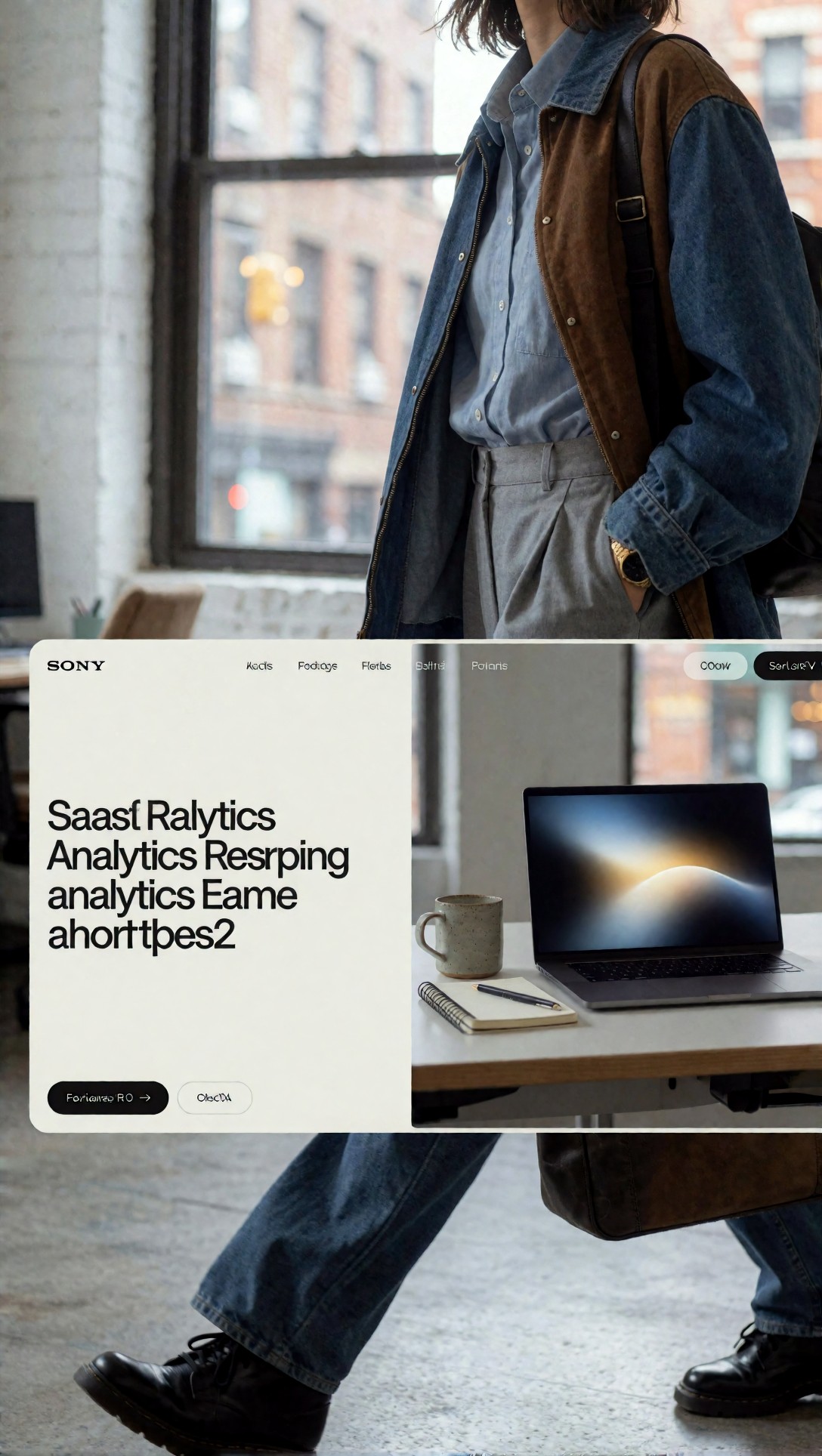
Inspect whether the left third stays truly usable after cropping. The strongest outputs in this style kept the desk line clean and did not insert random devices in the empty space.
Test 2: Fintech website banner with trust-first tone
This test is for websites that need credibility rather than spectacle. I used it to reduce the usual crypto-style glow overload.
Topic: fintech trust-focused website banner
Genre: Corporate Lifestyle
Camera: Canon EOS R5
Lens: 50mm f/2.8
Lighting: overcast daylight diffusion
Location: bright financial district office lounge with stone, glass, and brushed metal accents
Style: restrained premium corporate branding
Final Prompt: wide fintech website hero image, calm executive workspace lounge in a financial district office, one professional figure in profile reviewing printed charts on a table, face partially turned away to reduce portrait emphasis, right-side subject placement, large clean negative space on the left for website headline, overcast daylight diffusion, palette of navy, silver, white, and muted teal, realistic glass and metal textures, no dramatic neon, no floating charts, no readable text, no extra people, trustworthy modern atmosphere, landing page banner composition, Canon EOS R5 realism, 50mm f/2.8, crisp but soft commercial finish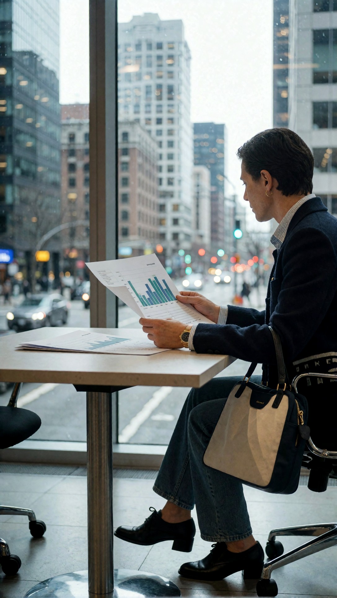
Check the mood first: does it feel stable and expensive, or generic and stock-like? In this test, profile poses were safer than front-facing business portraits because they reduced expression weirdness and helped preserve layout.
What failed most often with website banner AI image prompts
The most common failure was asking the model to visualize a business category instead of a scene. Terms like "innovation", "growth", and "digital transformation" often produced floating shapes, holograms, and fake interface panels that looked busy above the fold.
The cleaner workflow was to start from:
- a place
- one subject or one object
- one mood
- one reserved text area
Then layer style direction after that.
Test 3: Creative agency header with visual energy but controlled clutter
This test checks whether a brand can look creative without turning the hero into a collage. The target is a website header, not a poster.
Topic: creative agency studio homepage hero
Genre: Design Editorial
Camera: Fujifilm GFX100S
Lens: 45mm f/2.8
Lighting: softbox key light mixed with natural daylight
Location: contemporary creative studio with pinboard wall, material samples, and clean worktable
Style: art-directed editorial commercial hybrid
Final Prompt: website header image for a creative agency, contemporary studio interior with material swatches, sketchbooks, color chips, and one standing designer adjusting prints on a board, asymmetrical composition with clear negative space on the right for copy, energetic but organized environment, palette of warm white, charcoal, terracotta, and muted cobalt, crisp textures on paper and wood, softbox key light mixed with daylight for clean contrast, no messy piles, no readable text on walls, no duplicated objects, wide panoramic frame for landing page hero, Fujifilm GFX100S medium format detail, 45mm f/2.8, polished editorial realism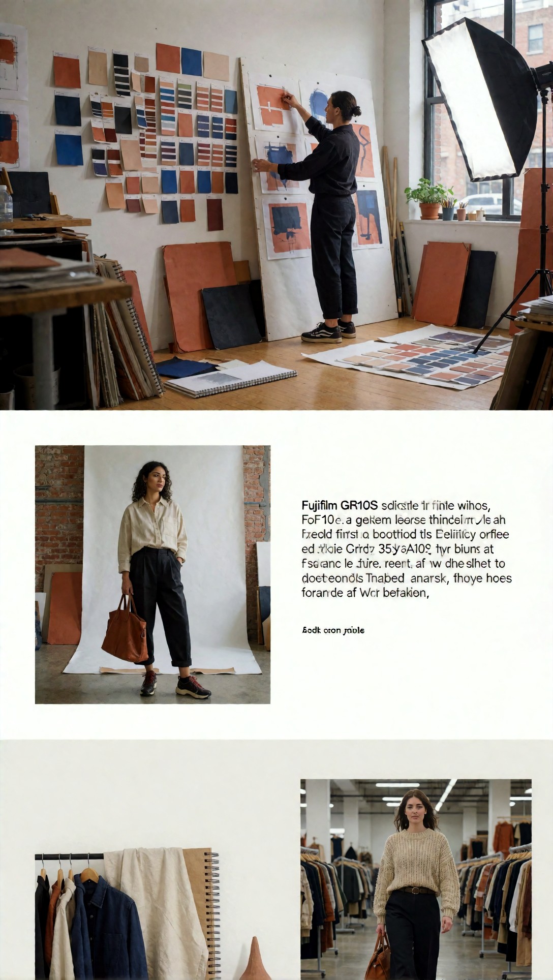
Inspect the pinboard and props closely. This is where models tend to add unreadable text blocks or duplicate tools; the good result keeps the studio feeling active without becoming visually noisy.
Test 4: Ecommerce brand hero with product-first composition
This test is meant to check product clarity and whether the background supports, rather than competes with, the main item.
Topic: ecommerce skincare brand hero visual
Genre: Product Editorial
Camera: Nikon Z8
Lens: 85mm f/3.2
Lighting: studio softbox with gentle top fill and reflected bounce
Location: matte stone pedestal setup in a warm neutral studio with subtle architectural backdrop
Style: clean luxury campaign
Final Prompt: wide ecommerce website hero image for a premium skincare brand, one hero bottle and one secondary jar on matte stone pedestals, placed on left side with generous clean empty space on the right for headline and button, warm beige, bone, and soft olive palette, elegant shadow transitions, premium packaging with no readable labels, subtle texture in plaster wall background, luxury campaign styling, Nikon Z8 clarity, 85mm f/3.2 depth compression, studio softbox with top fill, crisp edges, refined reflections, web banner composition, no extra props, no flowers, no water splash, no clutter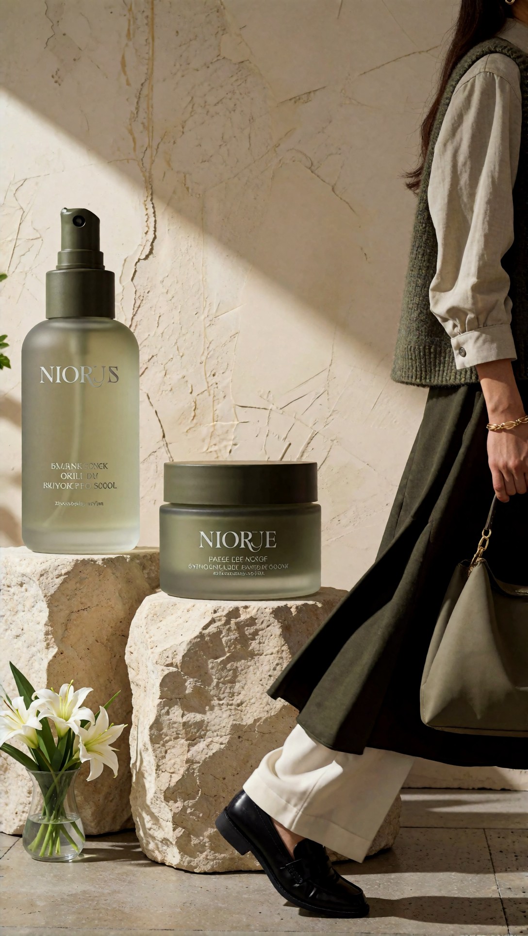
Check whether the product silhouette reads instantly at thumbnail size. The weak versions added decorative props that made the hero look like an ad spread instead of a clean landing-page header.
Checklist: what makes the best AI visuals for landing pages usable
Before keeping a generated hero, I use this checklist:
- Is there a clear text-safe area without high-contrast distractions?
- Does the focal subject still read after a wide crop?
- Are there any accidental letters, symbols, or fake dashboards?
- Do the edges stay clean, or do they collapse into duplicates and warped geometry?
- Is the palette compatible with white or dark navigation text?
- Would I need heavy retouching before placing this in a real layout?
If three or more of those fail, I regenerate instead of trying to rescue the image.
Test 5: AI tool landing page without cliché holograms
This test targets the hardest category in the set. AI product pages often drift into generic neon heads, floating nodes, and sci-fi clutter.
Topic: AI productivity tool website hero
Genre: Conceptual Product Lifestyle
Camera: Leica SL2-S
Lens: 28mm f/2
Lighting: cool daylight with soft practical lamp glow
Location: quiet modern desk setup in a dark-light balanced home office at early morning
Style: cinematic realism for commercial tech branding
Final Prompt: wide landing page hero for an AI productivity tool, modern desk scene with one open notebook, slim keyboard, soft monitor glow visible only as abstract light, no visible UI details, one seated figure seen from behind in relaxed posture, clean negative space in upper left for headline, balanced composition with subtle depth, cool gray, muted blue, and warm amber accents, cinematic realism but restrained, realistic material surfaces, no floating holograms, no robots, no code rain, no readable text, Leica SL2-S look, 28mm f/2, early morning atmosphere, web design friendly composition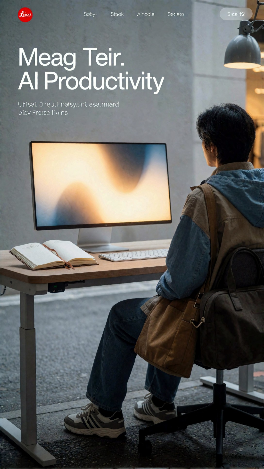
Inspect whether the image communicates "AI tool" through mood and context rather than symbols. In this test, back-facing figures were much more reliable than front-facing operators at screens.
Test 6: Abstract fallback for text-to-image website header use
Sometimes a brand wants no people and no products. This test checks the safest abstract route I found for a text to image website header.
Topic: abstract geometric website header background
Genre: Minimal Abstract Editorial
Camera: cinematic digital capture
Lens: virtual 40mm f/4 look
Lighting: soft gradient illumination with edge glow
Location: abstract architectural space with layered translucent panels
Style: clean futuristic commercial branding
Final Prompt: wide website header background with layered translucent architectural panels, soft depth, gentle curved geometry, strong negative space across the center-left for headline placement, elegant gradients in pearl white, mist blue, pale graphite, and soft cyan, subtle glass textures, clean commercial abstraction, no symbols, no numbers, no text, no obvious 3D software artifacts, smooth tonal transitions, panoramic landing page composition, minimal futuristic branding, restrained depth and crisp edges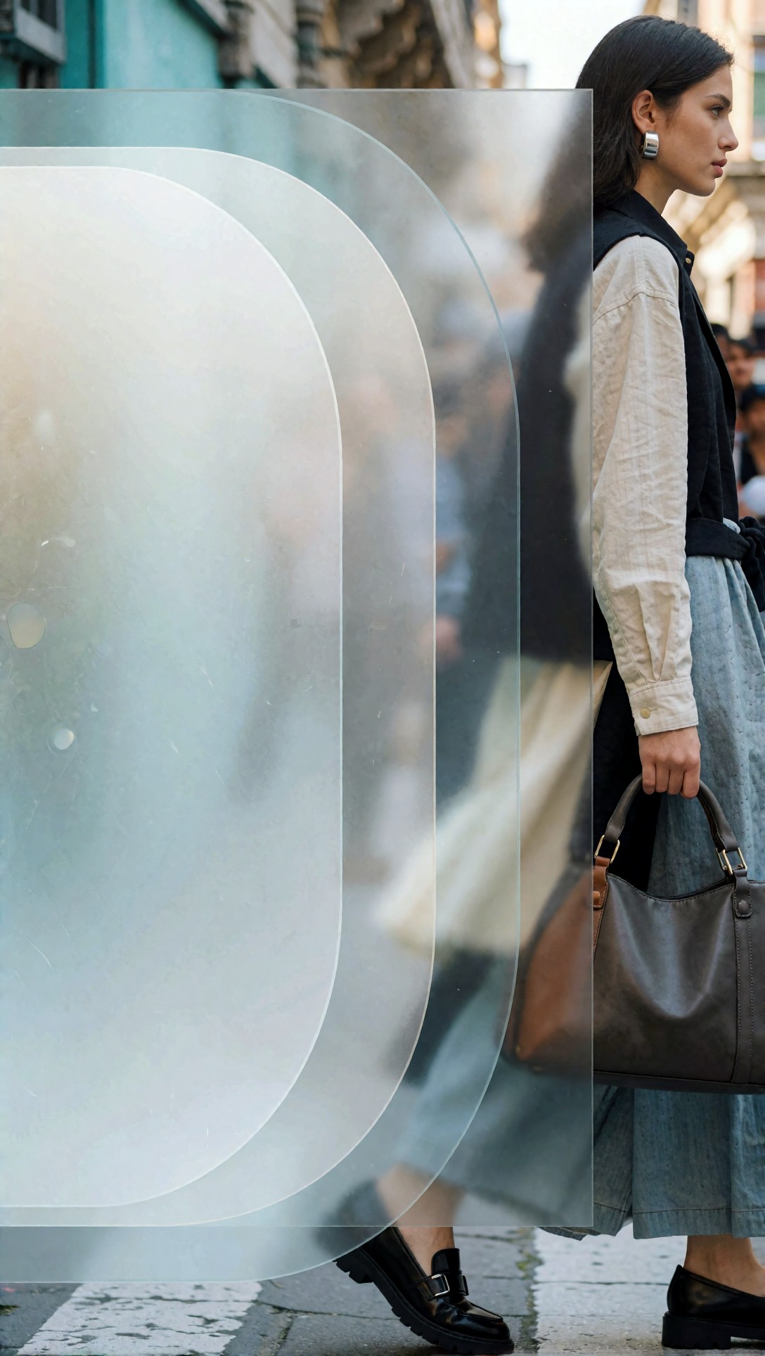
Look for banding, muddy gradients, and overcomplicated shapes. This setup worked when the site needed atmosphere without introducing anatomy risk, but it failed if the generator pushed too much contrast into the center.
When to switch models or settings
Not every failure is a prompt problem. In this test, some issues were model-specific.
Switch models when:
- the same prompt keeps generating fake UI text
- panoramic crops repeatedly break architecture
- skin texture turns waxy under soft commercial lighting
- product geometry changes too much between attempts
Change settings when:
- composition is good but detail is weak: raise resolution or upscale late in the workflow
- style drift is high: reduce prompt complexity and remove competing aesthetic phrases
- image is too dramatic for web use: lower contrast in prompt wording and remove cinematic extremes
- empty space keeps filling up: explicitly say "clean negative space, no objects in copy area"
For iteration, I would generate broad variants in [Create](/create), keep the composition winner, then run final enlargements through [Upscaler](/upscaler). If I needed to reverse-engineer a good visual style from an existing hero, I would test it through [Tools](/tools) before rebuilding the prompt.
Test 7: B2B services hero with architectural structure
This test checks whether architecture can carry authority better than people for service businesses.
Topic: B2B consulting website hero image
Genre: Architectural Commercial
Camera: Sony A1
Lens: 24mm f/4
Lighting: bright overcast exterior light
Location: modern office building atrium with stone floor, glass walls, and repeating vertical lines
Style: precise premium business minimalism
Final Prompt: wide B2B consulting website hero, modern office atrium interior with strong architectural rhythm, one small human figure walking at far right for scale, vast clean negative space on left half for headline and subcopy, bright overcast lighting for even exposure, stone, glass, and brushed aluminum textures, palette of white, slate, and muted blue, no signage, no readable text, no crowd, no dramatic reflections, polished but understated business tone, Sony A1 realism, 24mm f/4 wide composition, above-the-fold landing page framing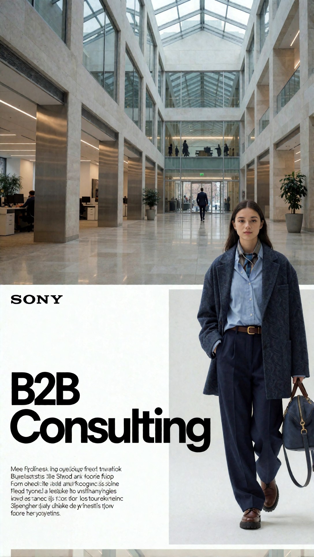
Inspect the vertical lines and horizon alignment. Architectural prompts were excellent for trust-heavy businesses, but only when the model kept the geometry straight and the reflections controlled.
Test 8: Lifestyle homepage hero for a modern DTC brand
This final test checks warmth and human presence without the usual multi-person errors. It is useful for brands that need a softer homepage than pure product shots.
Topic: direct-to-consumer brand lifestyle homepage hero
Genre: Lifestyle Portrait
Camera: Canon EOS R3
Lens: 50mm f/1.8
Lighting: late afternoon window light with soft curtain diffusion
Location: airy apartment living room with natural wood, linen sofa, and minimal decor
Style: warm clean commercial lifestyle
Final Prompt: wide homepage hero image for a modern direct-to-consumer brand, one person seated casually on a linen sofa holding a simple ceramic cup, relaxed expression, body placed on the left side with open negative space on the right for copy, airy apartment interior, late afternoon window light through sheer curtains, warm beige, oak, soft gray, and muted sage palette, realistic textile texture, calm lived-in atmosphere, no extra people, no pets, no wall art text, no cluttered shelves, Canon EOS R3 realism, 50mm f/1.8 softness with clear subject separation, web banner composition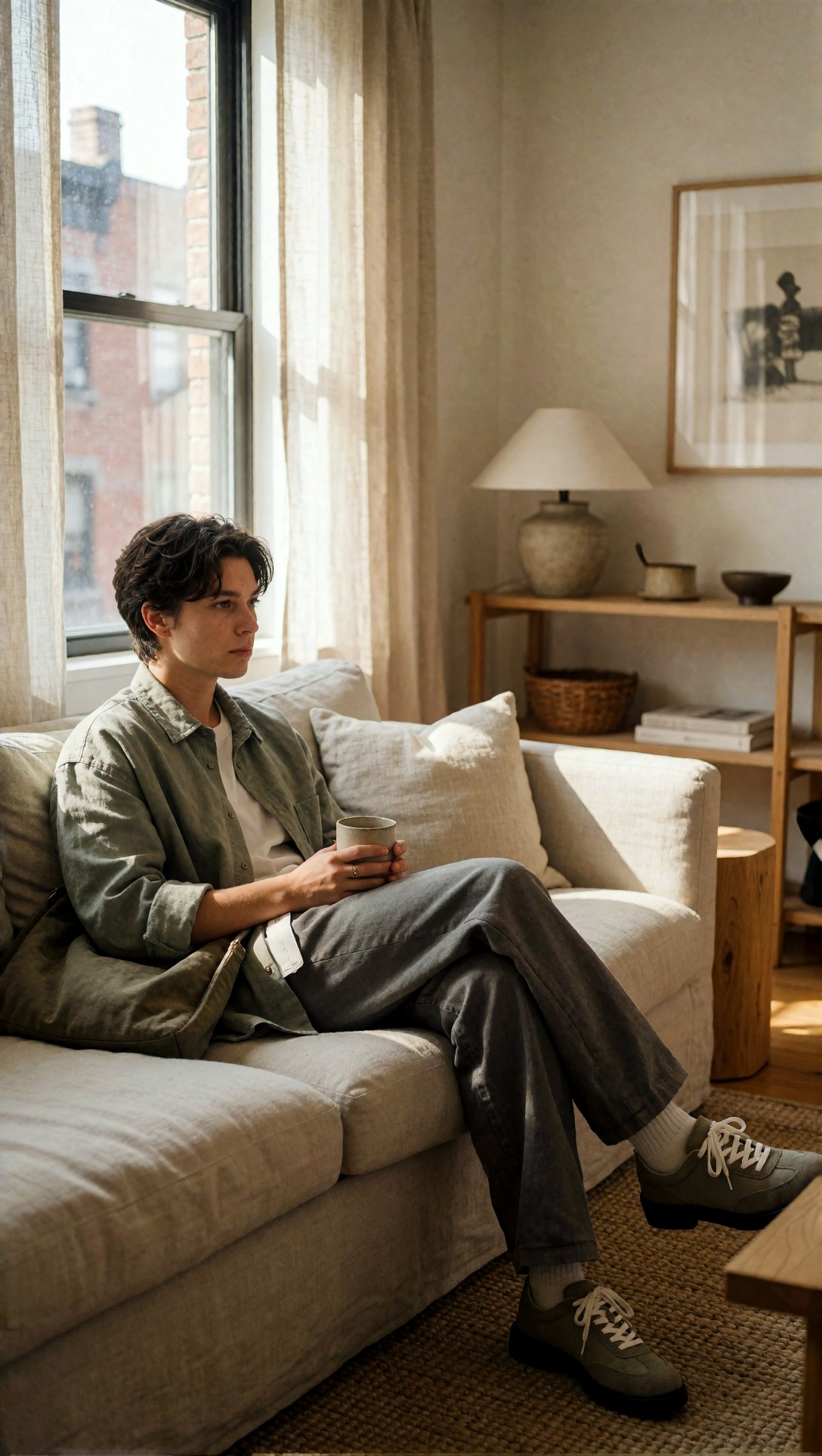
Check whether the room still feels designed after cropping for desktop and mobile. The best outputs kept textiles believable and did not overfill the background with decorative objects.
What I would change next after this test run
If I repeated the session, I would split prompts into two lanes.
Lane one: object-led and architecture-led heroes for B2B, SaaS, and fintech.
Lane two: single-person lifestyle heroes for consumer brands.
I would avoid mixed scenes unless the page truly needed them. The quality drop from one subject to multiple interacting subjects was still noticeable in wide header crops.
I would also spend more time testing negative prompts around typography artifacts. Even good models still like to invent tiny label-like elements in the background.
Practical recommendation: which setup is best for which site
Best for SaaS and AI tools
Use desk scenes, architecture, or back-facing operator setups. Keep the message in the layout, not in the image.
Best for fintech and consulting
Use restrained office or atrium imagery with straight lines, overcast or soft daylight, and low-saturation palettes.
Best for ecommerce and DTC
Use one hero product or one person, never both unless the frame is simple. Product-first compositions were easier to deploy than story-heavy scenes.
Best for creative agencies
Use controlled studio energy: visible materials, one active gesture, and no random text-like details.
FAQ
What is the best AI image generator for website hero images?
The best option is the one that preserves composition in wide crops and follows text-safe instructions reliably. In this test, prompt discipline mattered almost as much as model choice. For hero work, layout obedience is more important than flashy style.
How do I prompt an AI hero image generator for cleaner landing pages?
Start with a specific scene, state the copy-safe area, define subject placement, ask for a wide website hero composition, and remove readable text or interface overlays. That combination produced cleaner results than style-only prompting.
Should website banner AI image prompts include people?
Only if a single person can carry the scene. One subject worked well; multiple people increased hand, pose, and overlap errors in above-the-fold crops.
Are abstract visuals good for landing page headers?
Yes, but only when the brand does not need product or human context. Abstract headers can be clean and flexible, though they often need extra control to prevent muddy gradients or center-heavy clutter.
What matters more: model choice or prompt recipe?
For hero images, the prompt recipe is usually the first lever. If the model keeps failing after you clearly specify negative space, wide composition, and no text artifacts, then switch models.
Closing note
For anyone searching for an AI image generator for website hero images, the most reliable workflow is not "write a beautiful prompt". It is: define the layout need, simplify the scene, reserve copy space, and inspect the crop like a designer.
Who should use this workflow: teams building landing pages, marketers needing fast hero variants, and designers who want a rough-but-usable visual starting point. Who should avoid it: brands that need exact packaging fidelity, exact UI storytelling, or multi-person narrative scenes without retouching.
The setting and prompt detail that mattered most in this test was simple: explicit negative space for copy. Once that was in the prompt, the rest of the image had a much better chance of behaving like a website hero instead of a generic AI poster.