AI Upscaler for Product Packaging: Make Labels, Edges, and Reflections Look Print-Ready 한국어 요약
이 페이지는 ZView Space의 영어 원문을 한국어 검색 사용자도 이해할 수 있도록 정리한 SEO 요약입니다. 핵심은 단순한 얼굴 중심 이미지가 아니라 패션 에디토리얼, 룩북, 아웃핏, 프롬프트 테스트, 이미지 생성 워크플로우를 실제로 어떻게 구성할지입니다.
핵심 요약
- 원문 주제: AI Upscaler for Product Packaging: Make Labels, Edges, and Reflections Look Print-Ready
- 목적: AI 이미지 생성에서 outfit, silhouette, fabric, pose, location, camera framing을 더 명확하게 설계합니다.
- 활용 범위: Z-Image Turbo, Krea2 Turbo, Qwen Image, Anima, SeedVR2 같은 이미지 생성 및 업스케일 워크플로우에 적용할 수 있습니다.
- SEO 관점: 제목, 설명, 이미지 alt, 프롬프트 예시가 실제 검색 의도와 맞아야 색인 가능성이 높아집니다.
한국어 사용자를 위한 체크포인트
1. 프롬프트가 얼굴 묘사에만 머물지 않고 전체 스타일과 의상 구성을 설명하는지 확인합니다. 2. 패션 이미지라면 상의, 하의, 아우터, 신발, 액세서리, 소재감, 촬영 장소를 분리해서 씁니다. 3. 생성 결과는 바로 게시하지 말고 디테일, 손, 의상 형태, 배경 일관성, 이미지 품질을 비교합니다. 4. 글 본문에는 실제 테스트 기준과 실패를 줄이는 방법이 들어가야 검색엔진에서 얇은 콘텐츠로 보일 가능성이 줄어듭니다.
원문 미리보기
Clear packaging visuals fail in predictable places: small label text softens, dieline edges look jagged, foil reflections break into mush, and transparent bottles lose separation from the background. An AI upscaler for product packaging can help, but only if i
---
Clear packaging visuals fail in predictable places: small label text softens, dieline edges look jagged, foil reflections break into mush, and transparent bottles lose separation from the background. An AI upscaler for product packaging can help, but only if it preserves design intent instead of inventing texture where precision matters.
This guide compares what upscalers do well for packaging work, where they still need manual correction, and how to prompt image models so labels, edges, and reflections survive enlargement with fewer artifacts. The focus is commercial investigation: what to test, which model behaviors matter, and how to decide whether an upscaler belongs in your packaging workflow.
What an AI upscaler for product packaging should actually improve
For packaging, “higher resolution” is not the main goal. The real goal is controlled detail recovery in areas that buyers and clients inspect closely.
The best packaging upscaler AI workflows improve:
- Label legibility for headlines, ingredient blocks, and micro typography
- Edge fidelity around boxes, pouches, tubes, and die-cut shapes
- Material separation between matte paper, gloss laminate, foil, plastic, and glass
- Reflection structure on bottles, jars, and metallic caps
- Print-preview realism for mockups shown in pitch decks, ecommerce previews, and launch materials
The weak workflows usually introduce:
- fake text strokes
- over-sharpened corners
- repeated texture patterns
- chrome and glass hallucinations
- noisy gradients in shadows and highlights
That distinction matters. A print ready product image upscaler is useful only when it makes the image look cleaner without changing the packaging design itself.
When to use an upscaler versus a regenerate pass
An upscaler is usually the right tool when:
- the composition is already approved
- the branding layout is mostly correct
- reflections look believable but slightly soft
- the image is intended for close digital viewing or presentation mockups
A regenerate or inpaint pass is often better when:
- text is unreadable or malformed
- the logo shape is wrong
- the bottle silhouette is inconsistent
- cap threading, seams, or folds are structurally broken
In practice, product teams often use both:
1. Generate the base packaging render or photo-real mockup 2. Inpaint obvious label or material errors 3. Upscale for detail and edge cleanup 4. Retouch critical text and brand marks manually
That hybrid approach is more reliable than expecting one model to solve every packaging issue.
Key evaluation criteria for packaging upscalers
If you are comparing tools, use the same close-up crops and evaluate them under the same conditions. These are the metrics that matter most.
1. Label detail retention
Check whether the model preserves:
- logo contours
- serif and sans-serif contrast
- spacing between small lines of type
- barcode-like linear detail
- thin border rules
For packaging mockups, this is often the first failure point.
Topic: Premium skincare bottle packaging close-up for label detail testing
Genre: Product Editorial
Camera: Canon EOS R5
Lens: 100mm f/2.8 Macro
Lighting: Studio softbox key light with controlled side fill
Location: Minimal white cyclorama tabletop studio
Style: Clean Commercial Look
Final Prompt: premium frosted glass skincare bottle with cream-colored label and fine black typography, tight macro close-up focused on label detail, elegant centered composition, subtle condensation-free surface, matte paper label texture, crisp serif logo, thin ingredient lines, silver pump collar, neutral white background, softbox key light from left with gentle side fill, realistic product editorial styling, Canon EOS R5 look, 100mm macro precision, clean commercial color, extremely sharp print-like detail, refined shadows, no warped text, no extra graphics, packaging mockup realism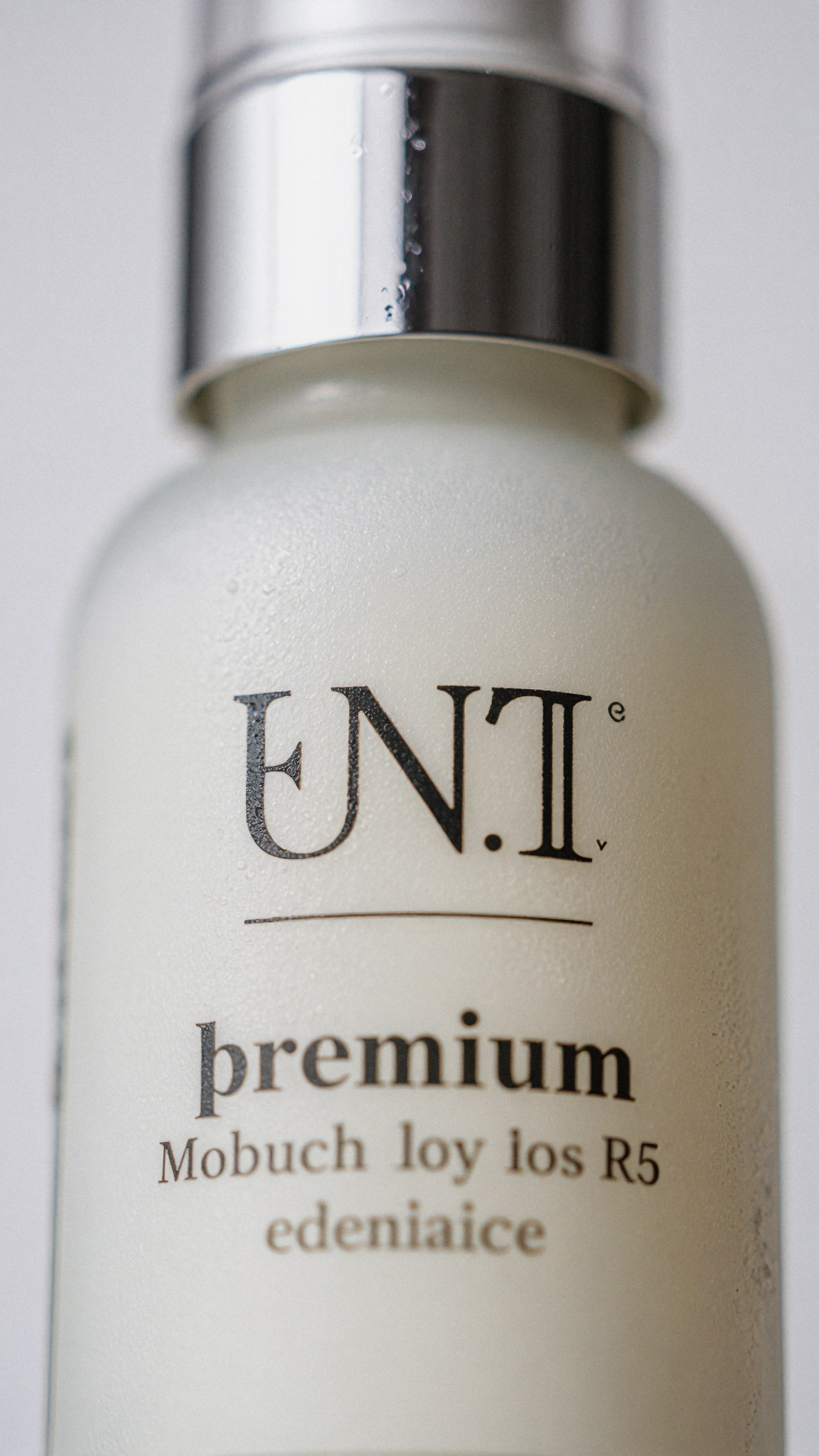
2. Edge accuracy
A sharp edges AI enhancer should keep structural lines straight rather than simply increasing contrast. Test:
- top edges of cartons
- corners of tuck boxes
- seams of flexible pouches
- cap edges against bright backgrounds
If a model creates glowing halos, it may look sharp at thumbnail size but poor at review size.
3. Reflection realism
Reflection detail product photo AI tools matter most for:
- glass bottles
- metallic lids
- foil labels
- glossy laminates
- plastic jars under studio lights
Look for reflections that follow the object form. Random specular streaks are a common sign of poor enhancement.
Topic: Luxury perfume carton and bottle with edge and reflection fidelity
Genre: Luxury Campaign
Camera: Nikon Z8
Lens: 70mm f/4
Lighting: Strip softboxes with rear rim light
Location: Dark charcoal studio set with reflective acrylic base
Style: High-End Beauty Advertising
Final Prompt: luxury perfume bottle beside a sharply folded black carton, close three-quarter angle showing crisp package edges and controlled glass reflections, polished metallic cap, embossed silver label accents, moody charcoal background, reflective acrylic surface with clean mirrored falloff, precise strip softbox highlights tracing the bottle silhouette, subtle rear rim light, rich black and silver palette, balanced negative space, premium high-end beauty advertising direction, Nikon Z8 clarity, 70mm lens realism, smooth gradients, razor-clean corners, believable specular detail, upscale-ready packaging composition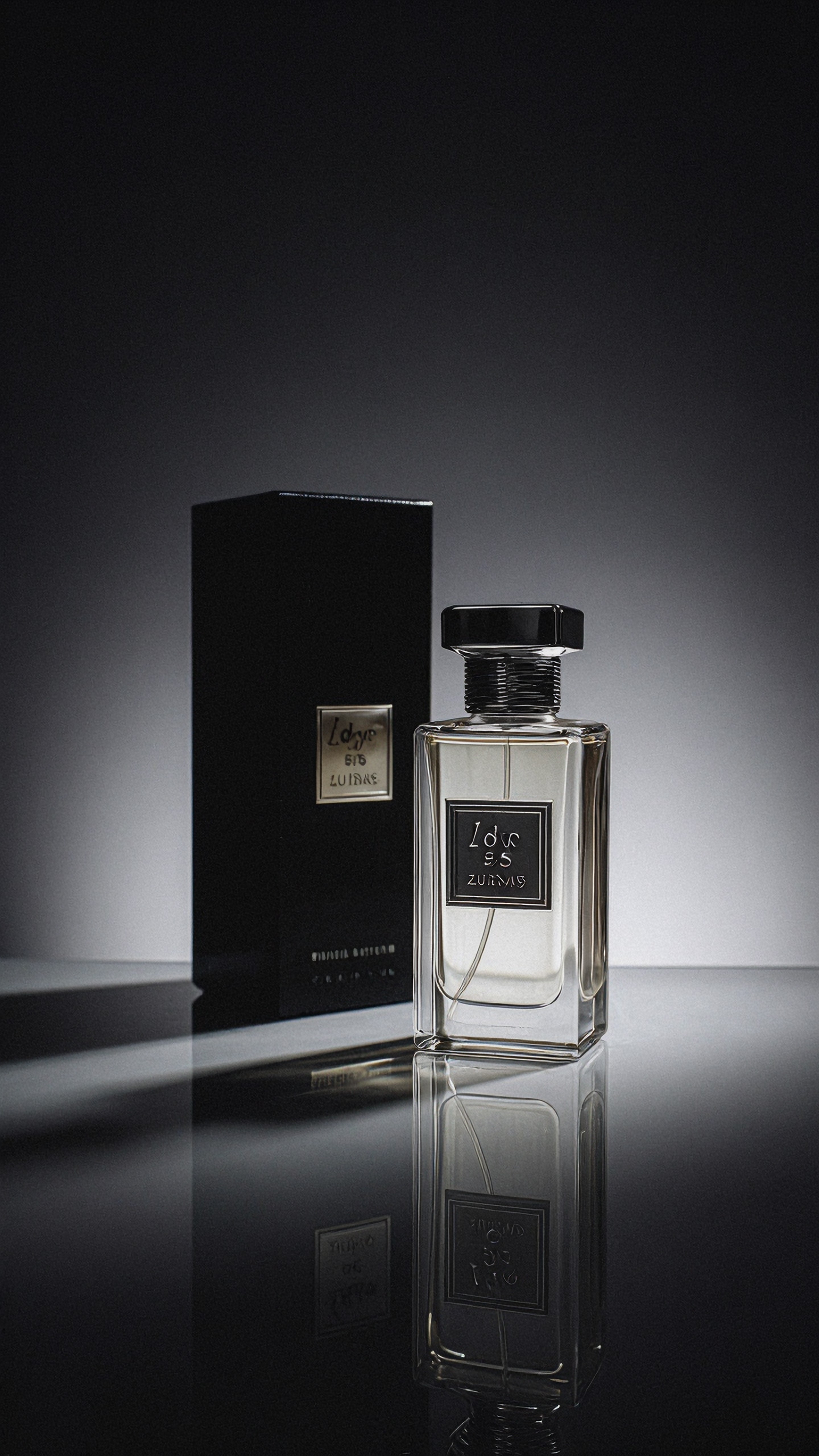
4. Texture discipline
Packaging should not gain fake pores, cloth grain, or random paper roughness unless the material calls for it. Good tools distinguish between:
- uncoated stock
- matte varnish
- gloss laminate
- brushed metal
- transparent PET or glass
5. Consistency across multiple SKUs
If you have a series of six flavors or variants, the upscaler should produce similar crispness and micro-contrast across all of them. Inconsistent enhancement creates problems in ecommerce category pages and campaign layouts.
Model behavior: what different upscalers tend to do
Rather than naming a single winner for every case, it is more useful to think in model categories.
Dedicated AI upscalers
These tools are usually best for:
- controlled enlargement
- edge cleanup
- mild texture recovery
- batch processing
They are less reliable for:
- fixing malformed text
- restoring missing design features
- rebuilding complex foil graphics
Use them when the original image is already structurally good.
Generative detail enhancers
These are stronger when:
- material surfaces need more realism
- highlights and reflections feel flat
- packaging scenes need more photographic richness
They are riskier because they may reinterpret the artwork. For brand-sensitive packaging, apply them selectively or mask critical areas.
Topic: Aluminum beverage can with printed wrap needing controlled material enhancement
Genre: Product Editorial
Camera: Fujifilm GFX100 II
Lens: 120mm f/4 Macro
Lighting: Overhead softbox with narrow back rim
Location: Contemporary beverage studio with muted concrete backdrop
Style: Cinematic Realism
Final Prompt: single aluminum beverage can with premium printed wrap design, macro product view emphasizing smooth cylindrical edges, clean logo zone, tiny legal copy area, believable metallic sheen, subtle condensation droplets only near lower third, cool gray concrete background, overhead softbox shaping the body with narrow back rim highlight, cinematic realism with disciplined commercial styling, Fujifilm GFX100 II medium format detail, 120mm macro lens rendering, realistic print registration, crisp edge transitions, restrained reflections, no text distortion, high-resolution upscale-friendly packaging shot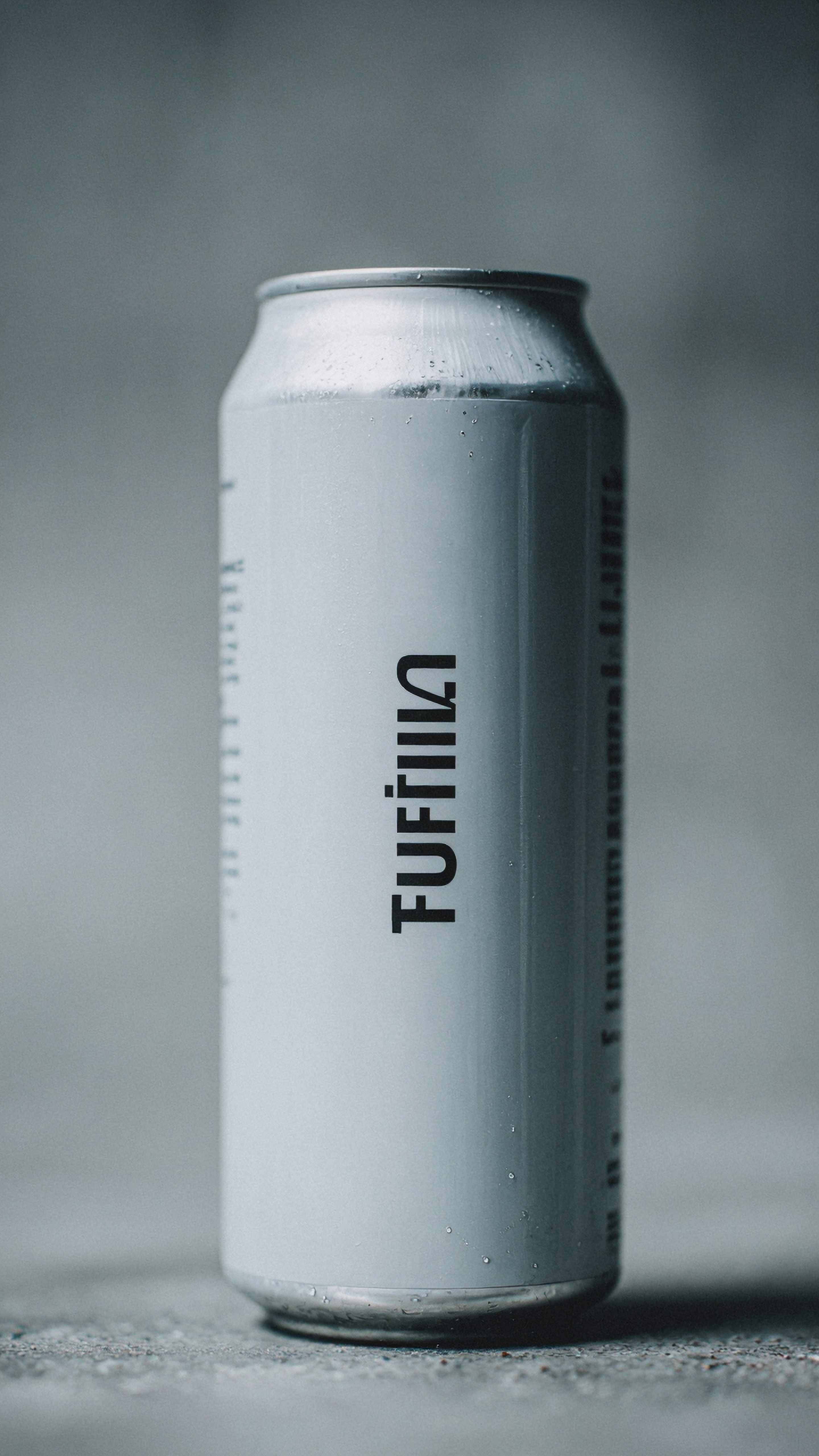
Photo editors with AI sharpen and super-resolution modes
These are practical for production because they fit into established workflows. They often do well with:
- quick review exports
- moderate resolution gains
- local adjustments on labels or caps
They tend to struggle when the source file is already heavily compressed or generated with unstable text.
Best use cases for AI upscale for packaging mockups
Ecommerce hero images
For marketplaces and DTC stores, the product often appears against a plain background with little room for error. Here, the upscaler should prioritize:
- silhouette clarity
- label readability at small and medium sizes
- realistic reflection control
- clean shadow transitions
Investor decks and pitch presentations
Mockups shown in slides often need to look polished at fullscreen. Moderate upscaling helps if the packaging concept is approved but the initial render feels soft.
Variant lineups and shelf visualizations
This is where consistency matters more than dramatic sharpness. Keep enhancement restrained so every SKU looks like part of the same system.
Beauty, beverage, and supplement campaigns
These categories depend heavily on precise highlights and package finish. Reflection control is more important than aggressive sharpening.
Topic: Supplement pouch lineup for ecommerce and shelf consistency
Genre: Clean Commercial Product Photography
Camera: Sony A1
Lens: 90mm f/2.8 Macro
Lighting: Large frontal softbox with even side panels
Location: Neutral seamless ecommerce studio
Style: Minimal Brand Catalog
Final Prompt: three premium supplement stand-up pouches in coordinated flavors, front-facing lineup with consistent spacing, matte packaging finish, bold clean labels, small nutritional detail blocks, sharp zipper seams, subtle grounded shadows, neutral off-white seamless background, large frontal softbox with balanced side panels for even illumination, catalog-perfect composition, Sony A1 clarity, 90mm macro precision, minimal brand catalog style, highly controlled edges, realistic pouch structure, no warping, cohesive SKU consistency, high-resolution ecommerce packaging mockup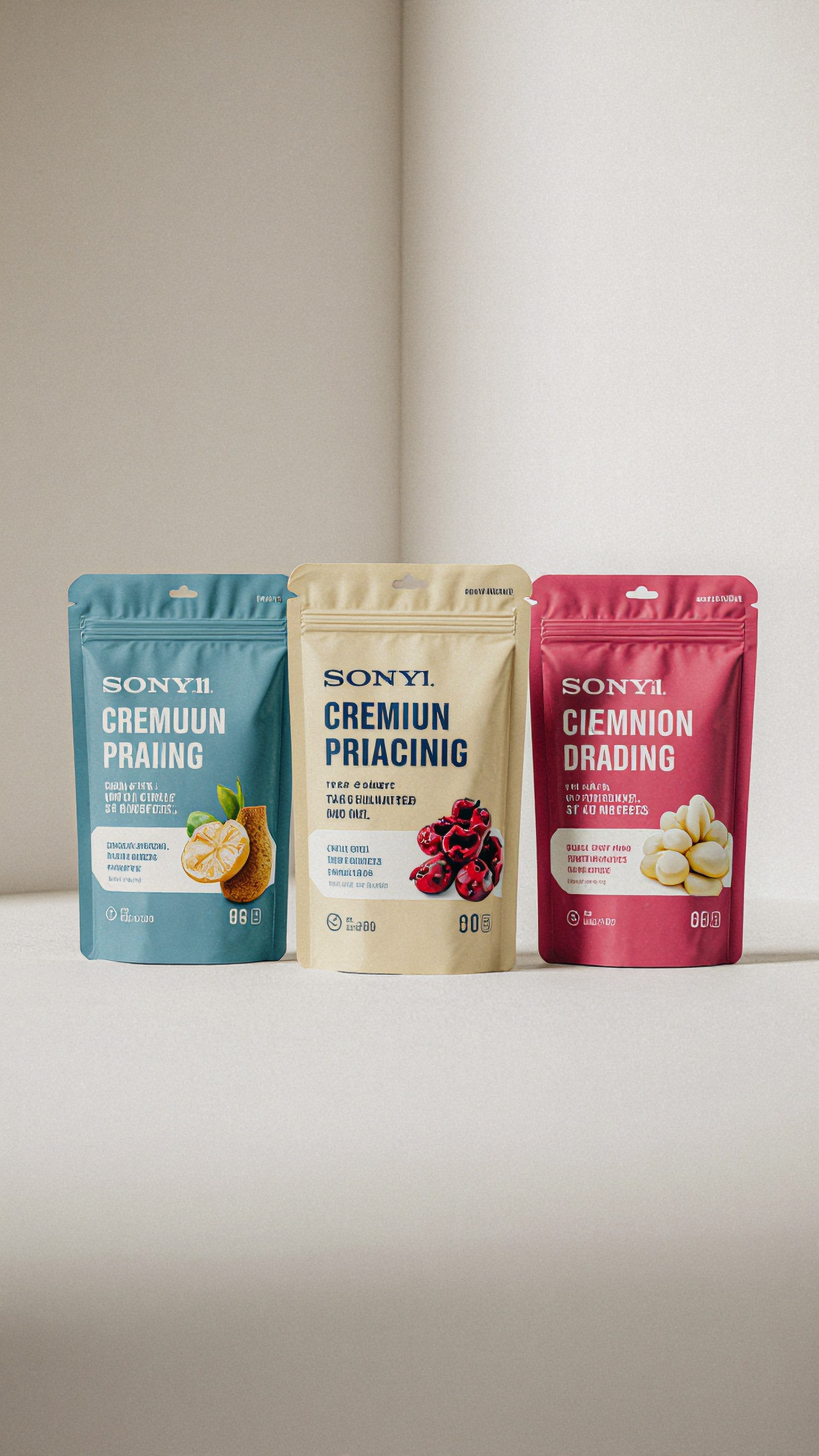
Where upscalers still fail on packaging
Even the best product packaging upscaler AI options have clear limits.
Small text is not the same as true vector recovery
If the source image contains broken letters, the upscaler may invent plausible strokes instead of restoring the correct copy. This is acceptable for moodboards and concept review, but not for final packaging approval.
Foil and holographic finishes confuse generative systems
Complex reflective labels often become too smooth or too noisy. The best results come from masking those areas and applying lighter enhancement.
Transparent packaging can lose dimensional cues
Bottles, clamshells, and jars need subtle internal reflections and edge separation. Overprocessing makes them look cut out.
Topic: Clear cosmetic jar with silver lid and reflective label for transparency testing
Genre: Beauty Campaign
Camera: Hasselblad X2D 100C
Lens: 80mm f/1.9
Lighting: Studio butterfly light with low side kicker
Location: Pale stone vanity set with luxury spa mood
Style: Elegant High-End Beauty Advertising
Final Prompt: clear cosmetic jar filled with soft pink cream, reflective silver lid, delicate foil-accent label, close beauty-product composition on pale stone vanity, soft spa atmosphere, butterfly key light creating refined frontal illumination, low side kicker shaping transparent edges and internal reflections, blush, silver, and ivory palette, luxury beauty campaign styling, Hasselblad X2D 100C look, 80mm lens depth, pristine glass contours, believable reflection detail, premium surface finish, clean background blur, print-ready product image realism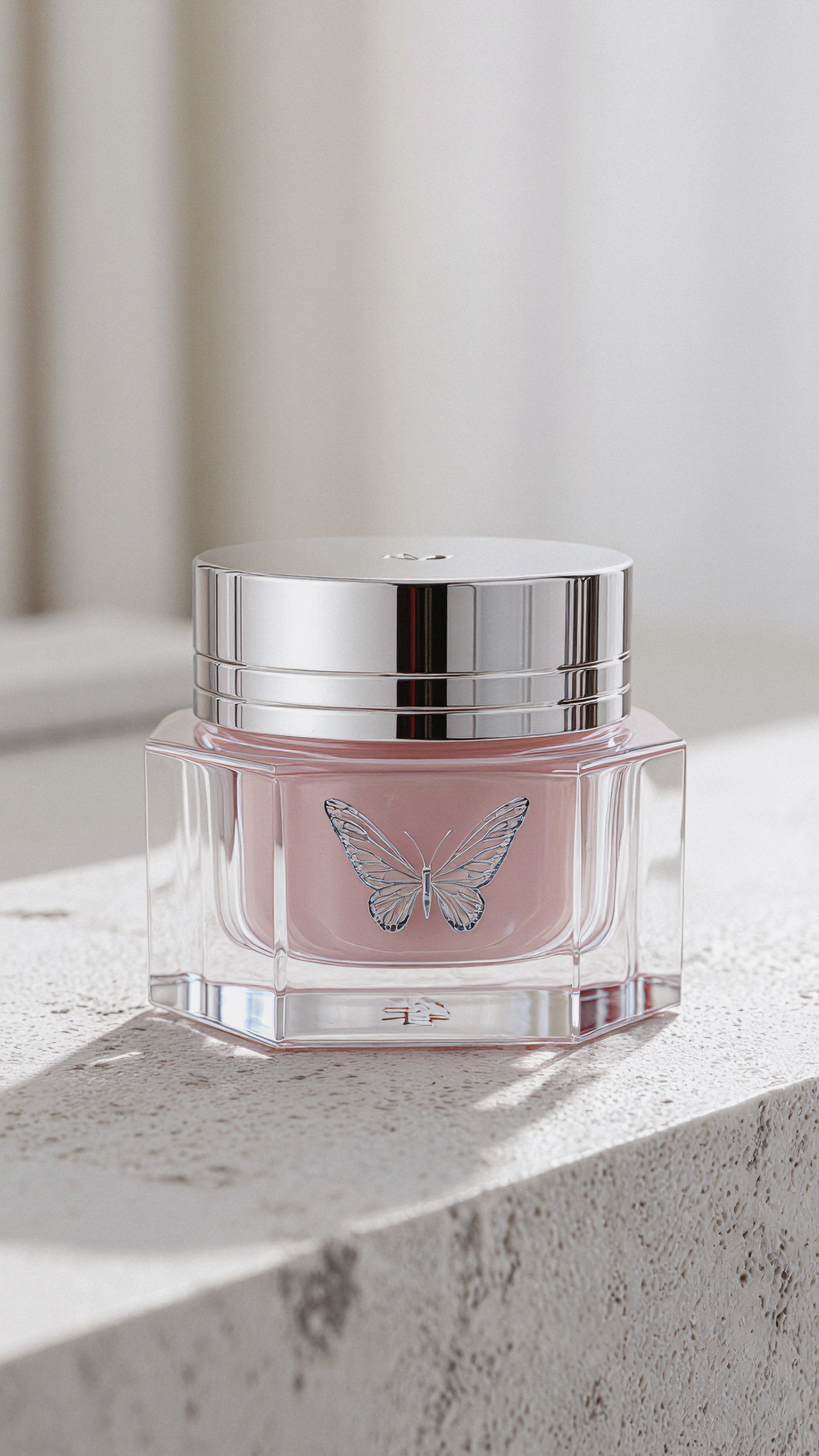
Cardboard fibers and paper grain are easily overdone
If you are enhancing a carton, check whether the model invented rough texture that makes the package look cheap or dirty.
How to prompt for better packaging images before upscaling
A strong upscale starts with a strong base image. Prompting for packaging should emphasize precision over atmosphere.
Use prompt language that specifies:
- exact package type
- material finish
- label placement
- camera distance
- lighting direction
- background simplicity
- edge cleanliness
- reflection discipline
Avoid vague terms like “super detailed product photo” without describing the package structure. The model needs constraints.
Prompting for label clarity
Ask for readable layout zones, crisp typography treatment, and a macro-friendly composition.
Topic: Organic tea box packaging with readable front panel typography
Genre: Product Editorial
Camera: Panasonic Lumix S1R II
Lens: 85mm f/2
Lighting: Soft side key with white bounce fill
Location: Natural paper backdrop studio with calm editorial mood
Style: Clean Commercial Look
Final Prompt: premium organic tea carton standing upright on a natural paper backdrop, front panel fully visible with elegant botanical illustration, readable brand block, subtitle lines, and fine border details, crisp folded edges, uncoated paperboard texture kept subtle and realistic, soft side key light with white bounce fill, warm neutral palette of sage, cream, and charcoal, clean commercial look with editorial restraint, Panasonic Lumix S1R II realism, 85mm lens, balanced composition, precise typography zones, no distorted corners, no clutter, upscale-friendly product packaging image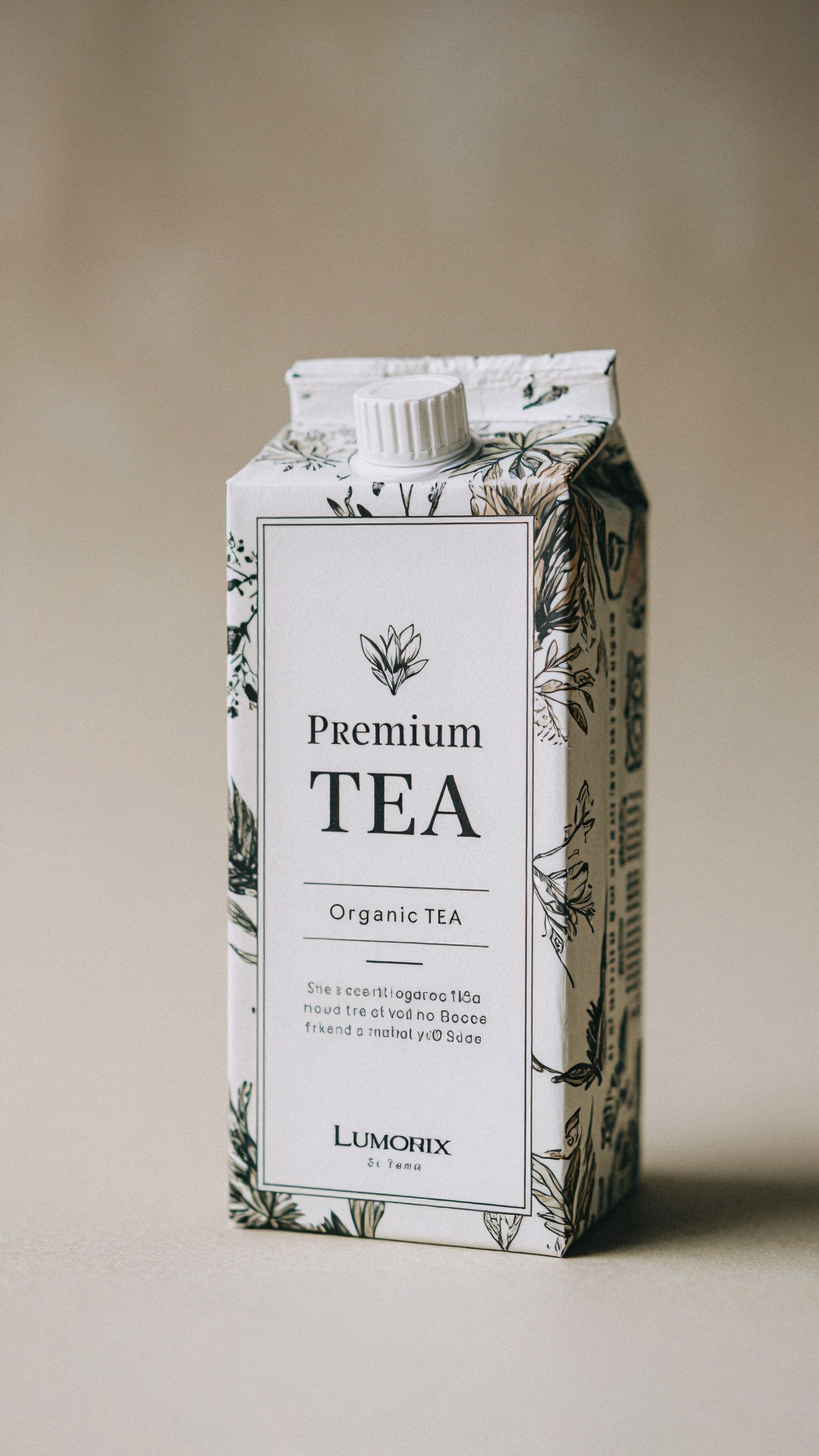
Prompting for metallic and gloss surfaces
Describe where highlights should sit and how strong they should be. Reflection control improves significantly when the model knows the material finish.
Topic: Metallic snack pouch with controlled gloss highlights
Genre: Product Advertising
Camera: Canon EOS R3
Lens: 50mm f/3.2
Lighting: Twin strip lights with top diffusion panel
Location: Sleek black tabletop studio
Style: Modern Commercial Advertising
Final Prompt: metallic snack pouch standing slightly angled on a sleek black tabletop, premium deep red and gold branding, precise sealed edges, subtle crimp details, controlled gloss highlights running vertically along the pouch form, top diffusion panel softening specular hotspots, twin strip lights defining side contours, modern commercial advertising style, Canon EOS R3 capture feel, 50mm lens natural perspective, bold but clean composition, high contrast without clipping, realistic laminate texture, sharp label boundaries, premium packaging mockup realism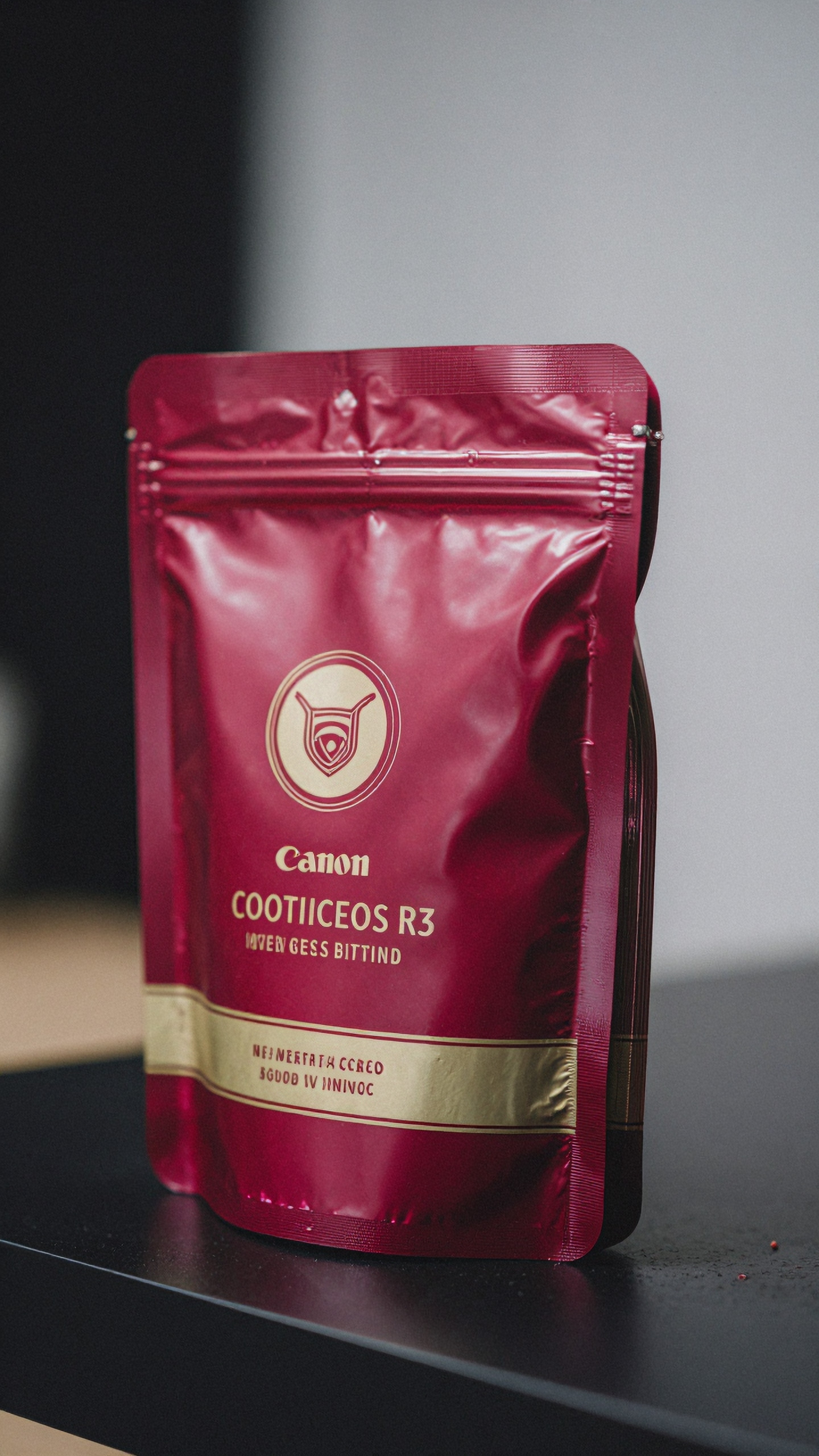
Comparative workflow: three practical approaches
Workflow A: Generate clean, upscale lightly
Best for:
- approved concepts
- ecommerce exports
- quick client presentations
Method:
1. Generate a structurally clean image 2. Apply 2x upscale 3. Retouch logo and micro text if needed
Pros:
- fastest
- low risk of design drift
Cons:
- limited recovery if source is weak
Workflow B: Inpaint critical areas, then upscale
Best for:
- labels with partial distortion
- cap details that need correction
- beauty packaging with foil accents
Pros:
- stronger final precision
- better for brand-sensitive presentations
Cons:
- slower
- needs masking judgment
Topic: Luxury serum dropper bottle requiring inpaint-first packaging workflow
Genre: High-End Beauty Advertising
Camera: Leica SL2-S
Lens: 75mm f/2
Lighting: Softbox key with narrow rear edge light
Location: Minimal beige studio plinth set
Style: Refined Beauty Editorial
Final Prompt: amber serum dropper bottle on a minimal beige plinth, front label aligned cleanly with thin gold rule and compact ingredient text zone, glossy black dropper cap, subtle glass reflections, softbox key light from upper left and narrow rear edge light tracing the silhouette, refined beauty editorial art direction, Leica SL2-S photographic feel, 75mm lens compression, luxurious neutral palette, balanced negative space, premium skincare packaging realism, crisp label placement, believable glass thickness, upscale-ready close product portrait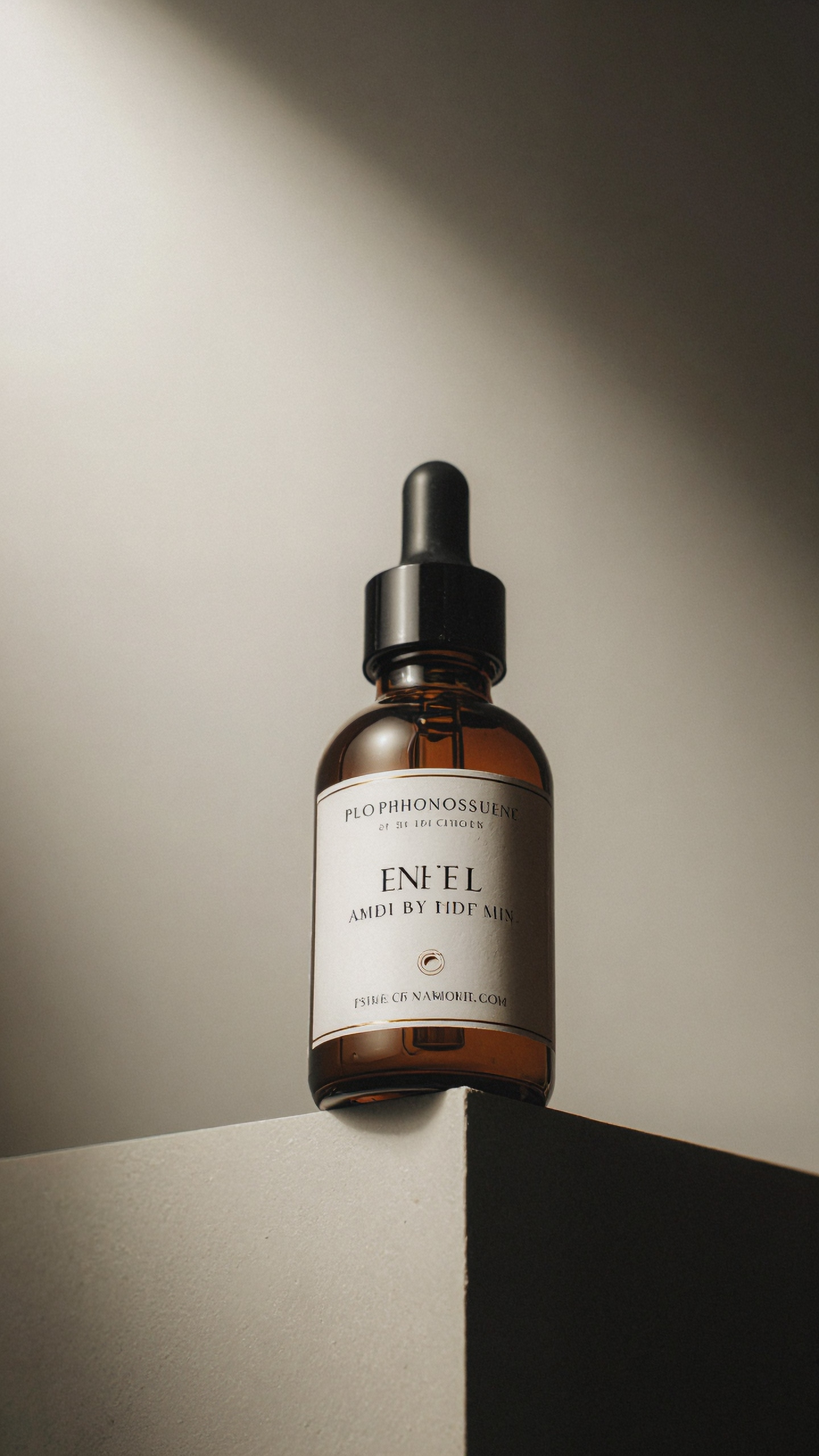
Workflow C: Render multiple variants, upscale only selected crops
Best for:
- SKU families
- homepage carousels
- comparison pages
Pros:
- efficient QA
- avoids wasting processing on rejected concepts
Cons:
- requires disciplined version control
Recommended quality checks before calling an image print-ready
A true print-ready package visual for review should pass these checks at 100% zoom:
- Are straight edges still straight?
- Are logos symmetrical and correctly proportioned?
- Does small type look stable rather than guessed?
- Do gloss highlights follow surface curvature?
- Are foil areas coherent and not noisy?
- Do shadows stay smooth in gradients?
- Does every SKU in a lineup match in sharpness and contrast?
If the answer is no on any of those, the image may still be useful for concept presentation, but not as a print-approval proxy.
Best categories for AI packaging enhancement
Some packaging categories benefit more from AI upscale for packaging mockups than others.
Strong candidates
- skincare bottles and jars
- supplement tubs and pouches
- beverage cans and cartons
- perfume bottles and boxes
- premium food packaging mockups
More difficult candidates
- holographic labels
- clear blister packaging
- highly embossed paper cartons
- ultra-small legal copy panels
- transparent bottles with liquid meniscus detail
Topic: Perfume gift box with embossed paper texture and foil stamp close-up
Genre: Luxury Campaign
Camera: Sony A7R V
Lens: 90mm f/2.8 Macro
Lighting: Angled softbox with delicate gold bounce
Location: Editorial tabletop set in warm neutral studio
Style: Luxury Fashion Campaign Product Styling
Final Prompt: premium perfume gift box in warm ivory paper with embossed crest and subtle gold foil stamp, close-up three-quarter composition revealing sharp corners, premium board thickness, satin ribbon accent nearby, warm neutral editorial tabletop, angled softbox defining emboss depth and delicate gold bounce enriching highlights, luxury campaign product styling, Sony A7R V detail, 90mm macro lens, sophisticated beige and gold palette, tactile but restrained paper texture, clean negative space, upscale-friendly close shot with crisp foil edges and refined print finish
Tool selection: what to prioritize by packaging task
If your main issue is soft labels, prioritize tools known for conservative sharpening and local enhancement.
If the problem is flat material rendering, choose models with stronger generative surface recovery, but protect brand marks.
If your use case is batch ecommerce, favor workflow speed, repeatability, and consistent output across SKUs.
If the challenge is glass and metallic reflections, test with difficult studio-lit samples before committing to a tool.
A useful shortlist process is:
1. Test one carton, one glass bottle, and one foil label image 2. Compare 2x and 4x outputs 3. Review at full zoom 4. Score label stability, edge cleanliness, and reflection realism separately 5. Pick the tool that fails least severely on your hardest packaging type
Practical prompt patterns for specific packaging scenarios
For cartons
Use terms like:
- crisp folded edges
- front panel fully visible
- subtle paperboard texture
- accurate die-cut silhouette
For bottles and jars
Use terms like:
- believable glass thickness
- controlled specular highlights
- clean internal reflections
- premium cap finish
For pouches and flexible packs
Use terms like:
- realistic seam structure
- restrained crinkle texture
- front label plane readable
- even studio lighting for packaging
Topic: Premium coffee pouch with realistic seam structure and matte finish
Genre: Lifestyle Product Editorial
Camera: Nikon D850
Lens: 105mm f/2.8 Macro
Lighting: Window-style diffusion with gentle negative fill
Location: Artisan cafe prep counter with muted morning atmosphere
Style: Editorial Commercial Realism
Final Prompt: premium matte coffee pouch standing on an artisan cafe prep counter, muted morning light, front label visible and clean, realistic seam structure and top crimp, restrained natural crinkle texture, earthy palette of espresso brown, cream, and muted olive, subtle coffee tools blurred in background, window-style diffusion with gentle negative fill for shape, editorial commercial realism, Nikon D850 detail, 105mm macro lens precision, tactile but controlled packaging surfaces, sharp readable label zone, upscale-friendly pouch photography
Final verdict: is an AI upscaler for product packaging worth using?
Yes, if you treat it as a finishing tool, not a replacement for design accuracy.
The best AI upscaler for product packaging can make mockups look more review-ready by improving label clarity, tightening edges, and refining reflections. It is especially useful for ecommerce images, concept presentations, and campaign mockups where the composition is already approved.
But for true print-critical review, it still has limits. Small text, logos, foil detail, and transparent materials often need manual correction or selective inpainting. That is why the strongest workflow is usually:
- precise generation
- targeted fixes
- restrained upscale
- manual QA at zoom level
If you compare tools objectively, focus less on dramatic before-and-after sharpness and more on whether the model preserves the package you already designed. For packaging, accuracy beats spectacle every time.
Topic: Full product packaging hero image for final review and upscale test
Genre: Product Editorial
Camera: RED Komodo 6K still frame capture
Lens: Sigma 65mm f/2 DG DN
Lighting: Large soft key with polished reflector accents
Location: Premium studio hero set with soft gradient backdrop
Style: Clean Premium Commercial Look
Final Prompt: hero shot of a premium product packaging set including bottle, carton, and secondary unit arranged in a balanced triangular composition, front labels clean and readable, sharp edges on folded carton, polished but restrained reflections on bottle and cap, soft gradient backdrop in pale stone to warm gray, large soft key shaping the products with polished reflector accents for premium definition, clean premium commercial look, RED Komodo 6K still-frame realism, Sigma 65mm f/2 perspective, sophisticated neutral palette, immaculate spacing, subtle grounded shadows, print-ready mockup sensibility, extremely crisp packaging detail without distortion