You cannot pick the "best AI image generator for fashion lookbooks" from this article, and you should be suspicious of any page that claims to. Ranking tools needs the same brief run through several of them, and the records behind this article contain one model: Krea2 Turbo. What I can offer instead is a close look at eight lookbook-style shots from that model (full-body street, three-quarter editorial, catalog grid, flat lay, garment detail) and an honest account of what held together and what did not. The short version: single garments and accessories came out convincingly, but framing instructions were not reliably followed, and the page-layout request produced unreadable text.
All eight images are portrait files of 1088 x 1928 pixels, generated on 2026-07-15. I opened each one. Six are shown below.
One detail that shapes every result: the prompt had a shared tail
Every prompt in the records ends with the same block of generic fashion wording, appended after the shot-specific text:
trend led fashion mood, outfit-first fashion editorial, complete styling system, visible fabric texture, accessories, shoes, bag, scene context, natural pose or walking action, 35mm editorial photography, realistic street, runway, retail, or lookbook settingThat matters when you read the images. The phrase "natural pose or walking action" was attached even to prompts that asked for a standing or seated pose, and several of the results show people mid-stride. I cannot prove the tail caused this, because there was no run without it, but it is a plausible contributor and worth removing if you want a still pose. The prompts quoted below show only the shot-specific part; the tail above follows each one.
Full-body street shot: the outfit reads, the framing does not
The brief was a head-to-toe street look. The shot-specific part of the prompt:
street-style full body fashion shot, complete head-to-toe lookbook image focused on styling system, model secondary to outfit, wearing oversized charcoal wool blazer over ribbed ivory knit top, wide-leg slate trousers with sharp crease, black leather loafers, structured burgundy shoulder bag, thin belt, silver earrings, layered silhouette clearly visible, relaxed walking pose, full body in frame with shoes visible, Seongsu fashion district background, neutral grey and burgundy palette, documentary 40mm framing, commercial clarity, crisp textile detail, realistic garment drape, clean negative space for lookbook use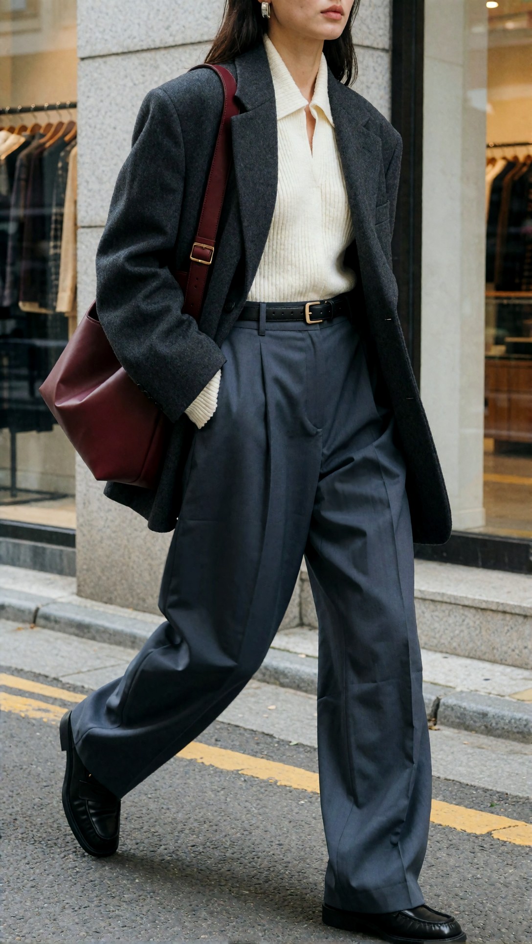
The garments are the strength here. The blazer shows a speckled wool texture, the ribbed knit has a collar that sits open under the lapels, the trouser pleats fall into believable folds, and the burgundy bag has a strap with a gold buckle that connects to the bag body. A silver earring is visible.
The failure is the crop. The image cuts off the face at the lips, and the right loafer is clipped by the bottom edge, even though the prompt asked for "full body in frame with shoes visible". For a lookbook this is a real problem: you cannot use a frame that loses the shoes or the head unless your layout expects a crop. In this set, instructions about what must be in frame were less reliable than instructions about what the clothes look like. With one run per prompt I cannot say how often this happens, only that it happened here.
Three-quarter editorial: the best garment structure in the set
The second brief asked for a quiet-luxury look with a trench coat. This is the full prompt as recorded, tail included, so you can see exactly what was sent:
three-quarter outfit editorial shot, trend-led quiet luxury styling, structured camel trench layered over fine gauge black turtleneck, pleated cream midi skirt, knee-high dark chocolate leather boots partly visible, top-handle tan bag, slim gold watch, clean tucked silhouette, body turned slightly to show layering and side seam, calm direct expression, studio-meets-editorial interior, soft directional light, warm beige and black palette, 50mm magazine framing, premium fabric texture, visible trench structure, elegant but commercially readable composition, trend led fashion mood, outfit-first fashion editorial, complete styling system, visible fabric texture, accessories, shoes, bag, scene context, natural pose or walking action, 35mm editorial photography, realistic street, runway, retail, or lookbook setting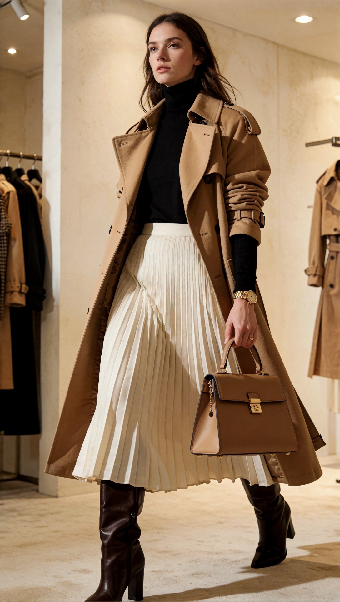
This is the most complete result of the eight. The trench has epaulettes, a wide lapel and a buckled cuff strap; the pleats of the skirt run evenly from waist to hem; both boots are in frame; the hand holding the bag has a ring and five readable fingers; and the bag has a consistent handle, flap and clasp. The prompt said "clean tucked silhouette" and "body turned slightly", but the model drew a walking stride with the coat open, and the prompt asked for boots "partly visible" while the image shows them fully. So even the best result interpreted the brief rather than following it literally. A second trench hangs on a rack at the right, which is a background detail the prompt did not ask for but which fits the retail setting.
The seated editorial prompt behaved similarly:
three-quarter outfit editorial, tailored fashion campaign image prioritizing styling system, cropped graphite blazer over silk cream blouse, high-waisted tobacco wide-leg trousers, pointed dark brown heels, sculptural gold earrings, compact clutch under arm, deliberate layered silhouette, seated edge-of-chair pose that still shows trouser volume and jacket cut, Milan editorial apartment setting, warm tobacco cream graphite palette, medium-format look, soft window light and gentle shadow contrast, refined fabric sheen, luxury campaign composition with commercial readability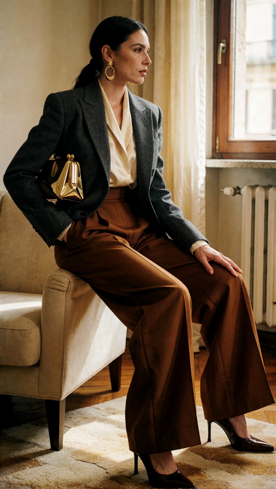
Here the head, both shoes and the clutch are all inside the frame, and the layers stay distinct: blazer lapel, blouse collar and trouser waistband do not merge. The pose is perched on the chair arm rather than on the chair edge. One thing I would check before using it: the trousers pool around the heels so far that the far leg is hard to follow. It is a small structural ambiguity rather than an error, but a catalog team would notice it.
Across these three model shots, the two that kept the whole figure in frame were the ones where the pose involved a prop (a bag held in hand, a chair to sit on). That is a pattern in three images, not a rule.
The catalog grid: layout is where it falls apart
This prompt asked for a page of several outfit and product frames without heavy text:
catalog grid page fashion concept, multiple outfit and product frames arranged like a clean retail lookbook spread, trend-led capsule wardrobe in sand, black, cream, and olive, visible items include trench coat, knit top, pleated skirt, tailored trousers, loafers, shoulder bag, belt, and scarf, balanced grid composition with product-focused spacing, minimal page furniture, premium e-commerce aesthetic, soft overhead studio lighting, sharp edges, realistic fabric texture, clear merchandising logic, modern retail catalog feel without heavy text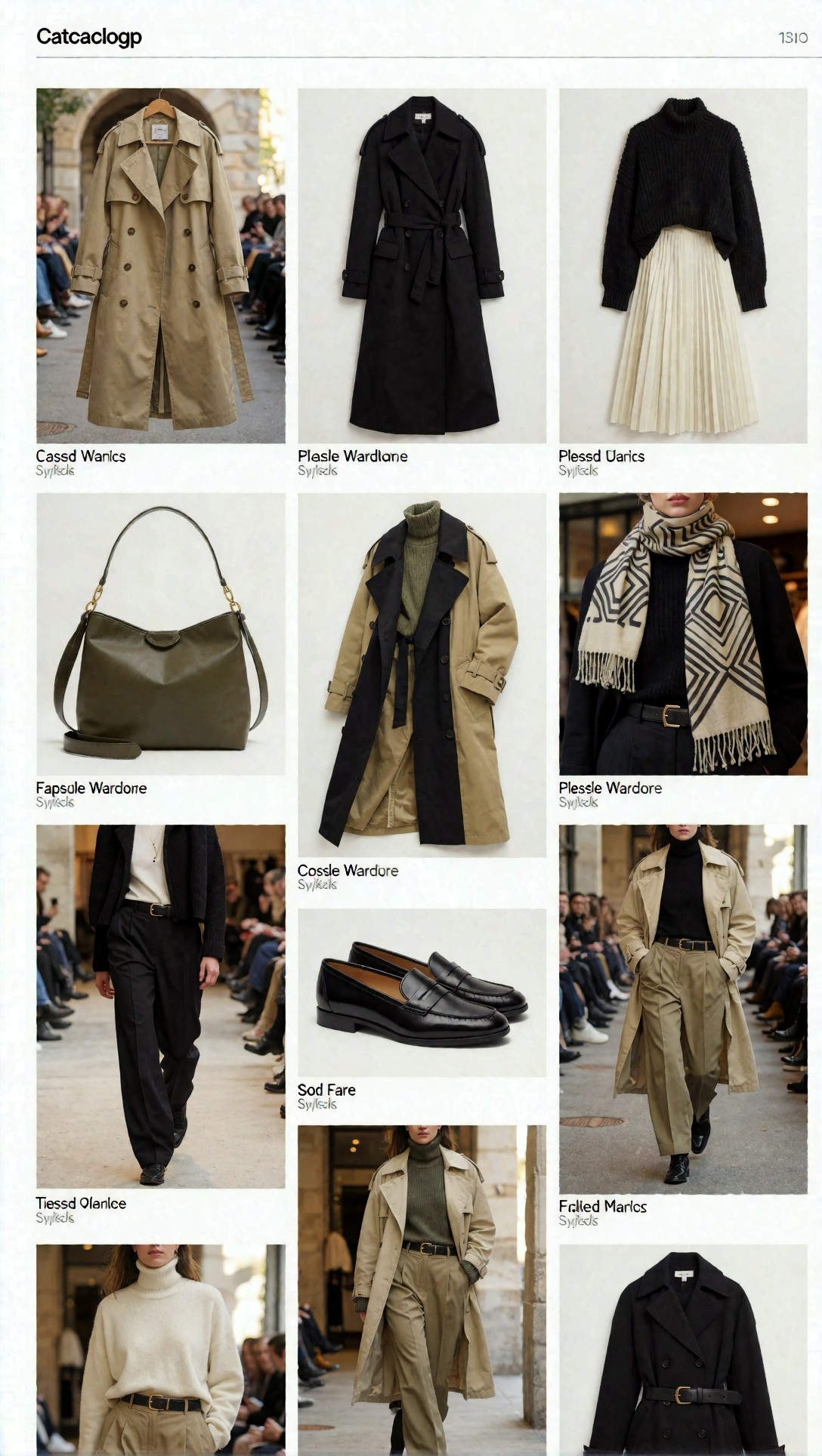
The individual tiles are good: the trench, the pleated skirt, the olive hobo bag and the loafers each look like product photography. The page is not usable. The header reads "Catacloqp", and the captions under the tiles read things like "Cassd Wanics" and "Plesle Wardlone", with illegible second lines. The grid also mixes two kinds of image, flat product shots and runway photos with seated audiences, and the bottom row is cut off by the canvas edge. The prompt said "without heavy text", and the model still drew captions and a header. If you want a page like this, treat it as a mood board for the tiles and build the layout in a design tool. The model did not hold a consistent garment identity across tiles either: the tan trench appears in several tiles with different cuts, which would be a problem for any real SKU list.
Flat lay: good for material, loose on the brief
product flat lay fashion composition, coordinated capsule wardrobe arranged neatly from overhead, oversized oatmeal knit, black tailored trousers, cream tank, cropped olive utility jacket, brown loafers, leather belt, canvas tote, square sunglasses, silk scarf, visible spacing between items, sleeves and hems carefully arranged, trend-led earthy palette, premium retail merchandising feel, top-down commercial clarity, realistic knit and leather texture, clean stone background, suitable for lookbook planning and e-commerce concepting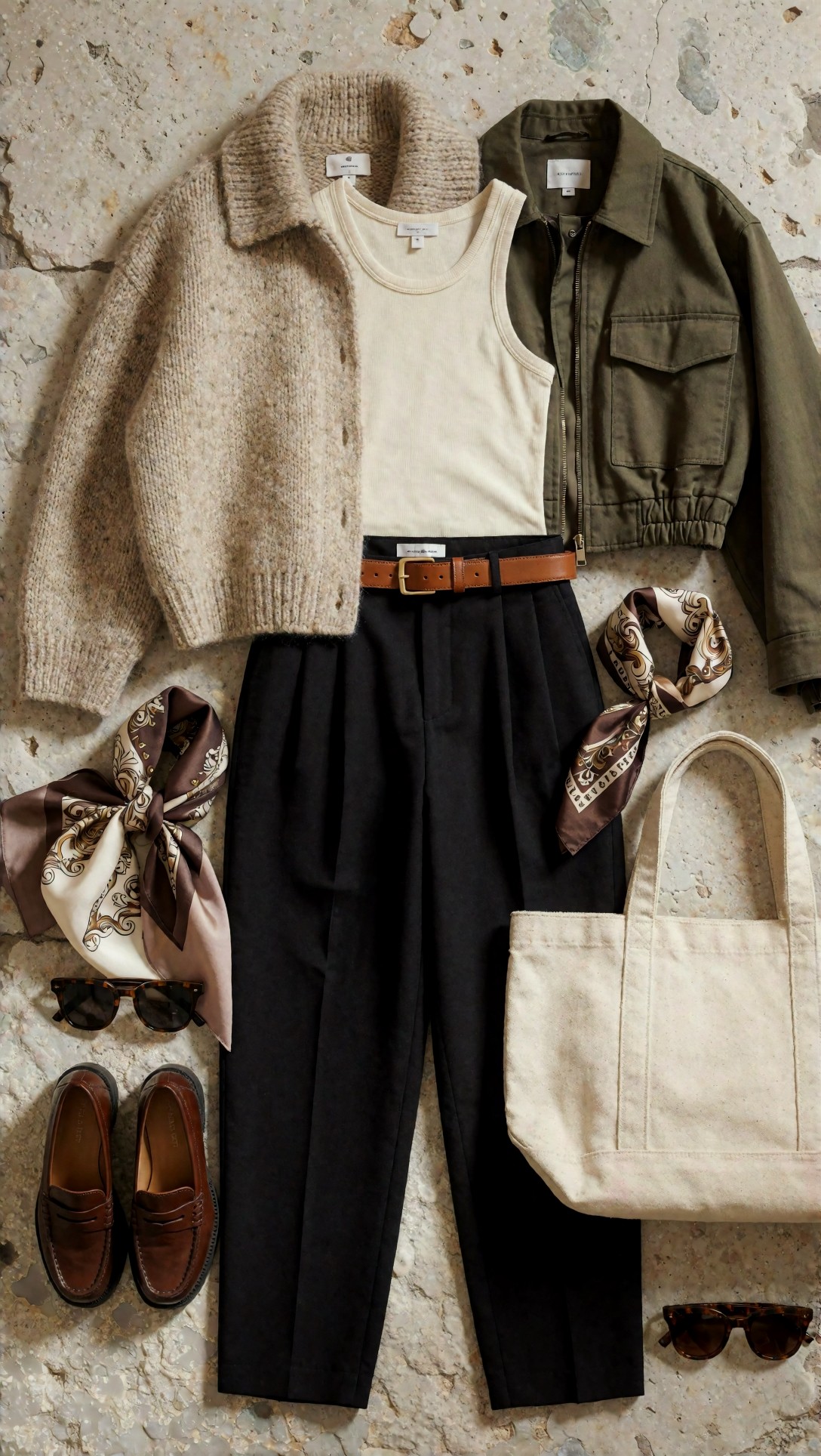
The material rendering is convincing: chunky knit, ribbed cotton, twill, leather and silk all read differently, and the items have clear edges with visible spacing. What does not match the prompt is the item list. The prompt named one scarf and one pair of sunglasses; the image has two of each. The sunglasses are tortoiseshell and rounded rather than square. The oatmeal knit became a button-front collared cardigan. The belt lies across the top of the trousers with a garment label beside it, and several garments carry small tags with illegible print. So this image is a good color-and-texture board but would not serve as an inventory picture. Anatomy is not an issue in a flat lay, but item count and identity are.
Garment detail: the tailoring logic mostly holds
garment detail macro image, close study of a charcoal wool coat sleeve, horn buttons, precise topstitching, brushed texture, cream knit cuff peeking underneath, leather glove tucked into pocket edge, fashion editorial material focus, shallow but controlled depth of field, side light revealing weave and seam construction, muted charcoal cream black palette, luxury garment craftsmanship mood, highly realistic textile detail, premium close-up suitable for supporting lookbook pages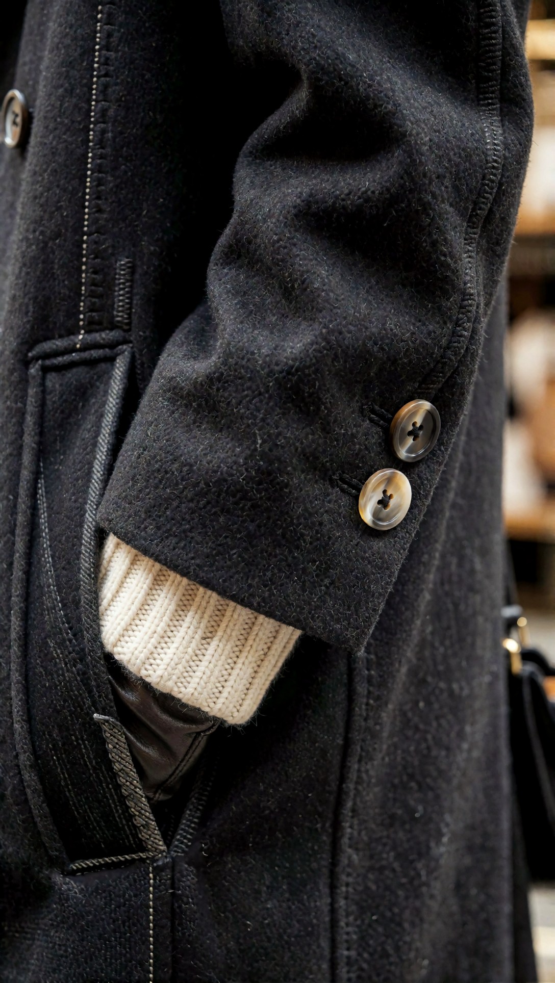
The wool has a brushed, felted surface; the two sleeve buttons have thread crosses and buttonholes beside them; the cream knit cuff and the leather glove both appear at the pocket opening. The coat is closer to black than the "charcoal" requested. The part that does not quite work is the pocket: the welt and a strip of twill tape run across the opening at angles that do not resolve into a pocket a tailor could cut. At this crop it supports a mood page, not a technical flat.
What to take from these eight images
- Clothes are easier than composition. Fabric, pleats, buttons and bag hardware were the strongest parts. Keeping the head and both shoes in frame was the weakest, and two prompts that explicitly asked for shoes or full body still produced cropped results.
- Do not ask for page layout. The catalog grid produced plausible tiles and nonsense text. Generate the tiles separately and assemble them in a layout tool.
- Count the items. In the flat lay the model added objects. Compare the output with your item list before trusting it as a planning image.
- Pose wording competes with the shared tail. If you append a generic style tail, check that it does not contradict your pose request.
- Known limitations not shown here. Keeping the same person or the same garment across a whole set is a widely reported weak point of text-to-image tools. Only one image per prompt was made here, so this set cannot confirm or refute it, apart from the repeated trench in the catalog grid. Upscaling is covered by general guidance only: check structure first, and enhance after. The [Upscaler](/upscaler/en) can do that second step.
To adapt these briefs, [Prompt Lab](/promptlab/en) is the place to rewrite the outfit list, and the [image generator](/create/en) runs them. If you are building a full visual set, the workflow questions in the other ComfyUI article on realism are relevant too: [Reducing the AI Look in ComfyUI Photos](/articles/comfyui-photorealistic-workflow-reduce-ai-look/en).
FAQ
So which generator should I pick for a lookbook? This article cannot tell you, because only Krea2 Turbo appears in the records. A fair comparison needs the same briefs run through each candidate and the results judged on framing, garment structure and text.
Can I use the catalog-grid output as a finished page? Not from this example. The captions and header were unreadable, and the tiles mixed runway and product images.
Should I negative-prompt the crop problem away? No negative prompts were used or recorded, so there is no evidence either way here. Changing the framing wording is the first experiment I would try.
> What this article is based on. Model: Krea2 Turbo (krea2_turbo). Eight images generated on 2026-07-15 (files dated 2026-07-16), each 1088 x 1928 pixels. I opened and inspected all eight; six are shown, and two were left out for redundancy. The generation records contain prompt and model only: no seeds, steps or settings, one image per prompt, and no comparison with other models. The earlier version of this article described a multi-model test and a "strongest workflow"; those claims are removed because no records support them.