Best AI Photo Generator for Product Marketing in 2026: What to Test for Ads, Packaging, and Web Visuals 한국어 요약
이 페이지는 ZView Space의 영어 원문을 한국어 검색 사용자도 이해할 수 있도록 정리한 SEO 요약입니다. 핵심은 단순한 얼굴 중심 이미지가 아니라 패션 에디토리얼, 룩북, 아웃핏, 프롬프트 테스트, 이미지 생성 워크플로우를 실제로 어떻게 구성할지입니다.
핵심 요약
- 원문 주제: Best AI Photo Generator for Product Marketing in 2026: What to Test for Ads, Packaging, and Web Visuals
- 목적: AI 이미지 생성에서 outfit, silhouette, fabric, pose, location, camera framing을 더 명확하게 설계합니다.
- 활용 범위: Z-Image Turbo, Krea2 Turbo, Qwen Image, Anima, SeedVR2 같은 이미지 생성 및 업스케일 워크플로우에 적용할 수 있습니다.
- SEO 관점: 제목, 설명, 이미지 alt, 프롬프트 예시가 실제 검색 의도와 맞아야 색인 가능성이 높아집니다.
한국어 사용자를 위한 체크포인트
1. 프롬프트가 얼굴 묘사에만 머물지 않고 전체 스타일과 의상 구성을 설명하는지 확인합니다. 2. 패션 이미지라면 상의, 하의, 아우터, 신발, 액세서리, 소재감, 촬영 장소를 분리해서 씁니다. 3. 생성 결과는 바로 게시하지 말고 디테일, 손, 의상 형태, 배경 일관성, 이미지 품질을 비교합니다. 4. 글 본문에는 실제 테스트 기준과 실패를 줄이는 방법이 들어가야 검색엔진에서 얇은 콘텐츠로 보일 가능성이 줄어듭니다.
원문 미리보기
In this test, I looked at what actually matters when choosing the best AI photo generator for product marketing in 2026: not just whether a model can make a pretty hero shot, but whether it can hold product shape, preserve label readability, follow packaging c
---
In this test, I looked at what actually matters when choosing the best AI photo generator for product marketing in 2026: not just whether a model can make a pretty hero shot, but whether it can hold product shape, preserve label readability, follow packaging color, and stay consistent across ad, packaging, and web use cases.
The main takeaway is simple: the strongest tools are no longer the ones that produce the most dramatic single image. They are the ones that can keep a product believable under different crops, lighting setups, and background demands without quietly redesigning the product between generations.
What was tested
I compared current AI photo generation workflows across three common product marketing tasks:
- Ad creatives for paid social and display
- Packaging visuals for mockups, launch decks, and concept review
- Web visuals for ecommerce hero images, category banners, and PDP support imagery
Rather than score tools by brand names alone, I tested by workflow behavior:
1. Text-to-image for concept generation 2. Image-reference workflows for product fidelity 3. Inpainting/edit workflows for campaign variations 4. Upscaling and detail recovery for final delivery
The core test subjects were typical problem products:
- a reflective skincare bottle
- a matte supplement pouch
- a soda can with branded graphics
- a glass perfume bottle
- a cardboard carton with printed pattern
These products expose the common weaknesses quickly. Reflective surfaces reveal lighting mistakes, printed labels reveal text instability, and rigid packaging reveals shape drift.
The comparison criteria that mattered most
If your goal is product marketing, image quality alone is too broad a metric. In this test, the useful filters were narrower.
1. Product fidelity
Can the model keep the product silhouette, cap shape, seam placement, and label zones stable? This mattered more than cinematic lighting. Several tools made attractive images that subtly changed bottle proportions or invented embossing that did not exist.
2. Text and branding behavior
Most generators in 2026 are better at pseudo-text than they were two years ago, but packaging still breaks fast when the prompt asks for exact front-panel copy. The weak point was not always total gibberish. More often, the model produced almost-correct branding that would pass a quick scroll but fail brand review.
3. Lighting control
For ad use, good lighting control determines whether an image feels premium or synthetic. The better workflows responded predictably to phrases like softbox key plus strip rim on gloss packaging. The weaker ones gave generalized brightness without product-specific reflections.
4. Background consistency
For ecommerce and banner systems, background discipline matters. Some tools handled isolated backgrounds cleanly but broke when asked for a lifestyle surface with realistic shadows. Others made strong scenes but could not stop adding irrelevant props.
5. Variation efficiency
The best AI generator for ecommerce creatives is often the one that can produce five usable campaign variants from one base setup, not the one that makes one perfect image after twenty retries.
Which type of tool was best for each situation
This was the clearest pattern in the test.
Best for early concept exploration: pure text-to-image models
If you are exploring campaign direction before packaging is locked, text-to-image remains the fastest option. It is useful for mood, composition, and surface ideas. It is weak for exact SKU representation.
Best use:
- moodboards
- launch campaign concepts
- early art direction reviews
- seasonal ad ideas
Weak point: shape drift and invented package details.
Best for accurate product ads: image-reference generation
When I fed the model a clean product cutout or packshot as reference, the hit rate improved sharply. Product edges, color blocking, and branding stayed much closer to the original. This is the workflow I would choose most often for product ads.
Best use:
- paid social product ads
- hero banners
- marketplace creatives
- brand-consistent launch visuals
Weak point: some tools overfit the source angle and resist more dramatic composition changes.
Best for packaging concept work: controlled compositing plus AI edits
For packaging visuals, the strongest result was usually not pure generation. It was a composite workflow: start from a real or rendered package face, then use AI for environment, lighting, and supporting elements. This reduced text errors and kept dieline logic intact.
Best use:
- shelf mockups
- packaging launch decks
- concept presentations
- retail environment previews
Weak point: takes longer and needs cleaner source assets.
Best for web visuals at scale: template-driven generation with inpainting
For ecommerce teams producing many SKUs, the winning approach was repeatable scene templates plus localized AI edits. Once the layout and lighting were locked, replacing product variants through masking was faster than regenerating scenes from scratch.
Best use:
- category pages
- collection banners
- seasonal homepage swaps
- cross-SKU visual systems
Weak point: requires discipline; sloppy masks produce floating shadows or warped edges.
Test case 1: Product ad hero image
The first test checked whether a model could create a premium ad-style hero visual for a skincare bottle without changing its proportions or making the glass look melted. This is where many tools look impressive at thumbnail size and fall apart on close inspection.
Topic: Premium skincare serum bottle hero ad
Genre: Product Editorial
Camera: Canon EOS R5
Lens: 100mm f/2.8 macro
Lighting: softbox key light with narrow strip rim light
Location: minimalist studio set with pale stone pedestal
Style: clean commercial look
Final Prompt: A premium amber glass skincare serum bottle with matte black dropper cap placed on a pale travertine pedestal in a minimalist studio set, front-facing hero composition, precise cylindrical proportions, centered label area kept clean and believable, softbox key light from upper left, narrow strip rim light defining glass edge and cap contour, subtle specular highlights on glass without blown reflections, soft shadow pool under product, warm neutral beige and ivory palette, high-end commercial skincare advertising, Canon EOS R5 realism, 100mm macro detail, crisp texture on glass and cap, luxurious but restrained composition, negative space for ad copy, ultra-clean background, premium retouching finish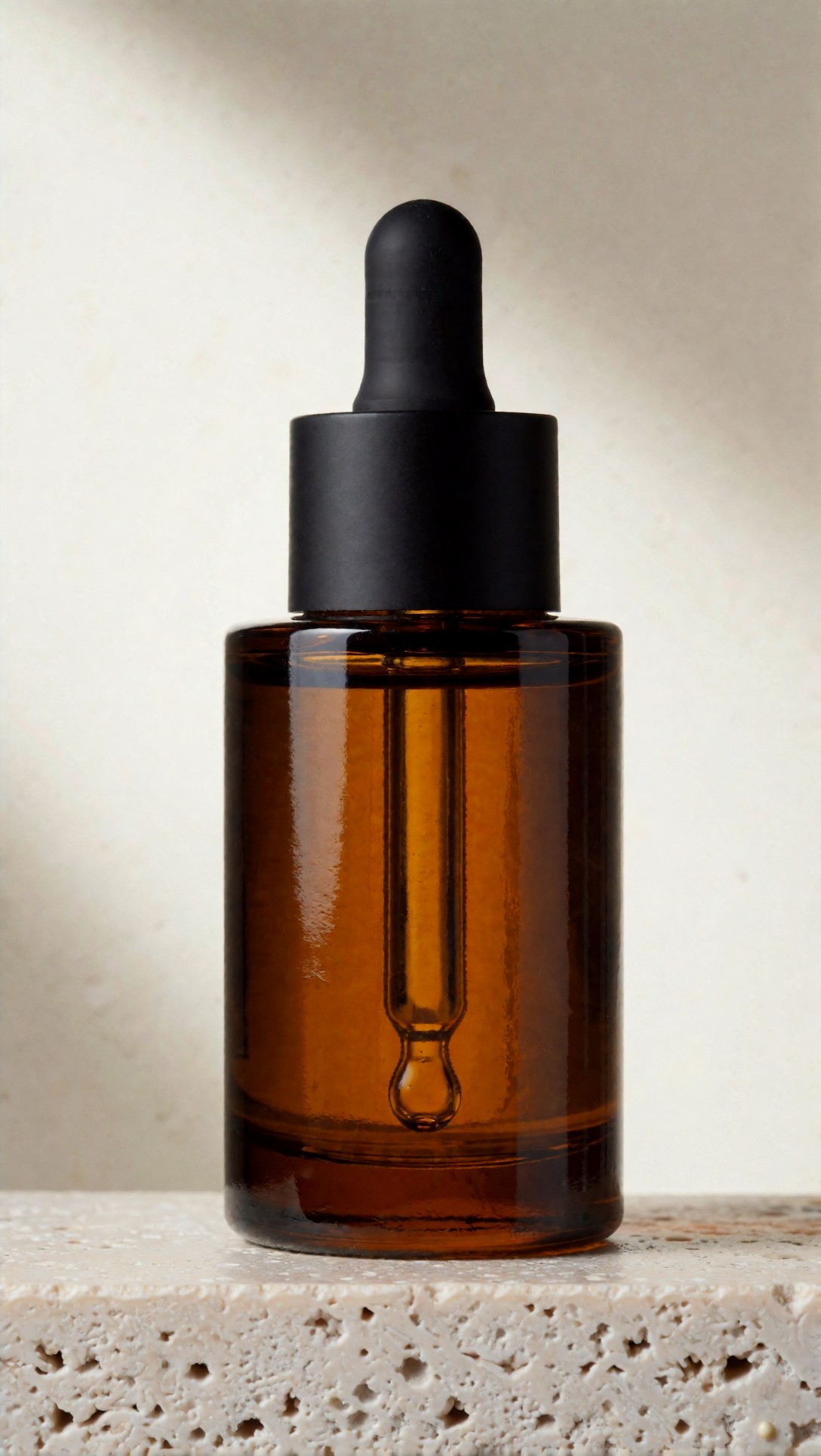
Inspect whether the bottle neck, cap threads, and front label zone remain structurally plausible. The useful outputs kept reflections controlled; the weaker ones invented extra highlights that made the bottle look dented.
In this setup, image-reference workflows clearly outperformed pure text prompts. The strongest result kept the bottle body symmetrical and left enough negative space for typography. The weak point was label text: even when the label area looked realistic, exact product copy still needed post-edit replacement.
What the best tools did well in ad generation
The better generators handled three things consistently:
- clean separation between product and background
- predictable highlight placement on glossy surfaces
- reasonable art-direction response to premium lighting language
What stood out was not just realism. It was controllability. When this setup works, you can push from sterile studio ecommerce into more brand-led ad aesthetics without losing the object.
The next test checked whether a beverage product could survive a more dynamic campaign treatment with condensation, color contrast, and a stronger lifestyle-ad mood.
Topic: Sparkling beverage can social ad visual
Genre: Luxury Campaign
Camera: Nikon Z8
Lens: 70mm f/2
Lighting: neon rim light with cool overhead key
Location: glossy colored studio surface with reflective backdrop
Style: cinematic realism
Final Prompt: A slim sparkling beverage can standing upright on a glossy cobalt studio surface, fresh condensation droplets across the metal, front branding panel facing camera, cool overhead key light with magenta and cyan neon rim lighting shaping the cylindrical form, reflective gradient backdrop with controlled glow, energetic premium beverage campaign mood, Nikon Z8 photographic realism, 70mm f/2 compression, crisp aluminum texture, believable pull-tab detail, sharp base ellipse, vivid electric blue, silver, and raspberry color palette, dynamic but uncluttered composition, ad-ready negative space, high contrast reflections kept realistic, premium social campaign finish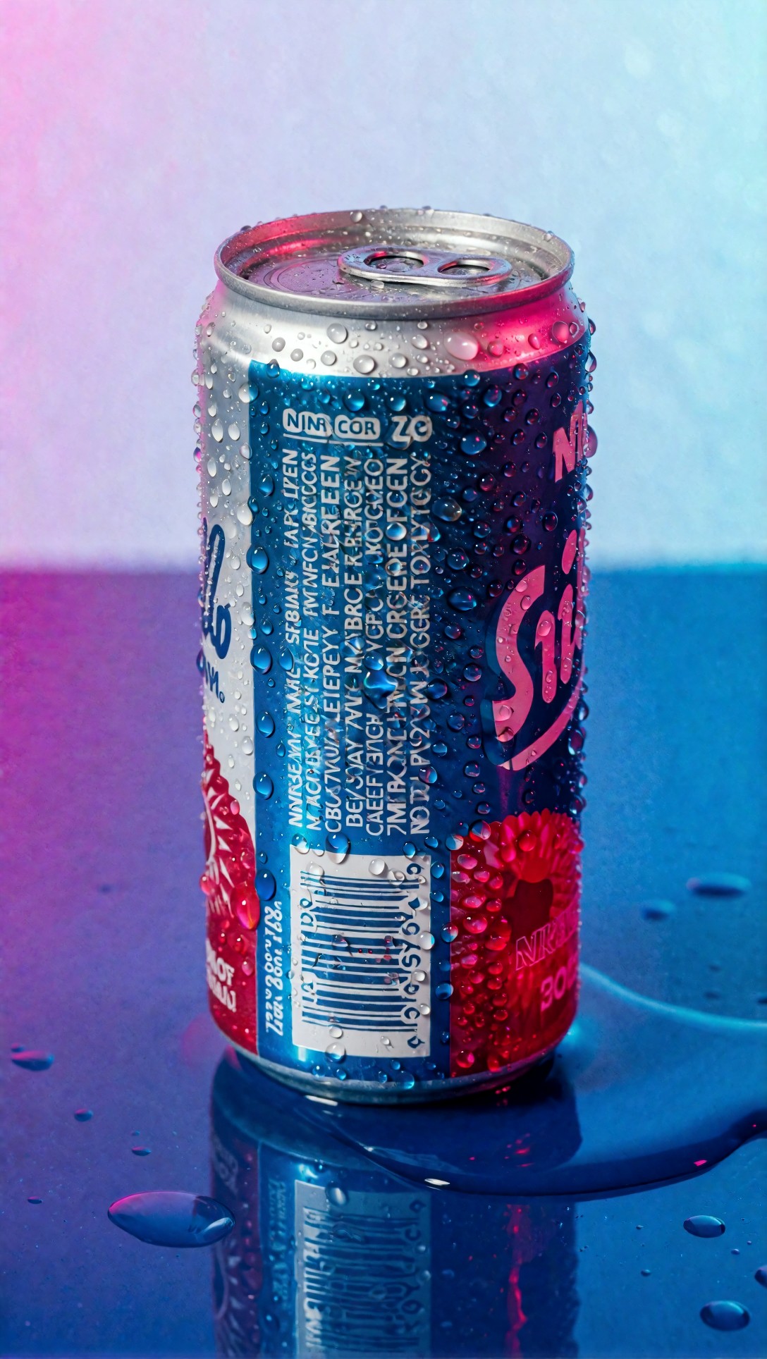
Look closely at the can top geometry, tab placement, and whether the branding panel stays centered instead of wrapping unrealistically. Good outputs kept droplet scale believable; bad ones turned condensation into random chrome noise.
Here, some text-to-image models did surprisingly well because cans are simpler shapes than dropper bottles. But failure risk remained high around the top rim and typography. For ad use, I would still prefer a referenced source can if the design is already approved.
Test case 2: Packaging visuals and shelf context
Packaging visuals are a different problem. You are not just selling the object; you are showing its print system, material feel, and how it sits in context. This is where the AI tools for packaging visuals start to separate sharply.
The most reliable route in this test was using a real front-face pack render or flat artwork reference, then generating shelf or tabletop context around it. Pure generation was faster, but it introduced too many small design changes.
This prompt was used to test carton fidelity, print discipline, and material texture on a semi-matte package.
Topic: Organic tea carton packaging mockup
Genre: Product Editorial
Camera: Fujifilm GFX100 II
Lens: 80mm f/1.7
Lighting: overcast diffusion through large window
Location: boutique grocery shelf with muted natural materials
Style: elegant retail editorial
Final Prompt: A premium organic tea carton displayed on a boutique grocery shelf, straight clean carton geometry with crisp folded edges, front panel fully visible and believable for packaging review, semi-matte paper stock texture, subtle botanical pattern printed on the box, surrounded by soft natural wood shelving and muted ceramic jars, overcast diffused window light creating gentle shadows and even print visibility, Fujifilm GFX100 II medium-format realism, 80mm f/1.7 depth and texture rendering, calm earthy green, cream, and oat color palette, elegant retail editorial style, composition balanced for brand presentation, realistic shelf spacing, no warped box corners, no exaggerated props, premium packaging concept visualization
Check the top folds, side panel angle, and whether the front face remains flat enough for packaging review. The better outputs preserved the board thickness and felt printable; weaker ones added impossible creases or made the carton too soft.
What I noticed here is that AI often understands retail mood better than packaging engineering. If the output will be used internally to align on shelf presence, that is fine. If the image is intended for approval of graphic placement, it is not enough on its own.
A second packaging test focused on flexible packaging, which often exposes edge and seam errors.
Topic: Protein powder stand-up pouch launch visual
Genre: Clean Commercial Product Shot
Camera: Sony A7R V
Lens: 90mm f/2.8 macro
Lighting: studio butterfly light with soft fill cards
Location: seamless light gray studio cyclorama
Style: high-end ecommerce advertising
Final Prompt: A matte stand-up protein powder pouch centered on a seamless light gray cyclorama, front-facing with slight three-quarter turn, clearly defined gusset and top seal, realistic zipper line and side seams, clean modern nutrition packaging design area on front panel, studio butterfly key light with soft fill cards producing controlled shadow under the base, Sony A7R V sharpness, 90mm macro product detail, premium ecommerce advertising style, minimal prop-free composition, neutral gray and muted charcoal palette with one accent color, crisp pouch texture without plastic shine, stable silhouette, ad-ready cleanliness, high-resolution commercial finish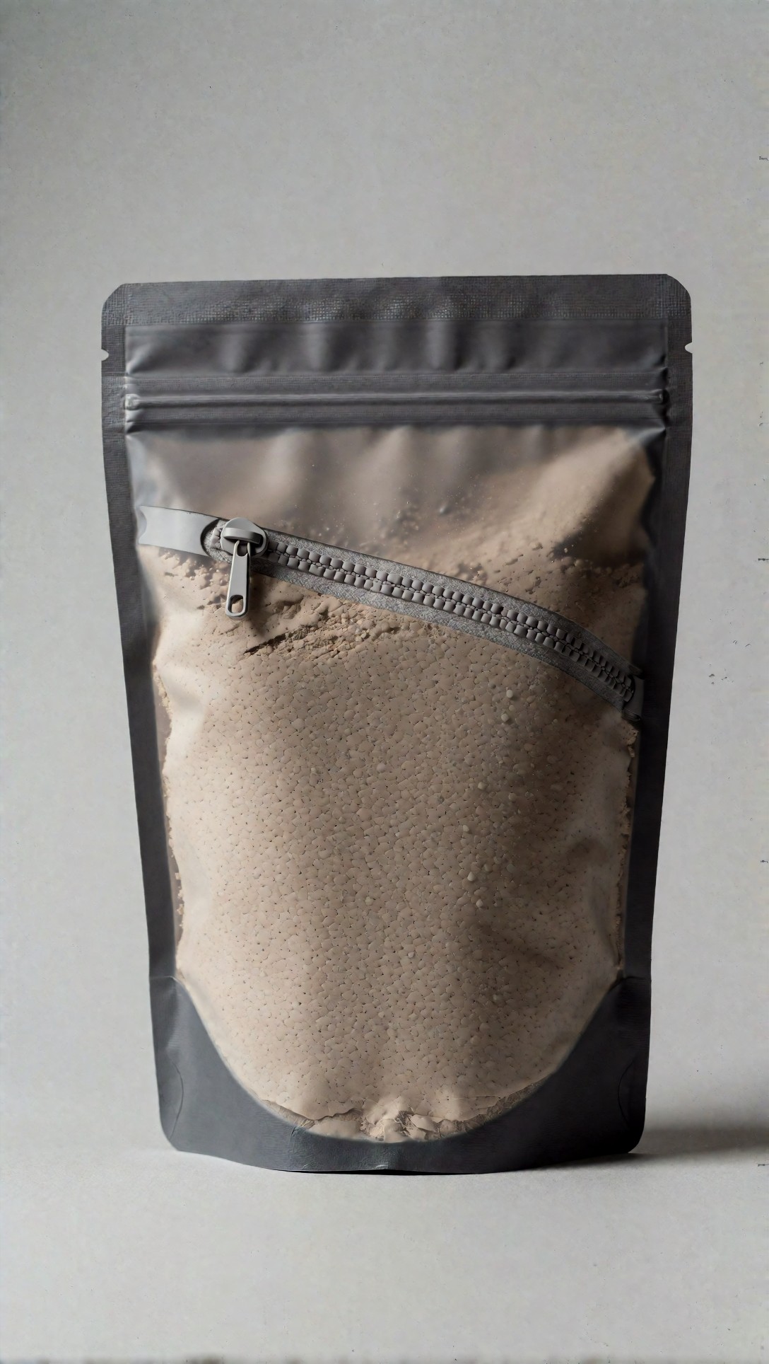
Inspect whether the pouch stands with believable base support and whether seams align with gravity. In weaker outputs, the pouch often bulged unevenly or collapsed in ways that made the pack feel empty or physically impossible.
For flexible packaging, the best AI photo generator for products was not necessarily the one with the most photorealistic lighting. It was the one that understood seam logic and did not randomly alter the top seal width across variations.
Strengths observed across the better workflows
Strong scene ideation speed
For campaign exploration, the best tools turned rough art direction into plausible ad territory quickly. I could test premium studio, kitchen lifestyle, spa minimalism, or bold color-field backgrounds in minutes.
Better material rendering than last-gen systems
Glass, brushed aluminum, paperboard, and matte pouch surfaces all showed noticeable improvement. In this test, matte paperboard and coated glass were the most dependable. Transparent plastic remained harder, especially around distorted refraction.
Faster variant production
Once I had a base image that held the product shape, inpainting was productive. Swapping background color, adding props, or changing crop orientation was much faster than rerunning full generations.
Useful for cross-channel adaptation
A good source composition could be extended into:
- square social ad
- vertical story crop
- landscape site banner
- close PDP support visual
That made image-reference pipelines especially attractive for smaller teams.
Failure risks and limitations
This is the part many comparison pieces skip, but it matters more than the headline results.
Branding drift
Even strong tools may slowly redesign the product after a few edits. The cap gets shorter, the label border changes thickness, the pouch becomes wider. If you are making a campaign set, this drift accumulates.
Text remains unreliable for final packaging
Readable text is improved, but exact legal copy, ingredients, dosage, or multilingual panel content still should not be trusted. For packaging visuals, use AI to support the scene, not to author compliance-critical text.
Reflective products still fail unpredictably
Perfume bottles, chrome caps, and foil labels exposed the biggest inconsistency. The model may place attractive reflections that ignore the actual environment, creating a product that feels rendered rather than photographed.
Hands and product interaction remain risky
If your ad concept includes someone gripping the product, check finger placement and contact shadows carefully. This has improved, but hand-to-object interaction is still a common hidden failure in otherwise usable ads.
The next prompt tested that exact issue with a lifestyle product ad.
Topic: Hand-held luxury perfume bottle campaign image
Genre: Beauty Campaign
Camera: Hasselblad X2D 100C
Lens: 90mm f/2.5
Lighting: sunset backlight with soft bounce fill
Location: upscale hotel balcony at dusk
Style: high-end beauty advertising
Final Prompt: A close beauty campaign image of a hand elegantly holding a faceted luxury perfume bottle near the collarbone, bottle label facing camera, sunset backlight from behind with soft warm bounce fill on skin and glass, upscale hotel balcony at dusk with blurred city lights in the background, refined feminine styling, natural manicured fingers with anatomically correct grip, realistic contact between fingers and bottle edges, amber-gold and soft rose color palette, Hasselblad X2D 100C realism, 90mm f/2.5 portrait-product balance, premium beauty advertising composition, clean skin texture, controlled reflections in the glass, sensual but restrained expression and pose, luxury editorial finish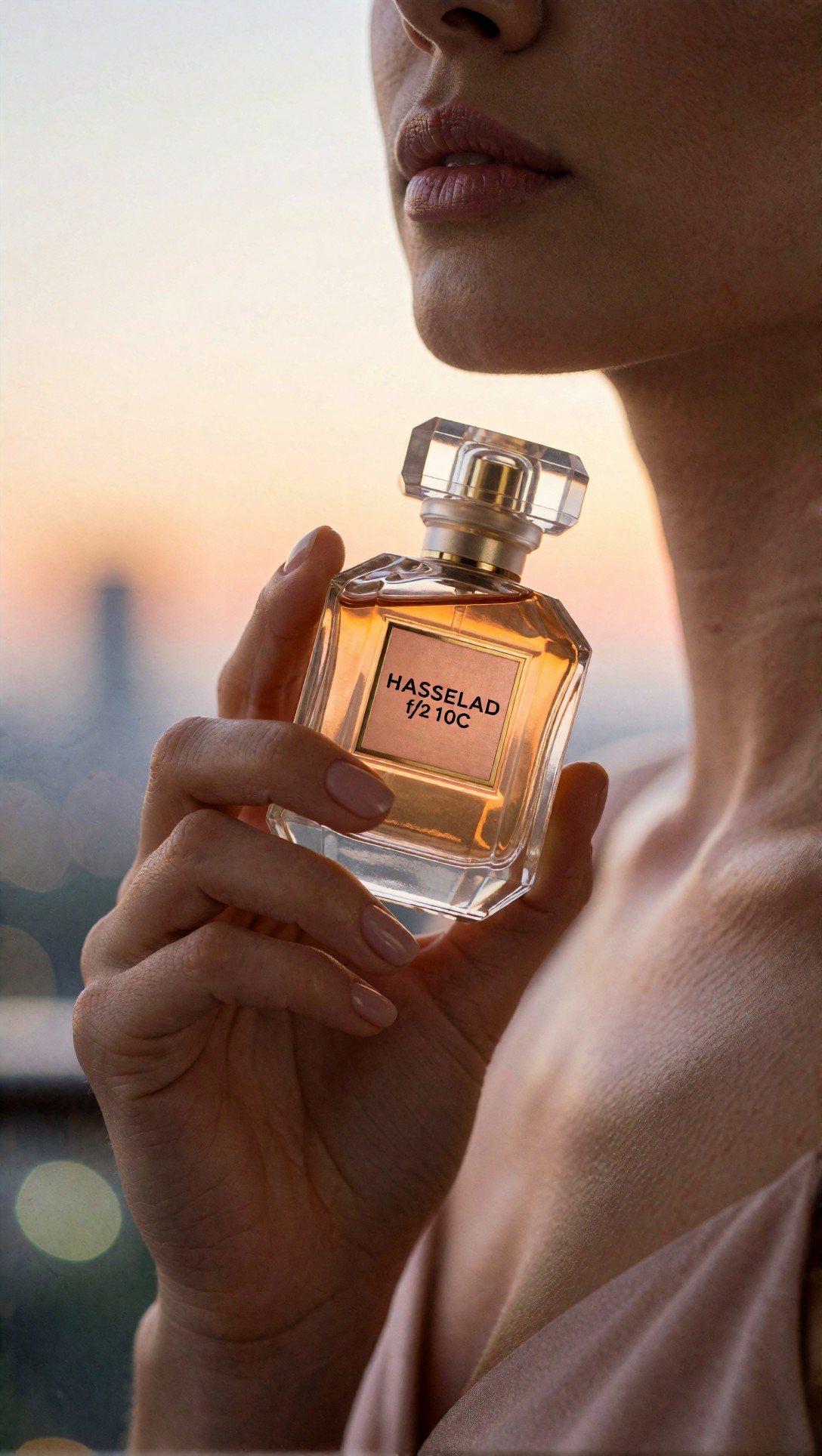
Inspect finger count, finger pressure, and whether the bottle edge actually aligns with the hand. A good image here is strong evidence of model control; a bad one usually fails in small contact details before anything else.
Over-styled outputs for ecommerce use
Some models now default toward glossy ad aesthetics even when asked for simple retail-ready images. That can be a problem for PDPs, where shoppers need clarity more than drama.
Test case 3: Ecommerce hero and PDP support imagery
For ecommerce, clarity beats atmosphere. The best AI generator for ecommerce creatives was the one that could produce a neutral, honest hero shot and then a few secondary context images without changing the product.
This test focused on a clean homepage or product detail page visual for a kitchen product.
Topic: Ceramic coffee bag ecommerce hero image
Genre: Clean Commercial Product Shot
Camera: Panasonic Lumix S1R II
Lens: 50mm f/4
Lighting: large softbox key with subtle reflector fill
Location: bright neutral tabletop studio
Style: minimalist web retail photography
Final Prompt: A specialty coffee bag placed beside a simple ceramic cup on a bright neutral tabletop, coffee bag front panel facing camera, clean rectangular geometry and believable folded top, large softbox key with subtle reflector fill for even detail visibility, soft grounded shadow, minimal web retail photography style, Panasonic Lumix S1R II realism, 50mm f/4 balanced depth, warm ivory, sand, and muted espresso color palette, uncluttered composition with generous negative space, crisp material detail on paper bag and ceramic glaze, accurate perspective for ecommerce hero use, simple premium atmosphere without editorial excess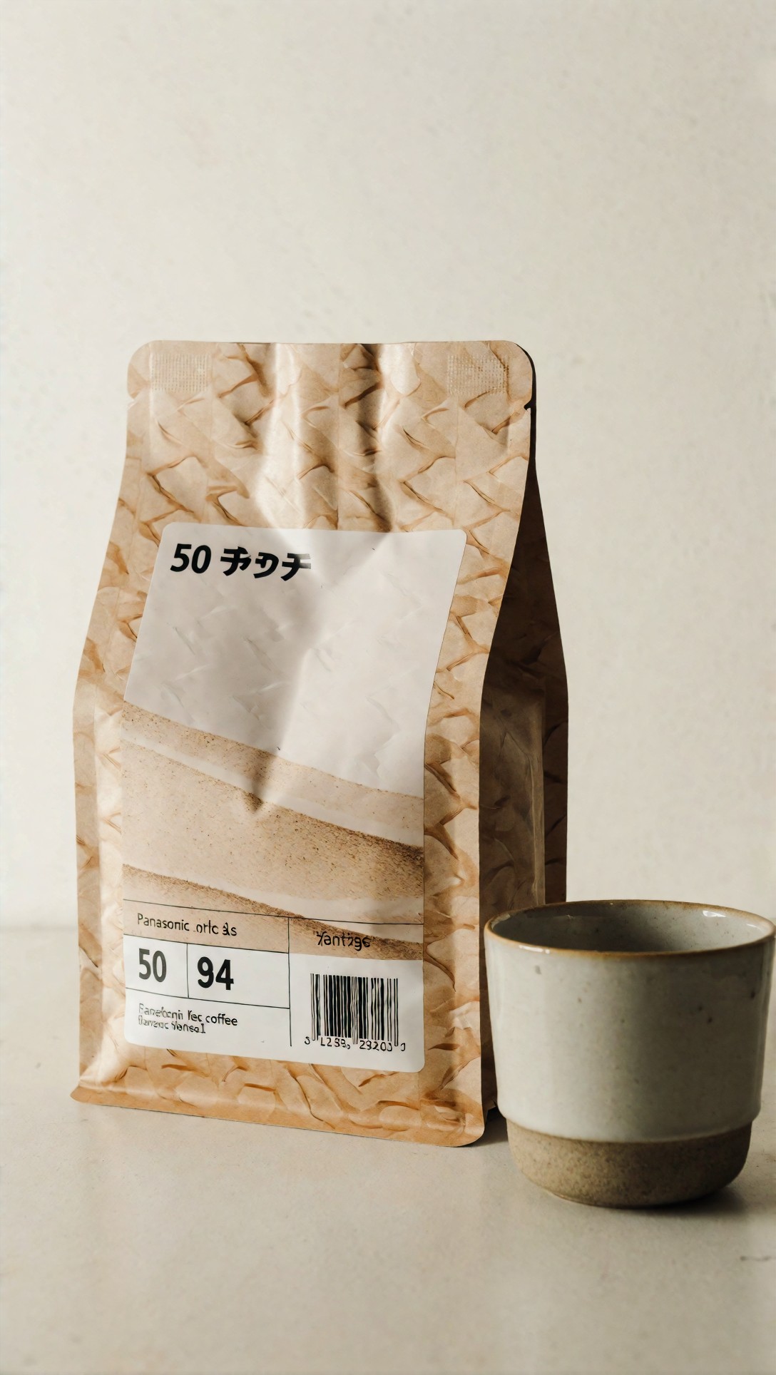
Check whether the product remains the focal point and whether the prop scale makes sense. In stronger outputs, the cup supports the scene without stealing attention; weaker ones let the prop become larger or more detailed than the product itself.
For PDP support imagery, I also tested whether the model could show functional detail without drifting into fantasy styling.
Topic: Smart water bottle feature-focused PDP support visual
Genre: Product Editorial
Camera: Leica SL3
Lens: 60mm f/2.8 macro
Lighting: top soft strip light with side fill
Location: modern office desk environment
Style: clean tech commercial look
Final Prompt: A smart insulated water bottle placed on a modern office desk, slight three-quarter angle emphasizing lid mechanism and body texture, top soft strip light with subtle side fill to reveal contours and material joins, minimal laptop and notebook in soft background blur, front branding area unobtrusive and believable, Leica SL3 realism, 60mm macro precision, clean tech commercial style, charcoal, brushed steel, and pale desk-wood palette, functional premium composition, clear visibility of lid hinge, grip texture, and bottle finish, realistic scale and shadowing, suitable for ecommerce product detail support image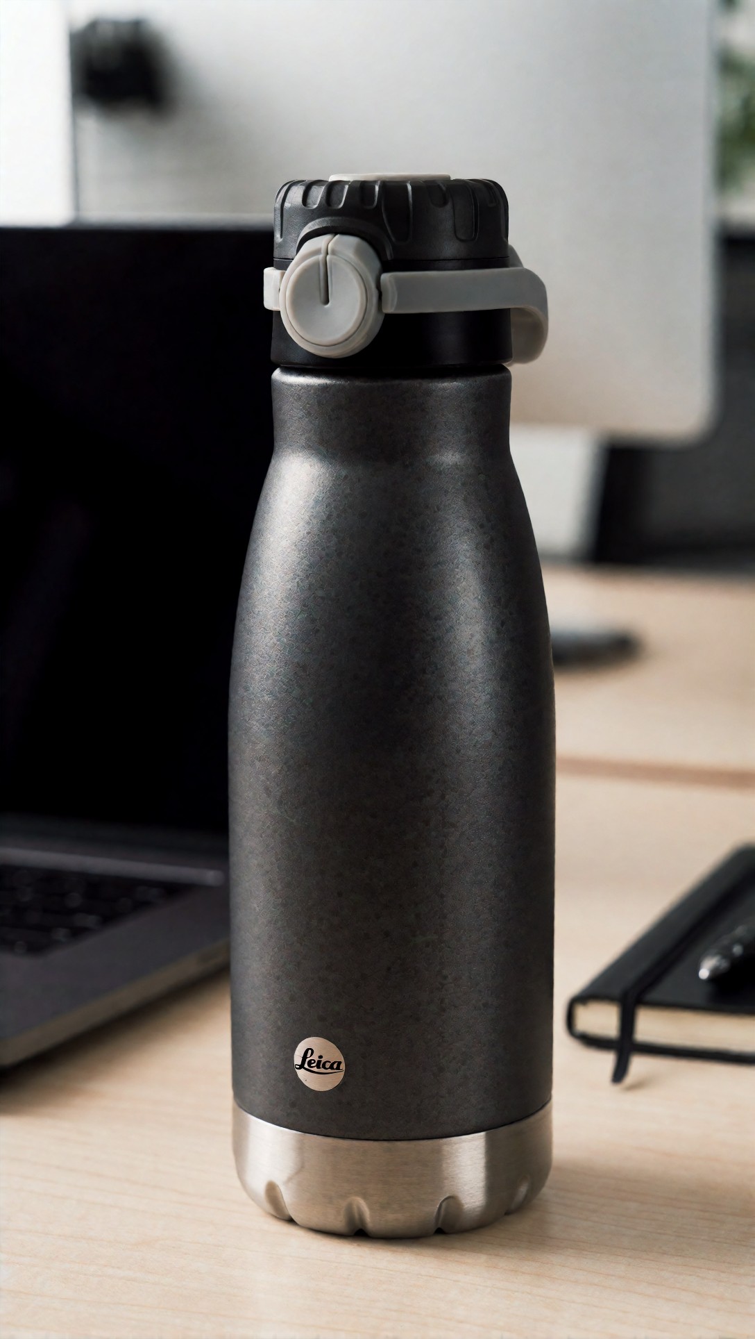
Inspect the lid mechanics, hinge plausibility, and any fine texture on the bottle body. If these details shift between generations, the workflow is poor for feature-led ecommerce pages.
What prompt ingredients made the difference
In this topic, prompt structure mattered because product marketing images need less ambiguity than fashion or concept art. The most useful ingredients were:
- specific product geometry cues like cylindrical, faceted, stand-up pouch, folded top, front-facing panel
- lighting instructions tied to surface behavior like strip rim for glass or overcast diffusion for print visibility
- composition constraints such as centered hero, three-quarter turn, negative space for copy
- material language like semi-matte paper stock, brushed aluminum, ceramic glaze, condensation droplets
- use-case framing such as ecommerce hero, packaging review, PDP support, campaign ad
Without those details, models tended to optimize for mood instead of product truth.
Test case 4: Packaging concept with food context
This prompt checked whether the model could place a packaged food product in a useful campaign environment while keeping the package face readable and physically stable.
Topic: Artisan chocolate bar packaging campaign visual
Genre: Product Editorial
Camera: RED V-RAPTOR cinema still
Lens: 50mm T2.1
Lighting: moody side key with soft practical warm fill
Location: dark stone tabletop with cacao ingredients
Style: luxury food advertising
Final Prompt: An artisan chocolate bar package leaning slightly against broken cacao pieces on a dark stone tabletop, front panel clearly visible, foil-paper wrapper structure believable with crisp folds, moody side key light shaping package edges with soft warm practical fill in the background, scattered cacao nibs and one linen napkin used sparingly, RED V-RAPTOR cinematic still look, 50mm T2.1 shallow depth, luxury food advertising style, deep brown, copper, and cream palette, rich texture detail, premium but controlled composition, no excessive garnish, realistic packaging scale, tactile material rendering, ad-ready frame with space for campaign copy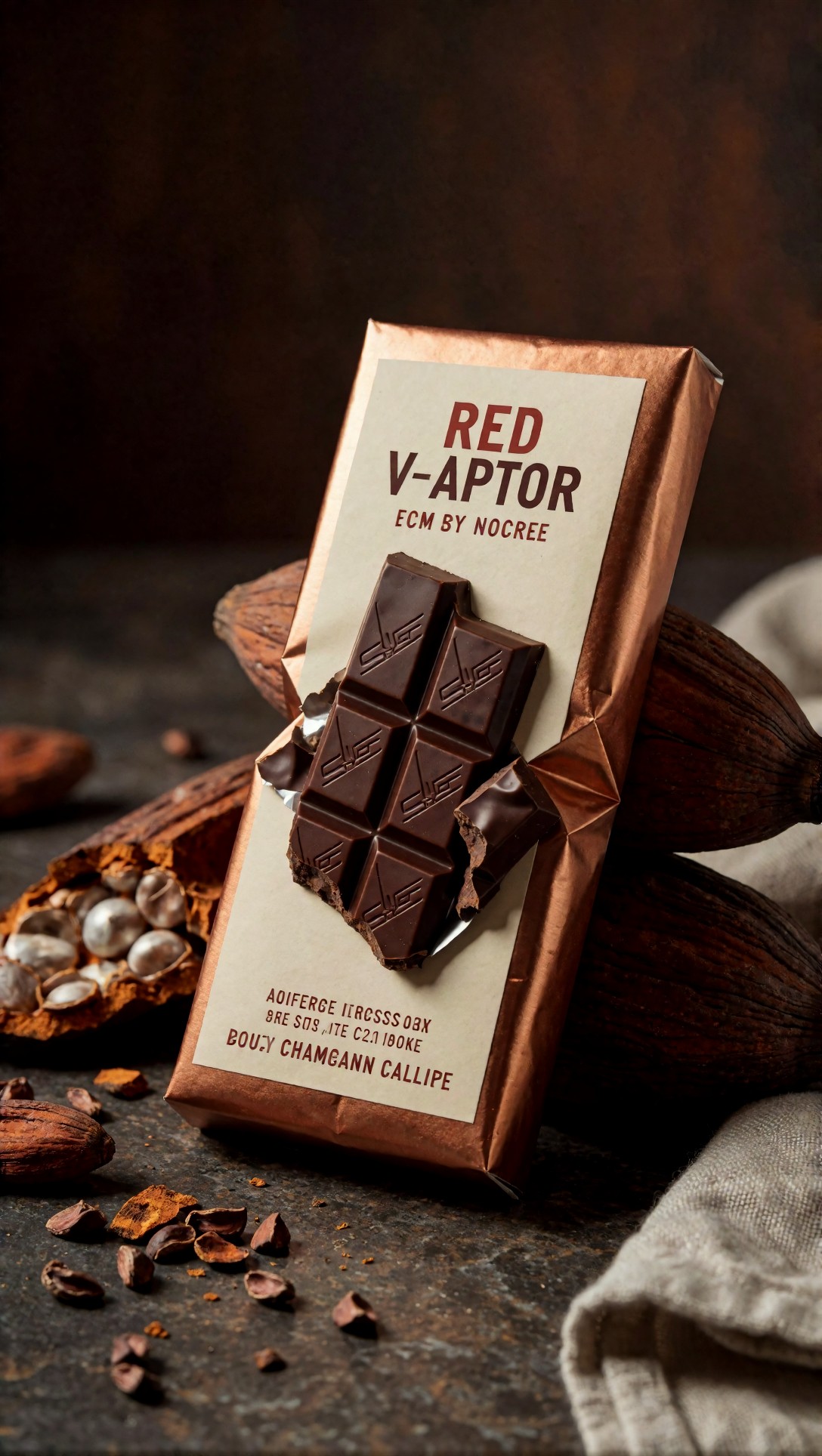
Inspect fold realism and whether the package remains readable against the dark environment. The strongest outputs balanced atmosphere with legibility; weaker ones buried the package in props and shadow.
This is where an AI image generator for product ads can become less useful if the art direction is too cinematic. Packaging visibility drops quickly when atmosphere is overemphasized.
Practical recommendations by use case
If you need paid social ads
Use an image-reference workflow first. Start from a clean packshot, lock the product angle, then generate environmental or graphic context around it. This gives the best balance between speed and brand fidelity.
What I would change next if results are weak:
- simplify the background
- specify exact light direction
- reduce prop count
- restate front-panel visibility
If you need packaging visuals
Do not rely on pure text prompts for final packaging representation. Use real packaging artwork, mockups, or 3D renders as anchors. Let AI handle shelf setting, mood, and supporting scene extension.
Best for: concept review and launch presentation
Avoid for: final sign-off on copy, dielines, or legal text
If you need ecommerce creatives at scale
Build a repeatable scene system. One lighting setup, one pedestal logic, one prop language, then swap product variants through masks or reference images. This is more efficient than chasing originality for every SKU.
Best for: category consistency and fast merchandising updates
If you need premium campaign visuals
Use text-to-image to explore campaign mood, then rebuild the selected route with product references. In this test, that two-stage method produced better final ad candidates than trying to force exact branding in a single pass.
Output quality checklist based on observed results
Before approving any AI product image, I would check:
- product silhouette matches source SKU
- label area size and placement are plausible
- top, base, seams, folds, and closures are physically coherent
- reflections match the stated lighting direction
- prop scale does not overpower the product
- shadows connect the object to the surface
- text is treated as placeholder unless manually replaced
- repeated variations do not drift in dimensions or branding
- crop leaves usable copy space if intended for ads
- resolution holds up after upscale and export
When upscaling helped and when it did not
Upscaling was useful for texture recovery on paperboard, ceramic, and matte pouches. It was less useful when the base image already had structural errors. A sharper wrong cap is still a wrong cap.
In other words, upscaling improved finish, not truth. For the AI product image tool comparison angle, this matters: do not confuse detail density with product accuracy.
Test case 5: Web banner lifestyle scene
This test looked at a wide-format banner, where many tools struggle with subject balance and environmental clutter.
Topic: Natural cleaning spray homepage banner visual
Genre: Lifestyle Product Advertising
Camera: Canon EOS R3
Lens: 35mm f/2.8
Lighting: morning window light with soft ambient fill
Location: airy kitchen counter with subtle household context
Style: bright clean commercial lifestyle
Final Prompt: A natural cleaning spray bottle standing on a light kitchen counter in an airy home interior, wide homepage banner composition with the bottle placed slightly off-center for website text, label facing camera, realistic trigger sprayer proportions, morning window light from the side with soft ambient fill across the room, subtle lemons and folded towel in the far background only, bright clean commercial lifestyle style, Canon EOS R3 realism, 35mm f/2.8 environmental perspective, fresh white, pale sage, and warm wood palette, believable countertop reflections, premium but practical home-care marketing image, clear product priority, uncluttered negative space, web-ready composition
Inspect whether the trigger mechanism is mechanically plausible and whether the wide frame still keeps the product readable. The weak outputs typically added too many kitchen props or distorted the nozzle shape.
For web banners, this setup works when the prompt explicitly reserves negative space and limits support props. If you leave the scene open-ended, many models overdecorate the frame.
Test case 6: Cosmetic packaging with reflective materials
Reflective packaging was one of the hardest categories in the entire test, so I included a dedicated setup for it.
Topic: Metallic lipstick carton and tube launch visual
Genre: Beauty Campaign
Camera: Sony FX3 cinematic still
Lens: 85mm T1.5
Lighting: studio butterfly light with silver bounce and rim kicker
Location: glossy black acrylic set
Style: luxe cosmetics advertising
Final Prompt: A metallic lipstick tube standing beside its matching carton on a glossy black acrylic set, both front-facing with slight angle separation, mirror-like rose-gold reflections controlled and elegant, studio butterfly key light with silver bounce and a subtle rim kicker, clean luxury cosmetics advertising style, Sony FX3 cinematic still look, 85mm T1.5 selective depth, black, rose-gold, and soft blush palette, pristine packaging edges, believable cap seam, refined specular highlights, premium beauty composition with restrained glamour, high polish without surreal distortion, negative space for launch messaging
Look for warped mirror reflections and whether the tube and carton feel like the same product family. Better outputs kept the material coherent; weaker ones gave the tube chrome while the carton turned satin or pink plastic.
This was a good reminder that the best AI photo generator for product marketing is often category-specific. A tool that handles food pouches well may still struggle with metallic beauty packaging.
Test case 7: Soft brand lifestyle with apparel accessory product
I also tested a softer editorial-commerce crossover visual because many modern brands want something between PDP clarity and campaign warmth.
Topic: Leather wallet brand story image
Genre: Street Style Product Editorial
Camera: Ricoh GR IIIx
Lens: 40mm equivalent f/2.8
Lighting: overcast outdoor diffusion
Location: quiet city cafe terrace
Style: understated premium lifestyle editorial
Final Prompt: A compact leather wallet placed beside a coffee cup and folded newspaper on a quiet city cafe terrace, wallet angled to show stitching and edge paint, overcast outdoor diffusion keeping texture soft and realistic, understated premium lifestyle editorial style, Ricoh GR IIIx candid realism, 40mm equivalent perspective, deep tan leather, stone tabletop, charcoal metal chair accents, minimal urban background blur, believable everyday luxury mood, careful prop restraint, product remains visual anchor, tactile grain detail, natural shadows, composition suitable for brand story web module
Inspect stitch consistency, edge finishing, and whether the wallet thickness stays believable. This is the kind of image where some models become too fashion-editorial and stop behaving like product tools.
Test case 8: High-clarity tabletop food product for direct response ads
The final prompt checked a direct-response style image where immediate product recognition matters more than atmosphere.
Topic: Granola jar tabletop direct response ad
Genre: Clean Commercial Product Shot
Camera: Olympus OM-1 Mark II
Lens: 45mm f/3.5 macro
Lighting: top softbox with front bounce card
Location: bright breakfast tabletop set
Style: simple high-conversion commercial look
Final Prompt: A clear granola jar with white lid placed on a bright breakfast tabletop, front label facing camera, realistic glass thickness and visible oat texture inside, top softbox light with front bounce card for readable packaging and soft appetizing highlights, simple high-conversion commercial look, Olympus OM-1 Mark II realism, 45mm macro clarity, clean white, honey, oat, and pale blue palette, minimal spoon and folded napkin as secondary props, centered composition, strong product readability, natural tabletop shadow, crisp but honest advertising finish suitable for performance marketing
Inspect ingredient visibility through the jar, lid threading, and whether the label remains a believable flat application on curved glass. Strong outputs here tend to perform well for direct-response creative because the object reads instantly.
Final verdict: what to test before choosing a tool
If you are comparing the best AI photo generator for product marketing, do not choose based on one beautiful sample image. Run the same product through at least three scenarios:
- a clean hero ad
- a packaging or shelf-context shot
- a web or ecommerce variation
That reveals whether the tool can maintain product truth across contexts.
My practical ranking by workflow is:
1. Image-reference generation for real product ads and ecommerce 2. Composite plus AI scene extension for packaging visuals 3. Pure text-to-image for early campaign ideation 4. Inpainting variation systems for scale production once a scene is approved
The strongest result in this test came from workflows that constrained the model with product references, specific lighting language, and explicit composition rules. The weak point across almost every system was still branding precision under repeated variation.
Editorial conclusion
Use this workflow if you need faster concepting, ad variation, or scalable web visuals while keeping a real product recognizable. It is especially effective for marketing teams with existing packshots, approved packaging art, or simple 3D product renders to use as anchors.
Avoid this workflow if your image must serve as final proof of legal packaging text, exact structural engineering, or fully accurate hand-product interaction without review. The failure risk is lower than it used to be, but it is not gone.
If I had to name the single prompt detail that matters most, it would be this: describe the product as an object, not just as a brand mood. Once the prompt specifies shape, material, panel visibility, lighting logic, and intended use case, the model becomes far more useful for real product marketing work.