There is no honest single answer to "what is the best AI upscaler for anime?" from this page, and it is better to say that up front. A ranking needs before-and-after files from the same source run through several tools, and this article does not have them. What it does have is eight anime-style images generated on this site, all opened and inspected, and they show very clearly which parts of an anime picture an upscaler can damage. The practical takeaway: pick a candidate tool from the general guidance below, then judge it on your own image using the inspection points, because the failures that matter depend on the kind of art.
What this article can and cannot tell you
The eight images were generated with Krea2 Turbo on 2026-07-12. Each file I opened is 1088 x 1928 pixels (I read this from the file headers). They are originals, not upscaled outputs. No generation record mentions an upscaler, a scale factor, denoise or sharpening values, so nothing here is a measured result for any specific upscaler.
That means statements such as "anime-trained models keep lines thinner" or "photo enhancers add skin pores" are not findings from these images. Where they appear below, they are marked as general guidance (unverified here). The images are useful for a different reason: they are a realistic set of source material, and you can see in them exactly where an upscale has something to ruin.
One size fact is worth having. At 1088 x 1928, a 2x upscale means 2176 x 3856 pixels and a 4x upscale means 4352 x 7712. That is simple arithmetic on the file size, and it tells you the output can get very large very quickly, so check your tool's limits before choosing 4x.
Thin ink lines and flat fills
The first image is the clearest case of what makes anime different from a photograph.
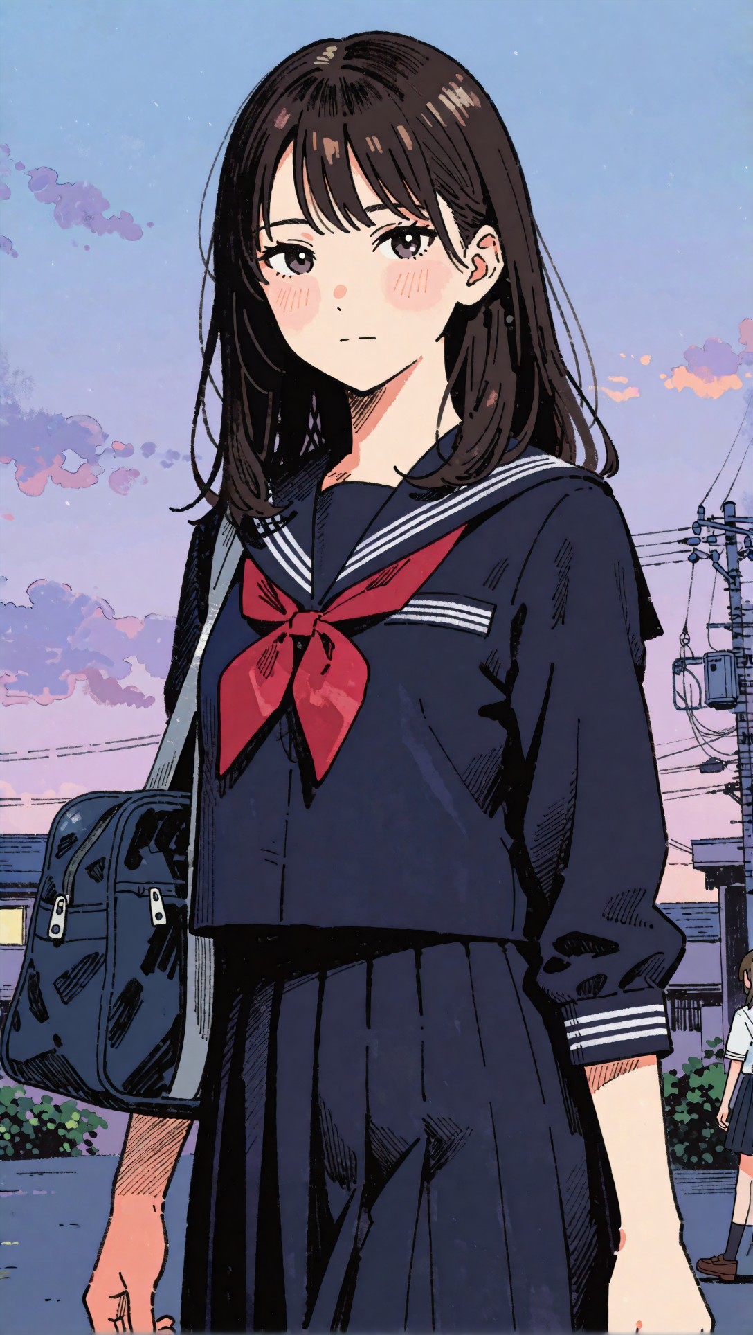
Here the outline is a thin, dark, even stroke around the eyes, bangs and collar. The shadows on the skirt and the bag are drawn as dense black hatching, the blush on the cheeks is a flat pink shape with a few short strokes, and the sky is a few flat-coloured cloud shapes on a soft blue-to-lavender gradient. The skin has no texture at all.
This is what an upscaler has to respect. General guidance (unverified here): a tool that treats the outline as an "edge to sharpen" can thicken it, and a tool that treats flat skin as "low detail" can paint grain into it. So after any upscale, zoom to 100 percent on the eyes, the hair-to-sky border and the hatched areas, and compare them with the original. If the lines got heavier, doubled, or the flat cheek now has noise, that tool is not a good fit for this kind of image.
The prompt for this image, exactly as recorded, began with an anime description and then ran on into an unrelated fashion-photography phrase list:
anime key visual of a high school girl in a navy school uniform with red ribbon, three-quarter portrait, calm neutral expression, clean inked outlines, flat cel shading, subtle blush, glossy dark hair with controlled highlights, simple dusk skyline background, soft lavender and blue color palette, clear silhouette separation between hair and sky, minimal skin texture, balanced composition, poster-ready framing, crisp line art, refined anime production still quality, trend led fashion mood, outfit-first fashion editorial, complete styling system, visible fabric texture, accessories, shoes, bag, scene context, natural pose or walking action, 35mm editorial photography, realistic street, runway, retail, or lookbook settingThe result is still an anime illustration, so the fashion tail did not turn it into a photograph, but it is a good reminder that a clean source is easier to judge than a mixed one.
Bright rim light and halos
Side profiles and backlight are where any bright fringe would show up.
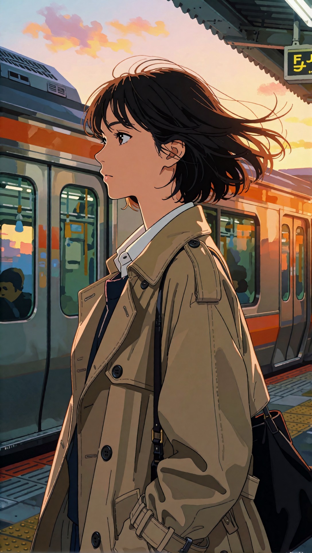
In this image the hair edge has warm orange light against a pale sky, the coat is drawn with thin dark lines plus large soft-edged shadow shapes, and the train behind is painted in a looser style than the character. There is a small lit sign at the top right whose characters are not legible (they read as broken glyphs), so that is text no upscaler can recover: it was never a real word.
What to inspect after an upscale: the loose hair strands against the sky, the collar of the white shirt against the dark coat, and the thin seam lines on the coat. A halo (a light rim around a dark shape) or a wobble in those seam lines would be visible at 100 percent even when the image looks fine at thumbnail size.
Painterly texture: where a flat-art tool may not fit
Not every anime image is cel-shaded, and the fourth image shows why one rule does not cover all of them.
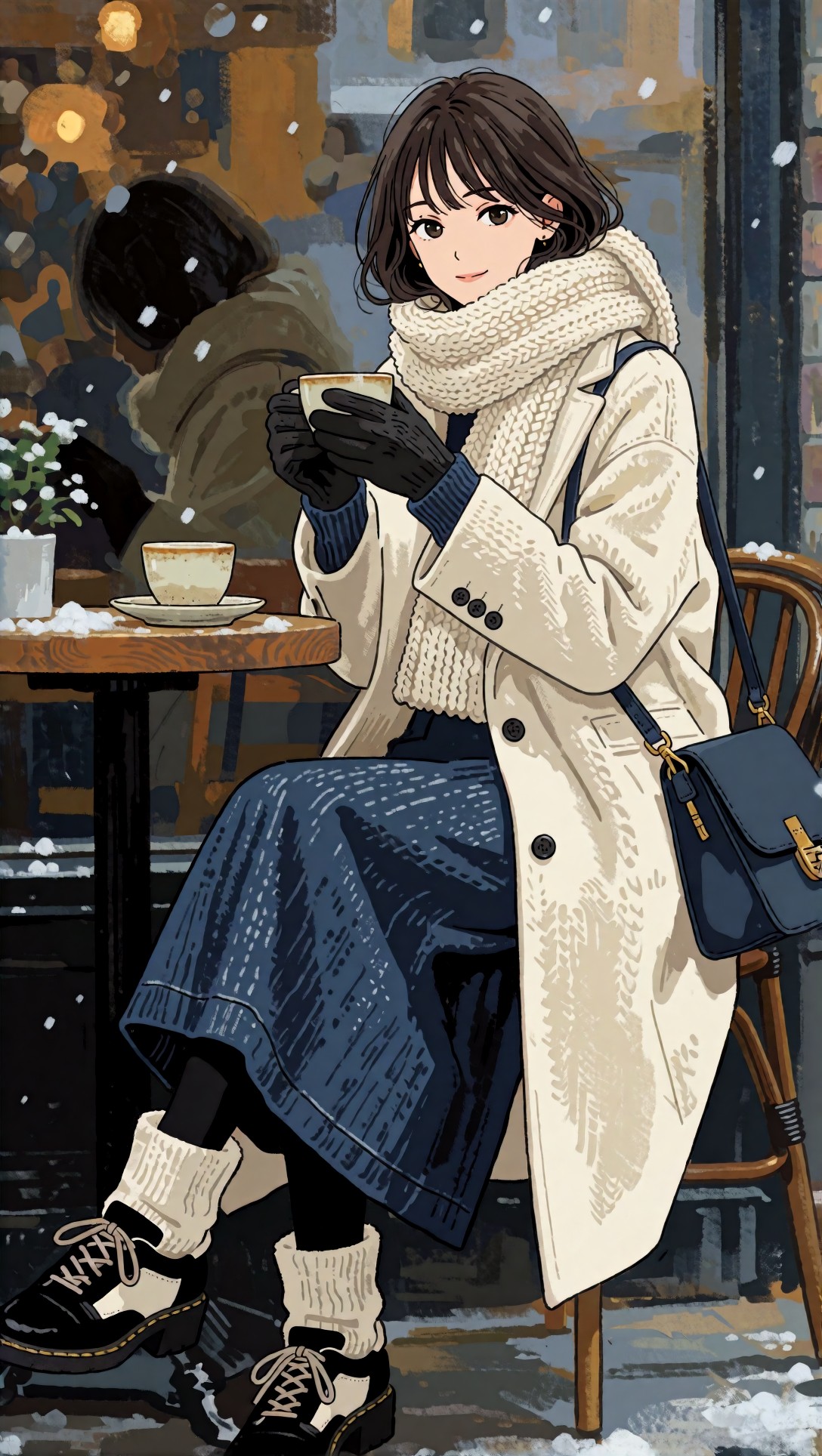
The coat, the scarf and the long blue skirt are rendered with visible dry-brush strokes and a chunky knit pattern, while the face keeps clean line work. The background is an abstract, painted blur. Here the texture is part of the art. General guidance (unverified here): a tool built for flat line art may smooth those strokes away, while a tool that adds detail may enhance them but also risk making the face look rough. The place to check is the boundary between the two styles, the cheek and the scarf edge.
Dark hair on a dark background
This is a stress test for edge preservation because almost everything is close in tone.
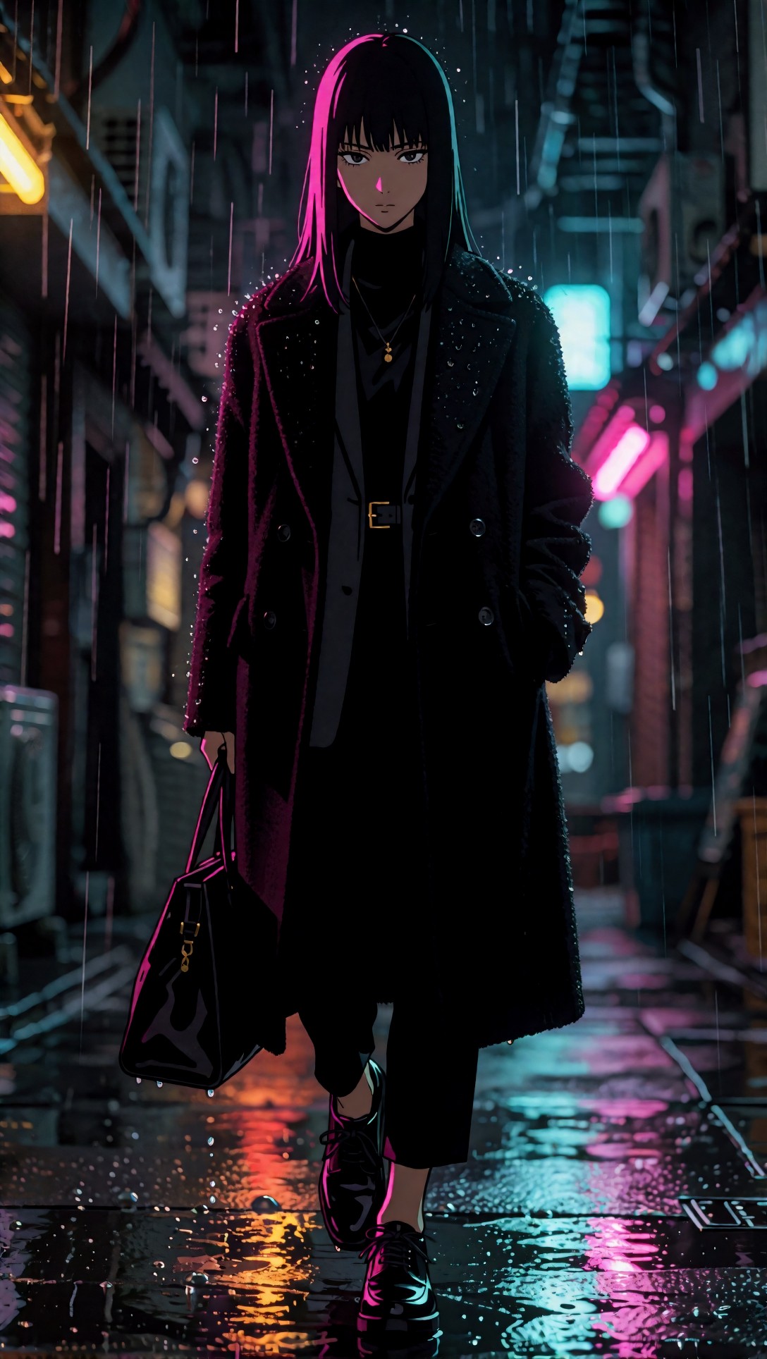
The hair, coat and background are all near black, separated mainly by a thin magenta rim light and by raindrop speckles on the coat. The coat has a fuzzy wool-like surface, the pavement has bright coloured reflections, and there is a faint, unreadable mark at the bottom right of the pavement.
After an upscale, look at whether the magenta rim stays a clean narrow line, whether the raindrops stay distinct dots instead of turning into noise, and whether dark areas show blocky colour patches. Heavy denoising in general can flatten shadow detail, but that is not something these images measure.
Dense ornament: lace, embroidery, jewels
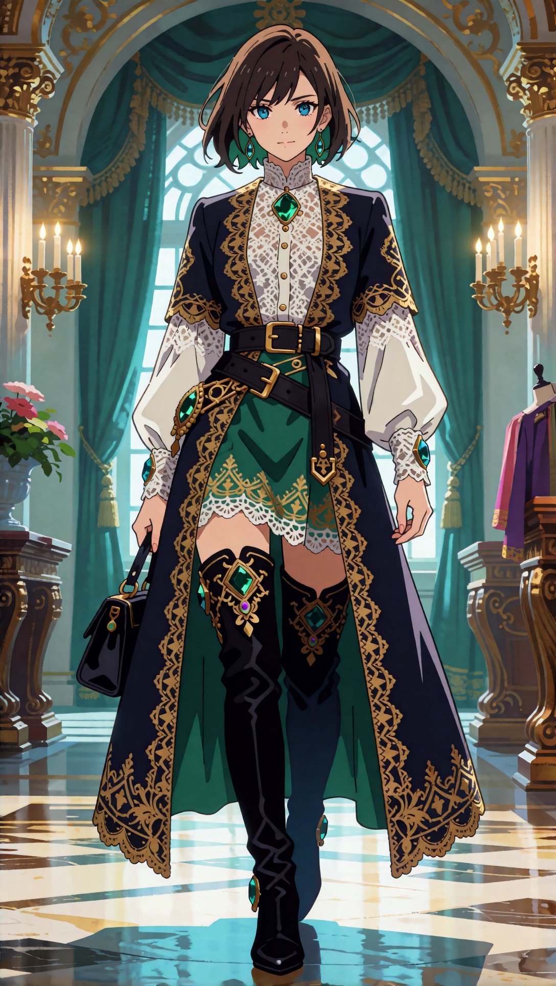
This one packs the most fine structure into one picture: a white lace blouse, gold scroll embroidery along the coat edges, a scalloped lace hem over the green skirt, jewels on the belt and boots, and a marble floor with reflections. The face is small in the frame, so any face damage matters less than lace damage.
Two checks apply. First, whether the lace pattern keeps its holes and does not clot into a smear. Second, whether the gold embroidery keeps its shape instead of becoming noisy specks. In this source image the hands and the boots look structurally sound, so if they change after an upscale the change comes from the tool. I did not run any upscale on this file.
A wide scene with signs, wires and branches
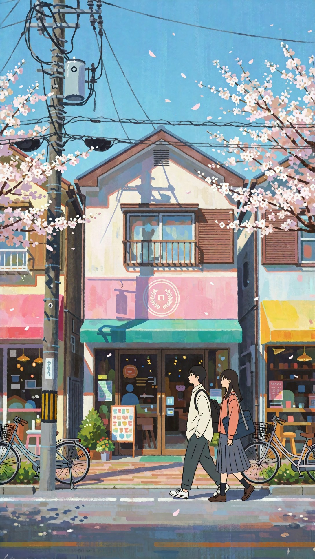
Background art stresses different things: the tangled wires on the pole, thin branch twigs against a flat sky, the shop sign board with coloured shapes instead of readable words, and a round emblem on the pink sign. The pattern on the sandwich board is not real text. An upscaler cannot turn those shapes into words and, if it tries, it may invent letters.
After upscaling, check that wires remain continuous single lines, that branches do not break into dashes, and that the emblem does not gain made-up lettering.
How to choose and test a tool
Putting the images together, this is the testing routine the set supports:
1. Pick one image from your own work that is hardest for your style. For flat line art, use something like the first image. For dark or neon art, use something like the noir alley. 2. Run the same file through each candidate at a modest scale first (2x is a sensible starting point, general guidance). 3. Compare at 100 percent on four spots: the eye, the hair edge, a flat colour area such as a cheek or sky, and any fine ornament. 4. Reject a tool as soon as it thickens lines, adds grain to flat fills, or invents text. Do not average these failures into a score.
You can try an upscale directly in the [Upscaler](/upscaler/en). If your goal is portraits specifically, the article on [the best AI upscaler for portraits](/articles/best-ai-upscaler-for-portraits/en) covers that case, and [the SeedVR2 3B vs 7B outfit portrait comparison](/articles/seedvr2-3b-vs-7b-outfit-portrait-upscaling-en/en) looks at how outfit detail holds up when upscaling.
Honest gaps
These images were not compared against any tool, so this article does not say which upscaler preserved them best. It also does not give tested settings for denoise or sharpening. Commonly repeated guidance such as lower sharpening for line art and two smaller upscales instead of one large one is general practice and has not been verified on this set.
FAQ
Is 4x upscaling good for anime? This article did not test it. Because every added pixel multiplies any damage to thin lines, starting at 2x and inspecting before going further is a common cautious approach.
Should I use a photo enhancer for anime? General guidance (unverified here) is that photo-oriented tools can add skin or fabric texture that cel-shaded art never had. The painterly cafe image is the kind of source where added texture might be welcome, but only your own test on your own file can tell.
Can an upscaler fix garbled text in a generated image? No. In these images the signs are already unreadable shapes. An upscaler only enlarges them, and it may add convincing but wrong letters.
> What this article is based on. Model: Krea2 Turbo, eight images generated on 2026-07-12. I opened and inspected all eight files (six are shown) and read each file's pixel size from the header (1088 x 1928). No upscaled outputs or upscaler settings were recorded, so no upscaler comparison is reported.