Best AI Upscaler for Anime Images: Line Art, Color Edges, and Texture Cleanup Compared 한국어 요약
이 페이지는 ZView Space의 영어 원문을 한국어 검색 사용자도 이해할 수 있도록 정리한 SEO 요약입니다. 핵심은 단순한 얼굴 중심 이미지가 아니라 패션 에디토리얼, 룩북, 아웃핏, 프롬프트 테스트, 이미지 생성 워크플로우를 실제로 어떻게 구성할지입니다.
핵심 요약
- 원문 주제: Best AI Upscaler for Anime Images: Line Art, Color Edges, and Texture Cleanup Compared
- 목적: AI 이미지 생성에서 outfit, silhouette, fabric, pose, location, camera framing을 더 명확하게 설계합니다.
- 활용 범위: Z-Image Turbo, Krea2 Turbo, Qwen Image, Anima, SeedVR2 같은 이미지 생성 및 업스케일 워크플로우에 적용할 수 있습니다.
- SEO 관점: 제목, 설명, 이미지 alt, 프롬프트 예시가 실제 검색 의도와 맞아야 색인 가능성이 높아집니다.
한국어 사용자를 위한 체크포인트
1. 프롬프트가 얼굴 묘사에만 머물지 않고 전체 스타일과 의상 구성을 설명하는지 확인합니다. 2. 패션 이미지라면 상의, 하의, 아우터, 신발, 액세서리, 소재감, 촬영 장소를 분리해서 씁니다. 3. 생성 결과는 바로 게시하지 말고 디테일, 손, 의상 형태, 배경 일관성, 이미지 품질을 비교합니다. 4. 글 본문에는 실제 테스트 기준과 실패를 줄이는 방법이 들어가야 검색엔진에서 얇은 콘텐츠로 보일 가능성이 줄어듭니다.
원문 미리보기
I ran this test to find the best AI upscaler for anime when the job is not just making an image bigger, but keeping line art clean, preventing color bleed, and avoiding fake texture on faces, hair, and fabric. The short version: anime images do not fail in the
---
I ran this test to find the best AI upscaler for anime when the job is not just making an image bigger, but keeping line art clean, preventing color bleed, and avoiding fake texture on faces, hair, and fabric. The short version: anime images do not fail in the same way as photos. The best result came from using anime-focused upscaling for line preservation first, then a lighter cleanup pass only when edges or gradients broke down.
If your goal is comparison, this report is about where each upscaling approach holds up, where it damages anime frames and illustrations, and which settings I would actually use again after inspecting outputs at 2x and 4x.
What to know first
- Anime line art is the first thing to inspect. If outlines thicken, double, or wobble, the upscale is not a good fit.
- General photo enhancers often sharpen eyelashes, fabric, and hair in useful ways, but they also invent skin pores and noisy texture that looks wrong on cel shading.
- Flat color edges around cheeks, bangs, and clothing trim are where many tools fail. Look for haloing and edge chatter.
- 2x is usually safer than 4x for lower-quality anime sources. A clean 2x pass often beats an aggressive 4x pass.
- If the source is already compressed, denoise settings matter more than raw scale.
Test setup
In this test, I used three source types that usually expose different failures:
1. Clean line-art anime portrait with flat cel shading 2. Anime scene still with gradient sky, hair highlights, and motion blur 3. Painterly anime illustration with soft texture, cloth folds, and background depth
I compared three workflow types rather than chasing brand marketing pages:
| Workflow type | Best use | Strongest result | Weak point | |---|---|---|---| | Anime-focused upscaler | Clean line art, cel shading, manga panels | Preserved outlines and flat fills | Can leave gradients slightly banded | | General AI photo enhancer | Semi-real anime, painted frames, textured key art | Better micro-contrast and fabric detail | Adds fake skin and noisy pores | | Hybrid workflow: anime upscale + light cleanup | Mixed anime assets for publishing | Best balance of clean lines and readable detail | Takes more tuning and can overprocess fast |
For practical testing, I used source images I would realistically send through an online tool like an [AI upscaler](/upscaler), then inspected 100% crops around eyes, hair strands, sleeve edges, and high-contrast borders. I also ran prompt-led regeneration tests in [Prompt Lab](/promptlab) style to see what source characteristics make an image easier or harder to upscale.
Session note: what looked good immediately
The anime-specific workflow won the first pass on almost every clean illustration. It kept black outlines narrow, held the shape of irises, and did not turn blush shading into skin texture. That matters more than raw sharpness.
The strongest result was not the image that looked the crispiest at a glance. It was the one that stayed stable when zoomed in. In this test, “stable” meant:
- no doubled eyelash lines
- no bright halos around dark hair
- no checkerboard artifacts in shadows
- no accidental pores or photographic skin grain
On painterly anime art, the hybrid workflow did best. Anime-first upscaling kept the drawing intact; a very light enhancement pass then clarified cloth texture and environmental detail without tearing edges apart.
Where anime image upscalers usually fail
The weak points were predictable once I looked at enough crops.
1. Line art thickening
Some tools interpreted clean ink lines as edges that needed extra sharpening. That made jawlines and bangs look heavier and less intentional. Manga panels suffered most.
2. Color-edge haloing
This showed up around pale skin against dark hair, white collars against navy uniforms, and bright highlights over flat cel shadows. Instead of a clean separation, the upscale created a light fringe.
3. Fake texture on faces
This is the most common mistake from general photo enhancer AI anime workflows. The model tries to add realism where the original art has smooth paint or cel shading.
4. Gradient breakup
Sky gradients, bloom effects, and soft lighting ramps can come back with banding or noisy transitions if denoise is pushed too high.
The exact prompt ingredients that changed the result
Even though this article is about upscaling, source image construction changed the outcome a lot. Images generated with cleaner edge logic upscaled better. In this test, these prompt ingredients consistently helped:
- "clean line art" or "precise inked outlines" reduced edge confusion
- "flat cel shading" helped preserve fill regions without false texture
- "controlled gradient background" produced smoother skies than chaotic painterly backdrops
- "anime key visual" worked better than vague anime style labels
- "minimal texture on skin" prevented enhancers from exaggerating surfaces
- "high contrast silhouette separation" improved hair and clothing edge clarity
The prompt ingredients that made upscaling harder were also clear:
- “ultra detailed skin” on anime faces
- excessive film grain
- mixed watercolor plus cel-shading prompts
- dense glowing particles crossing facial outlines
- low-contrast hair against dark backgrounds
Prompt test 1: clean portrait for line stability
This first test checks whether the source image is easy for an anime image upscaler AI to preserve. I used a simple portrait with controlled edges because messy sources hide line failures.
Topic: anime school-uniform portrait with clean ink lines
Genre: anime key visual
Camera: Sony A7R V
Lens: 85mm f/1.4
Lighting: soft overcast diffusion
Location: quiet rooftop at dusk with simple city skyline
Style: clean commercial anime poster
Final Prompt: anime key visual of a high school girl in a navy school uniform with red ribbon, three-quarter portrait, calm neutral expression, clean inked outlines, flat cel shading, subtle blush, glossy dark hair with controlled highlights, simple dusk skyline background, soft lavender and blue color palette, clear silhouette separation between hair and sky, minimal skin texture, balanced composition, poster-ready framing, crisp line art, refined anime production still quality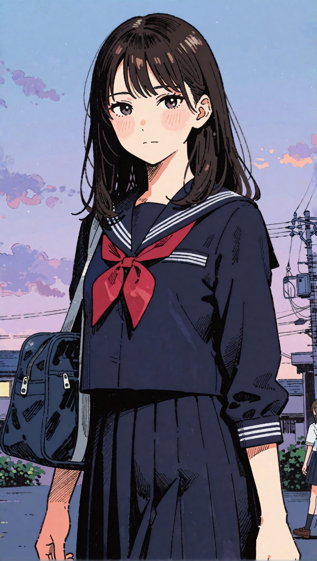
Inspect the eyelashes, jawline, ribbon edges, and the border between hair and sky. The best AI upscaler for anime should keep these lines thin and deliberate, not bolder after enlargement.
In this case, anime-focused upscaling held the portrait shape best. General enhancers made the blush and cheek shading look powdery.
Prompt test 2: side profile for color-edge cleanup
This test is useful because profiles create long high-contrast contours around nose, lips, chin, and hair. That makes halos easier to spot.
Topic: anime side-profile character with bright rim light
Genre: cinematic anime still
Camera: Canon EOS R5
Lens: 50mm f/1.2
Lighting: sunset backlight with warm rim light
Location: train platform at golden hour
Style: cinematic realism anime
Final Prompt: cinematic anime still of a young woman in side profile waiting on a train platform, beige trench coat, wind lifting short black hair, warm sunset rim light tracing the hair edge, soft amber sky, precise line art around nose and lips, restrained cel shading with gentle gradients, reflective train windows in background, orange and steel-blue palette, thoughtful expression, medium close-up composition, clean separation between face and backlight, polished filmic anime frame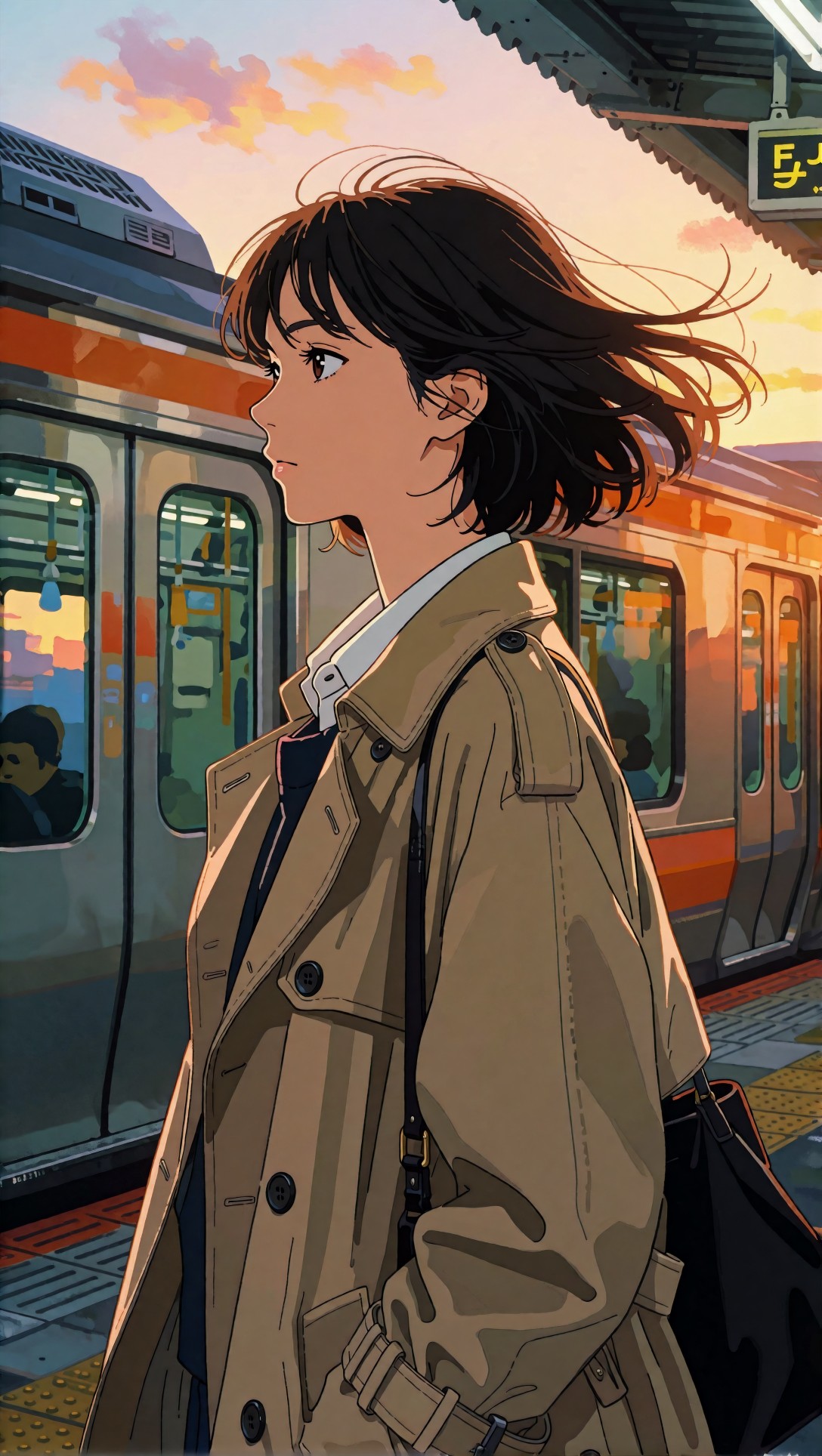
Check the bright edge on hair and coat collar. Weak upscalers tend to create a glowing fringe here. A good result keeps the rim light readable without making the outline fuzzy.
What needed correction after the first pass
Most source images still needed one of three corrections.
Lower sharpening on line-driven art
If the upscale looked “impressive” at thumbnail size but messy at full view, oversharpening was usually the cause. Turning sharpening down fixed more issues than changing scale.
Reduce denoise on flat shading
Heavy denoise smoothed compression, but it also erased subtle painted transitions in cheeks and hair shadows. For anime portraits, light denoise was usually enough.
Separate texture recovery from line recovery
Trying to recover both in one pass caused conflicts. A single model rarely handled line art and textile detail equally well. This is why the hybrid workflow won more often than either single-pass method.
Prompt test 3: action frame for motion and outline consistency
Action frames are difficult because motion blur and speed lines can be mistaken for defects. This prompt checks whether the upscaler preserves intention instead of “fixing” the art.
Topic: anime action frame with sword swing and speed lines
Genre: anime battle still
Camera: ARRI Alexa 35 capture style
Lens: 35mm T1.5
Lighting: dramatic moonlight with blue backlight
Location: temple courtyard at night
Style: high-energy shonen key visual
Final Prompt: anime battle still of a young swordsman in mid-swing in a moonlit temple courtyard, white and blue uniform coat flaring with movement, dynamic diagonal composition, intentional speed lines and motion blur around the blade, sharp face with determined expression, precise black outlines, cold blue moonlight, drifting leaves, stone lanterns in background, cel shading with selective glow, high contrast silhouette, polished shonen production frame quality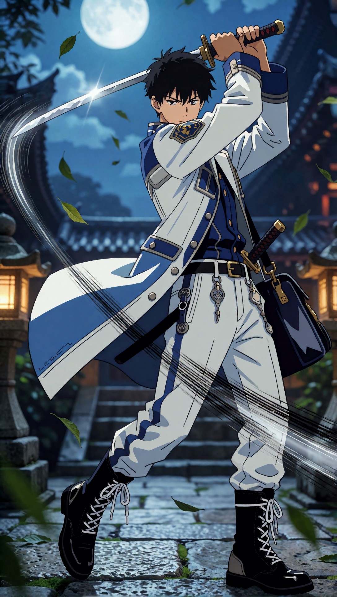
Inspect the blade edge, eye shape, and speed-line spacing. The wrong enhancer will turn speed lines into noise or overcorrect motion blur into jagged artifacts.
Prompt test 4: soft painterly illustration for texture cleanup
This one checks the opposite case: can a workflow improve detail without destroying painted softness? I used it to compare anime upscaling versus photo enhancer AI anime methods.
Topic: painterly anime character in winter coat with soft brush texture
Genre: illustrated key art
Camera: Nikon Z8
Lens: 105mm f/2.8
Lighting: window light with cool winter ambience
Location: cafe window seat during snowfall
Style: elegant magazine illustration
Final Prompt: illustrated anime key art of a woman seated by a cafe window during snowfall, cream wool coat, knitted scarf, gloved hands around a ceramic cup, soft painterly brush texture in hair and fabric, reflective window highlights, muted winter palette of cream blue and charcoal, gentle smile, detailed cloth folds, cozy interior depth, refined facial features, subtle line work rather than hard ink, balanced negative space, premium editorial illustration quality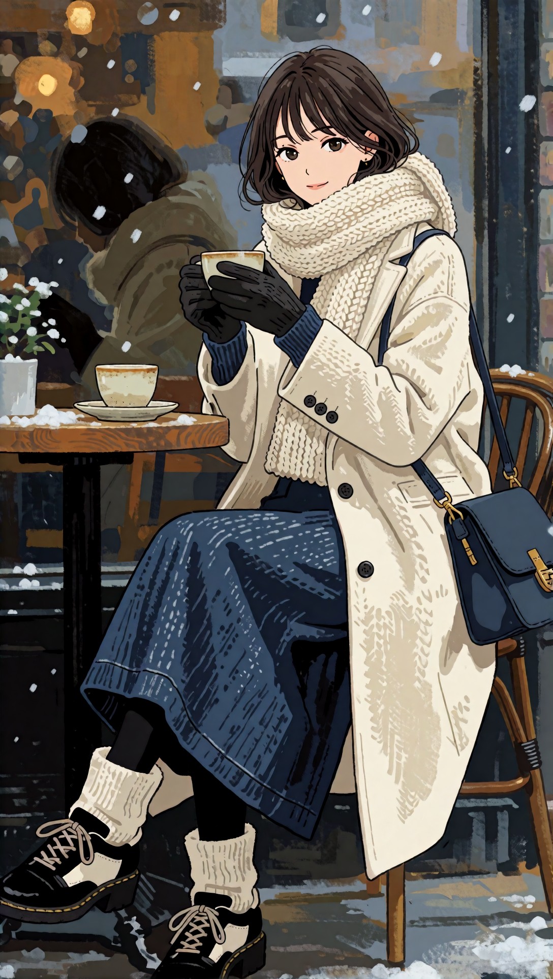
Inspect coat fibers, hair highlight transitions, and the cheek area. General enhancers often help on the coat, but they can roughen the face. The hybrid pass worked best here because it improved the scarf and cup edges without breaking the skin paint.
Image inspection notes: which workflow fits which anime source
Here is the checklist I would use if you need to upscale anime image online and choose quickly.
Use an anime-focused model when:
- the source has strong outlines
- cel shading is clean and graphic
- manga or frame grabs need line fidelity
- facial surfaces should stay smooth
Use a general enhancer when:
- the art is semi-painted or highly textured
- background detail matters more than strict line purity
- fabric, props, and scenery need micro-contrast
- faces are not the main crop
Use a hybrid workflow when:
- you are publishing key visuals
- portraits need clean eyes and hair plus readable clothing detail
- the source has both ink lines and painted surfaces
- 4x enlargement is required from a compressed file
Prompt test 5: bright pastel palette for banding risk
Pastel gradients expose bad denoise and color smoothing. I used this to see which workflow preserved soft atmosphere without turning the sky into stripes.
Topic: pastel anime idol portrait with soft gradient background
Genre: beauty campaign anime visual
Camera: Fujifilm GFX100 II
Lens: 110mm f/2
Lighting: studio butterfly light with pastel bounce
Location: seamless studio backdrop in pink and mint gradient
Style: high-end beauty advertising anime
Final Prompt: anime beauty campaign portrait of a pastel-haired idol wearing a pearl choker and off-shoulder satin top, direct gaze, slight smile, butterfly lighting with soft pastel bounce, smooth pink-to-mint studio gradient background, delicate eyelashes, glossy lips rendered in anime style, clean line work, minimal skin texture, luminous highlights on hair ribbons, centered composition, luxury beauty poster mood, polished gradient control, elegant cel-shaded finish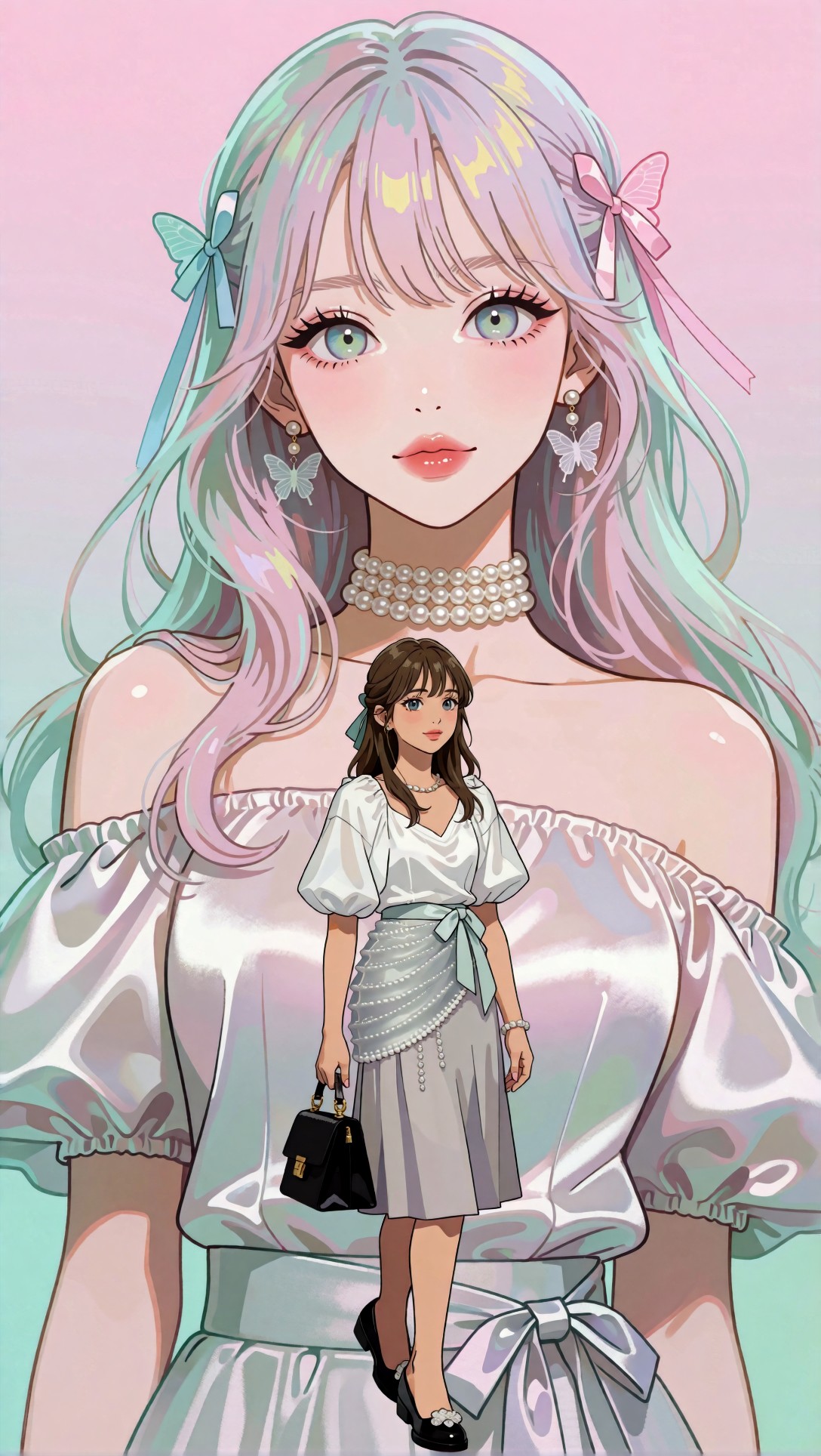
Inspect the background gradient and edges around shoulders and hair ornaments. If the model introduces speckling or contour bands, the denoise or texture recovery is too aggressive.
Prompt test 6: dark hair against dark background
This is a stress test for edge separation. Many tools lose strands here or create crunchy borders.
Topic: anime noir portrait with dark hair and black coat
Genre: noir character poster
Camera: Leica SL2-S
Lens: 75mm f/2
Lighting: neon rim light with low-key fill
Location: rainy alley with reflected signage
Style: moody cinematic poster
Final Prompt: moody anime noir character poster of a woman with straight black hair and black wool coat standing in a rainy alley, magenta and cyan neon rim light tracing one side of the face and shoulders, low-key fill, serious expression, wet pavement reflections, dark background intentionally close in value to the hair, precise outline design, restrained specular highlights, cinematic vertical composition, subtle raindrops, polished suspense-drama anime frame quality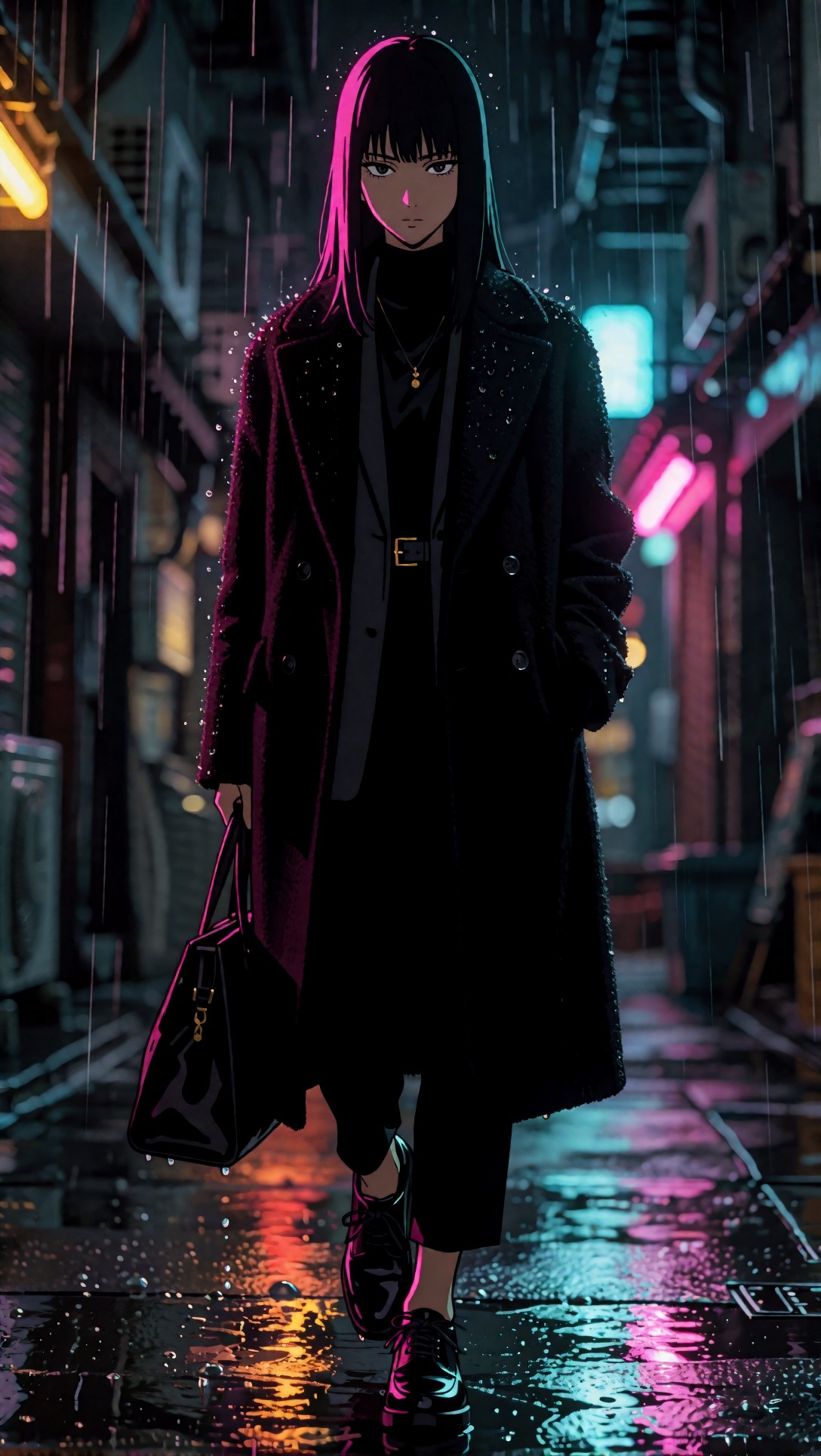
Check whether the border between hair and background stays legible. The best result in this test came from preserving line art first, then adding only minimal contrast enhancement.
When to switch models or settings
This was the most useful part of the comparison. I would switch immediately when I saw one of these symptoms.
Switch away from anime-focused upscaling if:
- fabric detail stays mushy after 2x
- painted backgrounds flatten too much
- soft atmospheric scenes lose depth
Switch away from photo-enhancer style upscaling if:
- faces gain pores or grain
- line work doubles around eyes or hair
- cel-shaded shadows become noisy
Change settings instead of models if:
- the result is good except for halos: reduce sharpening
- the result is smooth but dead: lower denoise slightly
- the image breaks at 4x: rerun at 2x and stack with a cleanup pass
If you want to compare outputs side by side, I would use a small batch and save crops in a working board before committing. A simple review flow through [Gallery](/gallery) or draft notes in [Articles](/articles) is enough to catch issues that thumbnails hide.
Prompt test 7: dense costume detail for edge versus texture balance
This checks the common tradeoff between preserving decorative line work and bringing back textile detail. It is where one-pass upscaling often looks conflicted.
Topic: fantasy anime costume with lace trim and layered accessories
Genre: character design showcase
Camera: Panasonic Lumix S1R
Lens: 70mm f/2.8
Lighting: softbox key light with cool rim light
Location: ornate palace hallway
Style: detailed fantasy editorial
Final Prompt: character design showcase of an anime heroine wearing an elaborate fantasy outfit with lace trim, gold embroidery, layered belts, gem accessories, thigh-high boots, and structured sleeves, standing in an ornate palace hallway, poised confident expression, clean contour lines around costume shapes, readable decorative patterns, softbox key light with cool rim light, jewel-toned palette of emerald navy and gold, full-body composition, luxury fantasy editorial direction, crisp design sheet clarity with premium anime illustration finish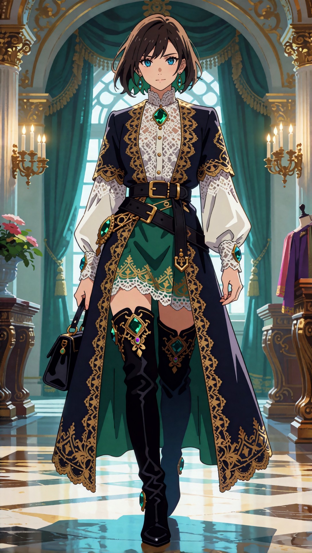
Inspect lace edges, embroidery, and the face. If the clothing becomes better but the face gets noisy, separate the process: anime upscale first, texture enhancement second.
Prompt test 8: environmental scene for background cleanup
The last test checks a wide shot, because some tools that do well on portraits fall apart on architecture, trees, and signage in anime scenes.
Topic: wide anime street scene with storefront signage and trees
Genre: slice-of-life anime background still
Camera: RED V-RAPTOR capture style
Lens: 28mm T1.8
Lighting: bright spring daylight
Location: suburban shopping street with cherry trees
Style: polished slice-of-life production frame
Final Prompt: wide slice-of-life anime background still of a suburban shopping street lined with small cafes, colorful storefront signage, bicycles, utility poles, and blooming cherry trees, two students walking through frame in the lower foreground, bright spring daylight, clean architectural perspective, soft cel shading mixed with painted environmental detail, readable shop windows, gentle breeze in tree branches, pastel seasonal palette, production-quality anime establishing shot with balanced depth and tidy edge control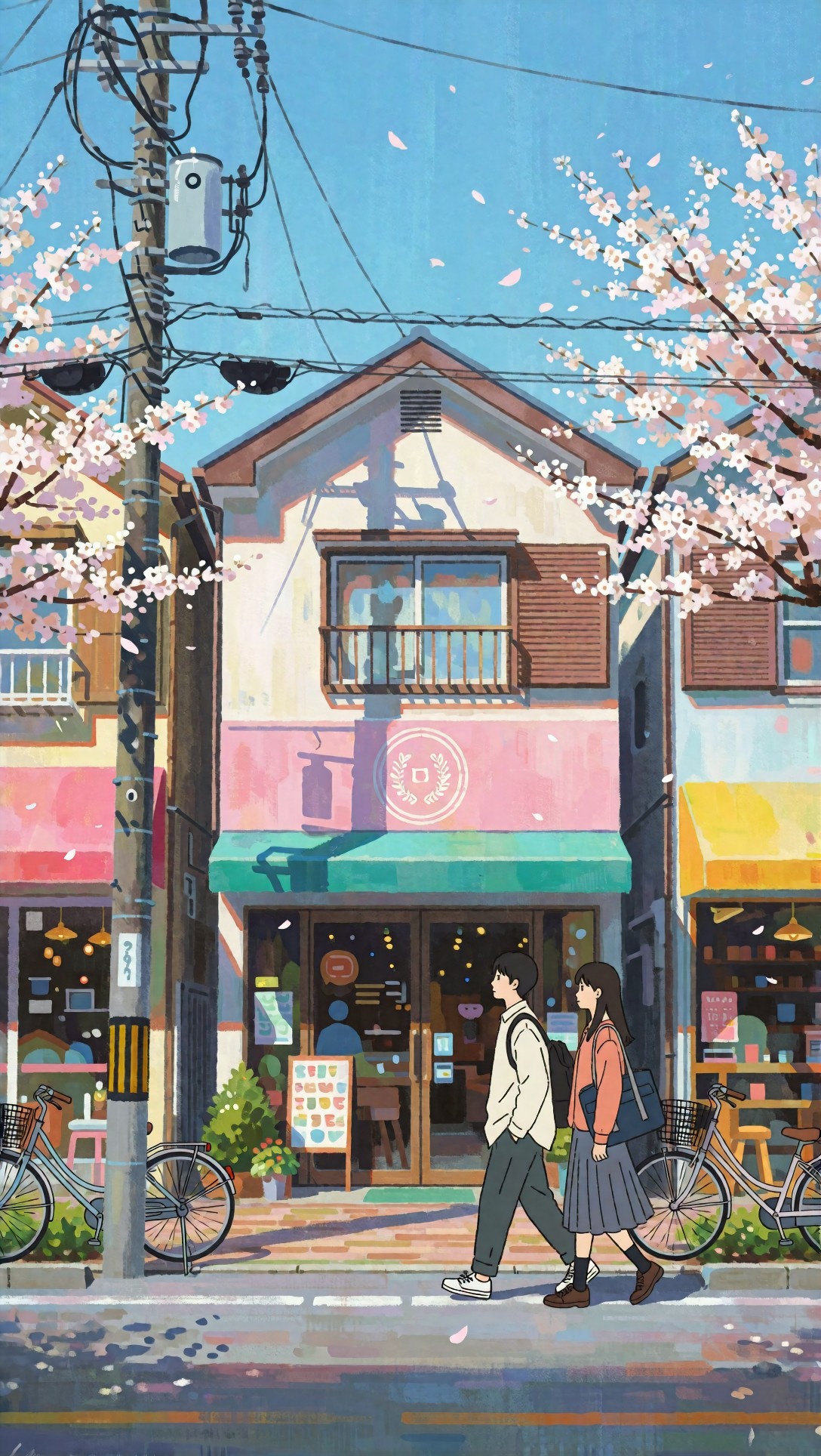
Inspect signage readability, branch edges, and distant window frames. General enhancers often help the environment here, but watch for branch chatter and artificial detail in the characters.
Practical recommendation: best workflow by use case
If someone asked me for the best AI upscaler for anime after this session, I would not answer with one universal tool. I would answer with the workflow that matched the source.
Best for line art and manga-style anime
Choose an anime-trained upscaler at 2x first. Keep denoise low to medium. This gave the cleanest eyes, hairlines, and borders.
Best for painterly anime illustrations
Start with anime upscaling, then apply a light detail pass only to textured areas if your tool allows masking. If not, keep the second pass conservative.
Best for scene stills and backgrounds
A general enhancer can help environmental detail, but only if the characters are not large in frame. If they are, crop and treat character and background separately.
Best for compressed social images
Do not jump straight to 4x. Compression damage gets amplified. Run 2x with low sharpening, review, then decide whether another pass is worth it. You can also stage tests in [Create](/create) or compare repair workflows through [Tools](/tools).
FAQ
What is the best AI upscaler for anime images?
In this test, the best overall result came from an anime-focused upscaler for line preservation, followed by a light cleanup pass only when texture recovery was necessary. A single photo enhancer was rarely the best all-around choice.
Can I use a general photo enhancer AI for anime?
Yes, but mainly for painterly illustrations, environmental scenes, or costume-heavy art. It often adds false skin texture and noisy edges on clean cel-shaded portraits.
Is 4x upscaling good for anime?
Sometimes, but only when the source is reasonably clean. For low-resolution or compressed anime images, 2x usually looks more natural and avoids outline damage.
How do I upscale anime image online without ruining line art?
Use an anime-oriented model, keep sharpening restrained, and inspect hair edges, eyelashes, and jawlines at full zoom. If outlines thicken, switch models or lower enhancement intensity.
What should I inspect first after upscaling anime art?
Check eyes, hair boundaries, collar edges, skin-to-hair transitions, and smooth gradients. These areas reveal haloing, fake texture, and line wobble faster than the rest of the frame.
Closing advice
My practical conclusion is simple: the best AI upscaler for anime is the one that respects drawing logic before it tries to add detail. If your work is mostly portraits, manga, or clean cel shading, use an anime-specific workflow and stay conservative. If your work is painterly key art or background scenes, a hybrid approach is stronger.
Who should use this workflow: artists, editors, and collectors who care about preserving line intent. Who should avoid a heavy enhancer-only pass: anyone working with clean faces, sharp ink lines, or flat color designs. The setting that mattered most in this test was not max scale. It was controlled sharpening with low-to-moderate denoise.
If I were repeating the session, I would still start with 2x anime upscaling, inspect crops, and only then decide whether extra texture cleanup is actually helping.