Best SEEDVR2 Settings for FP16 Upscaling in ComfyUI: Practical Workflow Tips 한국어 요약
이 페이지는 ZView Space의 영어 원문을 한국어 검색 사용자도 이해할 수 있도록 정리한 SEO 요약입니다. 핵심은 단순한 얼굴 중심 이미지가 아니라 패션 에디토리얼, 룩북, 아웃핏, 프롬프트 테스트, 이미지 생성 워크플로우를 실제로 어떻게 구성할지입니다.
핵심 요약
- 원문 주제: Best SEEDVR2 Settings for FP16 Upscaling in ComfyUI: Practical Workflow Tips
- 목적: AI 이미지 생성에서 outfit, silhouette, fabric, pose, location, camera framing을 더 명확하게 설계합니다.
- 활용 범위: Z-Image Turbo, Krea2 Turbo, Qwen Image, Anima, SeedVR2 같은 이미지 생성 및 업스케일 워크플로우에 적용할 수 있습니다.
- SEO 관점: 제목, 설명, 이미지 alt, 프롬프트 예시가 실제 검색 의도와 맞아야 색인 가능성이 높아집니다.
한국어 사용자를 위한 체크포인트
1. 프롬프트가 얼굴 묘사에만 머물지 않고 전체 스타일과 의상 구성을 설명하는지 확인합니다. 2. 패션 이미지라면 상의, 하의, 아우터, 신발, 액세서리, 소재감, 촬영 장소를 분리해서 씁니다. 3. 생성 결과는 바로 게시하지 말고 디테일, 손, 의상 형태, 배경 일관성, 이미지 품질을 비교합니다. 4. 글 본문에는 실제 테스트 기준과 실패를 줄이는 방법이 들어가야 검색엔진에서 얇은 콘텐츠로 보일 가능성이 줄어듭니다.
원문 미리보기
SEEDVR2 can produce clean, detailed FP16 upscales in ComfyUI, but the best results usually come from a few controlled choices rather than one magic setting. If you push denoise too high, textures drift. If tile overlap is too low, seams appear. And if you feed
---
SEEDVR2 can produce clean, detailed FP16 upscales in ComfyUI, but the best results usually come from a few controlled choices rather than one magic setting. If you push denoise too high, textures drift. If tile overlap is too low, seams appear. And if you feed the model weak source images, no upscale setting will fully rescue them.
This guide focuses on practical settings, when to change them, and how to adapt SEEDVR2 for portraits, products, anime, interiors, and cinematic scenes inside a real ComfyUI workflow.
Why FP16 matters with SEEDVR2 in ComfyUI
FP16 is a practical choice when you want a good balance between memory use, speed, and output quality. In ComfyUI, it often lets you run larger upscales or heavier node graphs on limited VRAM without dropping to much slower workflows.
For SEEDVR2 specifically, FP16 works well when:
- you need faster iteration during look development
- you are batch-upscaling many AI generations
- you want to preserve detail without building a very heavy graph
- you are working on GPUs that struggle with full precision pipelines
The trade-off is simple: FP16 is efficient, but it rewards disciplined settings. Small mistakes in denoise, tile size, or sharpening become more visible during upscale.
A solid starting point for SEEDVR2 FP16
If you need a baseline that works for most still images, start here:
- Precision: FP16
- Upscale factor: 2x first, then evaluate before pushing to 4x
- Denoise / strength: 0.18 to 0.28 for detail recovery without major drift
- Tile size: 768 to 1024 depending on VRAM
- Tile overlap: 64 to 128
- Sampler pairing: use a stable sampler setup you already trust in ComfyUI
- Prompt guidance: keep it light during upscale; avoid rewriting the whole scene
- VAE decode/encode path: keep it consistent across the graph to reduce surprises
This range is reliable for images that are already compositionally sound and only need cleaner texture, better edges, and more convincing fine detail.
Workflow principle: fix composition first, upscale second
SEEDVR2 is not the best place to solve major anatomy, framing, or object logic issues. Use your base generation pass to lock in:
- subject placement
- pose and gesture
- silhouette
- major lighting direction
- background structure
Then use SEEDVR2 to refine what already works.
For example, if you are upscaling a beauty portrait for a glossy editorial finish, keep the upscale prompt focused on texture, lighting continuity, and material quality rather than introducing new styling ideas.
Topic: High-end Beauty Portrait for Glossy Upscale
Genre: Beauty Campaign
Camera: Canon EOS R5
Lens: 100mm f/2.8 Macro
Lighting: Studio butterfly light
Location: Minimal cream-toned beauty studio with reflective acrylic surfaces
Style: High-end beauty advertising
Final Prompt: close-up beauty portrait of a confident woman with luminous skin and refined makeup, sleek pulled-back hair, soft neutral lip color, elegant direct gaze, shoulders angled slightly toward camera, clean cream-toned studio with subtle reflective acrylic accents, studio butterfly light sculpting cheekbones and smooth skin texture, premium cosmetic campaign composition, Canon EOS R5 look, 100mm f/2.8 macro precision, crisp eyelashes, natural pores, glossy highlight control, soft beige and champagne palette, polished luxury retouch aesthetic, balanced shallow depth of field, premium editorial sharpness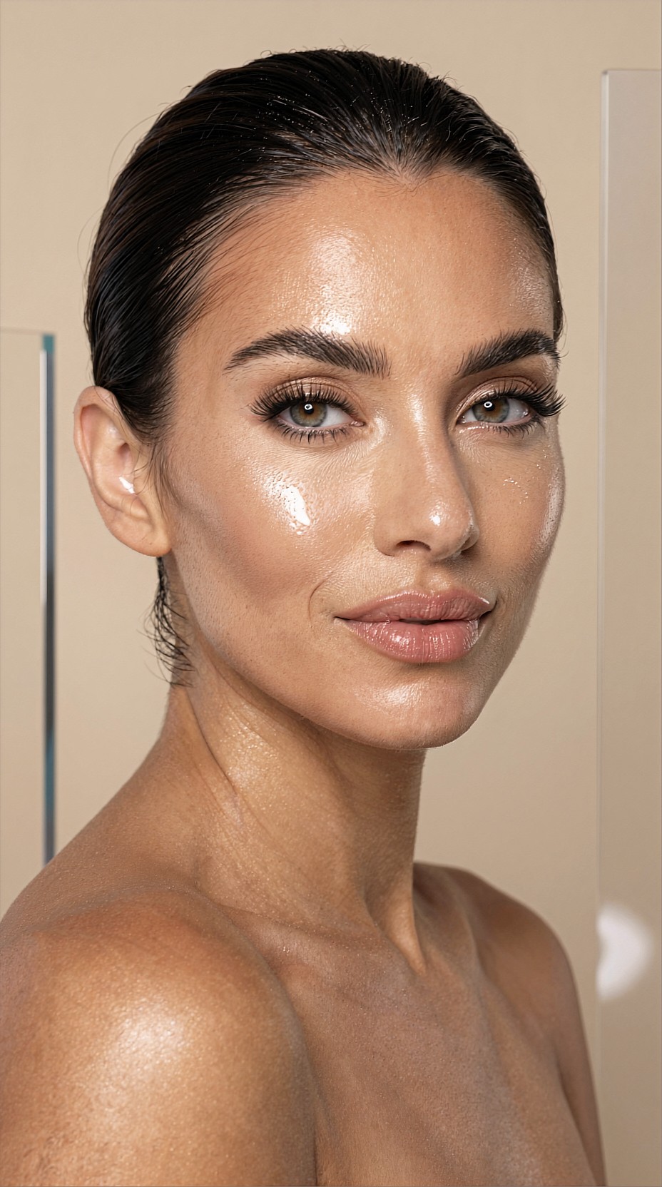
Best denoise settings by use case
Denoise is the setting most likely to make or break an FP16 upscale.
0.12 to 0.18: preservation mode
Use this when the original image is already strong and you mainly want cleaner edges, slightly better skin, fabric clarity, or environmental texture.
Best for:
- finished portraits
- product shots
- UI mock imagery
- architecture renders with stable lines
This range is safer for client delivery work because it preserves image identity.
Topic: Premium Watch Product Shot Upscale
Genre: Product Editorial
Camera: Nikon Z8
Lens: 105mm f/2.8 Macro
Lighting: Softbox key light with controlled strip rim lights
Location: Dark graphite tabletop studio with brushed metal props
Style: Clean commercial look
Final Prompt: luxury stainless steel wristwatch displayed on a dark graphite tabletop, brushed metal accents and subtle reflections, precise product-centered composition, softbox key light defining polished surfaces, controlled strip rim lights separating the case from the background, Nikon Z8 clarity, 105mm f/2.8 macro detail, crisp dial texture, engraved bezel markings, realistic sapphire glass reflections, cool steel and charcoal palette, premium commercial sharpness, minimal dust, elegant high-contrast product editorial finish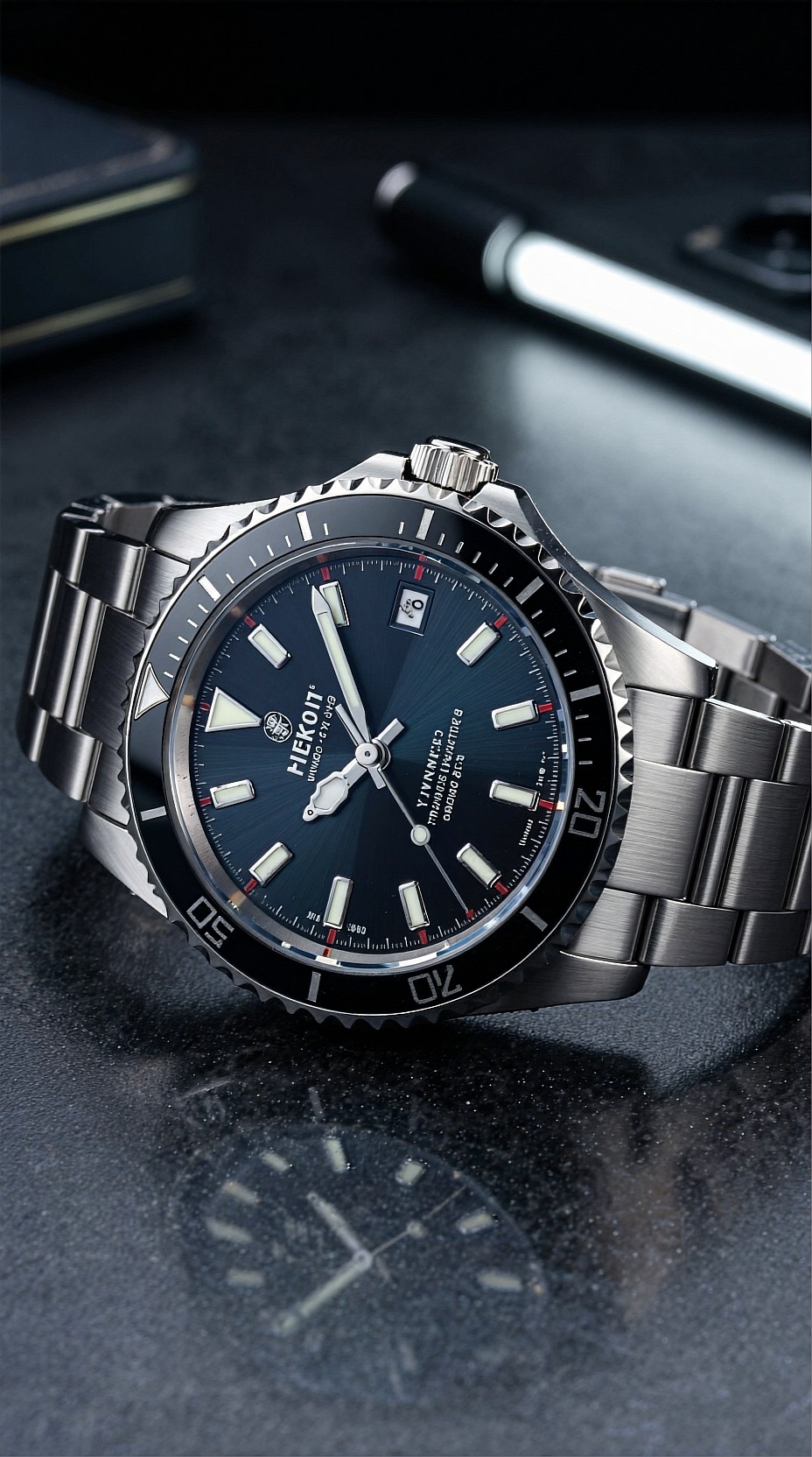
0.20 to 0.30: balanced recovery mode
This is the most useful range for general AI image generation. It can restore texture and realism while keeping the original design mostly intact.
Best for:
- fashion images
- cinematic portraits
- travel scenes
- food and lifestyle outputs
- stylized but not abstract artwork
Topic: Street Fashion Portrait for Editorial Upscale
Genre: Street Style
Camera: Sony A7R V
Lens: 50mm f/1.2
Lighting: Overcast diffusion
Location: Narrow Seoul side street with muted storefront signage and wet pavement
Style: Korean magazine cover
Final Prompt: stylish young woman in layered streetwear including oversized charcoal blazer, pleated skirt, knee-high boots, and silver accessories, standing confidently on a narrow Seoul side street after light rain, subtle half-smile, one hand in pocket, overcast diffusion creating soft skin tones and controlled contrast, wet pavement reflecting muted storefront signage, Korean magazine cover aesthetic, Sony A7R V realism, 50mm f/1.2 natural perspective, clean editorial composition, cool gray and soft blue palette, realistic fabric folds, detailed hair strands, polished urban mood with premium fashion clarity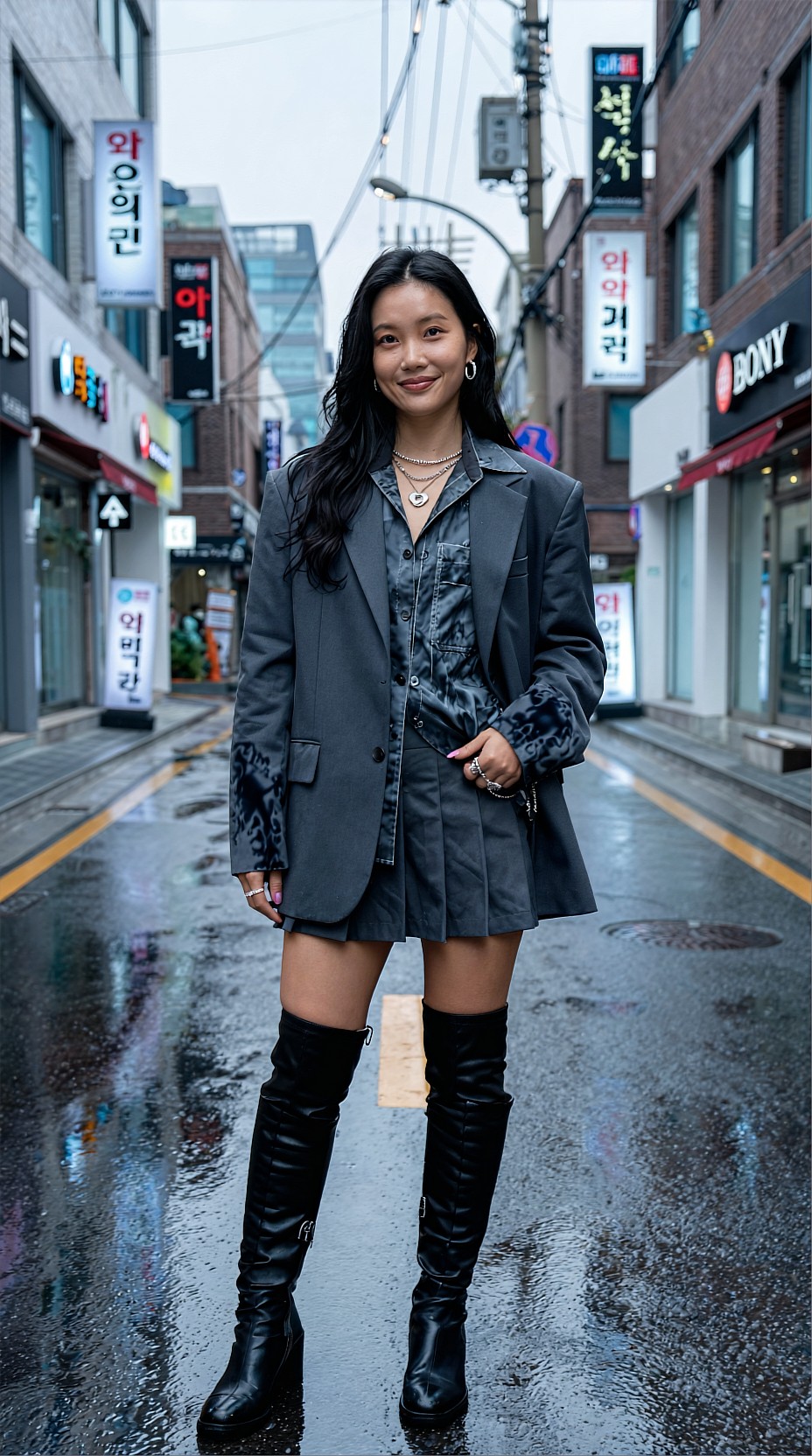
Above 0.35: reconstruction mode
Use this only when the source is visibly soft, compressed, or weak. At this level, SEEDVR2 starts making stronger interpretive choices. That can help damaged images, but it can also change faces, materials, and background logic.
Best reserved for:
- low-quality source outputs
- old generations made at small resolutions
- salvage passes before selective retouching
If you go this high, inspect hands, jewelry, text-like details, hairline edges, and repeated patterns.
Topic: Cinematic Desert Traveler Scene Recovery
Genre: Cinematic Travel
Camera: ARRI Alexa Mini LF
Lens: 40mm anamorphic at T2.8
Lighting: Sunset backlight
Location: Windswept desert ridge with distant dunes and amber haze
Style: Cinematic realism
Final Prompt: solitary traveler in a sand-colored coat standing on a windswept desert ridge, scarf moving in the wind, calm determined expression, body turned three-quarters toward camera, distant layered dunes fading into amber haze, sunset backlight outlining the figure and dust particles, ARRI Alexa Mini LF cinematic texture, 40mm anamorphic look with subtle horizontal flare, warm ochre and bronze palette, rich fabric movement, atmospheric depth, filmic contrast, elegant widescreen composition, realistic terrain detail, premium cinematic travel image with restored texture and natural sharpness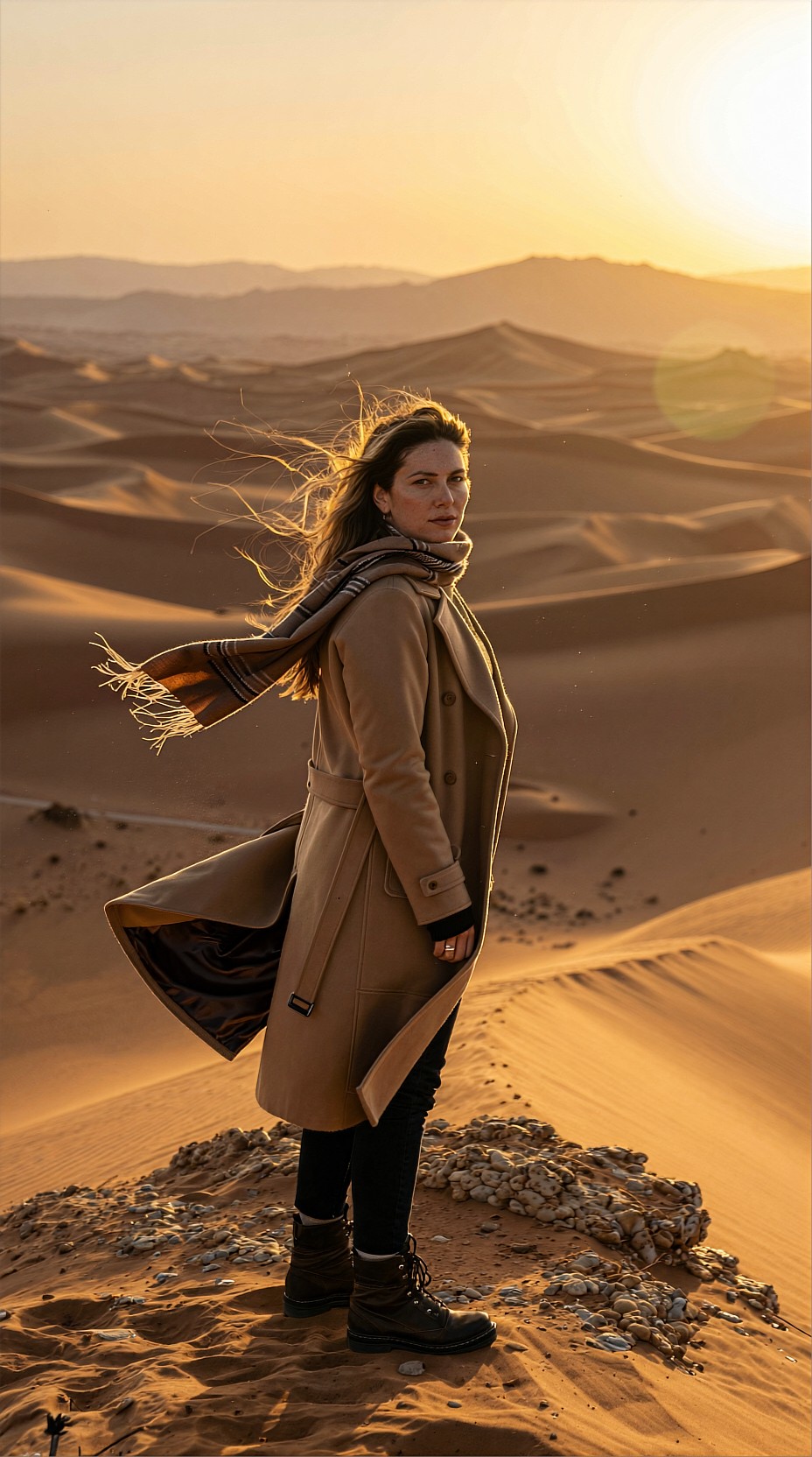
Tile size and overlap: the practical settings that prevent seams
In ComfyUI, tile settings matter as much as denoise.
Recommended tile sizes
- 512: safest for lower VRAM, but can produce more tile transitions
- 768: strong default for many FP16 workflows
- 1024: often best if your GPU can handle it
Larger tiles generally preserve continuity better, especially in:
- skin gradients
- skies
- studio backdrops
- walls and soft-focus interiors
Recommended overlap
- 64: acceptable baseline
- 96: safer for portraits and gradient-heavy scenes
- 128: useful for detailed fabrics, hair, foliage, and interiors
If you notice seam artifacts, do not immediately raise denoise. Increase overlap first.
Topic: Luxury Hotel Interior Upscale
Genre: Lifestyle Portrait
Camera: Fujifilm GFX100 II
Lens: 63mm f/2.8
Lighting: Window light with warm lamp fill
Location: Contemporary hotel suite with textured stone wall and linen drapery
Style: Elegant resort editorial
Final Prompt: elegant woman seated on the edge of a designer sofa in a contemporary hotel suite, relaxed posture, thoughtful expression looking toward a large window, refined neutral wardrobe in ivory silk and tailored trousers, textured stone wall, linen drapery, warm ambient lamps, window light shaping soft shadows across the room, Fujifilm GFX100 II medium-format richness, 63mm f/2.8 balanced perspective, understated luxury styling, beige, taupe, and warm gold palette, crisp textile detail, clean interior lines, calm upscale resort editorial atmosphere with realistic depth and polished finish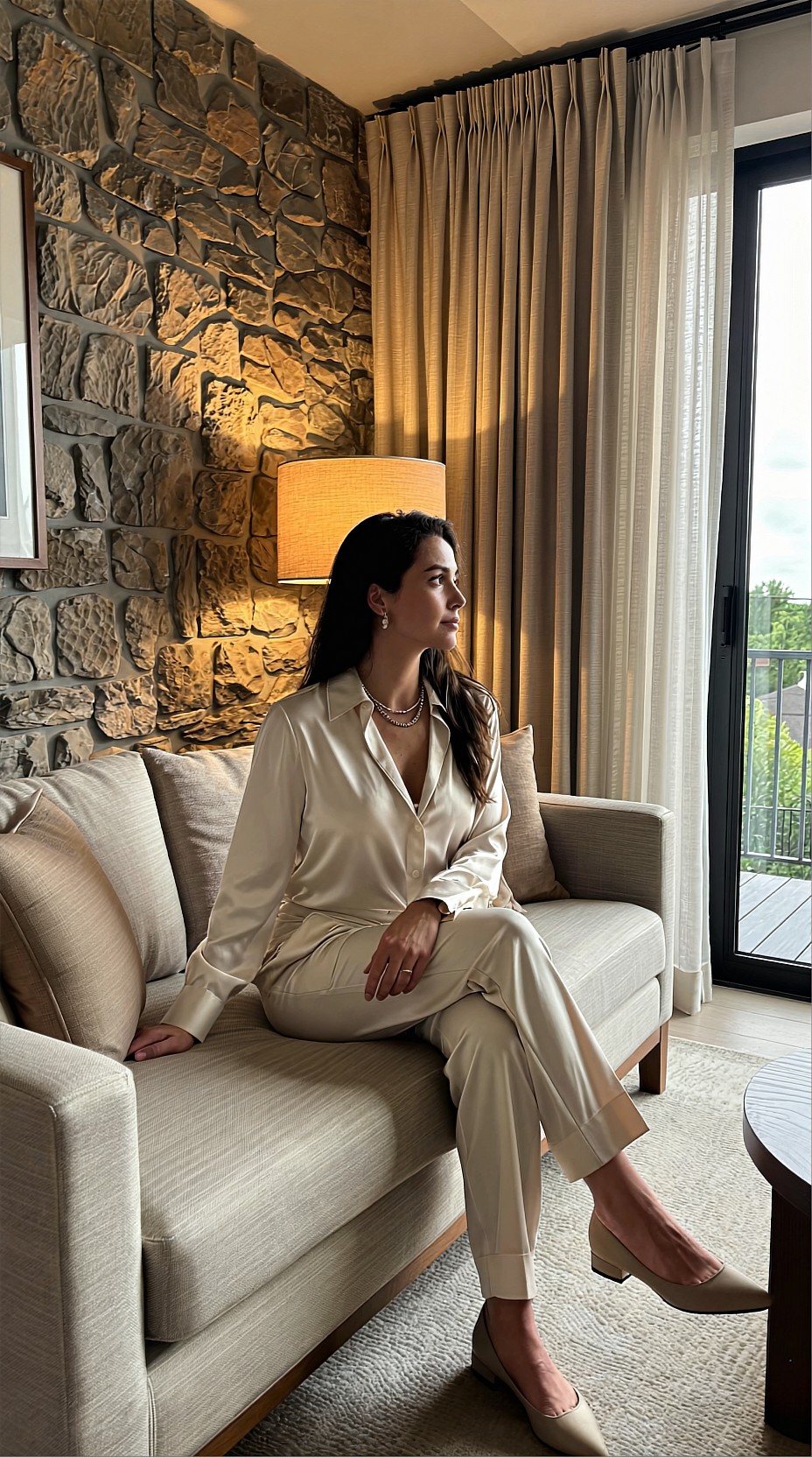
Prompting during upscale: add precision, not reinvention
A common mistake is treating the upscale pass like a full generation pass. For SEEDVR2, especially in FP16, prompting should be restrained.
Good upscale prompting emphasizes:
- texture quality
- material realism
- lighting consistency
- facial clarity
- micro-detail in hair, skin, fabric, or product surfaces
Avoid adding major new concepts such as a different outfit, a different time of day, or a complex new background element unless you deliberately want reinterpretation.
Good prompt language for upscale passes
Useful terms include:
- natural skin texture
- refined fabric detail
- realistic material definition
- crisp edge separation
- cinematic color grading
- controlled highlight rolloff
- subtle atmospheric depth
Topic: Artisan Coffee Product Scene Upscale
Genre: Product Editorial
Camera: Leica SL2-S
Lens: 50mm f/2 APO-Summicron
Lighting: Soft morning window light
Location: Small café counter with ceramic cups, steam, and oak wood textures
Style: Clean commercial look
Final Prompt: premium coffee bag and ceramic espresso cup arranged on an oak café counter, soft steam rising, artisanal branding area left clean and readable, textured ceramic surfaces, folded linen napkin, roasted beans scattered sparingly, soft morning window light creating natural shadows and warm highlights, Leica SL2-S tonal depth, 50mm f/2 APO precision, earthy brown and cream palette, realistic packaging texture, crisp edge definition, subtle atmospheric depth, modern clean commercial composition with upscale product photography finish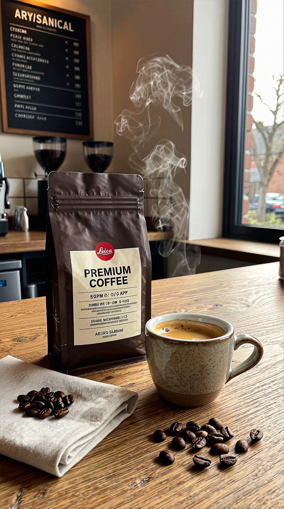
Portraits: keep skin believable
Portrait upscaling is where aggressive settings become obvious fastest. FP16 can still look excellent, but it helps to stay conservative.
For portraits, a reliable pattern is:
- denoise around 0.16 to 0.24
- tile size 768 or 1024
- overlap 96 or 128
- avoid over-sharpening after the upscale
Watch for these failure points:
- waxy skin
- sharpened pores with plastic highlights
- eyelashes becoming clumped shapes
- hairlines breaking into artificial strands
- teeth becoming too bright or too uniform
Topic: Natural Light Editorial Portrait Upscale
Genre: Fashion Editorial
Camera: Canon EOS R3
Lens: 85mm f/1.4
Lighting: Golden hour
Location: Rooftop terrace overlooking a soft urban skyline
Style: Luxury fashion campaign
Final Prompt: editorial portrait of a model wearing a structured cream blazer over a silk slip dress, standing on a rooftop terrace above a soft urban skyline, relaxed shoulders, poised expression, hair moving gently in the wind, golden hour light creating warm rim highlights and flattering skin tones, Canon EOS R3 look, 85mm f/1.4 shallow depth of field, luxury fashion campaign composition, peach, cream, and dusty blue palette, natural skin texture, premium tailoring detail, cinematic background blur, clean magazine-ready sharpness with believable facial detail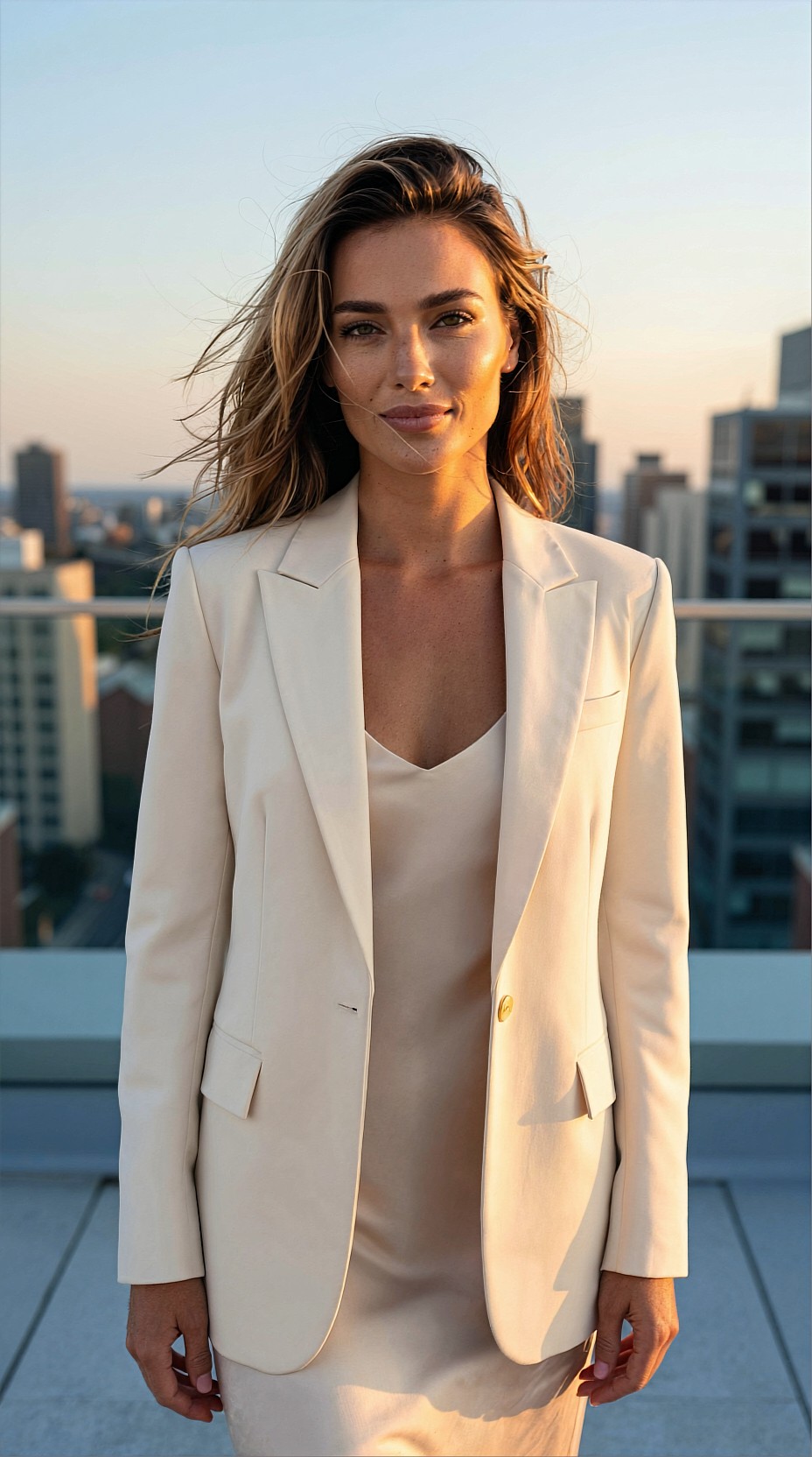
Anime and stylized images: use less denoise than you think
Stylized work often breaks when the upscale pass tries too hard to add realism. With anime, illustration, and graphic key visuals, too much denoise can blur line intent or mutate eye design and costume accents.
Try:
- denoise 0.10 to 0.18
- modest prompt guidance
- stronger overlap for clean edge continuity
Prioritize:
- line stability
- color separation
- controlled highlight placement
- fabric and accessory clarity without photoreal drift
Topic: Futuristic Idol Anime Key Visual Upscale
Genre: Anime Key Visual
Camera: Cinematic anime capture style
Lens: 35mm equivalent at f/2.0 look
Lighting: Neon rim light
Location: Rainy rooftop stage above a futuristic city with holographic signage
Style: High-gloss anime promotional art
Final Prompt: futuristic idol performer in a white and silver stage outfit with translucent accents, standing on a rainy rooftop stage above a neon-lit city, dynamic three-quarter pose with microphone in hand, confident bright expression, holographic signage and distant towers glowing behind her, neon rim light defining silhouette and hair edges, cinematic anime capture style, 35mm equivalent framing, vivid cyan, magenta, and violet palette, crisp line integrity, glossy costume detail, reflective wet floor, dramatic atmosphere, polished anime promotional key visual with clean upscale clarity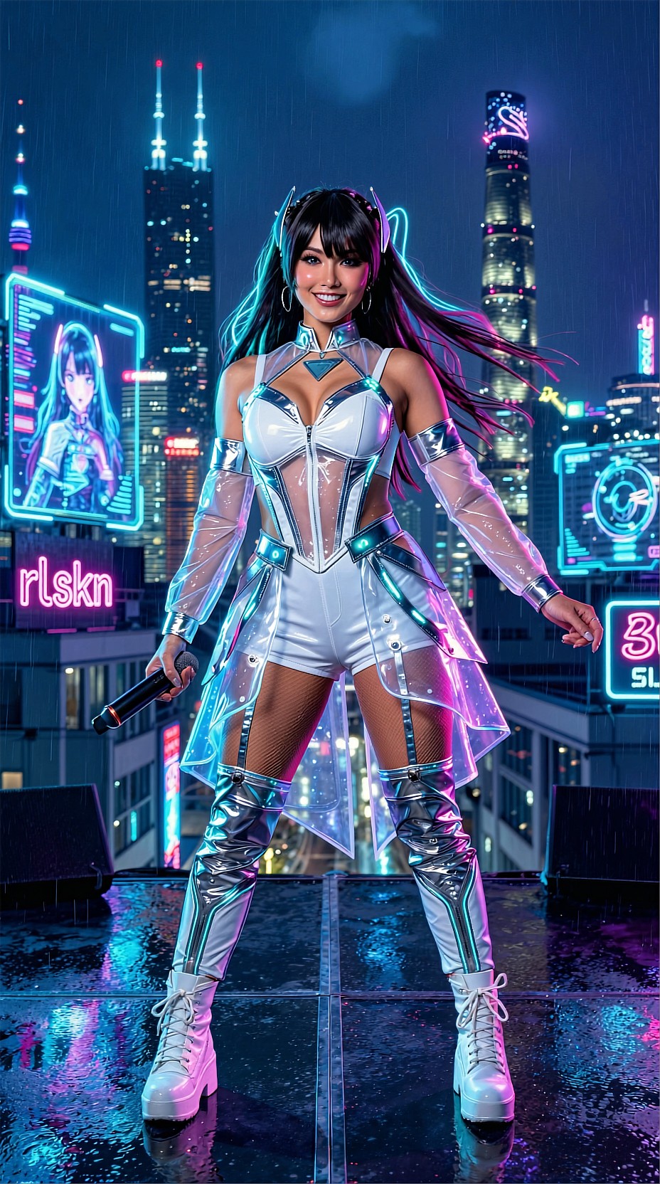
Landscapes and environment scenes: protect gradients
Environment images often show tile problems in skies, fog, water, and long tonal transitions. Here, overlap is more important than chasing extra detail.
Recommended approach:
- denoise 0.18 to 0.26
- tile size as large as VRAM allows
- overlap 96 to 128
- careful with contrast-heavy post-processing afterward
Topic: Alpine Lake Sunrise Environment Upscale
Genre: Cinematic Travel
Camera: Nikon Z7 II
Lens: 24mm f/4
Lighting: Sunrise with soft mist diffusion
Location: Alpine lake shoreline with pine forest and distant snow peaks
Style: Cinematic realism
Final Prompt: tranquil alpine lake at sunrise with still reflective water, pine forest along the shoreline, distant snow peaks emerging through soft mist, a lone traveler in a rust-colored jacket standing near the foreground rocks for scale, gentle sunrise light spreading across the valley, Nikon Z7 II landscape realism, 24mm f/4 wide composition, cool blue shadows and warm peach highlights, refined water reflections, crisp mountain texture, subtle atmospheric layering, cinematic realism with clean gradients and premium environmental detail
Product and e-commerce imagery: favor consistency over drama
For product work, the goal is usually accurate edges, clean materials, and reliable repeatability across a set. SEEDVR2 is useful here if you avoid creative drift.
Use cases include:
- jewelry renders
- cosmetic packshots
- furniture visuals
- food packaging
- concept product launch art
Recommended settings:
- denoise 0.12 to 0.20
- low prompt deviation
- medium to large tile size
- consistent lighting language across the batch
Topic: Luxury Perfume Bottle Packshot Upscale
Genre: Product Editorial
Camera: Hasselblad X2D 100C
Lens: 90mm f/2.5
Lighting: Controlled softbox key with amber gel background glow
Location: Minimal studio set with reflective glass platform
Style: High-end beauty advertising
Final Prompt: elegant perfume bottle with faceted glass and gold cap placed on a reflective glass platform, minimal studio environment with soft amber glow in the background, centered hero composition, controlled softbox key light shaping the bottle edges and liquid clarity, Hasselblad X2D 100C medium-format luxury detail, 90mm f/2.5 refined perspective, honey, gold, and smoke palette, crisp reflections, premium glass texture, subtle shadow falloff, sophisticated beauty advertising finish with clean commercial precision
A practical ComfyUI workflow order
A dependable ComfyUI flow for SEEDVR2 FP16 upscaling usually looks like this:
1. Generate or import the base image. 2. Clean obvious issues before upscale if needed. 3. Encode through the VAE path used in your graph. 4. Run SEEDVR2 upscale in FP16 at 2x. 5. Inspect seams, face integrity, hands, text-like details, and repeating textures. 6. If needed, do a second controlled pass instead of one overly aggressive pass. 7. Apply final color work or light sharpening only at the end.
In practice, two moderate passes often look better than one aggressive pass, especially for portrait or fashion work.
When 2x is better than 4x
Many users push directly to 4x, but 2x is often the smarter editorial choice.
Choose 2x when:
- the source is already decent
- you need texture cleanup more than size expansion
- you are preparing images for web editorials, social crops, or lookbooks
- you want fewer hallucinated details
Choose 4x when:
- the source is genuinely too small
- the composition is stable
- you can inspect the result carefully
- you are prepared to retouch problem areas
For most AI image workflows, 2x followed by selective finishing is the safer production route.
Troubleshooting quick guide
If the image looks too different
- lower denoise
- simplify the upscale prompt
- use a stronger original source image
If you see seams
- increase tile overlap
- increase tile size if VRAM allows
- check smooth gradients like sky and walls first
If faces become strange
- lower denoise into portrait-safe range
- reduce extra descriptive prompt language
- avoid second-pass sharpening before inspection
If details still look mushy
- raise denoise slightly, but in small increments
- make sure the source image is not fundamentally broken
- test a 2-pass workflow instead of one heavy pass
Final take
The best SEEDVR2 FP16 settings in ComfyUI are usually conservative: moderate denoise, generous overlap, and prompts that refine rather than reinvent. For most production work, the sweet spot is a 2x upscale, 0.18 to 0.28 denoise, and 768 to 1024 tiles with 96 to 128 overlap.
That combination is flexible enough for portraits, products, anime visuals, travel scenes, and editorial lifestyle images while keeping drift under control.
If you remember one rule, make it this: use SEEDVR2 to strengthen an image that already works. The cleaner the source and the lighter the touch, the better the FP16 upscale usually looks.