How to Build a Cohesive Resort Brand Mood Board With AI Images 한국어 요약
이 페이지는 ZView Space의 영어 원문을 한국어 검색 사용자도 이해할 수 있도록 정리한 SEO 요약입니다. 핵심은 단순한 얼굴 중심 이미지가 아니라 패션 에디토리얼, 룩북, 아웃핏, 프롬프트 테스트, 이미지 생성 워크플로우를 실제로 어떻게 구성할지입니다.
핵심 요약
- 원문 주제: How to Build a Cohesive Resort Brand Mood Board With AI Images
- 목적: AI 이미지 생성에서 outfit, silhouette, fabric, pose, location, camera framing을 더 명확하게 설계합니다.
- 활용 범위: Z-Image Turbo, Krea2 Turbo, Qwen Image, Anima, SeedVR2 같은 이미지 생성 및 업스케일 워크플로우에 적용할 수 있습니다.
- SEO 관점: 제목, 설명, 이미지 alt, 프롬프트 예시가 실제 검색 의도와 맞아야 색인 가능성이 높아집니다.
한국어 사용자를 위한 체크포인트
1. 프롬프트가 얼굴 묘사에만 머물지 않고 전체 스타일과 의상 구성을 설명하는지 확인합니다. 2. 패션 이미지라면 상의, 하의, 아우터, 신발, 액세서리, 소재감, 촬영 장소를 분리해서 씁니다. 3. 생성 결과는 바로 게시하지 말고 디테일, 손, 의상 형태, 배경 일관성, 이미지 품질을 비교합니다. 4. 글 본문에는 실제 테스트 기준과 실패를 줄이는 방법이 들어가야 검색엔진에서 얇은 콘텐츠로 보일 가능성이 줄어듭니다.
원문 미리보기
A strong resort mood board should feel like one world, not a random set of pretty travel images. With AI image tools, beginners can quickly explore that world, but the real skill is learning how to keep every image aligned with the same brand story. In this gu
---
A strong resort mood board should feel like one world, not a random set of pretty travel images. With AI image tools, beginners can quickly explore that world, but the real skill is learning how to keep every image aligned with the same brand story.
In this guide, you’ll learn a simple workflow for building a cohesive resort brand mood board with AI images, plus practical prompt examples you can adapt for hospitality, boutique hotels, spa concepts, and luxury travel presentations.
Start with the brand feeling before the images
Before you generate anything, write down the emotional direction of the resort brand in a few plain words. This helps you avoid a scattered board.
For example, a resort might be:
- quiet and restorative
- tropical but refined
- family-friendly and bright
- adult-only and minimal
- earthy, coastal, and wellness-focused
This short direction becomes your filter. If an image is beautiful but does not match the feeling, leave it out.
A helpful beginner framework is to define these five brand anchors:
- Audience: honeymooners, families, wellness travelers, luxury guests
- Palette: sand, teal, white linen, terracotta, sunset coral
- Materials: stone, rattan, teak, linen, glass, water
- Mood: calm, elegant, playful, secluded, sunlit
- Visual style: cinematic, editorial, commercial, minimal, aspirational
Choose 4 to 6 image categories for the board
A cohesive mood board usually works better when it covers a few repeatable visual categories instead of trying to show everything.
For a resort brand, useful categories include:
- exterior architecture
- guest lifestyle moments
- food and drink scenes
- spa or wellness imagery
- room details and textures
- branded objects like towels, menus, pool bags, or signage
These categories help you create variety while keeping the board organized. They also give your prompts a clear job.
Build a visual rule set and reuse it
Consistency comes from repeating visual decisions across prompts. Even when the subject changes, the board should still feel connected.
Keep these elements steady across most of your generations:
- similar color palette
- related time of day
- consistent level of luxury or casualness
- matching material language
- recurring wardrobe direction
- one overall image finish, such as clean commercial realism or elegant editorial softness
You do not need identical prompts. You need prompts that belong to the same visual family.
Prompt for the hero atmosphere first
Start with the image that defines the resort’s overall mood. This often becomes the center of the board and sets the standard for everything else.
A good hero image usually combines location, architecture, light, and a subtle sense of guest experience.
Topic: Luxury tropical resort arrival scene
Genre: Cinematic Travel
Camera: Canon EOS R5
Lens: 35mm f/1.8
Lighting: Sunset backlight
Location: Open-air beachfront resort entrance with palm shadows, limestone walls, reflecting pool, and ocean view beyond
Style: Elegant resort editorial
Final Prompt: A luxury tropical resort arrival scene at an open-air beachfront entrance, warm sunset backlight skimming across limestone walls, shallow reflecting pool, tall palms casting soft patterned shadows, ocean horizon visible in the distance, a relaxed guest couple in refined neutral resort wear walking slowly toward the lobby, understated smiles, linen and silk textures moving in the breeze, balanced wide composition with strong architectural framing, palette of sand, sea glass teal, ivory, and sun-warmed gold, cinematic realism, polished editorial travel photography, natural skin texture, premium material detail, calm upscale atmosphere, Canon EOS R5 look, 35mm f/1.8 depth and perspective, high-end hospitality campaign quality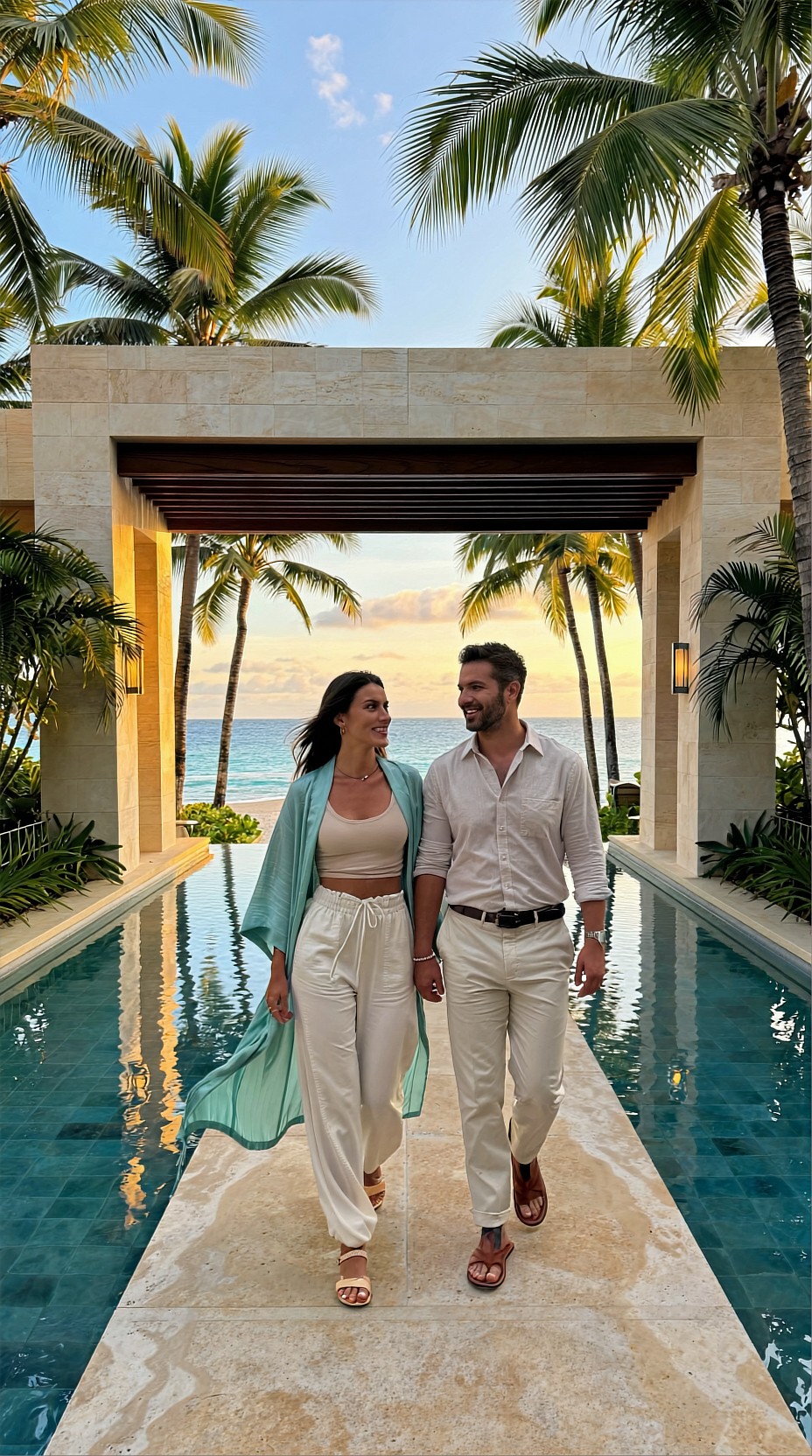
This kind of image is useful for:
- setting the board’s emotional direction
- defining architecture and landscape language
- establishing light, palette, and guest positioning
Use lifestyle images to show the guest experience
Once you have the overall atmosphere, generate images that show how it feels to be there. Resort branding often works best when it balances spaces with human moments.
Think about experiences such as:
- breakfast on a shaded terrace
- a guest walking to a spa treatment
- poolside relaxation with understated styling
- sunset lounge moments with soft conversation
The goal is not action-heavy tourism imagery. It is brand-aligned lifestyle storytelling.
Topic: Poolside guest lifestyle at a boutique wellness resort
Genre: Lifestyle Portrait
Camera: Sony A7 IV
Lens: 50mm f/1.2
Lighting: Beach reflection
Location: Private plunge pool terrace with travertine decking, linen daybed, tropical planting, and partial sea view
Style: Clean commercial look
Final Prompt: A boutique wellness resort poolside lifestyle portrait featuring a solo guest seated on the edge of a private plunge pool terrace, relaxed posture with one hand resting behind her and the other lightly touching a chilled glass of citrus water, calm thoughtful expression, wearing a soft ivory linen cover-up over a muted sage swimsuit, travertine decking, rolled white towels, tropical foliage, and a blurred sea view in the background, bright beach reflection lighting with clean sunlit highlights and soft fill from surrounding pale stone, composition centered but natural with premium hospitality styling, palette of ivory, pale aqua, sage, and warm beige, crisp commercial realism, detailed fabric texture and wet stone surface, Sony A7 IV look, 50mm f/1.2 shallow depth of field, refined resort campaign quality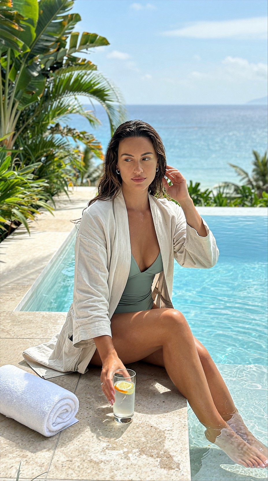
Use these lifestyle visuals to answer a practical branding question: What kind of guest belongs in this place? If the people, wardrobe, and styling shift too much from image to image, the board will lose focus.
Add material and interior detail shots for texture
A mood board feels more believable when it mixes wide scenes with close details. Detail images are especially useful for designers, marketers, and clients because they show what the brand feels like up close.
Good resort detail subjects include:
- folded linen on a teak lounger
- handmade ceramic tableware
- sunlit curtains in a guest suite
- stone basins and spa products
- woven textures, tiles, and shadows
These images help define tactile identity, not just scenery.
Topic: Resort suite interior materials and styling detail
Genre: Product Editorial
Camera: Fujifilm GFX 100S
Lens: 80mm f/1.7
Lighting: Overcast diffusion
Location: Minimal coastal guest suite with sheer curtains, teak furniture, limewashed walls, and ocean breeze through open doors
Style: Luxury campaign
Final Prompt: A refined resort suite interior detail featuring a teak side table with a folded ivory linen robe, handmade ceramic cup, small tray of botanical amenities, and a straw sun hat, framed beside sheer curtains moving gently from an open balcony door, limewashed walls and soft coastal light creating a calm atmosphere, no visible faces, focus on texture and tactile luxury, layered composition with foreground fabric softness and clean negative space, palette of chalk white, driftwood beige, pale seafoam, and muted clay, elegant high-end editorial styling, visible textile weave, ceramic glaze detail, subtle breeze, quiet premium hospitality mood, Fujifilm GFX 100S medium-format look, 80mm f/1.7 selective focus, luxury campaign finish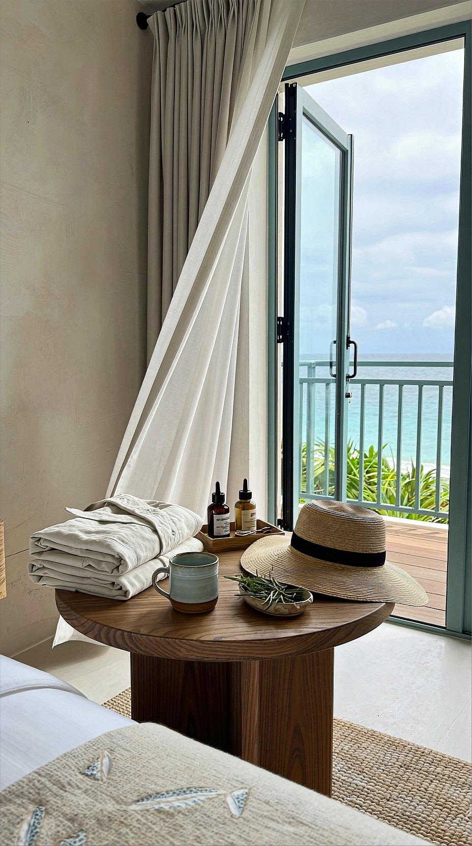
Detail shots are especially helpful when your mood board will support:
- hotel website redesigns
- interior concept presentations
- resort rebranding decks
- social media art direction
- brochure and ad campaign planning
Show food, drink, or wellness in the same visual language
If the resort brand includes dining or spa positioning, generate those scenes with the same restraint and palette as the rest of the board. A common beginner mistake is using one polished architectural style and then switching to loud, unrelated food photography.
Keep the same world in place:
- similar tones
- similar styling quality
- consistent surfaces and props
- similar camera feel
- the same type of guest experience
For a wellness-led resort, spa imagery may be more useful than restaurant imagery. For a social beach club resort, signature cocktails and sunset dining might matter more.
Topic: Open-air resort spa treatment moment
Genre: Beauty Campaign
Camera: Nikon Z8
Lens: 85mm f/1.8
Lighting: Softbox key light
Location: Open-sided spa pavilion surrounded by tropical greenery, warm wood screens, and stone treatment bed
Style: High-end beauty advertising
Final Prompt: An open-air resort spa treatment moment featuring a guest reclining on a stone treatment bed with eyes gently closed and a peaceful expression, therapist hands placing botanical oil onto the shoulder in a graceful understated gesture, softly wrapped ivory spa textiles, warm wood screens and blurred tropical greenery beyond, controlled softbox key light blended with natural ambient daylight for polished skin tones and serene contrast, close editorial composition focused on wellness ritual and premium detail, palette of cream, honey wood, muted green, and soft stone, luxurious but calm atmosphere, natural skin texture, clean beauty-campaign precision, Nikon Z8 look, 85mm f/1.8 portrait compression, sophisticated hospitality branding image quality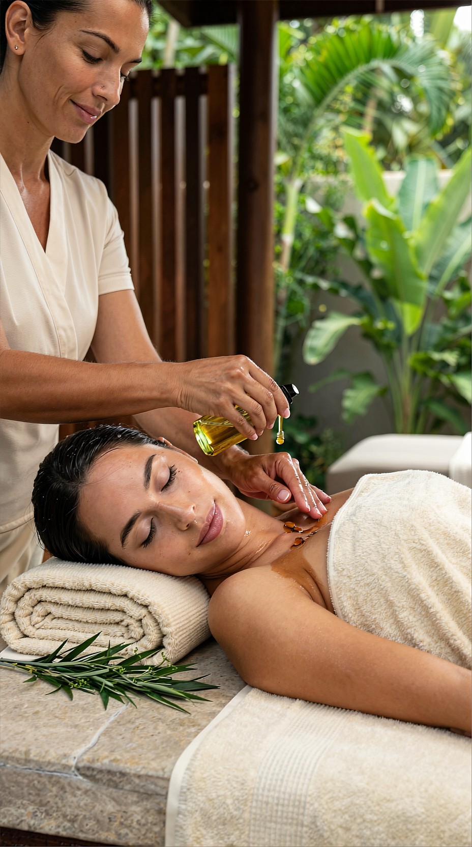
Curate harder than you generate
AI makes it easy to create many images, but cohesion comes from editing. After generating options, review them side by side and remove anything that breaks the board.
Look for these common problems:
- mixed color temperatures that clash
- inconsistent wardrobe formality
- one image that looks too futuristic or too generic
- props that do not match the resort’s price point
- too many camera angles with no visual rhythm
- surfaces and architecture that feel like different properties
A good test is to shrink the board and view it from a distance. If one image jumps out for the wrong reason, replace it.
Arrange the board like a story
The order of images matters. Even a simple mood board feels stronger when it moves through a clear visual narrative.
A beginner-friendly sequence is:
1. hero exterior or arrival image 2. lifestyle image with guests 3. interior or texture detail 4. food, spa, or brand ritual image 5. supporting architecture or landscape image
This creates a balance between aspiration and specificity.
If you want the board to feel more premium, use:
- one or two wide images
- two medium human-centered images
- one close texture shot
- generous whitespace between elements
Keep a prompt bank for future consistency
One of the best practical habits is saving your strongest prompt ingredients in a reusable brand prompt bank.
Your bank might include:
- approved color words
- preferred materials
- wardrobe notes
- lighting choices
- camera and lens combinations
- signature phrases like “elegant resort editorial” or “clean commercial realism”
This saves time when you need to generate more visuals later for social posts, ads, menus, or seasonal campaigns.
Final tips for beginners
If you are new to AI image generation, keep the process simple:
- start with one clear brand mood
- generate by category, not randomly
- repeat the same palette and material cues
- mix wide shots, people, and details
- edit aggressively before calling it finished
A cohesive resort brand mood board is less about making the most dramatic images and more about making images that belong together. When the light, styling, textures, and mood all support the same story, your board becomes useful for real creative decisions.
With a small set of thoughtful prompts and careful selection, AI can help you build a resort brand direction that feels polished, consistent, and easy to share with clients or collaborators.