How to Build a ComfyUI Workflow for Consistent Character Images Across Multiple Generations 한국어 요약
이 페이지는 ZView Space의 영어 원문을 한국어 검색 사용자도 이해할 수 있도록 정리한 SEO 요약입니다. 핵심은 단순한 얼굴 중심 이미지가 아니라 패션 에디토리얼, 룩북, 아웃핏, 프롬프트 테스트, 이미지 생성 워크플로우를 실제로 어떻게 구성할지입니다.
핵심 요약
- 원문 주제: How to Build a ComfyUI Workflow for Consistent Character Images Across Multiple Generations
- 목적: AI 이미지 생성에서 outfit, silhouette, fabric, pose, location, camera framing을 더 명확하게 설계합니다.
- 활용 범위: Z-Image Turbo, Krea2 Turbo, Qwen Image, Anima, SeedVR2 같은 이미지 생성 및 업스케일 워크플로우에 적용할 수 있습니다.
- SEO 관점: 제목, 설명, 이미지 alt, 프롬프트 예시가 실제 검색 의도와 맞아야 색인 가능성이 높아집니다.
한국어 사용자를 위한 체크포인트
1. 프롬프트가 얼굴 묘사에만 머물지 않고 전체 스타일과 의상 구성을 설명하는지 확인합니다. 2. 패션 이미지라면 상의, 하의, 아우터, 신발, 액세서리, 소재감, 촬영 장소를 분리해서 씁니다. 3. 생성 결과는 바로 게시하지 말고 디테일, 손, 의상 형태, 배경 일관성, 이미지 품질을 비교합니다. 4. 글 본문에는 실제 테스트 기준과 실패를 줄이는 방법이 들어가야 검색엔진에서 얇은 콘텐츠로 보일 가능성이 줄어듭니다.
원문 미리보기
In this test, the main finding was simple: a ComfyUI consistent character workflow is less about one magic node and more about locking three variables at the same time—identity reference, prompt anchor traits, and denoise discipline. When I let any one of thos
---
In this test, the main finding was simple: a ComfyUI consistent character workflow is less about one magic node and more about locking three variables at the same time—identity reference, prompt anchor traits, and denoise discipline. When I let any one of those drift, the character changed. When I fixed all three, I could move from portrait to half-body to scene variations while keeping the same person recognizable.
The strongest result came from a workflow built around a base portrait reference, an IPAdapter-style identity lock, fixed seed tests, and only moderate denoise during variation passes. It did not make the character perfectly identical in every frame, but it kept face shape, eye spacing, hairline, and overall age impression far more stable than prompt-only generation.
Test setup
I tested three ways of producing repeatable character images in ComfyUI:
1. Prompt-only consistency using a detailed character description and fixed seed 2. Reference-led consistency using a single anchor image with identity guidance 3. Reference plus structure control using identity guidance together with pose/composition control for more demanding scene changes
The goal was not to get carbon-copy outputs. The goal was to keep the same fictional person recognizable across multiple generations, outfits, crops, and lighting conditions.
What I checked in each batch:
- face shape stability
- eye distance and nose profile consistency
- hairline and hair texture retention
- age drift
- makeup drift
- body proportion drift in wider shots
- whether lighting changes broke identity
- whether stronger stylization damaged recognition
For the actual runs, the best balance came from SDXL-based checkpoints with an identity reference node, a CLIP text prompt that repeated key anchor traits, and a variation stage that stayed conservative on denoise. In this test, extreme prompt creativity worked against consistency.
What actually held the character together
The best result was a two-stage workflow:
- Stage 1: generate or choose one clean anchor portrait of the character
- Stage 2: use that anchor image as the identity reference for all later generations
That sounds obvious, but the difference in output quality was not small. Prompt-only generations produced "similar casting" rather than the same person. Once the workflow had a strong anchor image, the model stopped improvising core facial structure as often.
The detail that mattered most was choosing an anchor image that was already clean and readable:
- front or 3/4 face
- clear lighting
- no heavy expression distortion
- visible hairline
- minimal occlusion from hands, hats, or props
A weak reference image created weak consistency. A strong reference image gave the workflow something stable to preserve.
The workflow that gave the strongest result
My preferred ComfyUI character consistency chain looked like this:
1. Load checkpoint suited to realistic portrait generation 2. Load text prompt with fixed identity descriptors 3. Load negative prompt to suppress common drift issues 4. Load anchor character image 5. Apply identity reference node such as IPAdapter or FaceID-style equivalent 6. Optional ControlNet for pose or framing when needed 7. KSampler with stable seed testing 8. VAE decode and review 9. Second pass only if needed for upscale or light detail correction
Why this worked better than prompt-only:
- the prompt defined who the character is in words
- the reference image defined who the character is visually
- the sampler settings limited how much the model was allowed to reinvent the face
The weak point was over-controlling the image. If identity weight was pushed too hard, the pose and expression range got narrower, and some images started to look waxy or overfitted to the anchor.
First anchor pass: build the character before testing variations
The first pass should create the clearest possible base identity. I got better downstream consistency when I used a neutral expression and clean studio-style lighting instead of trying to make the first image dramatic.
This first prompt is meant to check whether the model can create a readable anchor face with enough distinct traits to survive later variations.
Topic: Original female character anchor portrait for consistent multi-image generation
Genre: Beauty Campaign
Camera: Canon EOS R5
Lens: 85mm f/1.4
Lighting: Studio butterfly light with soft fill
Location: Neutral gray seamless studio
Style: Clean commercial look
Final Prompt: a highly recognizable original female character, late 20s, oval face, narrow jawline, wide-set hazel eyes, straight medium nose, soft arched brows, light freckles across cheeks, pale olive skin, dark copper shoulder-length wavy hair with a defined center part, neutral confident expression, minimal natural makeup, wearing a fitted black crew-neck top, chest-up framing, clean posture, direct eye contact, neutral gray seamless background, studio butterfly light with soft fill, Canon EOS R5 realism, 85mm f/1.4 depth separation, crisp skin texture, realistic pores, subtle catchlights, commercial beauty image, highly consistent facial structure, no dramatic styling, no props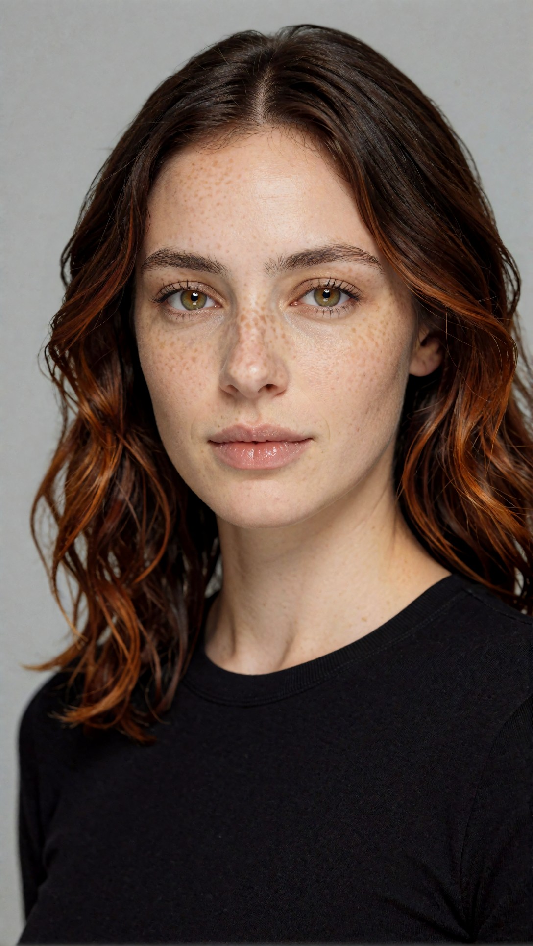
Inspect whether the eye spacing, nose bridge, brow shape, and hairline are all clearly visible. If the anchor is ambiguous or over-stylized, later generations usually drift faster.
A second anchor option worked well when I wanted slightly more personality but still needed a stable identity reference.
Topic: Original male character anchor portrait for repeatable editorial generations
Genre: Lifestyle Portrait
Camera: Nikon Z7 II
Lens: 105mm f/2.8
Lighting: Overcast window diffusion
Location: Minimal concrete loft interior
Style: Cinematic realism
Final Prompt: an original male character designed for repeatable image generation, early 30s, long rectangular face, high forehead, deep-set brown eyes, slightly prominent nose, defined cupid's bow, warm beige skin, short curly black hair with a clean temple fade, faint scar near left eyebrow, calm observant expression, subtle stubble, wearing a charcoal knit henley shirt, seated near a large loft window, soft overcast window diffusion, muted concrete loft interior, Nikon Z7 II realism, 105mm f/2.8 portrait compression, natural skin detail, restrained color palette, cinematic realism, chest-up composition, no accessories obscuring the face, strong facial identity cues preserved
Check whether the character has at least two or three memorable traits beyond hair color. In this test, scars, freckles, brow shape, and nose profile were more reliable identity anchors than clothing.
Why prompt-only consistency was not enough
Prompt-only runs looked coherent at a glance, but they failed under close comparison. The model preserved broad traits like "copper hair" or "hazel eyes" while changing the actual person. In side-by-side review, the chin length shifted, eyelids changed, and the age impression moved by several years.
That matters if you are building:
- recurring comic or story characters
- product mascots
- fashion editorial series with the same model identity
- ad concepts that need continuity from frame to frame
This prompt is useful as a control test. It checks how far text description alone can carry identity before a reference image is introduced.
Topic: Prompt-only female character consistency control test
Genre: Fashion Editorial
Camera: Sony A7R IV
Lens: 50mm f/2
Lighting: Softbox key light with weak rim light
Location: White cyclorama studio
Style: Minimal magazine editorial
Final Prompt: the same original female character across multiple generations, late 20s, oval face, narrow jawline, wide-set hazel eyes, straight medium nose, soft arched brows, pale olive skin, light freckles, dark copper shoulder-length wavy hair with center part, calm poised expression, wearing a cream tailored blazer over a black silk camisole, standing on a white cyclorama studio set, softbox key light with weak rim light, Sony A7R IV look, 50mm f/2 clean perspective, full upper-body magazine framing, minimal editorial styling, controlled neutral palette, realistic skin texture, no jewelry, no hat, no face obstruction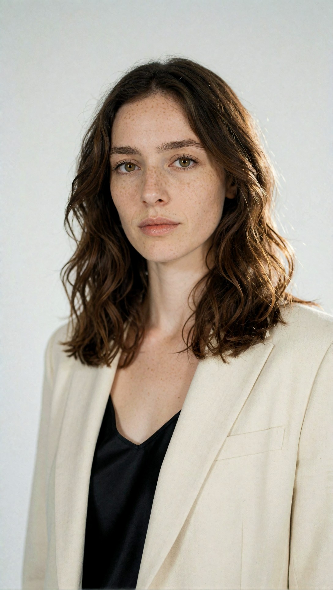
When you inspect the results, focus on whether this is actually the same person across seeds or only a similar type. In this test, prompt-only control usually failed at the exact point where a real production workflow needs reliability.
Best result: reference plus moderate variation
The strongest result came when I reused the anchor image and changed only one or two visual factors at a time. For example, changing wardrobe and location while keeping the facial description nearly identical worked well. Changing wardrobe, age mood, lighting, pose, and camera angle all at once increased drift.
The practical rule I ended up with was:
- keep identity traits fixed in text
- keep a stable reference image attached
- vary scene elements gradually
- avoid aggressive denoise for normal variations
This next prompt is meant to check whether the workflow can move from studio anchor to environmental portrait without losing the same face.
Topic: Same female character in outdoor editorial variation using anchor reference
Genre: Street Style
Camera: Fujifilm GFX100S
Lens: 80mm f/1.7
Lighting: Late afternoon overcast diffusion
Location: Quiet side street with stone facades and muted storefronts
Style: European fashion editorial
Final Prompt: the same original female character from the anchor reference, late 20s, oval face, narrow jawline, wide-set hazel eyes, straight medium nose, soft arched brows, pale olive skin, faint freckles, dark copper shoulder-length wavy hair with center part, walking slowly on a quiet European side street, composed expression, wearing a camel wool trench coat, black straight-leg trousers, cream knit top, leather ankle boots, muted storefronts and stone facades behind her, late afternoon overcast diffusion, Fujifilm GFX100S medium-format realism, 80mm f/1.7 shallow depth, editorial movement, natural posture, subdued earthy palette, realistic skin texture, same facial identity preserved despite location and styling change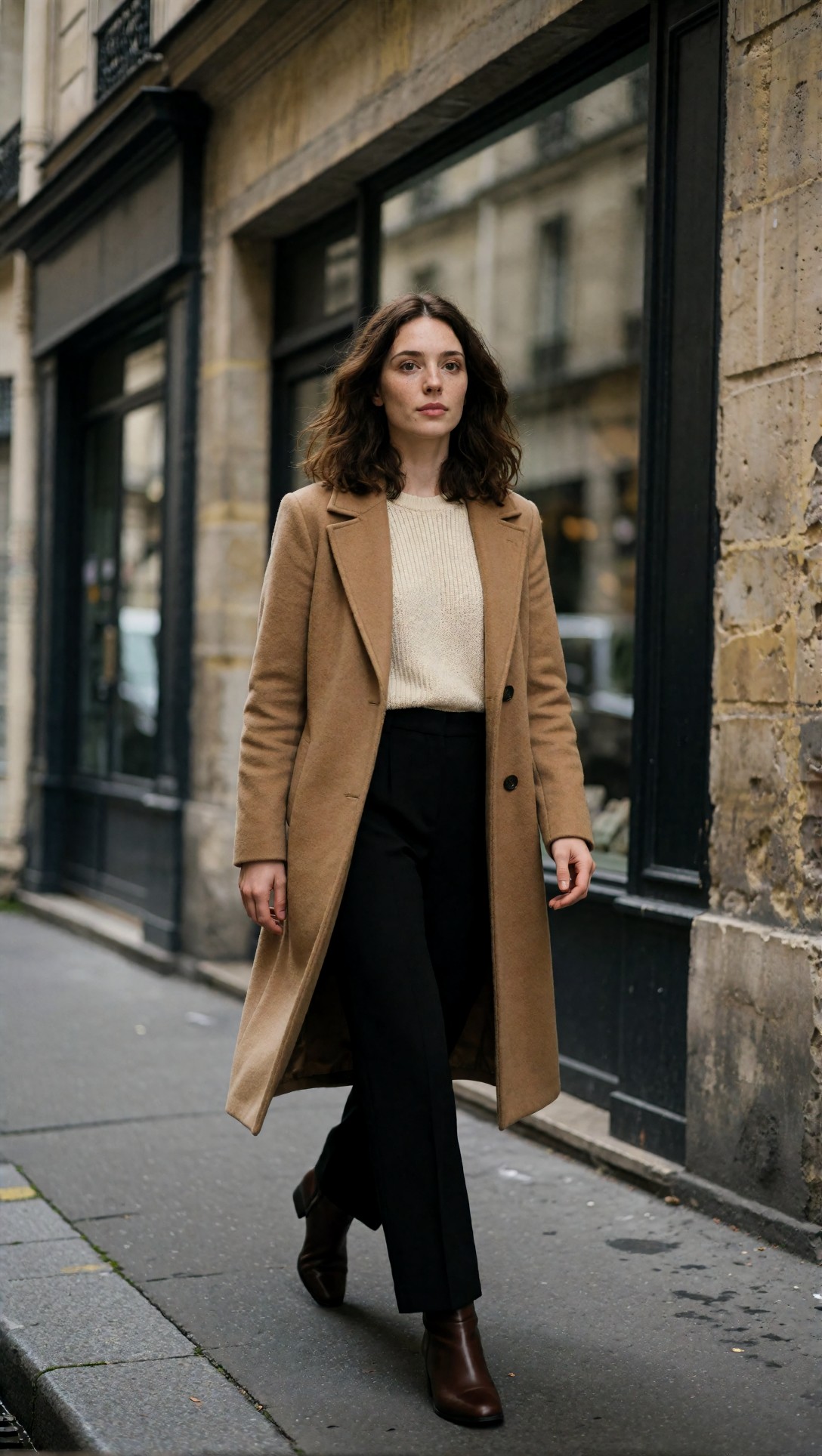
Inspect whether the hairline, brow arc, and mouth shape still match the anchor. In this test, environmental changes were possible, but only when facial descriptors stayed repetitive and specific.
A second variation test pushed lighting harder while keeping the same identity lock. This is where some workflows start to break.
Topic: Same male character under low-key cinematic lighting
Genre: Cinematic Travel
Camera: Panasonic Lumix S1H
Lens: 85mm f/1.8
Lighting: Neon rim light with soft practical key
Location: Night train platform with reflective metal surfaces
Style: Moody cinematic realism
Final Prompt: the same original male character from the anchor reference, early 30s, long rectangular face, high forehead, deep-set brown eyes, slightly prominent nose, warm beige skin, short curly black hair with temple fade, faint scar near left eyebrow, subtle stubble, standing on a night train platform, reflective metal surfaces and soft atmospheric haze, wearing a dark navy bomber jacket over a textured charcoal shirt, serious focused expression, neon rim light from station signage with soft practical key from platform lamps, Panasonic Lumix S1H cinematic capture, 85mm f/1.8 subject isolation, moody blue and amber palette, realistic filmic contrast, same facial identity maintained under dramatic lighting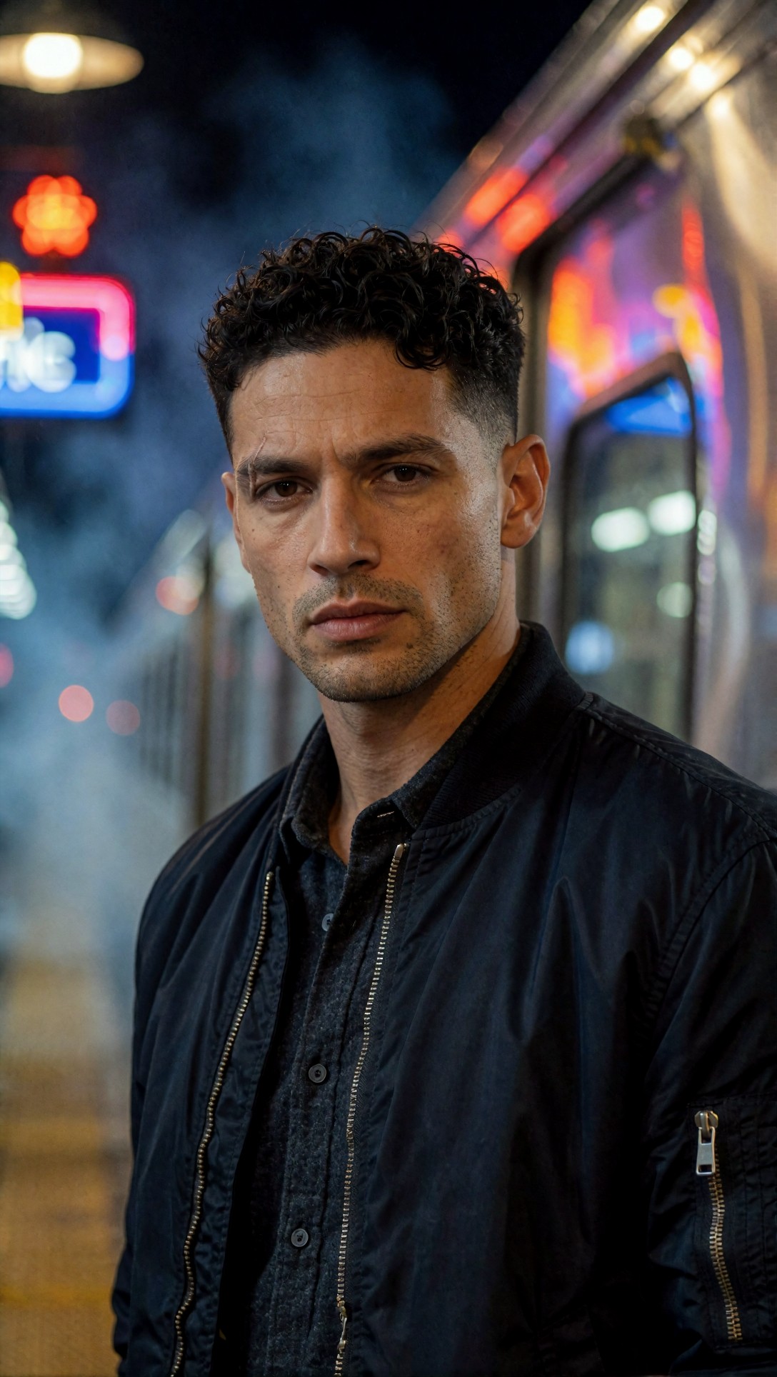
Look closely at the scar placement and forehead shape. In my tests, unusual lighting was one of the first things to weaken identity consistency if the reference strength or denoise setting was not well balanced.
Where the workflow struggled
The failures were consistent enough to be useful.
1. Extreme angle changes
Once I pushed into high-angle shots, profile views, or dramatic wide-lens perspectives, the same character became less reliable. The face often kept one or two traits but lost overall likeness.
2. Full-body shots
This was the biggest surprise in the workflow. Face consistency can look good in portraits and still fall apart when you move to full-body compositions. The reason is simple: the face occupies less of the frame, so the model has more room to reinterpret it.
This prompt is meant to stress-test full-body continuity, which is where many ComfyUI character consistency workflows become noticeably weaker.
Topic: Same female character full-body fashion consistency stress test
Genre: Luxury Campaign
Camera: Hasselblad X2D 100C
Lens: 55mm f/2.5
Lighting: Sunset backlight with soft bounce fill
Location: Modern museum courtyard with pale stone walls
Style: Luxury fashion campaign
Final Prompt: the same original female character from the anchor reference, late 20s, oval face, narrow jawline, wide-set hazel eyes, straight medium nose, pale olive skin, faint freckles, dark copper shoulder-length wavy hair with center part, full-body fashion image in a modern museum courtyard, wearing a structured ivory long coat, black column dress, slim leather belt, pointed boots, relaxed upright pose, walking toward camera, sunset backlight with soft bounce fill, pale stone walls and long shadows, Hasselblad X2D 100C luxury realism, 55mm f/2.5 balanced full-body perspective, refined neutral palette, crisp textile texture, same facial identity preserved even at smaller face scale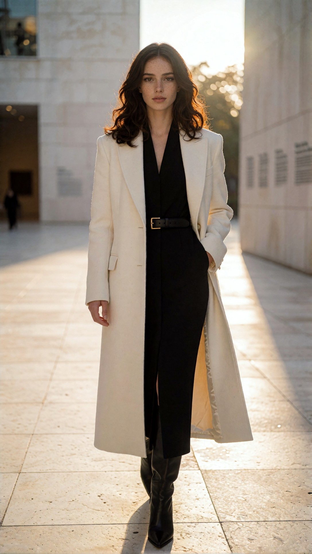
Check whether the face still reads as the same person once it occupies less image area. In this test, full-body images needed stronger identity guidance than close portraits.
3. Expression drift
A neutral face was easy. Strong laughter, shouting, or exaggerated emotion often altered the cheeks, eye shape, and jawline enough to weaken recognition.
4. Heavy style transfer
The more I pushed painterly looks, anime conversion, or aggressive cinematic grading, the more the workflow preserved "character concept" instead of strict identity. That can be acceptable, but it is not the same outcome.
This test checks whether stylization can be introduced without destroying the anchor identity.
Topic: Same male character in stylized editorial black-and-white treatment
Genre: Editorial Portrait
Camera: Leica SL2-S
Lens: 90mm f/2
Lighting: Hard side light with negative fill
Location: Dark studio with textured plaster wall
Style: High-contrast monochrome magazine portrait
Final Prompt: the same original male character from the anchor reference, early 30s, long rectangular face, high forehead, deep-set brown eyes, slightly prominent nose, faint scar near left eyebrow, short curly black hair with clean fade, subtle stubble, standing against a textured plaster wall in a dark studio, direct serious gaze, wearing a black wool turtleneck and tailored overcoat, hard side light with negative fill, Leica SL2-S monochrome portrait aesthetic, 90mm f/2 compressed framing, high-contrast black-and-white magazine treatment, visible skin texture, sculpted facial planes, preserve exact facial identity despite stylized tonal rendering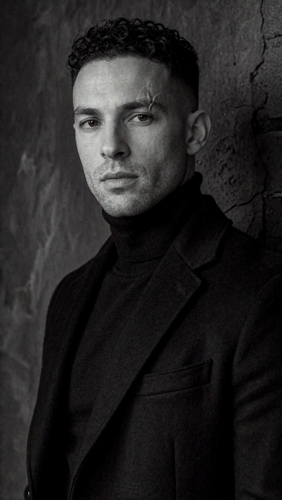
Inspect whether the scar, eye depth, and mouth shape survive the monochrome treatment. In this test, identity held better in black and white than in heavily painterly styles, but still drifted more than in neutral realism.
Prompt ingredients that mattered most
The prompts that worked best had a specific structure. I kept seeing better consistency when the text included:
- age range
- face shape
- eye spacing or eye shape
- nose description
- skin detail such as freckles or scar
- hairline and hair parting
- expression intensity
- wardrobe that does not hide the neck and jaw
Why those ingredients were chosen:
- face shape survives many scene changes
- small asymmetries like freckles or a scar help with identity lock
- hair parting is more stable than generic hair color alone
- controlled expression prevents the model from redrawing facial anatomy too aggressively
By contrast, vague prompts like "beautiful woman, same character" or "same man in another scene" were not useful in production.
Settings I would recommend after this test
These settings gave the most stable results overall, though exact node names depend on your ComfyUI build:
- Use one high-quality anchor image before trying batch variations
- Keep seed fixed for early consistency tests, then branch after the identity is stable
- Use moderate identity strength rather than maximum strength
- Keep denoise lower for variation passes than for first-generation exploration
- Use ControlNet only when composition really matters
- Avoid changing too many variables in one pass
- Upscale after identity is confirmed, not before
The strongest practical tradeoff was this:
- more identity strength = better likeness, less flexibility
- more denoise = more creativity, less repeatability
This prompt is meant to test controlled pose changes using structure guidance while preserving the same person.
Topic: Same female character seated indoor pose variation with structure control
Genre: Lifestyle Editorial
Camera: Sony A1
Lens: 70mm f/2
Lighting: Large window side light with white bounce
Location: Quiet reading room with oak shelves and linen curtains
Style: Refined lifestyle magazine
Final Prompt: the same original female character from the anchor reference, late 20s, oval face, narrow jawline, wide-set hazel eyes, straight medium nose, pale olive skin, faint freckles, dark copper shoulder-length wavy hair with center part, seated in a quiet reading room, relaxed thoughtful pose in a wooden chair, wearing a slate blue cashmere sweater and cream pleated trousers, large window side light with white bounce, oak shelves and linen curtains in soft background blur, Sony A1 realism, 70mm f/2 natural perspective, refined lifestyle magazine styling, warm neutral palette, realistic skin texture, preserve the same facial identity while changing pose and posture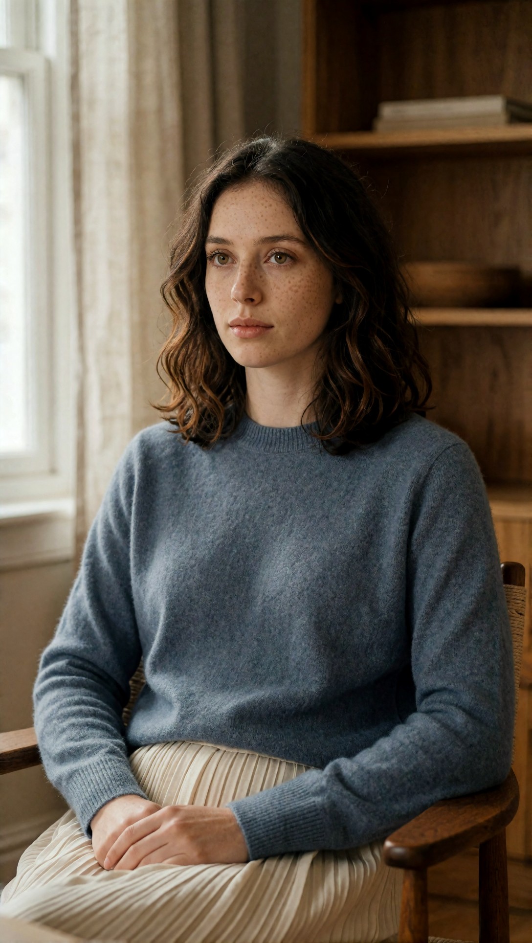
What to inspect here is whether the seated pose changes the jawline or neck proportion enough to alter recognition. In this test, pose control helped composition, but too much structure control sometimes stiffened the image.
A second settings-oriented test checks whether product or prop interaction breaks hands and face at the same time.
Topic: Same male character holding a coffee cup for hand-and-face consistency check
Genre: Product Editorial
Camera: Canon EOS R3
Lens: 50mm f/1.2
Lighting: Morning café window light
Location: Small modern café with matte wood interior
Style: Clean commercial lifestyle
Final Prompt: the same original male character from the anchor reference, early 30s, long rectangular face, high forehead, deep-set brown eyes, slightly prominent nose, warm beige skin, short curly black hair with temple fade, faint scar near left eyebrow, subtle stubble, seated at a matte wood café table holding a ceramic coffee cup naturally with both hands, soft attentive expression, wearing an olive overshirt over a white tee, morning café window light, shallow background with modern interior details, Canon EOS R3 clean realism, 50mm f/1.2 natural commercial depth, realistic hands, realistic skin texture, preserve exact facial identity during prop interaction, understated earthy palette
Check both the face and the fingers. In this test, hand interaction increased the chance of facial drift because the model had to solve more anatomy at once.
A short quality checklist before you call the workflow stable
Before treating a ComfyUI workflow for same character generation as production-ready, I would check these five items across at least 12 to 20 outputs:
- Does the character remain recognizable in portrait, half-body, and full-body crops?
- Do unique traits stay fixed, especially freckles, scars, brow shape, and hairline?
- Does dramatic lighting preserve the same age impression?
- Do smiles or side glances break the likeness?
- Do props, hands, hats, or glasses cause identity drift?
If two or more of those fail regularly, the workflow is not stable yet. It may still be good for concepting, but not for continuity.
When this setup works best
This approach is strongest for:
- character sheets
- narrative image sequences
- brand avatars
- consistent editorial campaigns
- iterative prompt development where one character must persist
It is less ideal for:
- highly experimental stylization
- extreme action scenes
- very wide ensemble compositions
- workflows where every image must radically change camera angle and expression
This final prompt is meant to check whether the same identity can hold up in a more ambitious campaign-style scene with styling, motion, and layered background detail.
Topic: Same female character campaign scene with motion and layered styling
Genre: Luxury Campaign
Camera: RED V-RAPTOR still frame capture
Lens: 65mm anamorphic at T2.0
Lighting: Golden hour backlight with soft overhead diffusion
Location: Coastal hotel terrace with stone flooring and wind movement
Style: Elegant resort editorial
Final Prompt: the same original female character from the anchor reference, late 20s, oval face, narrow jawline, wide-set hazel eyes, straight medium nose, pale olive skin, faint freckles, dark copper shoulder-length wavy hair with center part, standing on a coastal hotel terrace with ocean horizon behind her, wind moving her hair and garments, wearing a flowing sand-colored silk dress, thin gold earrings, strappy sandals, one hand resting lightly on the terrace rail, calm self-possessed expression, golden hour backlight with soft overhead diffusion, RED V-RAPTOR still frame aesthetic, 65mm anamorphic T2.0 cinematic depth and oval bokeh, elegant resort editorial styling, warm stone, sea blue, and champagne palette, realistic skin detail, preserve exact facial identity in a dynamic premium scene
Inspect whether motion, wind, and accessories add atmosphere without replacing the face with a different person. In this test, this was close to the upper limit of complexity before consistency started to soften.
What I would change next
If I were refining this workflow further, I would do three things:
1. create two anchor references of the same character, one frontal and one 3/4 view 2. separate portrait workflow and full-body workflow instead of forcing one setup to do both equally well 3. maintain a small identity descriptor block that is copied unchanged across all prompts
That last point matters more than it sounds. Prompt drift causes character drift. If one prompt says "soft arched brows" and another omits it, the model often fills the gap with a different face.
Editorial conclusion
For anyone searching for a ComfyUI consistent character workflow, this is the approach I would actually recommend: start with one strong anchor portrait, add identity reference guidance, keep text descriptors fixed, and use conservative denoise for variation passes. In this test, that combination gave the best balance between likeness and flexibility.
Who should use it: creators building recurring characters, editorial sequences, branded personas, or any image set where continuity matters more than novelty.
Who should avoid it: users who want extreme style shifts, highly dynamic action shots, or constant lens-angle experimentation in every frame.
The setting that mattered most was not a single sampler number. It was the relationship between reference strength and denoise. Too little reference and the person changes. Too much reference and the image stiffens. The strongest result sat in the middle: enough identity lock to preserve the person, enough freedom to let the scene change.