In this test, I built a ComfyUI fast iteration workflow for one specific job: checking prompt direction early, rejecting weak ideas fast, and only spending full-resolution compute on prompts that already proved they can hold composition, lighting, and subject identity. If your current ComfyUI graph jumps straight into expensive renders, this tutorial shows the workflow changes that cut wasted runs the most.
What to know first
- Use a two-pass workflow: cheap preview first, full render second.
- Test composition, pose, and subject clarity at low resolution before chasing texture detail.
- Keep one seed fixed while changing prompt ingredients, or you will misread random variation as prompt improvement.
- Most wasted compute comes from testing too many variables at once: model, sampler, CFG, steps, prompt, and resolution.
- Save your best prompt branches and preview outputs inside ComfyUI so you can promote only proven variants to final generation.
Test setup
This session was designed like an operator check, not a benchmark chart.
What I tested
- SDXL-style checkpoint workflow in ComfyUI
- Low-cost preview pass at small resolution
- Selective high-cost final pass at larger resolution
- Prompt edits for subject clarity, lighting control, material detail, and background consistency
- Sampler and step changes only after prompt direction was stable
Preview-stage settings used most often
| Stage | Resolution | Steps | CFG | Purpose | What I inspected | |---|---:|---:|---:|---|---| | Fast preview | 768x768 or 832x1216 | 8-14 | 4.5-6.5 | Prompt direction check | composition, pose, subject count, color palette | | Refined preview | 1024 short side | 16-22 | 5-7 | Stability check | face coherence, hands, clothing shape, background logic | | Final render | 1344+ long side | 24-35 | 5-7 | Publishable output | texture, micro-contrast, edge cleanup, material realism |
A practical companion for this kind of workflow is keeping reference outputs in a folder or a board, then moving winning images into a tracked set on [/gallery](/gallery). For rapid prompt variations, I also cross-check language fragments in [/promptlab](/promptlab).
Production note from the session
The biggest change was not a better model. It was workflow discipline.
In the first round, I was still doing what many ComfyUI users do: changing prompt text and sampler settings at the same time, then trying to guess why one image looked better. That produced attractive images, but it did not produce reliable conclusions.
Once I split the graph into a quick preview branch and a final branch, the test became much clearer. Bad prompt ideas failed quickly at low cost. Good prompt ideas survived into the second stage. That is the core value of a ComfyUI prompt testing workflow.
What looked good immediately in this ComfyUI quick preview workflow
Three things improved as soon as the workflow was simplified.
1. Composition errors became obvious faster
At low resolution, composition mistakes show up early: merged limbs, crowded framing, weak silhouette separation, or a subject drifting too close to the edge. Those problems rarely fix themselves just because you increase steps.
This first test checks whether a prompt can hold a single subject with readable framing and a stable lighting idea.
Topic: cinematic portrait of a cyclist pausing beside a wet city street at night
Genre: Lifestyle Portrait
Camera: Canon EOS R5
Lens: 50mm f/1.2
Lighting: neon rim light with soft storefront spill
Location: narrow downtown side street after rain
Style: cinematic realism
Final Prompt: a solo cyclist standing beside a matte black road bike on a rain-slick city side street at night, relaxed posture, one foot on curb, reflective pavement, teal and amber neon reflections, soft storefront light shaping the face, breathable technical jacket with visible fabric texture, clean helmet straps, realistic hands, balanced negative space above subject, cinematic realism, Canon EOS R5 look, 50mm f/1.2 depth falloff, crisp silhouette separation, subtle mist in the air, restrained color palette, natural skin detail, editorial composition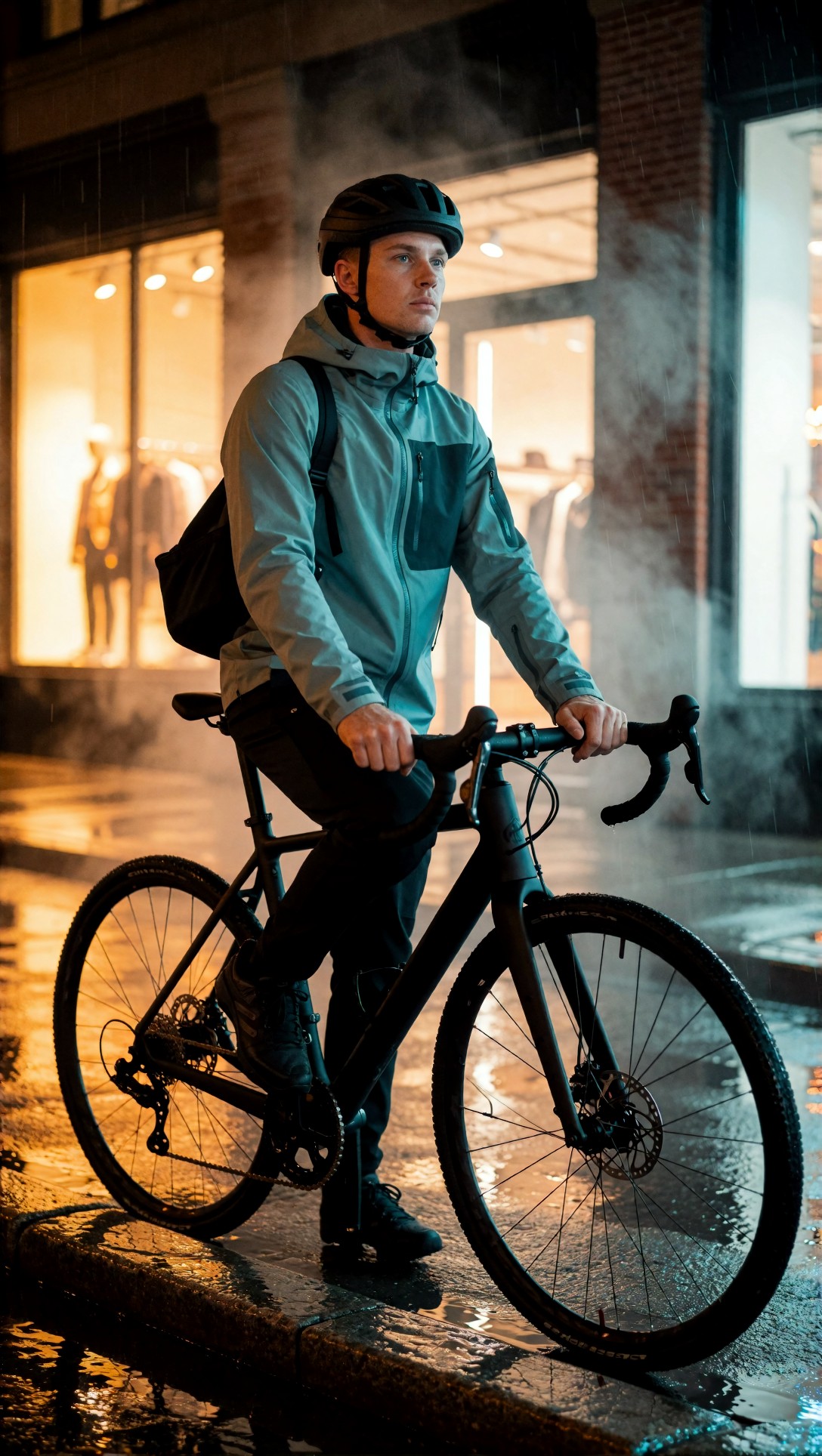
Inspect whether the bike frame stays readable, whether the rider remains a single clear subject, and whether the neon color split stays controlled instead of washing the face. If the silhouette is weak in preview, a larger render usually just makes the weak composition sharper.
2. Prompt hierarchy was easier to read
In preview mode, unnecessary prompt clutter became visible. Prompts with too many style tokens often looked busy before they looked detailed.
The strongest preview prompts had a simple hierarchy: subject first, framing second, lighting third, texture and mood last.
This second test checks whether a product-focused prompt holds shape and spacing before spending compute on surface detail.
Topic: premium over-ear headphones on a stone pedestal with minimal luxury staging
Genre: Product Editorial
Camera: Nikon Z8
Lens: 85mm f/2
Lighting: large softbox key light with subtle silver bounce
Location: neutral studio set with textured stone backdrop
Style: clean commercial look
Final Prompt: premium over-ear headphones displayed on a sculpted stone pedestal in a minimal studio set, centered hero composition, soft shadows, precise ear cup symmetry, brushed metal frame, matte leather headband, refined seam detail, controlled reflections on hardware, warm gray and charcoal palette, negative space around the product, luxury commercial styling, Nikon Z8 clarity, 85mm f/2 compression, realistic materials, crisp edges, premium catalog-meets-editorial presentation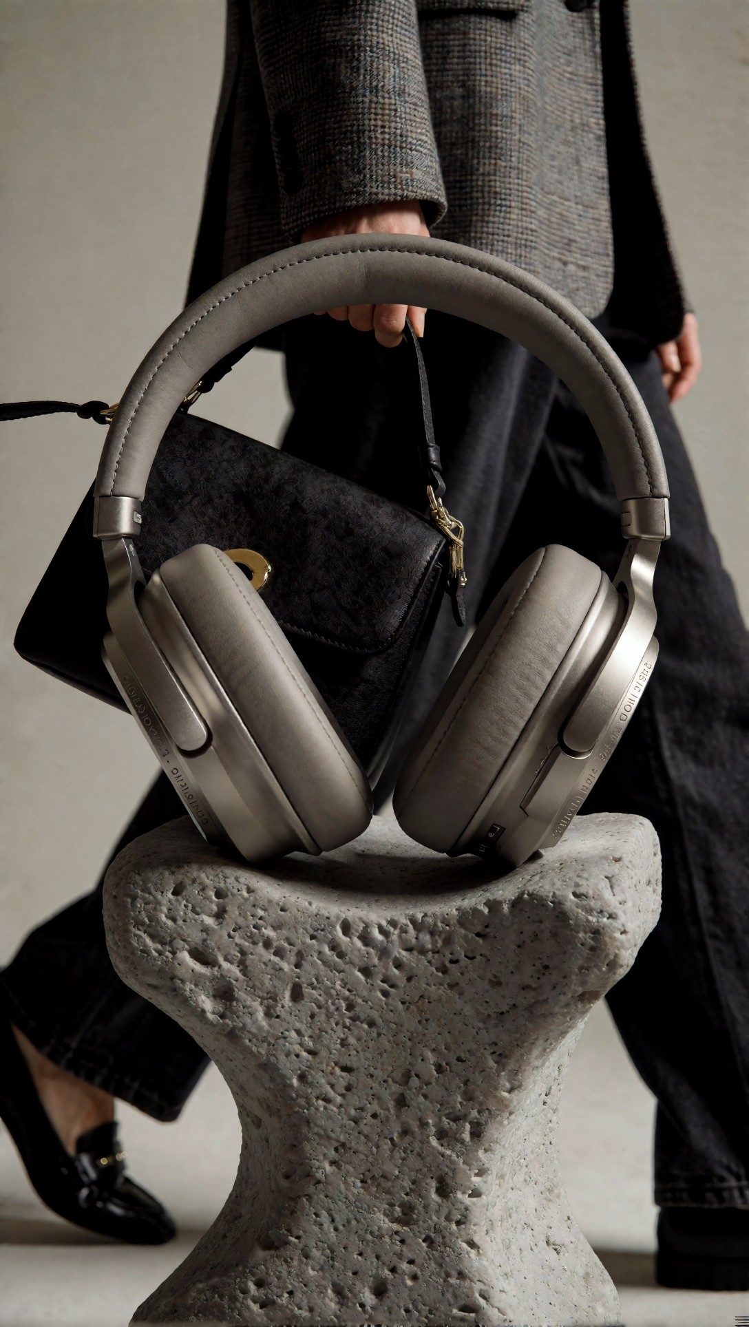
Check ear cup symmetry, headband geometry, and reflection control. If the object shape is already unstable in preview, increasing resolution often makes the flaws more obvious rather than correcting them.
3. Weak prompts died early
That sounds negative, but it saves time. A prompt that cannot establish scene logic in 10 to 12 steps should not get a 30-step upscale pass yet.
What needed correction before this became an efficient workflow
The weak point was not image quality. It was testing method.
I was changing too many variables at once
In the messy version of the graph, I changed:
n- sampler
- prompt wording
- CFG
- resolution
- denoise strength
- model
That makes comparison nearly useless.
The corrected workflow was much more rigid:
1. Lock one model. 2. Lock one sampler. 3. Lock one seed for A/B prompt tests. 4. Test only prompt changes in preview. 5. Promote the best prompt to a refined preview. 6. Only then test steps, CFG, resolution, or model swaps.
I was asking preview images to prove texture detail
That is the wrong job for a preview branch.
A quick preview workflow should answer these questions only:
- Is the subject correct?
- Is the framing usable?
- Is the pose coherent?
- Is the lighting direction believable?
- Is the style generally aligned?
If yes, move on. If no, fix the prompt first.
This test checks background consistency and whether a travel-style composition stays readable with multiple scene elements.
Topic: traveler in a desert railway station at dawn with vintage luggage
Genre: Cinematic Travel
Camera: Fujifilm GFX100 II
Lens: 45mm f/2.8
Lighting: sunrise side light with dusty atmospheric haze
Location: remote desert train platform with faded signage
Style: cinematic realism
Final Prompt: a lone traveler waiting on a remote desert railway platform at dawn, vintage leather luggage beside a weathered bench, long coat moving slightly in dry wind, soft sunrise side light, dusty haze in the air, faded station signage, warm sand and rust color palette, grounded perspective, balanced composition with clear platform lines, cinematic realism, Fujifilm GFX100 II medium format feel, 45mm f/2.8 natural depth, realistic clothing folds, quiet narrative mood, clean facial structure, coherent background architecture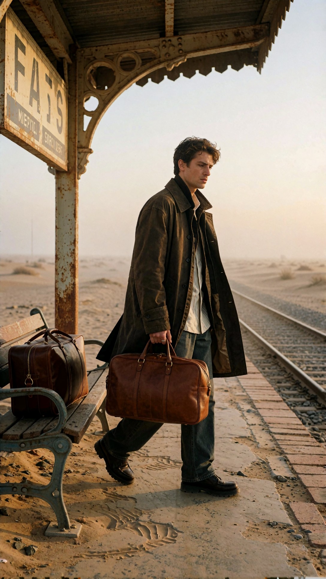
Inspect line perspective, luggage placement, and whether the station reads as one coherent place. If the platform geometry breaks apart in preview, it usually points to prompt ambiguity or a model mismatch.
The exact prompt ingredients that changed the result
This was the part that mattered most in practice. In this ComfyUI efficient workflow, a few prompt ingredients consistently improved preview reliability.
1. Clear subject count
Using phrases like solo subject, single product hero, or one traveler reduced unwanted extra figures and duplicate objects.
2. Framing language with camera intent
Terms like waist-up portrait, centered hero composition, three-quarter view, or full-body with negative space helped more than abstract style tags.
3. Lighting that implied shape, not just mood
Prompts improved when lighting described where the shape came from: side light, butterfly light, rim light, overhead softbox, overcast diffusion.
4. Material cues for object stability
For products and clothing, concrete materials improved structure: brushed aluminum, matte leather, ribbed knit, polished ceramic, wet asphalt, stone pedestal.
5. A restrained style layer
The strongest previews used one clear art direction, not five mixed aesthetics.
This test checks whether face stability holds under a cleaner beauty prompt with precise lighting and restrained styling language.
Topic: close beauty portrait with pearl earrings and natural skin texture
Genre: Beauty Campaign
Camera: Sony A7R V
Lens: 90mm macro f/2.8
Lighting: studio butterfly light with soft reflector fill
Location: seamless warm ivory studio backdrop
Style: high-end beauty advertising
Final Prompt: close-up beauty portrait of a woman wearing small pearl earrings and a silk cream blouse, direct gaze, calm expression, clean hairline, natural lips, visible skin texture without plastic smoothing, studio butterfly lighting with soft reflector fill, warm ivory seamless background, precise catchlights, elegant minimal styling, Sony A7R V detail, 90mm macro f/2.8 rendering, high-end beauty advertising, refined tonal transitions, realistic pores, polished but believable retouching, centered magazine crop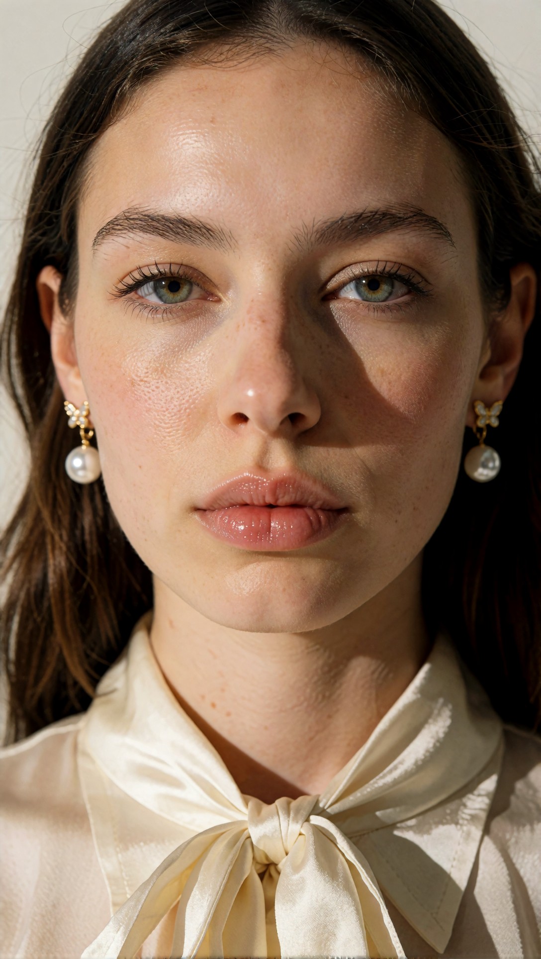
Inspect eye alignment, skin texture balance, earring symmetry, and catchlight placement. If the preview already shows waxy skin or unstable eyes, adding more steps often deepens the artificial look instead of improving realism.
A practical ComfyUI prompt testing workflow that saves compute
Here is the workflow that produced the cleanest iteration cycle.
Stage 1: Cheap preview branch
Use a low-resolution latent, basic sampler settings, and a fixed seed.
Goal: reject bad prompts fast.
What to inspect:
- subject accuracy
- pose coherence
- framing
- object count
- broad light direction
- obvious hand or anatomy risk
Stage 2: Refined preview branch
Keep the same prompt and seed, but add moderate steps or slightly larger dimensions.
Goal: verify that the prompt scales.
What to inspect:
- face stability
- clothing shape
- product geometry
- edge behavior
- background consistency
Stage 3: Final branch
Only now should you spend on larger dimensions, finer steps, optional detail passes, or an external upscaler.
If the image is worth preserving but lacks finish, I would rather upscale a proven composition in [/upscaler](/upscaler) than keep gambling on fresh high-cost rerolls.
Short checklist: promote or reject?
Use this checklist before moving a preview to final render.
- [ ] Subject count is correct
- [ ] Main silhouette reads clearly at thumbnail size
- [ ] Pose is physically coherent
- [ ] Lighting direction is obvious and intentional
- [ ] Background supports the scene instead of competing with it
- [ ] No major hand, eye, or object-merge failure
- [ ] Prompt style is consistent enough to justify a full render
This test checks whether fashion-like garment structure survives a quick preview branch before a final upscale.
Topic: full-body editorial of a model in structured charcoal tailoring on a rooftop
Genre: Fashion Editorial
Camera: Leica SL2-S
Lens: 75mm f/2
Lighting: overcast diffusion with soft negative fill
Location: urban rooftop with concrete walls and distant skyline
Style: modern minimalist editorial
Final Prompt: full-body fashion editorial portrait of a model wearing structured charcoal tailoring, long double-breasted coat over a sharp vest and tapered trousers, polished black boots, hands relaxed at sides, clean posture, rooftop concrete setting with distant city skyline, overcast diffusion with soft negative fill for sculpted fabric shape, restrained monochrome palette, modern minimalist editorial direction, Leica SL2-S rendering, 75mm f/2 natural compression, visible wool texture, clean garment lines, balanced full-body framing, magazine-quality composition with subtle wind movement in the coat hem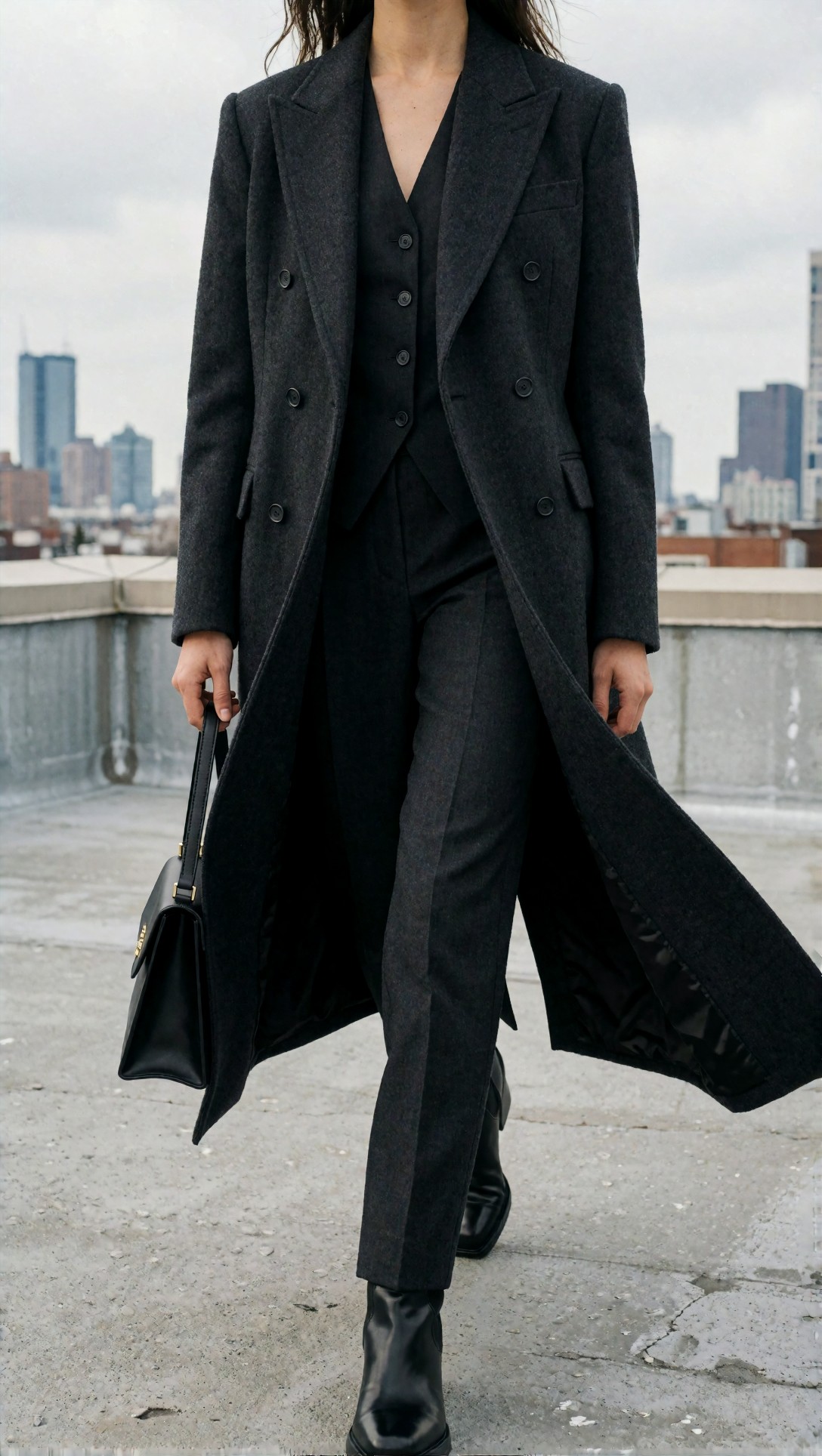
Inspect whether coat edges stay clean, whether the legs remain proportional, and whether the skyline stays secondary. This is a good example of a preview image that can already reveal if garment structure is likely to survive a larger render.
Example prompts and generated-image inspection notes
The next tests were useful because each one isolates a different failure mode.
Prompt test for hand risk and object interaction
Hands are one of the fastest reasons to reject a prompt in preview. If the hands fail while holding a simple object, do not waste a final pass.
Topic: ceramic cup held with both hands in a cozy cafe portrait
Genre: Lifestyle Portrait
Camera: Panasonic Lumix S5II
Lens: 50mm f/1.8
Lighting: window side light with soft interior ambient fill
Location: quiet corner cafe with wood table and muted wall tones
Style: clean commercial look
Final Prompt: waist-up lifestyle portrait of a person holding a ceramic coffee cup with both hands at a quiet cafe table, relaxed shoulders, soft direct gaze, textured knit sweater in oatmeal color, natural window side light with gentle interior ambient fill, warm wood tabletop, muted taupe wall behind, realistic finger placement around the cup, visible steam, clean commercial lifestyle styling, Panasonic Lumix S5II realism, 50mm f/1.8 intimacy, shallow depth of field, believable skin texture, calm morning atmosphere, uncluttered composition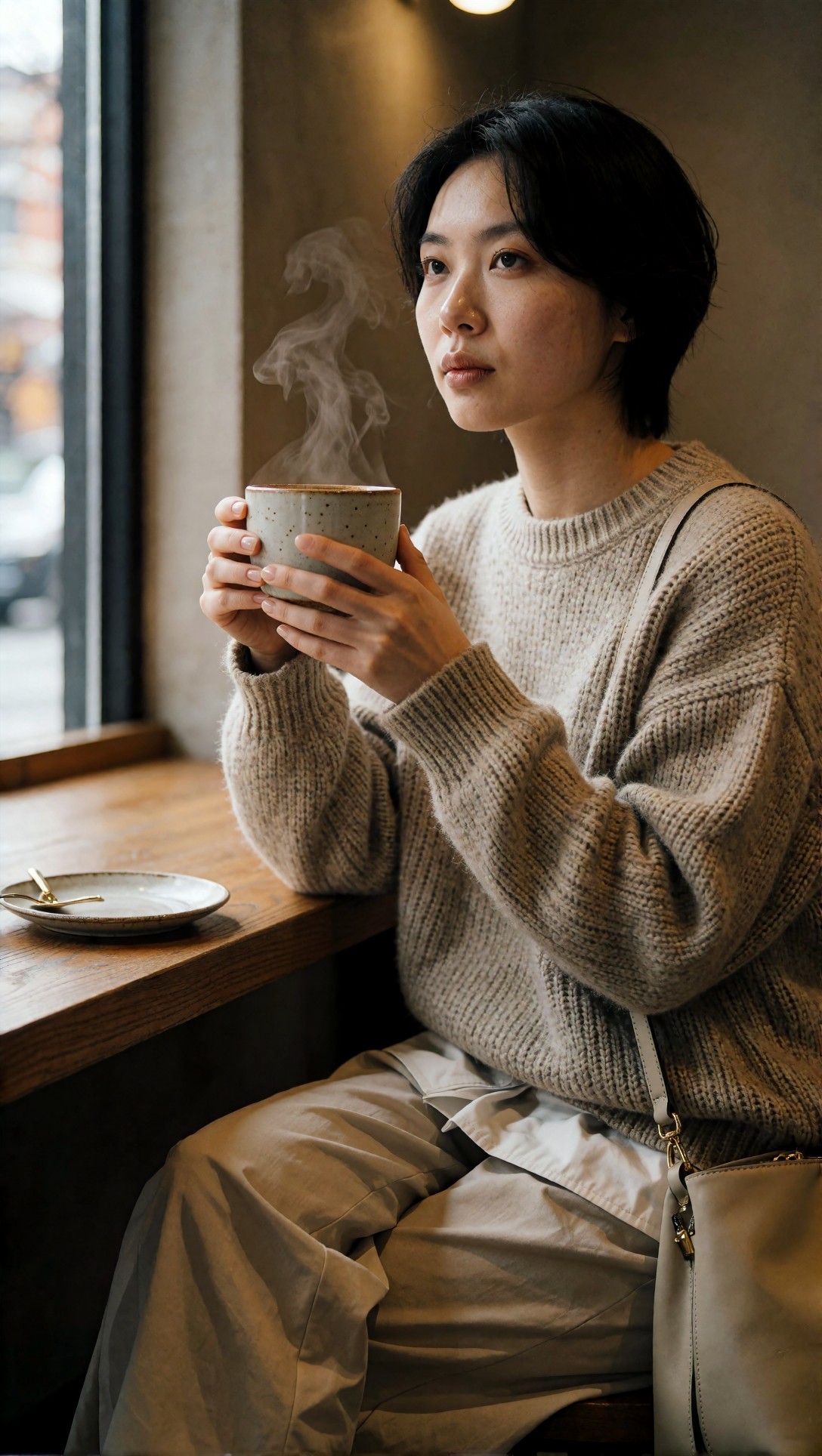
Check finger count, grip logic, cup rim shape, and steam behavior. In this kind of prompt, a bad preview usually predicts a bad final image.
Prompt test for background consistency and depth layering
This is useful when scenes include architecture, props, and atmosphere. The preview should show whether the model understands spatial layers.
Topic: rainy bookstore window scene with a reader standing inside
Genre: Cinematic Interior
Camera: RED Komodo 6K
Lens: 35mm T1.5
Lighting: warm interior practicals against cool rainy exterior light
Location: old city bookstore with large front window
Style: moody cinematic realism
Final Prompt: inside an old city bookstore at dusk, a reader standing near a large rain-streaked front window, shelves of books receding into the background, warm practical lamps inside, cool blue rainy street visible outside, layered reflections on glass kept controlled, dark green coat, relaxed stance, moody cinematic realism, RED Komodo 6K image character, 35mm T1.5 environmental framing, rich wood textures, believable depth layering, atmospheric contrast, sharp focal subject with soft falloff into shelves, thoughtful quiet mood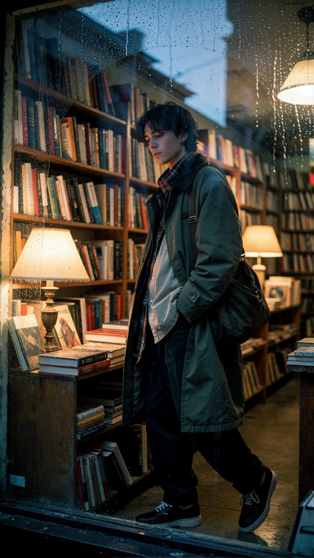
Inspect the glass reflections, shelf perspective, and separation between interior and exterior light. If the layers collapse in preview, adding detail passes rarely fixes the scene logic.
Prompt test for texture detail that should wait until late stage
This kind of prompt often tempts users into rendering too large too soon. The trick is to confirm shape first, then spend compute on texture.
Topic: artisanal leather boots arranged for a brand campaign still life
Genre: Product Editorial
Camera: Hasselblad X2D 100C
Lens: 80mm f/1.9
Lighting: directional softbox with narrow strip rim light
Location: dark oak studio floor with canvas backdrop
Style: luxury campaign
Final Prompt: artisanal leather boots arranged in a premium campaign still life on a dark oak floor, one upright pair with one boot slightly angled forward, rich brown full-grain leather, visible stitching, subtle creases, stacked heel detail, canvas backdrop with soft folds, directional softbox shaping the leather volume, narrow strip rim light on boot edges, luxury campaign art direction, Hasselblad X2D 100C precision, 80mm f/1.9 depth and separation, earthy brown and tobacco palette, controlled reflections, highly realistic construction, elegant negative space
Inspect boot shape, sole geometry, and overall arrangement first. Stitch fidelity matters later, but if the boot silhouette is wrong in preview, the prompt is not ready for final render.
Prompt test for style lock without prompt bloat
This is where many workflows lose efficiency. Too many style terms can produce attractive but inconsistent results.
Topic: anime-inspired rooftop duo at sunset with clear silhouette separation
Genre: Anime Key Visual
Camera: cinematic anime capture style
Lens: 35mm equivalent f/2
Lighting: sunset backlight with soft sky fill
Location: high school rooftop with chain-link fence and city horizon
Style: polished anime key visual
Final Prompt: two students standing on a high school rooftop at sunset, clear silhouette separation between characters, one facing the horizon and one turning slightly toward camera, school uniforms with clean linework and subtle wind movement, chain-link fence catching warm light, orange and violet sky gradient, polished anime key visual style, cinematic composition, 35mm equivalent perspective, sunset backlight with soft fill on faces, expressive but controlled body language, crisp hair shapes, readable accessories, emotional end-of-day atmosphere, balanced negative space for poster-like framing
Inspect character count, spacing, line clarity, and whether sunset color overwhelms the faces. This is a good case where style lock should come from scene clarity, not from stacking many art-style labels.
When to switch models or settings
This is where a lot of compute gets wasted.
Do not switch models just because a preview lacks micro-detail. That is often a resolution or step issue, not a model failure.
Switch models when you see one of these repeated problems across multiple prompts:
Switch model if
- the checkpoint repeatedly misreads your subject category
- anatomy breaks in similar ways across seeds
- the model refuses the intended visual language, such as product realism versus painterly output
- backgrounds keep turning generic even when the prompt is spatially clear
Switch settings instead if
- composition is good but texture is weak
- the face is mostly right but needs cleaner refinement
- materials read correctly but need more edge definition
- the image is already strong and only needs resolution
This test checks whether a scene with many reflective surfaces still behaves under a more cinematic setup, which is often where model choice becomes more obvious.
Topic: luxury hotel lobby arrival scene with reflective marble and brass details
Genre: Luxury Campaign
Camera: Canon EOS R3
Lens: 28mm f/2
Lighting: chandelier practicals with soft hidden fill
Location: grand hotel lobby with marble floor and brass reception desk
Style: elegant hospitality campaign
Final Prompt: elegant hotel arrival scene in a grand marble lobby, a well-dressed guest pulling a compact suitcase across reflective stone flooring, brass reception desk in the midground, chandelier practical lights overhead balanced by subtle hidden fill, tailored cream travel coat, polished loafers, controlled reflections, warm gold and ivory palette, wide environmental composition, Canon EOS R3 realism, 28mm f/2 perspective with cinematic depth, hospitality campaign styling, believable architecture, clean facial features, premium materials, poised motion captured without blur
Inspect marble reflections, luggage wheel shape, and architectural straight lines. If these repeatedly distort across prompts, the model may be the bottleneck rather than the workflow.
Failure risks in a ComfyUI save compute setup
A fast workflow is not automatically a good workflow.
Risk 1: Over-trusting previews
Some prompts pass preview but fail when scaled. Fine jewelry, dense typography, crowded city scenes, and intricate hands can break late.
Risk 2: Using too few steps to judge a good idea
If steps are too low, you can reject a prompt that actually had strong structure. I found 8 to 14 steps acceptable for early screening, but not for final judgment on faces.
Risk 3: Seed drift during comparison
If you compare different prompts with different seeds, you are no longer measuring prompt quality cleanly.
Risk 4: Letting upscaling hide prompt problems
Upscaling improves finish, not composition logic. If the subject placement is wrong, sharpening it only makes the mistake clearer.
For full image creation after a prompt proves itself, it makes sense to move the winner into [/create](/create) or archive the prompt variant in [/articles](/articles) notes for repeatable production use.
Practical recommendations from this test
If I had to reduce the entire session into one working method, it would be this:
1. Build one cheap preview lane and one final lane in ComfyUI. 2. Fix the seed during prompt tests. 3. Change only one prompt ingredient at a time. 4. Judge previews on composition and scene logic, not pores and stitching. 5. Promote only the top variants to expensive renders.
The strongest result came from treating the preview branch like a filter, not a miniature final renderer.
The weak point was anything involving too many simultaneous experiments. As soon as prompt edits, sampler changes, and model swaps happened together, the test became noisy and slower.
FAQ
What is the best ComfyUI fast iteration workflow for prompt testing?
A two-stage setup works best: low-cost preview first, then a refined or final pass only for winning prompts. Keep the seed fixed and test prompt wording before changing sampler or model settings.
What resolution should I use for a ComfyUI quick preview workflow?
Use a small but readable size such as 768x768 or 832x1216 for early checks. That is usually enough to judge framing, pose, and scene logic without spending full compute.
How do I save compute in ComfyUI without missing good prompts?
Do not ask the preview stage to prove texture detail. Let it prove composition and subject clarity first. Then raise steps or resolution only for prompts that already work.
When should I switch models in ComfyUI?
Switch only after repeated prompt failures point to a model mismatch: wrong visual language, unstable anatomy, or poor subject understanding across multiple attempts.
Is upscaling part of an efficient ComfyUI workflow?
Yes, but only after the image is compositionally sound. Upscaling is best used to finish a proven image, not to rescue a weak one.
Closing advice
This workflow is best for users who generate in batches, compare prompt variants, and want a repeatable way to reject bad ideas early. It is especially useful for editorial scenes, product images, and prompt-heavy concept work where small wording changes matter.
It is less useful for users who want one-click final images without inspecting failures, because the value comes from deliberate comparison.
If you use this ComfyUI fast iteration workflow, the setting that matters most is not a magic sampler value. It is the decision to separate preview judgment from final rendering. The prompt detail that matters most is clear visual hierarchy: subject, framing, lighting, then style. When that order is right, ComfyUI becomes faster not because it renders quicker, but because you stop paying for prompts that were already weak in the first 10 steps.