ComfyUI High Resolution Workflow Tutorial: When to Resize, Upscale, and Re-Render 한국어 요약
이 페이지는 ZView Space의 영어 원문을 한국어 검색 사용자도 이해할 수 있도록 정리한 SEO 요약입니다. 핵심은 단순한 얼굴 중심 이미지가 아니라 패션 에디토리얼, 룩북, 아웃핏, 프롬프트 테스트, 이미지 생성 워크플로우를 실제로 어떻게 구성할지입니다.
핵심 요약
- 원문 주제: ComfyUI High Resolution Workflow Tutorial: When to Resize, Upscale, and Re-Render
- 목적: AI 이미지 생성에서 outfit, silhouette, fabric, pose, location, camera framing을 더 명확하게 설계합니다.
- 활용 범위: Z-Image Turbo, Krea2 Turbo, Qwen Image, Anima, SeedVR2 같은 이미지 생성 및 업스케일 워크플로우에 적용할 수 있습니다.
- SEO 관점: 제목, 설명, 이미지 alt, 프롬프트 예시가 실제 검색 의도와 맞아야 색인 가능성이 높아집니다.
한국어 사용자를 위한 체크포인트
1. 프롬프트가 얼굴 묘사에만 머물지 않고 전체 스타일과 의상 구성을 설명하는지 확인합니다. 2. 패션 이미지라면 상의, 하의, 아우터, 신발, 액세서리, 소재감, 촬영 장소를 분리해서 씁니다. 3. 생성 결과는 바로 게시하지 말고 디테일, 손, 의상 형태, 배경 일관성, 이미지 품질을 비교합니다. 4. 글 본문에는 실제 테스트 기준과 실패를 줄이는 방법이 들어가야 검색엔진에서 얇은 콘텐츠로 보일 가능성이 줄어듭니다.
원문 미리보기
This tutorial shows a practical ComfyUI high resolution workflow for getting large, clean images without wasting VRAM or blindly upscaling everything. In this test, I compared three paths operators actually use in ComfyUI: generate big from the start, generate
---
This tutorial shows a practical ComfyUI high resolution workflow for getting large, clean images without wasting VRAM or blindly upscaling everything. In this test, I compared three paths operators actually use in ComfyUI: generate big from the start, generate small then upscale, and generate small then re-render at higher resolution. The useful result is not that one method always wins. It is knowing when each method preserves composition, when it breaks faces or textures, and how to choose the next step based on what the first render already got right.
If you want a workflow you can repeat, this guide is written as a checklist-led test report rather than a generic overview. I will focus on observed tradeoffs: edge detail, anatomy drift, texture sharpness, prompt adherence, and where resize nodes help or quietly hurt.
Quick answer: what to know first
- If the base image already has the right composition and anatomy, upscale first before doing anything more destructive.
- If the base image is soft, confused, or structurally wrong, re-render at higher resolution is usually better than a pure upscale.
- In most cases, the strongest practical path is: compose at moderate resolution, upscale in stages, then lightly refine only if needed.
- Resizing is not the same as re-rendering. A resize node changes pixel dimensions; a re-render step asks the model to invent or re-interpret detail.
- For very large outputs, tile-based methods are safer than pushing one huge latent render, especially on limited VRAM.
Test setup
What was tested in this workflow:
- Base generation sizes: 768px, 1024px, and 1344px long side variants
- Main scenarios: portraits, product close-ups, architecture/interiors, and complex scenes with repeating detail
- Evaluation points: face stability, hand risk, fabric texture, text legibility, background consistency, edge cleanliness, and prompt lock
- Practical tools around the workflow: prompt iteration in [Prompt Lab](/promptlab), image review in [Gallery](/gallery), and final enlargement checks with the [Upscaler](/upscaler)
I am not treating all subjects as equal because they are not. Portraits can survive a careful upscale surprisingly well. Dense city scenes and text-heavy products expose workflow weaknesses much faster.
Before you generate: preparation checklist
Use this checklist before building the graph. It saves more time than trying to fix a weak image after the fact.
Preparation checklist
- Choose the final use first: web hero, print, crop-heavy editorial, product detail, or background plate.
- Decide what must remain stable: face, logo-free product shape, architecture lines, garment texture, or hand pose.
- Start with an aspect ratio that matches the delivery target instead of planning a heavy crop later.
- Set a realistic base resolution for your GPU. In many setups, 1024-class generation is the sweet spot before upscale.
- Separate goals into two buckets: structural accuracy and micro-detail.
- Only re-render if the structure is already good enough to preserve through a second pass.
When each method makes sense
| Workflow choice | Best when | Strong point | Weak point | My recommendation | |---|---|---|---|---| | Generate large from scratch | You have enough VRAM and need native composition at near-final size | Better global coherence | Slow, expensive, more crash risk | Use for simple scenes or when crop precision matters | | Resize + upscale | Base image is already correct | Fastest path to more pixels | Can amplify blur or bad anatomy | Best default for clean portraits and product shots | | Resize + re-render | Base image needs more believable detail, not just bigger size | Can add richer texture and depth | May alter identity or composition | Use when image is promising but under-detailed | | Tile upscale + light refinement | You need very large output | Efficient and scalable | Tile seams or over-sharpening if pushed too far | Best for posters, backgrounds, and large commercial outputs |
Step-by-step ComfyUI high res tutorial
Step 1: Generate a composition-first base image
The first decision in a ComfyUI high resolution workflow is not the upscaler. It is the base render size. In this test, images that started too small often locked in weak anatomy and muddy local textures. Images that started too large sometimes looked impressive at first glance but were slower, less consistent, and harder to iterate.
For most subjects, I got the best working base by generating around the 1024-class range or a proportional equivalent for the chosen aspect ratio. That size was large enough to establish forms, lighting, and scene layout, but still fast enough for several prompt passes.
A practical rule: do not ask the first pass to solve everything. Ask it to solve composition, subject readability, and lighting hierarchy.
This first prompt checks whether the base render can hold facial structure and shallow-depth portrait lighting before any high-resolution step.
Topic: Studio portrait with strong skin detail foundation
Genre: Beauty Campaign
Camera: Canon EOS R5
Lens: 85mm f/1.2
Lighting: Studio butterfly light with soft fill
Location: Neutral gray seamless studio
Style: High-end beauty advertising
Final Prompt: close-up beauty portrait of a woman with clean symmetrical features, direct eye contact, relaxed confident expression, subtle natural makeup, smooth but realistic skin texture, dark tailored blazer with minimal jewelry, centered composition, neutral gray seamless backdrop, studio butterfly key light with soft fill and gentle catchlights, Canon EOS R5 look, 85mm f/1.2 shallow depth of field, balanced contrast, high tonal separation in skin, refined pores and hair strands, premium beauty campaign framing, natural color, precise facial anatomy, no exaggerated retouching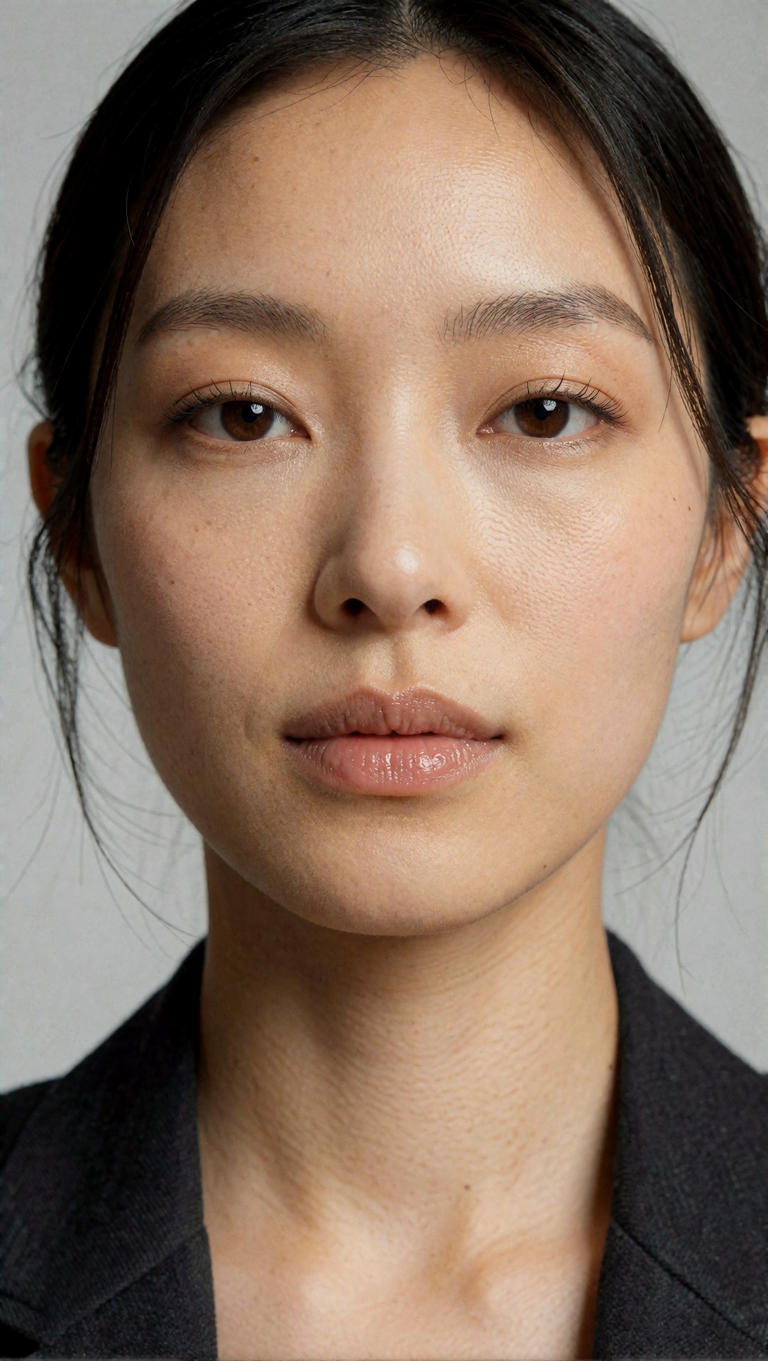
Inspect whether the face is stable before thinking about resolution. If the eyes, mouth line, or jaw shape already drift at base size, upscaling will only make the mistake bigger.
Step 2: Decide whether the image needs resize, upscale, or re-render
This is the fork that matters most.
Use resize only when you need dimension changes, not detail invention
A resize node is useful for preparing the image for another stage, matching target dimensions, or feeding an upscaler. By itself, resize does not create meaningful new information. In this test, simple resizes were fine for moving from one working size to another, but they never fixed softness or weak material detail.
Use upscale when structure is already correct
If the base image has the right subject, pose, perspective, and clean anatomy, upscale is usually the safest next move. The strongest result here was preserving what was already working.
Use re-render when the base image is under-resolved in important areas
If hair, fabric weave, environment texture, or product edges feel implied rather than present, a higher-resolution re-render can outperform a pure upscale. The catch is that it may reinterpret small features. That is why I only recommend it when the image is promising but not final.
This second prompt is useful for testing texture-rich clothing, because fabric and seams reveal the difference between simple enlargement and genuine detail recovery.
Topic: Tailored fashion portrait with visible fabric structure
Genre: Fashion Editorial
Camera: Sony A7R V
Lens: 50mm f/1.4
Lighting: Large octabox key with negative fill
Location: Industrial loft with concrete wall
Style: Luxury fashion campaign
Final Prompt: full upper-body fashion portrait of a model wearing a charcoal wool blazer over a crisp white shirt and pleated black trousers, standing near a textured concrete wall in an industrial loft, composed posture, serious editorial expression, visible stitching, lapel structure, fabric grain, polished leather belt, soft directional octabox key light with controlled negative fill, Sony A7R V look, 50mm f/1.4 natural perspective, muted gray and black palette, clean luxury campaign styling, sharp garment texture, realistic hands, magazine-ready framing, subtle background falloff, refined cinematic realism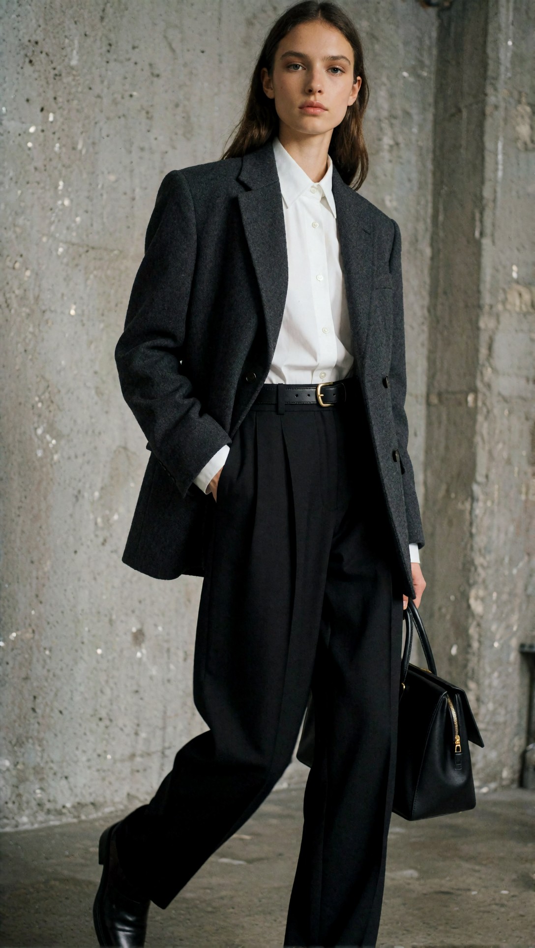
Check whether the blazer weave, shirt collar edges, and hand shape remain coherent. If an upscale keeps them intact, that is a good sign the image did not need a full re-render.
Step 3: Build the base graph around a moderate latent size
For a repeatable ComfyUI high res tutorial, keep the graph simple at first:
1. Load model and text conditioning 2. Set a moderate latent size for the first render 3. Generate multiple candidates 4. Review composition and anatomy 5. Select one image for high-resolution treatment
In this test, producing several moderate-size candidates beat producing one oversized candidate almost every time. The reason was simple: prompt correction is cheaper than rescue work.
What I would change next if a batch underperformed:
- Raise base resolution slightly if the scene is dense
- Simplify the prompt if subjects blend into the background
- Reduce too many style adjectives if the lighting becomes unstable
- Fix pose language before trying any upscale stage
This prompt tests scene density and line stability. Architecture and interiors expose weak large-image planning very quickly.
Topic: Modern interior with hard lines and layered depth
Genre: Architectural Editorial
Camera: Nikon Z8
Lens: 24mm f/4
Lighting: Morning window light with soft interior bounce
Location: Minimalist penthouse living room
Style: Clean commercial look
Final Prompt: wide interior view of a minimalist penthouse living room with floor-to-ceiling windows, pale oak flooring, low linen sofa, black steel shelving, travertine coffee table, sculptural reading lamp, crisp architectural lines, morning window light entering from the left with soft interior bounce, calm upscale residential mood, Nikon Z8 look, 24mm f/4 wide-angle realism, balanced perspective, restrained neutral palette of stone, oak, black, and warm white, clean commercial composition, high clarity in edges and surfaces, realistic reflections, no warped furniture geometry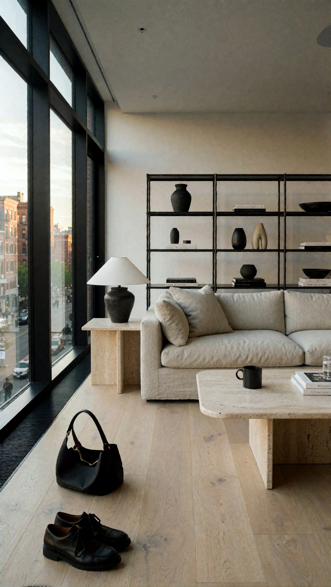
Inspect wall edges, shelf alignment, and repeating materials. If they are already warped at the base stage, a larger re-render may compound the problem rather than fix it.
Step 4: Upscale in stages when the image is already right
This was the most reliable path in the test.
When the base image had good structure, staged upscaling produced better practical results than jumping straight to an extreme output size. A single huge enlargement often made edges brittle or skin too plasticky. Two smaller jumps were safer.
A good operator habit is to pause after each upscale stage and ask: did I gain usable detail, or only sharper noise?
What this setup does well
- Preserves the original composition
- Keeps identity more stable than re-rendering
- Is easier to compare objectively
- Works well for portraits, product shots, and simple environments
Where it fails
- Fine text rarely becomes truly readable
- Hands do not magically improve
- Dense foliage, crowds, and micro-patterns can turn crunchy
- Already-soft faces may become waxy
This prompt checks a product-oriented case where edges and surfaces matter more than dramatic creativity.
Topic: Luxury watch product close-up for upscale testing
Genre: Product Editorial
Camera: Fujifilm GFX100 II
Lens: 120mm macro f/4
Lighting: Softbox key with strip light rim
Location: Black acrylic studio set
Style: Premium commercial product photography
Final Prompt: close-up luxury wristwatch product shot on a black acrylic surface, brushed steel case, deep blue dial, polished bezel, visible crown detail, subtle reflections, leather strap texture clearly visible, precise macro composition, softbox key light from above with narrow strip rim light defining edges, Fujifilm GFX100 II look, 120mm macro f/4 crisp focus, premium commercial product style, controlled highlights, dark elegant palette, clean background separation, realistic metal reflections, no logo text emphasis, ultra-clear material rendering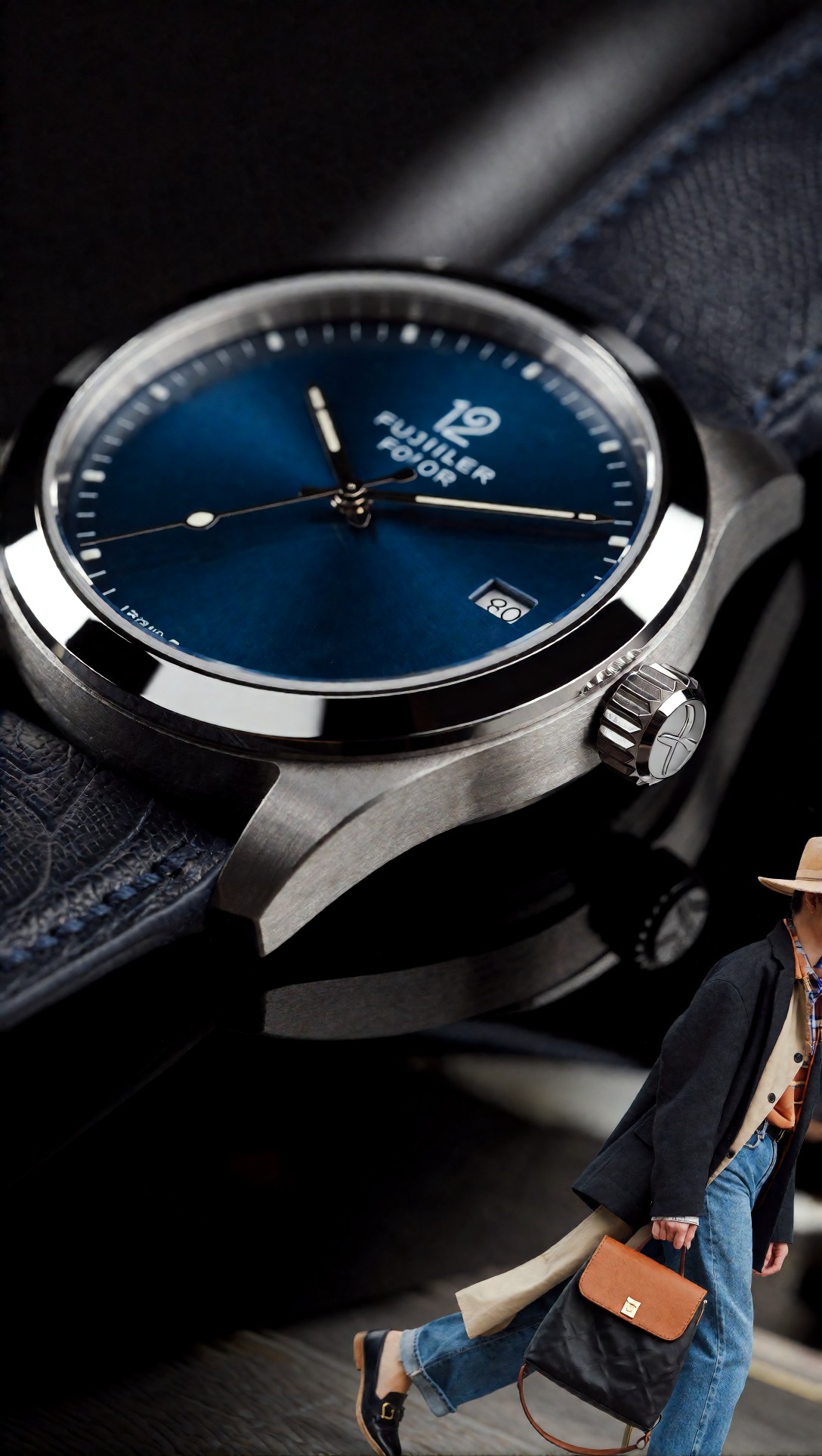
Inspect the lug edges, dial markers, and leather grain. A strong upscale should improve clarity without inventing random scratches or muddy reflections.
Step 5: Re-render at higher resolution when you need real detail recovery
Some images look fine at thumbnail size but collapse when viewed large. In this test, re-rendering at a larger resolution worked best when the first image had the right layout but only hinted at small detail.
The strongest result came from light-touch refinement rather than aggressive reinterpretation. When pushed too hard, re-rendering changed eye shape, fabric folds, architecture proportions, or object silhouette.
Use this route for:
- Hair that needs strand separation
- Fashion images where fabric type matters
- Interiors with layered material surfaces
- Landscapes or city scenes where distant detail matters
Avoid it when:
- Character identity must remain exact
- Product geometry must stay unchanged
- The base image already contains hidden anatomical problems
This prompt is designed to expose whether a higher-resolution re-render can recover natural strand detail without reshaping the subject.
Topic: Outdoor portrait with wind-moved hair and layered clothing
Genre: Lifestyle Portrait
Camera: Leica SL2-S
Lens: 75mm f/2
Lighting: Overcast diffusion
Location: Coastal cliff path
Style: Cinematic realism
Final Prompt: half-body outdoor portrait of a woman standing on a coastal cliff path, dark trench coat over a cream knit sweater, wind moving loose hair across the frame, thoughtful side glance, natural skin texture, layered ocean background with soft haze, overcast diffused daylight creating gentle contrast, Leica SL2-S look, 75mm f/2 intimate compression, cinematic realism, muted blue-gray and sand palette, detailed knit texture, believable hair strands, subtle atmosphere, authentic documentary posture, high image fidelity without overprocessing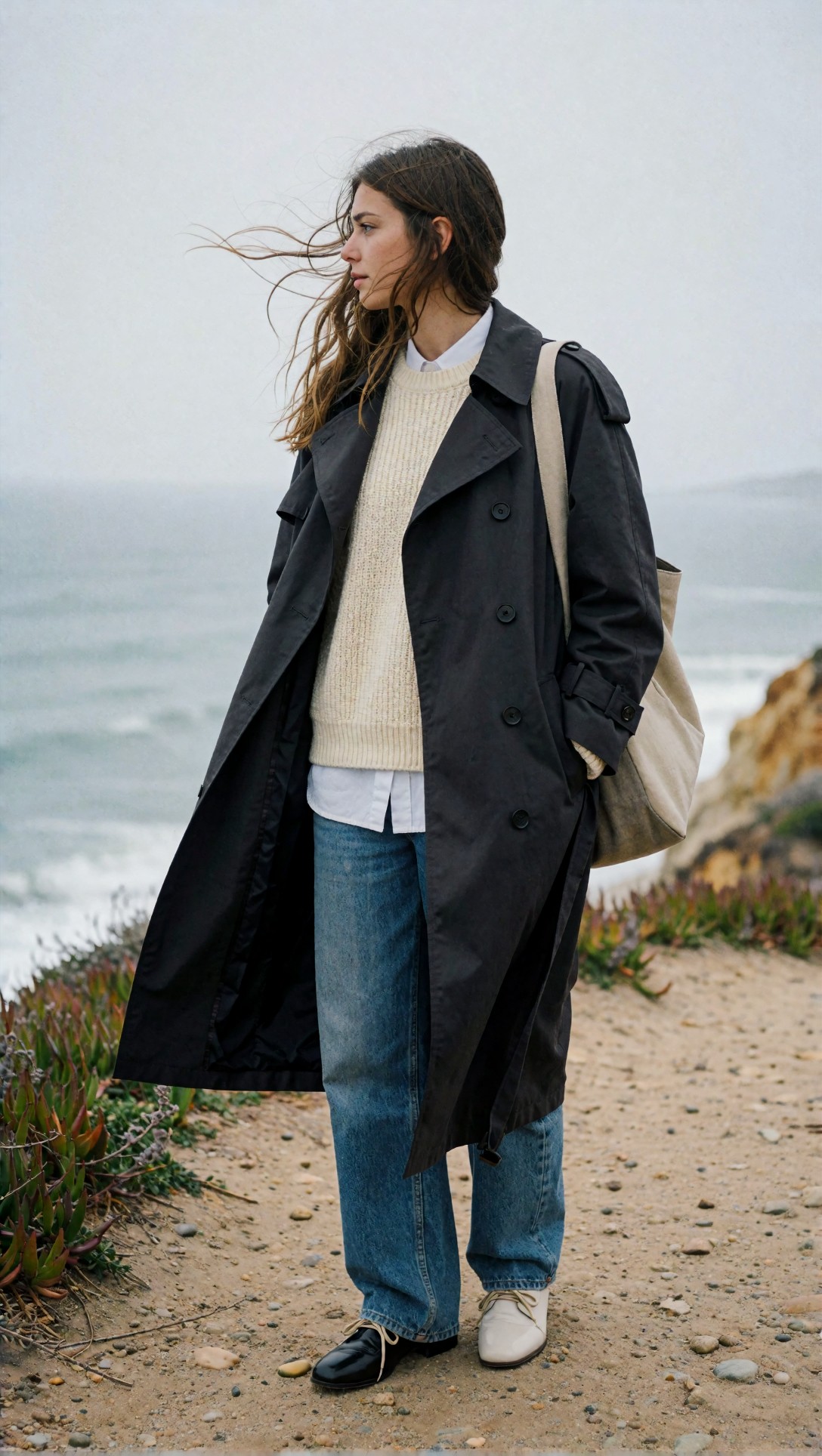
Look closely at flyaway hair, sweater knit detail, and facial stability. If the re-render sharpens those areas while preserving expression and head shape, the workflow is doing useful work.
Step 6: For very large images, use tiled enlargement carefully
If your goal is poster-scale output or heavy cropping, tile-based workflows are often the practical answer. In this test, they outperformed forcing one giant generation on limited hardware.
The tradeoff is local inconsistency. Tiles can sharpen different areas unevenly, and some scenes reveal seams more than others.
Best subjects for tile workflows:
- Landscapes
- Architecture exteriors
- Background plates
- Product environments with clean geometry
Worst subjects:
- Tight portraits with delicate skin gradients
- Small text and labels
- Busy scenes with many overlapping hands or faces
This prompt checks how well a large environmental image survives tiled enhancement without visible seam behavior in repeated textures.
Topic: Dense city street scene for tiled high-resolution workflow
Genre: Cinematic Travel
Camera: Panasonic Lumix S1R II
Lens: 35mm f/2
Lighting: Blue-hour ambient with neon rim light
Location: Tokyo side street after rain
Style: Urban cinematic editorial
Final Prompt: cinematic street scene on a narrow Tokyo side street after rain, glowing shop signs, wet pavement reflections, pedestrians with umbrellas, bicycles parked along walls, layered depth into the distance, blue-hour ambient light mixed with pink and cyan neon rim light, Panasonic Lumix S1R II look, 35mm f/2 street perspective, urban cinematic editorial style, detailed reflections, realistic clothing silhouettes, textured walls and signage, moody atmosphere, controlled motion feel, rich color separation, sharp environmental detail without chaos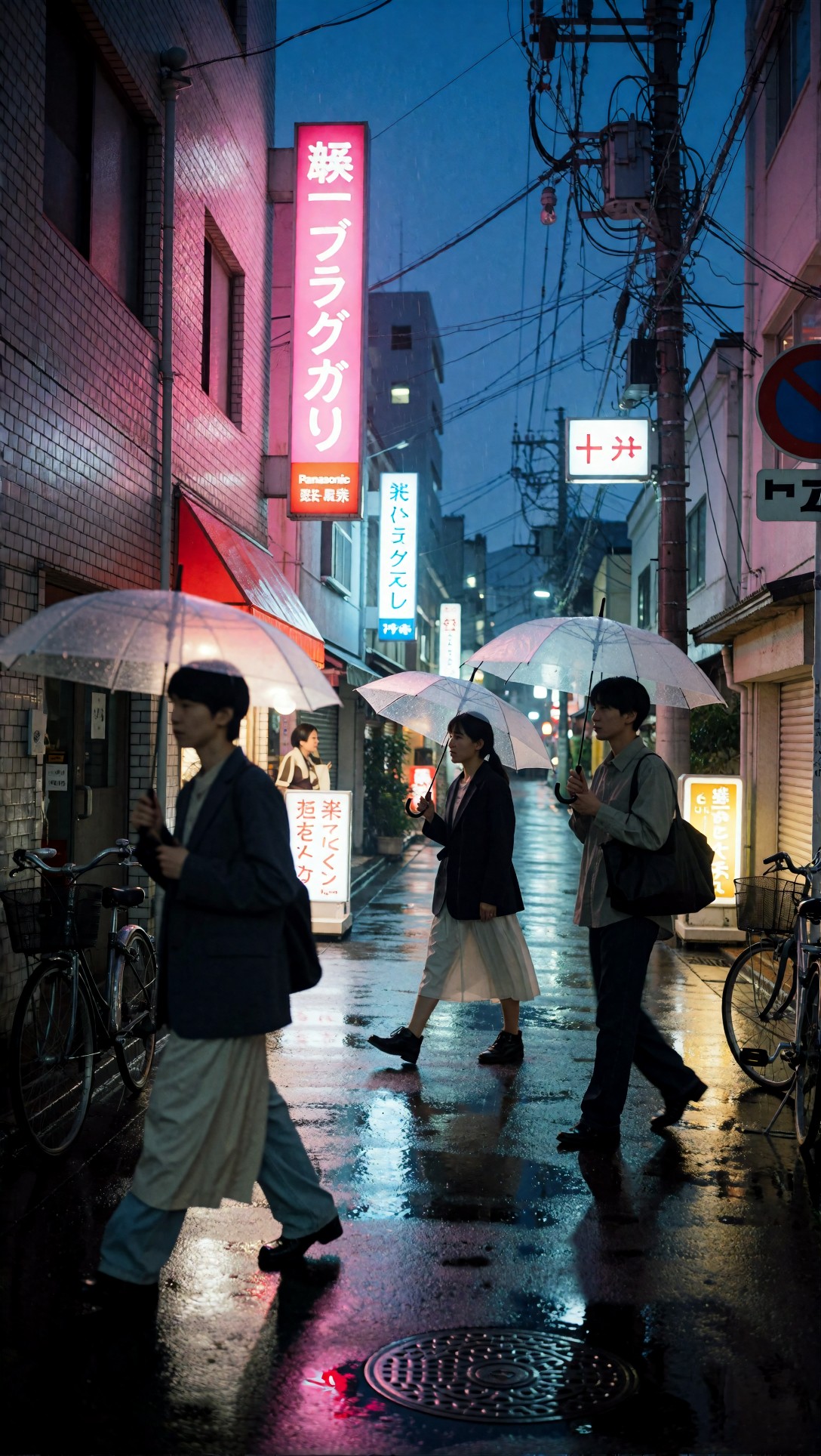
Inspect neon edges, repeated window patterns, and pavement reflections. Tile workflows often look convincing overall but show uneven sharpness where reflective surfaces repeat.
Prompt examples: choosing prompts that reveal workflow weaknesses
The most useful prompts for workflow testing are not random beautiful scenes. They are prompts with failure hooks: hands, fabrics, reflective metal, architecture lines, fine hair, and repeated background detail.
This portrait prompt is built to test hand stability and background blur during upscale decisions.
Topic: Seated portrait with hands visible in frame
Genre: Editorial Portrait
Camera: Hasselblad X2D 100C
Lens: 90mm f/2.5
Lighting: Window side light with white bounce
Location: Quiet hotel lounge
Style: Minimal magazine portrait
Final Prompt: seated editorial portrait of a man in a quiet hotel lounge, navy knit polo and tailored cream trousers, both hands relaxed and visible, calm direct gaze, soft posture angled slightly toward window light, warm wood paneling and blurred lounge furniture in the background, window side light with subtle white bounce, Hasselblad X2D 100C look, 90mm f/2.5 medium-format rendering, minimal magazine portrait style, natural skin texture, realistic fingers, clean separation from background, warm neutral palette, refined composition with negative space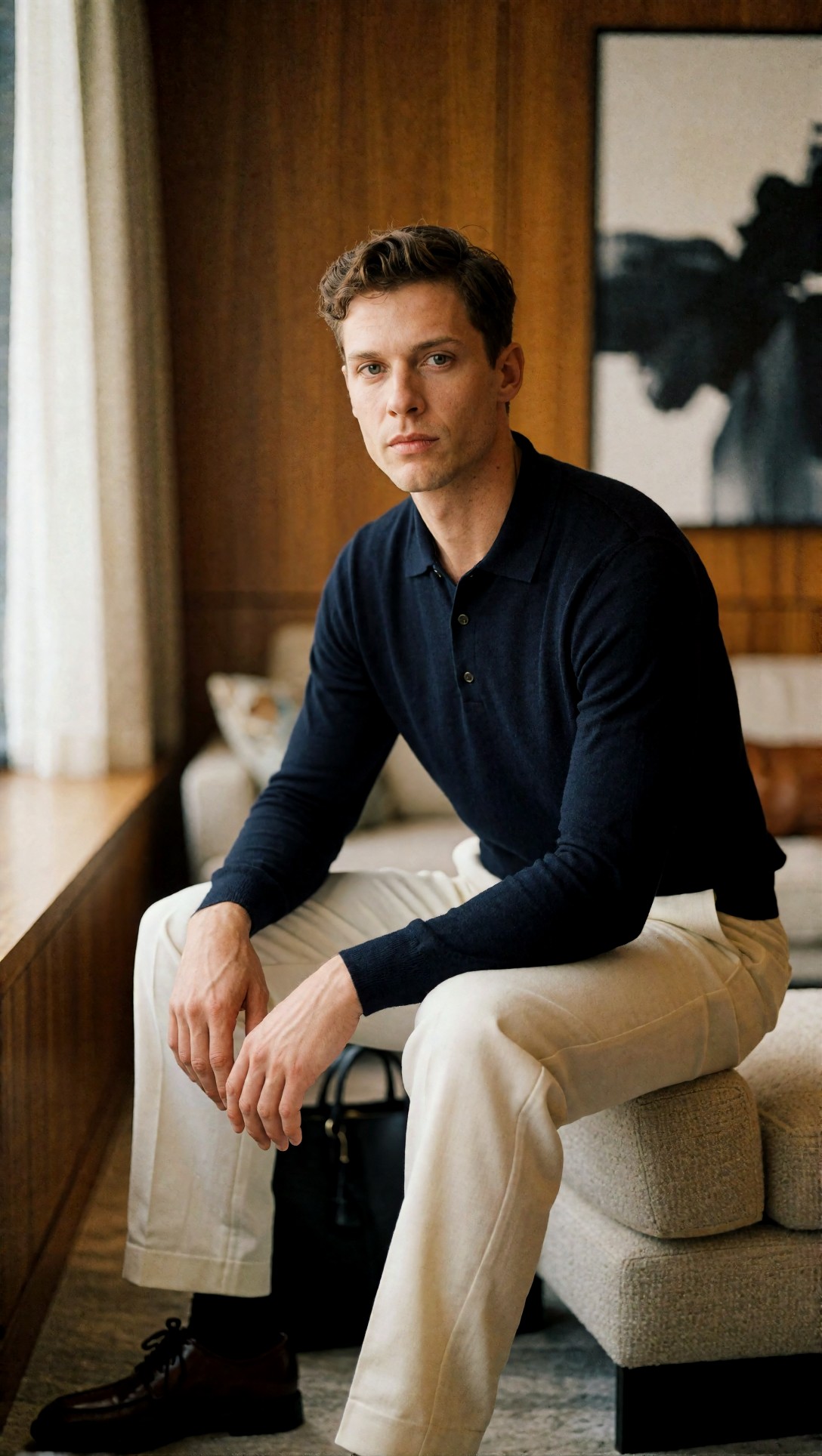
Inspect finger length, knuckle shape, and whether the chair arms stay consistent. Hands are often the first area that tells you whether to stop at upscale or attempt a corrective re-render.
This food-and-product hybrid prompt helps test surface realism, edge cleanliness, and whether detail becomes fake under aggressive sharpening.
Topic: Artisan dessert product scene with glossy textures
Genre: Product Editorial
Camera: Canon EOS R3
Lens: 100mm macro f/2.8
Lighting: Soft side light with silver reflector
Location: Marble cafe counter
Style: Clean commercial look
Final Prompt: close-up artisan dessert scene on a cool gray marble cafe counter, plated lemon tart with glossy glaze, toasted meringue peaks, scattered zest, brushed silver fork, linen napkin, shallow café background blur, soft side light with silver reflector creating delicate specular highlights, Canon EOS R3 look, 100mm macro f/2.8, clean commercial style, fresh pastel yellow and stone palette, crisp texture in crust and meringue, realistic reflections, premium editorial food presentation without clutter
Check the tart edge, glaze reflections, and fine crumb texture. If those details turn harsh or synthetic after enlargement, the upscale stage is too aggressive.
This last prompt tests wide-scene coherence, useful for deciding whether a large-image workflow should stay in latent generation longer before upscaling.
Topic: Mountain landscape with layered atmospheric depth
Genre: Cinematic Landscape
Camera: Sony A1
Lens: 70-200mm at 135mm f/5.6
Lighting: Sunrise backlight with valley haze
Location: Alpine overlook
Style: Epic natural realism
Final Prompt: panoramic mountain landscape from an alpine overlook at sunrise, layered ridgelines fading into valley haze, tall dry grass in the foreground, winding river catching early light below, distant pine forests, cool blue shadows balanced with warm orange sunrise backlight, Sony A1 look, 135mm telephoto compression at f/5.6, epic natural realism, high atmospheric depth, crisp terrain contours, restrained color grading, realistic cloud texture, large-format scenic composition suitable for high-resolution print
Inspect the transition from foreground grass to distant ridgelines. If the workflow introduces crunchy edges or repeating foliage artifacts, stop before the final upscale pass.
Quality-control checklist for large-image output
Before exporting the final file, run this checklist:
Structural check
- Are eyes aligned and facial proportions intact?
- Do hands still make anatomical sense at 100% view?
- Are straight lines actually straight?
- Did any object silhouette drift between stages?
Detail check
- Is new detail believable, or only sharper noise?
- Do fabrics show coherent weave direction?
- Do reflective objects keep clean highlight logic?
- Is hair separated naturally rather than frizzed into noise?
Consistency check
- Does one area look much sharper than the rest?
- Are there tile seams in walls, skies, or repeated textures?
- Did background bokeh become grainy or patterned?
- Does skin texture match the rest of the image style?
Delivery check
- Is the final resolution matched to actual output needs?
- Could a smaller export do the job with fewer artifacts?
- Have you compared the final image against the original selected render?
If you are testing multiple variants, it helps to keep both the chosen base render and the final enlarged version together in a review set in [Gallery](/gallery) or iterate a corrected variant through [Create](/create).
Strengths of this workflow
The strongest part of this ComfyUI high resolution workflow is that it separates creative decisions from resolution decisions. That sounds basic, but in practice it prevents a lot of wasted time.
What worked well in this test:
- Moderate base renders were easier to prompt-correct
- Staged upscale preserved winning compositions reliably
- Re-rendering was valuable when texture mattered more than identity lock
- Tile methods made very large files practical on limited hardware
This workflow also scales well across subject types because you can stop early. Not every image needs all stages.
Limitations and failure risks
The weak point is that resolution can disguise bad fundamentals. A larger image may look more impressive while still containing the same core errors.
Common failure risks I observed:
- Over-sharpened skin after multiple enhancement passes
- Changed facial identity after aggressive re-rendering
- Broken fingers that looked acceptable until zoomed in
- Architecture line warping that upscale could not rescue
- Texture hallucination on leather, fabric, and foliage
Another limitation: text and logos remain unreliable. If a product image depends on exact typography, a generic high-res workflow is the wrong fix. You need either manual correction or a workflow designed around post-editing.
Troubleshooting weak outputs
Problem: the image is bigger but not better
Cause: the base render was too soft or compositionally weak.
What I would do next:
- Return to the base prompt
- Raise the initial render size slightly
- Reduce unnecessary style terms
- Pick a cleaner candidate before upscaling
Problem: faces changed during refinement
Cause: re-render strength was too aggressive.
What I would do next:
- Use upscale only if identity is already correct
- Apply lighter refinement
- Avoid a second re-render unless absolutely necessary
Problem: tiled output shows seam behavior
Cause: local contrast and repeated textures were enhanced unevenly.
What I would do next:
- Reduce tile aggressiveness
- Check overlap strategy
- Use tile workflows more for environments than for close human subjects
Problem: fabrics look crisp but fake
Cause: the workflow created edge contrast instead of true texture.
What I would do next:
- Compare against the base render at equal zoom
- Use a more restrained upscale path
- Prefer re-render only if the garment structure is already stable
FAQ
What is the best ComfyUI high resolution workflow for most users?
For most users, the best path is: generate at a moderate size, choose the strongest composition, upscale in stages, and only re-render if the image needs real detail recovery.
In ComfyUI, should I upscale or rerender?
Upscale when the image is already correct and you mainly need more pixels. Re-render when the image has good composition but lacks believable small detail.
What resolution should I start with in ComfyUI?
A moderate starting size is usually the safest. In practice, 1024-class generation or an equivalent aspect-ratio variant gives a good balance between structure quality and iteration speed.
Does resizing improve image quality in ComfyUI?
No. Resizing changes dimensions, but it does not meaningfully invent new detail. It is a preparation step, not a quality fix.
When should I use tile upscaling in ComfyUI?
Use tile upscaling when you need very large final images or have limited VRAM. It works best for landscapes, architecture, and broader environmental scenes.
Summary recommendation
If you want a reliable ComfyUI high resolution workflow, treat high resolution as a decision tree rather than a single feature. Start with a moderate base image and solve composition first. If the image is already structurally good, upscale in stages. If the image is promising but under-detailed, re-render carefully at a higher resolution. If the target size is extremely large, move to tiled enlargement and inspect for local inconsistencies.
Who should use this workflow: operators who want cleaner large images without guessing, especially for portraits, products, interiors, and print-oriented assets. Who should avoid it: users expecting high resolution alone to fix weak prompting, bad anatomy, or exact text requirements. The setting detail that matters most is not just output size. It is whether your next step preserves structure or reinterprets it. That is the difference between a bigger image and a genuinely better one.
For more workflow experiments, compare prompt variants in [Prompt Lab](/promptlab), review outputs in [Gallery](/gallery), or test enlargement behavior in the [Upscaler](/upscaler).