The short answer: the "AI look" in a photorealistic ComfyUI image usually comes from asking the model for too much at once. That means too many quality keywords, guidance pushed too high, and detail forced into the first pass. The fixes below are standard practice rather than the result of a controlled benchmark. The most useful one is to write the prompt like a photographer's shot brief, not a pile of adjectives. The images in this article show what a brief like that produces on one model, and they also show the new problems it brings, such as camera brand names leaking into the picture as printed text.
What the AI look actually is
When people say an image "looks AI", they usually mean one or more of these:
- Skin with uniform, airbrushed texture and no variation between forehead, cheeks and nose.
- Every surface equally sharp, where a real lens would let focus fall off.
- Lighting that does not agree with itself, such as a shadow direction that contradicts the window.
- Clothing that looks sprayed onto the body instead of hanging, folding and pulling at joints.
- Small objects and text that almost make sense but fall apart on inspection.
Some of these come from the model, and some come from how the workflow is configured. The second group is the part you can change in ComfyUI.
Write a shot brief, not a keyword pile
Stacking words such as "photorealistic, ultra-detailed, 8k, masterpiece" is a widely repeated habit, but these words describe a quality label and say nothing about a scene. A more reliable approach is to describe what a camera would record: who is wearing what, how they stand, where the light comes from, what the location looks like, and roughly what lens distance you want.
All eight prompts behind the images in this article follow that pattern. Here is the first one, exactly as it was sent to the model (Krea2 Turbo, generated on 2026-07-10):
a realistic woman standing on a quiet residential city street after light rain, wearing a charcoal wool coat over a cream knit top, subtle silver earrings, relaxed posture with one hand in coat pocket, neutral thoughtful expression, natural skin texture with faint under-eye detail, slightly windswept hair, soft overcast daylight, damp pavement reflections, muted storefront colors, shallow but believable depth of field, Canon EOS R5 look, 50mm f/2 perspective, cinematic realism, accurate facial proportions, realistic pores, gentle tonal falloff, authentic street photography composition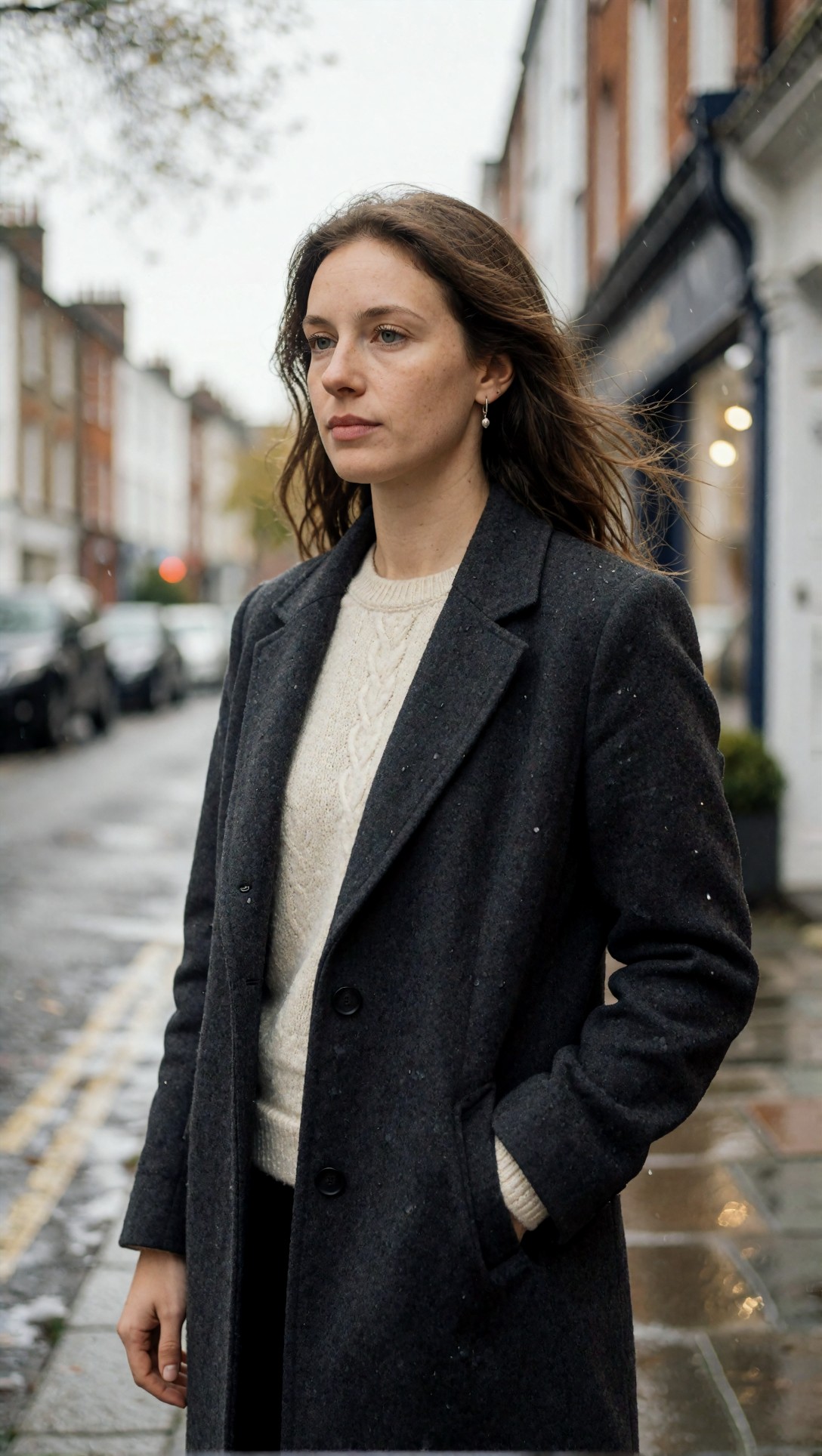
What is visible in the result: the coat shows a speckled wool weave with small water droplets, the sweater has a readable cable pattern, the light is flat and overcast, and the wet pavement picks up warm reflections at the lower right. Freckles and uneven skin tone are present on the face, and the background falls out of focus progressively. The pocketed hand is natural; the free hand at the bottom left is relaxed and readable.
This is one image, so it proves nothing about reliability. It does show that a concrete brief covering wardrobe, weather, light and posture gives the model plenty of material to keep a scene coherent.
Why the specifics help
A prompt that names "linen shirt wrinkling at the elbow" or "trouser break over loafers" gives the model a material and a physical behavior to match. A prompt that only says "realistic" gives it nothing to check against. This is general prompting experience, not something measured here, but the full-body example below is consistent with it.
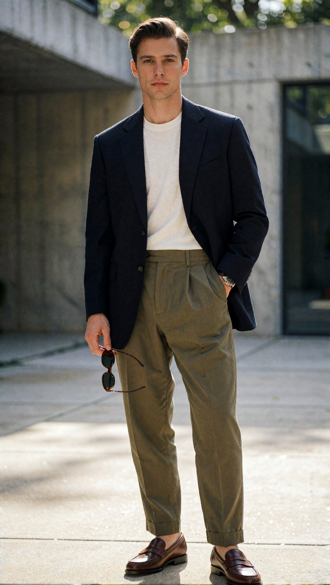
The prompt asked for "realistic fabric drape at knees and elbows, accurate trouser break". In the image, the pleated trousers fold at the hip and stack slightly over the loafers, the cuffs are turned up, and the blazer hangs with a believable shoulder. The hand holding sunglasses has four visible fingers and a thumb in a plausible grip. I would not call it flawless, because the two shoes point in slightly different directions, but nothing structural is broken.
Keep guidance restrained
In a KSampler, CFG (classifier-free guidance) controls how hard the sampler pushes toward the prompt. Commonly cited advice for realism is to avoid very high CFG, because high values tend to produce oversaturated, glossy, over-committed results. The right range depends on the checkpoint and sampler. Distilled or turbo-style models often expect very low guidance, and the model's own documentation is the best source for its intended value. I do not have generation settings for the images in this article beyond the prompts and the model name, so I cannot give you a verified CFG number. If your output looks polished and symmetrical, lowering CFG before rewriting the prompt is a cheap first experiment.
Do detail in a second stage
A common ComfyUI structure separates composition from texture:
1. Load a checkpoint and encode positive and negative prompts. 2. Create an empty latent at your target size and sample a first pass. 3. Decode, inspect, and only continue if the structure is sound (face, hands, clothes). 4. Upscale moderately, then run a second sampler as img2img with a low denoise to add texture. 5. Save.
Two principles are widely recommended here. First, keep denoise low in the second pass; once it is high, the pass stops refining and starts repainting, and the face can drift away from the original lighting. Second, treat face-restoration nodes as optional. If the base face is already good, heavy restoration can make it cleaner than the neck and hair. Neither of these was tested for this article; they are standard guidance you can check against your own graph.
If you want to do the upscale step outside ComfyUI, the [Upscaler](/upscaler/en) on this site is one option, and the same "moderate, then judge" approach applies.
Resolution
Commonly used SDXL-class starting sizes are 832x1216 for portraits, 1216x832 for landscape frames and 1024x1024 for square compositions. These are conventions, not requirements, and other model families use different native sizes, so check what your checkpoint was trained for. Very small canvases tend to collapse hands and fabric structure; very large first passes tend to invent noise. Both statements are general experience, not a measurement from this article.
What the sample images show: strengths
The eight prompts were designed to probe different realism risks. I opened all eight results and looked at them closely; six are shown here.
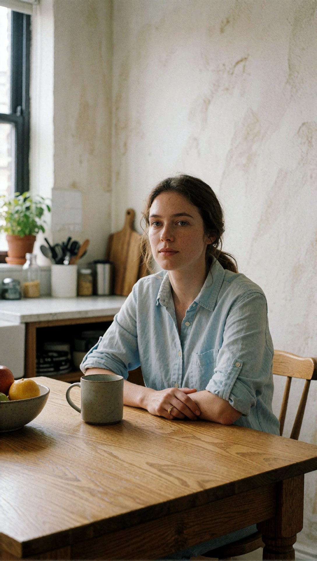
The kitchen scene is the most convincing of the set. The oak grain is visible and irregular, the light shirt has a soft linen-like creasing at the rolled sleeves, the mug has a speckled glaze, and the background objects (cutting board, utensil jar, potted plant, jars) are separate and recognizable instead of melting together. The face has visible freckles, and the clasped hands with a thin ring are readable. The prompt for this image asked for "visible cotton weave, realistic wood grain" and "textured plaster wall", and all three show up.
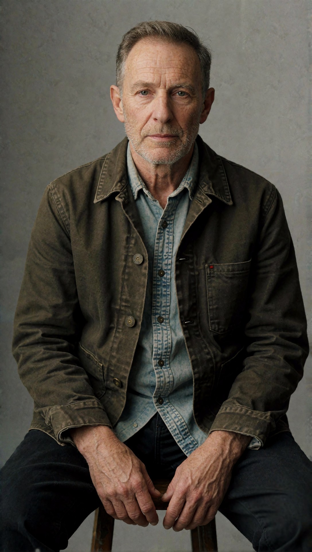
The older-man portrait tests whether age texture survives. Here the forehead lines, crow's feet and stubble read as part of the face structure, and the hands show veins and creases consistent with the face. The jacket has visible stitching and metal buttons. One small oddity: a tiny red mark on the chest pocket that the prompt did not mention. Small stray details like this are easy to miss at thumbnail size.
What the sample images show: failures
Camera names leak into printed text
Two of the eight prompts ended with camera or brand names, such as "Hasselblad X2D 100C look" and "Panasonic Lumix S5II look". In both images, those words appear to have been read as things to draw, not as style cues.
The skincare prompt included this phrase:
Hasselblad X2D 100C look, 55mm f/2.5, luxury campaign style with realistic material rendering, accurate finger anatomy, premium packaging detail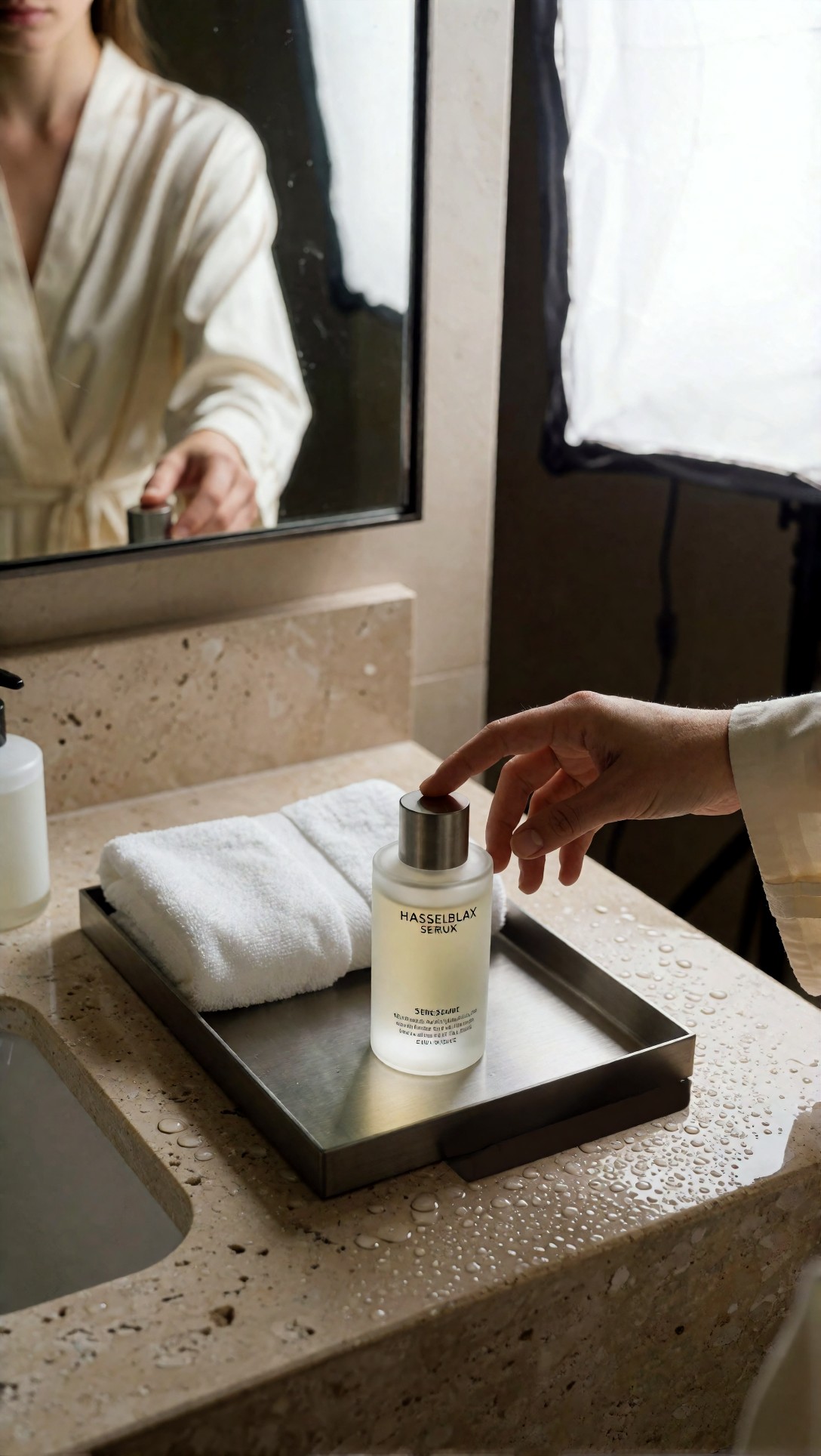
The bottle label reads something like "HASSELBLAX SERUX" with smaller unreadable lines below. The prompt asked for a serum bottle and a Hasselblad camera look, and the model put the camera name on the label, with broken letters. The hand reaching for the cap is well formed but has a slightly long index finger. The mirror reflection is plausible, though it shows a person who does not line up precisely with the hand on the right.
The night scene shows the same effect:
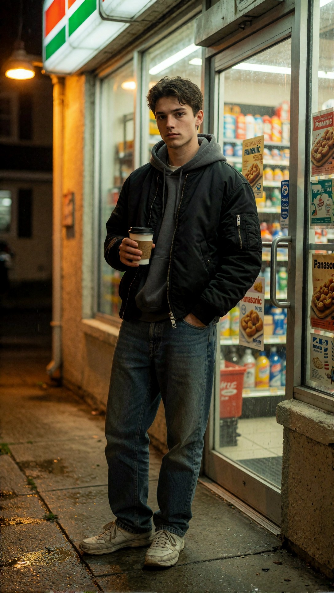
The store door posters carry the word "Panasonic" and other warped lettering, even though the prompt only used "Panasonic Lumix S5II look" as a camera style phrase. The sign at the top left also reads as a striped blur resembling a known convenience-store logo, which the prompt did not request. The lighting itself works: warm sodium light on the left wall, cool fluorescent light through the glass, wet pavement reflections. The jacket, hoodie and jeans are structurally sound.
The practical lesson, which is specific to what these two images show: if your scene contains any surface that can carry text (labels, posters, signs), putting a camera or brand name in the prompt carries a real risk of it appearing in the picture. Options are to drop the camera name, describe the look in optical terms instead (for example "medium-format depth of field"), or name the lens behavior without the brand. I have not tested these alternatives, so treat them as suggestions.
Small text and backgrounds
The barista image, which I also opened, has a storefront sign behind the window showing letters that do not form a word. The hands on the portafilter are readable, but background text is a consistent weak spot across these outputs. This matches the widely reported limitation that image models struggle with small text.
Known limitations not shown here
These are general risks rather than observations from these images: complex finger interactions, multi-person scenes, very shallow depth of field hiding structural errors, and color contamination in mixed lighting. The sample set does not test them enough to say more.
A short pre-upscale check
Before you upscale or rerun, it is worth checking a handful of things on the first-pass image:
- Does the skin vary across the face, or is it uniformly smooth?
- Do the clothes fold where the body bends?
- Are there letters anywhere, and do they say something you did not ask for?
- Does sharpness fall off naturally?
If several fail, rerunning the base generation is usually cheaper than rescuing the image downstream. This is a rule of thumb, not a measured threshold.
To draft and refine briefs like the ones above, the [Prompt Lab](/promptlab/en) is set up for that, and you can try them directly in the [image generator](/create/en).
FAQ
Do I need a special checkpoint for realism? Checkpoints fine-tuned for photographic output are commonly recommended over broad style models, but I have no comparison data here. The images in this article were made with Krea2 Turbo, not with a ComfyUI checkpoint swap.
Is there a single setting that removes the AI look? No single setting is documented here. Restrained guidance, a low-denoise second pass and specific prompts are the usual levers, and each needs checking against your own model.
Should I avoid camera model names in prompts? Not always. In two of the eight examples here they appeared as garbled printed text, so remove them first when a scene has labels or signs.
> What this article is based on. Model: Krea2 Turbo, eight images generated on 2026-07-10 (files dated 2026-07-11). I opened and inspected all eight (six are shown). Generation records contain prompts and model name only; no ComfyUI graph, CFG, steps or sampler values were recorded, so workflow advice is general guidance and is marked as such.