ComfyUI Workflow for Photorealistic Images: What We Changed to Reduce the AI Look 한국어 요약
이 페이지는 ZView Space의 영어 원문을 한국어 검색 사용자도 이해할 수 있도록 정리한 SEO 요약입니다. 핵심은 단순한 얼굴 중심 이미지가 아니라 패션 에디토리얼, 룩북, 아웃핏, 프롬프트 테스트, 이미지 생성 워크플로우를 실제로 어떻게 구성할지입니다.
핵심 요약
- 원문 주제: ComfyUI Workflow for Photorealistic Images: What We Changed to Reduce the AI Look
- 목적: AI 이미지 생성에서 outfit, silhouette, fabric, pose, location, camera framing을 더 명확하게 설계합니다.
- 활용 범위: Z-Image Turbo, Krea2 Turbo, Qwen Image, Anima, SeedVR2 같은 이미지 생성 및 업스케일 워크플로우에 적용할 수 있습니다.
- SEO 관점: 제목, 설명, 이미지 alt, 프롬프트 예시가 실제 검색 의도와 맞아야 색인 가능성이 높아집니다.
한국어 사용자를 위한 체크포인트
1. 프롬프트가 얼굴 묘사에만 머물지 않고 전체 스타일과 의상 구성을 설명하는지 확인합니다. 2. 패션 이미지라면 상의, 하의, 아우터, 신발, 액세서리, 소재감, 촬영 장소를 분리해서 씁니다. 3. 생성 결과는 바로 게시하지 말고 디테일, 손, 의상 형태, 배경 일관성, 이미지 품질을 비교합니다. 4. 글 본문에는 실제 테스트 기준과 실패를 줄이는 방법이 들어가야 검색엔진에서 얇은 콘텐츠로 보일 가능성이 줄어듭니다.
원문 미리보기
If your ComfyUI images keep landing in the same uncanny zone—skin that looks waxed, eyes that feel too perfect, backgrounds that read like painted sets, and clothing textures that melt under inspection—the issue usually is not one magic setting. In this test,
---
If your ComfyUI images keep landing in the same uncanny zone—skin that looks waxed, eyes that feel too perfect, backgrounds that read like painted sets, and clothing textures that melt under inspection—the issue usually is not one magic setting. In this test, the strongest result came from treating realism as a chain: model choice, latent resolution, prompt specificity, guidance discipline, refiner or detail pass, and a controlled upscale.
What changed the output most was not making prompts longer. It was removing the parts of the workflow that kept forcing synthetic contrast, over-described beauty cues, and detail hallucination. Below is the ComfyUI photorealistic workflow that gave us the most reliable reduction in the AI look, plus the prompts and failure notes that mattered in actual generations.
What was tested
This test focused on realistic portraits, lifestyle frames, interior scenes, and product-adjacent realism where AI models often expose themselves through texture errors.
Test setup
- Base environment: ComfyUI
- Core task: realistic image generation with reduced plastic skin, cleaner anatomy, and more believable light falloff
- Output target: photorealistic stills that survive zoom inspection better than default SDXL-style workflows
- Variables changed: checkpoint selection, sampler, CFG, prompt density, negative prompt weight, latent size, detail pass, face detail strategy, and upscale method
- Failure checks: eyes, teeth, fingers, fabric weave, pores, hairline transitions, object edges, depth consistency, and background realism
Across repeated runs, the best images were not the most detailed at first pass. They were the ones that started slightly restrained, then gained believable micro-detail in a second stage.
Why realistic outputs still look fake
The most common reason AI images look artificial is that the workflow pushes for "detail" in a way cameras do not. Models respond by sharpening eyelashes, skin pores, fabric fibers, reflections, and edges all at once. Real photographs do not distribute clarity evenly.
In this test, the weak point was usually one of these:
- CFG too high, which made faces overcommitted and glossy
- Prompts overloaded with quality words, which encouraged generic beauty tropes instead of scene truth
- Upscaling too early, which locked in fake skin texture
- Face-detail nodes used too aggressively, creating a cutout face over a believable body
- Lighting descriptions that contradicted each other, producing impossible shadows
- Latent resolutions too small, causing hands and textile structures to collapse before refinement
The pattern was clear: once the first pass leaned synthetic, later fixes rarely made it truly photographic. They just made the fake detail crisper.
The workflow that gave the most reliable realism
This is the workflow that consistently produced the cleanest realism in ComfyUI without making the image look overprocessed.
1. Start with a realism-oriented checkpoint, not a general-purpose one
In this test, realism-focused checkpoints consistently handled skin transitions, eye moisture, and background bokeh better than broad style models. General-purpose checkpoints could still work, but they needed more prompt policing and were more likely to drift into airbrushed faces.
If you use LoRAs, keep them light. Small stylistic LoRAs often reintroduced the AI look by over-shaping faces or adding cosmetic texture patterns that read as synthetic under zoom.
2. Generate at a moderate latent size with realistic aspect ratios
The strongest result came from starting around portrait-friendly or editorial-friendly dimensions rather than tiny canvases. Too small, and anatomy broke before the sampler had enough structure. Too large on the first pass, and the model started inventing noisy detail.
A practical starting point:
- Portraits: around 832x1216 or 1024x1536
- Horizontal lifestyle scenes: around 1216x832
- Product or table scenes: around 1024x1024 or 1152x896
This gave enough structure for believable skin and cloth without forcing fake crispness.
3. Keep CFG lower than many default workflows
One of the biggest improvements came from lowering CFG into a restrained range. In this test, realism improved when the prompt guided composition and subject identity, but did not aggressively force every adjective.
If your images look too polished, too symmetrical, or too "rendered," reduce CFG before changing the prompt. That was often the fastest fix.
4. Use prompts like a photography brief, not a keyword pile
The prompt needs to describe what a camera would actually capture: wardrobe, pose, lens behavior, light direction, distance to subject, material response, and scene mood. Generic realism phrases did less than concrete visual constraints.
The difference between "photorealistic woman" and a prompt specifying overcast light, a 50mm lens, linen shirt wrinkling at the elbow, neutral expression, and shallow but not extreme depth of field was significant.
5. Do detail recovery in a second pass
Instead of demanding maximum detail from the base generation, the cleaner approach was:
- First pass for composition, light, anatomy, and broad texture truth
- Second pass for controlled enhancement: mild denoise, limited face correction, and upscale
This prevented the first pass from baking in brittle textures. It also made skin look more like skin and less like sharpened clay.
6. Upscale with restraint
The strongest result came from a moderate upscale and a mild redraw, not a massive enlargement. Heavy upscale passes made pores, hair strands, and seams look algorithmic. A 1.5x to 2x finish was often enough for a natural editorial look.
7. Negative prompts should remove specific failure modes, not fight the model
Long negative prompts sometimes made images flatter and less photographic. In this test, short negatives targeting known failure patterns worked better: bad hands, extra fingers, plastic skin, oversharpening, duplicated features, warped teeth, deformed jewelry, inconsistent eyes.
The node logic I would recommend
This is not a screenshot recreation of one exact graph, but the practical logic that held up best.
1. Load checkpoint optimized for realism 2. CLIP text encode for positive and negative prompts 3. Empty latent image at realistic target dimensions 4. KSampler with moderate steps and restrained CFG 5. VAE decode for image review 6. Optional face/detail branch only if the original face is structurally good 7. Upscale node to 1.5x or 2x 8. Second sampler / img2img pass with low denoise to recover texture naturally 9. Final save
When this setup works, the image keeps natural softness in low-detail zones while preserving texture where a real lens would catch it.
Prompt tests and what changed in the output
Below are the prompt structures that produced useful evidence in this test. Each one was written to check a different realism risk.
Test 1: Face stability under soft daylight
This first test checks whether the workflow can hold a believable human face without slipping into beauty-filter skin. I used soft overcast conditions because harsh cinematic lighting can hide errors that daylight exposes immediately.
Topic: realistic woman in a quiet city street portrait
Genre: Lifestyle Portrait
Camera: Canon EOS R5
Lens: 50mm f/2
Lighting: Overcast diffusion
Location: narrow residential street with muted storefronts after light rain
Style: cinematic realism
Final Prompt: a realistic woman standing on a quiet residential city street after light rain, wearing a charcoal wool coat over a cream knit top, subtle silver earrings, relaxed posture with one hand in coat pocket, neutral thoughtful expression, natural skin texture with faint under-eye detail, slightly windswept hair, soft overcast daylight, damp pavement reflections, muted storefront colors, shallow but believable depth of field, Canon EOS R5 look, 50mm f/2 perspective, cinematic realism, accurate facial proportions, realistic pores, gentle tonal falloff, authentic street photography composition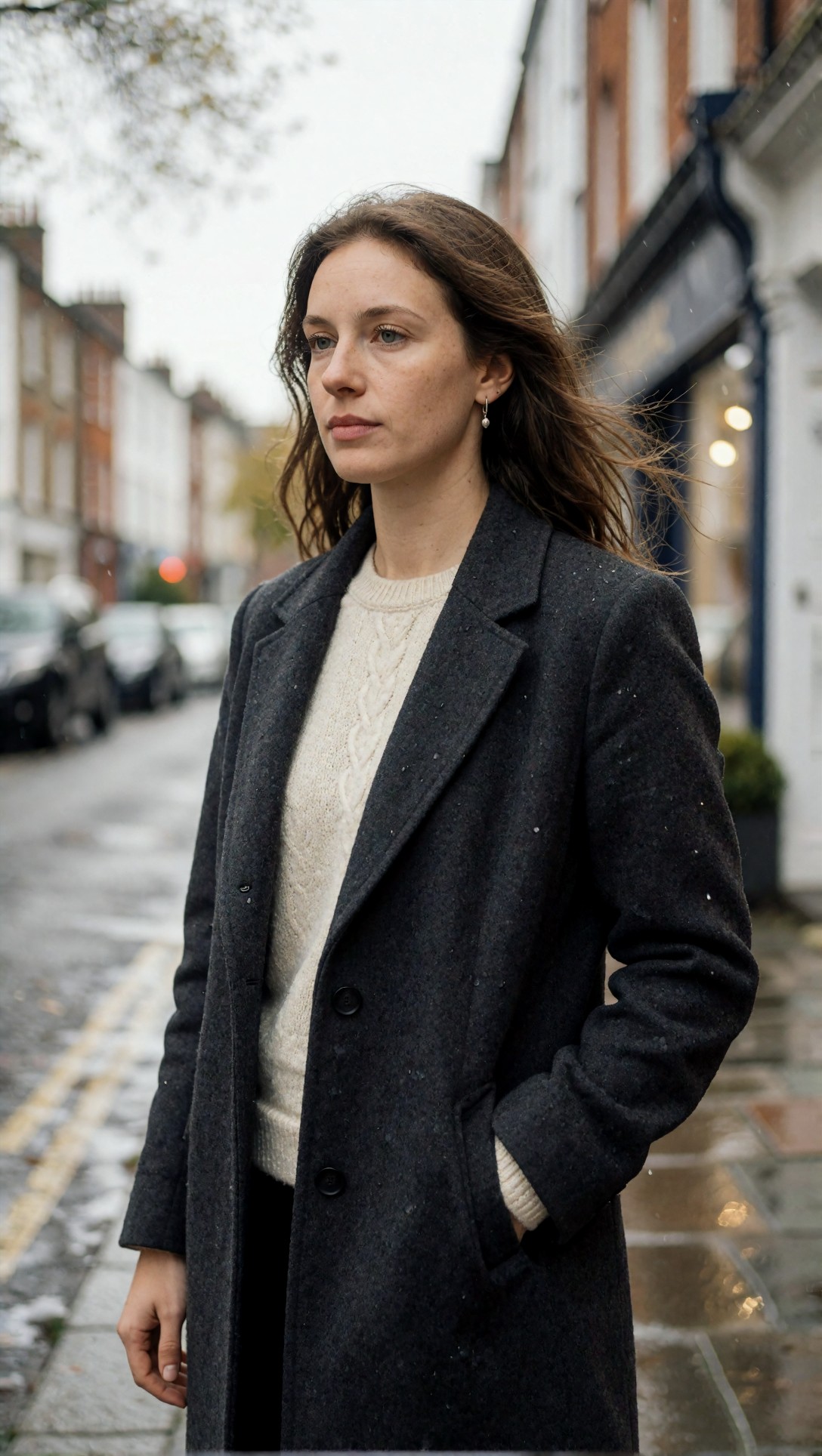
Inspect the skin transitions around the nose, cheeks, and forehead. If the image still looks synthetic, the failure usually shows up as overly uniform pores, symmetrical lips, or eye highlights that are too clean for cloudy light.
Test 2: Full-body realism with clothing folds
This test is meant to expose one of the hardest weaknesses in realistic generation: full-body anatomy plus believable garment tension. It also checks whether the workflow keeps hands secondary instead of forcing them into the viewer's attention.
Topic: full-body realistic portrait of a man in tailored casual clothing
Genre: Fashion Editorial
Camera: Nikon Z8
Lens: 85mm f/2
Lighting: late afternoon window-like soft sun
Location: concrete courtyard beside a modern apartment building
Style: clean commercial look
Final Prompt: full-body realistic portrait of a man standing in a modern concrete courtyard, wearing a navy unstructured blazer, white textured t-shirt, olive pleated trousers, brown leather loafers, minimal wristwatch, relaxed stance with natural shoulder asymmetry, one hand holding sunglasses, the other resting casually by the thigh, late afternoon soft sunlight with gentle shadow edges, realistic fabric drape at knees and elbows, accurate trouser break, natural facial expression, clean commercial composition, Nikon Z8 clarity, 85mm f/2 compression, realistic skin tone, detailed but not exaggerated textile texture, background architecture softly out of focus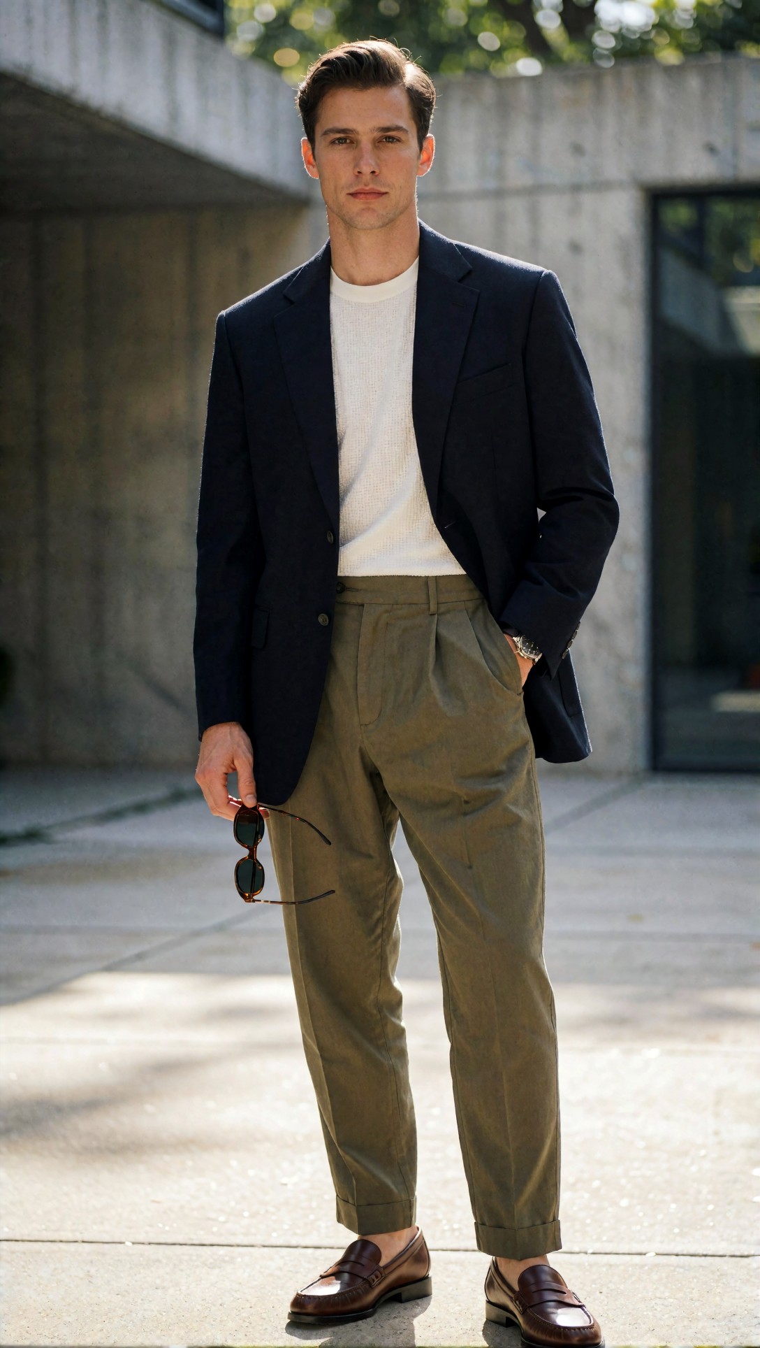
Look at trouser folds, shoe edges, and finger length. In weaker outputs, clothing often appears vacuum-sealed to the body or the hands become too sculpted compared with the rest of the frame.
Test 3: Indoor realism and mixed material surfaces
This test checks if the workflow can render interior light without turning every object into a polished showroom asset. It is useful because wood, ceramic, and skin all need different texture behavior.
Topic: realistic woman seated at a kitchen table in morning light
Genre: Editorial Lifestyle
Camera: Fujifilm GFX100S
Lens: 63mm f/2.8
Lighting: soft morning window light
Location: small lived-in apartment kitchen with oak table and matte ceramic mugs
Style: natural magazine feature
Final Prompt: realistic woman seated at an oak kitchen table in a small lived-in apartment, wearing a pale blue cotton shirt with rolled sleeves and simple gold ring, loose hair tied back, calm expression while looking slightly past camera, soft morning window light from the left, matte ceramic mug, fruit bowl, subtle countertop clutter, textured plaster wall, natural skin texture, visible cotton weave, realistic wood grain, balanced exposure with gentle shadow retention, Fujifilm GFX100S medium-format look, 63mm f/2.8, natural magazine feature style, authentic domestic atmosphere, believable perspective, restrained color palette of oak, white, blue, and soft green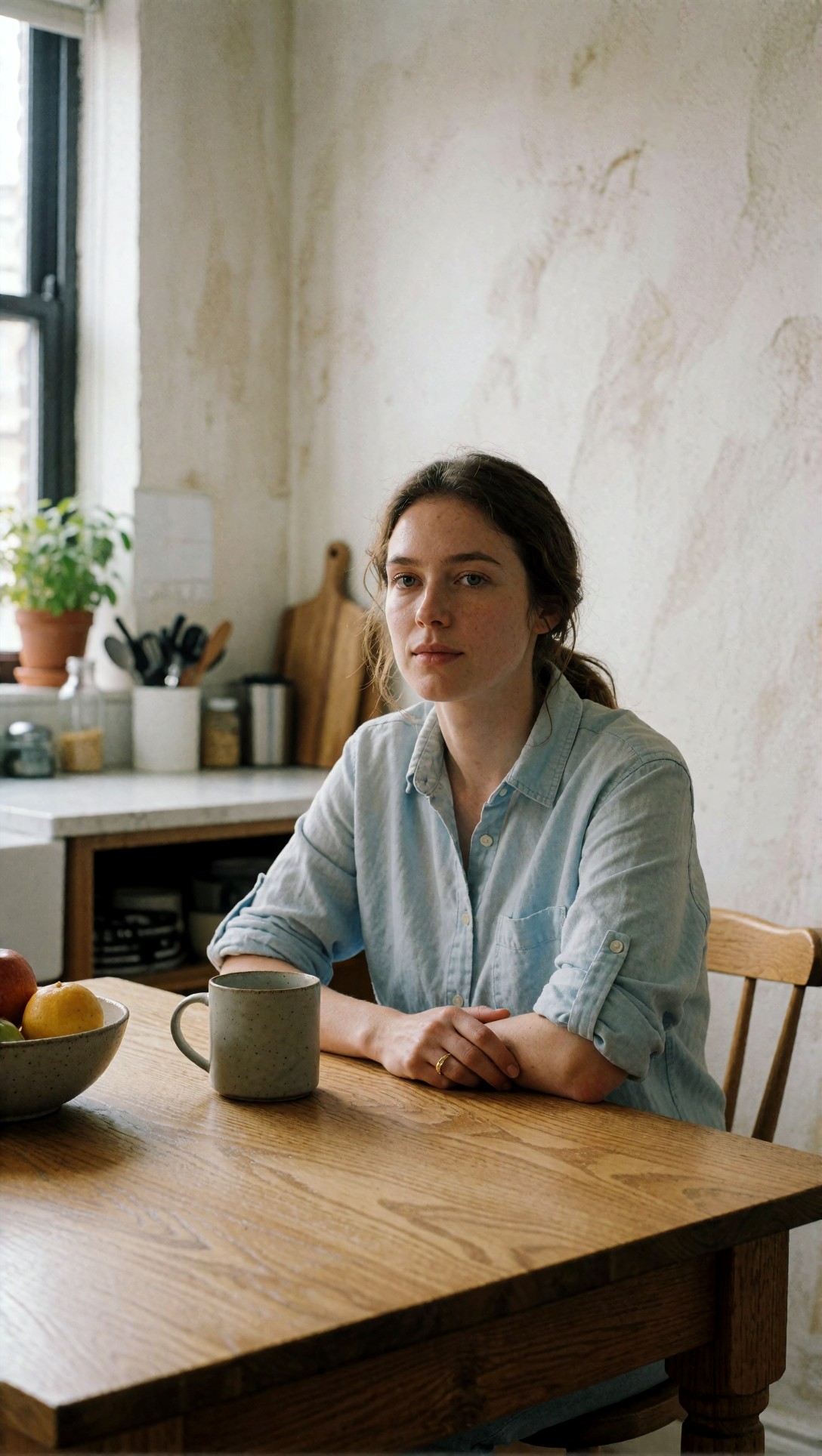
Inspect whether the wood grain and shirt fabric stay believable without becoming hyper-sharpened. This is also a good test for whether background objects duplicate or drift into AI-shaped clutter.
Test 4: Backlit hair and edge control
Backlighting often creates pretty images, but it also reveals fake edge halos and hairline errors. This prompt was chosen specifically to see whether the workflow could keep rim light subtle.
Topic: realistic outdoor portrait with backlit hair at sunset
Genre: Beauty Campaign
Camera: Sony A7R V
Lens: 85mm f/1.8
Lighting: sunset backlight with soft bounce fill
Location: dry grass field at the edge of a suburban park
Style: high-end beauty advertising
Final Prompt: realistic outdoor portrait of a woman standing in a dry grass field at sunset, wearing a sand-colored silk blouse and delicate gold necklace, soft confident expression, hair catching warm backlight with controlled rim glow, subtle bounce fill on the face, natural skin with fine texture and soft lip detail, shallow depth of field but eyes fully in focus, warm amber and beige palette, blurred suburban park in the distance, Sony A7R V look, 85mm f/1.8, high-end beauty advertising with restrained realism, accurate ear shape, believable hairline transitions, gentle lens rendering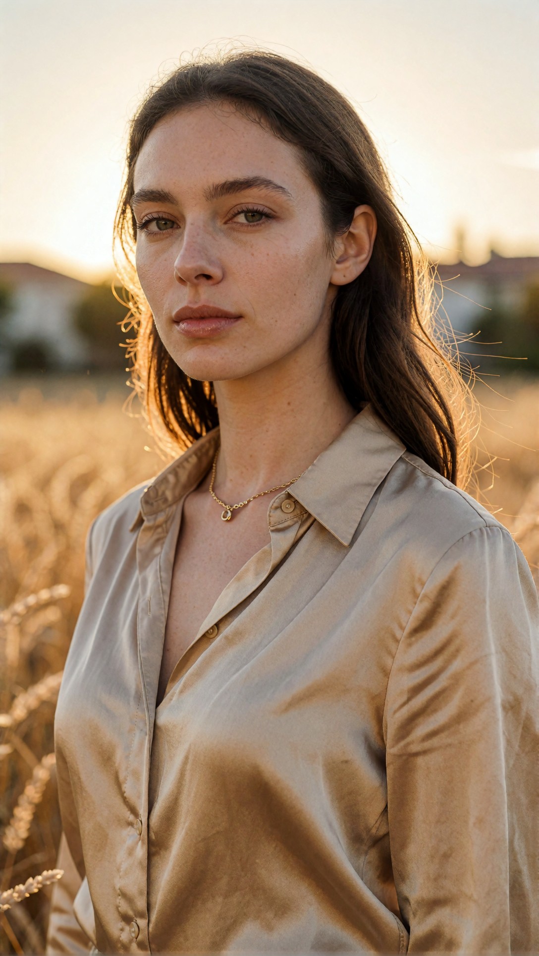
Check the edges of hair against the background and the transition between jawline and neck. If the AI look remains, you often see a glowing cutout outline or individual hair strands that look etched rather than photographed.
Test 5: Group-adjacent scene with object interaction
Single-subject portraits can hide a lot. This test introduces more interaction—body posture, props, and scene depth—without going fully multi-character, which still breaks more often in many workflows.
Topic: realistic barista preparing coffee in a small cafe
Genre: Documentary Lifestyle
Camera: Leica SL2-S
Lens: 35mm f/2
Lighting: soft daylight through front windows with warm interior practicals
Location: compact neighborhood cafe with worn wood counter and espresso machine
Style: editorial documentary realism
Final Prompt: realistic barista behind a worn wood counter in a compact neighborhood cafe, mid-action preparing espresso, white oxford shirt with sleeves rolled, dark canvas apron, subtle forearm tension, focused expression, cups and metal tools arranged naturally, daylight from front windows mixed with warm practical pendant lights, realistic stainless steel reflections, soft steam near machine, textured tiled wall, Leica SL2-S look, 35mm f/2 environmental framing, editorial documentary realism, natural body proportions, believable hand interaction with portafilter, grounded color palette of cream, steel, walnut, and deep green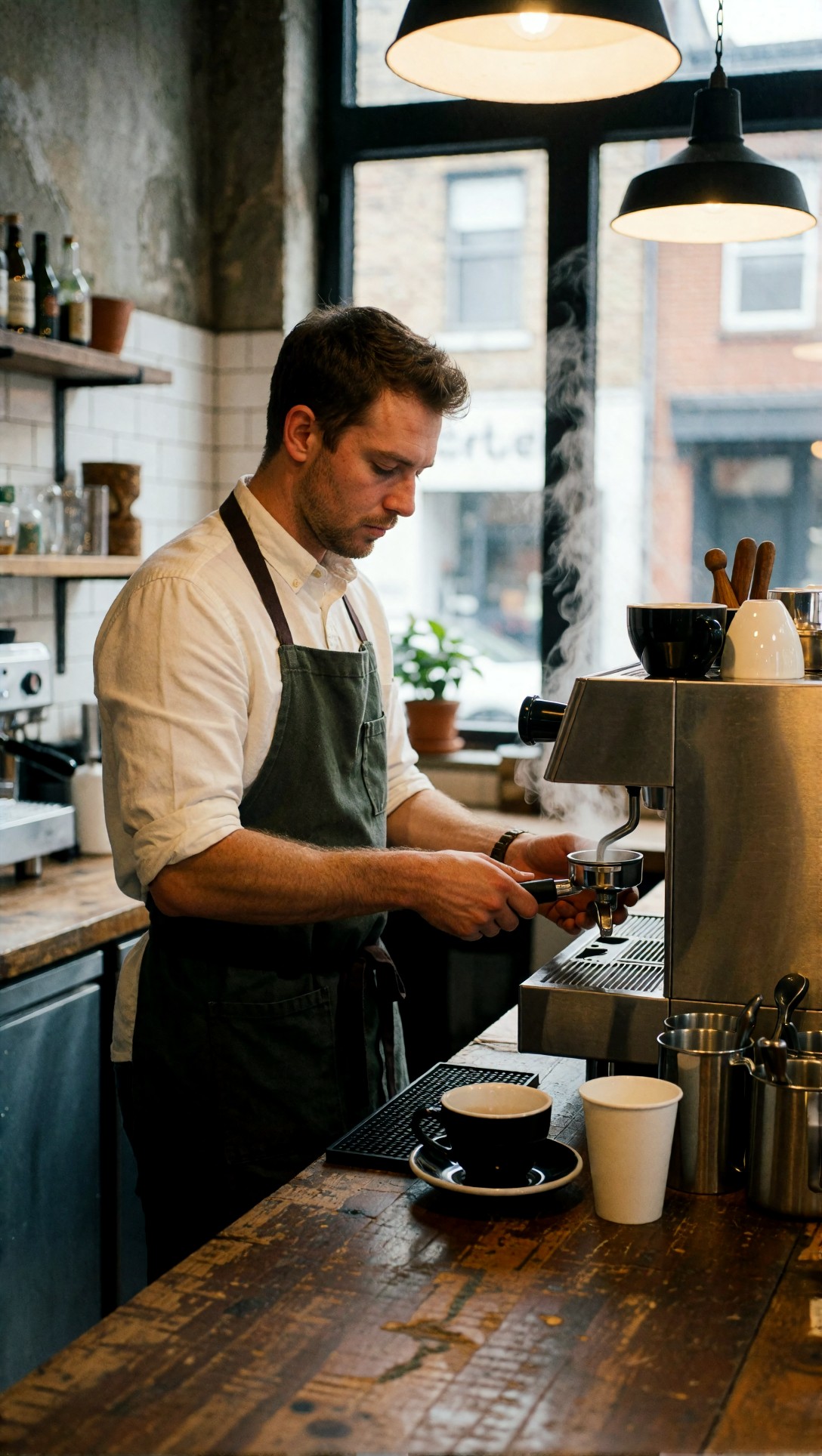
Inspect the hands on the espresso tools and the reflections on metal surfaces. This is where fake realism often breaks: too many perfect highlights, twisted wrists, or tool geometry that melts under close inspection.
Test 6: Realistic portrait with older skin texture
Many workflows default toward over-smoothed younger faces. I included this prompt to test whether the setup could preserve age cues without turning them into caricature.
Topic: realistic portrait of an older man with visible character lines
Genre: Character Portrait
Camera: Canon EOS R3
Lens: 70mm f/2.8
Lighting: softbox key light with weak ambient fill
Location: modest portrait studio with neutral gray seamless backdrop
Style: classic editorial portraiture
Final Prompt: realistic portrait of an older man seated on a simple stool in a modest studio, wearing a dark olive work jacket over a faded chambray shirt, hands relaxed in lap, direct calm gaze, visible forehead lines, soft crow's feet, natural skin texture, slight beard shadow, softbox key light from camera left with weak ambient fill, subtle falloff across the face, neutral gray seamless background, Canon EOS R3 look, 70mm f/2.8, classic editorial portraiture, authentic aging detail, restrained retouching, lifelike eyes, natural ear shape, true fabric texture and stitching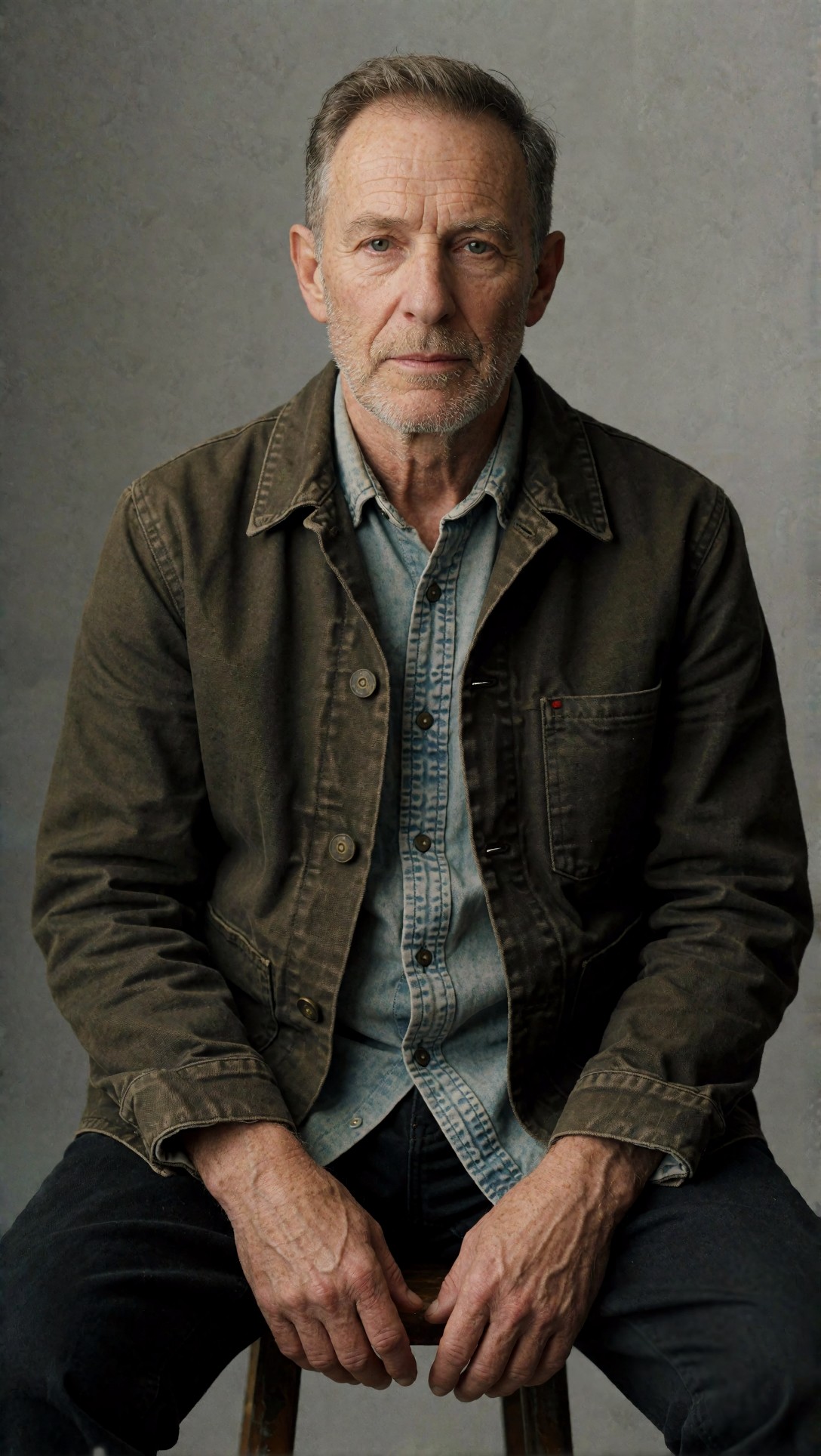
Look for whether wrinkles follow face structure naturally or appear sprayed on. A good result keeps age in the skin, eyes, and posture together instead of isolating wrinkles as a decorative effect.
Test 7: Product-adjacent realism with a human presence
This checks whether the workflow can balance object sharpness and human realism in the same frame. That balance matters because some setups over-prioritize products and make the person look composited in.
Topic: realistic skincare product scene with model hand and vanity setup
Genre: Product Editorial
Camera: Hasselblad X2D 100C
Lens: 55mm f/2.5
Lighting: large softbox key light with soft reflector fill
Location: stone vanity in a boutique hotel bathroom
Style: luxury campaign
Final Prompt: realistic skincare product scene on a stone vanity in a boutique hotel bathroom, frosted glass serum bottle beside folded white towel and brushed metal tray, elegant female hand reaching toward the bottle, partial reflection in mirror, model wearing a cream silk robe visible at frame edge, large softbox key light with soft reflector fill, clean but believable moisture on the stone surface, subtle shadows, neutral beige and ivory palette, Hasselblad X2D 100C look, 55mm f/2.5, luxury campaign style with realistic material rendering, accurate finger anatomy, premium packaging detail, restrained highlights, natural spatial depth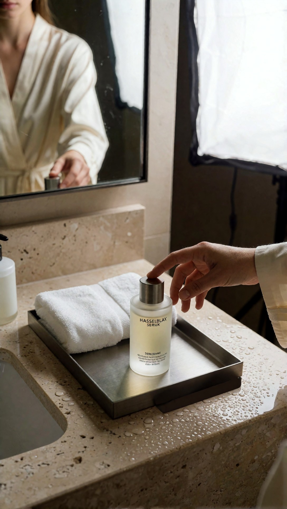
Inspect the fingers, bottle label integrity, and mirror logic. This kind of scene quickly reveals whether the workflow can keep text-like details coherent without overprocessing the hand.
Test 8: Night realism with practical lights
Night scenes are useful because AI models often cheat with fake contrast and muddy shadows. This final test checks whether the workflow can preserve atmosphere without turning the frame into neon gloss.
Topic: realistic nighttime portrait outside a convenience store
Genre: Street Style
Camera: Panasonic Lumix S5II
Lens: 40mm f/1.8
Lighting: mixed fluorescent spill and street sodium light
Location: convenience store sidewalk in a quiet urban neighborhood at night
Style: moody cinematic realism
Final Prompt: realistic nighttime portrait of a young man standing outside a neighborhood convenience store, wearing a black bomber jacket, washed gray hoodie, straight-leg denim, and worn sneakers, holding a small paper coffee cup, relaxed posture with slight slouch, mixed fluorescent light from the store and warm sodium streetlight from the side, realistic skin without beauty smoothing, subtle under-eye shadow, reflections in the glass door, small posters and shelves visible inside, damp sidewalk, Panasonic Lumix S5II look, 40mm f/1.8 environmental portrait framing, moody cinematic realism, natural noise character, believable shadow depth, muted palette of green, amber, charcoal, and off-white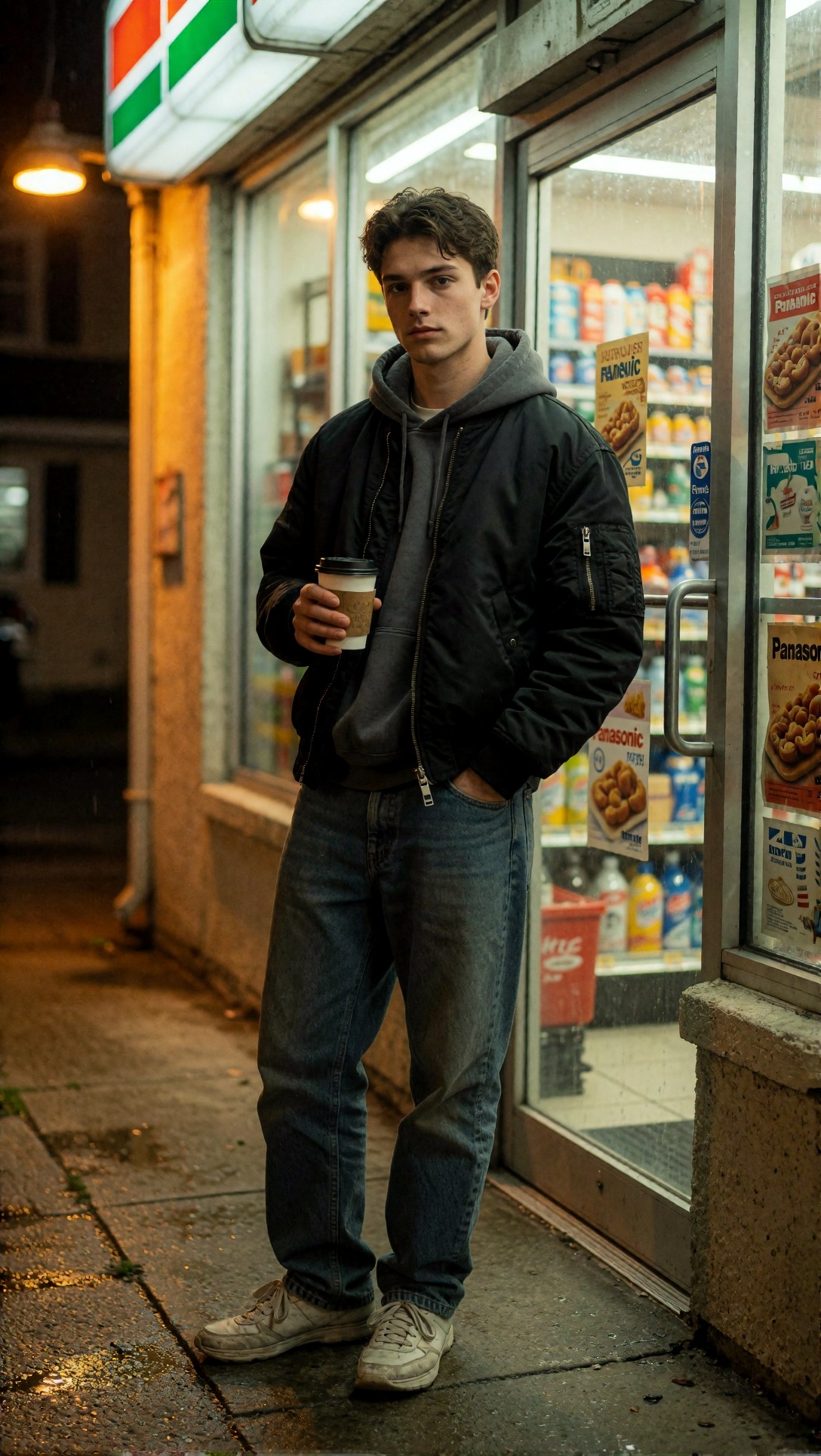
Check whether the shadows hold detail without turning mushy and whether mixed light creates plausible skin color. Weak outputs often show impossible color transitions across the face or store reflections that do not match the camera angle.
What actually improved realism the most
After running these prompt types through the workflow, a few changes repeatedly mattered more than everything else.
Strengths of this setup
Lower guidance preserved natural imperfections. With restrained CFG, faces stopped trying to satisfy every beauty adjective. The result was more asymmetry, gentler pores, and less polished skin.
The second pass improved detail without baking in fake texture. A mild img2img or redraw phase was more reliable than forcing the first pass to be ultra-detailed.
Lens and light descriptions stabilized realism better than extra style words. Specific camera logic gave the model structure. It reduced the floating, synthetic look common in broad prompts.
Moderate upscale kept images photographic. A controlled 1.5x or 2x finish often looked more believable than huge enlargements with aggressive sharpening.
Where the workflow still fails
Even the strongest result had consistent limitations.
Failure risks and limitations
Hands remain a quality threshold. The workflow reduced obvious hand deformities, but complex finger interactions still failed more often than simple relaxed poses.
Faces can detach after aggressive detailing. If you push face restoration too hard, the face becomes cleaner than the neck, hair, and clothing. That mismatch is one of the fastest ways to reintroduce the AI look.
Busy backgrounds still drift. Shelves, signage, small decor objects, and repeated window patterns can become slightly surreal even when the main subject looks real.
Very shallow depth of field can hide structural issues. It creates attractive images, but it can also mask bad ears, uneven jewelry, and weak environment logic. For testing realism, moderate depth of field is more honest.
Night scenes are less forgiving. Mixed lighting increases realism when it works, but color contamination and reflection errors rise quickly.
Common mistakes I would avoid in ComfyUI
These were the mistakes that made realistic generation worse, even when the prompt looked strong.
1. Chasing realism by stacking every realism keyword
Words like photorealistic, ultra-detailed, high detail, realistic skin, 8k, DSLR, cinematic, raw, masterpiece do not automatically create a convincing photo. In this test, too many of them made the image more generic, not more real.
2. Using high denoise in the detail pass
Once denoise gets too strong, the second pass stops refining and starts repainting. That is where faces become disconnected from the original lighting and anatomy.
3. Letting face-fix tools override the base image
If the first pass face is structurally sound, use only a light correction. Heavy fixing made eyes unnaturally crisp and erased natural expression lines.
4. Ignoring wardrobe and material logic
Realism improves when clothing has believable structure: cotton wrinkles differently from silk, denim reflects differently from leather, and wool should not shine like satin.
5. Making every prompt beauty-centered
The more the prompt fixates on perfect skin, perfect eyes, perfect lips, and flawless symmetry, the more likely the model is to produce the AI look you were trying to avoid.
A compact realism checklist
Use this after each generation before you decide to upscale or rerun.
- Does the skin have variation, or is it uniformly smooth?
- Do the eyes match the lighting direction and scene mood?
- Are hands simple, readable, and proportional?
- Do fabric folds make sense at elbows, knees, and waist?
- Is the background believable when you inspect edges and small objects?
- Does the sharpness fall off naturally, or is every surface equally crisp?
- Do reflections, shadows, and highlights agree with the described light source?
- After upscale, does the image still feel photographic rather than etched?
If three or more of those fail, I would rerun the base generation instead of trying to rescue it downstream.
Practical recommendations by use case
Not every realistic image task needs the same workflow pressure.
Best for portraits and editorial people shots
Use the full workflow: realism checkpoint, moderate latent size, low-to-moderate CFG, careful prompt, second-pass refinement, restrained upscale. This is where the setup gave the highest hit rate.
Best for interiors and lifestyle scenes
Keep prompts object-aware and reduce shallow depth of field. Room realism improves when surfaces and props remain visible enough to establish spatial truth.
Best for product-plus-human frames
Prioritize accurate hand poses and label integrity over dramatic lighting. If the hand breaks, the entire realism claim collapses.
Less ideal for dense crowd scenes or high-motion action
This workflow can still produce attractive images there, but the consistency drops. Too many interacting limbs and overlapping objects expose model weaknesses quickly.
Final recommendation
If your goal is to build a ComfyUI photorealistic workflow that reduces the AI look, the most important change is not adding more detail. It is controlling where detail appears and how strongly the model is forced to obey the prompt.
Who should use this workflow: creators making realistic portraits, editorial lifestyle images, commercial scenes with believable people, and prompt-driven test shots where skin, fabric, and light need to survive inspection.
Who should avoid it: users who want heavily stylized beauty output, exaggerated sharpness, or fast one-pass renders with dramatic face enhancement. This setup favors restraint over spectacle.
If I had to keep only one rule from this test, it would be this: treat realism like camera direction, not adjective stacking. The setting that mattered most was restrained guidance combined with a mild second pass. That single change did more to reduce the AI look than any long prompt or aggressive upscale.