ComfyUI Upscaler Settings Tested: Denoise, Tile Size, and Sharpening Side by Side 한국어 요약
이 페이지는 ZView Space의 영어 원문을 한국어 검색 사용자도 이해할 수 있도록 정리한 SEO 요약입니다. 핵심은 단순한 얼굴 중심 이미지가 아니라 패션 에디토리얼, 룩북, 아웃핏, 프롬프트 테스트, 이미지 생성 워크플로우를 실제로 어떻게 구성할지입니다.
핵심 요약
- 원문 주제: ComfyUI Upscaler Settings Tested: Denoise, Tile Size, and Sharpening Side by Side
- 목적: AI 이미지 생성에서 outfit, silhouette, fabric, pose, location, camera framing을 더 명확하게 설계합니다.
- 활용 범위: Z-Image Turbo, Krea2 Turbo, Qwen Image, Anima, SeedVR2 같은 이미지 생성 및 업스케일 워크플로우에 적용할 수 있습니다.
- SEO 관점: 제목, 설명, 이미지 alt, 프롬프트 예시가 실제 검색 의도와 맞아야 색인 가능성이 높아집니다.
한국어 사용자를 위한 체크포인트
1. 프롬프트가 얼굴 묘사에만 머물지 않고 전체 스타일과 의상 구성을 설명하는지 확인합니다. 2. 패션 이미지라면 상의, 하의, 아우터, 신발, 액세서리, 소재감, 촬영 장소를 분리해서 씁니다. 3. 생성 결과는 바로 게시하지 말고 디테일, 손, 의상 형태, 배경 일관성, 이미지 품질을 비교합니다. 4. 글 본문에는 실제 테스트 기준과 실패를 줄이는 방법이 들어가야 검색엔진에서 얇은 콘텐츠로 보일 가능성이 줄어듭니다.
원문 미리보기
This test is about ComfyUI upscaler settings in the specific situation where a good base image still falls apart during the final upscale. I ran the same images through multiple passes with different denoise values, tile sizes, and sharpening steps to see whic
---
This test is about ComfyUI upscaler settings in the specific situation where a good base image still falls apart during the final upscale. I ran the same images through multiple passes with different denoise values, tile sizes, and sharpening steps to see which settings actually improve texture and which ones quietly damage faces, text, edges, or fabric detail.
The short version: low denoise protects composition, larger tiles reduce seam risk, and sharpening helps only when the image already has clean structure. If the source image is weak, sharpening mostly makes the weakness louder.
Quick answer
- For most realistic images, denoise around 0.15 to 0.3 is the safest starting range in a ComfyUI upscaler workflow.
- Tile size matters more than many users expect. Small tiles can recover micro-detail, but they also increase seam risk and local inconsistency.
- Sharpening should be the last step, and only after checking eyes, hair edges, fabric weave, and background transitions at 100% zoom.
- If your upscale changes identity, hand shape, or product geometry, the denoise is too high or the prompt is too loose.
- The best ComfyUI upscale settings depend on subject type: portraits, products, and illustrations each break in different ways.
What was tested
I used one ComfyUI upscale graph pattern with only three variables changing:
1. Denoise strength 2. Tile size 3. Sharpening intensity
The source set included:
- a close portrait with skin texture and hair flyaways
- a fashion half-body image with layered fabric
- a product scene with labels and hard edges
- a stylized illustration with line detail and gradients
Base workflow:
- latent or image upscale depending on source quality
- same checkpoint and prompt family per subject
- same output resolution target
- same sampler and step count during comparison rounds
- sharpen pass added only after the upscale comparison
I inspected each result at fit view and 100% crop. The key checks were identity stability, texture realism, edge continuity, text or label preservation, and whether the image looked genuinely improved rather than just noisier.
For readers testing their own outputs, you can compare variants inside your own pipeline, then send the keepers to [/upscaler](/upscaler) or archive examples in [/gallery](/gallery).
The use case: when the base image is almost good enough
The scenario was common: the original render already had the right composition, color mood, and pose, but it was not publication-ready. At native size it looked fine. At crop level, the weak points appeared fast:
- pores turned waxy
- eyelashes merged together
- jacket stitching dissolved into mush
- bottle labels became fake text
- line art gained broken edges
This is where people start adjusting ComfyUI upscaler settings and often overshoot. The temptation is to raise denoise so the model can "rebuild" detail. In practice, that can fix one texture while changing three other things you wanted to keep.
Why this case is hard for image models
Upscaling is not only resolution expansion. It is also a reinterpretation step.
That becomes difficult when the image contains both:
- global structure that must stay fixed: face identity, product shape, silhouette, composition
- local detail that must be invented carefully: skin pores, cloth weave, hair separation, printed text, brush texture
A model asked to do both at once can drift. In this test, the biggest problems came from local detail generation happening without enough respect for the original layout.
Failure patterns I saw repeatedly
- Faces improved in texture but changed age or expression
- Fabric looked sharper but seam lines bent unnaturally
- Background bokeh gained fake repeating detail
- Product corners became rounded or asymmetrical
- Illustration linework got overcooked by sharpen filters
That is why ComfyUI denoise tile size decisions matter as much as the model itself.
First pass: the tempting high-denoise setup
My first attempt used a moderate upscale ratio with denoise set high enough to encourage new detail generation. The output looked impressive in thumbnail view, but not in crop view.
What improved:
- pores and hair appeared more defined
- some cloth textures looked richer
- low-detail surfaces gained visual interest
What got worse:
- eye shape shifted slightly
- lip edge changed from the source
- jewelry reflections became inconsistent between tiles
- printed packaging gained decorative noise instead of readable structure
This was the classic false win. The image looked more "detailed" but less trustworthy.
To stress-test that failure mode on portrait structure, I used a prompt built around fine skin detail, hair separation, and reflective accessories.
Topic: close portrait of a woman with fine skin texture, layered hair strands, and metallic earrings
Genre: Beauty Campaign
Camera: Canon EOS R5
Lens: 100mm f/2.8 macro
Lighting: studio butterfly light with soft fill
Location: seamless warm gray studio backdrop
Style: high-end beauty advertising
Final Prompt: close beauty portrait of a woman with luminous natural skin, visible pores without harsh retouching, layered dark hair with soft flyaway strands, polished metallic earrings, calm direct gaze, neutral expression, symmetrical composition, warm gray studio backdrop, studio butterfly key light with subtle fill and controlled catchlights, premium beauty campaign styling, Canon EOS R5 look, 100mm f/2.8 macro clarity, crisp eyelash separation, realistic lip texture, elegant tonal contrast, refined editorial color grading, highly detailed but natural finish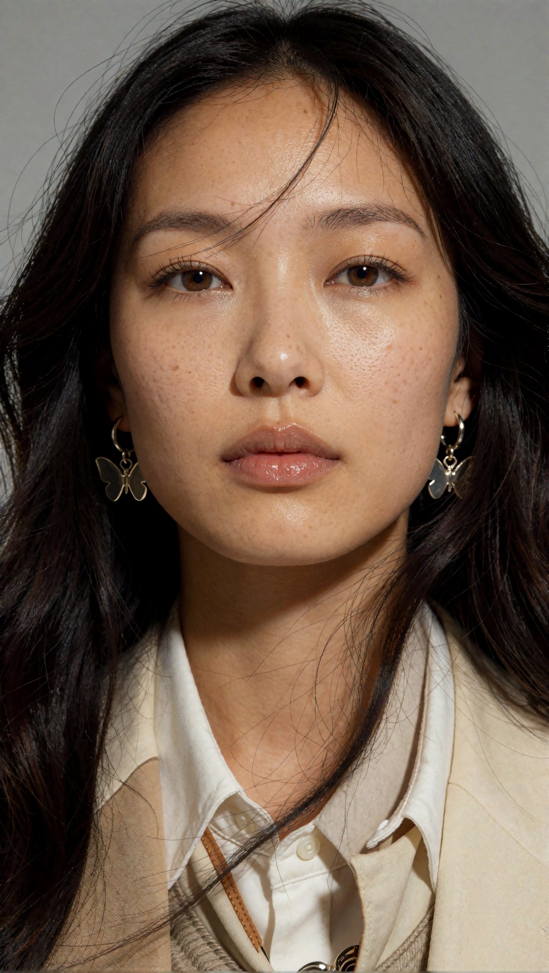
Inspect the eyes first, then the lip contour and hairline. If denoise is too high, these three areas often improve in sharpness while losing identity stability.
What changed the result: lower denoise, larger tile
The strongest result in this test came from a conservative shift, not an aggressive one:
- denoise reduced into the low-to-mid range
- tile size increased enough to preserve context
- sharpening moved to the very end
This improved coherence immediately. The model had less freedom to redraw structure, and the larger tile gave it more neighboring information to resolve transitions cleanly.
Why larger tile helped
With smaller tiles, each region solved detail more independently. That can help local crispness, but it also increased these issues in my outputs:
- tiny contrast differences across cheeks or walls
- repeated texture patterns in coats and curtains
- edge mismatch near jawlines and product borders
Larger tiles reduced those artifacts because the model could see more of the image context during each solve.
To test clothing texture and seam continuity, I used a layered fashion image where fake detail is easy to spot.
Topic: half-body fashion portrait with layered wool coat, silk blouse, and visible stitching
Genre: Fashion Editorial
Camera: Sony A7R V
Lens: 85mm f/1.4
Lighting: large softbox key with subtle rim light
Location: minimalist editorial studio with concrete floor
Style: clean commercial luxury fashion campaign
Final Prompt: half-body fashion portrait of a woman wearing a structured charcoal wool coat over an ivory silk blouse, visible lapel stitching, tailored sleeves, fine fabric texture, relaxed upright pose, composed facial expression, minimalist editorial studio with pale textured wall and concrete floor, large softbox key light with gentle rim separation, luxury campaign styling, Sony A7R V realism, 85mm f/1.4 depth, crisp garment edges, natural skin detail, controlled neutral palette, premium magazine composition, strong textile clarity without overprocessing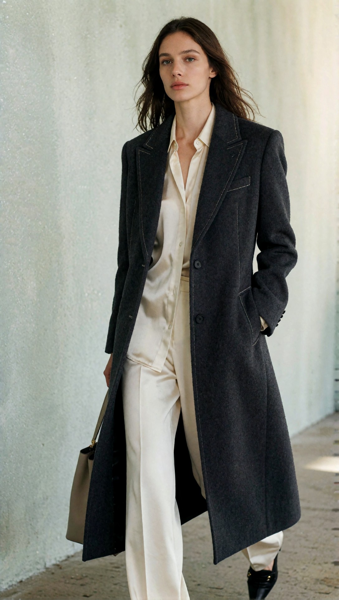
Inspect lapel edges, stitch lines, and the transition between blouse folds and coat shadows. If tile size is too small, these areas often show repeated or disconnected texture logic.
Side-by-side findings on ComfyUI denoise tile size and sharpening
Below is the practical comparison that matched the test outputs most closely.
| Setting choice | What improved | What got worse | Best use | |---|---|---|---| | Low denoise | Preserved identity, product shape, composition | May leave soft detail unresolved | Portraits, products, strong source images | | Mid denoise | Best balance of recovery and stability | Can add minor drift in eyes, fingers, text | General-purpose upscale workflows | | High denoise | Invents lots of texture fast | Structural drift, fake detail, prompt overreach | Rescue attempts only, not safe default | | Small tile size | Strong local sharpness | Seams, repeated patterns, local inconsistency | Flat textures, some illustration cases | | Large tile size | Better coherence across surfaces | Higher VRAM demand, sometimes slightly softer micro-detail | Portraits, fashion, products | | Strong sharpening | Fast crispness boost | Halos, brittle hair, crunchy pores, line damage | Only for already-clean outputs | | Mild sharpening | Better edge definition with lower artifact risk | Less dramatic at thumbnail size | Final finishing pass |
Denoise tests: where the safe range actually felt usable
In this test, denoise had the biggest impact on whether the upscale felt like enhancement or replacement.
Low denoise
Low denoise was the most dependable when the source image already had the right face, geometry, and lighting. It did not magically recover every weak area, but it respected the image.
Best for:
- portraits with good identity lock
- product images with important edges or labels
- images you only need to polish, not reinterpret
Weak point:
- subtle softness may remain in eyelashes, fabric weave, or distant background detail
To check product geometry preservation, I used a packaging scene where fake detail is worse than soft detail.
Topic: premium skincare bottle and box with embossed label and reflective cap
Genre: Product Editorial
Camera: Nikon Z8
Lens: 105mm f/2.8 macro
Lighting: softbox key with strip light reflections
Location: clean studio tabletop with pale stone surface
Style: clean commercial look
Final Prompt: premium skincare product editorial featuring a frosted glass serum bottle and matching box, embossed label area, reflective silver cap, arranged on a pale stone tabletop with controlled negative space, clean studio background, softbox key light with narrow strip reflections shaping the glass, Nikon Z8 precision, 105mm f/2.8 macro detail, luxury commercial composition, crisp packaging edges, realistic material reflections, subtle shadow falloff, muted cream and silver palette, elegant premium retail presentation, high clarity without distortion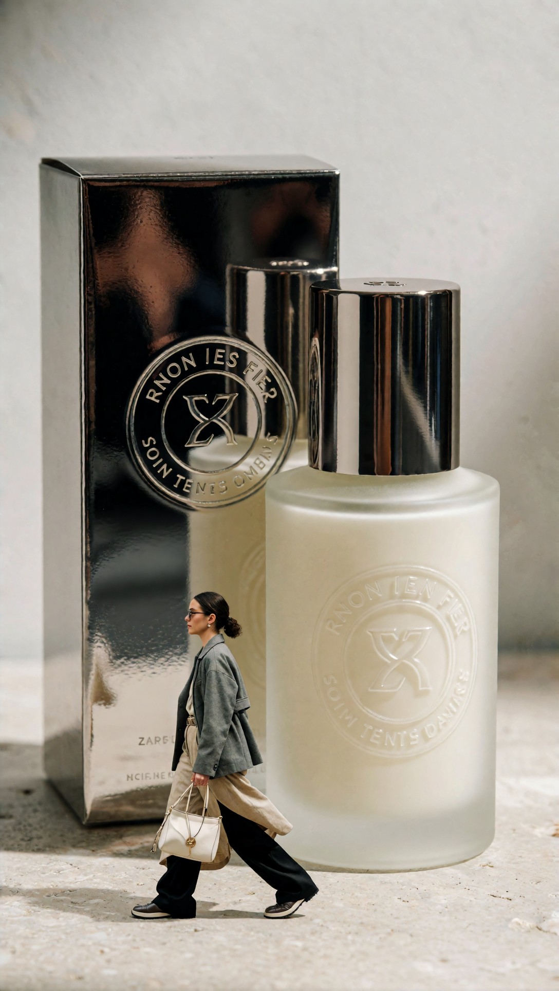
Inspect the cap symmetry, label border, and bottle shoulder curve. If denoise is too high, these areas often gain fake complexity and lose product accuracy.
Mid denoise
This was the strongest overall range. It added enough micro-detail to improve realism without redrawing the image too aggressively.
Best for:
- portraits with slightly soft skin and hair
- fashion scenes where fabric detail matters
- mixed-detail images with face plus wardrobe plus environment
Risk:
- if the prompt is loose, the model may still embellish jewelry, eyelashes, or background foliage
For a scene with both face and environment detail, I used a travel-style portrait with layered depth and natural texture.
Topic: environmental portrait with textured jacket, wind-shaped hair, and distant architectural background
Genre: Cinematic Travel
Camera: Fujifilm GFX100 II
Lens: 63mm f/2.8
Lighting: overcast diffusion
Location: old European stone alley after light rain
Style: cinematic realism
Final Prompt: environmental portrait of a woman standing in a narrow old stone alley after light rain, textured olive jacket, soft scarf, wind-shaped hair, thoughtful side glance, wet cobblestones reflecting muted daylight, distant architectural detail fading into soft depth, overcast diffused light, cinematic realism, Fujifilm GFX100 II medium-format look, 63mm f/2.8 natural perspective, subdued green and stone palette, realistic skin texture, clear garment detail, atmospheric background, editorial framing with balanced depth and authentic travel mood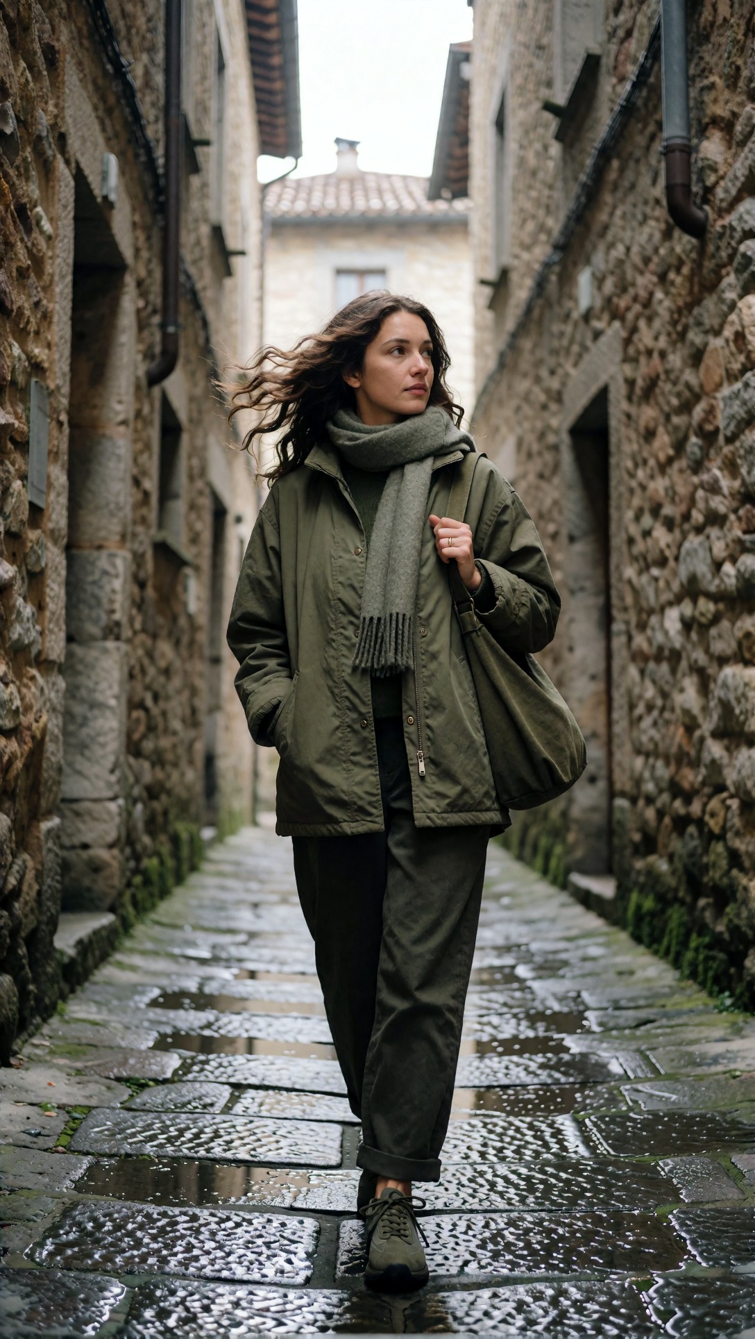
Inspect whether background stone detail stays believable without competing with the face. Mid denoise works best when the environment gets cleaner but does not become louder than the subject.
High denoise
High denoise produced the most obvious change and the lowest trust. It occasionally rescued muddy hair or weak backgrounds, but too often at the cost of identity, shape, or realism.
Best for:
- rare cases where the source image is fundamentally under-detailed and you accept reinterpretation
Not best for:
- product work
- client portraits
- scenes with readable text, logos, or intricate linework
To expose drift on stylized surfaces, I tested a character illustration with line precision.
Topic: anime character key visual with clean line art, gradient hair, and decorative costume trim
Genre: Anime Key Visual
Camera: cinematic digital illustration framing
Lens: 50mm equivalent composition
Lighting: neon rim light with soft ambient fill
Location: night rooftop overlooking a futuristic city
Style: polished anime promotional art
Final Prompt: anime key visual of a confident female character standing on a rooftop at night, futuristic city lights below, long gradient hair moving in the wind, fitted costume with gold trim, gloves, layered skirt panels, clean expressive eyes, precise line art, neon rim light with soft ambient fill, cinematic framing, polished promotional anime art style, balanced magenta and cyan highlights, clear silhouette, crisp costume edges, atmospheric skyline depth, premium poster-level finish
Inspect line continuity around hair, fingers, and costume trim. High denoise tends to add extra line chatter or reshape elements that were already correct.
Tile size tests: coherence versus micro-detail
Tile size was the setting that changed how "assembled" the upscale felt.
Small tiles
Small tiles sometimes gave the sharpest immediate crop, especially on textured surfaces. But they were also the most likely to create:
- seams in gradients
- inconsistent blur levels
- repeated details in leaves, fabric, skin, or stone
This was most visible on broad surfaces with subtle tonal change.
To stress broad tonal surfaces plus hair detail, I tested a beauty scene with smooth background and soft skin transitions.
Topic: soft beauty portrait with pastel backdrop, smooth skin gradients, and delicate hair strands
Genre: Korean Magazine Cover
Camera: Hasselblad X2D 100C
Lens: 90mm f/2.5
Lighting: large diffused frontal soft light
Location: pastel studio set with seamless peach backdrop
Style: refined glossy editorial cover
Final Prompt: refined beauty portrait of a young woman against a seamless peach studio backdrop, delicate hair strands framing the face, fresh natural makeup, soft confident expression, clean shoulders and neckline styling, large diffused frontal soft light creating smooth skin gradients and bright catchlights, Hasselblad X2D 100C medium-format clarity, 90mm f/2.5 elegant compression, Korean magazine cover styling, pastel peach and cream color palette, crisp eyelashes, natural skin detail, balanced negative space, polished glossy editorial finish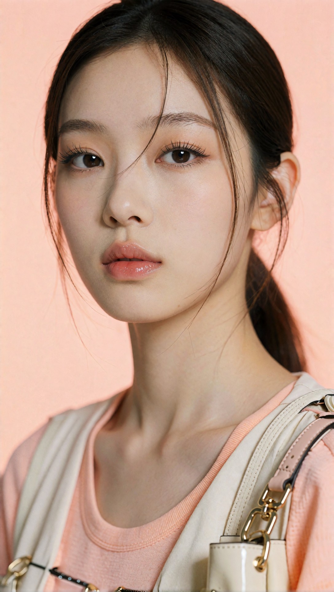
Inspect the background gradient near the head and shoulders. Small tiles often create tiny tonal shifts there even when the face looks sharper.
Larger tiles
Larger tiles were more forgiving. They preserved overall image logic better, especially in portraits and fashion scenes.
What improved in this test:
- face-to-hair transitions
- jacket panel continuity
- background blur consistency
- reflective object shape coherence
Tradeoff:
- on some images, the texture looked a touch less aggressively crisp than the smallest tile option
That tradeoff was worth it in most realistic workflows.
To test larger tiles on layered environment plus wardrobe, I used a street-style frame with repeating textures that can reveal tile mismatch quickly.
Topic: full-body street style image with leather jacket, denim texture, and repeating storefront reflections
Genre: Street Style
Camera: Leica SL2-S
Lens: 50mm f/1.4
Lighting: cloudy daylight with soft reflections
Location: urban shopping street with glass storefronts
Style: modern editorial street fashion
Final Prompt: full-body street style portrait on an urban shopping street, model wearing a black leather jacket, faded denim, structured boots, layered accessories, relaxed walking pose, confident expression, glass storefronts reflecting soft cloudy daylight, repeating urban textures in pavement and windows, Leica SL2-S realism, 50mm f/1.4 balanced perspective, modern editorial street fashion direction, controlled neutral and blue palette, crisp garment textures, clean silhouette, realistic reflections, natural city depth, premium magazine-style composition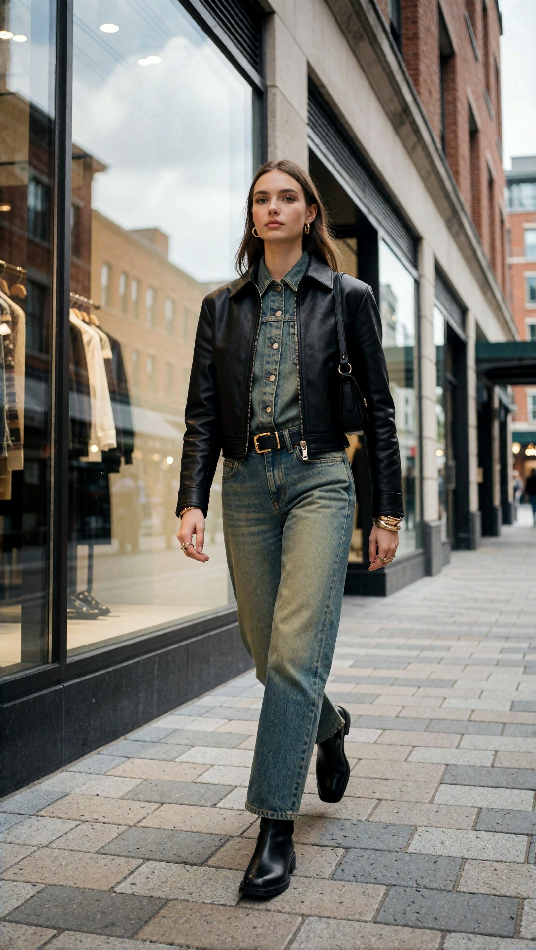
Inspect jacket panel continuity, denim grain, and storefront reflection alignment. Larger tiles should keep these transitions more consistent across the frame.
Sharpening tests: useful finish or artifact amplifier?
Sharpening was the most misunderstood step in the workflow.
It did help when:
- the upscale was already structurally stable
- edges were slightly soft but clean
- fabric, product edges, or lashes needed a small final lift
It failed when:
- noise was mistaken for detail
- skin was already over-textured
- illustration lines were thin and fragile
- bokeh backgrounds had subtle gradients
Mild sharpening
Mild sharpening worked best as a finishing move. It added separation without calling attention to itself.
Good targets:
n- jacket seams
- eyelashes
- bottle edges
- illustrated contour lines with enough thickness
To test whether sharpen was helping texture instead of creating halos, I used a resort fashion image with fine fabric and hard accessory edges.
Topic: resort fashion portrait with linen fabric texture, sunglasses edge detail, and layered jewelry
Genre: Luxury Campaign
Camera: Panasonic Lumix S1R
Lens: 70-200mm at 135mm f/2.8
Lighting: sunset backlight with soft bounce fill
Location: Mediterranean terrace overlooking the sea
Style: elegant resort editorial
Final Prompt: luxury resort fashion portrait on a Mediterranean sea-view terrace, model wearing a cream linen suit with visible weave, layered gold jewelry, sculpted sunglasses, relaxed seated pose, composed expression, warm sunset backlight shaped with subtle bounce fill, sea horizon and pale stone architecture in the background, Panasonic Lumix S1R clarity, 135mm f/2.8 compression, elegant resort editorial styling, warm cream and gold palette, crisp fabric texture, clean accessory edges, natural skin finish, sophisticated cinematic grading
Inspect fabric weave, sunglass rim edges, and jewelry highlights. Good sharpening makes them cleaner; bad sharpening creates bright halos and brittle edge contrast.
Strong sharpening
Strong sharpening looked impressive at small preview size and disappointing at 100%. It exaggerated pores, made hair look cut-out, and damaged gradients.
I would avoid it for most portrait workflows.
For line sensitivity, I ran a stylized poster-like scene where edge integrity matters more than texture punch.
Topic: illustrated luxury fragrance poster with glass bottle silhouette, floral accents, and soft gradient backdrop
Genre: Luxury Campaign
Camera: cinematic poster composition
Lens: 80mm equivalent framing
Lighting: studio spotlight with diffused bloom
Location: abstract editorial set with gradient backdrop
Style: high-end beauty advertising illustration
Final Prompt: high-end illustrated fragrance campaign poster featuring a sculptural glass perfume bottle, soft floral accents, elegant ribbon movement, diffused spotlight glow, abstract gradient editorial set in rose and ivory tones, premium poster composition, crisp silhouette, refined decorative detail, clean edges, subtle bloom, luxury beauty advertising style, balanced negative space, polished premium finish suitable for print-style presentation
Inspect the bottle edge and the transition in the soft gradient backdrop. If strong sharpening creates jagged contouring or banding emphasis, the finish is too heavy.
Prompt examples tied to the workflow
The prompts above were not random subjects. Each one was chosen to stress a different failure point in AI upscaler settings ComfyUI users commonly run into:
- beauty portrait: identity drift, skin texture, hairline stability
- fashion portrait: seam continuity, layered fabric realism
- product shot: geometry and label preservation
- travel portrait: mixed subject-background detail balance
- anime key visual: line art stability under denoise
- pastel beauty cover: gradient seam visibility from tile size
- street style frame: repeated pattern coherence across tiles
- resort fashion image: sharpening on mixed soft and hard edges
If you want to refine prompts before sending them into an upscale workflow, [/promptlab](/promptlab) is useful for isolating subject detail and style locks, while [/create](/create) helps compare starting renders before you commit to upscaling.
What to inspect before publishing the result
This checklist mattered more than any single slider.
Final output checklist
- Eyes: shape, iris symmetry, eyelash direction
- Skin: realistic pores versus crunchy texture
- Hair: natural strand flow, no cut-out edge look
- Hands: finger count, nail shape, knuckle continuity
- Fabric: seam logic, repeated texture patterns, fold realism
- Products: symmetry, cap alignment, straight lines, label boundaries
- Background: gradient smoothness, bokeh consistency, no tile seams
- Illustrations: line continuity, edge cleanliness, no oversharpened chatter
If an image fails two or more of these, I would rerun the upscale rather than retouch around the damage.
Strengths of this ComfyUI sharpening workflow
When this setup works, it works for a very practical reason: each setting has a narrow job.
- Denoise restores or interprets detail
- Tile size manages context and coherence
- Sharpening adds a controlled finish
That separation produced the most reliable results in this test. The strongest result was not the most dramatic one. It was the image that stayed faithful to the source while improving crop-level confidence.
Limitations and failure risks
There are still hard limits to the workflow.
Where it struggles
- very weak source images with broken anatomy
- text-heavy product packaging
- dense jewelry and lace at low starting resolution
- group portraits with many faces
- painterly images where sharpen destroys brush logic
If the original image is structurally poor, best ComfyUI upscale settings will not rescue it cleanly. In those cases, regenerating the base image is usually faster and safer than forcing a heroic upscale.
Practical recommendations by image type
Portraits
- start with low to mid denoise
- prefer larger tiles when possible
- use mild sharpen only at the end
Fashion and editorial
- mid denoise is often the sweet spot
- larger tiles help clothing continuity
- inspect lapels, hems, and jewelry before export
Product images
- stay conservative on denoise
- avoid heavy sharpen
- reject any result that changes geometry or label structure
Illustrations and anime
- test lower denoise than you think you need
- use sharpening carefully or skip it
- inspect line edges before judging overall quality
Transferable lesson for similar workflows
The main lesson from this case study is simple: the best ComfyUI upscaler settings are the ones that protect what is already correct.
Most bad upscale outcomes came from asking the model to do too much in one pass. If the composition, identity, and lighting are already good, your upscale workflow should behave like a finisher, not a re-generator.
In practice, that means:
- keep denoise lower than your first instinct
- increase tile size before you increase aggression
- sharpen only after structural review
- judge at 100%, not just thumbnail view
That logic transfers well to portraits, fashion, products, and even many stylized images.
FAQ
What are the best ComfyUI upscale settings for portraits?
A low to mid denoise range with larger tiles and mild final sharpening was the safest portrait setup in this test. It preserved identity better than aggressive detail generation.
How does ComfyUI denoise tile size affect quality?
Denoise controls how much the model reinterprets the image. Tile size controls how much context it sees while doing that. High denoise with small tiles is the riskiest combination for drift and seams.
Should I sharpen before or after upscaling in ComfyUI?
After. In this test, pre-sharpening tended to amplify defects, while post-upscale mild sharpening worked better as a controlled finishing pass.
Why does my ComfyUI upscale look detailed but wrong?
That usually means the workflow created synthetic texture without preserving structure. Common causes are denoise set too high, tile size too small, or a prompt that is too broad during the upscale pass.
What is the safest default for AI upscaler settings in ComfyUI?
Start conservative: low-to-mid denoise, larger tiles if VRAM allows, and very mild sharpening only after checking the image at full size.
Conclusion
This workflow is best for users who already have a solid base image and want cleaner crop-level detail without rewriting the scene. It is especially useful for portraits, fashion editorials, and product images where structural accuracy matters more than dramatic texture invention.
I would avoid this approach if the original image is fundamentally broken. In that situation, high-denoise upscaling often creates confident-looking errors instead of true fixes.
If you only change one thing, change this: lower the denoise before adding more sharpening. In this test, that decision mattered more than any other setting, because it kept the upscale faithful while still allowing meaningful detail recovery.