ComfyUI Workflow Anime vs Realistic: What Needs to Change in Your Setup 한국어 요약
이 페이지는 ZView Space의 영어 원문을 한국어 검색 사용자도 이해할 수 있도록 정리한 SEO 요약입니다. 핵심은 단순한 얼굴 중심 이미지가 아니라 패션 에디토리얼, 룩북, 아웃핏, 프롬프트 테스트, 이미지 생성 워크플로우를 실제로 어떻게 구성할지입니다.
핵심 요약
- 원문 주제: ComfyUI Workflow Anime vs Realistic: What Needs to Change in Your Setup
- 목적: AI 이미지 생성에서 outfit, silhouette, fabric, pose, location, camera framing을 더 명확하게 설계합니다.
- 활용 범위: Z-Image Turbo, Krea2 Turbo, Qwen Image, Anima, SeedVR2 같은 이미지 생성 및 업스케일 워크플로우에 적용할 수 있습니다.
- SEO 관점: 제목, 설명, 이미지 alt, 프롬프트 예시가 실제 검색 의도와 맞아야 색인 가능성이 높아집니다.
한국어 사용자를 위한 체크포인트
1. 프롬프트가 얼굴 묘사에만 머물지 않고 전체 스타일과 의상 구성을 설명하는지 확인합니다. 2. 패션 이미지라면 상의, 하의, 아우터, 신발, 액세서리, 소재감, 촬영 장소를 분리해서 씁니다. 3. 생성 결과는 바로 게시하지 말고 디테일, 손, 의상 형태, 배경 일관성, 이미지 품질을 비교합니다. 4. 글 본문에는 실제 테스트 기준과 실패를 줄이는 방법이 들어가야 검색엔진에서 얇은 콘텐츠로 보일 가능성이 줄어듭니다.
원문 미리보기
This comparison is about one practical question: what actually needs to change in a ComfyUI workflow when you switch from anime images to realistic images . In this test, the biggest finding was simple: the core graph can stay similar, but the model choice, pr
---
This comparison is about one practical question: what actually needs to change in a ComfyUI workflow when you switch from anime images to realistic images. In this test, the biggest finding was simple: the core graph can stay similar, but the model choice, prompt density, sampler behavior, denoise strategy, and detail-recovery steps need to be tuned very differently. If you run the same ComfyUI workflow for anime and realistic outputs, you usually get one of two failures: anime images become over-rendered and muddy, or realistic images look plastic, flat, and structurally weak.
I approached this as an operator test, not a theory piece. The goal was to generate style-led fashion images in both directions, compare where the same setup breaks, and isolate which nodes and prompt ingredients were actually doing the work.
Quick answer
- Anime workflows want cleaner structure and stronger style lock. They usually perform best with shorter but more targeted prompts, lower CFG in some checkpoints, and less aggressive detail repair.
- Realistic workflows need better physical coherence. They benefit from camera-aware prompts, more careful skin and fabric detail handling, and stronger upscaling or refinement.
- The sampler that looks fine for anime can expose weak anatomy in realistic images. Realistic outputs are less forgiving when hands, textiles, reflections, and depth cues drift.
- Your prompt language should change with the model family. Anime checkpoints respond more to illustration language and styling shorthand; realistic checkpoints respond better to material, lens, lighting, and scene logic.
- If you only change the checkpoint and keep everything else fixed, you are not really testing ComfyUI realistic workflow vs ComfyUI anime workflow. You are just forcing two model types through the same bottleneck.
What was tested
In this test, I used a shared ComfyUI backbone and then swapped style-specific parts:
- Checkpoint loader
- Positive and negative prompt structure
- CFG range
- Sampler and scheduler pairing
- Latent resolution strategy
- Hires fix / latent upscale behavior
- Face and fabric detail recovery priorities
The visual target was trend-led fashion imagery because it exposes differences quickly. Outfit layering, fabric texture, accessories, background control, and body framing make it easy to see where anime and realistic workflows diverge.
I kept the article centered on ComfyUI workflow anime vs realistic rather than broad model talk, because the search intent here is comparison: what do you change, why, and when does each setup work?
The prompt has to solve different problems
Before touching nodes, the prompt itself needs a different job description.
For anime, the prompt needs to lock silhouette, styling logic, palette, and graphic readability. It does not need every physical detail spelled out, and too much realism language can actually weaken line confidence or create hybrid outputs.
For realistic, the prompt has to hold together materials, lens perspective, lighting physics, pose plausibility, and scene depth. If those cues are thin, the model fills gaps with stock-photo mush.
That difference showed up immediately in fashion shots. Anime handled exaggerated layering and bold accessory language well, but it struggled when prompts asked for subtle textile realism. Realistic checkpoints did better on leather grain, knit tension, denim folds, and footwear shape, but they needed far more support to keep styling clean.
A practical workflow checklist: anime vs realistic in ComfyUI
| Workflow part | Anime setup priority | Realistic setup priority | What I saw in testing | |---|---|---|---| | Checkpoint | Strong style-trained anime model | Photo-trained realistic model | This matters more than any sampler tweak | | Prompt style | Concise, style-specific, silhouette-first | Descriptive, material and light-aware | Realistic prompts collapse faster when underspecified | | CFG | Moderate, often lower than expected | Moderate to slightly higher, but not excessive | High CFG damaged both, but realism became brittle first | | Resolution | Clean composition first | More room for texture and anatomy | Realistic images benefited more from careful upscale passes | | Denoise | Lower for style preservation | Slightly higher for refinement when controlled | Anime lost identity fast under heavy denoise | | Negative prompt | Artifact cleanup, anatomy guardrails | Plastic skin, duplicate limbs, malformed details | Realistic negatives need more targeted cleanup | | Detail pass | Minimal or selective | Important for face, hands, fabric, accessories | Realistic outputs improved more with second-stage repair |
Baseline test: one shared workflow, two style directions
I started with a baseline graph that many users already have: checkpoint loader, CLIP text encode positive/negative, empty latent image, KSampler, VAE decode, optional upscale branch. That is enough to reveal the style split.
The baseline prompt was designed to stay comparable across anime and realistic runs by keeping the same fashion subject and changing only the art direction language.
Subject, style, camera, light, and location choices
To make the comparison fair, I used outfit-heavy scenes where clothing mattered more than the face. That helps separate whether the workflow is preserving styling or just producing an attractive portrait.
For subject design, I leaned on layered trend styling: outerwear, visible bag, distinct shoes, and contrasting fabrics. For location, I chose urban retail and editorial spaces because they stress background coherence. For camera language, I used 35mm to 50mm framing most often, since that is where full outfit logic stays visible.
The strongest result from this setup was that anime likes categorical style language, while realistic likes optical and material language.
This first prompt checks how far a shared setup can go before anime and realistic outputs split apart.
Topic: Street-style full body layered fashion comparison
Genre: Street Style
Camera: Sony A7R IV
Lens: 35mm f/2
Lighting: Overcast diffusion
Location: Seongsu fashion street with concrete storefronts and muted retail signage
Style: Trend-led urban editorial
Final Prompt: street-style full body fashion image, complete layered outfit visible from head to toe, oversized charcoal blazer over fitted white rib knit top, wide-leg washed denim, black leather loafers, structured shoulder bag, silver jewelry, visible garment proportions and silhouette logic, model walking past a Seongsu storefront, calm editorial pose, clean composition, muted gray and blue palette, documentary fashion framing, outfit texture and accessory clarity, trend-led urban editorial, natural street depth, high image quality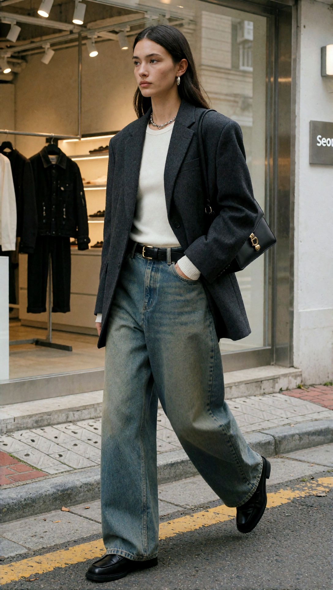
Inspect whether the outfit reads clearly before you inspect the face. In anime runs, I expected cleaner silhouette separation; in realistic runs, I looked for denim fold logic, blazer structure, footwear shape, and believable street depth.
This companion prompt pushes the same concept into anime-specific language to see whether the model responds better when the style target is explicit.
Topic: Street-style full body layered fashion anime test
Genre: Anime Key Visual
Camera: cinematic capture style
Lens: 40mm equivalent framing
Lighting: Soft daylight with cool reflected fill
Location: Tokyo street fashion block with compact storefronts and poster walls
Style: Contemporary anime fashion editorial
Final Prompt: anime key visual of a full-body street-style fashion look, oversized charcoal blazer layered over a fitted white knit top, wide-leg washed denim, black loafers, structured shoulder bag, silver accessories, clear silhouette design, crisp line confidence, balanced outfit proportions, fashion-forward Tokyo street context, poster walls and compact storefronts in the background, cool daylight, stylish walking pose, trend-led anime fashion editorial, clean color blocking, readable fabric shapes, polished composition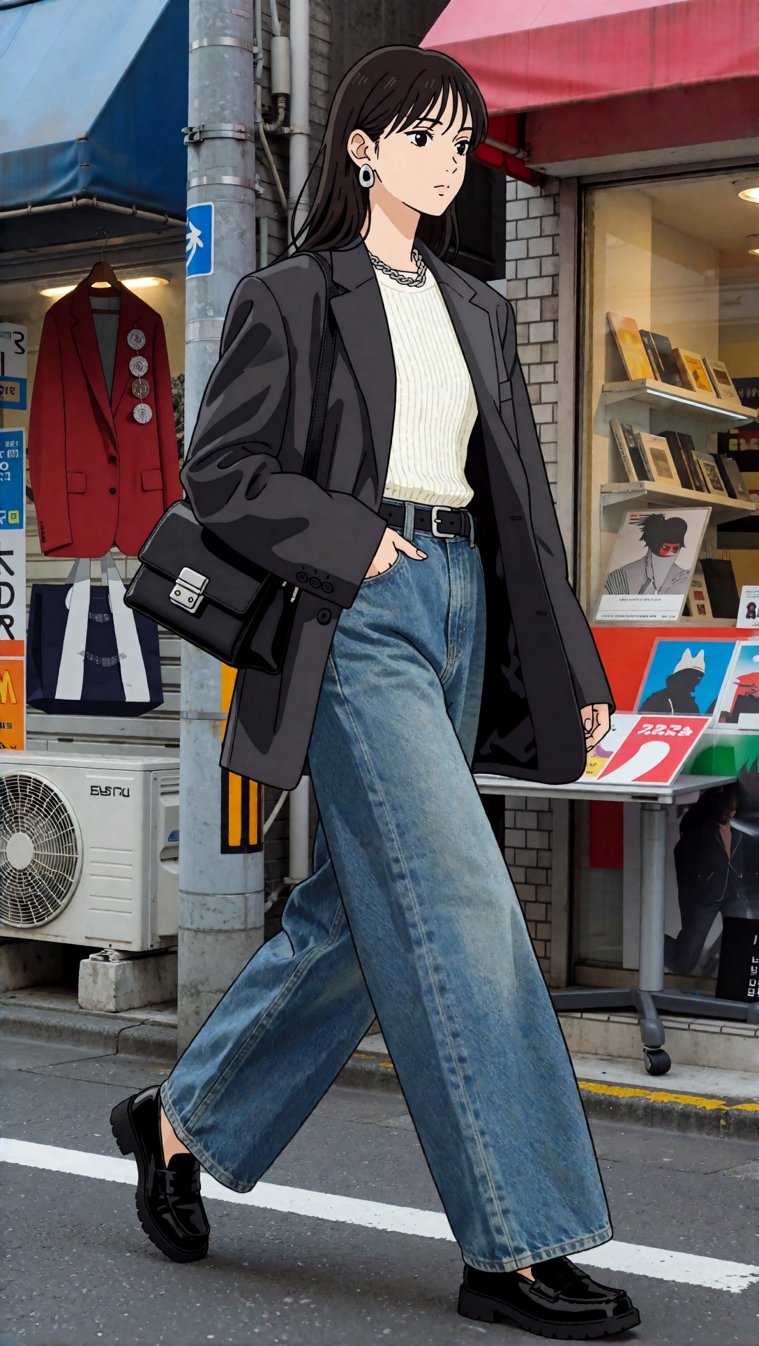
What to inspect here is style lock. If the anime checkpoint is good, the outfit should simplify into readable shapes without losing the fashion logic. If it drifts toward semi-realistic rendering, the workflow is already mixing signals.
Where the baseline breaks
The shared baseline produced usable images, but the weak points were immediate.
In anime runs
- Fine textures became noisy when I pushed realism-oriented detail language.
- Hires passes sometimes softened line art instead of improving detail.
- Accessories could merge into clothing when the prompt became too long.
- Hands improved only slightly with extra prompt pressure; they improved more from composition control.
In realistic runs
- Faces looked acceptable before outfits did.
- Shoes and bags drifted first.
- Fabric texture often turned generic unless the prompt named materials clearly.
- Background architecture became mushy when denoise was too high in a refinement pass.
That is the core lesson of ComfyUI anime workflow vs ComfyUI realistic workflow: the failure mode is not the same, so the fix cannot be the same.
First improvement: change the prompt architecture, not just the checkpoint
The first meaningful improvement came from rewriting prompts by style instead of trying to make one master prompt cover both. This is where many ComfyUI style comparison tests become misleading.
For anime, I trimmed the prompt and made every phrase carry visual structure: silhouette, palette, accessory hierarchy, and setting mood. For realistic, I added lens logic, fabric names, surface response, and environmental depth.
This next test isolates realistic prompt density. It is meant to check whether the workflow can hold textile and accessory detail without turning the face into the only finished area.
Topic: Three-quarter outfit editorial realistic refinement
Genre: Fashion Editorial
Camera: Canon EOS R5
Lens: 50mm f/1.8
Lighting: Window light with soft side fill
Location: Minimal Paris editorial loft with pale plaster walls and wood floor
Style: Clean commercial fashion look
Final Prompt: three-quarter outfit editorial photograph, full styling system visible, cropped black leather jacket over sheer gray layering top, pleated wool midi skirt, knee-high boots, slim shoulder bag, metal cuff bracelet, relaxed fashion pose near a tall loft window, soft side light shaping the leather and wool textures, Paris editorial loft background, refined neutral palette, realistic material separation, believable fabric drape, clean commercial fashion image, camera-aware perspective, polished magazine composition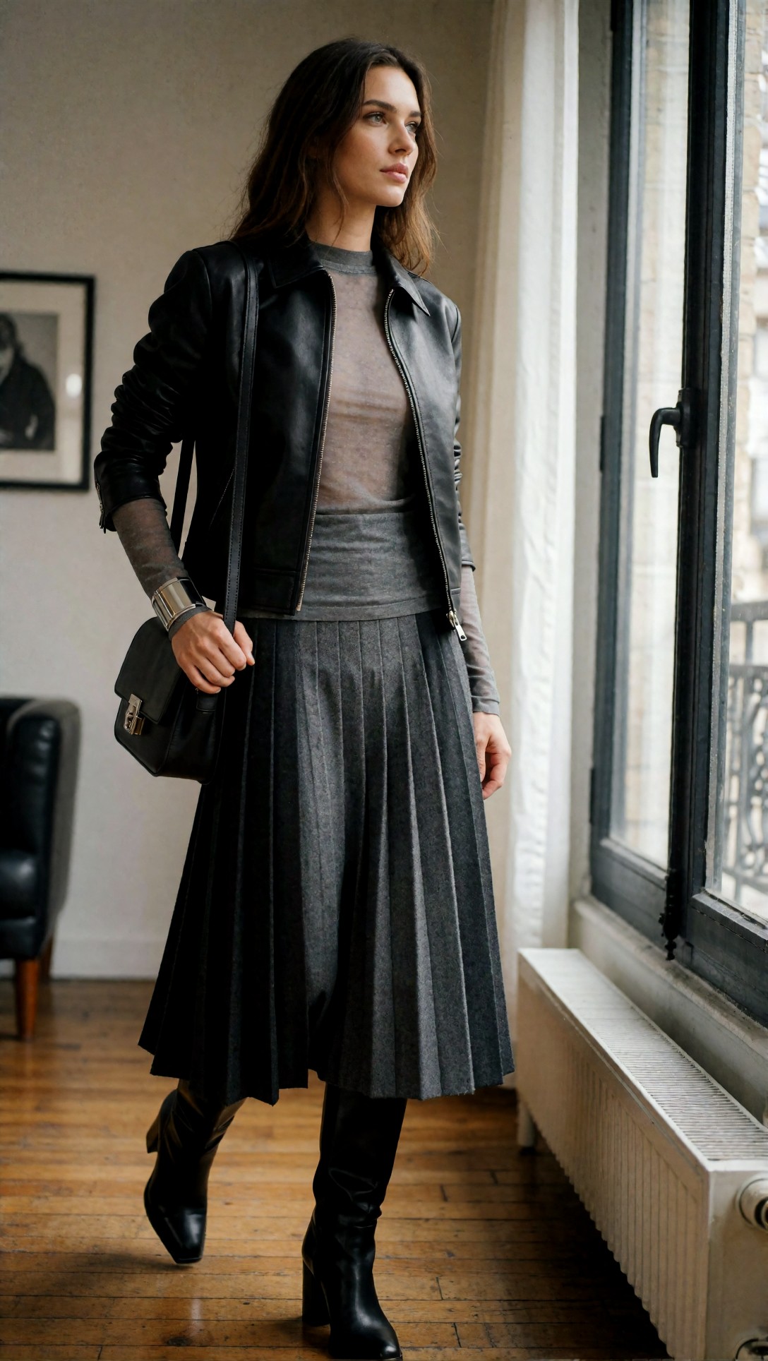
Inspect the leather, sheer top, and pleats separately. In this test, the strongest realistic results came when each material had its own visual job instead of being described as just “detailed clothing.”
This anime version tests the opposite principle: less material obsession, more silhouette clarity and graphic hierarchy.
Topic: Three-quarter outfit editorial anime refinement
Genre: Fashion Editorial
Camera: cinematic anime capture style
Lens: 50mm equivalent framing
Lighting: Diffused interior daylight
Location: Minimal Seoul studio loft with editorial set styling
Style: Korean magazine-inspired anime fashion art
Final Prompt: three-quarter outfit fashion editorial in anime style, cropped black leather jacket layered over a translucent gray top, pleated midi skirt, knee-high boots, slim shoulder bag, metal cuff bracelet, poised editorial stance in a minimal Seoul studio loft, diffused daylight, clear garment layering, elegant silhouette emphasis, Korean magazine-inspired anime fashion art direction, controlled neutral palette, crisp outfit readability, balanced composition, polished fashion illustration finish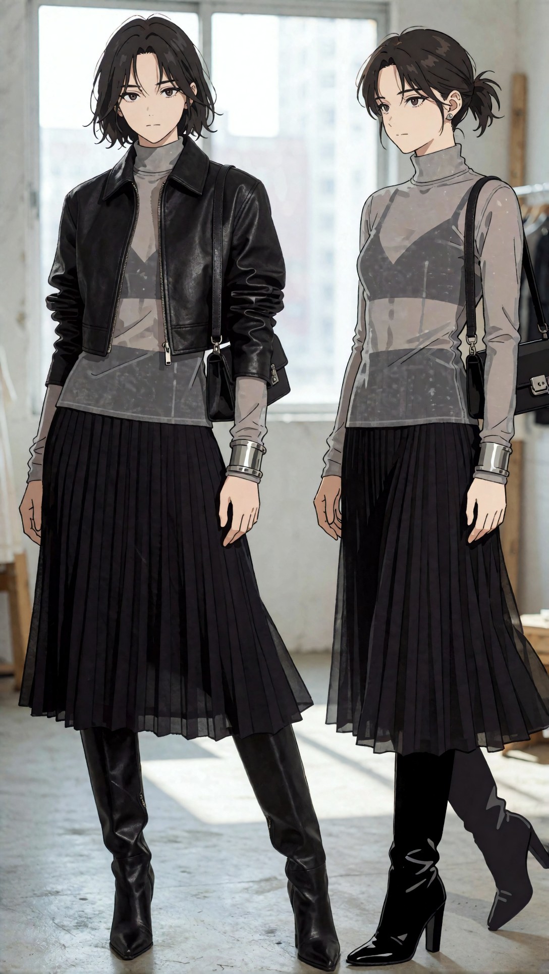
What to inspect is whether the layering remains legible without over-rendering. If the output gets muddy around the jacket and top overlap, the workflow is carrying too much realism pressure into an anime target.
The workflow changes that mattered most
Once the prompt architecture was split correctly, the workflow differences became easier to measure.
1. Checkpoint and VAE pairing
This sounds obvious, but it was the highest-impact variable. Anime checkpoints tolerated bold styling language and compressed background detail better. Realistic checkpoints punished weak VAE or weak decode quality more visibly, especially in skin transitions and fabric edges.
If you are comparing ComfyUI realistic workflow and ComfyUI anime workflow, start by treating the checkpoint as the style engine and the rest of the graph as support.
2. Sampler behavior by style
Anime outputs often looked cleaner with samplers that preserved shape decisiveness early. Realistic outputs needed a sampler behavior that did not overcook micro-contrast or sharpen skin unnaturally.
In practice, what I would change next in any mixed-style graph is to save separate sampler presets instead of separate full workflows. That keeps the graph manageable while acknowledging that style-sensitive sampling matters.
3. CFG is not a universal quality slider
In this test, pushing CFG too high was one of the fastest ways to make both styles worse.
- In anime, high CFG made fabric motifs and accessories over-assertive and sometimes distorted body balance.
- In realistic, high CFG made skin waxy, hands tense, and backgrounds artificially “staged.”
4. Refinement passes help realism more than anime
A second pass, latent upscale, or controlled denoise refinement was more valuable for realistic fashion outputs. It recovered bag hardware, shoe seams, knit texture, and facial asymmetry more often.
Anime did not scale the same way. Extra passes could improve polish, but they also introduced edge softness or hybrid rendering. When this setup works for anime, it usually works because the first pass already nailed the style.
A refined realistic workflow prompt
This prompt tests a realistic setup after separating prompt structure and giving the model stronger environmental and optical cues.
Topic: Head-to-toe lookbook realistic workflow test
Genre: Lookbook Photography
Camera: Nikon Z8
Lens: 40mm f/2
Lighting: Softbox key with gentle floor bounce
Location: Scandinavian minimalist retail studio with warm concrete and pale oak fixtures
Style: Premium retail campaign
Final Prompt: head-to-toe lookbook fashion photograph, complete outfit fully visible, long camel wool coat over fine black turtleneck, straight charcoal trousers, dark brown leather ankle boots, structured tote bag, layered gold accessories, standing in a Scandinavian minimalist retail studio with pale oak fixtures and warm concrete textures, softbox key light with subtle floor bounce, premium retail campaign style, realistic garment fit, wool texture, leather detail, clean body proportions, centered composition, calm luxury palette, high clarity fashion image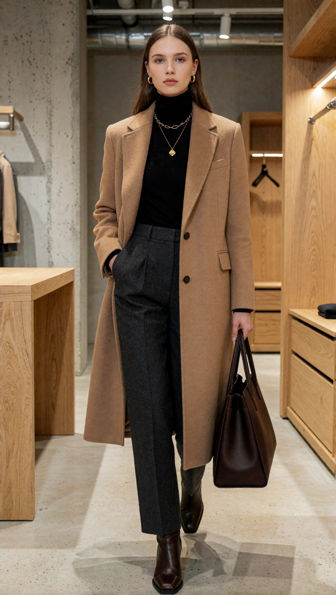
Inspect the coat hem, trouser break, and boot shape before judging the image as a success. In realistic workflows, those lower-frame details often reveal whether the graph truly understands fashion structure or is only producing a convincing upper body.
A refined anime workflow prompt
This prompt is designed to test style lock after reducing prompt clutter and emphasizing shape-first fashion storytelling.
Topic: Head-to-toe lookbook anime workflow test
Genre: Fashion Lookbook Illustration
Camera: stylized editorial capture
Lens: 35mm equivalent framing
Lighting: Bright studio diffusion
Location: Minimal concept retail set with graphic display panels
Style: Contemporary anime lookbook design
Final Prompt: head-to-toe anime fashion lookbook image, long camel coat over fitted black turtleneck, straight charcoal trousers, dark brown ankle boots, structured tote, layered gold accessories, full outfit centered and clearly visible, minimal concept retail set with graphic display panels, bright studio diffusion, contemporary anime lookbook design, elegant silhouette focus, clear coat shape, readable layering, polished color harmony, clean background separation, fashion-forward composition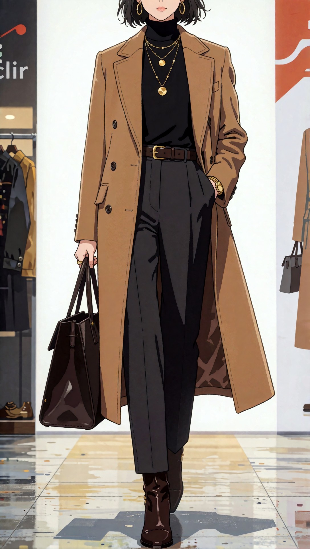
The image should feel intentional and graphic, not just like a realistic prompt filtered into anime. Check whether the coat and boots remain distinct and whether the tote reads as its own accessory rather than a fused shape.
Likely failure points in ComfyUI style comparison
This is where most side-by-side tests become useful. The weak point is rarely “quality” in general. It is usually one visible failure cluster.
Anime workflow failure risks
Style bleed from realistic language
Words like pores, photoreal, ultra-detailed skin, cinematic bokeh, and studio realism can drag anime checkpoints into awkward hybrid territory.
Over-refinement
If your latent upscale or denoise pass is tuned for realism, anime line confidence can melt. The strongest anime result was often the cleaner first-pass image, not the most processed one.
Busy prompts
Anime checkpoints often handled fashion styling better when I reduced descriptive redundancy. Too many clothing synonyms and environment qualifiers increased confusion instead of control.
This prompt intentionally stresses anime background consistency in a retail display scene.
Topic: Storefront display anime consistency check
Genre: Retail Editorial
Camera: stylized commercial capture
Lens: 24-70mm documentary framing at 35mm
Lighting: Evening window glow with soft interior practicals
Location: Harajuku concept storefront with glass display and layered product styling
Style: Trend-led anime retail campaign
Final Prompt: anime retail editorial scene, storefront display with a complete styled outfit on a fashion model, cropped puffer jacket, striped knit layer, mini skirt over tights, platform shoes, crossbody bag, visible accessories and display props, Harajuku concept storefront with glass reflections and layered product styling, evening window glow with soft interior practical lights, trend-led anime retail campaign, clean outfit visibility, strong color blocking, readable retail depth, polished commercial composition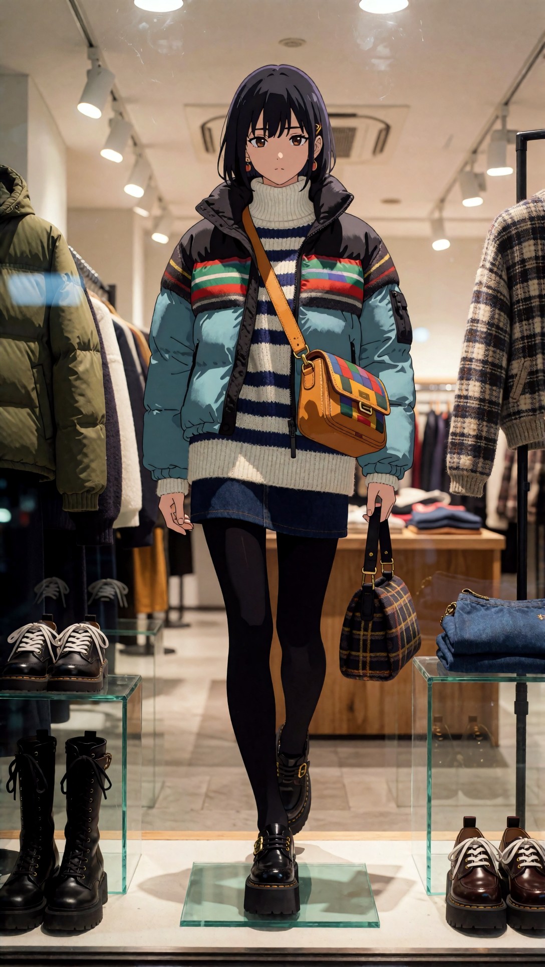
Inspect the reflections and product hierarchy. In weaker anime workflows, glass, display objects, and the outfit often compete for attention and flatten into one visual layer.
Realistic workflow failure risks
Plastic skin and dead fabric
Realistic models can produce a good face while failing the clothing. If knitwear, denim, leather, and metal all reflect light the same way, the workflow is not resolving materials well.
Hands and accessories drift
Bags, jewelry, sunglasses, belts, and fingers are where realism gets exposed. Anime can stylize around errors; realistic fashion images cannot.
Composition collapse in upscale passes
When denoise is too high in a second stage, realistic images gain texture but lose pose integrity or background continuity.
This prompt tests realistic accessory integrity, which is where many setups fail first.
Topic: Accessories close-up realistic detail check
Genre: Luxury Campaign
Camera: Sony A1
Lens: 85mm f/1.8
Lighting: Studio strip light with soft frontal fill
Location: Neutral luxury set with brushed metal pedestal
Style: High-end accessories advertising
Final Prompt: accessories close-up fashion campaign image, cropped frame focused on structured black leather handbag, gold chain bracelet, square sunglasses, tailored coat sleeve, fine knit cuff, clean hand placement, brushed metal pedestal in a neutral luxury set, studio strip light with soft frontal fill, high-end accessories advertising style, realistic leather grain, polished metal reflections, accurate stitching, elegant composition, restrained black, gold, and gray palette, premium commercial detail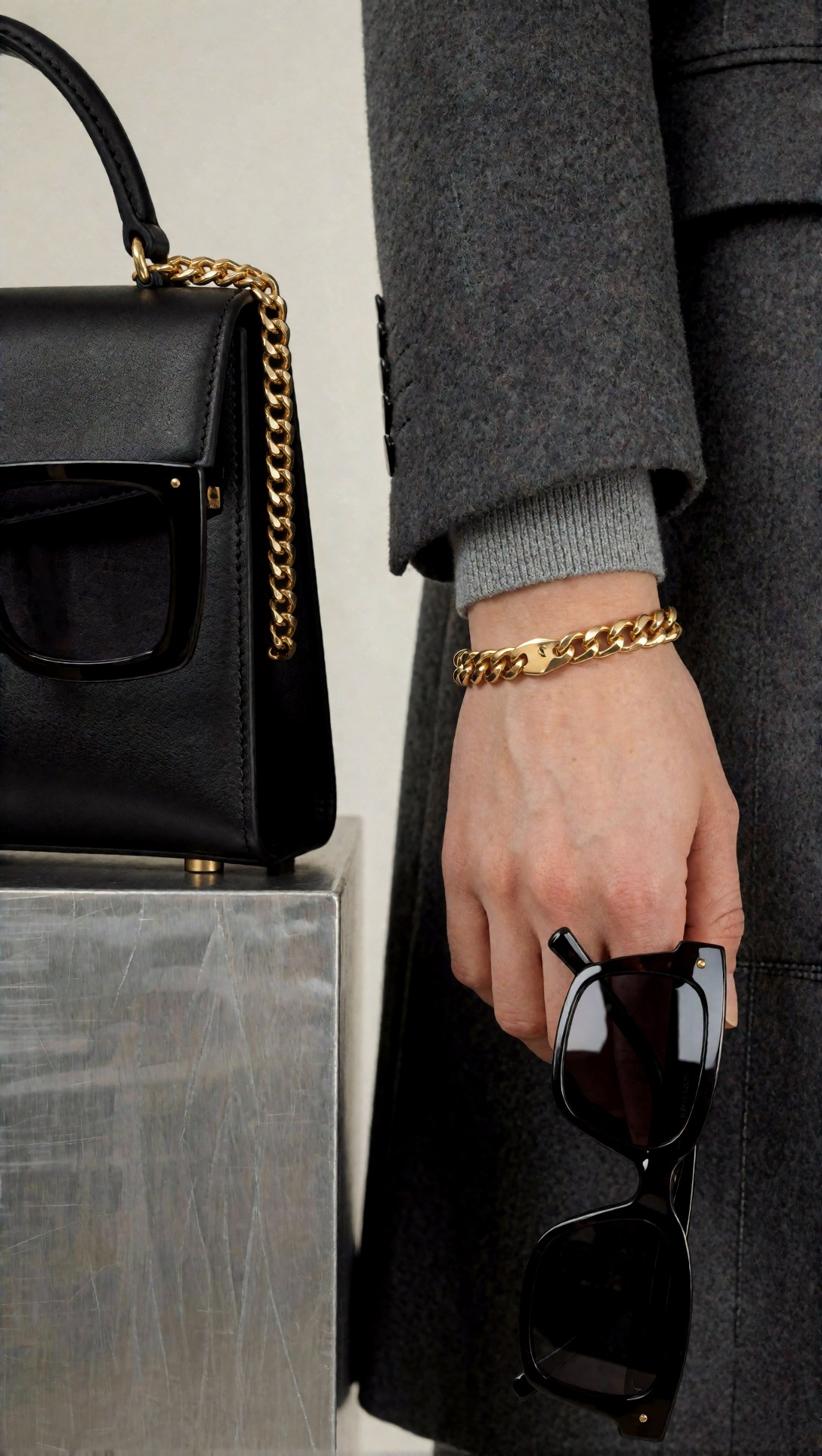
What to inspect is finger structure, stitch quality, and reflection behavior. If the metal, leather, and knit all look equally soft, your realistic workflow needs better refinement discipline rather than more prompt adjectives.
Reusable prompt pattern by style
A reusable pattern helped more than a giant universal template.
For anime
Use this when you want strong style lock, visible silhouette, and clean editorial fashion logic:
- Shot type
- Outfit hierarchy
- Silhouette
- Key accessories
- Setting identity
- Palette
- Mood
- Composition cue
- Anime style direction
This prompt tests that pattern in a runway/backstage setup, where anime models often excel because the visual hierarchy is strong.
Topic: Runway backstage moment anime style lock
Genre: Anime Key Visual
Camera: cinematic backstage capture
Lens: 35mm equivalent framing
Lighting: Mixed backstage practical light with cool overhead diffusion
Location: Milan runway backstage with garment racks and styling stations
Style: Fashion-week anime editorial
Final Prompt: anime key visual of a runway backstage moment, complete outfit visible with tailored silver jacket, black mesh inner layer, tapered trousers, pointed boots, slim belt bag, ear cuff accessories, fashion-week styling logic clearly shown, Milan runway backstage with garment racks, mirrors, and styling stations, cool overhead diffusion mixed with practical backstage lights, poised pre-show stance, energetic but controlled composition, fashion-week anime editorial style, clean silhouette separation, metallic fabric readability, trend-led palette of silver, black, and smoke blue
Check whether the background supports the outfit instead of stealing focus. In strong anime outputs, racks and mirrors become graphic context; in weak ones, they turn into clutter.
For realistic
Use this when you need believable textiles, retail or editorial environment depth, and stronger object coherence:
- Shot type
- Garment materials
- Layering logic
- Pose and framing
- Camera and lens cue
- Lighting direction
- Real location texture
- Commercial or editorial finish
This prompt is meant to test realistic workflow control in a campaign-style street scene.
Topic: Street-style full body realistic campaign control
Genre: Fashion Campaign
Camera: Fujifilm GFX100S
Lens: 45mm f/2.8
Lighting: Late afternoon side light
Location: New York sidewalk outside a modern gallery facade
Style: Cinematic realism fashion campaign
Final Prompt: street-style full body fashion campaign image, complete outfit visible, long navy trench layered over striped shirt and soft gray hoodie, straight cream trousers, polished black derby shoes, large leather tote, sunglasses, visible garment layering and silhouette logic, walking past a modern New York gallery facade, late afternoon side light creating controlled shadow shape, cinematic realism fashion campaign, believable fabric weight, clean stride, accurate bag structure, subtle city reflections, sophisticated navy, cream, and steel-gray palette, high-end editorial composition
Inspect the tote shape during motion, the trouser drape, and the trench edges. Those details show whether the realistic workflow is structurally stable or only cosmetically sharp.
Practical recommendations: what to change in your setup
If you already have a working graph, do not rebuild everything at once. In this test, the most efficient path was to keep the backbone and split the style-sensitive controls.
Best setup adjustments for anime
- Save a separate anime prompt template with shorter, silhouette-first language.
- Use fewer realism-weighted descriptors.
- Keep refinement passes lighter.
- Prioritize composition and shape over micro-texture.
- If needed, use [Prompt Lab](/promptlab) to shorten bloated prompts before testing style lock.
Best setup adjustments for realistic
- Add stronger camera, lens, material, and light cues.
- Reserve a second-stage pass for face, fabric, and accessories.
- Watch denoise carefully in hires or upscale nodes.
- Evaluate lower-frame details, not just face quality.
- Use [Upscaler](/upscaler) or a dedicated detail pass when the first image is compositionally strong but material detail is weak.
Best use case for each workflow
- Anime workflow: concept art, stylized fashion editorials, lookbook illustrations, retail campaign visuals where bold styling and clean shape matter more than physical realism.
- Realistic workflow: product-forward fashion images, commercial lookbooks, campaign mockups, accessory tests, and any output where believable materials and anatomy matter.
If you want to compare outputs visually, keeping test generations organized in a [Gallery](/gallery) view helps a lot. For building custom graphs around these splits, [Create](/create) is the natural place to stage multiple style presets.
Prompt examples recap in production contexts
To keep this comparison grounded, the prompts above covered these production contexts:
1. Street-style full body baseline realistic 2. Street-style full body baseline anime 3. Three-quarter outfit editorial realistic 4. Three-quarter outfit editorial anime 5. Head-to-toe lookbook realistic 6. Head-to-toe lookbook anime 7. Storefront display anime 8. Accessories close-up realistic 9. Runway backstage anime 10. Street-style full body realistic campaign
The main pattern across all of them was consistent: anime prompts worked best when they read like a style brief; realistic prompts worked best when they read like a shot brief.
Strengths and limitations of each approach
Where anime workflows were stronger
- Faster style cohesion
- Cleaner outfit readability from simpler prompts
- Better tolerance for graphic backgrounds
- More forgiving of minor anatomy imperfections in editorial contexts
Where realistic workflows were stronger
- Better material separation
- More believable accessories and retail scenes when tuned well
- Stronger lower-body garment logic
- Better value for upscale and refinement steps
Limitations to keep in mind
- Anime workflows can fake detail elegantly, but that does not mean they are better for product-accurate fashion.
- Realistic workflows can appear high quality at first glance while still failing on hands, shoes, seams, or bag geometry.
- A single “best” ComfyUI style workflow is unrealistic if you switch often between anime and realistic jobs.
FAQ
What is the main difference in a ComfyUI workflow anime vs realistic setup?
The main difference is not just the checkpoint. Anime setups usually need tighter style-focused prompts and lighter refinement, while realistic setups need more camera, lighting, material, and detail-recovery control.
Can I use one ComfyUI workflow for anime and realistic images?
Yes, but only if you split style-sensitive settings such as prompt template, sampler preset, CFG behavior, and refinement strategy. A single graph can work; a single unchanged setup usually does not.
What sampler settings are best for ComfyUI anime workflow?
There is no single best preset, but anime generally benefits from settings that preserve shape clarity and avoid over-processing. The important part is testing whether the image keeps line confidence and clean silhouette separation.
Why do realistic images fail more often on clothing and accessories?
Because realism asks the model to solve more physical constraints at once: material response, stitching, reflections, anatomy, perspective, and background depth. Faces often look good before the outfit does.
Should I upscale anime and realistic images the same way?
Usually no. Realistic outputs often benefit more from a careful second-stage detail pass. Anime images can lose style identity if upscaling or denoise is too aggressive.
Conclusion
If your goal is a direct answer to ComfyUI workflow anime vs realistic, here it is: keep the backbone, split the style logic. Anime should use shorter, silhouette-driven prompts and lighter refinement. Realistic should use more descriptive shot language, stronger material cues, and more controlled detail recovery.
Who should use the anime-leaning workflow? Anyone making stylized editorials, concept fashion visuals, or fast style exploration.
Who should use the realistic workflow? Anyone who needs believable garments, accessories, retail scenes, and commercial-grade image structure.
Who should avoid forcing one setup across both? Anyone frustrated that anime looks muddy after upscaling or that realistic images look pretty until you zoom into the shoes, hands, or bag.
The single detail that mattered most in this test was prompt role clarity: anime prompts should describe visual design; realistic prompts should describe how the image is physically captured. Once that changed, the rest of the workflow made a lot more sense.