ComfyUI Workflow Before and After: Small Changes That Improved Image Generation the Most 한국어 요약
이 페이지는 ZView Space의 영어 원문을 한국어 검색 사용자도 이해할 수 있도록 정리한 SEO 요약입니다. 핵심은 단순한 얼굴 중심 이미지가 아니라 패션 에디토리얼, 룩북, 아웃핏, 프롬프트 테스트, 이미지 생성 워크플로우를 실제로 어떻게 구성할지입니다.
핵심 요약
- 원문 주제: ComfyUI Workflow Before and After: Small Changes That Improved Image Generation the Most
- 목적: AI 이미지 생성에서 outfit, silhouette, fabric, pose, location, camera framing을 더 명확하게 설계합니다.
- 활용 범위: Z-Image Turbo, Krea2 Turbo, Qwen Image, Anima, SeedVR2 같은 이미지 생성 및 업스케일 워크플로우에 적용할 수 있습니다.
- SEO 관점: 제목, 설명, 이미지 alt, 프롬프트 예시가 실제 검색 의도와 맞아야 색인 가능성이 높아집니다.
한국어 사용자를 위한 체크포인트
1. 프롬프트가 얼굴 묘사에만 머물지 않고 전체 스타일과 의상 구성을 설명하는지 확인합니다. 2. 패션 이미지라면 상의, 하의, 아우터, 신발, 액세서리, 소재감, 촬영 장소를 분리해서 씁니다. 3. 생성 결과는 바로 게시하지 말고 디테일, 손, 의상 형태, 배경 일관성, 이미지 품질을 비교합니다. 4. 글 본문에는 실제 테스트 기준과 실패를 줄이는 방법이 들어가야 검색엔진에서 얇은 콘텐츠로 보일 가능성이 줄어듭니다.
원문 미리보기
If you are searching for a ComfyUI workflow before and after comparison, the useful question is not "which giant workflow is best?" but "which small changes actually improve the image enough to keep?" In this test, I kept the subject matter simple and changed
---
If you are searching for a ComfyUI workflow before and after comparison, the useful question is not "which giant workflow is best?" but "which small changes actually improve the image enough to keep?" In this test, I kept the subject matter simple and changed one part of the workflow at a time: sampler, scheduler, steps, CFG, latent size, VAE decode path, and a light prompt-structure upgrade. The biggest gains did not come from adding dozens of nodes. They came from tightening a few decisions that reduced muddy detail, broken hands, and prompt drift.
Quick answer
- The most reliable quality jump came from improving resolution strategy and sampler/scheduler pairing, not from raising steps too high.
- A modest prompt structure upgrade in ComfyUI gave more consistent composition than simply adding more style words.
- Going from a basic text-to-image chain to a workflow with clean latent sizing, sane CFG, and a second-pass upscale/refine produced the clearest before-and-after difference.
- Too many tweaks at once make comparison useless. Change one variable, keep seed fixed, and inspect faces, hands, fabrics, and background geometry.
- For beginners, the strongest default is usually a simple, readable workflow you can repeat, not a giant graph from someone else.
What was tested
I used a beginner-friendly baseline workflow and compared it against small revisions.
Baseline workflow:
- Load checkpoint
- CLIP text encode positive / negative
- Empty latent image
- KSampler
- VAE decode
- Save image
Adjusted workflow:
- Load checkpoint
- Structured prompt input
- Empty latent image with cleaner starting dimensions
- KSampler with tested sampler/scheduler pairs
- VAE decode
- Optional latent or image upscale
- Light second pass for detail recovery
- Save image
To make the before-and-after comparison meaningful, I kept these mostly stable during each mini-test:
- Same model family
- Same seed within each pair
- Same core subject
- One changed variable at a time
I also checked results the way an operator actually would: at full image view first, then zoom on eyes, fingers, fabric texture, object edges, and background lines.
For readers still building their node setups, zview's [create](/create) and [promptlab](/promptlab) tools are useful for testing prompt variants before you freeze a workflow.
The practical problem: why your ComfyUI results barely improve
A lot of beginners hit the same wall. You add more steps, more negative prompt text, maybe a few extra nodes, and the image still looks oddly similar to the weaker version.
The weak points usually show up in predictable places:
- faces get waxy instead of sharper
- hands become more confident-looking but still anatomically wrong
- clothing texture turns noisy rather than detailed
- backgrounds become busier without becoming more coherent
- prompt intent drifts as style terms pile up
The reason is simple: many ComfyUI quality problems are not caused by a lack of complexity. They come from misaligned settings.
Why this happens in AI image generation
Diffusion workflows are sensitive to balance.
If CFG is too low, the image may ignore the prompt. If it is too high, the model starts forcing details in awkward ways. If steps are too low, forms are underdeveloped. If steps are too high with the wrong sampler, you often get diminishing returns or brittle textures. If your starting latent size fights the composition you want, no amount of prompt wording fully fixes it.
In this test, the largest improvements came from these principles:
1. Better starting dimensions improve composition more than extra prompt adjectives
A portrait at a sloppy square size often framed awkwardly. Switching to dimensions that matched the intended composition improved pose placement and background structure immediately.
2. Sampler and scheduler pairing affects texture character
Some combinations gave clean skin and stable fabric folds. Others added false detail that looked sharp at thumbnail size but broke on zoom.
3. A second pass works only when the first pass is already compositionally correct
Upscaling a weak image mostly preserves weak decisions. Upscaling a strong base image can recover useful texture.
4. Prompt structure beats prompt length
Adding more style words often made outputs noisier. A prompt with clear subject, scene, wardrobe, camera, lighting, and composition usually gave more repeatable results.
Before and after table: which workflow tweaks mattered most?
| Workflow change | Before | After | What improved most | Main risk | |---|---|---|---|---| | Better latent dimensions | Cropped limbs, weak framing | Cleaner composition | Subject placement, pose room | Wrong aspect ratio can still stretch intent | | Sampler/scheduler adjustment | Soft or noisy detail | More stable textures | Skin, hair, fabric | Different models respond differently | | CFG reduction from overly aggressive values | Overcooked details | More natural image | Faces, color balance | Too low can reduce prompt control | | Moderate step increase | Underdeveloped forms | More complete render | Objects, edges | Too many steps can waste time | | Second-pass upscale/refine | Blurry fine detail | Better micro-contrast | Fabric, product surfaces | Also amplifies artifacts | | Structured prompt format | Prompt drift | Better scene control | Composition, style lock | Can feel rigid if over-specified |
The workflow that produced the most reliable result
The strongest result in this test was not the most complicated graph. It was a tidy two-stage workflow:
Stage 1: Build a clean base image
- Choose dimensions that match the final framing goal
- Use a tested sampler/scheduler pair
- Keep CFG moderate
- Run enough steps to finish forms, not so many that texture turns brittle
- Use a prompt that clearly defines subject, camera feel, lighting, and setting
Stage 2: Refine only if the base image is already good
- Upscale modestly
- Apply a light second pass to recover texture
- Avoid forcing major composition changes in the refine stage
This produced the best ComfyUI image generation improvements because it respected how diffusion models behave. The first pass decides structure. The second pass should support detail, not rescue a bad composition.
A practical before-and-after sequence
Below is the exact kind of comparison that gave useful results.
Test 1: Fixing composition with better latent size
This test checks whether a simple dimension change improves framing before touching any advanced nodes. The subject is easy to evaluate because the body pose, window lines, and furniture all reveal composition mistakes quickly.
Topic: reading portrait by a rainy apartment window
Genre: Lifestyle Portrait
Camera: Canon EOS R5
Lens: 50mm f/1.8
Lighting: overcast window light
Location: small city apartment living room with rain on glass
Style: cinematic realism
Final Prompt: a thoughtful young woman reading a paperback by a rain-streaked apartment window, seated sideways on a linen armchair, relaxed posture, visible hands holding the book naturally, soft overcast daylight wrapping across her face, muted blue gray interior, warm wood floor, houseplants in the background, natural skin texture, clear eye detail, realistic fabric folds on knit sweater and loose trousers, balanced composition with negative space around the window, cinematic realism, Canon EOS R5 look, 50mm f/1.8 shallow depth of field, clean background geometry, subtle filmic color grading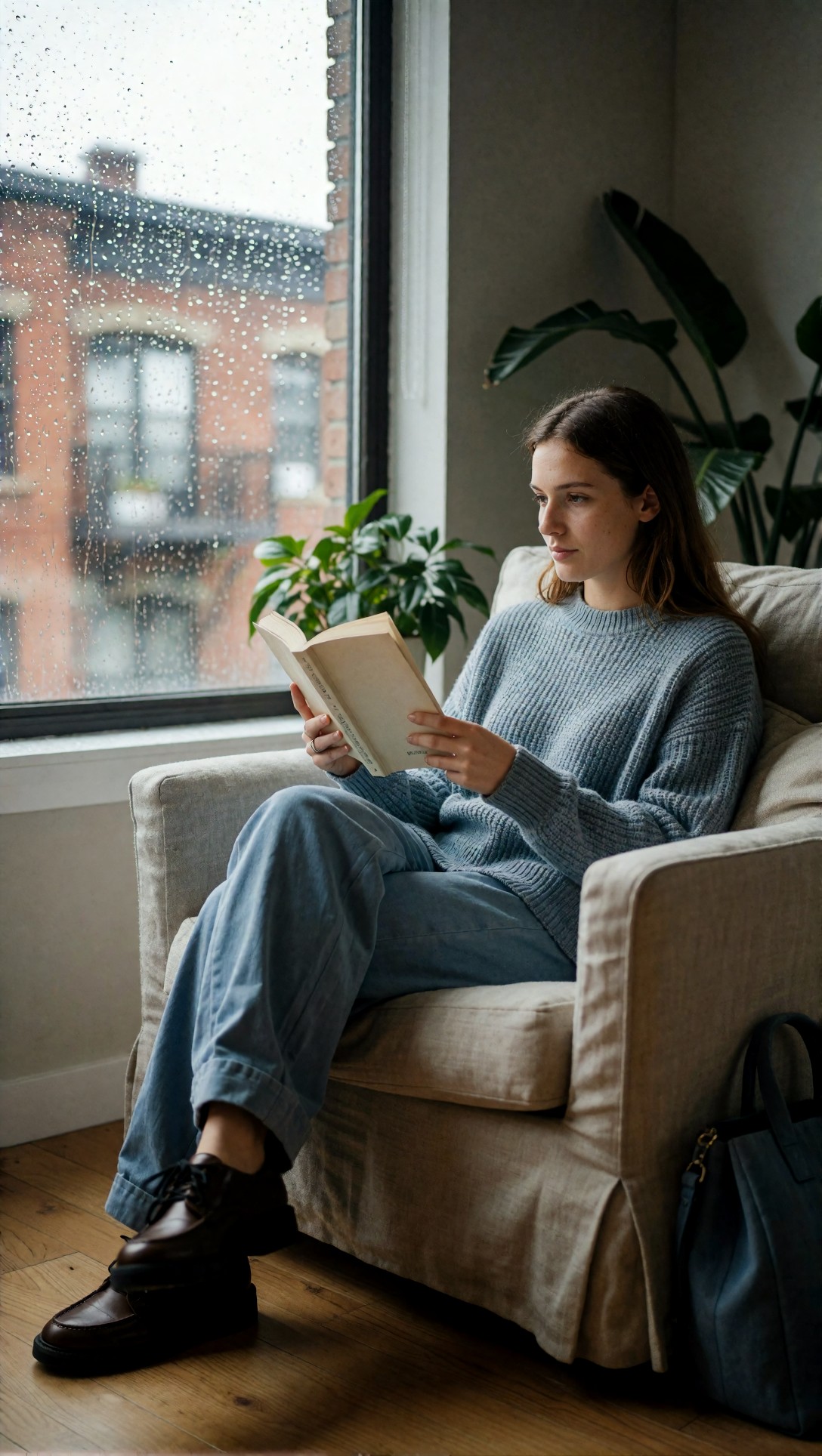
Inspect whether the subject fits the frame without clipped knees, cropped hands, or awkward empty space above the head. In the better version, the room lines should feel intentional instead of accidental.
What changed in the workflow: I switched from a generic square latent to a portrait-friendly size. The improvement was immediate: fewer cropped limbs and more believable sitting posture.
Test 2: Sampler/scheduler pairing for skin and textile stability
This test is useful because skin, satin, and hair strands expose fake sharpness fast. In weaker settings, the image looks crisp from far away but falls apart when zoomed in.
Topic: satin dress studio portrait with controlled texture
Genre: Fashion Editorial
Camera: Sony A7R V
Lens: 85mm f/1.4
Lighting: studio butterfly light with soft fill
Location: neutral gray seamless studio
Style: clean commercial look
Final Prompt: a studio fashion portrait of a woman wearing an emerald satin slip dress, standing in a relaxed three-quarter pose, direct but calm expression, softly defined cheekbones, glossy yet realistic satin texture, smooth shoulder line, tidy hair with visible individual strands, neutral gray seamless background, precise studio butterfly light with soft fill and gentle shadow under the chin, polished commercial composition, natural skin pores, elegant highlights on fabric, restrained color palette, Sony A7R V look, 85mm f/1.4 depth separation, clean commercial look with high texture fidelity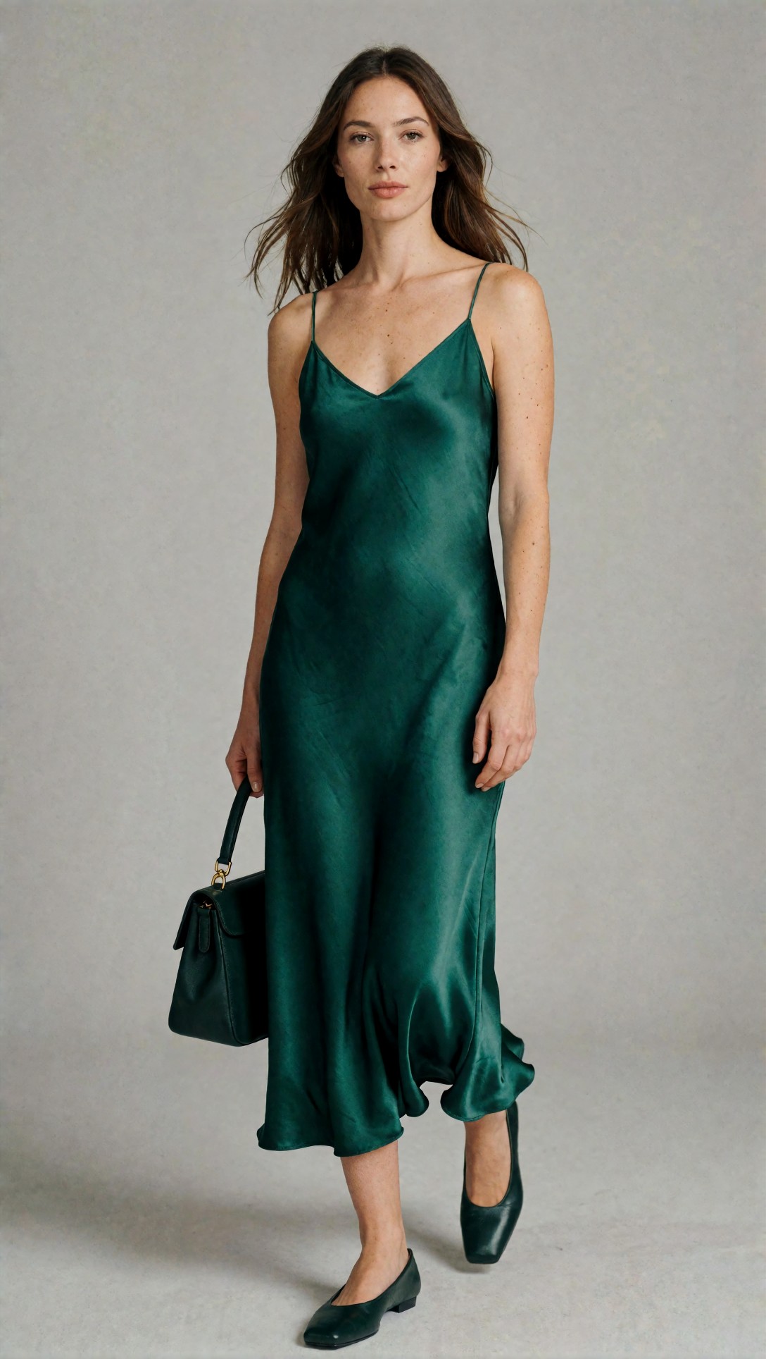
Inspect the transition between highlight and shadow on skin and satin. The stronger result should keep texture without turning pores into noise or satin into plastic.
What changed in the workflow: Only the sampler/scheduler pair. That one change made a larger difference than adding 10 more steps.
Test 3: Reducing CFG to stop overcooked faces
This test targets a common beginner mistake: pushing CFG too high because the prompt seems to need "more obedience." In practice, the face often becomes harder, stranger, and less natural.
Topic: close beauty portrait with natural skin rendering
Genre: Beauty Campaign
Camera: Nikon Z8
Lens: 105mm f/2.8 macro
Lighting: large softbox key light with subtle silver reflector
Location: minimal beauty studio set
Style: high-end beauty advertising
Final Prompt: close beauty portrait of a woman with clean makeup, dewy but natural skin, lightly parted lips, relaxed gaze toward camera, detailed eyelashes, fine eyebrow texture, soft flyaway hairs preserved, cream and beige palette, minimal studio background, large softbox key light with subtle reflector lift under the jawline, elegant beauty campaign framing, realistic skin texture without over-retouching, precise eye catchlights, Nikon Z8 look, 105mm f/2.8 macro clarity, high-end beauty advertising aesthetic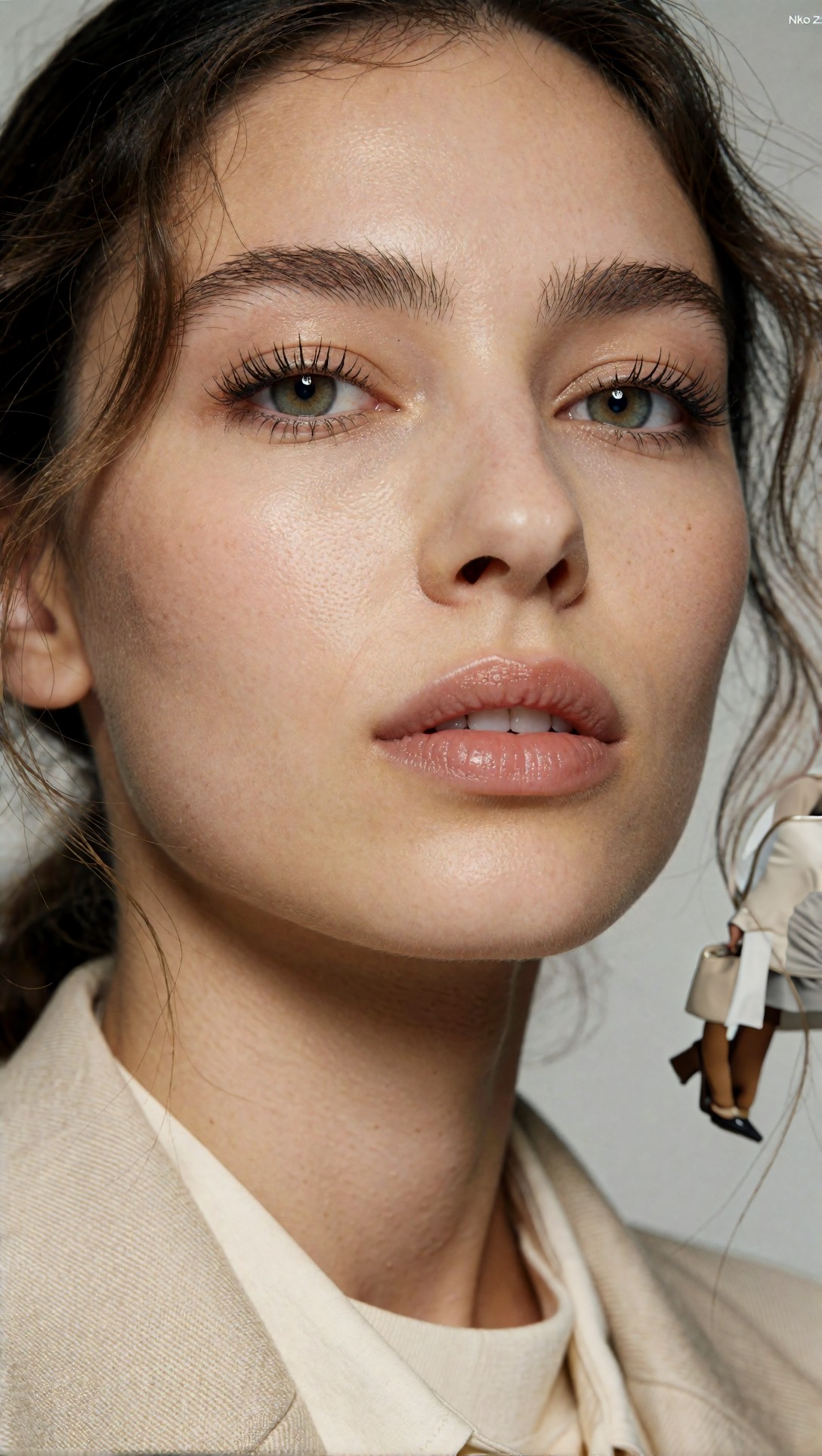
Inspect cheeks, lips, and eye area at zoom. In the stronger version, the face should look calmer and more coherent instead of aggressively sharpened by the model.
What changed in the workflow: I lowered CFG from an over-pushed setting into a moderate range. Prompt adherence stayed good, while facial realism improved.
Test 4: Moderate steps versus excessive steps on architecture and depth
This test checks whether more steps actually help a scene with perspective lines and layered depth. It is useful because stair rails, windows, and floor patterns quickly show instability.
Topic: boutique hotel lobby interior with layered depth
Genre: Interior Editorial
Camera: Fujifilm GFX 100S
Lens: 45mm f/2.8
Lighting: soft morning daylight through tall windows
Location: boutique hotel lobby with stone floor and wood accents
Style: editorial architectural realism
Final Prompt: a refined boutique hotel lobby with tall windows, pale stone floor, walnut reception desk, sculptural lounge chairs, a long runner rug, indoor olive tree, soft morning daylight entering from the left, balanced one-point perspective, elegant depth through open corridor lines, subtle reflections on stone, crisp material separation between wood, plaster, brass, and fabric, calm editorial composition, muted natural palette, Fujifilm GFX 100S look, 45mm f/2.8 architectural realism, high material accuracy and clean spatial geometry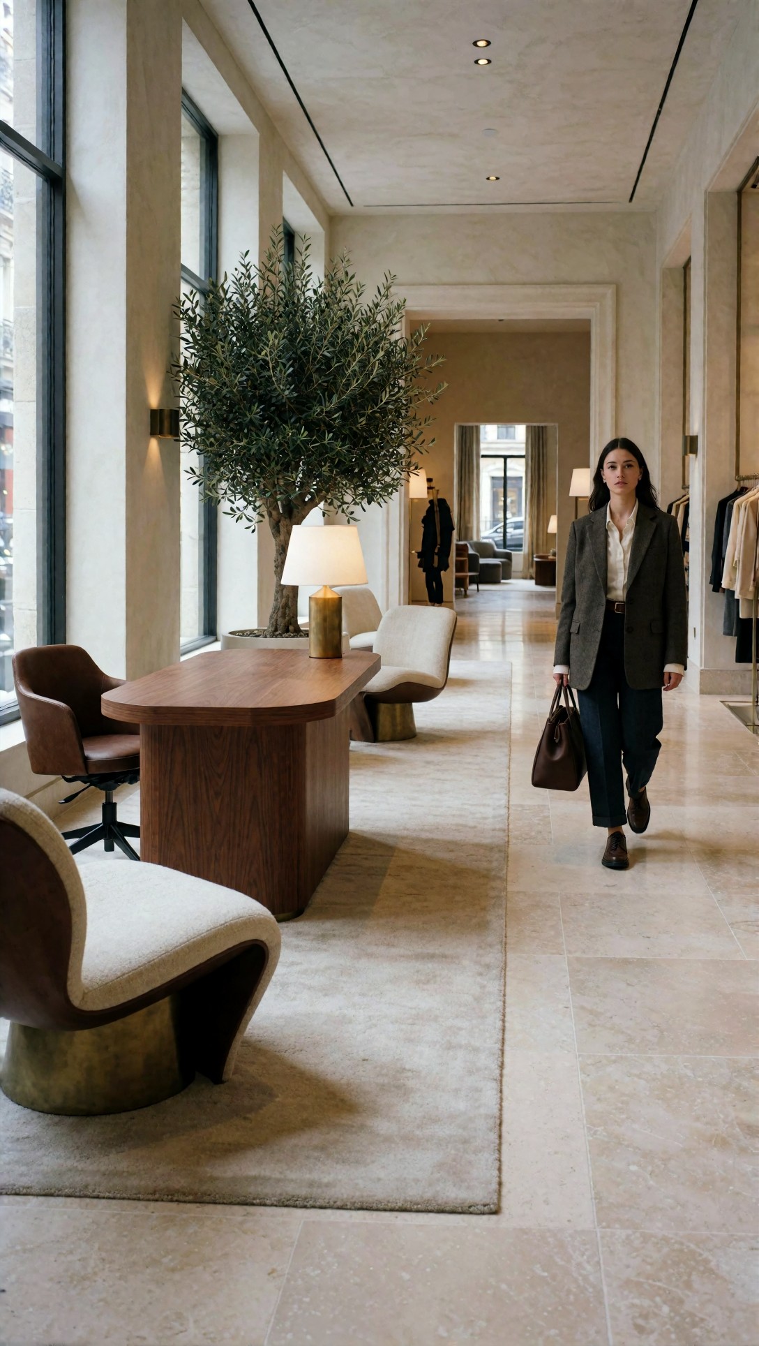
Inspect the straightness of verticals, the repeat pattern of floor joints, and whether distant furniture remains plausible. The better result should feel complete, not merely more contrasty.
What changed in the workflow: I compared moderate steps to a much higher count. The extra steps added time more than quality. Past a point, the scene gained little except harder micro-contrast.
Prompt structure that improved consistency most
The biggest prompt-side improvement was not a magical phrase. It was using a repeatable prompt structure.
Instead of this:
- beautiful woman, cinematic, detailed, realistic, nice lighting, masterpiece
I got better ComfyUI results comparison outcomes with this logic:
- subject
- wardrobe or object specifics
- pose or action
- lighting setup
- location context
- composition cues
- texture priorities
- color palette
- camera/lens look
That structure reduced prompt drift, especially when testing multiple settings against the same seed.
Test 5: Product clarity with explicit material language
This test checks whether a structured prompt improves edge definition and branding-free product readability. Bottles, caps, labels, and reflections are good stress points.
Topic: amber skincare bottle on stone pedestal
Genre: Product Editorial
Camera: Phase One XF IQ4
Lens: 80mm f/2.8
Lighting: softbox key light with warm side rim
Location: minimal studio set with travertine pedestal
Style: luxury campaign
Final Prompt: a premium amber glass skincare bottle with matte black dropper cap displayed on a travertine pedestal, centered but slightly forward composition, warm side rim light defining bottle edges, softbox key light creating clean controlled reflections, beige and sand background, faint shadow falloff, realistic glass thickness, crisp cap texture, clear unlabeled product silhouette, high-end luxury campaign style, elegant negative space, subtle dust-free studio finish, Phase One XF IQ4 look, 80mm f/2.8 product sharpness, refined color separation and realistic specular highlights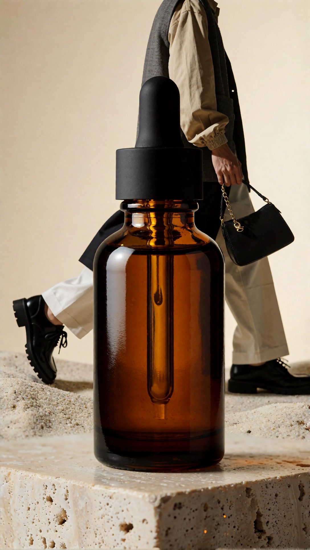
Inspect bottle edges, reflection control, and the realism of glass thickness. The stronger result should look cleaner without becoming sterile or losing dimensionality.
What changed in the workflow: I kept the graph nearly identical and improved only prompt specificity. This was one of the clearest examples of small wording changes creating meaningful quality gains.
Test 6: Background consistency in outdoor scenes
This test checks how small workflow tweaks affect environmental coherence. Outdoor markets often break in the background first: duplicated faces, tangled signage, and warped stalls.
Topic: street market documentary-style portrait
Genre: Street Style
Camera: Leica SL2
Lens: 35mm f/2
Lighting: late afternoon open shade
Location: narrow street market with produce stalls and hanging awnings
Style: documentary fashion realism
Final Prompt: a stylish young man walking through a narrow produce market street, dark olive chore jacket over a white tee, loose black trousers, worn leather sneakers, one hand carrying a paper bag, alert expression glancing slightly off-camera, layered awnings overhead, stacked oranges and greens at neighboring stalls, textured pavement, soft late afternoon open shade, realistic pedestrian depth in background, documentary fashion realism, Leica SL2 look, 35mm f/2 environmental portrait, muted earthy palette, natural motion in clothing, believable market geometry and background continuity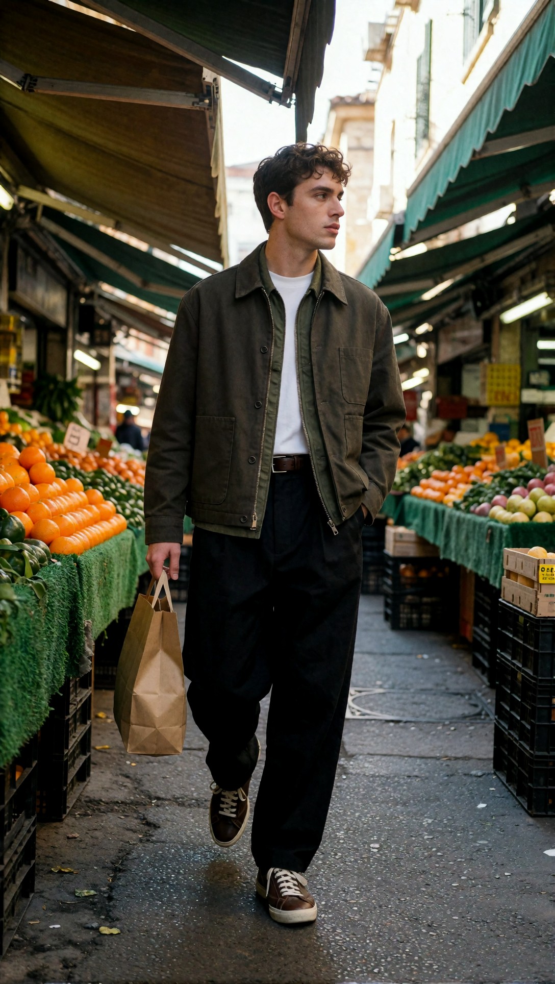
Inspect the background for duplicated people, impossible stall shapes, and collapsing awning lines. The stronger version should hold the scene together beyond the subject.
What changed in the workflow: A better base composition plus more disciplined CFG helped the model keep the environment coherent.
Where the strongest workflow still fails
Even the best ComfyUI workflow tweaks did not fix everything.
Failure risk 1: Hands do not always improve with more detail passes
Refining can make fingers look more detailed but not more correct. If the hand pose is complex in the base image, the second pass often preserves the mistake.
Failure risk 2: Fine patterns can turn into false texture
Tweed, knitwear, tiled floors, and hair can all look sharper while becoming less real. This is where "after" images can fool you if you only compare thumbnails.
Failure risk 3: Prompt specificity can become rigidity
A structured prompt helps, but too many locked details can flatten the image into a checklist instead of a scene.
Test 7: Hand risk in a café action shot
This test deliberately includes a cup, table edge, and visible fingers, because those reveal whether the workflow actually improves anatomy or just hides it under texture.
Topic: café portrait with visible hands and cup interaction
Genre: Lifestyle Editorial
Camera: Panasonic Lumix S1R
Lens: 50mm f/1.4
Lighting: window side light with warm interior practicals
Location: compact café corner with marble table and wood chairs
Style: contemporary magazine feature
Final Prompt: a young woman seated at a marble café table holding a ceramic cup with both hands, relaxed shoulders, candid half-smile, charcoal wool coat over a cream knit top, soft window side light shaping the face, warm practical lights glowing in the background, visible fingers wrapped naturally around the cup handle and rim, shallow depth of field, realistic table reflections, muted brown and cream palette, contemporary magazine feature styling, Panasonic Lumix S1R look, 50mm f/1.4 intimacy, believable hand anatomy and cozy indoor atmosphere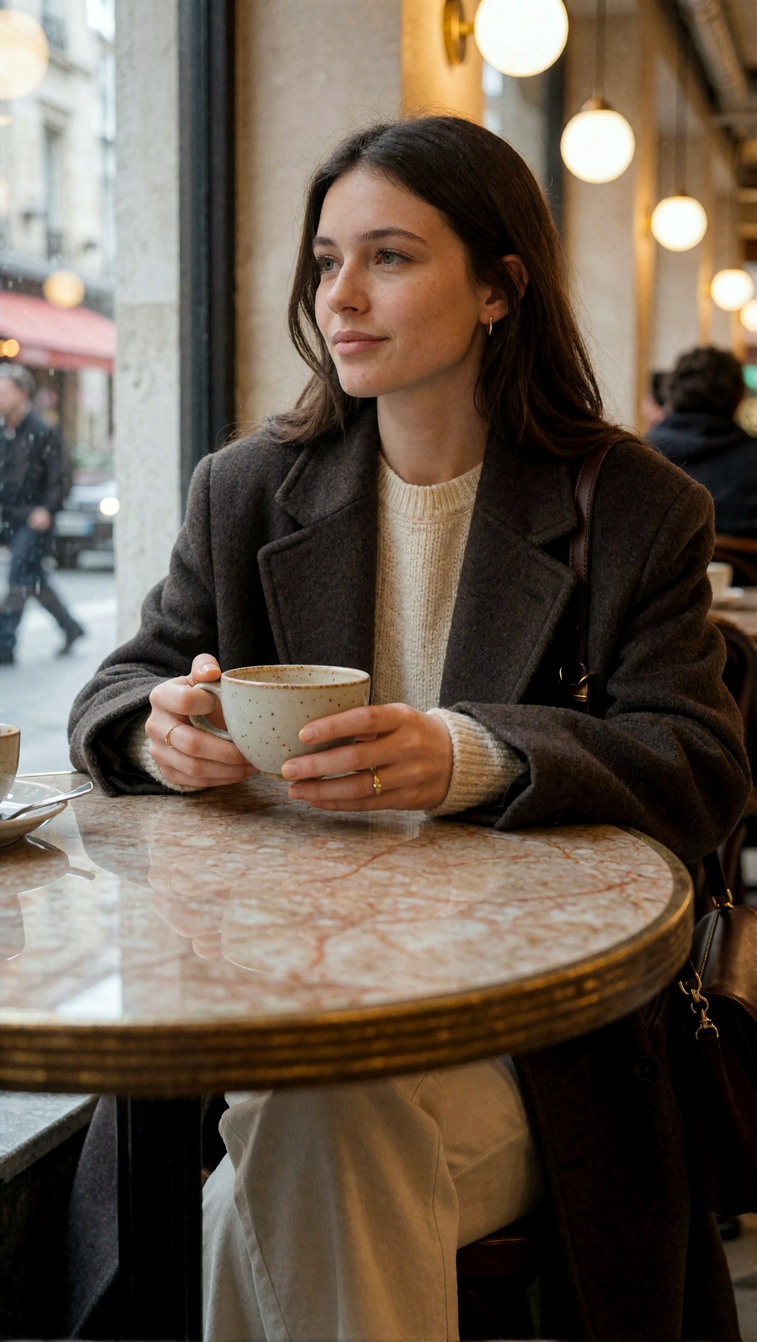
Inspect finger count, knuckle placement, grip logic, and cup geometry. If the hands are wrong in the base image, the refine pass usually does not truly rescue them.
Test 8: Style lock without overloading the prompt
This final test checks whether a prompt can hold a specific mood and palette without drowning the model in decorative language. It is useful for seeing whether your workflow respects direction or wanders.
Topic: neon alley cinematic portrait with controlled color mood
Genre: Cinematic Travel
Camera: RED Komodo 6K
Lens: 40mm anamorphic at T2.0
Lighting: neon rim light with damp street bounce
Location: narrow alley after rain in a dense night market district
Style: cinematic realism
Final Prompt: a cinematic portrait of a traveler standing in a narrow neon-lit alley after rain, navy trench coat over a dark layered outfit, one hand in pocket, focused expression, wet pavement reflecting magenta and cyan signage, steam drifting from a food stall in the distance, balanced medium shot, subtle anamorphic character, realistic skin under mixed lighting, controlled color separation, textured walls and cables, atmospheric depth without clutter, RED Komodo 6K look, 40mm anamorphic T2.0, cinematic realism with disciplined neon palette and strong subject separation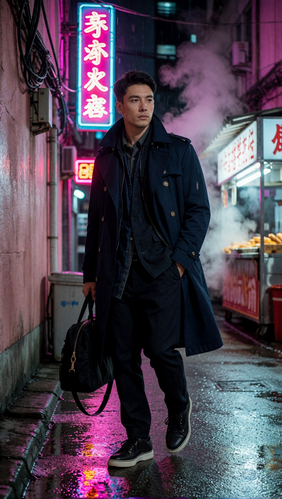
Inspect whether the color mood stays controlled or turns chaotic. The stronger result should keep the palette intentional while preserving skin tone and background readability.
For more side-by-side visual ideas, the [gallery](/gallery) and [articles](/articles) sections are useful reference points when you want to compare output character rather than just settings.
Common mistakes that hurt ComfyUI before-and-after tests
These were the mistakes that made comparison harder or led to false conclusions.
Changing too many variables at once
If you switch sampler, CFG, steps, resolution, and prompt wording in one go, you learn nothing useful.
Judging only at thumbnail size
Many "improved" images looked better small and worse on zoom.
Treating upscale as a repair tool
Upscale helps detail recovery, not composition rescue.
Using giant negative prompts by default
In this test, long negative prompts often reduced clarity rather than improving it. A shorter, purposeful negative prompt was easier to control.
Copying workflows you cannot read
A huge graph may work, but if you do not know which node changed what, debugging becomes slow. Beginners should prefer workflows they can explain node by node.
If you want to isolate prompt effects separately from workflow effects, [promptlab](/promptlab) is a practical place to rewrite prompts before rebuilding a graph around them.
Compact quality checklist
Use this checklist when doing your own ComfyUI settings before after comparison.
- Keep the seed fixed for each pair
- Change one variable at a time
- Match latent dimensions to the composition goal
- Start with moderate CFG, not maximum CFG
- Increase steps only until forms look complete
- Inspect eyes, teeth, fingers, fabric, and straight lines at zoom
- Do not run a second pass on a composition you already dislike
- Compare the full image first, then micro-detail
- Save notes with each render, not just the image
Which workflow is best for which situation?
Best for beginners
A simple two-stage workflow is best if you want repeatable gains without getting lost in node clutter.
Use it when:
- you generate portraits, products, interiors, or lifestyle scenes
- you want clear before-and-after learning
- you are still figuring out samplers and CFG behavior
Best for intermediate users
A more modular workflow is helpful if you already know when to branch into upscale, control nodes, or custom conditioning.
Use it when:
- your base composition is already reliable
- you need batch consistency
- you are testing model-specific sampler behavior
Not ideal for everyone
Avoid refine-heavy workflows if your first pass is unstable. They add time and can make artifacts look more convincing instead of more correct.
FAQ
What is the most important small change in a ComfyUI workflow before and after test?
In this test, the most consistent improvement came from better latent dimensions plus a good sampler/scheduler pairing. That changed composition and texture quality more than simply increasing steps.
Do more steps always improve ComfyUI image generation?
No. More steps help only up to the point where forms are complete. After that, gains are small and sometimes the image gets harsher or noisier.
Is CFG the main reason ComfyUI faces look overcooked?
Often, yes. Overly high CFG can push faces into brittle, unnatural detail. A moderate setting usually gives better realism while keeping prompt control.
Should I upscale every image in ComfyUI?
No. Upscale only the images that already work at base resolution. If the composition, anatomy, or lighting is wrong, upscale tends to preserve the mistake.
How do I make a fair ComfyUI results comparison?
Keep the same seed, same model, same prompt core, and change one setting at a time. Then inspect both framing and zoom-level detail.
Final recommendation
If you want a practical ComfyUI workflow before and after improvement, start smaller than you think. Do not begin by collecting the biggest workflow on the internet. Begin with a readable base graph, fix your latent dimensions, test one sampler/scheduler pair at a time, keep CFG moderate, and only refine images that are already compositionally strong.
Who should use this workflow: beginners and intermediate users who want dependable quality gains and understandable comparisons.
Who should avoid it: users looking for a one-click fix for bad anatomy or chaotic prompts. This setup improves strong images; it does not magically rescue weak ones.
If I had to pick one setting detail that mattered most, it would be this: match the workflow to the image structure first. In practice, that means correct framing dimensions and a clean first pass. Once that is right, every other tweak becomes easier to evaluate and much more likely to help.