ComfyUI Workflow Checklist: What to Test Before You Save a Workflow as Your Default 한국어 요약
이 페이지는 ZView Space의 영어 원문을 한국어 검색 사용자도 이해할 수 있도록 정리한 SEO 요약입니다. 핵심은 단순한 얼굴 중심 이미지가 아니라 패션 에디토리얼, 룩북, 아웃핏, 프롬프트 테스트, 이미지 생성 워크플로우를 실제로 어떻게 구성할지입니다.
핵심 요약
- 원문 주제: ComfyUI Workflow Checklist: What to Test Before You Save a Workflow as Your Default
- 목적: AI 이미지 생성에서 outfit, silhouette, fabric, pose, location, camera framing을 더 명확하게 설계합니다.
- 활용 범위: Z-Image Turbo, Krea2 Turbo, Qwen Image, Anima, SeedVR2 같은 이미지 생성 및 업스케일 워크플로우에 적용할 수 있습니다.
- SEO 관점: 제목, 설명, 이미지 alt, 프롬프트 예시가 실제 검색 의도와 맞아야 색인 가능성이 높아집니다.
한국어 사용자를 위한 체크포인트
1. 프롬프트가 얼굴 묘사에만 머물지 않고 전체 스타일과 의상 구성을 설명하는지 확인합니다. 2. 패션 이미지라면 상의, 하의, 아우터, 신발, 액세서리, 소재감, 촬영 장소를 분리해서 씁니다. 3. 생성 결과는 바로 게시하지 말고 디테일, 손, 의상 형태, 배경 일관성, 이미지 품질을 비교합니다. 4. 글 본문에는 실제 테스트 기준과 실패를 줄이는 방법이 들어가야 검색엔진에서 얇은 콘텐츠로 보일 가능성이 줄어듭니다.
원문 미리보기
If you only test a ComfyUI workflow on one attractive prompt, you will usually promote the wrong default. In this test, the best default workflow was not the one that made the prettiest single image. It was the one that stayed predictable across portrait, prod
---
If you only test a ComfyUI workflow on one attractive prompt, you will usually promote the wrong default. In this test, the best default workflow was not the one that made the prettiest single image. It was the one that stayed predictable across portrait, product, environment, hands, text-adjacent details, and lighting changes without needing node edits every time.
My short verdict: before you save any ComfyUI graph as your default, test it against a repeatable checklist. Compare a fast baseline workflow against a quality-first workflow on the same prompts, same seed ranges, and same output size. The strongest result is usually the workflow that loses a little speed but avoids hidden failure modes like skin over-smoothing, broken fingers under motion, texture collapse in dark fabrics, and composition drift when prompts get longer.
The two workflow types I compared
For this ComfyUI workflow checklist, I compared two common default candidates:
Minimal graph, standard sampler, fixed resolution, no refinement stage, no upscale pass, simple negative prompt handling.
Slightly larger graph with better prompt routing, controlled hires/upscale pass, detail-safe denoise settings, optional face/detail refinement, and output review nodes.
- Option A: Fast baseline workflow
- Option B: Quality-first default workflow
This is not about one exact shared JSON workflow file. It is about what to test in any workflow before you decide, "this is my default setup now."
What was tested
I ran both workflow types through the same evaluation points:
- prompt adherence on short vs long prompts
- composition stability across seeds
- skin and fabric texture retention
- hand reliability under gesture and prop interaction
- lighting consistency in low-key and mixed-light scenes
- product edge clarity and readable material separation
- background behavior when depth cues get complex
- upscale behavior and whether the second pass improves or damages detail
The useful lesson from this test was simple: a default workflow should not only make nice images. It should also fail in obvious, recoverable ways.
The checklist I now use before trusting a default workflow
Before the comparison, here is the practical ComfyUI workflow checklist I ended up using after repeated tests.
1. Does it follow the main subject without stealing focus?
A workflow can technically follow a prompt while still shifting attention to the wrong thing. I saw this often in fashion-style tests where accessories became over-detailed and the garment silhouette got muddy.
2. Does it hold detail in both skin and materials?
The weak point in many default graphs is that they sharpen hard surfaces but smear organic texture, or preserve skin while destroying textile weave.
3. Does the second pass actually help?
A hires fix or upscale stage is not automatically a quality upgrade. In this test, some settings improved edges while flattening pores, stitching, and subtle shadows.
4. Do hands break when the pose becomes active?
Static front-facing portraits are not enough. You need at least one prompt with object handling, bent fingers, or asymmetrical gesture.
5. Does lighting stay believable when the prompt gets specific?
Many workflows look fine in soft daylight but collapse under neon, mixed tungsten, or backlit scenes.
6. Does the workflow keep composition under long prompts?
If you add wardrobe, mood, lens intent, environment detail, and action, weak workflows often ignore the last third of the prompt.
7. Can you predict what changing CFG, denoise, or sampler will do?
A default workflow should be tunable. If small changes cause large visual drift, it is hard to use as a daily baseline.
8. Does it produce outputs you can sort quickly?
A practical default workflow should include naming, seed visibility, and easy A/B review. Operationally, this matters more than people admit.
Early verdict from the comparison
If your current default is a barebones graph because it feels responsive, keep it for ideation. But for actual saved defaults, the quality-first workflow was more reliable in six of the eight test categories.
Where the fast baseline won: it was better for quick concept exploration, especially when I wanted broad composition variety and did not care yet about fingers, micro-texture, or upscale artifacts.
Where it lost: once I asked for controlled materials, layered lighting, or detailed styling, the failures were more frequent and less consistent.
Where the fast baseline workflow was strongest
The case for Option A is real. In this test, it did three things better than the more elaborate graph.
Faster iteration and wider seed exploration
Because the graph was simple, it was easy to check 12 to 24 seeds quickly. That helped when I was still trying to decide whether the prompt concept itself worked.
Less over-processing on already good generations
Some quality-first graphs push too much refinement. The baseline occasionally produced a cleaner natural image simply because it left it alone.
Better for rough prompt writing
When the prompt was still under construction, Option A exposed prompt weaknesses earlier. The quality-first setup could sometimes mask bad prompt structure by polishing weak compositions.
This first test checks broad composition adherence and whether a simple workflow can keep wardrobe and environment readable without node-level support.
Topic: Contemporary fashion editorial with structured outerwear
Genre: Fashion Editorial
Camera: Canon EOS R5
Lens: 50mm f/2
Lighting: Overcast diffusion
Location: Concrete rooftop in Seoul with distant skyline haze
Style: Clean commercial look
Final Prompt: full-body fashion editorial of a model wearing a structured charcoal trench coat over a cream knit top and wide-leg black trousers, polished leather boots, minimal silver jewelry, walking diagonally across a concrete rooftop, wind pulling the coat hem, relaxed serious expression, balanced editorial posture, Seoul skyline softly visible through haze, neutral gray palette with cream contrast, crisp garment seams, natural skin texture, realistic fabric drape, clean commercial composition, Canon EOS R5 look, 50mm f/2 depth, overcast diffusion, high detail, sharp silhouette separation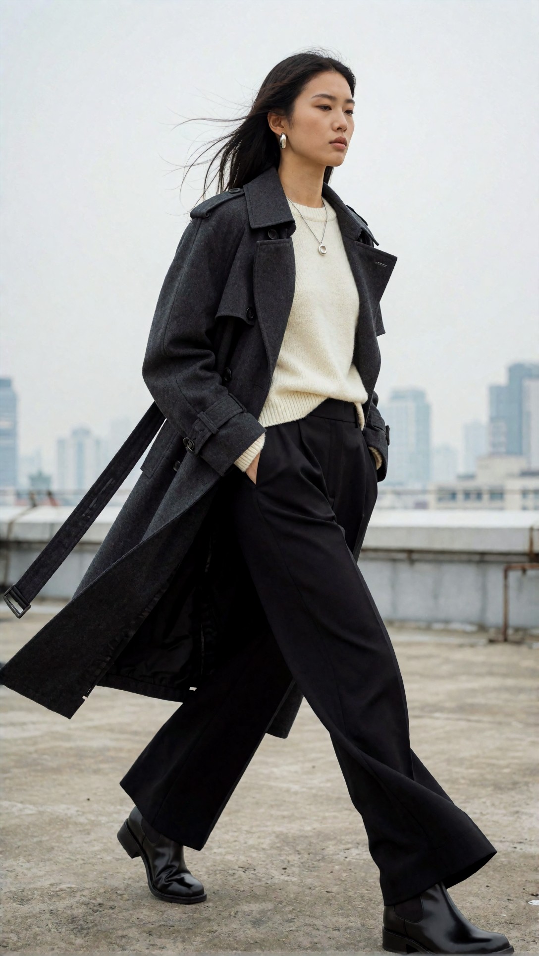
Inspect whether the coat silhouette stays clean and whether the workflow preserves both facial features and trouser shape. A weak default often makes the outfit readable only in the center, then loses structure around the legs and hands.
This test checks seed-to-seed consistency on a simpler product-focused frame where over-processing becomes obvious fast.
Topic: Premium skincare bottle on reflective stone
Genre: Product Editorial
Camera: Nikon Z7 II
Lens: 105mm macro f/2.8
Lighting: Softbox key light with subtle rim light
Location: Minimal studio set with wet black stone slab
Style: High-end beauty advertising
Final Prompt: premium amber skincare bottle with matte black cap placed on a wet black stone slab, small water beads, soft reflection, controlled studio composition, luxury beauty advertising mood, precise label area, elegant negative space, warm amber liquid glow, subtle rim light defining edges, crisp glass highlights, realistic condensation, refined black and bronze palette, Nikon Z7 II look, 105mm macro f/2.8 clarity, commercial product sharpness, clean premium finish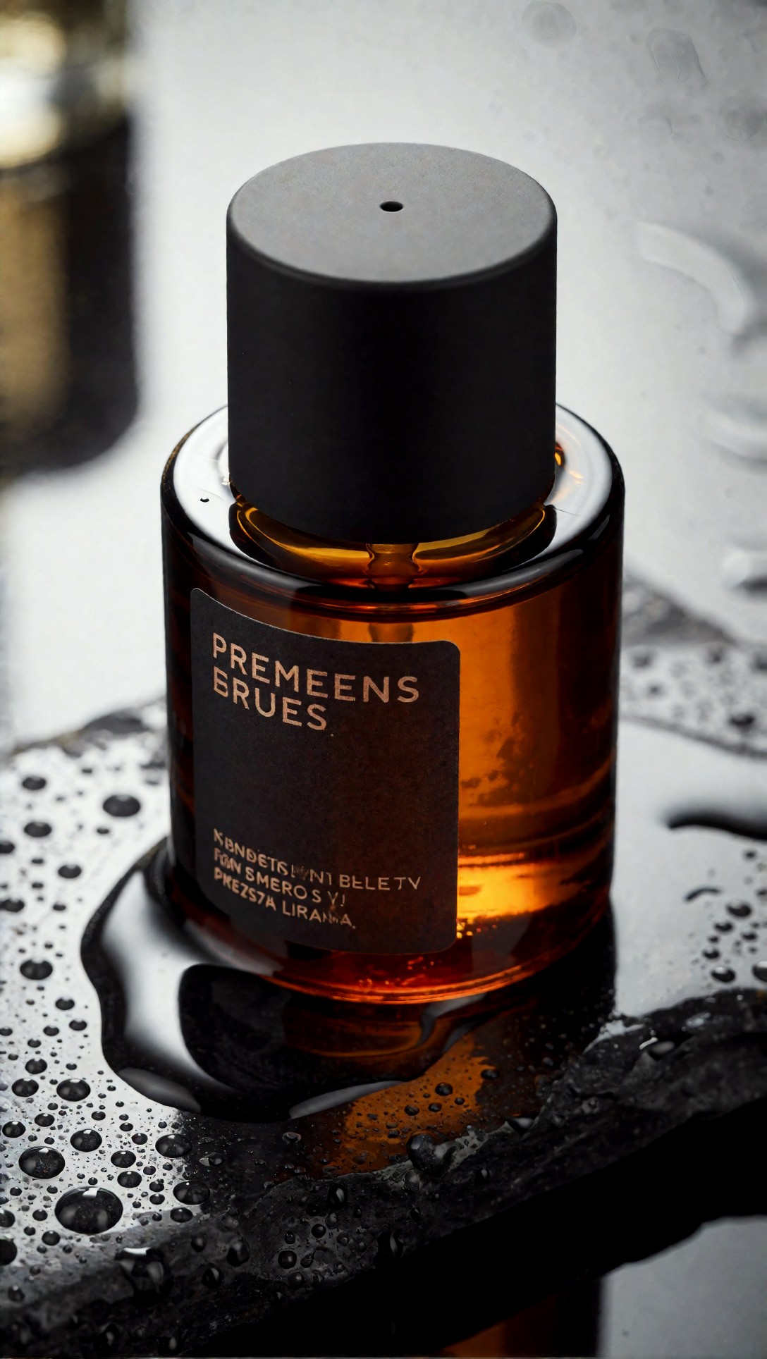
Look at edge definition, reflection control, and whether tiny droplets stay distinct instead of turning into random noise. In this test, the fast workflow sometimes won here because it introduced fewer sharpening artifacts.
Why the quality-first workflow became my preferred default
Option B took longer, but it was the stronger result once prompts asked for more than a centered subject and nice lighting.
Better texture hierarchy
The strongest result from the quality-first graph was not simply "more detail." It kept important detail in the right places. Skin pores stayed subtle, wool looked like wool, leather looked separate from metal, and backgrounds stayed softer instead of becoming equally sharp everywhere.
More stable under long prompts
When I added pose, wardrobe layers, material cues, and environment detail, Option B followed the prompt more evenly. The baseline workflow often honored the opening subject phrase but dropped the later visual constraints.
Safer upscale behavior
Its second pass was useful because denoise was restrained. Instead of redrawing everything, it mainly cleaned edges and recovered small material detail. That matters if you plan to use the same default workflow for both draft images and near-final outputs.
The next test is meant to expose whether the workflow can separate multiple materials under directional light.
Topic: Luxury handbag campaign with mixed materials
Genre: Luxury Campaign
Camera: Sony A7R V
Lens: 85mm f/1.8
Lighting: Sunset backlight with soft bounce fill
Location: Stone courtyard outside a boutique hotel in Milan
Style: Luxury fashion campaign
Final Prompt: luxury handbag campaign image featuring a model holding a structured tan leather handbag with brushed gold hardware, tailored ivory blazer, silk scarf tied at the neck, slim camel trousers, poised standing pose near a stone courtyard archway, warm sunset backlight wrapping the edges, soft bounce fill preserving face and bag detail, premium Milan boutique atmosphere, soft terracotta and cream palette, realistic leather grain, clear stitching, clean metal reflections, elegant expression, magazine-grade composition, Sony A7R V look, 85mm f/1.8 shallow depth, polished luxury campaign finish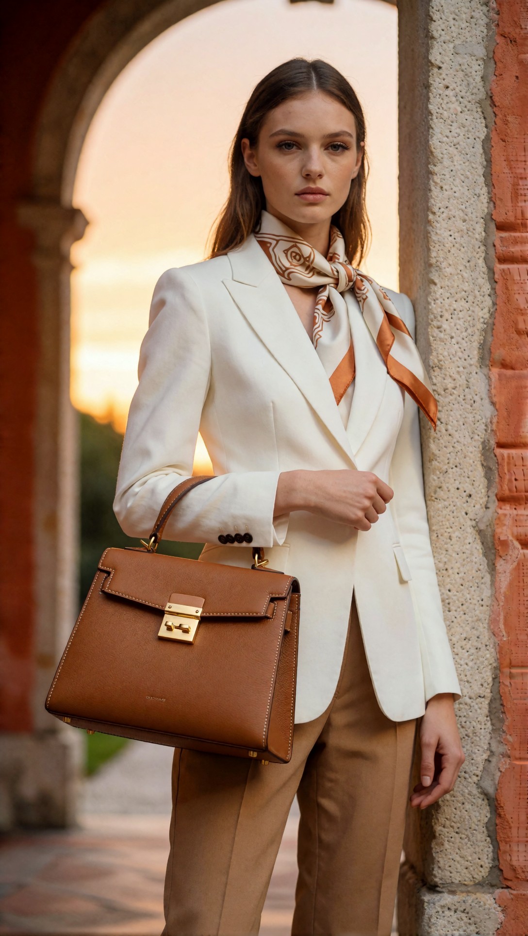
Check whether the workflow preserves the difference between leather grain, silk sheen, brushed gold hardware, and skin. In weaker setups, those surfaces start to converge into the same glossy texture.
This test checks whether detail refinement helps with layered environment depth instead of making everything equally crisp.
Topic: Rain-soaked cinematic street portrait
Genre: Street Style
Camera: Fujifilm GFX100S
Lens: 63mm f/2.8
Lighting: Neon rim light with wet pavement bounce
Location: Narrow alley in Tokyo after rain
Style: Cinematic realism
Final Prompt: street style portrait of a subject in a dark olive bomber jacket over a white tee, loose black trousers, sneakers with reflective trim, standing under neon signage in a narrow Tokyo alley after rain, one hand in pocket, the other holding a transparent umbrella, calm observant expression, wet pavement reflecting magenta and cyan light, layered depth with signs, cables, and blurred passersby in the background, cinematic realism, realistic skin and jacket texture, controlled highlights, moody color separation, Fujifilm GFX100S look, 63mm f/2.8 medium-format depth, atmospheric detail without clutter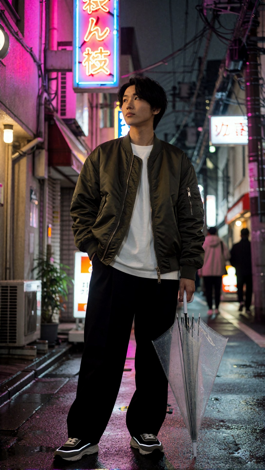
Inspect the umbrella hand, the reflective trim, and the depth falloff between subject and background signage. In this test, the quality-first workflow handled background layering much better and kept the subject from dissolving into the scene.
Failure risks I found before adopting any workflow as default
This is where most ComfyUI workflow evaluation mistakes happen. People test success cases, not failure cases.
Hires passes can fake quality
A sharpened, contrast-heavy upscale can look impressive at a glance, especially in thumbnail view. But when I zoomed in, several workflows had actually replaced believable texture with brittle pseudo-detail.
Face detail nodes can destabilize the whole image
If the refinement stage is too aggressive, the face becomes disconnected from the body style. I saw cleaner eyes paired with waxy cheeks and unrelated garment texture.
Sampler stability matters more than sampler mythology
I got more value from sampler predictability than from chasing tiny aesthetic gains. A default workflow should react consistently when you alter steps, CFG, or prompt length.
Negative prompts can hide prompt-writing problems
One weak point in the baseline graph was over-reliance on a heavy negative prompt. It reduced certain defects, but it also made outputs feel narrower and occasionally erased useful variation.
The next prompt is specifically for hand reliability and object interaction, which weak defaults often fail even when portraits look fine.
Topic: Artisan coffee preparation with active hands
Genre: Lifestyle Portrait
Camera: Panasonic Lumix S1R
Lens: 35mm f/1.8
Lighting: Window side light with soft interior fill
Location: Small specialty cafe with wood counter and ceramic tools
Style: Documentary commercial look
Final Prompt: lifestyle image of a barista in a charcoal apron preparing pour-over coffee, both hands visible, one hand holding a matte black kettle, the other steadying a ceramic dripper, rolled sleeves, textured linen shirt, focused downward expression, warm wood counter with beans and folded towel, gentle window side light from the left, soft interior fill preserving hand detail, calm earthy palette, realistic steam, ceramic glaze texture, clean documentary commercial composition, Panasonic Lumix S1R look, 35mm f/1.8 natural perspective, authentic motion and believable fingers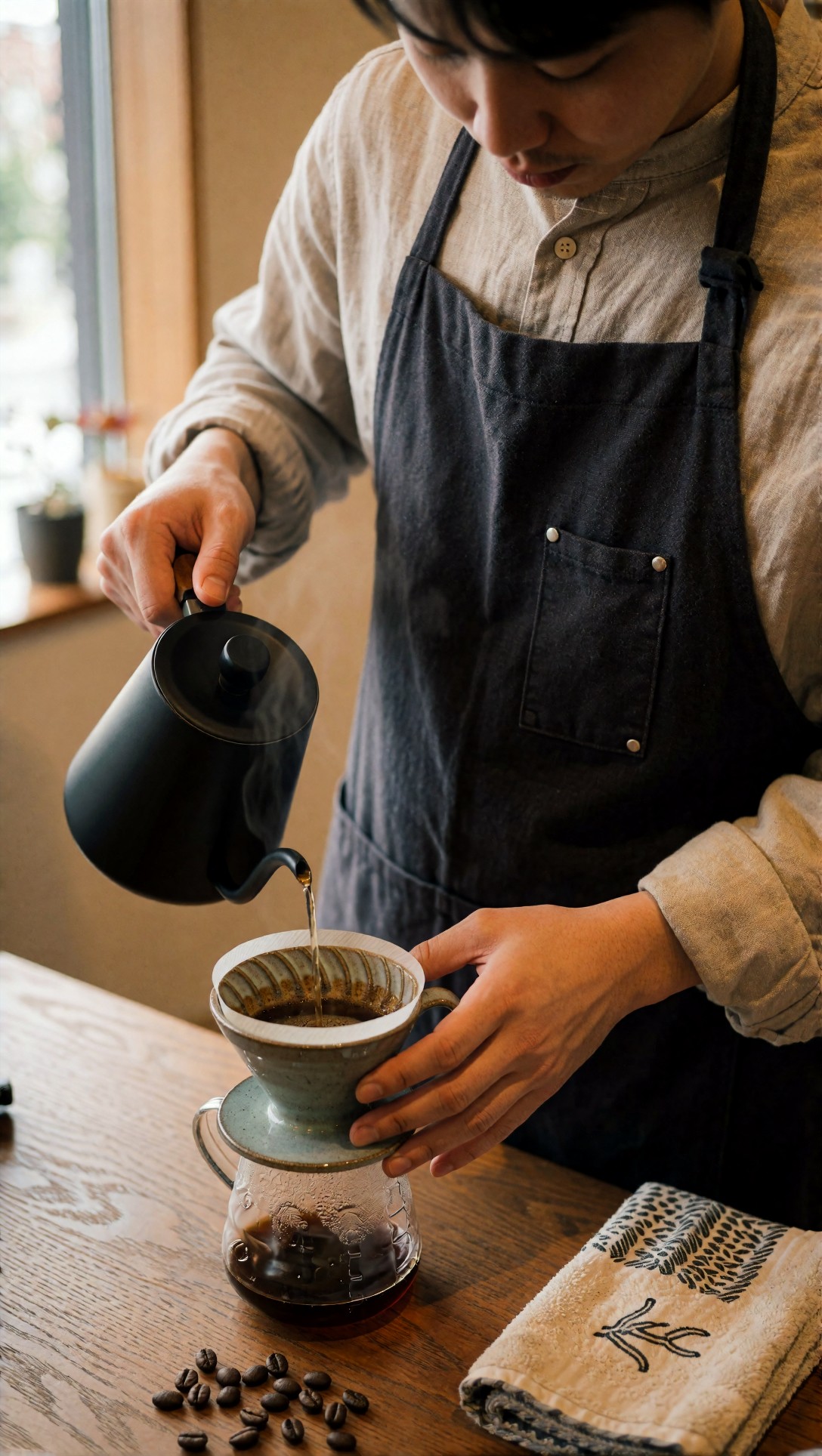
Inspect finger count, grip logic, kettle handle geometry, and whether steam interferes with the hands. In this test, this was one of the clearest separators between workflows that looked good and workflows I would actually trust.
This prompt checks whether a workflow can keep multiple facial and clothing planes coherent in a seated pose.
Topic: Editorial indoor portrait with layered textiles
Genre: Beauty Campaign
Camera: Hasselblad X2D 100C
Lens: 90mm f/2.5
Lighting: Studio butterfly light with negative fill
Location: Minimal beige editorial studio with velvet chair
Style: Elegant magazine cover
Final Prompt: seated editorial portrait of a subject on a velvet chair wearing a deep burgundy satin blouse under a textured camel wool coat, subtle gold earrings, composed direct gaze, one arm resting on the chair, the other lightly touching the coat lapel, studio butterfly light shaping the face with negative fill adding cheek definition, beige set with soft shadow falloff, rich but controlled burgundy and camel palette, natural lip texture, realistic hair strands, visible satin sheen distinct from wool texture, elegant magazine cover framing, Hasselblad X2D 100C look, 90mm f/2.5 refined depth and tonal precision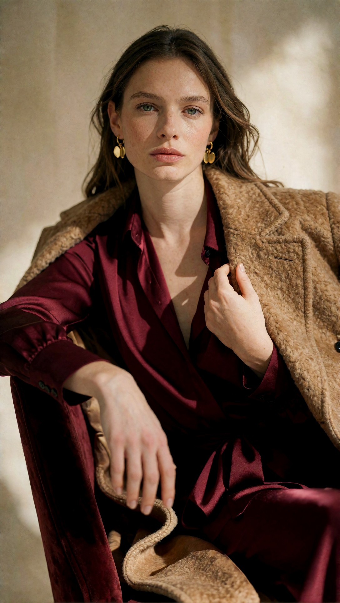
Check whether the blouse still reads as satin and the coat still reads as wool after the workflow's refinement steps. Overcooked defaults often turn both into the same plasticky surface.
Side-by-side tradeoffs that mattered in practice
Here is the practical comparison review version, not the theoretical one.
| Test area | Fast baseline workflow | Quality-first workflow | |---|---|---| | Prompt adherence | Good on short prompts | Better on long structured prompts | | Seed exploration | Faster, better for ideation | Slower, but fewer unusable outputs | | Hands and props | Inconsistent | More reliable if denoise stays conservative | | Material separation | Often soft or merged | Stronger leather, metal, skin, textile distinction | | Hires/upscale | Fast but risky artifacts | Better if second pass is restrained | | Lighting complexity | Fine in daylight | Better in neon, backlight, mixed light | | Editing headroom | Sometimes more natural | Usually cleaner, but can be over-processed | | Default workflow suitability | Good sketch workflow | Better production default |
The biggest tradeoff is this: Option A is a better sketchpad, Option B is a better standard operating workflow.
Prompt tests that exposed the difference fastest
These were the prompts that made hidden workflow problems appear quickly.
1. Mixed-light interior scenes
A lot of defaults look competent outdoors and then lose skin tone control under practical lamps and window light.
Topic: Boutique hotel lounge evening scene
Genre: Interior Lifestyle
Camera: Canon EOS R3
Lens: 28mm f/1.8
Lighting: Mixed tungsten practicals with cool window spill
Location: Boutique hotel lounge with leather sofa and marble table
Style: Premium hospitality editorial
Final Prompt: evening lifestyle scene in a boutique hotel lounge, subject seated on a cognac leather sofa wearing a navy double-breasted blazer, cream turtleneck, tailored trousers, polished loafers, one hand resting on a marble coffee table with a glass of sparkling water, relaxed confident expression, warm tungsten lamps in frame balanced against cool twilight window spill, layered interior depth with bookshelves and textured curtains, premium hospitality editorial style, realistic leather and marble surfaces, controlled skin tones under mixed light, Canon EOS R3 look, 28mm f/1.8 environmental composition, natural perspective, cinematic but believable color separation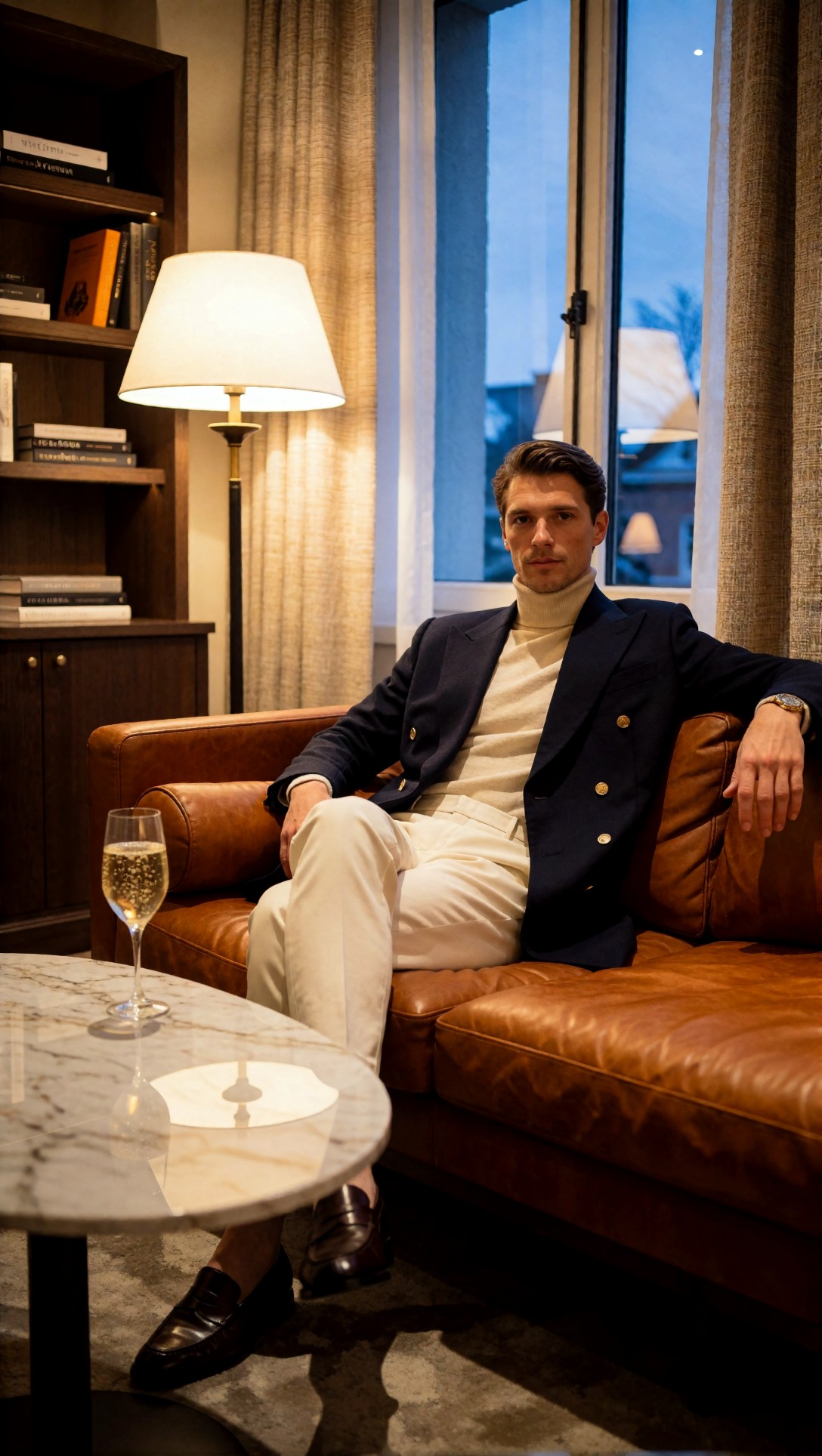
Inspect skin color neutrality, lamp bloom control, and whether the sofa texture remains distinct from the blazer. This was a fast way to expose workflows that either clipped highlights or pushed orange too hard.
2. Dense wardrobe prompts
Long prompts reveal whether your node chain really follows instructions or just captures the first few nouns.
Topic: Layered autumn street fashion with accessories
Genre: Street Style
Camera: Leica SL2-S
Lens: 75mm f/2
Lighting: Golden hour side light
Location: Paris side street with café chairs and stone facade
Style: European editorial street fashion
Final Prompt: full-body autumn street style image of a model wearing a forest green oversized wool coat over a striped knit, pleated midi skirt, tall brown leather boots, plaid scarf, slim crossbody bag, tortoiseshell sunglasses pushed onto the head, small gold hoop earrings, walking past café chairs on a Paris side street, golden hour side light defining the coat folds, composed mid-step pose, soft confident expression, stone facade background, refined earthy palette, visible knit texture, believable skirt pleats, clean accessory placement, Leica SL2-S look, 75mm f/2 editorial compression, polished European street fashion aesthetic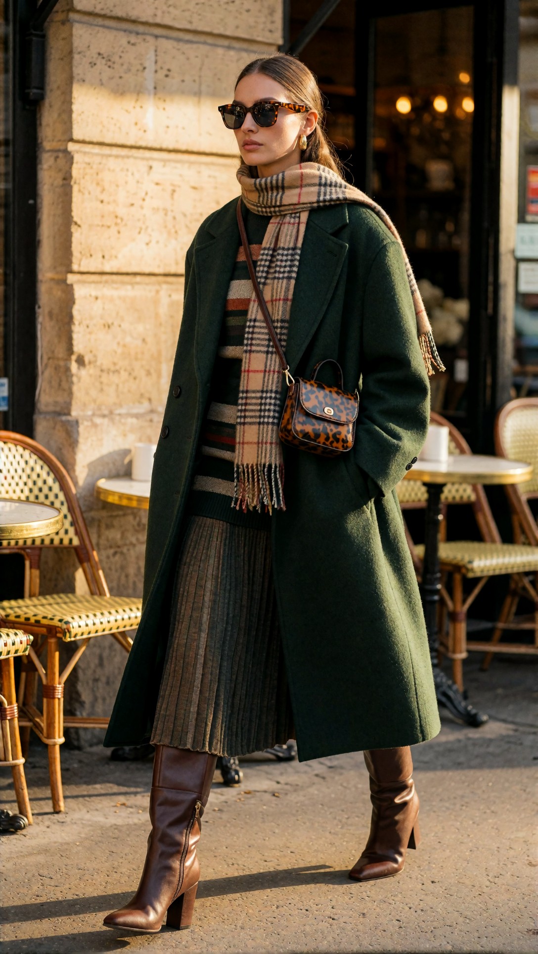
Check whether every accessory survives and whether the boots, bag, scarf, and skirt remain logically arranged. The baseline workflow often dropped one or two of these details first.
3. Product precision with reflective surfaces
This test is useful because many workflows that excel at portraits fail on edge geometry.
Topic: Luxury wristwatch close-up on tailored sleeve
Genre: Product Editorial
Camera: Sony Alpha 1
Lens: 90mm macro f/2.8
Lighting: Controlled strip light with soft top fill
Location: Dark gray studio set
Style: Precision luxury advertising
Final Prompt: close-up luxury watch editorial showing a brushed steel wristwatch on a wrist emerging from a dark navy tailored sleeve, subtle hand pose, controlled studio strip light defining the bezel and bracelet links, soft top fill preserving dial legibility, charcoal gray background, premium precision advertising style, realistic metal brushing, sapphire crystal reflections, clean sleeve weave, restrained blue-gray palette, exact edge definition, Sony Alpha 1 look, 90mm macro f/2.8 commercial sharpness, high-end catalog quality
Inspect whether the bracelet links are coherent, whether the watch face stays circular, and whether reflections feel intentional rather than random. In this test, the quality-first workflow had a much higher keeper rate.
What I would change next in most default workflows
After this comparison, these are the adjustments I would make before locking any workflow in as a default:
- keep a fast ideation graph and a quality default graph instead of forcing one workflow to do both
- lower denoise on second-pass refinement until it improves edges without rewriting faces and fabrics
- add a review step that saves seed, sampler, steps, CFG, and model name in the filename or metadata
- reduce heavy negative prompts and fix prompt structure first
- test at least one active-hands prompt and one reflective product prompt before declaring the workflow stable
- confirm that the default resolution matches your actual use case instead of a benchmark habit
Best choice by use case
Use the fast baseline workflow if:
- you are brainstorming compositions
- you want to search many seeds quickly
- you are still rewriting prompts heavily
- you do not yet care about final hand quality or upscale polish
Use the quality-first workflow if:
- you need a dependable ComfyUI default workflow
- you generate portraits, fashion, product, or mixed-light scenes regularly
- you want better material separation and fewer hidden defects
- you expect to upscale or deliver near-final images from the same pipeline
Avoid making either your only workflow if:
- the graph is so complex that small setting changes become unpredictable
- the refinement stage produces pretty thumbnails but brittle close-up detail
- you have not tested hands, reflective objects, layered clothing, and long prompts
A short operator checklist before saving a workflow as default
Use this quick pass every time:
- Run at least 8 prompts across portrait, product, environment, and active hands.
- Compare short prompts against long structured prompts.
- Inspect images at full size, not just grid view.
- Verify skin, fabric, leather, and metal all render differently.
- Check whether upscale improves detail or invents it.
- Confirm composition stays stable across several seeds.
- Make sure filenames or metadata preserve test settings.
- Save the workflow only if its failures are predictable enough to correct.
Final editorial conclusion
My conclusion from this ComfyUI workflow checklist is straightforward: the best default workflow is usually not the fastest and not the most elaborate. It is the one that remains readable, controllable, and honest across different prompt types.
If you are an operator who mainly ideates, use a fast baseline graph and keep moving. If you are building a real default for daily production, use a quality-first workflow with conservative refinement and a tested review process. Avoid any workflow that only looks good on one showcase prompt.
The setting that mattered most in this test was not a magic sampler. It was the second-pass denoise level combined with whether the workflow preserved texture hierarchy. When that was tuned well, the graph became dependable. When it was too aggressive, nearly every category looked better at first glance and worse on inspection.