ComfyUI Workflow Comparison: Simple vs Advanced Pipelines for Speed, Control, and Image Quality 한국어 요약
이 페이지는 ZView Space의 영어 원문을 한국어 검색 사용자도 이해할 수 있도록 정리한 SEO 요약입니다. 핵심은 단순한 얼굴 중심 이미지가 아니라 패션 에디토리얼, 룩북, 아웃핏, 프롬프트 테스트, 이미지 생성 워크플로우를 실제로 어떻게 구성할지입니다.
핵심 요약
- 원문 주제: ComfyUI Workflow Comparison: Simple vs Advanced Pipelines for Speed, Control, and Image Quality
- 목적: AI 이미지 생성에서 outfit, silhouette, fabric, pose, location, camera framing을 더 명확하게 설계합니다.
- 활용 범위: Z-Image Turbo, Krea2 Turbo, Qwen Image, Anima, SeedVR2 같은 이미지 생성 및 업스케일 워크플로우에 적용할 수 있습니다.
- SEO 관점: 제목, 설명, 이미지 alt, 프롬프트 예시가 실제 검색 의도와 맞아야 색인 가능성이 높아집니다.
한국어 사용자를 위한 체크포인트
1. 프롬프트가 얼굴 묘사에만 머물지 않고 전체 스타일과 의상 구성을 설명하는지 확인합니다. 2. 패션 이미지라면 상의, 하의, 아우터, 신발, 액세서리, 소재감, 촬영 장소를 분리해서 씁니다. 3. 생성 결과는 바로 게시하지 말고 디테일, 손, 의상 형태, 배경 일관성, 이미지 품질을 비교합니다. 4. 글 본문에는 실제 테스트 기준과 실패를 줄이는 방법이 들어가야 검색엔진에서 얇은 콘텐츠로 보일 가능성이 줄어듭니다.
원문 미리보기
I ran this ComfyUI workflow comparison to answer a practical question: when does a simple graph get you to a publishable image faster, and when does an advanced pipeline actually earn its extra nodes? The short version is that both can produce good images, but
---
I ran this ComfyUI workflow comparison to answer a practical question: when does a simple graph get you to a publishable image faster, and when does an advanced pipeline actually earn its extra nodes?
The short version is that both can produce good images, but they fail in different ways. In this test, the simple ComfyUI workflow was better for quick iteration, broad composition searches, and low-friction prompting. The advanced ComfyUI workflow won when the image needed repeatability, better texture control, cleaner lighting separation, and fewer surprises during upscaling or detail passes.
What follows is not a generic feature list. It is a hands-on comparison based on generating the same scenarios through both setups, watching where they broke, and adjusting prompts and graph design until the differences were clear.
What was tested
I compared two practical pipelines using the same base model family and similar seed ranges across multiple subject types.
Simple ComfyUI workflow
- Checkpoint loader
- Positive and negative prompt
- CLIP text encode
- Empty latent image
- KSampler
- VAE decode
- Save image
Advanced ComfyUI workflow
- Checkpoint loader plus optional refiner/model switch
- Prompt conditioning split by subject, environment, and style emphasis
- Latent upscale or second pass detail stage
- Control add-ons where useful, mainly edge/composition guidance
- High-res/detail pass with denoise control
- Sharpening or upscale output node depending on target use
Shared test conditions
- Same base concept prompts where possible
- Same output aspect ratios per case
- Similar sampling ranges, then adjusted only when failure patterns appeared
- Evaluation based on speed to acceptable image, prompt sensitivity, anatomy stability, fabric/material rendering, background coherence, and post-upscale integrity
The scenario: editorial-style images that need both speed and control
The use case was a mixed editorial workload: fashion-style full-body images, product-forward scenes, environmental portraits, and cinematic compositions with layered backgrounds. This is where a ComfyUI pipeline comparison becomes useful, because these scenes are exactly where "good enough" and "publishable" start to diverge.
A simple graph can produce an attractive first image quickly. But if the assignment requires stable hands, garment texture, readable accessories, clean separation between subject and background, and enough fidelity to survive a second look, the workflow choice matters.
The strongest result in this test was not the one with the most nodes. It was the one where the graph complexity matched the image problem.
Why this case is difficult for image models
These scenes create several competing demands at once:
- Full-body framing increases hand, foot, and pose risk
- Layered outfits expose fabric hallucinations and seam errors
- Background depth can either support realism or collapse into mush
- Reflective materials often become noisy during aggressive detail passes
- Upscaling can fix micro-detail while damaging face consistency
In other words, the model has to solve composition, anatomy, styling, material behavior, and atmosphere together. A simple ComfyUI workflow often handles the first draft well but starts drifting when precision matters. An advanced ComfyUI workflow can stabilize those details, though sometimes at the cost of speed and prompt flexibility.
First pass: what the simple workflow got right, and where it fell apart
My first runs used the simplest viable graph. That was deliberate. I wanted to see how far a minimal ComfyUI setup could go before I added control nodes, latent upscaling, or a second pass.
The immediate advantage was speed. I could move through composition ideas quickly and test prompt wording without troubleshooting graph logic. For loose ideation, this setup still has a lot of value.
The weak point appeared when the scene demanded specificity. The simple pipeline often gave me one strong region and one compromised region in the same frame. For example, a subject's jacket texture could look excellent while the hands softened, or the lighting on the face looked good while the background architecture became vague.
This first prompt was designed to test whether a simple graph could hold a full-body editorial composition with fabric detail and clean posture.
Topic: Full-body urban fashion editorial subject in layered tailoring
Genre: Fashion Editorial
Camera: Sony A7R V
Lens: 50mm f/2
Lighting: Overcast diffusion
Location: Concrete rooftop in central Seoul with distant glass towers
Style: Clean commercial look
Final Prompt: Full-body fashion editorial image of a model wearing a charcoal oversized blazer, pleated wide-leg trousers, fitted black knit top, structured leather belt, and pointed ankle boots on a concrete rooftop in central Seoul, relaxed but asymmetrical pose with one foot forward and one hand adjusting the blazer cuff, calm confident expression, subtle wind movement in the garments, muted gray and steel-blue palette, distant glass towers softly visible behind the subject, overcast diffusion for even skin tone and fabric readability, clean commercial composition with clear silhouette separation, realistic textile weave, natural skin texture, sharp accessories, editorial framing with negative space, Sony A7R V realism, 50mm f/2 depth and balanced perspective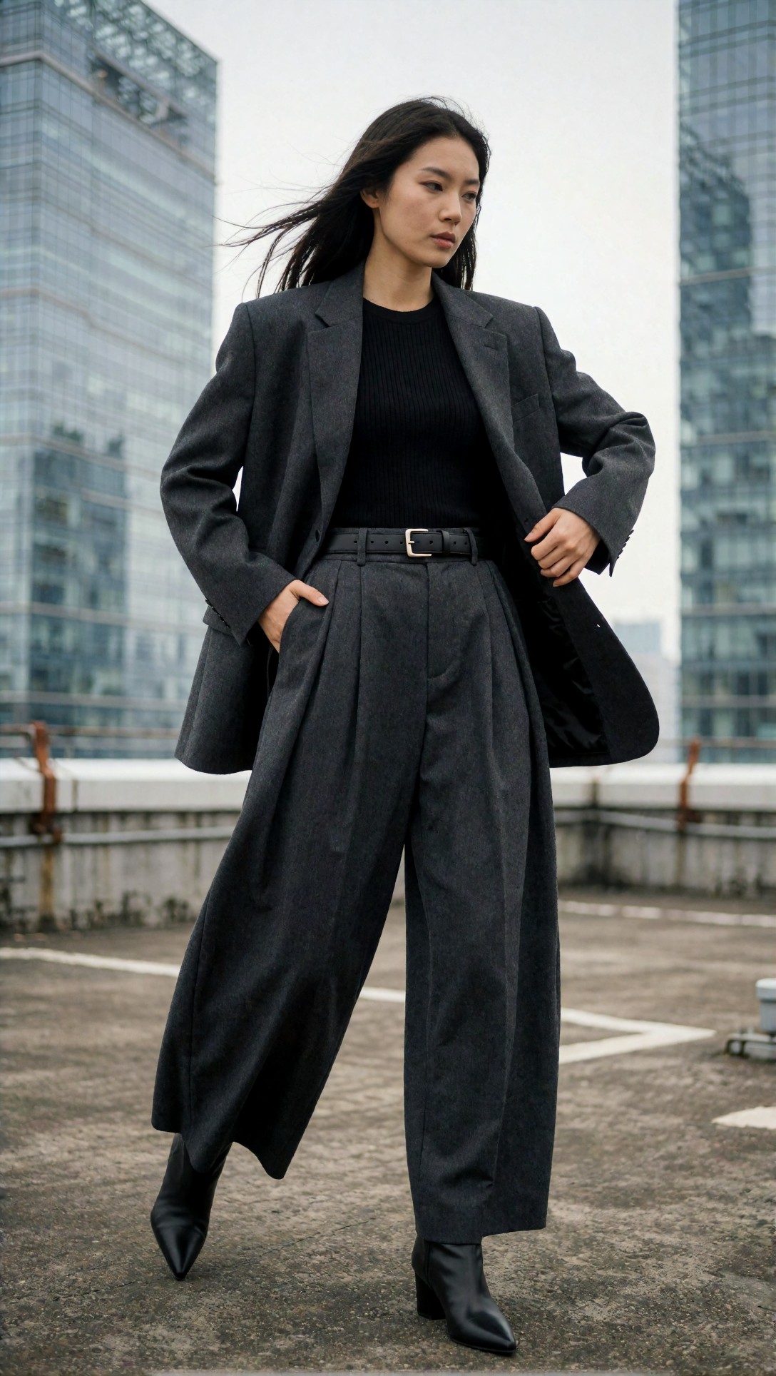
What to inspect here is whether the silhouette stays readable from shoulder to shoe. In my simple pipeline runs, the blazer and trousers usually rendered well, but hands and ankle boot geometry were the first places to break.
The next simple-workflow test checked product clarity in a still-life scene, where fewer anatomy problems should let the minimal graph perform better.
Topic: Luxury skincare bottle product scene with reflective surfaces
Genre: Product Editorial
Camera: Canon EOS R5
Lens: 100mm f/2.8 Macro
Lighting: Studio softbox key light with controlled rim reflection
Location: Minimal stone vanity set with frosted glass backdrop
Style: High-end beauty advertising
Final Prompt: Premium skincare serum bottle displayed on a pale travertine vanity with a frosted glass backdrop, subtle water condensation on the bottle, metallic cap with controlled reflections, folded ivory hand towel, small pool of reflected light beneath the product, precise product-centered composition, cool ivory and champagne palette, studio softbox key light with gentle rim reflection, micro-detail in label edges and glass thickness, luxury beauty advertising style, Canon EOS R5 macro realism, 100mm f/2.8 close-up clarity, crisp surface texture, clean commercial finish without clutter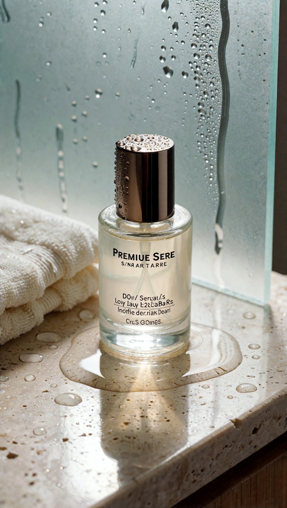
This is where the simple ComfyUI workflow did surprisingly well. Check the label edge sharpness, bottle symmetry, and reflection discipline. If those hold, the minimal graph is often enough for draft product concepts.
The adjustment that changed the comparison
The advanced workflow started to justify itself when I stopped asking it to merely "improve quality" and instead used it to solve specific failure modes.
That distinction matters. Adding a high-res fix, latent upscale, refiner, or control guidance without a reason often just changes the image rather than improving it. In this test, the advanced pipeline worked best when each extra stage had one job:
- first pass for composition and broad lighting
- second pass for edge cleanup and material fidelity
- optional guidance for pose or architecture stability
- output upscale only when the base image already held together
Once I treated the advanced graph as a problem-solving pipeline rather than a quality button, the results improved.
Where the advanced ComfyUI workflow pulled ahead
The advanced ComfyUI workflow was strongest in scenes with competing textures or fragile structure. Layered garments, interior depth, accessories, and mixed light sources all benefited.
One clear win was background consistency. In the simple graph, the subject often looked acceptable while the environment felt improvised. In the advanced graph, especially with a careful second pass, window frames, furniture edges, and architectural rhythm stayed more coherent.
This test targeted interior depth, posture, and material separation, which exposed the simple workflow's tendency to blur secondary objects.
Topic: Editorial portrait seated in a textured hotel lounge with mixed materials
Genre: Lifestyle Portrait
Camera: Nikon Z8
Lens: 85mm f/1.8
Lighting: Window light with warm lamp practicals
Location: Boutique hotel lounge with walnut paneling and velvet seating
Style: Cinematic realism
Final Prompt: Editorial lifestyle portrait of a subject seated in a boutique hotel lounge with walnut wall paneling, deep green velvet seating, brass side table, and soft lamp practicals, wearing a cream silk blouse, tailored mocha trousers, slim gold watch, and low-heeled leather shoes, poised seated posture with one arm resting on the chair and a thoughtful off-camera gaze, cinematic realism with layered depth, warm brown and olive palette, natural skin texture, readable silk sheen, clean hand anatomy, realistic lamp glow and window light balance, Nikon Z8 image character, 85mm f/1.8 shallow depth for subject isolation while preserving interior structure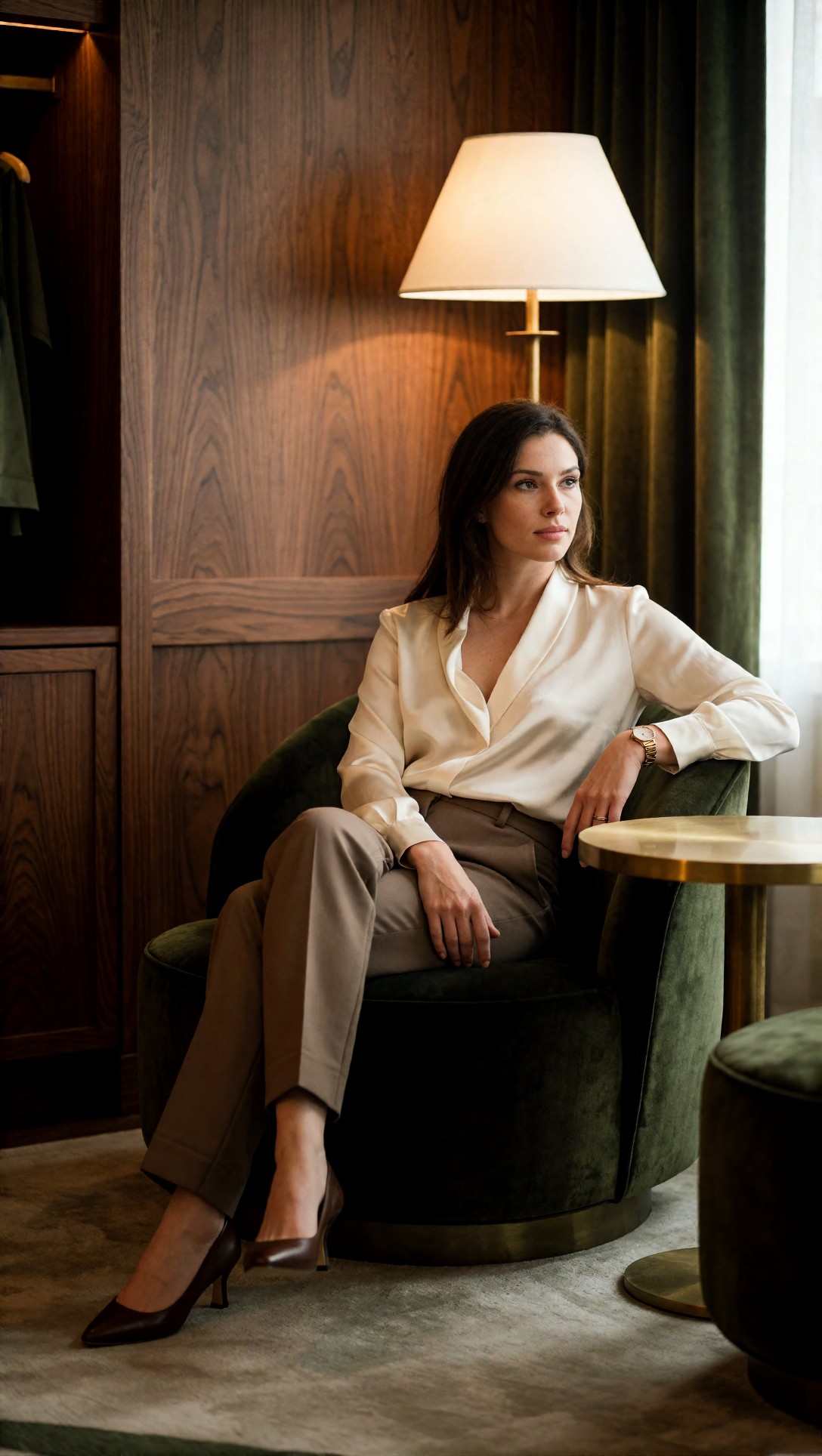
Inspect the chair edges, fingers, silk sheen, and whether the lamp glow contaminates skin tone unnaturally. In my advanced-pipeline results, those relationships were noticeably more stable than in the simple pass.
I also saw a stronger improvement in scenes with fine textile patterns. The simple workflow often implied texture rather than resolving it. The advanced workflow, especially with a restrained detail pass, produced fabric that looked designed rather than guessed.
This prompt tested whether the pipeline could keep a patterned garment readable without inventing visual noise.
Topic: Outdoor editorial with patterned coat and strong directional movement
Genre: Street Style
Camera: Fujifilm GFX100S
Lens: 110mm f/2
Lighting: Cold morning side light
Location: Narrow stone street in Copenhagen after light rain
Style: Luxury fashion campaign
Final Prompt: Street style editorial on a narrow stone street in Copenhagen after light rain, full-body subject wearing a long patterned wool coat in charcoal and rust, fine rib knit turtleneck, cropped tailored trousers, polished loafers, leather gloves tucked into one hand, walking stride with the coat opening in motion, focused expression, reflective wet pavement, controlled cold morning side light, luxury campaign composition with refined urban minimalism, crisp textile pattern integrity, subtle environmental haze, Fujifilm GFX100S medium-format realism, 110mm f/2 compression and premium detail rendering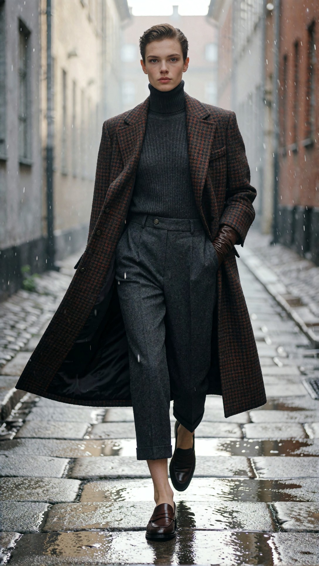
What to inspect is whether the coat pattern remains consistent across folds and whether the moving hem still makes physical sense. The advanced setup reduced pattern drift and random texture clumping.
Prompt design mattered more in the advanced graph
One of the more interesting findings from this ComfyUI pipeline comparison was that the advanced workflow was less forgiving of vague prompts. The simple workflow could still return a plausible image from broad language. The advanced graph exposed prompt weaknesses fast.
When I separated subject, environment, and style cues more clearly in the prompt logic, the output improved. When I left those ideas tangled together, the second pass often intensified the wrong details.
This next test was written to isolate architecture, wardrobe, and mood cleanly, because mixed prompts were producing environment drift.
Topic: Evening architectural fashion scene with precise subject placement
Genre: Fashion Editorial
Camera: Leica SL2-S
Lens: 35mm f/1.4
Lighting: Blue hour ambient with soft storefront spill
Location: Modern arts district walkway with concrete arches and glass facades
Style: Minimalist editorial campaign
Final Prompt: Full-body fashion editorial scene at blue hour in a modern arts district walkway with concrete arches, glass facades, and soft storefront spill light, subject centered but slightly offset in frame wearing a bone-white structured coat, black column dress, slim leather clutch, and sculptural silver earrings, composed upright stance with subtle turn of the shoulders, neutral expression, minimalist palette of bone, black, and cool blue reflections, clean architectural lines, accurate perspective, refined shadow transitions, Leica SL2-S realism, 35mm f/1.4 environmental depth, minimalist editorial campaign style with strong geometric framing and crisp silhouette separation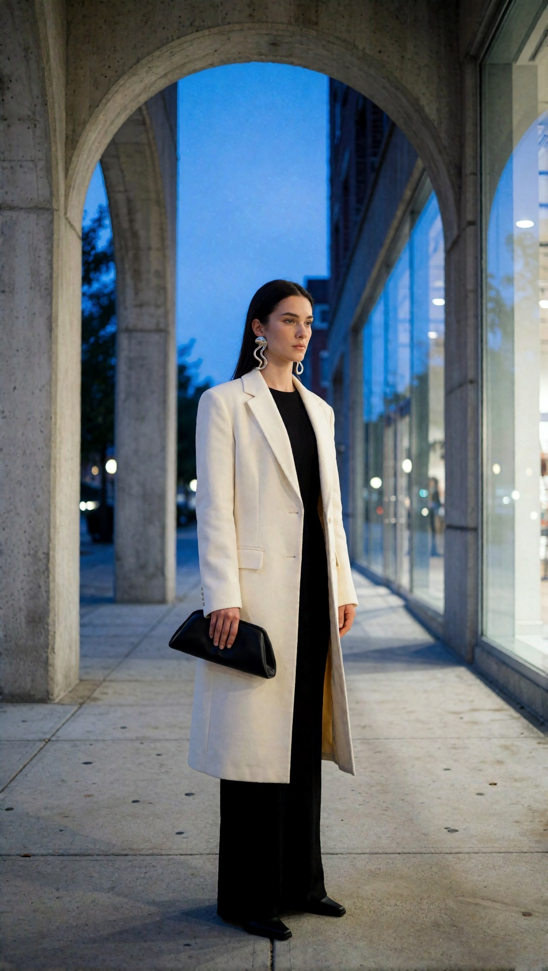
Check whether the arches stay architecturally plausible and whether the coat edges remain clean against glass reflections. In this case, the advanced pipeline held perspective better, while the simple one tended to soften repeating structures.
Speed vs control: the practical tradeoff
If the only question is "which looks better," the answer is incomplete. The useful question is what it cost to get there.
When the simple ComfyUI workflow was better
- Fast concept exploration
- Testing multiple prompt directions quickly
- Product mockups with uncomplicated geometry
- Portraits where background detail was not critical
- Situations where one strong image was enough and consistency mattered less
The best simple ComfyUI workflow outputs often came from not overreaching. If I kept the ask narrow, the graph responded efficiently.
When the advanced ComfyUI workflow was better
- Full-body compositions with styling detail
- Editorial scenes with layered backgrounds
- Images intended for upscaling or cropping
- Cases where fabric, accessories, or interior objects had to survive close inspection
- Repeatable campaigns where visual consistency mattered across a set
The strongest result overall came from an advanced setup on a controlled product-plus-environment scene. It had enough structure to benefit from extra passes, but not so much complexity that the detail stage invented problems.
This prompt tested controlled complexity: a product scene embedded in an environment rather than floating in a blank studio.
Topic: Fragrance bottle in a lived-in editorial interior with supporting props
Genre: Luxury Campaign
Camera: Hasselblad X2D 100C
Lens: 90mm f/2.5
Lighting: Late afternoon window shaft with negative fill
Location: Paris apartment window ledge with plaster walls and linen curtain
Style: Elegant resort editorial
Final Prompt: Luxury fragrance bottle placed on a Paris apartment window ledge with textured plaster walls, a soft linen curtain drifting inward, a ceramic tray, a handwritten note, and a folded sand-colored scarf nearby, late afternoon window shaft cutting across the scene with negative fill for sculpted contrast, warm beige, ivory, and amber palette, realistic glass refraction, premium cap detailing, restrained lifestyle styling, editorial luxury campaign mood, Hasselblad X2D 100C realism, 90mm f/2.5 medium-format depth and precision, composition balanced between product focus and lived-in atmosphere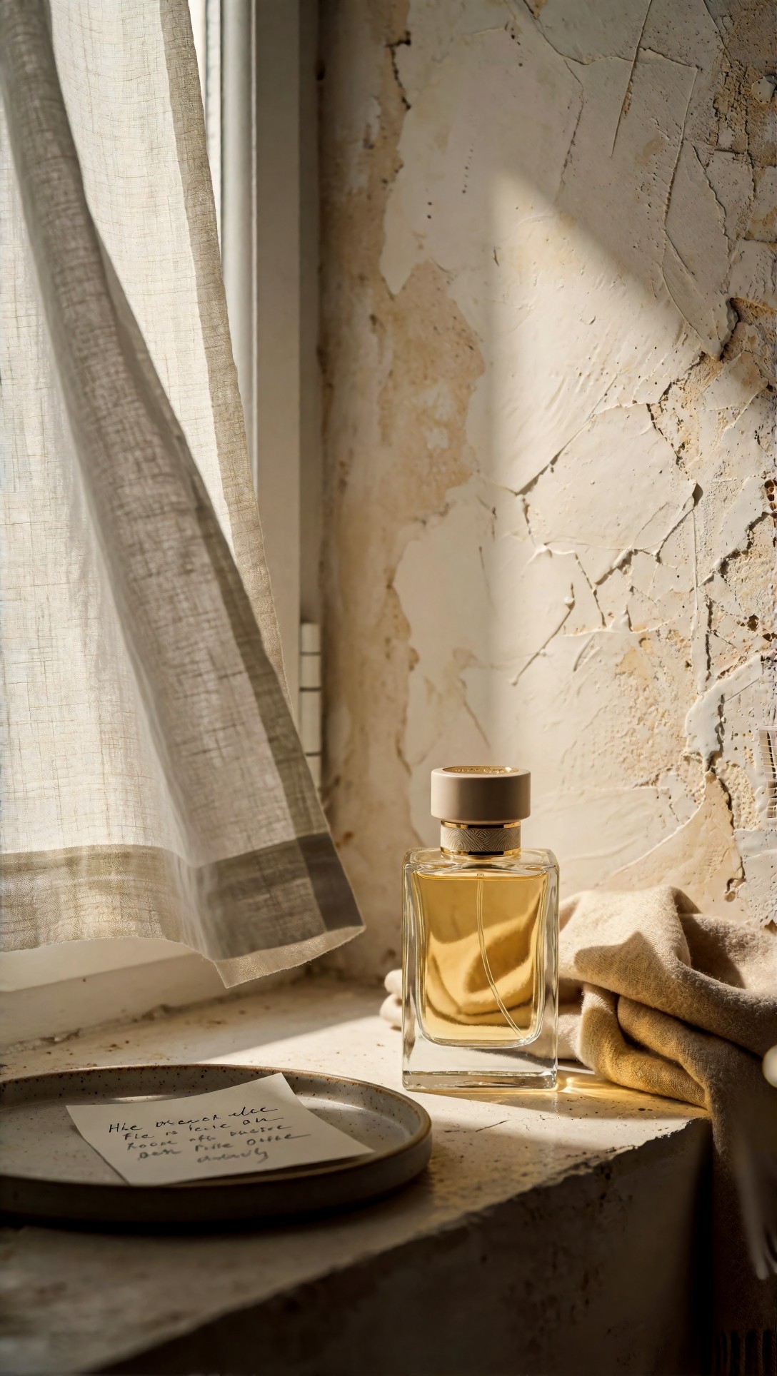
Inspect whether the props support the bottle rather than stealing attention. The advanced workflow handled prop hierarchy better, while the simple graph often let the curtain or tray become oddly dominant.
Failure risks I would watch before calling either workflow "best"
This is where most best ComfyUI setup advice gets too abstract. The risks are not theoretical; they show up in predictable places.
Simple workflow risks
- Good first impression, weak second look
- Inconsistent hands in full-body scenes
- Backgrounds that read as unfinished once you zoom in
- Fine patterns turning into vague texture noise
- Upscaling that reveals missing structure instead of enhancing detail
Advanced workflow risks
- Overprocessing that hardens skin or fabric unnaturally
- Second-pass denoise changing the face too much
- Control guidance making poses feel stiff
- Longer iteration time hiding the fact that the core prompt is weak
- Detail recovery turning reflective surfaces into clutter
I would not call the advanced ComfyUI workflow "better" by default. It is better only when you know what specific problem the extra stage is solving.
This prompt intentionally stressed hand pose, accessories, and specular highlights to reveal overprocessing issues.
Topic: Close three-quarter beauty-fashion image with jewelry and reflective fabric
Genre: Beauty Campaign
Camera: Sony A1
Lens: 90mm f/2.8 Macro
Lighting: Studio butterfly light with silver bounce
Location: Seamless warm gray studio set
Style: High-end beauty advertising
Final Prompt: Three-quarter beauty-fashion campaign image of a subject in a warm gray studio wearing a liquid-satin espresso blouse, sculptural gold earrings, stacked rings, and a slim cuff bracelet, hands lifted naturally near the collarbone to display jewelry without tension, composed direct gaze, polished but natural makeup, smooth butterfly lighting with silver bounce for controlled highlights, rich brown and gold palette, visible satin texture without clipping, precise finger anatomy, premium skin texture, Sony A1 detail character, 90mm f/2.8 macro precision, luxury beauty advertising composition with negative space for campaign layout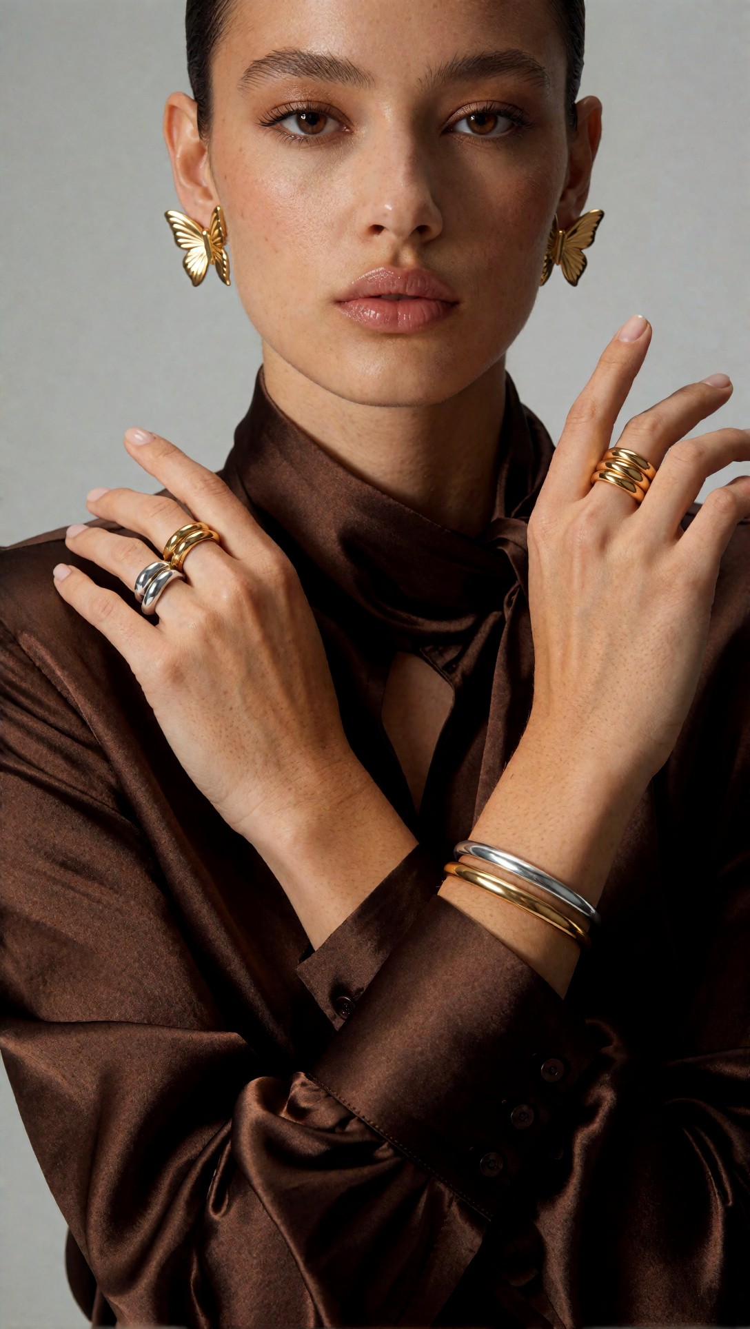
Look closely at finger proportion, ring placement, and whether the satin still looks like fabric instead of melted chrome. In my advanced passes, too much detail emphasis could make the blouse harsher than intended.
The prompts that exposed quality-vs-speed differences most clearly
Some prompts are simply better for judging ComfyUI quality vs speed than others. The best diagnostic prompts combine one difficult human element with one difficult environmental element.
This test checked action, motion, and depth separation, which quickly revealed whether the simple graph could keep all parts of the frame coherent.
Topic: Running subject in cinematic transit corridor with layered lighting
Genre: Cinematic Travel
Camera: Canon EOS C70 cinematic capture style
Lens: 35mm T1.5
Lighting: Mixed fluorescent overhead with warm platform spill
Location: Underground transit corridor in Tokyo
Style: Cinematic realism
Final Prompt: Cinematic scene of a fashion-forward subject moving through an underground transit corridor in Tokyo, mid-stride with coat trailing behind, wearing a navy trench, white shirt, tapered black trousers, and clean leather sneakers, one hand holding a slim weekender bag, alert focused expression, mixed fluorescent overhead light with warm platform spill in the distance, reflective floor, layered signage and tiled walls, dynamic but readable motion, strong subject separation, realistic corridor depth, Canon EOS C70 cinematic image character, 35mm T1.5 perspective, cinematic realism with controlled motion energy and clean anatomy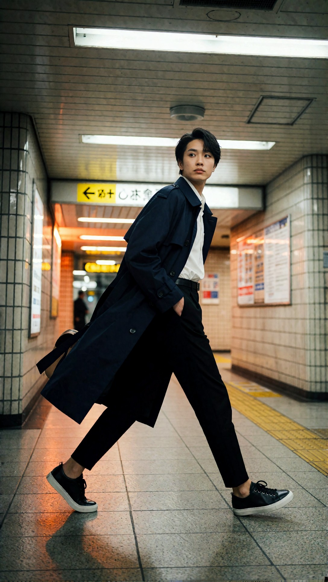
Inspect whether motion reads as intentional rather than deformed anatomy. The simple workflow was faster to iterate here, but the advanced workflow did more to preserve corridor structure and bag shape.
This final comparison prompt focused on skin, fabric, and environmental atmosphere in a lower-contrast natural-light setup.
Topic: Coastal resort editorial with soft natural light and layered linen styling
Genre: Lifestyle Portrait
Camera: Panasonic Lumix S1R
Lens: 70mm f/2.8
Lighting: Early morning coastal haze
Location: Whitewashed terrace overlooking the Aegean Sea
Style: Elegant resort editorial
Final Prompt: Lifestyle editorial portrait on a whitewashed terrace overlooking the Aegean Sea, subject wearing layered natural-linen resort styling in off-white and pale sand, rope belt, flat leather sandals, delicate shell jewelry, seated sideways on a built-in bench with relaxed shoulders and a soft contemplative expression, early morning coastal haze diffusing the light, breezy fabric movement, subtle sea horizon, clean terrace geometry, restrained palette, realistic skin texture, refined linen weave, Panasonic Lumix S1R realism, 70mm f/2.8 natural compression, elegant resort editorial mood with airy atmosphere and calm composition
Check the linen weave, terrace edge straightness, and whether the sea horizon stays believable. This was a good case for an advanced workflow only if the image was meant for final delivery; for ideation, the simple graph was enough.
What I inspect before publishing the result
No matter which workflow produced the image, I use the same practical review pass.
Quick quality checklist
- Are hands, footwear, and accessory overlaps anatomically plausible?
- Does the main fabric read like the intended material at 100% zoom?
- Is the subject-background edge clean without cutout artifacts?
- Do repeated architectural elements stay logically aligned?
- Has the face changed between base pass and detail/upscale pass?
- Are reflections behaving like glass, metal, satin, or water rather than generic shine?
- Does the background support the subject, or is it competing for attention?
- If cropped tighter, does the image still hold up compositionally?
This last product-forward test was useful for checking whether the workflow could preserve edge clarity without making the whole frame brittle.
Topic: Premium watch product portrait on wrist with environmental storytelling
Genre: Product Editorial
Camera: Nikon D850
Lens: 105mm f/2.8 Macro
Lighting: Soft north-window light with black flag contrast control
Location: Writing desk with leather notebook and fountain pen
Style: Clean commercial look
Final Prompt: Product editorial image of a premium stainless steel wristwatch worn on a relaxed wrist above a writing desk, soft north-window light shaping the brushed metal case and textured dial, black flag contrast control for crisp edge definition, supporting props including a leather notebook, fountain pen, and folded correspondence, neutral taupe and steel palette, realistic hand anatomy, precise bracelet links, readable dial detail, shallow but controlled depth, Nikon D850 realism, 105mm f/2.8 macro rendering, clean commercial composition balancing product clarity with subtle lifestyle context
Inspect bracelet geometry, dial readability, and whether the hand looks naturally connected to the wrist. This is a good sanity check because both human anatomy and product precision need to survive together.
Practical recommendation: which setup should you actually use?
If you are deciding between a simple ComfyUI workflow and an advanced ComfyUI workflow, I would frame it this way:
Use the simple workflow when
- You are still finding the shot
- You need rapid prompt iteration
- The scene has one clear subject and limited structural complexity
- You are testing style direction before investing time in polish
Use the advanced workflow when
- You already know the composition you want
- The image contains layered clothing, interiors, props, or architecture
- You plan to upscale, crop, or publish at larger display sizes
- Consistency across a series matters more than raw generation speed
What I would change next
If I were refining this test further, I would split advanced workflows into two separate classes:
- advanced but light, with only a second pass and restrained upscale
- advanced and guided, with structural controls for pose or composition
That would make the ComfyUI workflow comparison even more useful, because not every advanced graph needs to become a node-heavy control system.
Transferable lesson for similar image tasks
The main lesson is simple: match workflow complexity to the failure risk of the scene.
If the prompt asks for a centered portrait against a soft background, a simple ComfyUI workflow is usually the better tool. If the prompt asks for full-body styling, patterned fabrics, reflective props, architectural rhythm, and publishable detail, an advanced ComfyUI workflow earns its overhead.
The setting or prompt detail that mattered most in this test was not sampler trivia. It was clarity of visual priorities. When the prompt made the hierarchy obvious—subject first, material second, environment third—the advanced pipeline improved the image. When the prompt tried to push everything equally, the extra control often amplified confusion.
Editorial conclusion
For a true ComfyUI workflow comparison, the winner depends on the job.
Use the simple ComfyUI workflow if you need speed, broad exploration, and low setup friction. It is best for early concepting, straightforward scenes, and operators who value iteration volume over perfect control.
Use the advanced ComfyUI workflow if you need cleaner structure, stronger material rendering, and more reliable final-quality images. It is best for full-body editorials, product-environment blends, architecture-aware scenes, and any output that will be inspected closely or upscaled.
Avoid the advanced setup if you are still uncertain about composition or prompt direction, because it can slow you down while polishing the wrong idea. Avoid the simple setup if the image must survive close review of hands, fabrics, repeating structures, or reflective materials.
If I had to reduce the whole test to one practical rule, it would be this: choose the workflow based on what is most likely to fail in the frame, not on which graph looks more impressive.