The short answer: on a low-VRAM PC, do not try to make the first generation perfect. Keep the first pass small, decide from that image whether it deserves more memory, and then spend extra VRAM only on the specific weakness you can see. This article cannot give you a verified "works on 8 GB" number. The original version of this page claimed VRAM headroom and speed results, but no measurement was recorded anywhere, so those claims have been removed. What can be checked is a set of eight real generated images, and the most useful thing they show is which kinds of flaws appear in a single pass. That tells you where a second step is worth its memory cost.
What the records support, and what they do not
The eight images behind this article were generated with Krea2 Turbo on 2026-07-11. Each generation record stores the prompt and the model name. It does not store a ComfyUI graph, a GPU model, peak VRAM, sampler, steps or timing. So:
- Not available: how much VRAM any image used, how long it took, and whether a "lean" or "enhanced" graph produced it. Any statement like that would be invented.
- Verified by opening the files: all eight are JPEGs of 1088x1928 pixels, about 2.1 megapixels each. That is a tall, fairly large canvas compared with the roughly one-megapixel size SDXL-class models are commonly described as trained around. Whether a given low-VRAM card can produce this size in one pass depends on the model, precision and software, and is not something these records answer.
- General guidance (unverified here): the memory-saving options described below come from common ComfyUI practice and documentation, not from our own measurements.
Read the first pass before you add nodes
The idea is simple. Every extra step (a second sampler pass, a larger decode, an upscale) costs memory and time. On a small card you can afford only a few of them, so the question is which flaw is worth fixing. Here is what six of the images show.
Flaws that more VRAM will not fix: printed text
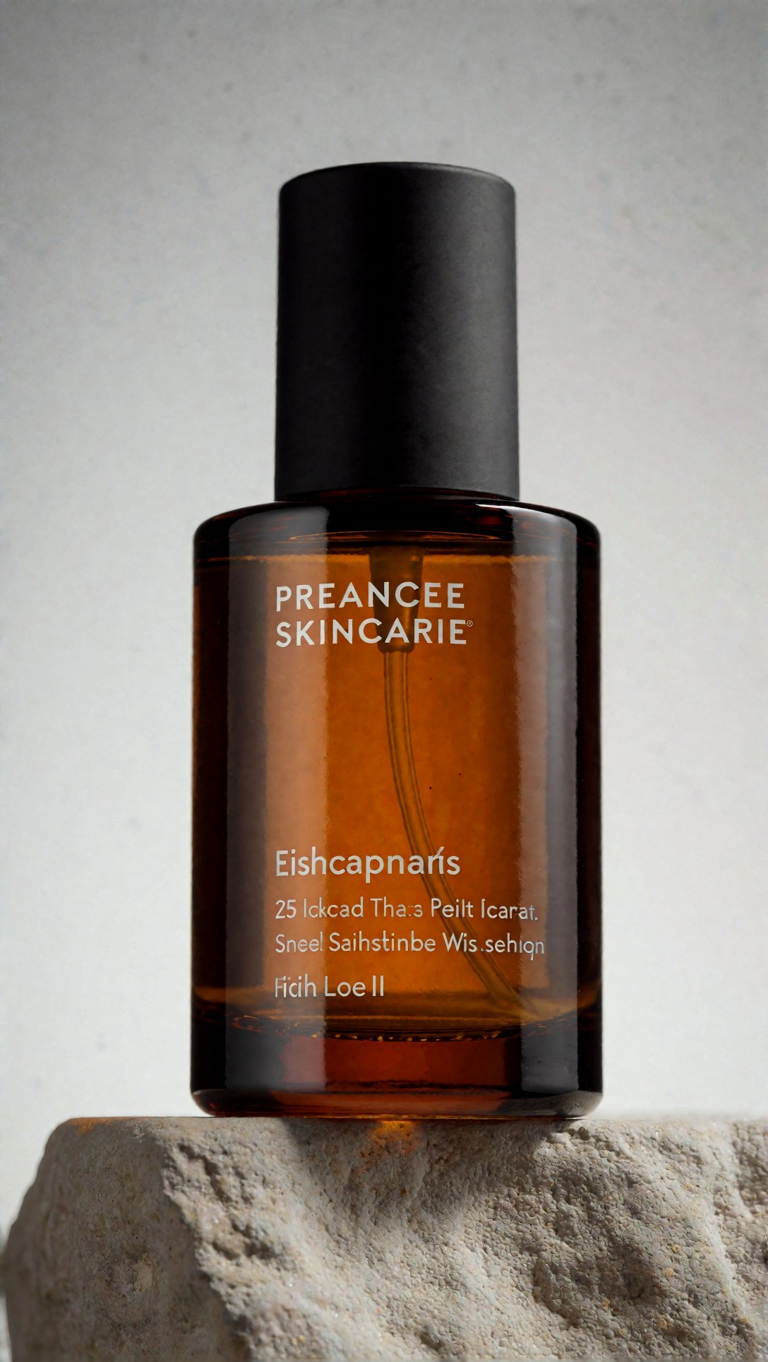
The prompt was:
a premium amber skincare bottle with matte black cap placed on a textured stone pedestal, minimal studio set, warm gray seamless backdrop, overhead softbox for soft label readability, narrow rim light defining bottle edges, subtle shadow falloff, clean commercial composition, realistic glass reflections, legible product silhouette, controlled highlights, tactile stone surface, Nikon Z7 II look, 85mm macro precision, premium retail editorial finishThe glass, the matte cap, the stone surface and the soft backdrop all look convincing. The label does not. The main line reads "PREANCEE SKINCARIE", and the lines below it ("Eishcapnaris", "25 Ickcad Tha:s Peilt Icarat.") are not words. The prompt asked for label readability, but it did not supply any text, and the model filled the label with plausible-looking letters.
The practical point for low-VRAM users: garbled text is a model behavior, not a memory problem. Tiling the decode or adding an upscale pass will not turn these letters into real ones, and will often make the wrong letters crisper. If you need real label text, plan to add it outside the generator.
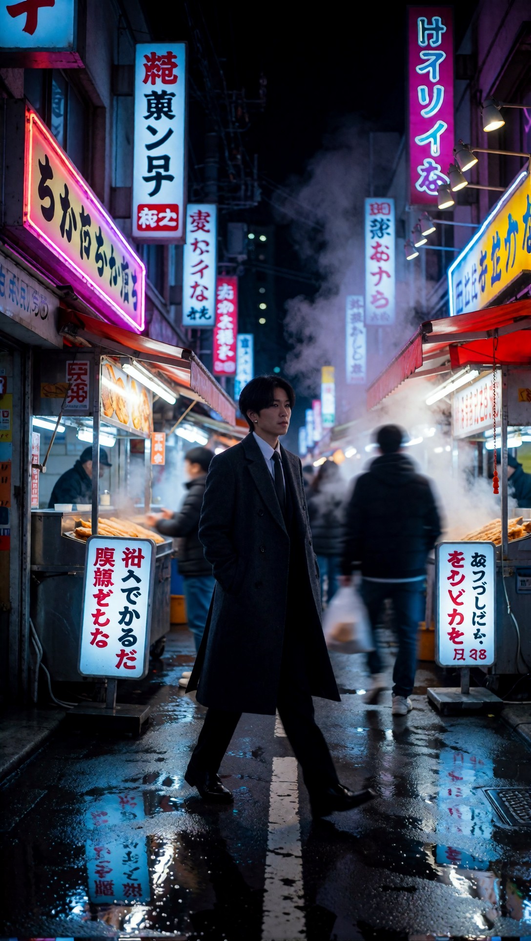
The same thing shows up in the alley scene. Prompt:
a full-body subject walking through a narrow neon-lit night market alley, dark tailored coat, reflective wet pavement, layered Japanese-style shop signs, steam drifting from food stalls, blue and magenta rim light, slight motion in background pedestrians, confident stride, off-center composition, glossy reflections, atmospheric depth, realistic urban clutter, cinematic realism, Sony A7S III look, 35mm f/1.4 perspective, rich night contrast, controlled noise, detailed but readable street sceneComposition, steam, motion blur on the passers-by and the puddle reflections are coherent. The signs are a different story: they look like Japanese signage from a distance, but the characters are mostly not real writing, and the puddle shows those same shapes mirrored. This is a good reminder that an image can look finished at thumbnail size and still fail when you look at the signs.
Flaws that a cheap check catches: hands, props and edges
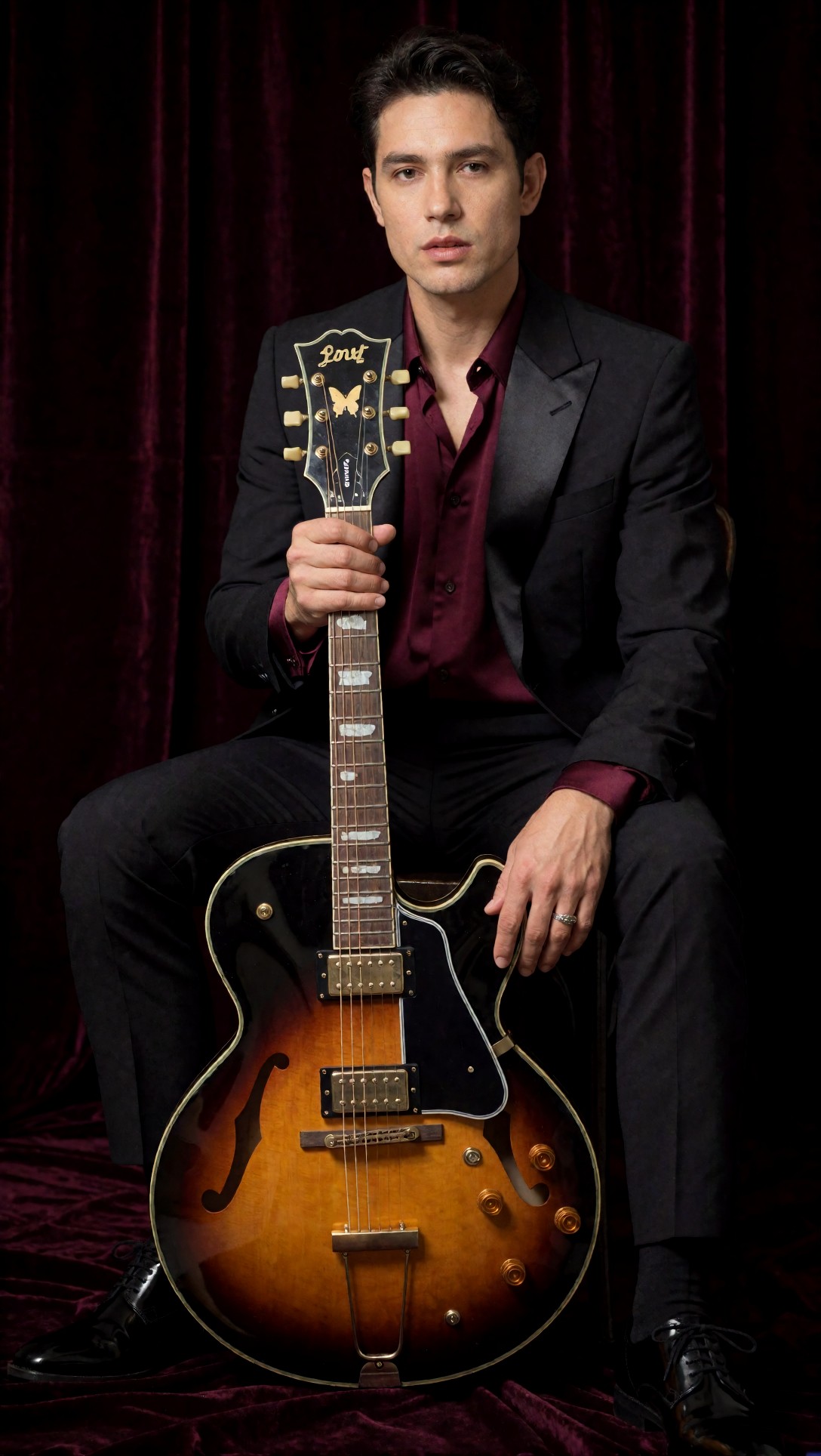
Prompt:
a seated musician holding a hollow-body guitar, both hands visible, tailored black suit with satin lapel, deep burgundy silk shirt, polished shoes, composed expression, dark velvet backdrop, studio butterfly light with soft fill preserving facial structure and hand detail, elegant seated pose, clean editorial framing, realistic fabric sheen, accurate finger placement, rich burgundy and black palette, Panasonic Lumix S1R look, 85mm f/2 portrait compression, refined magazine portrait finishBoth hands are visible and each shows plausible fingers; the right hand even carries a ring. The guitar has f-holes, two pickups, a bridge and a tailpiece, and its overall shape holds together. The clear defect is the headstock: it carries script lettering that does not spell a real brand name, and the neck is held upright in front of the shoulder so the headstock overlaps the suit, which makes the geometry harder to read. Fine details of this kind are where you would look first when deciding whether the image is worth a refinement pass.
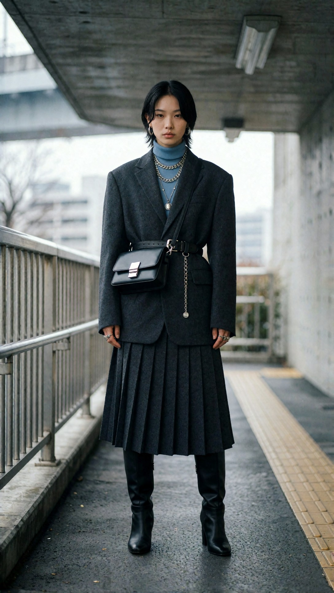
Not every accessory-heavy image needs rescue. In this one the pleats, the belt, the bag with its metal clasp, the layered chains and the boots are all clearly separated and consistent with the prompt:
a full-body fashion subject in structured street-style clothing, oversized charcoal blazer, pleated skirt, leather belt bag, layered silver jewelry, knee-high boots, composed stance under a concrete pedestrian underpass, cool overcast daylight with soft reflected fill, editorial posture, clean lines, textured fabrics, muted gray and steel-blue palette, detailed accessories, realistic skin, modern magazine street editorial, Fujifilm GFX100S look, 80mm f/1.7 shallow separation, premium fabric and styling clarityI could not find a defect at normal viewing size, so there is nothing here that a second pass would obviously repair. That is the useful outcome of the first-pass check: some images should simply be kept, and the memory you did not spend on them is available for the ones that fail.
Flaws that are easy to miss: edge artifacts

a seated young woman in layered autumn clothing, wool coat over ribbed knit sweater, relaxed posture on a wooden stool, calm direct gaze, soft window side light, subtle bounce fill, apartment studio with matte off-white plaster wall and warm wood floor, muted brown and cream palette, realistic skin texture, visible knit fibers, natural hand placement, balanced composition with negative space, Canon EOS R5 look, 50mm f/1.8 depth of field, detailed but clean cinematic realismThe wool, the ribbed knit and the plaster wall are all convincing, and the hands resting on her knees look natural. But along the right edge of the frame there are thin, colored, smeared streaks, most visible beside the coat and near the floor. They are easy to miss when the picture is scaled down. I cannot tell from the record whether they came from the model or from later processing, so I am not going to blame any particular setting. What I can say is that cropping a few pixels from the border is a cheap fix, while re-running at higher settings would be an expensive one.
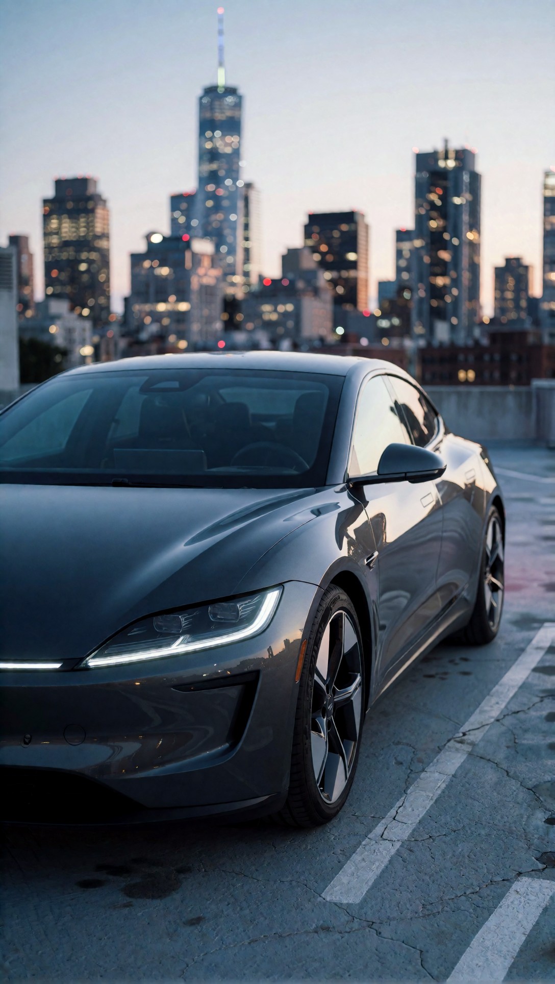
The car is the clean counter-example among hard-surface subjects: the headlight strip, the mirror, the wheel and the reflections in the door are consistent, and the skyline is pleasantly out of focus. Prompt:
a sleek electric sports car in three-quarter view on a rooftop parking deck at dusk, polished graphite bodywork, narrow LED headlights, soft city skyline bokeh in the background, controlled LED edge light tracing body lines, subtle reflections across hood and doors, cinematic low stance, premium automotive composition, cool blue-gray evening palette, clean surface realism, Hasselblad X2D 100C look, 55mm f/2.5 medium-format clarity, high-end automotive advertising finishMemory levers worth knowing (general guidance, not measured here)
These are standard ComfyUI options. They are listed so you know they exist, not because this site measured their effect.
- Smaller canvas first. Generating at a lower resolution and enlarging only the chosen image is the usual way to keep the first step cheap. The [AI upscaler](/upscaler/en) on this site covers the enlarging step.
- Batch size of 1. Batches multiply the memory used by latents during sampling.
- Tiled VAE decode. ComfyUI includes a tiled variant of the VAE Decode node, commonly used when decoding a large latent runs out of memory. Tiling can leave faint seams, so inspect the result.
- Launch flags. ComfyUI has command-line options such as `--lowvram` and `--novram` that push more model parts to system RAM, trading speed for capacity. Check the current documentation for your version, because defaults and flags change.
- Lower-precision weights. Fp16 or fp8 model files use less memory than fp32, sometimes with a quality cost. Whether that cost is visible depends on the model.
Stacking several ControlNets or LoRAs raises memory use too, though by how much depends on the files involved.
How to get real numbers for your own PC
Because the original numbers were not recorded, the honest way to learn your limits is to measure them:
1. Fix one prompt, one seed and one model. 2. Start ComfyUI, run the graph once to warm up, then note peak VRAM with `nvidia-smi` (or your GPU vendor's tool) while the next run is in progress. 3. Change one thing at a time (canvas size, batch size, tiled decode on or off) and record peak VRAM, total time and whether the run completed. 4. Keep the table. A table from your own card is worth more than any figure quoted for someone else's.
To write and refine the prompts used above, the [Prompt Lab](/promptlab/en) is set up for it, and you can try them in the [image generator](/create/en).
FAQ
Will tiled decode fix blurry or garbled details? No. It exists to avoid running out of memory while decoding. Garbled text, like the bottle label above, comes from generation, not from decoding.
How do I know if an upscale is worth it? Open the first-pass image at full size and look for text, hands, edges and props. If they are already clean, as in the street-style and car images, upscaling has less to repair. If the letters are wrong, plan to add text later rather than hoping a larger pass fixes it.
> What this article is based on. Model: Krea2 Turbo. Images generated 2026-07-11 (files dated 2026-07-11). I opened and inspected all eight source images (six are shown; each is 1088x1928). Generation records contain prompts and model name only: there is no ComfyUI graph, GPU, VRAM, speed or settings data, so memory advice is general guidance, and no performance numbers are claimed.