ComfyUI Workflow Nodes Explained by Use Case: Which Ones Actually Improve Output 한국어 요약
이 페이지는 ZView Space의 영어 원문을 한국어 검색 사용자도 이해할 수 있도록 정리한 SEO 요약입니다. 핵심은 단순한 얼굴 중심 이미지가 아니라 패션 에디토리얼, 룩북, 아웃핏, 프롬프트 테스트, 이미지 생성 워크플로우를 실제로 어떻게 구성할지입니다.
핵심 요약
- 원문 주제: ComfyUI Workflow Nodes Explained by Use Case: Which Ones Actually Improve Output
- 목적: AI 이미지 생성에서 outfit, silhouette, fabric, pose, location, camera framing을 더 명확하게 설계합니다.
- 활용 범위: Z-Image Turbo, Krea2 Turbo, Qwen Image, Anima, SeedVR2 같은 이미지 생성 및 업스케일 워크플로우에 적용할 수 있습니다.
- SEO 관점: 제목, 설명, 이미지 alt, 프롬프트 예시가 실제 검색 의도와 맞아야 색인 가능성이 높아집니다.
한국어 사용자를 위한 체크포인트
1. 프롬프트가 얼굴 묘사에만 머물지 않고 전체 스타일과 의상 구성을 설명하는지 확인합니다. 2. 패션 이미지라면 상의, 하의, 아우터, 신발, 액세서리, 소재감, 촬영 장소를 분리해서 씁니다. 3. 생성 결과는 바로 게시하지 말고 디테일, 손, 의상 형태, 배경 일관성, 이미지 품질을 비교합니다. 4. 글 본문에는 실제 테스트 기준과 실패를 줄이는 방법이 들어가야 검색엔진에서 얇은 콘텐츠로 보일 가능성이 줄어듭니다.
원문 미리보기
If you are trying to decide which ComfyUI workflow nodes actually improve image quality, the short answer is this: a small set of nodes consistently changes output in visible ways, while many others mostly improve convenience, repeatability, or speed. In this
---
If you are trying to decide which ComfyUI workflow nodes actually improve image quality, the short answer is this: a small set of nodes consistently changes output in visible ways, while many others mostly improve convenience, repeatability, or speed. In this test, the biggest image-quality gains came from better sampler scheduling, latent/detail refinement, ControlNet-style guidance, and selective upscaling passes. Some popular nodes looked impressive in workflow screenshots but barely moved the final image.
That matters because ComfyUI can become cluttered fast. A bigger graph does not automatically mean a better result. What helped most in this comparison was choosing nodes by failure type: anatomy drift, weak composition, muddy texture, poor prompt adherence, or upscale artifacts.
Quick answer
- The most useful ComfyUI workflow nodes are the ones that solve a specific failure: composition control, detail recovery, or upscale cleanup.
- For raw prompt-only generation, sampler, scheduler, CFG handling, and latent resolution choices changed output more than novelty utility nodes.
- For consistent poses, products, interiors, and scene layout, ControlNet-related nodes were the strongest upgrade.
- For final polish, a two-stage workflow with latent generation plus image upscaling beat single-pass high resolution renders in most tests.
- If a node adds complexity but you cannot point to the defect it fixes, it is probably workflow overhead, not image improvement.
What was tested
I compared a few practical workflow families rather than every node in the ecosystem:
1. Baseline prompt workflow: checkpoint loader, text encode, empty latent, sampler, VAE decode, save image. 2. Refined generation workflow: baseline plus better scheduler choices, latent upscaling, detail-focused second pass. 3. Guided workflow: baseline plus ControlNet or conditioning nodes for pose/composition lock. 4. Post-fix workflow: baseline plus upscale and face/detail restoration nodes.
The goal was not to crown one giant workflow. It was to see which ComfyUI workflow building blocks changed output enough to justify the added graph complexity.
Comparison criteria
I judged each node category on the same things:
- prompt adherence
- facial stability
- hand and limb failure rate
- texture detail
- background coherence
- composition control
- artifact risk after upscaling
- setup cost in time and node complexity
For adjacent tools, zview users often pair generation with prompt drafting in [Prompt Lab](/promptlab), test outputs in [Create](/create), compare finished images in the [Gallery](/gallery), and polish final renders with the [Upscaler](/upscaler).
Verdict first: which ComfyUI useful nodes mattered most
Here is the practical ranking from this test.
| Node category | Visible output gain | Best for | Weak point | |---|---|---|---| | Sampler + scheduler tuning | High | cleaner structure, prompt response | can be subtle without controlled A/B testing | | Latent upscale / second pass refine | High | texture, edges, subject separation | can invent detail or sharpen mistakes | | ControlNet / conditioning guidance | Very high | pose, layout, product framing, architecture | extra inputs required | | Regional/detail refinement nodes | Medium to high | face cleanup, local texture work | can overcook skin or create mismatch | | Upscale nodes | Medium to high | delivery resolution, texture polish | can add fake detail | | LoRA loaders and style nodes | Medium | style targeting | can overpower prompt intent | | Utility/reroute/metadata nodes | Low for image quality | workflow organization | no direct visual gain |
Option A: the lean baseline workflow is stronger than people think
The default assumption is often wrong here. A simple workflow with good core settings frequently beat a bloated graph.
My baseline stack was:
- Checkpoint Loader
- CLIP Text Encode positive/negative
- Empty Latent Image
- KSampler
- VAE Decode
- Save Image
With the right checkpoint, image size, steps, scheduler, and denoise behavior, this already produced the cleanest overall images for many portrait and concept tasks. The strongest result from the simple graph came when the prompt was specific and the subject did not need strict pose control.
Why the baseline worked
- Fewer moving parts meant fewer conflicts.
- Prompt intent stayed clearer because no extra guidance node was fighting the text.
- It was easier to spot whether a problem came from prompt wording, model limitations, or sampling.
What improved output inside the baseline
In this test, these “basic” node decisions mattered more than many add-ons:
- choosing a sampler that preserved form before chasing micro-detail
- using a scheduler that did not wash out contrast late in the denoise
- generating at a sensible latent size instead of forcing huge first-pass renders
- keeping CFG in a moderate range instead of overdriving it
This prompt was useful for checking whether the baseline could hold facial structure, clothing texture, and clean depth separation without extra guidance.
Topic: editorial portrait of a woman in a tailored charcoal suit
Genre: Fashion Editorial
Camera: Sony A7R V
Lens: 85mm f/1.4
Lighting: softbox key light with subtle negative fill
Location: minimalist concrete studio with matte gray backdrop
Style: clean commercial look
Final Prompt: editorial portrait of a woman wearing a sharply tailored charcoal wool suit with satin lapels, crisp white shirt, silver ear cuff, relaxed confident pose, direct eye contact, clean posture, natural hands visible, minimalist concrete studio, matte gray seamless backdrop, softbox key light with subtle negative fill, premium fabric texture, accurate skin texture, shallow depth of field, clean commercial composition, Sony A7R V look, 85mm f/1.4, neutral gray palette with controlled contrast, realistic anatomy, polished but not over-retouched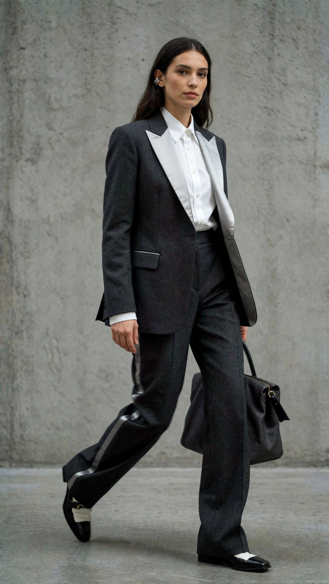
Inspect whether the jawline, fingers, and lapel edges stay coherent before adding any “improvement” node. If the baseline already solves the image cleanly, extra nodes may only increase failure points.
Baseline limitations
The weak point was repeatability under harder constraints.
When I asked for exact poses, products held at a specific angle, or rooms with reliable perspective, the baseline drifted. It also struggled when I pushed crowded scenes or requested small text-like details that needed structural guidance.
This second test exposed hand stability and object interaction limits in the simple workflow.
Topic: barista holding a ceramic cup while steaming milk in a narrow cafe workspace
Genre: Lifestyle Portrait
Camera: Canon EOS R5
Lens: 50mm f/1.8
Lighting: overcast window light with warm interior practicals
Location: compact neighborhood cafe with tiled counter and espresso machine
Style: cinematic realism
Final Prompt: lifestyle portrait of a barista in a dark green apron holding a ceramic cup in one hand while steaming milk with the other, narrow cafe workspace, tiled counter, polished espresso machine, stacked cups, natural body angle, visible hands interacting with tools, overcast window light mixed with warm practical pendant lights, candid expression, cinematic realism, Canon EOS R5 look, 50mm f/1.8 depth, brown cream and brass color palette, realistic steam, believable object placement, documentary-style framing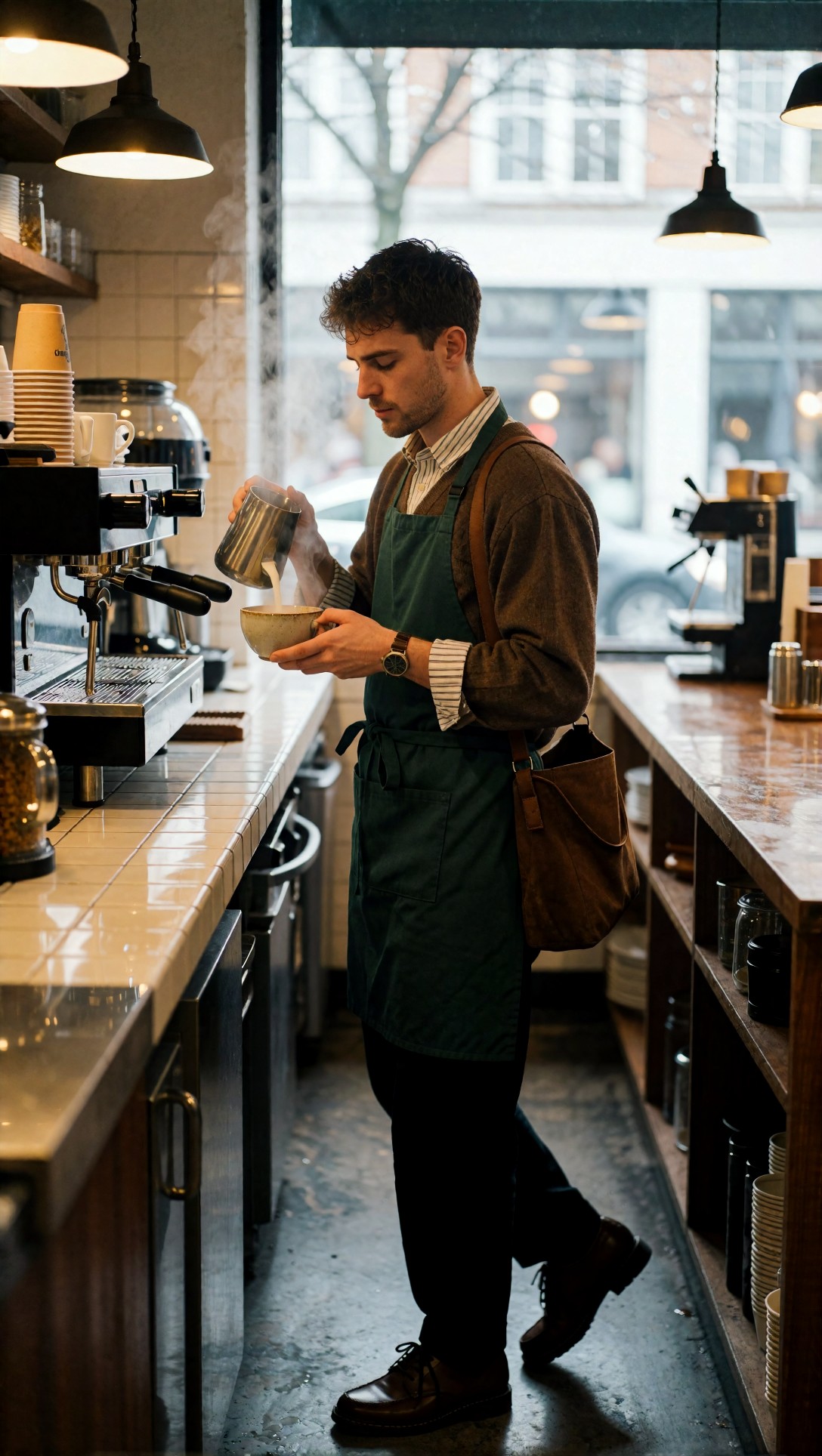
Look closely at finger count, cup grip, and steam wand placement. In the baseline workflow, these interaction points were where output quality broke first.
Option B: guided workflows with ControlNet-style nodes improve the image when structure matters
If the baseline is best for fast prompting, the best alternative workflow is a guided one. In this test, ControlNet and related conditioning nodes were the most meaningful upgrade when the scene needed a locked pose, composition, or spatial arrangement.
This is where “best ComfyUI nodes for image generation” depends on the use case. For freeform portrait work, not always necessary. For anything that must obey structure, extremely useful.
Where guided workflows clearly won
- full-body poses
- product framing
- architecture/interiors
- scenes with hand-object contact
- character consistency from rough references
What changed visually
The good result was not just “more control.” The actual images had:
- fewer collapsed limbs
- cleaner subject placement inside frame
- more believable camera angle continuity
- stronger adherence to silhouette and pose intention
I would use this workflow whenever prompt wording alone cannot anchor geometry.
This prompt was used with pose or edge guidance to test whether the node stack could preserve full-body stance and clothing silhouette.
Topic: full-body fashion model in a structured ivory trench coat stepping forward
Genre: Street Style
Camera: Nikon Z8
Lens: 35mm f/2
Lighting: overcast diffusion with light street bounce
Location: wet city crosswalk with reflective pavement
Style: luxury fashion campaign
Final Prompt: full-body fashion model stepping forward in a structured ivory trench coat over a black turtleneck and knee-high leather boots, one hand adjusting the collar, the other carrying a compact leather bag, wet city crosswalk with reflective pavement, controlled stride, visible full silhouette, balanced limb proportions, overcast diffusion with soft street bounce, luxury fashion campaign direction, Nikon Z8 look, 35mm f/2 environmental framing, restrained monochrome palette with silver reflections, crisp coat structure, realistic motion and pose accuracy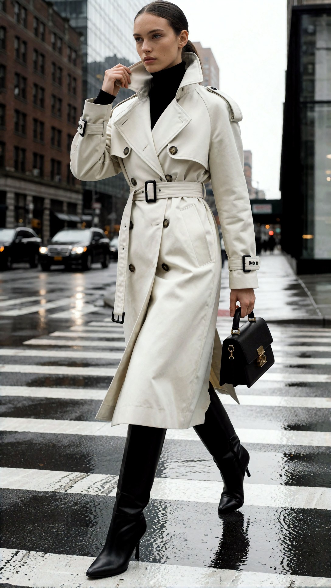
Check the coat hem, leg spacing, and bag-hand contact. With pose guidance, these stayed noticeably more consistent than the prompt-only baseline.
This next test targeted interior layout consistency, where pure prompting often drifts between design styles and perspective rules.
Topic: modern hotel lobby with curved sofa and large pendant light
Genre: Interior Editorial
Camera: Fujifilm GFX100 II
Lens: 32-64mm f/4 at 40mm
Lighting: soft skylight with warm lamp accents
Location: boutique hotel lobby with stone floor and walnut wall panels
Style: architectural digest realism
Final Prompt: wide interior editorial of a boutique hotel lobby with a curved cream sofa, large sculptural pendant light, walnut wall panels, stone floor, reception desk in the distance, balanced negative space, coherent one-point perspective, soft skylight mixed with warm lamp accents, calm luxury atmosphere, Fujifilm GFX100 II look, 40mm medium-format realism, beige walnut and brushed brass palette, clean furniture lines, accurate scale relationships, high material fidelity, editorial architectural composition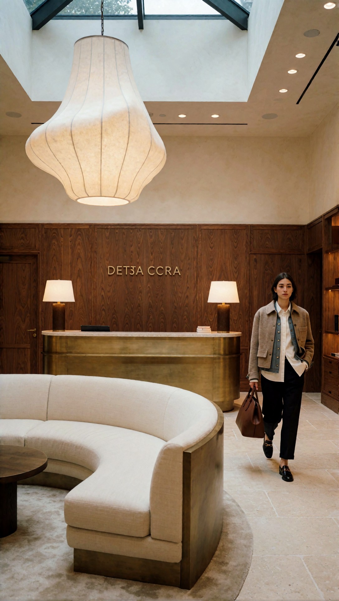
Inspect perspective lines, furniture spacing, and whether the pendant light remains plausible in scale. Guidance nodes improved these relationships more than sampler changes did.
Weak points of guided workflows
- More setup time.
- More preprocessing if you use pose, depth, line art, or canny inputs.
- Over-constrained images can feel stiff.
- Bad guide images lock in bad composition just as effectively as good ones.
In other words, guided workflows improve output when the target is structurally demanding, not because they are universally superior.
The node group that quietly helps most: latent upscale and second-pass refinement
If I had to keep only one “improvement” layer beyond the baseline, it would be a second pass. Not because it always makes the image prettier, but because it usually gives the cleanest path to more detail without paying the full cost of giant first-pass renders.
Why this node pattern worked
Generate a solid composition first. Then increase latent size or pass the decoded image into a controlled refine stage with moderate denoise. This preserved global structure better than asking the initial generation to solve everything at high resolution.
The gain was easy to see in:
- textile weave
- hair separation
- product edge definition
- skin pores without heavy plastic smoothing
This test was built to expose whether fine texture appears natural or just sharpened.
Topic: luxury wristwatch on folded linen beside a glass of water
Genre: Product Editorial
Camera: Hasselblad X2D 100C
Lens: 90mm f/2.5
Lighting: large softbox from left with silver bounce fill
Location: quiet tabletop set with limestone surface
Style: high-end beauty advertising
Final Prompt: close product editorial of a luxury wristwatch with brushed steel case and deep blue dial resting on folded off-white linen beside a clear glass of water, limestone tabletop, refined styling, precise reflections, crisp bezel markings, shallow but controlled depth of field, large softbox from left with silver bounce fill, Hasselblad X2D 100C look, 90mm f/2.5 medium-format detail, cool blue and warm stone palette, premium commercial composition, micro-texture in fabric and metal, elegant negative space, highly realistic product edges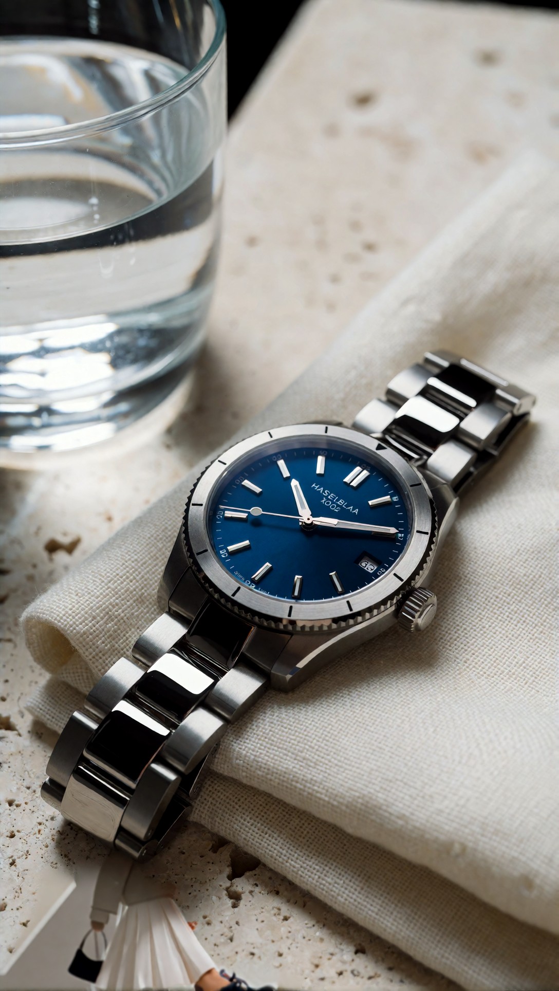
Inspect the watch numerals, crown shape, and linen weave. A good second pass should add clarity without turning reflections into noise or inventing fake engraving.
This portrait prompt tested whether a latent refinement pass could improve skin and hair texture while preserving identity.
Topic: close beauty portrait with wet-look hair and soft gold makeup
Genre: Beauty Campaign
Camera: Canon EOS R3
Lens: 100mm f/2.8 macro
Lighting: studio butterfly light with low fill cards
Location: warm beige seamless studio
Style: high-end beauty advertising
Final Prompt: close beauty portrait of a model with wet-look hair slicked back, soft gold eye makeup, luminous natural skin, nude satin wrap top, calm neutral expression, symmetrical framing, warm beige seamless studio, studio butterfly light with low fill cards, Canon EOS R3 look, 100mm f/2.8 macro detail, high-end beauty advertising style, visible skin texture without harsh pores, subtle catchlights, controlled highlights on cheekbones, gold beige and honey palette, premium cosmetic campaign finish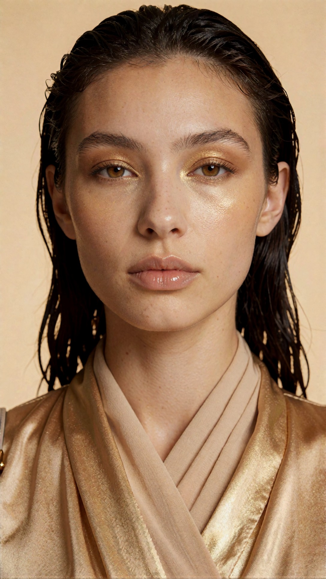
The main thing to inspect is whether pores, eyelashes, and hairline detail become clearer without changing face shape. If identity shifts between passes, the denoise level is too aggressive.
Upscale and restore nodes: good finishers, bad rescuers
A common mistake is expecting upscaling nodes to repair a weak image. In this test, they worked best when the original image was already structurally sound.
What they improved
- delivery resolution
- edge crispness
- local texture readability
- print-friendly detail in products and interiors
What they did not fix well
- broken hands
- warped facial proportions
- confused object relationships
- poor composition
That means upscale nodes belong late in the workflow. If your source image is wrong, they often make the wrong parts clearer.
This test prompt makes upscale artifacts easy to spot because it contains repeating texture, stitching, and reflective accessories.
Topic: premium leather handbag on a boutique shelf with folded scarves
Genre: Product Editorial
Camera: Sony A1
Lens: 70mm f/2.8
Lighting: directional window light with soft bounce card fill
Location: upscale boutique shelving in muted taupe interior
Style: clean commercial look
Final Prompt: premium leather handbag displayed on a boutique shelf beside neatly folded silk scarves and a polished brass accessory stand, visible stitching, structured handle, subtle logo hardware, directional window light with soft bounce fill, upscale taupe retail interior, Sony A1 look, 70mm f/2.8 product framing, clean commercial style, tan cream and brass palette, crisp leather grain, controlled reflections, tidy composition, realistic shelf geometry, high-detail retail presentation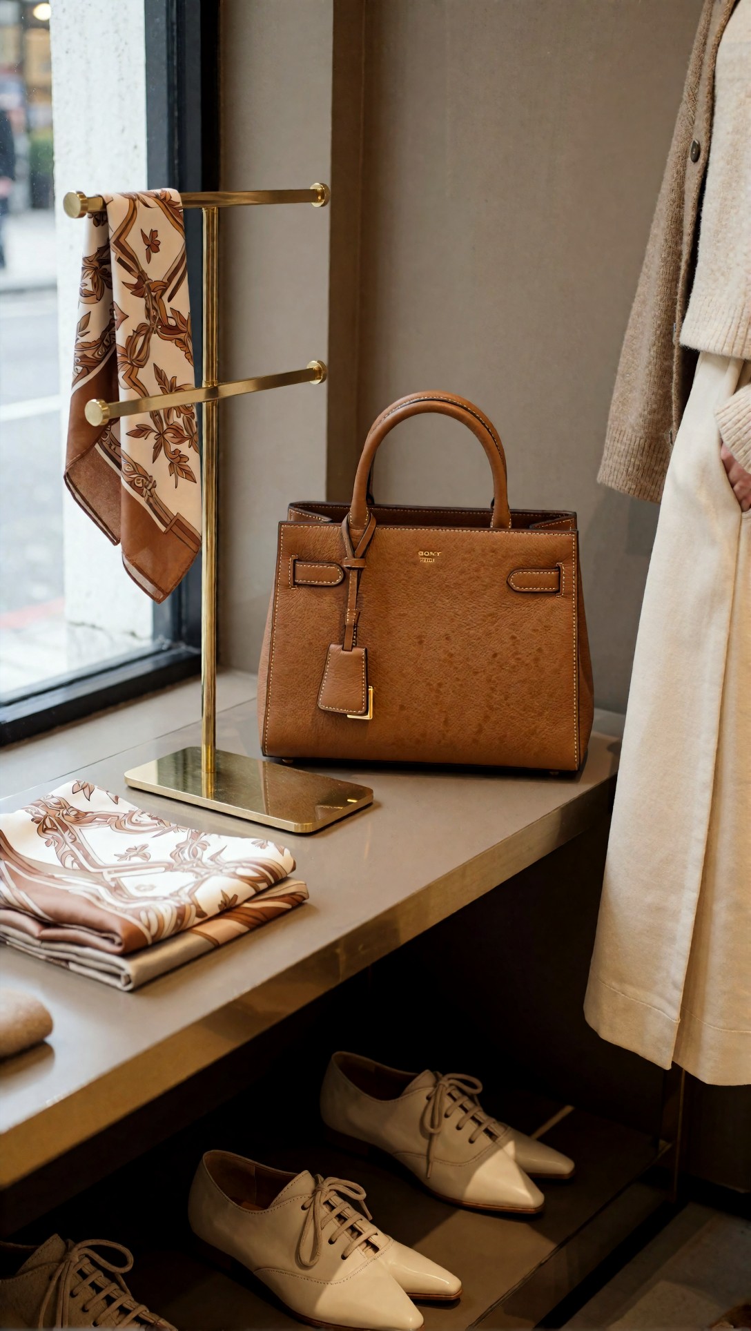
Inspect stitch continuity, leather grain, and hardware edges after upscaling. Good upscale nodes preserve material identity; weak ones create crunchy pseudo-detail.
Side-by-side tradeoffs: which ComfyUI nodes explained by outcome, not hype
A lot of node guides explain what a node does technically but not when it earns a permanent place in a workflow. This checklist is the more useful view.
Use this if your problem is composition drift
Choose:
- pose/depth/edge guidance nodes
- aspect-ratio-aware latent setup
- moderate sampler settings before heavy refinement
Avoid:
- jumping straight to upscale nodes
- adding face/detail restorer nodes before the composition is fixed
Use this if your problem is muddy textures
Choose:
- latent upscale
- second-pass refinement
- controlled upscale node at the end
Avoid:
- very high first-pass resolution with unstable composition
- excessive denoise in the refine stage
Use this if your problem is weak prompt adherence
Choose:
- cleaner positive prompt structure
- lower-conflict LoRA use
- sampler and CFG retuning
Avoid:
- stacking too many style nodes
- long contradictory prompts
Use this if your problem is hand and face errors
Choose:
- guided pose/composition nodes for interaction scenes
- detail refinement on face regions only if available
- prompts that reduce ambiguous hand actions
Avoid:
- assuming upscaling will repair anatomy
- asking for multiple complex gestures in one shot unless structure is guided
Prompt examples that expose the differences
The clearest way to understand ComfyUI workflow nodes is to run prompts that punish weak workflows. These examples were selected to surface specific failure modes.
This image tests multi-subject spacing and whether a workflow can preserve separate identities without merging poses.
Topic: two chefs plating desserts side by side in an open kitchen
Genre: Culinary Editorial
Camera: Panasonic Lumix S1R II
Lens: 50mm f/2
Lighting: bright overhead kitchen light with soft frontal fill
Location: stainless steel restaurant pass in an open kitchen
Style: documentary commercial realism
Final Prompt: two chefs plating intricate desserts side by side at a stainless steel restaurant pass, one adding berries with tweezers, the other placing mint leaves, clean chef jackets, visible separate hand actions, trays, plates, utensils, open kitchen background, bright overhead kitchen light with soft frontal fill, Panasonic Lumix S1R II look, 50mm f/2, documentary commercial realism, white steel and berry-red color palette, sharp culinary detail, believable spacing between subjects, realistic arm positions, crisp plating textures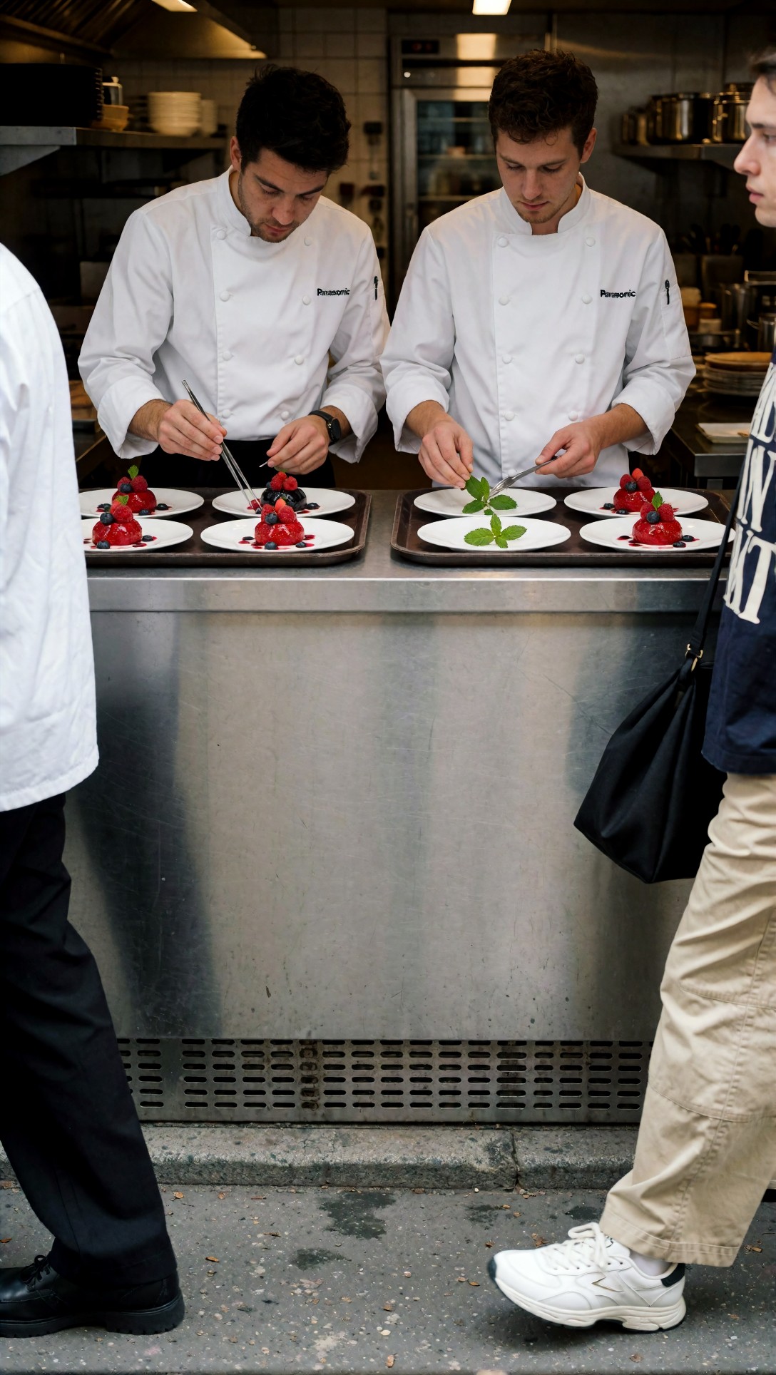
Check for arm crossover, duplicated tools, and merged shoulders. Guided workflows handled subject separation better than prompt-only runs.
This next test checks scene depth and whether background complexity remains readable after a second-pass detail workflow.
Topic: night market portrait with layered lanterns and hanging signs
Genre: Cinematic Travel
Camera: Leica SL2-S
Lens: 35mm f/1.4
Lighting: neon rim light with warm stall spill
Location: narrow East Asian night market alley
Style: cinematic realism
Final Prompt: cinematic travel portrait of a young man in a navy bomber jacket standing in a narrow night market alley, layered lanterns overhead, hanging signs, food stalls, light steam, slight turn toward camera, calm observant expression, Leica SL2-S look, 35mm f/1.4 environmental portrait, neon rim light mixed with warm stall spill, cinematic realism, deep reds amber and cyan palette, wet pavement reflections, detailed background depth without losing subject separation, natural skin texture, realistic crowd blur in distance
Inspect whether signs, lanterns, and face detail all remain coherent together. A good workflow should improve background readability without breaking the subject.
Best choice by use case
If you want a practical ComfyUI node guide, this is the shortest honest version.
Best workflow for fast creative exploration
Use the lean baseline workflow.
Best nodes:
- checkpoint loader
- text encode
- latent image setup
- sampler with tested scheduler
- VAE decode
Choose this when:
- you are exploring ideas quickly
- pose accuracy is not critical
- you want fewer variables while tuning prompts
For prompt iteration, I would usually start here and refine wording in [Prompt Lab](/promptlab) before adding more graph complexity.
Best workflow for reliable poses, products, and scene layout
Use guided conditioning workflows.
Best nodes:
- ControlNet or equivalent guidance nodes
- preprocessors for pose/depth/edge where needed
- sampler with conservative settings
Choose this when:
- the image must match a structure
- hands interact with objects
- perspective or layout matters
Best workflow for detail and final delivery
Use latent upscale plus a restrained final upscale.
Best nodes:
- latent upscale or second-pass image refine
- selective detail enhancement
- final upscale node
Choose this when:
- the composition is already correct
- you need cleaner texture and larger output size
- you are preparing images for comparison or publishing in [Articles](/articles)
A simple quality checklist for workflow building blocks
Before keeping a node in your permanent graph, ask:
- Did it improve a visible defect in at least 3 test prompts?
- Did it reduce errors, or just change the style?
- Did it preserve anatomy and composition while adding detail?
- Can you explain when to turn it off?
- Would prompt cleanup solve the same problem faster?
If the answer is mostly no, it is not one of the ComfyUI workflow nodes that actually improves output for your use case.
FAQ
Which ComfyUI workflow nodes improve image quality the most?
In this test: sampler and scheduler choices, ControlNet-style guidance for structure, latent upscale/second-pass refinement, and careful final upscaling. Utility nodes improved workflow management, not image quality.
What are the best ComfyUI nodes for image generation beginners?
Start with the core nodes only: checkpoint loader, text encode, latent image, KSampler, VAE decode, save image. Then add one upgrade path at a time: either guidance for structure or a second pass for detail.
Are ControlNet nodes always better than a simple workflow?
No. They are better when composition, pose, or perspective must be controlled. For looser portrait or concept work, they can add friction without improving the image enough to justify the setup.
Do upscale nodes fix bad generations?
Usually not. They make good images bigger and sometimes cleaner. They rarely repair broken anatomy or confused object relationships.
How should I test ComfyUI useful nodes fairly?
Keep the checkpoint, seed range, prompt intent, and output size as consistent as possible. Change one node category at a time, then inspect anatomy, texture, and prompt adherence side by side.
Conclusion
The practical verdict is simple: the best ComfyUI workflow nodes are not the ones that make your graph look advanced. They are the ones that correct a known failure in the image. For most users, that means starting with a lean baseline, adding guidance nodes only when structure matters, and using latent refinement or upscaling only after composition is already right.
Who should use the bigger guided workflow: anyone making products, interiors, full-body poses, or scenes with precise object interaction. Who should avoid it: prompt explorers who are still changing concept direction every few generations. The setting that mattered most in this test was not a flashy node at all—it was controlled refinement. Get the first pass structurally correct, then add detail with a restrained denoise level. That produced the strongest results most consistently.