ComfyUI Workflow Optimization: 9 Small Changes That Improved Our Image Generation Results 한국어 요약
이 페이지는 ZView Space의 영어 원문을 한국어 검색 사용자도 이해할 수 있도록 정리한 SEO 요약입니다. 핵심은 단순한 얼굴 중심 이미지가 아니라 패션 에디토리얼, 룩북, 아웃핏, 프롬프트 테스트, 이미지 생성 워크플로우를 실제로 어떻게 구성할지입니다.
핵심 요약
- 원문 주제: ComfyUI Workflow Optimization: 9 Small Changes That Improved Our Image Generation Results
- 목적: AI 이미지 생성에서 outfit, silhouette, fabric, pose, location, camera framing을 더 명확하게 설계합니다.
- 활용 범위: Z-Image Turbo, Krea2 Turbo, Qwen Image, Anima, SeedVR2 같은 이미지 생성 및 업스케일 워크플로우에 적용할 수 있습니다.
- SEO 관점: 제목, 설명, 이미지 alt, 프롬프트 예시가 실제 검색 의도와 맞아야 색인 가능성이 높아집니다.
한국어 사용자를 위한 체크포인트
1. 프롬프트가 얼굴 묘사에만 머물지 않고 전체 스타일과 의상 구성을 설명하는지 확인합니다. 2. 패션 이미지라면 상의, 하의, 아우터, 신발, 액세서리, 소재감, 촬영 장소를 분리해서 씁니다. 3. 생성 결과는 바로 게시하지 말고 디테일, 손, 의상 형태, 배경 일관성, 이미지 품질을 비교합니다. 4. 글 본문에는 실제 테스트 기준과 실패를 줄이는 방법이 들어가야 검색엔진에서 얇은 콘텐츠로 보일 가능성이 줄어듭니다.
원문 미리보기
This test is about ComfyUI workflow optimization in the practical sense: not how to build the biggest graph, but which small changes actually improved image quality, consistency, and usable hit rate in repeated generations. We ran the same core scenes through
---
This test is about ComfyUI workflow optimization in the practical sense: not how to build the biggest graph, but which small changes actually improved image quality, consistency, and usable hit rate in repeated generations. We ran the same core scenes through a baseline workflow, then changed one variable at a time to see which adjustments produced cleaner anatomy, more stable lighting, better texture retention, and fewer wasted reruns.
Most advice on optimize ComfyUI image generation falls into two extremes: either very basic node introductions or highly personalized graphs that are hard to transfer. In this report, I focused on the middle ground. These are nine workflow improvements that changed results in visible ways across portraits, product shots, interiors, and cinematic scenes.
Quick answer
- The biggest gains came from better latent sizing, controlled CFG, stronger sampler matching, and cleaner two-pass detail recovery.
- The fastest way to lose quality was stacking too many "helpful" fixes at once: hires pass, LoRAs, aggressive negatives, and sharp upscaling often fought each other.
- In this test, simpler prompts plus better workflow control beat overloaded prompts in most scenes.
- If you only change three things, start with resolution strategy, sampler/scheduler pairing, and denoise strength in second-pass refinement.
What was tested
I used one base ComfyUI graph and duplicated it into nine variants, each changing a single decision point. The goal was not benchmark speed alone. The target was a better keeper rate: more images that were publishable after one or two generations instead of six to ten.
Baseline workflow
- Standard text-to-image graph
- One checkpoint at a time, no model mixing
- Positive and negative prompt inputs
- KSampler with common default-style settings
- VAE decode to image output
- Optional upscale after generation
Scenes tested
- Cinematic portrait with mixed lighting
- Skincare product on reflective surface
- Modern interior with window light
- Street-fashion full body shot
- Food close-up with shallow depth of field
- Fantasy character with detailed costume
For prompt drafting and variations, the most useful companions were [PromptLab](/promptlab) for structured phrasing and [Create](/create) for quick side-by-side generation checks. For final recovery tests, I also compared outputs after [Upscaler](/upscaler) passes.
The use case: why this workflow needed optimization
The specific scenario was familiar: trying to generate editorial-quality images for review posts and tool comparisons without spending too many rerolls on avoidable errors. The problem was not that the models could not produce good frames. The problem was that the baseline ComfyUI workflow produced too many almost-good images.
Those near-misses had patterns:
- faces looked right but clothing textures collapsed
- product labels were clean but reflections became muddy
- interiors had strong composition but window light clipped badly
- full-body fashion shots held silhouette but hands drifted
- fantasy costumes gained detail in one area and plastic smoothness in another
This is exactly where ComfyUI better results workflow design matters. Small node-level choices affect whether the model spends its capacity on composition, texture, anatomy, lighting, or noise cleanup.
Why this case is difficult for image models
The hard part was not prompt imagination. It was balancing competing demands in one frame.
A fashion portrait needs face stability, fabric separation, hands, pose, and background order. A product scene needs edge discipline, reflections, material realism, and readable branding space. An interior needs perspective control and local contrast without crunchy microdetail. The more constraints added, the easier it became for the baseline workflow to overcorrect.
In practice, these were the failure patterns I saw most often:
- High CFG improved prompt compliance but stiffened faces and exaggerated textures.
- Large latent sizes improved composition framing but increased anatomy drift when pushed too early.
- Aggressive negatives removed defects but also removed life from skin, fabric, and atmosphere.
- One-step upscaling habits made edges look sharper while reducing believable texture.
First attempt: the baseline and what it revealed
The baseline graph was usable, but inconsistent. It could produce one strong image in a batch, yet the neighboring outputs often broke in predictable ways. That told me the issue was not only the model checkpoint. It was the workflow tolerance.
The first lesson was simple: if a workflow only works on its best seed, it is not optimized. A stronger graph should preserve quality over multiple seeds and nearby prompt variations.
Baseline vs improved workflow checklist
| Workflow choice | Baseline effect | Improved effect | When it helped most | |---|---|---|---| | Start too large in latent space | Better framing, weaker anatomy consistency | Smaller base latent then refine | portraits, fashion | | High CFG by default | Strong adherence, brittle realism | Mid CFG with better prompt wording | product, interiors, faces | | One sampler for everything | Uneven texture behavior | Sampler matched to scene type | all categories | | Single-pass final output | Flat local detail | Controlled second pass | costume, products | | Hard negative prompt stack | Cleaner but sterile images | Shorter, targeted negatives | beauty, food, editorial | | Post-upscale only | Sharper edges, fake detail | Preplanned detail recovery + upscale | product, architecture |
Change 1: Start smaller in latent space, then refine
My first meaningful improvement came from reducing the initial generation resolution instead of pushing a large latent immediately. Large first-pass latent sizes often gave me attractive layouts, but anatomy and microstructure became less reliable, especially in full-body people.
A smaller base latent preserved subject coherence better. Then a second-pass refinement recovered texture without rebuilding the whole composition.
This test was designed to check whether composition quality really required a large initial canvas. It turned out that for portraits and editorial scenes, a smaller start often held faces and limbs together better.
Topic: cinematic portrait for ComfyUI workflow optimization resolution test
Genre: Lifestyle Portrait
Camera: Canon EOS R5
Lens: 50mm f/1.2
Lighting: soft window key with warm practical lamp fill
Location: quiet apartment studio corner at dusk
Style: cinematic realism
Final Prompt: a cinematic lifestyle portrait of a woman seated beside a window in a small apartment studio at dusk, charcoal knit top, subtle silver earrings, relaxed upright posture, calm direct expression, soft window light on one side of the face with warm tungsten lamp glow in the background, layered shadows, neutral beige and deep blue color palette, realistic skin texture, natural hair strands, detailed knit fabric, shallow depth of field, balanced composition with negative space, Canon EOS R5 look, 50mm f/1.2 rendering, refined editorial realism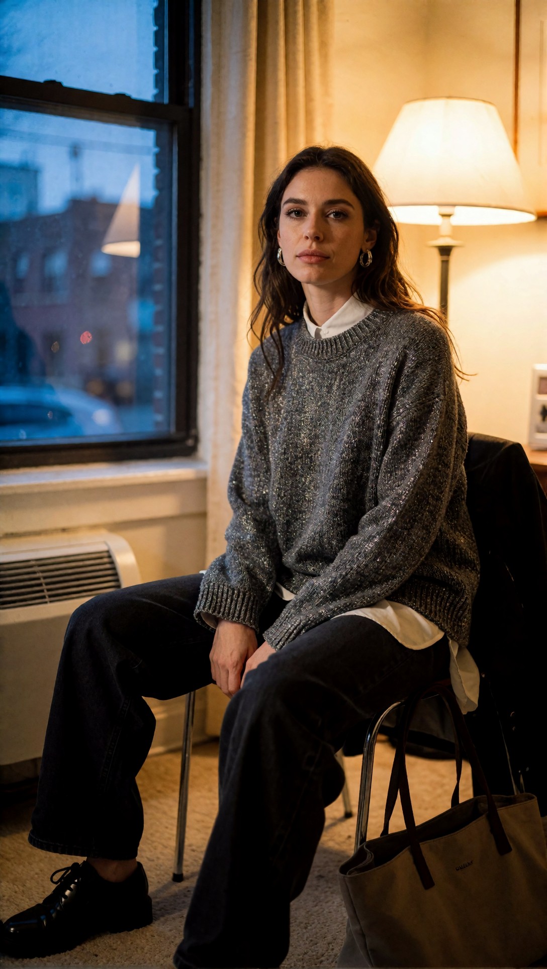
Inspect whether the face shape, fingers, and shoulder line remain stable across seeds. On the refined pass, check if added detail supports the structure instead of redrawing it.
What changed in ComfyUI
- Lower initial latent resolution for first pass
- Preserve aspect ratio for composition intent
- Use a modest denoise second pass rather than restarting at full detail
Observed result
- Better facial consistency
- Fewer limb distortions
- Less "melted cloth" behavior on jackets and knits
Tradeoff
- Some backgrounds looked less rich before the second pass
Change 2: Lower CFG slightly and rewrite the prompt instead
This was one of the most repeatable quality improvements. In the baseline graph, high CFG produced obedient but tense images. Lighting became over-literal, skin lost softness, and styled scenes started to look assembled rather than photographed.
Lowering CFG by a small amount improved realism, but only when the prompt was rewritten to be more specific about visual priorities. In other words, workflow and prompt quality had to work together.
This prompt checks lighting control and expression realism after reducing CFG. The goal is to see whether the image keeps intent without becoming rigid.
Topic: premium skincare bottle on reflective stone for CFG control test
Genre: Product Editorial
Camera: Nikon Z7 II
Lens: 105mm macro f/2.8
Lighting: large softbox key with controlled rim light
Location: dark stone tabletop studio set
Style: clean commercial look
Final Prompt: premium skincare serum bottle with frosted glass body and matte silver cap placed on a dark basalt stone tabletop, controlled reflection beneath the bottle, softbox key light from upper left, subtle rim light defining edges, minimal luxury set design, muted charcoal and cool grey palette, faint moisture droplets, precise label area, elegant negative space for editorial layout, Nikon Z7 II product photography look, 105mm macro f/2.8 detail, realistic glass refraction, crisp edges, premium commercial realism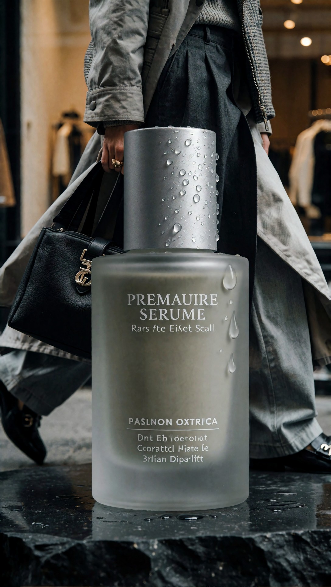
Check whether reflections remain clean without halos and whether the label zone stays plausible. If CFG is still too high, highlights often look forced and edge transitions become brittle.
What changed in ComfyUI
- Slightly reduced CFG from the default comfort zone
- Added more precise prompt wording for material, lighting direction, and composition
- Removed redundant style adjectives
Observed result
- Skin looked less waxy in portraits
- Product reflections became more believable
- Interiors kept atmosphere better
Tradeoff
- If the prompt was vague, lower CFG sometimes weakened subject specificity
Change 3: Match sampler and scheduler to the scene instead of standardizing everything
Using one sampler for every subject was convenient, but it was not neutral. Some scenes gained smooth tonal transitions but lost edge confidence. Others gained detail but became brittle.
The strongest improvement came from separating use cases:
- portraits and beauty scenes favored smoother tonal behavior
- product and architecture scenes benefited from cleaner edge discipline
- fantasy costumes needed detail retention without over-sharpening the whole frame
This test checks whether a scene with layered materials benefits from a sampler better suited to microdetail and controlled contrast.
Topic: fantasy costume detail for sampler pairing test
Genre: Fantasy Character Portrait
Camera: Fujifilm GFX 100S
Lens: 80mm f/1.7
Lighting: moonlit key with blue rim and candle fill
Location: stone hall with hanging banners
Style: high-detail cinematic realism
Final Prompt: regal fantasy character standing in an ancient stone hall, layered embroidered coat, weathered leather gloves, antique metal clasps, deep green and bronze costume palette, composed three-quarter pose, focused gaze, cool moonlit key light from high window, subtle blue rim on shoulders, warm candle fill near waist level, hanging banners fading into shadow, visible textile weave, believable metal patina, cinematic medium portrait framing, Fujifilm GFX 100S clarity, 80mm f/1.7 depth, high-detail realism without plastic skin
Inspect embroidery edges, glove seams, and facial texture together. A poor sampler match often makes one material look excellent while another turns synthetic.
Observed result
- Better consistency between skin, cloth, and metal materials
- Fewer crunchy shadows in dark scenes
- Stronger edge readability in products and interiors
What I would change next
If you only use one workflow template, save scene-specific sampler presets inside it. That keeps the graph simple while still making quality adjustments practical.
Change 4: Use shorter, targeted negative prompts
The baseline workflow used a long negative prompt string that had been copied from older setups. It did remove common defects, but it also flattened images. Skin became too uniform. Food looked dry. Fashion fabrics lost natural folding.
A shorter negative prompt with only scene-relevant exclusions worked better. This was especially noticeable in beauty and editorial portrait tests.
This prompt is meant to test face stability and texture preservation when the negative prompt is kept restrained. It helps reveal whether the workflow is suppressing useful surface detail.
Topic: editorial beauty close-up for negative prompt restraint test
Genre: Beauty Campaign
Camera: Sony A7R V
Lens: 85mm f/1.4
Lighting: studio butterfly light with soft silver reflector
Location: seamless warm-grey beauty studio
Style: high-end beauty advertising
Final Prompt: close-up beauty campaign portrait of a woman with luminous natural skin, soft taupe makeup, brushed brows, slightly parted lips, hair pulled back cleanly, direct confident eye contact, studio butterfly key light with gentle reflector fill, warm-grey seamless background, precise catchlights, visible skin texture without harsh pores, elegant shoulder line, minimal jewelry, premium cosmetic-ad composition, Sony A7R V look, 85mm f/1.4 shallow depth, refined high-end beauty realism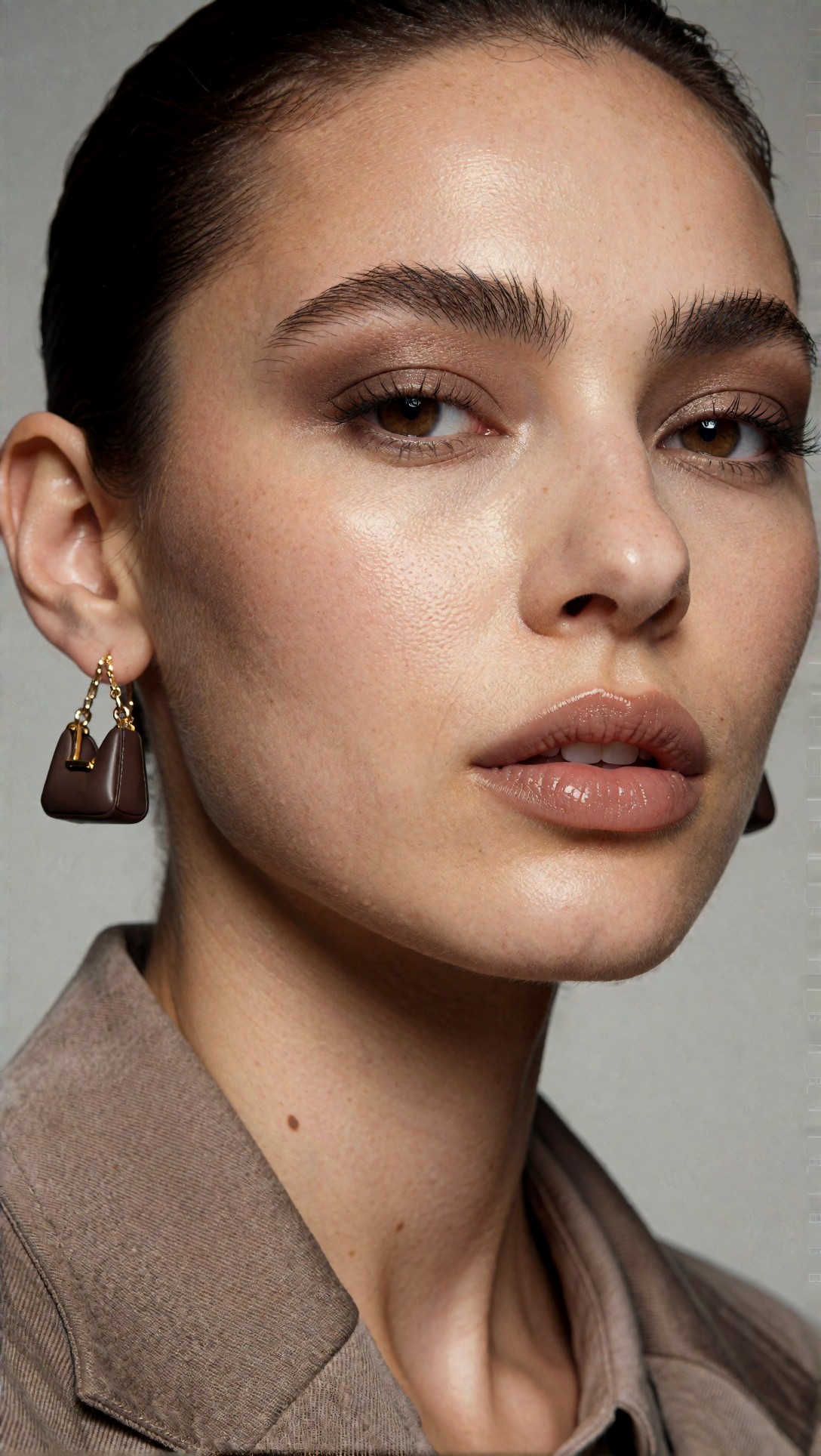
Check the skin first, then the eyelashes, then lip edges. If the negative stack is too aggressive, the image may look technically clean but cosmetically dead.
Observed result
- Better natural skin variation
- Improved fabric realism in fashion frames
- Less over-correction in hairlines and eyelashes
Failure risk
- Very short negatives can allow old artifacts back in, especially with hands and typography-like details
Change 5: Treat the second pass as recovery, not reinvention
A common failure in ComfyUI workflow improvements is setting denoise too high in the second pass. The image gets more detailed, but it is not the same image anymore. Poses drift. Product geometry changes. Window patterns mutate.
The strongest results came when the second pass had one clear job: recover local detail while respecting the first-pass structure.
This prompt checks whether interior structure survives refinement. It is useful because windows, furniture lines, and soft daylight are easy to distort when denoise is too strong.
Topic: modern interior daylight scene for second-pass denoise test
Genre: Interior Editorial
Camera: Leica SL2-S
Lens: 35mm f/2
Lighting: overcast daylight through tall windows
Location: minimalist living room with oak flooring and linen sofa
Style: architectural editorial realism
Final Prompt: minimalist living room with floor-to-ceiling windows, soft overcast daylight entering from the left, pale linen sofa, oak herringbone floor, low travertine coffee table, one dark ceramic vase, muted sand and stone palette, balanced architectural lines, tidy but lived-in arrangement, gentle shadows, realistic fabric folds, subtle reflections on wood finish, wide editorial interior framing, Leica SL2-S realism, 35mm f/2 perspective, crisp structure with calm atmospheric detail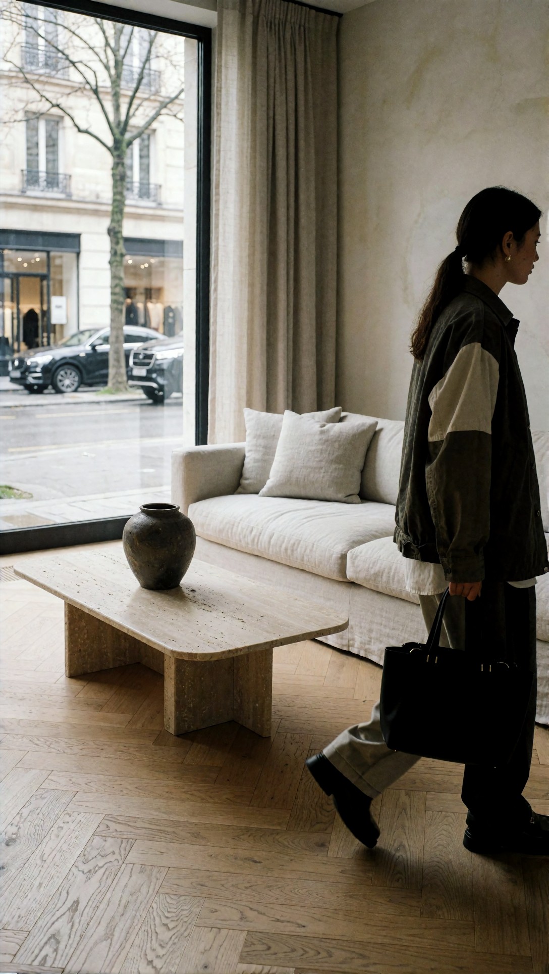
Inspect vertical lines, sofa seam integrity, and the transition between window highlights and interior shadows. If the second pass is too aggressive, geometry starts drifting before detail actually improves.
Observed result
- Better retention of original composition
- More believable fabrics and surfaces
- Fewer cases where a good first image was ruined by refinement
Change 6: Separate composition control from texture control
When I tried to solve everything in one prompt and one generation stage, results were unstable. A better approach was to lock composition first, then target texture and finish later through refinement or controlled upscaling.
This mattered most in full-body fashion images, where pose and silhouette have to survive texture enhancement.
This prompt tests silhouette integrity first and garment texture second. It is useful for spotting when workflow changes improve cloth detail but damage proportions or hands.
Topic: street-fashion full body look for composition-first workflow test
Genre: Street Style
Camera: Panasonic Lumix S1R
Lens: 70mm f/2.8
Lighting: overcast diffusion with soft street bounce
Location: narrow city side street with concrete walls and café signage
Style: contemporary fashion editorial
Final Prompt: full-body street-fashion portrait of a model standing mid-stride on a narrow city side street, oversized charcoal blazer over white ribbed tank, pleated wide-leg trousers, black leather loafers, slim shoulder bag, relaxed hand posture, neutral focused expression, overcast daylight with soft urban bounce, concrete walls and distant café signage softly blurred, cool grey and muted espresso palette, clean editorial silhouette, visible fabric drape and seam structure, Panasonic Lumix S1R realism, 70mm f/2.8 fashion framing, modern magazine composition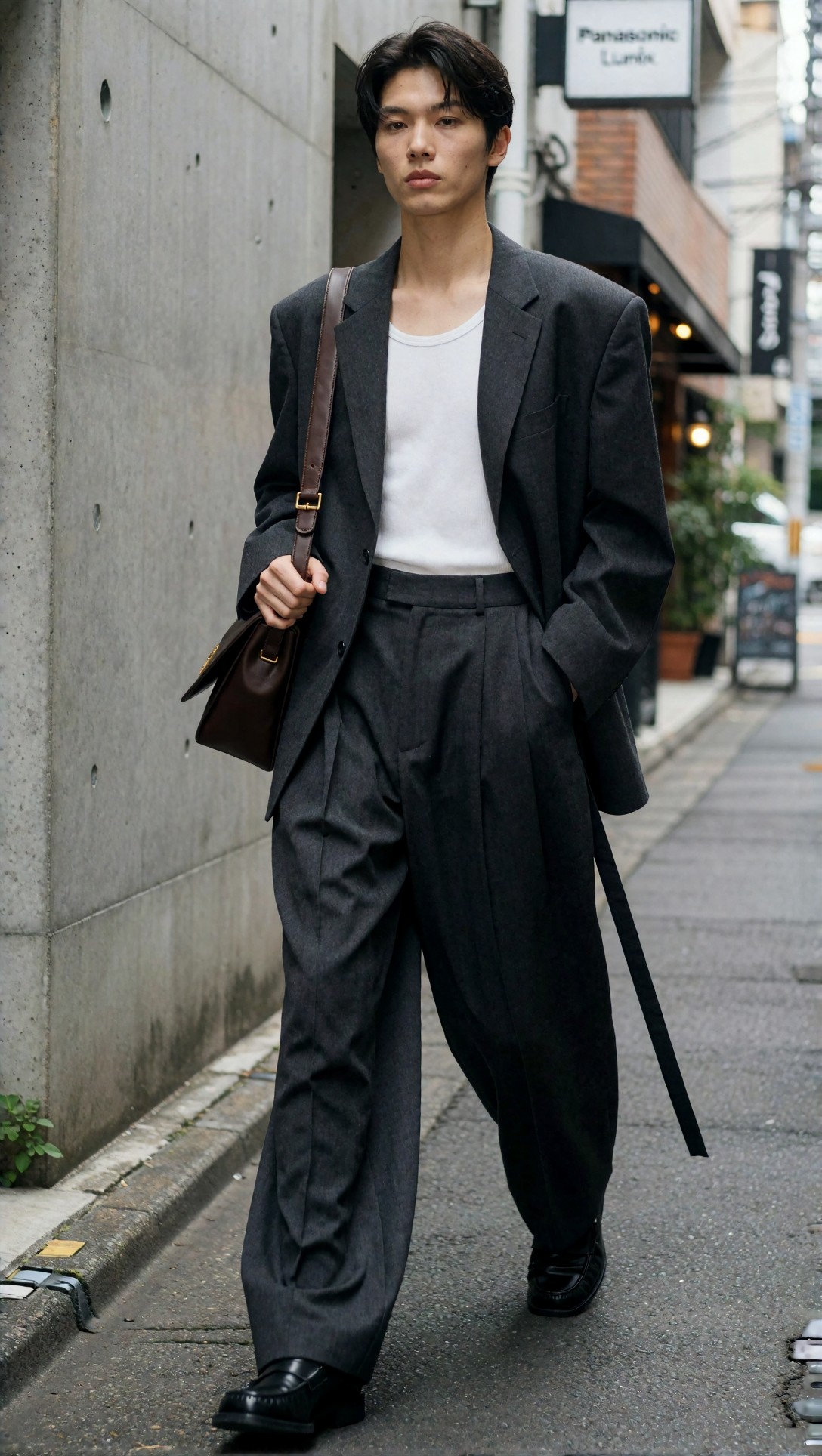
Inspect ankle alignment, hand shape, and the break of the trousers before judging texture. If composition is weak, extra detail only makes the failure more obvious.
Observed result
- Better keep rate on full-body images
- Fewer deformed shoes and hands after later enhancement
- More reliable clothing silhouettes
Change 7: Upscale with a purpose, not by habit
Post-generation upscaling was useful, but only when it matched the image goal. For product and architecture images, upscale helped edge clarity and local texture. For beauty close-ups, the wrong upscale made pores, lashes, and flyaway hair look synthetic.
In this test, the best workflow used upscaling selectively and inspected surfaces by category. If the image was already compositionally strong but slightly soft, upscale helped. If the image had unresolved anatomy or uncertain material structure, upscale amplified the problem.
This prompt checks product clarity and specular control, two areas where smart upscaling can help or hurt quickly.
Topic: luxury watch product shot for upscale decision test
Genre: Luxury Campaign
Camera: Hasselblad X2D 100C
Lens: 90mm f/2.5
Lighting: narrow strip lights with soft overhead diffusion
Location: black acrylic studio platform with subtle smoke haze
Style: luxury advertising realism
Final Prompt: luxury wristwatch displayed upright on a black acrylic platform, brushed steel bracelet, deep blue dial, polished bezel, fine engraved markers, controlled strip-light reflections along metal edges, faint atmospheric haze for depth, dark premium background with gentle falloff, highly precise product composition, cool blue and graphite palette, realistic glass reflections, material separation between polished and brushed surfaces, Hasselblad X2D 100C look, 90mm f/2.5 macro-style luxury campaign realism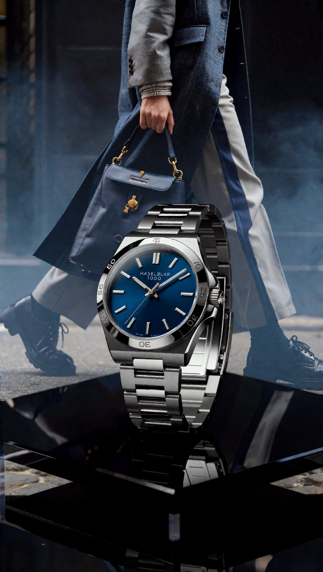
Inspect the dial markers, bracelet links, and reflection boundaries. Good upscaling improves legibility and material separation; bad upscaling invents edge noise and false engraving.
For output review, I found it useful to compare native and upscaled versions side by side in [Gallery](/gallery) or run rescue tests through [Upscaler](/upscaler).
Change 8: Keep LoRA influence narrow and intentional
When a LoRA was doing too much, the workflow became less stable across prompts. The strongest results came from using LoRAs for one specific job: garment language, camera treatment, face consistency, or product styling cue. Once two or three broad style biases stacked, outputs became repetitive and local errors increased.
This prompt checks whether style lock remains controlled instead of overwhelming scene realism.
Topic: cinematic travel scene for controlled style-bias test
Genre: Cinematic Travel
Camera: ARRI Alexa Mini LF
Lens: 40mm anamorphic
Lighting: sunset backlight with ambient street practicals
Location: coastal train platform in southern Europe
Style: restrained cinematic realism
Final Prompt: traveler standing on a quiet coastal train platform at sunset, lightweight tan trench coat over navy knitwear, weathered leather weekender bag, wind lifting the coat hem slightly, thoughtful sideways glance, warm backlight from low sun, soft amber practical lamps beginning to glow, pale stucco walls and distant sea haze, cinematic composition with moderate anamorphic character, dusty gold and desaturated blue palette, tactile fabrics, realistic face proportions, ARRI Alexa Mini LF cinematic realism, 40mm anamorphic mood without excessive stylization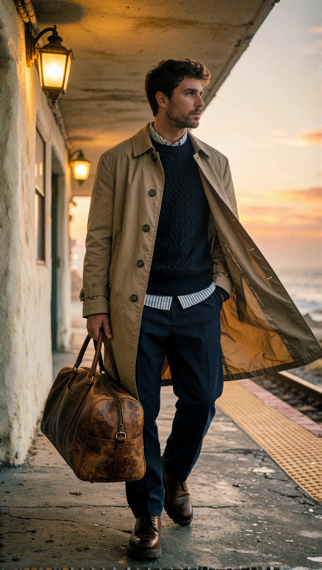
Inspect whether the style treatment supports the scene rather than replacing it. If LoRA influence is too broad, faces and wardrobe details start repeating across unrelated prompts.
Observed result
- Better prompt responsiveness
- Less "same image in different clothes" syndrome
- More reliable realism in mixed-use workflows
Change 9: Add a pre-publish inspection step inside the workflow habit
The last improvement was not a node. It was an operator habit. Once outputs improved, the remaining failures became subtler: asymmetrical glasses, half-clean product edges, background geometry mismatch, inconsistent hand tension, or overcooked sharpening after upscale.
A short review checklist caught more weak images than another round of prompt edits.
This prompt tests food texture, shallow depth, and surface realism, which are all easy to overprocess during optimization.
Topic: plated dessert macro scene for pre-publish inspection test
Genre: Food Editorial
Camera: Canon EOS R3
Lens: 100mm macro f/2.8
Lighting: side softbox with white bounce fill
Location: dark restaurant table by window
Style: premium food magazine realism
Final Prompt: plated chocolate tart dessert on a matte ceramic plate, glossy ganache surface, raspberries and micro mint garnish, fine cocoa dust on the rim, side softbox simulating window light, gentle bounce fill preserving shadow depth, dark restaurant tabletop, intimate close-up composition, rich brown, berry red, and muted charcoal palette, visible crumb texture, realistic glaze reflections, shallow depth of field, Canon EOS R3 food editorial realism, 100mm macro f/2.8 detail, appetizing but natural finish
Inspect glaze reflections, berry seeds, plate edge shape, and focus falloff. If the image looks sharp everywhere or the tart texture turns rubbery, the workflow has been pushed too far.
Pre-publish checklist
- Are the eyes, hands, or key product edges correct at full zoom?
- Does the second pass preserve the same composition, or did it quietly redraw it?
- Are textures believable for the material, or just sharper?
- Is lighting coherent across subject and background?
- Did upscaling improve detail, or only add edge noise?
- Would this frame survive being viewed beside real photography?
Strengths of this optimized ComfyUI workflow
The strongest result was not one perfect hero image. It was a better average output. After these nine changes, the workflow produced more images that were usable without heavy rescue.
Where this setup worked best
- editorial portraits with mixed practical light
- product scenes with reflective materials
- full-body fashion shots where silhouette mattered
- interiors needing calm daylight and straight geometry
Why it worked
- structure was protected before detail enhancement
- prompt specificity replaced brute-force CFG pressure
- texture recovery happened later and more carefully
Limitations and failure risks
This workflow is not ideal if your main goal is highly stylized chaos, surreal abstraction, or aggressive concept variance per seed. The optimizations here favor stability and publication readiness over maximum unpredictability.
Weak points remained:
- text-like elements still needed caution
- crowded hand interactions were still the easiest failure point
- very dark scenes could still lose local separation without careful sampler choice
- some checkpoints responded differently enough that the same optimized graph still required per-model tuning
If your output target is highly illustrative rather than photographic, some of these changes may feel too conservative.
Practical recommendations: which change to try first
If you want the shortest path to ComfyUI performance and quality tips that actually show up in images, apply them in this order:
1. Fix initial resolution strategy before chasing detail. 2. Lower CFG slightly and rewrite prompts with clearer visual instructions. 3. Tune sampler/scheduler by scene type instead of using one default forever. 4. Reduce second-pass denoise so refinement stays faithful. 5. Trim negative prompts until they only remove known problems. 6. Upscale only when the base image is already structurally correct.
If you are building reusable graphs, save these as light presets rather than one giant universal workflow. It makes comparisons cleaner and debugging much easier. More workflow references and adjacent tests are worth browsing in [Articles](/articles) and [Tools](/tools).
Transferable lesson for similar topics
The broad lesson from this case study is that ComfyUI workflow optimization works best when each stage has a narrow purpose. Composition, prompt adherence, detail recovery, and final output polish should not all fight for control in the same step.
That applies beyond the scenes tested here. Whether you are generating beauty, product, interior, or fashion images, the most reliable workflow improvements usually come from removing hidden conflict rather than adding more controls.
FAQ
What is the fastest ComfyUI workflow optimization for better image quality?
Start by lowering the initial generation size and using a careful second pass. In this test, that produced the most immediate improvement in anatomy stability and overall keeper rate.
How do I optimize ComfyUI image generation without losing realism?
Reduce CFG slightly, shorten negative prompts, and make the positive prompt more visually specific. Realism improved when the workflow stopped forcing every detail too hard.
Which matters more in ComfyUI: sampler choice or prompt wording?
Both matter, but prompt wording only helped consistently when sampler behavior suited the scene. For portraits, products, and interiors, sampler mismatch was visible even with a strong prompt.
Should I always use upscaling in a ComfyUI better results workflow?
No. Upscaling helps when the base image is structurally sound but under-detailed. It hurts when anatomy, geometry, or material logic is already weak.
What causes second-pass refinement to ruin a good image?
Usually denoise is too high, so the workflow reinterprets the image instead of enhancing it. That was the most common reason a strong first pass became a weaker final output.
Conclusion
For operators who want more reliable photographic results, this workflow is worth using. It is especially effective for portraits, fashion, products, and interiors where consistency matters more than surprise. If your goal is wild stylistic exploration, you may find it too restrained.
Who should use it: creators building repeatable ComfyUI production flows, reviewers comparing models fairly, and anyone tired of getting one good seed out of many weak near-misses.
Who should avoid it: users chasing maximal stylization, loose abstraction, or highly experimental graph behavior on every generation.
The setting that mattered most in this test was not a single magic sampler or prompt phrase. It was how gently the workflow handled refinement. Once the second pass stopped trying to reinvent the image, quality improved across almost every category.