This article is a hands-on ComfyUI workflow troubleshooting report focused on a common failure pattern: images that come out technically detailed but still look flat, oversharpened, plastic, or just slightly wrong. In this test, I used one repeatable portrait-and-product workflow, changed one variable at a time, and tracked which node choices actually fixed bad image quality versus which ones only made the file look more processed.
If your ComfyUI output looks crunchy, airbrushed, muddy in the midtones, or oddly synthetic even when the prompt is good, the issue is usually not one single setting. It is more often the interaction between sampler, CFG, denoise strength, upscale pass, VAE behavior, and prompt density.
What to know first
- Flat-looking images usually come from weak tonal separation, too much denoise, or prompts that describe objects but not light.
- Overcooked images often come from stacked sharpening: high CFG, aggressive hires fix, extra detail LoRAs, and an upscaler pass that pushes micro-contrast too far.
- Unnatural faces and materials usually appear when the workflow forces too much correction after the base composition is already unstable.
- In this test, the best fixes came from simplifying the graph before adding more nodes.
- Before rebuilding your whole setup, inspect latent generation, decode, upscale, and final post-process as separate stages.
Test setup
I used a standard ComfyUI graph built around a text-to-image base pass, latent upscale, second denoise pass, VAE decode, and final image upscale. The goal was not to find the most stylized output. The goal was to diagnose why a realistic editorial image could look clean at thumbnail size but fall apart at full resolution.
What was tested:
- Realistic portrait prompts with fabric, skin, hair, and reflective surfaces
- Product-style scenes with packaging edges and printed text zones
- Base generation versus latent upscale versus image upscale
- Low, medium, and high CFG behavior
- Conservative versus aggressive denoise values
- Neutral prompts versus overloaded prompts with style stacking
For readers building or debugging workflows, it also helps to compare outputs inside a fixed workspace like [Create](/create), keep prompts organized in [PromptLab](/promptlab), and send final candidates through [Upscaler](/upscaler) only after the base image is already correct.
The scenario: a clean editorial portrait that kept turning plastic
The test case was simple on purpose: a waist-up editorial portrait of a model in a tailored jacket with visible fabric texture, natural skin, controlled studio lighting, and a neutral background. This kind of image is a good troubleshooting target because it exposes nearly every weakness at once.
If the workflow is weak, you see it immediately in:
- waxy skin
- crispy hair edges
- jacket texture that looks pasted on
- eyes that are too glassy
- flat background depth
- excessive local contrast around the nose and lips
This is also why why ComfyUI images look flat is not just a prompt problem. Portraits reveal whether your graph is producing believable light transitions or simply amplifying edges.
Why this case is difficult for image models
Models are good at generating signals that read as detail. They are much less reliable at generating detail that stays natural across skin, cloth, metal, and depth transitions in the same image.
In this case, the difficult part was balance:
- Skin needs softness, but not blur.
- Fabric needs texture, but not fake sharpness.
- Eyes need clarity, but not glowing over-definition.
- Background separation should feel optical, not cut out.
The weak point in many ComfyUI graphs is that they treat all detail equally. Once you add a high-detail checkpoint, a realism LoRA, a latent upscale pass, and a final ESRGAN-style upscale, the workflow stops asking what kind of detail belongs where.
First attempt: sharp, detailed, and obviously wrong
The first run used a fairly common beginner setup: medium-high CFG, detailed positive prompt, long negative prompt, latent upscale, then a final image upscale. At first glance, the result looked impressive. At 100% zoom, it looked processed.
What I observed:
- Skin pores were visible, but arranged in a uniform synthetic pattern.
- The blazer weave was too contrasty and looked etched rather than photographed.
- Hairline transitions were harsh.
- Catchlights were overemphasized.
- The background felt compressed, with weak tonal roll-off.
That combination is what many users describe as ComfyUI bad image quality even when resolution is high. The file is not low quality. It is poorly balanced.
To reproduce that failure on purpose, I used a prompt that encouraged too much simultaneous precision without enough lighting guidance.
This test checks how fast a workflow becomes brittle when the prompt asks for hyper-detail but the graph is already detail-heavy.
Topic: Editorial studio portrait for ComfyUI troubleshooting
Genre: Fashion Editorial
Camera: Canon EOS R5
Lens: 85mm f/1.4
Lighting: Studio beauty dish with weak fill
Location: Seamless gray studio backdrop
Style: Clean commercial look
Final Prompt: A waist-up editorial portrait of a woman wearing a structured charcoal blazer over a silk top, direct gaze, relaxed shoulders, minimal jewelry, seamless gray studio background, highly detailed skin, highly detailed hair, highly detailed fabric texture, crisp eyes, polished commercial portrait, Canon EOS R5 look, 85mm f/1.4, beauty dish key light with subtle fill, centered composition, neutral color palette, premium retouch feel, sharp texture throughout, realistic facial symmetry, modern fashion magazine framing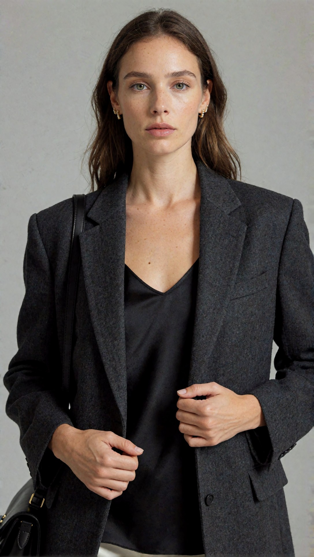
Inspect whether the model separates skin detail from cloth detail. If pores, hair, and jacket texture all become equally sharp, the workflow is forcing uniform micro-contrast instead of natural depth.
What the first result revealed in the workflow
The important lesson was that the prompt was not the main problem. The graph was.
Three issues stood out:
1. CFG was pushing the model into over-commitment
Once CFG moved too high, skin and edges became assertive in the wrong way. Features were not more accurate. They were more insistent. That often reads as oversharpening even before any upscale node is applied.
2. The latent upscale denoise was too aggressive
The second pass was not refining the image. It was partially repainting it. That is where natural gradients started turning synthetic.
3. Final upscale amplified an already broken texture map
The image upscaler made the file larger, but also made errors more legible. This is a common ComfyUI oversharpened image fix misunderstanding: people blame the upscaler first, when the real damage often happens one stage earlier.
The adjustment that improved the output
The strongest result came from a less glamorous change: removing complexity.
I lowered CFG, reduced denoise in the refinement stage, shortened the negative prompt, and removed one extra detail enhancer. The output immediately looked less impressive at thumbnail size and much better at full size.
The gains were specific:
- Skin regained tonal transitions.
- Background depth became smoother.
- Jacket texture read as woven fabric, not etched noise.
- Eyes stayed clear without looking wet or artificial.
This test was designed to check whether better lighting language in the prompt could reduce the need for aggressive workflow correction.
Topic: Natural studio portrait for ComfyUI unnatural images fix
Genre: Beauty Campaign
Camera: Nikon Z8
Lens: 105mm f/2.8
Lighting: Large softbox key with controlled edge light
Location: Matte warm-gray studio set
Style: High-end beauty advertising
Final Prompt: A refined studio portrait of a woman in a tailored deep navy jacket with subtle wool texture, natural makeup, calm expression, soft closed-lip pose, gentle head turn, realistic skin texture with smooth tonal transitions, large softbox key light with delicate edge light separation, matte warm-gray background, premium beauty campaign styling, Nikon Z8 realism, 105mm f/2.8 compression, clean composition, muted blue and taupe palette, believable pores, soft hair flyaways, controlled fabric detail, natural optical falloff, elegant magazine finish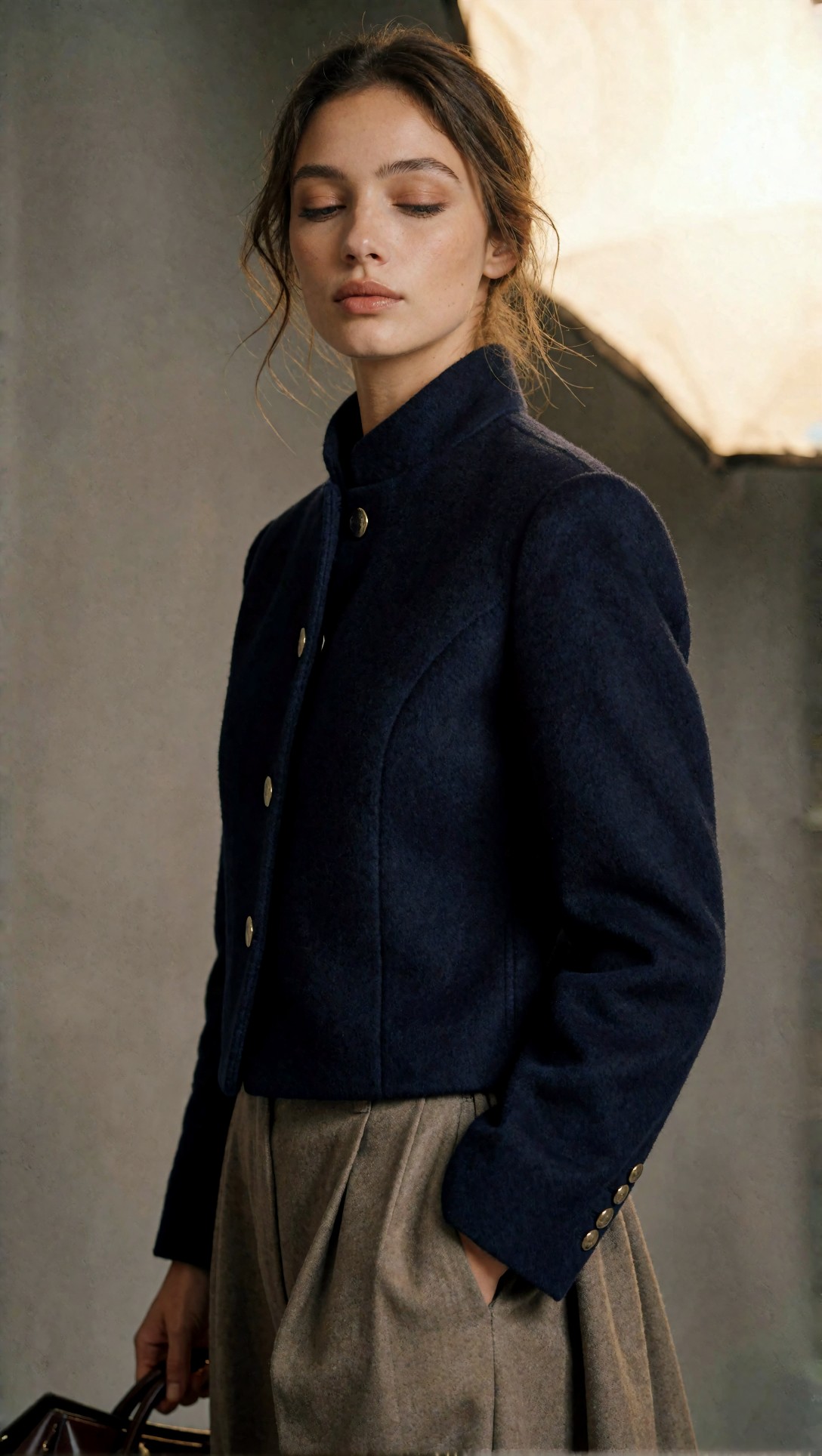
Inspect the cheek-to-jaw transition, the fabric weave, and the eye whites. If these stay believable without a crunchy edge halo, the workflow is finally letting light do the work instead of forcing texture.
A practical troubleshooting table
Use this checklist when diagnosing ComfyUI workflow problems.
| Symptom | Likely cause in ComfyUI workflow | What fixed it in this test | |---|---|---| | Flat image with weak depth | Prompt lacks lighting structure, denoise too high, background too generic | Add explicit light direction, lower refinement denoise, simplify scene layers | | Overcooked skin | High CFG, too many realism/detail add-ons, aggressive upscale | Lower CFG, remove one enhancer, upscale only after base image looks right | | Fake fabric texture | Latent pass repainting material surfaces | Reduce denoise and shorten prompt emphasis on "ultra detailed" texture | | Unnatural eyes and lips | Too much face correction from second pass | Keep base face stable first, then refine lightly | | Crispy edges after upscale | Upscaler amplifying existing artifacts | Fix source image before image upscale, choose milder sharpening behavior |
Prompt test 3: diagnosing flat lighting
One reason why ComfyUI images look flat is that the prompt describes objects but not the light path. I tested that by keeping styling simple and shifting the prompt toward directional lighting and spatial depth cues.
Topic: Window-lit editorial portrait for flat image diagnosis
Genre: Lifestyle Portrait
Camera: Sony A7R V
Lens: 50mm f/1.8
Lighting: Overcast window light with negative fill
Location: Minimal apartment interior near a tall north-facing window
Style: Cinematic realism
Final Prompt: A natural editorial portrait of a woman standing beside a tall apartment window, cream wool blazer, white tank top, dark tailored trousers, one hand resting on the sill, thoughtful expression, overcast window light shaping the face from one side, negative fill on the shadow side, soft falloff into the room, realistic skin, subtle under-eye texture, natural hair volume, muted interior background with depth, cinematic realism, Sony A7R V look, 50mm f/1.8, soft neutral palette, believable shadows, grounded perspective, documentary fashion mood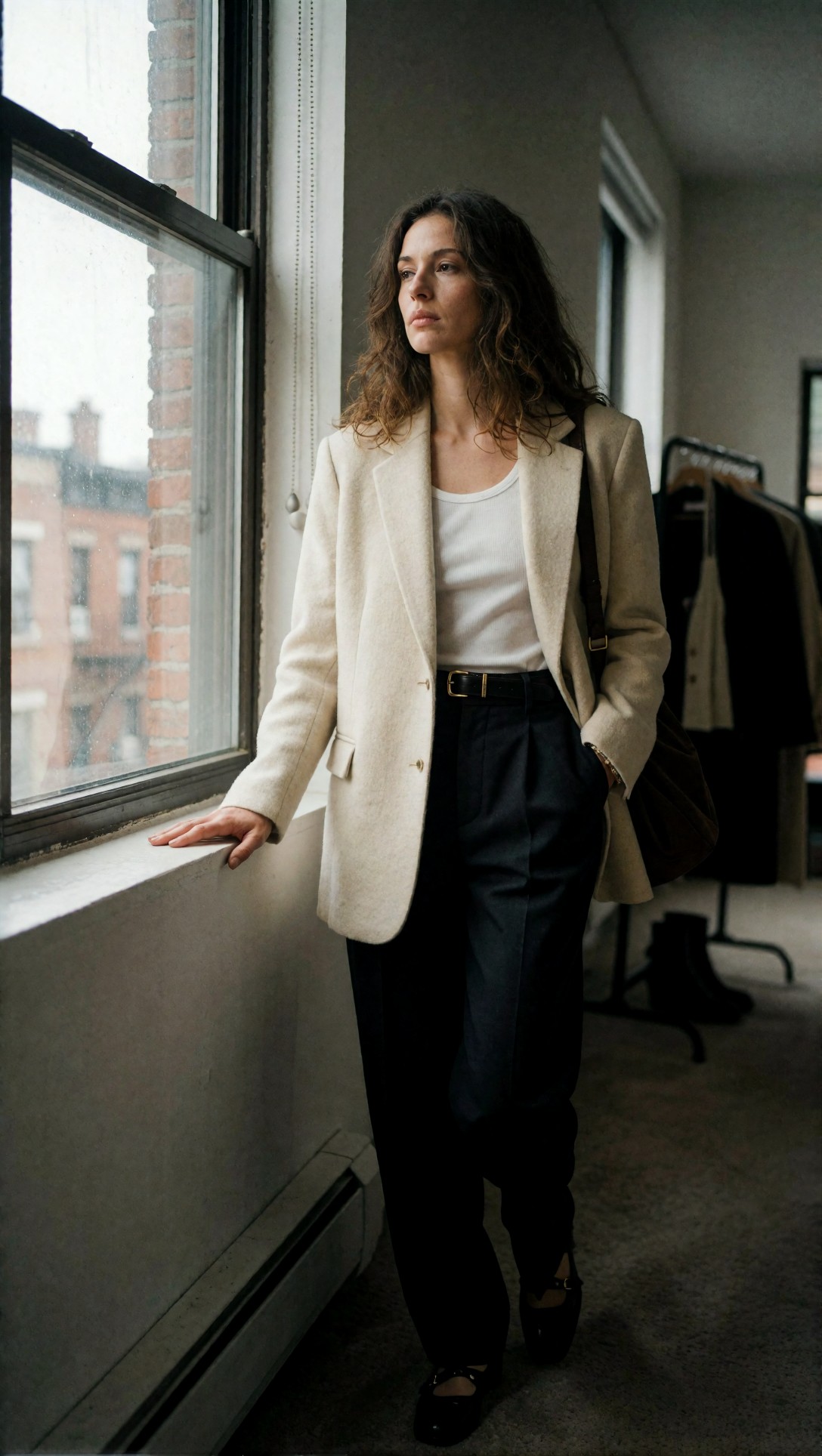
Inspect whether the face has real dimensionality. If the shadow side still looks lifted and texture remains equally visible everywhere, the workflow is flattening contrast before or during refinement.
Prompt test 4: finding the oversharpening threshold
For ComfyUI oversharpened image fix work, I like using subjects with multiple edge types: skin, satin, hair, and jewelry. It shows quickly whether the graph is adding clarity or just local contrast.
Topic: Satin-and-skin sharpness stress test
Genre: Fashion Editorial
Camera: Fujifilm GFX100 II
Lens: 110mm f/2
Lighting: Studio butterfly light with soft reflector fill
Location: Ivory fashion studio set
Style: Luxury fashion campaign
Final Prompt: A close editorial portrait of a model wearing a champagne satin blouse, small gold earrings, smooth pulled-back hair with a few soft loose strands, neutral ivory studio set, butterfly lighting with soft reflector fill, luxury fashion campaign direction, Fujifilm GFX100 II medium format look, 110mm f/2, luminous but natural skin, satin highlights with smooth rolloff, sharp iris detail without exaggerated catchlights, elegant posture, restrained expression, refined cream and gold palette, magazine-grade composition, realistic microtexture only where optically plausible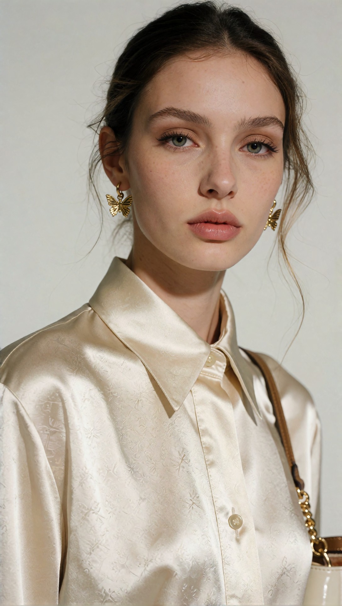
Inspect the satin folds and the forehead. If both show the same kind of hard-edged crispness, the image is oversharpened at a workflow level rather than naturally detailed.
The change that mattered most: denoise discipline
In this test, denoise strength had a larger effect than most prompt changes. High denoise in the second pass made the model reinterpret skin, textile edges, and small reflections. Lower denoise preserved the base image structure.
That matters because many users treat the second pass like a universal quality booster. It is not. It is a controlled rewrite. If the first pass already has good composition, too much rewrite is exactly how images become unnatural.
Prompt test 5: preserving texture without repainting it
This prompt was paired with a conservative second pass to see whether textured garments could stay believable when the workflow stopped trying to improve everything at once.
Topic: Tailored fabric realism for denoise control
Genre: Street Style
Camera: Leica SL2-S
Lens: 75mm f/2
Lighting: Soft morning side light
Location: Quiet stone arcade in an old city center
Style: Editorial street realism
Final Prompt: A full-body street editorial portrait of a woman walking through a stone arcade, wearing a dark olive tailored wool coat, wide-leg black trousers, leather loafers, simple silver watch, relaxed stride, soft morning side light, muted stone reflections, Leica SL2-S look, 75mm f/2, natural facial expression, believable hair movement, realistic wool texture, clean silhouette separation from the background, understated editorial street realism, earthy green and charcoal palette, gentle depth, optical realism instead of digital crispness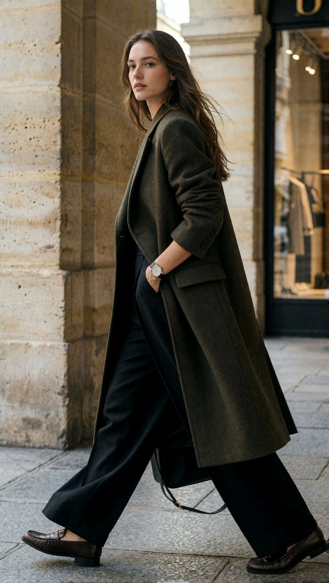
Inspect the coat texture and the stone background. The goal is to see woven structure and surface variation without the coarse, scratchy look that appears when refinement denoise is too high.
Where prompts help, and where they do not
Prompting can improve outputs, but it cannot fully rescue a graph that is overprocessing. In this test, prompts helped most in three areas:
- specifying directional light
- limiting style conflict
- asking for believable material behavior rather than generic “ultra detail”
Prompting did not solve:
- too much latent repainting
- a bad upscale choice
- edge halos created by stacked enhancement
That is why I would diagnose the workflow in this order:
1. Generate at base settings with no upscale. 2. Check face, fabric, and background at native resolution. 3. Add one refinement stage only if the base is already structurally sound. 4. Upscale last.
If you want to compare your cleaner base outputs against previous runs, a simple visual archive like [Gallery](/gallery) is more useful than judging single images in isolation.
Prompt test 6: product-style scene for unnatural surface behavior
Portraits reveal skin problems. Product scenes reveal edge and material problems. I used this setup to see whether labels, glass, and metallic caps became brittle during upscale.
Topic: Cosmetic product scene for ComfyUI bad image quality diagnosis
Genre: Product Editorial
Camera: Phase One XF IQ4
Lens: 120mm f/4 Macro
Lighting: Large diffused top light with silver bounce cards
Location: Minimal stone vanity with soft beige backdrop
Style: Clean commercial look
Final Prompt: A premium cosmetic serum bottle on a pale stone vanity, frosted glass body, brushed metal cap, understated cream label area, soft condensation beads, minimal beige studio backdrop, large diffused top light with silver bounce control, clean commercial product editorial, Phase One XF IQ4 look, 120mm macro precision, realistic reflections, accurate label edges, soft shadow grounding, restrained luxury palette, crisp glass contour without haloing, premium packaging photography composition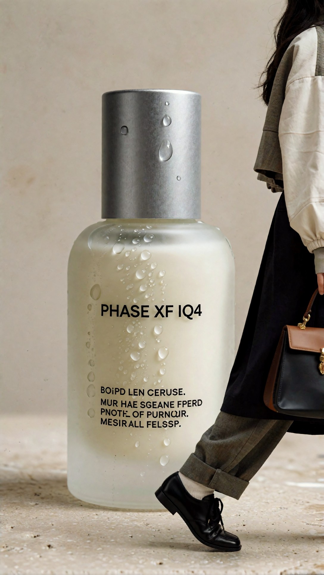
Inspect the bottle edges, reflections, and label zone. If the reflections look cut with a knife or the edges glow unnaturally, your sharpening and upscale stack is too aggressive.
Strengths of a simplified ComfyUI workflow
After stripping back the graph, the setup had some clear strengths:
Better material separation
Skin, wool, satin, glass, and painted walls no longer shared the same texture logic. This was the biggest sign the workflow was improving.
More believable depth
Backgrounds stopped feeling like decorated backdrops glued behind the subject. Midtone separation improved without needing dramatic contrast.
Cleaner upscale decisions
Once the source image was healthier, even modest upscale passes produced more usable files. That is the right point to use an external or final-stage enlarger like [Upscaler](/upscaler), not as a rescue step but as a finishing step.
Limitations and failure risks
A lighter-touch workflow is not always better.
It can look too soft if the model checkpoint is already gentle
If your base model naturally renders smooth images, lowering CFG and denoise too much can make the result lose bite. The answer is not to re-add every enhancer. Start by improving light structure and composition language in the prompt.
Some style-heavy prompts still need controlled refinement
Editorial fantasy, glossy sci-fi fashion, and highly ornamental scenes may need a second pass to organize small details. The lesson is not “never refine.” The lesson is “refine only what the first pass already supports.”
Text and tiny accessories remain fragile
Even in the improved workflow, small typography, chain links, and fingernails were still risk areas. Those need manual inspection before publishing.
Prompt test 7: checking face stability under stylized lighting
This prompt was designed to test whether stronger color styling could stay natural without tipping the face into synthetic beauty-filter territory.
Topic: Stylized neon portrait for unnatural face detection
Genre: Cinematic Fashion
Camera: Panasonic Lumix S1H
Lens: 85mm f/1.8
Lighting: Cyan-magenta neon rim light with soft frontal fill
Location: Rainy rooftop at night overlooking a dense city skyline
Style: Cinematic editorial
Final Prompt: A dramatic waist-up portrait of a woman on a rainy rooftop at night, black structured coat over a plum silk dress, damp hair tucked behind one ear, serious expression, cyan and magenta neon rim lights with soft frontal fill preserving natural skin tone, distant city bokeh, wet reflective surfaces, Panasonic Lumix S1H cinematic capture style, 85mm f/1.8, editorial realism, controlled atmosphere, glossy but believable lips, defined eyes without glassy exaggeration, moody purple-blue palette, cinematic fashion composition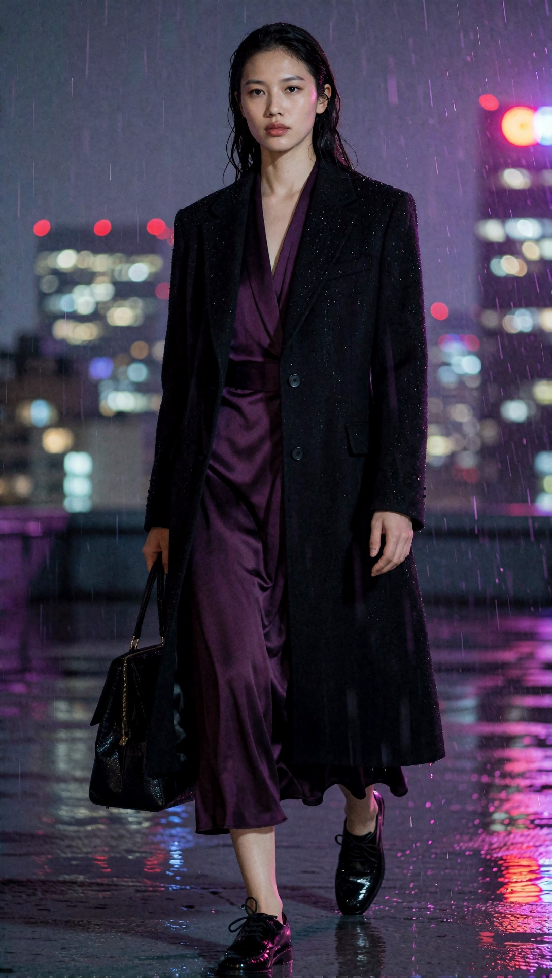
Inspect the nose bridge, lips, and transition from colored rim light into skin. If the face turns airbrushed while the environment stays textured, your workflow is over-correcting facial regions.
What to inspect before publishing the result
Before calling the image finished, I would run this checklist.
Output quality checklist
- Does skin texture vary naturally by area, or is the entire face uniformly detailed?
- Are fabric textures plausible for the material, or do they look engraved?
- Do eyes have clarity without glowing edges or over-bright sclera?
- Is background blur optical and gradual, or does it look cut out?
- Are small reflective objects smooth, or do they show jagged micro-contrast?
- Did the upscale improve readability, or just amplify mistakes?
- At 100% zoom, does the image still feel photographed rather than synthesized?
This is also the stage where tools like [Tools](/tools) or saved prompt variants in [PromptLab](/promptlab) are useful, because you can compare near-identical runs instead of guessing from memory.
Prompt test 8: final pre-publish realism check
For the final test, I used a balanced environmental portrait. It is less forgiving than a studio shot and better at revealing whether the whole workflow feels coherent.
Topic: Environmental editorial portrait for final workflow validation
Genre: Lifestyle Editorial
Camera: Canon EOS R3
Lens: 35mm f/2
Lighting: Late afternoon sun with open shade control
Location: Modern art museum courtyard with pale concrete walls and shallow reflecting pool
Style: Premium magazine realism
Final Prompt: A three-quarter environmental portrait of a woman standing in a modern art museum courtyard, sand-colored trench coat over a black knit dress, leather ankle boots, one hand in pocket, calm confident expression, late afternoon sun balanced by open shade, pale concrete walls and a shallow reflecting pool behind her, Canon EOS R3 realism, 35mm f/2 environmental framing, premium magazine look, natural skin, crisp but believable trench fabric detail, soft reflected highlights, restrained beige-black palette, clean lines, grounded perspective, subtle movement in the coat hem, realistic depth and atmosphere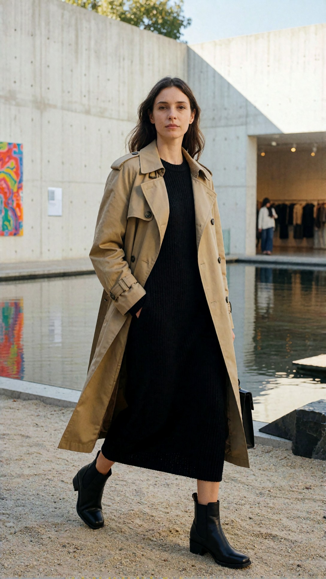
Inspect the relationship between subject and environment. If the coat, face, and architecture all feel like they belong to different images, the workflow still has integration problems.
Transferable lessons for similar ComfyUI workflow problems
The strongest transferable lesson from this test is simple: when images look flat, overcooked, or unnatural, remove enhancement before adding more control.
That applies beyond portraits.
Best for:
- realistic portraits
- product editorials
- fashion stills
- interior scenes with subtle lighting
- any workflow where materials need to remain distinct
Less ideal for:
- extremely stylized illustration pipelines
- intentionally hyper-detailed fantasy renders
- workflows built around dramatic repainting between passes
If your goal is realism, the winning pattern is usually:
- stable base image
- explicit lighting prompt
- restrained CFG
- low refinement denoise
- upscale only after realism is already present
FAQ
Why do my ComfyUI images look flat even with a good prompt?
Usually because the workflow is compressing tonal separation. Check denoise strength, light direction in the prompt, and whether your refinement pass is repainting shadows and midtones.
What is the fastest ComfyUI unnatural images fix?
Lower refinement denoise and reduce stacked enhancement first. In this test, that fixed more problems than rewriting the prompt.
How do I fix oversharpened images in ComfyUI?
Treat it as a pipeline issue, not just an upscale issue. Lower CFG, remove one detail enhancer, and confirm the base image looks natural before any final upscale.
Why does upscale make my image worse?
Because it makes existing artifacts clearer. If skin, fabric, and edges are already brittle, the upscaler will exaggerate those flaws.
Should I use longer negative prompts for bad image quality?
Not automatically. In this test, shorter and more targeted negatives performed better than long catch-all negatives that pushed the model into stiff, overcontrolled outputs.
Editorial conclusion
For ComfyUI workflow troubleshooting, this workflow style is best for users who want realistic, publishable images and are willing to debug the graph stage by stage. It is a poor fit for users who rely on heavy second-pass repainting to manufacture detail after the fact.
The most important setting in this test was not the prompt and not the upscaler. It was refinement denoise. Keep that under control, pair it with clear lighting language, and many flat, overcooked, or unnatural images stop being a mystery. If I had to give one practical rule, it would be this: do not upscale or sharpen an image that still looks synthetic at base resolution.