The smallest ComfyUI text-to-image graph that is worth learning has seven nodes, and the skill that matters most after building it is reading the first draft it produces. Most beginners rebuild the graph when a draft disappoints. In practice the fault is often somewhere else: the canvas shape, the prompt, or a word in the prompt that the model decided to draw. This article gives you the graph (as general guidance, since no ComfyUI graph or sampler settings were recorded for the images here) and then walks through eight first drafts, looking at what actually went right and wrong in each.
One honesty note up front. The eight images below were generated with Krea2 Turbo on 2026-07-10. The generation records contain the prompt and the model name and nothing else: no steps, no CFG, no sampler, no graph. Everything about node settings in this article is therefore general guidance (untested here). Everything about the images is something I saw when I opened the files.
The seven nodes and the one decision each one owns
A minimal text-to-image graph in ComfyUI is usually built like this. Thinking of each node as owning one decision makes debugging much easier.
| Node | The decision it owns | |---|---| | Load Checkpoint | Which model, and therefore its style bias and its native size | | CLIP Text Encode (positive) | What you want | | CLIP Text Encode (negative) | What you want to steer away from | | Empty Latent Image | Canvas width, height and batch size, which is your framing | | KSampler | Seed, steps, CFG, sampler, scheduler, denoise | | VAE Decode | Turning the latent into pixels | | Save Image | Writing the file |
For pure text-to-image the KSampler denoise stays at 1.0, because there is no input image to preserve. That part is standard ComfyUI behavior.
Settings: what I can and cannot give you
I cannot give you verified step, CFG or sampler numbers for these images, because none were recorded. General guidance (untested here):
- Use the settings recommended on your checkpoint's model page. Turbo or distilled models typically want far fewer steps and lower guidance than classic SDXL-style checkpoints, so numbers copied from a tutorial for a different model family can make results worse.
- Generate at the checkpoint's native size or one of its common aspect ratios rather than an arbitrary one. Common SDXL-class sizes are around 1024x1024, 832x1216 and 1216x832, but other model families differ.
- Keep the seed fixed while you compare settings, and change one thing per run. Otherwise you cannot tell which change did anything.
- Keep the negative prompt short, if your model uses one at all.
These are conventions, not measurements from this article.
Reading a first draft: eight images, one inspection routine
All eight images below are tall portrait-orientation frames, which matches the prompts' people-and-product framing. For each one I checked the same four things: the subject's structure, the hands or object edges, the background, and any text. I am showing six of the eight; the other two are covered in one line at the end of this section.
Start with the easy win: a single subject, one light, one place
The traveler prompt is a good example of a brief that asks for one scene:
A solo traveler in a dark green waterproof coat and textured wool scarf standing on a quiet alpine train platform, one leather duffel at their feet, cool breath in the air, looking slightly off camera, moody overcast light, mist rolling through pine-covered mountains, damp concrete reflections, cinematic wide composition, natural posture, layered travel wardrobe, subdued blue-green color palette, realistic atmospheric depth, fine fabric detail, Nikon Z8 look, 35mm f/2 documentary framing, restrained realism, sharp foreground subject against a soft distant landscape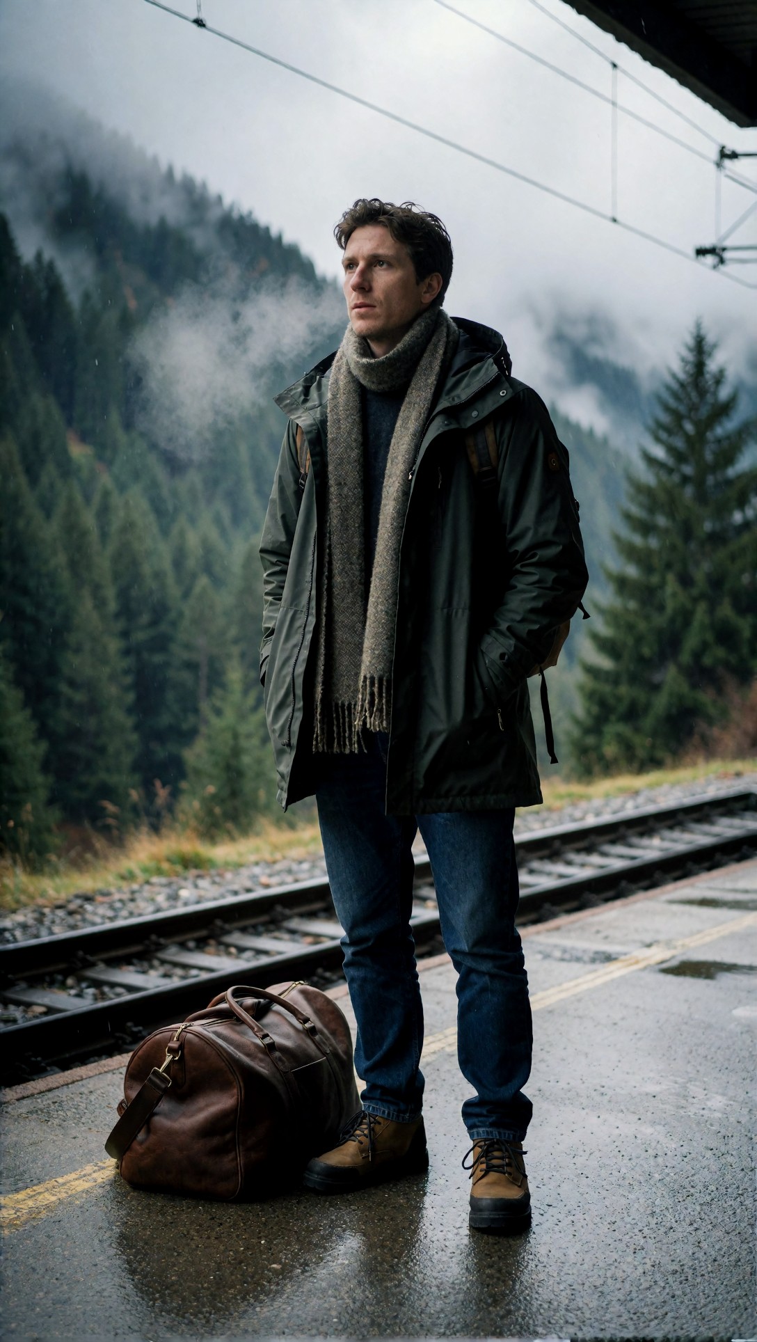
What is visible: the jacket has believable seams, a hood and zip pockets; the scarf shows a woven texture with fringe; both boots sit on the wet platform with laces readable; the duffel has a strap, buckle and scuffed leather; the tracks converge sensibly and the pines fade into mist. His hands are in his pockets, which quietly avoids the hardest part of human anatomy. Two small extras appear that the prompt never mentioned: a backpack strap over his shoulder and a wire of overhead line across the sky. Neither is an error, but it is a reminder that a draft adds things.
This also fits the practical advice for beginners: one person, one location, one lighting idea leaves the model little to contradict.
The pose choice decides how much hand risk you take on
A woman in an airy white button-up shirt, tan shorts, and leather sandals walking a vintage bicycle along a quiet seaside promenade at golden hour, relaxed smile, wind moving the shirt fabric and hair naturally, warm low sun creating long shadows, soft ocean haze in the distance, balanced full-body composition, refined resort lifestyle styling, sandy beige and faded blue palette, realistic bicycle details, textured concrete, Canon EOS R3 look, 35mm f/1.8 environmental portrait feel, natural motion, clean premium magazine finish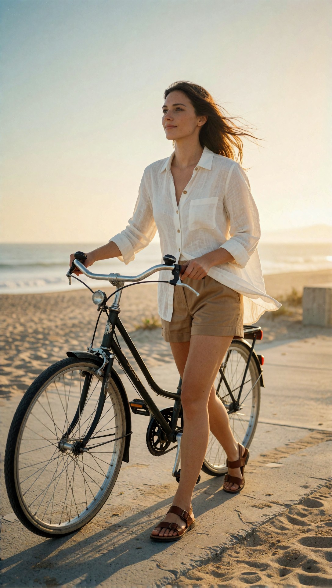
This prompt asked for a full-body pose with hands on a bicycle, which is the kind of thing people worry about. In this draft both hands rest on the handlebar grips, the frame, chainring, pedal, spokes and lamp are all legible, and the sandals have readable buckles. The linen shirt looks translucent and wind-blown, which matches the prompt. I looked for a structural fault and did not find one on this frame. That is a single sample, so it says nothing about how often hand-on-object poses succeed; run several seeds before you trust a pose.
Reflective and branded objects are where the drafts failed
The two product-style prompts are the most instructive, because both ended with a camera brand and lens as a style cue, and both images put text into the scene.
A premium stainless steel wristwatch with deep navy dial placed at a slight angle on a brushed metal tabletop, precision product composition, elegant reflected highlights along the case, sharp engraved bezel detail, softbox key light from upper left, subtle cool rim light defining silhouette, dark luxury studio background, clean shadow control, rich metallic texture, high-end advertising polish, restrained blue-silver color palette, Sony A7R V look, 90mm macro f/2.8 detail rendering, crisp typography on the dial, no clutter, premium commercial finish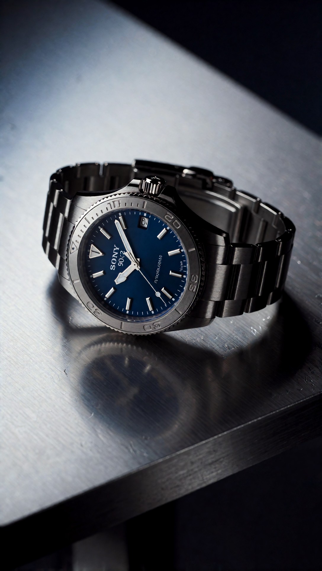
The case, bracelet, clasp, brushed table and soft reflection are convincing. The dial is not: it prints the word "SONY" with "90" and a distorted digit pair beneath, which are fragments of the camera phrase, and a second line of small text is unreadable. The bezel numerals are also irregular. The prompt asked for "crisp typography on the dial", which may have added pressure to produce text, but that is my inference, not something I tested.
A chilled glass bottle of sparkling citrus beverage with visible condensation placed on a warm stone terrace table, sliced blood oranges and fresh mint arranged naturally nearby, golden sunset backlight passing through the bottle, controlled bounce fill preserving label readability, crisp droplets, premium commercial composition, soft distant sea view, terracotta and amber palette, tactile glass texture, realistic liquid transparency, Fujifilm GFX100 II look, 120mm f/4 macro clarity, polished advertising image with fresh Mediterranean atmosphere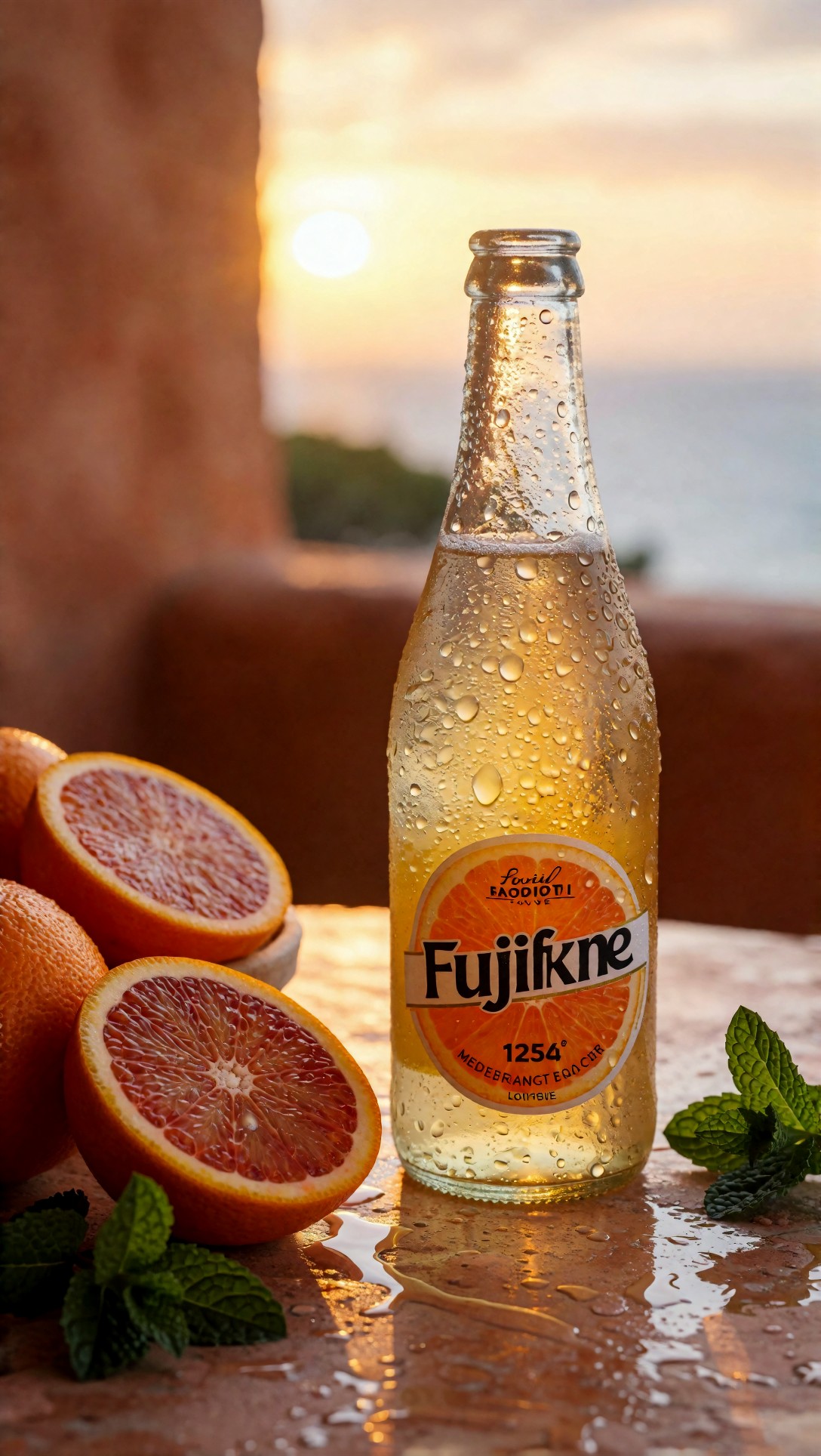
The glass, droplets, liquid color, orange segments and mint are the strongest part of the image. The label is the weak part: the big word reads roughly "Fujifkne", with a "1254" and two lines of nonsense letters. Again it echoes a camera brand from the prompt, and "label readability" was asked for. For a product where the label must be correct, plan to composite the real label later or to leave the label area blank in the prompt.
The same habit shows up in the lobby image:
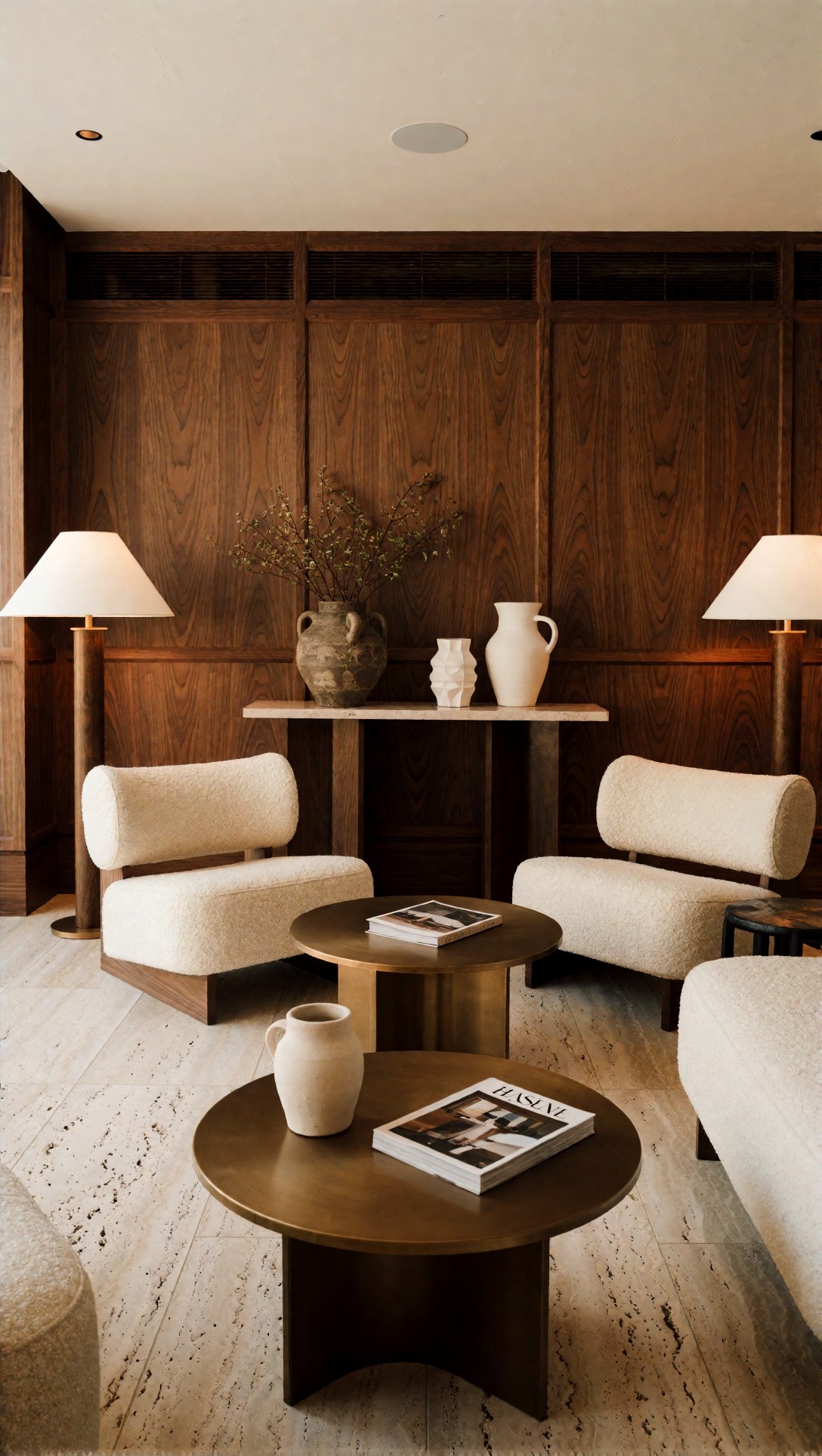
The walnut grain, boucle upholstery, travertine floor, round bronze tables, vases and lamps are separate and coherent, and the perspective is sound. The magazine on the front table has a masthead that reads roughly "HASENE", a garbled cousin of the camera name in that prompt ("Hasselblad X2D 100C look"). A magazine was not requested; the model invented it, then lettered it with leaked text. Treat that as an observation about these images, not proof that brand names always leak.
When the glow becomes a sticker outline
The neon street portrait asked for "magenta and cyan neon rim light tracing the jacket edges".
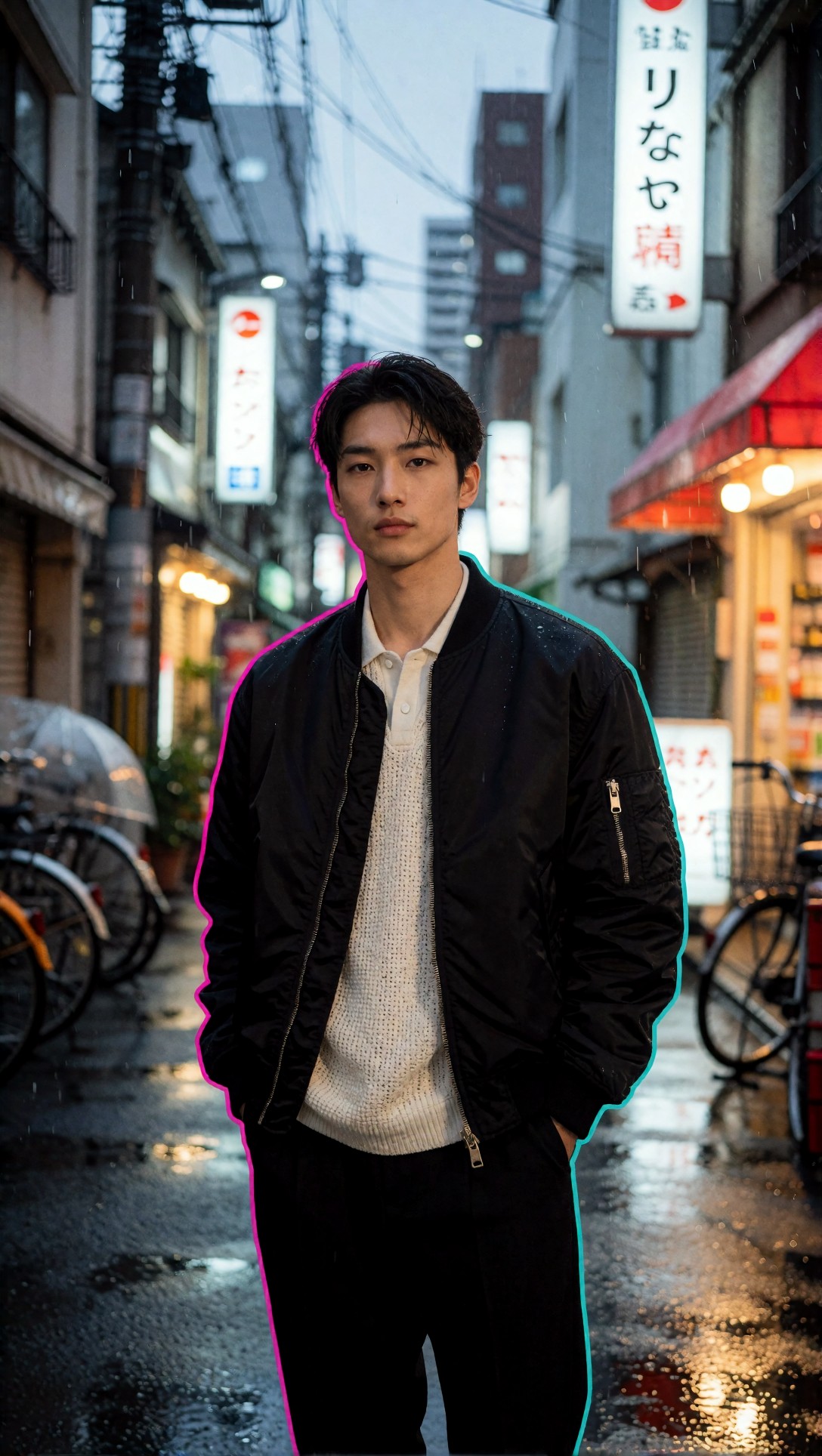
The jacket, zip pocket, knit texture, wet street and bicycles are well formed, and the face is clean. But the rim light is a uniform thin outline of pink on the left and cyan on the right, wrapping the head, arms and trousers in one continuous line. It looks like a cut-out border rather than light falling on edges, because real rim light would vary in strength and stay off surfaces facing away from the source. The signs behind him show Japanese-looking glyphs that I cannot read as real words, so I would not trust any of the signage. If your glow looks pasted on, simplify the color instruction or ask for a single-color edge light first.
The remaining two drafts, a window-lit portrait in a cream blouse and an anime rooftop scene, both came out structurally clean in my inspection. I am not showing them, so I make no further claims about them.
What the eight drafts say about where to spend your effort
From looking at these files, not from an A/B test of node settings:
1. The clean wins were the prompts with one subject, one place and no text-bearing surface (the traveler, the bicycle scene). 2. Every image with a surface that can carry text (watch dial, bottle label, magazine) produced garbled lettering, and in three of them the letters echoed a camera brand that was in the prompt. 3. Nothing on this page tells you whether changing steps, CFG or sampler would have fixed those labels. That experiment was not run.
This gives a simple order of operations for a first draft. First fix the canvas shape and the prompt scope. Then remove brand-like words from any prompt whose scene has labels, signs, dials or covers. Only then start moving KSampler values, one at a time, with a fixed seed.
Suggested next experiment (untested): rerun the watch prompt with the same seed and the "Sony A7R V look" phrase replaced by a purely optical description such as a macro close-up with shallow depth of field, and compare the dial.
A quick inspection routine
- Look at the thumbnail first: is the subject readable?
- Zoom on hands, straps, shoe edges and product edges.
- Read every piece of text in the image aloud. If you did not ask for it, suspect a leak.
- Check whether the light has one direction or looks outlined.
When the draft passes, you can enlarge it with the [Upscaler](/upscaler/en), and to iterate on wording you can use the [Prompt Lab](/promptlab/en) or try a prompt in the [image generator](/create/en). For a comparison of wording styles in realistic portraits, see the related ComfyUI article on reducing the AI look.
FAQ
Is DPM++ 2M Karras the right sampler? It is a widely used default for SDXL-class checkpoints, but I have no sampler data for these images. Start from your checkpoint's recommended sampler.
Why not add ControlNet or LoRAs to this graph? Because a seven-node graph lets you see cause and effect. Add extra nodes once you can explain why a draft failed.
> What this article is based on. Model: Krea2 Turbo, eight images generated on 2026-07-10. I opened and inspected all eight (six are shown, two described in one line). Generation records hold prompts and model name only; no ComfyUI graph, steps, CFG, sampler or seed were recorded, so node and setting advice is general guidance (untested).