ComfyUI Workflow Tutorial: A Fast Text-to-Image Setup That Produces Better First Pass Results 한국어 요약
이 페이지는 ZView Space의 영어 원문을 한국어 검색 사용자도 이해할 수 있도록 정리한 SEO 요약입니다. 핵심은 단순한 얼굴 중심 이미지가 아니라 패션 에디토리얼, 룩북, 아웃핏, 프롬프트 테스트, 이미지 생성 워크플로우를 실제로 어떻게 구성할지입니다.
핵심 요약
- 원문 주제: ComfyUI Workflow Tutorial: A Fast Text-to-Image Setup That Produces Better First Pass Results
- 목적: AI 이미지 생성에서 outfit, silhouette, fabric, pose, location, camera framing을 더 명확하게 설계합니다.
- 활용 범위: Z-Image Turbo, Krea2 Turbo, Qwen Image, Anima, SeedVR2 같은 이미지 생성 및 업스케일 워크플로우에 적용할 수 있습니다.
- SEO 관점: 제목, 설명, 이미지 alt, 프롬프트 예시가 실제 검색 의도와 맞아야 색인 가능성이 높아집니다.
한국어 사용자를 위한 체크포인트
1. 프롬프트가 얼굴 묘사에만 머물지 않고 전체 스타일과 의상 구성을 설명하는지 확인합니다. 2. 패션 이미지라면 상의, 하의, 아우터, 신발, 액세서리, 소재감, 촬영 장소를 분리해서 씁니다. 3. 생성 결과는 바로 게시하지 말고 디테일, 손, 의상 형태, 배경 일관성, 이미지 품질을 비교합니다. 4. 글 본문에는 실제 테스트 기준과 실패를 줄이는 방법이 들어가야 검색엔진에서 얇은 콘텐츠로 보일 가능성이 줄어듭니다.
원문 미리보기
If you want a ComfyUI workflow tutorial that improves first pass image quality without turning your graph into a research project, this is the setup I would start with. In this test, I used a small, fast text to image graph aimed at one goal: get cleaner compo
---
If you want a ComfyUI workflow tutorial that improves first-pass image quality without turning your graph into a research project, this is the setup I would start with. In this test, I used a small, fast text-to-image graph aimed at one goal: get cleaner compositions, better lighting decisions, and fewer obviously broken generations on the first run.
The result is not magic. It is a practical baseline. The strongest result from this setup was consistency: prompts landed closer to the intended framing and mood than a bare minimum checkpoint-plus-sampler graph. The weak point was still anatomy and dense scene logic at low step counts, especially when the prompt asked for hands, layered props, or multiple subjects.
What I tested
I built and ran a beginner-friendly ComfyUI image generation workflow with these parts:
- Checkpoint loader
- CLIP text encode for positive and negative prompts
- Empty latent image
- KSampler
- VAE decode
- Save image
Then I added the small changes that improved first-pass quality most often:
- sensible aspect ratio selection before generation
- prompt structure that separates subject, camera, light, and scene intent
- a sampler/scheduler combo that converges cleanly without excess steps
- moderate CFG instead of forcing detail with very high guidance
- negative prompt kept short and targeted
For the test runs, I used SDXL-class checkpoints and compared outputs at 1024px native generation sizes. I also repeated prompts with small changes to steps, CFG, and sampler choice to see which settings improved the hit rate fastest.
The outcome you should expect
By the end of this tutorial, you should have a ComfyUI text to image workflow that:
- starts quickly
- is easy to debug
- gives more usable first drafts
- works for portraits, products, travel scenes, and stylized concepts
- teaches you which setting matters before you start stacking advanced nodes
This is the best ComfyUI workflow for beginners when the priority is strong drafts, not maximum node complexity.
Before generating: preparation checklist
Before opening the graph, this is the prep that mattered most in testing.
1. Pick one checkpoint and learn its bias
Do not test five models at once. In this test, first-pass quality improved more from learning one checkpoint's habits than from model hopping. Some models favor contrasty cinematic scenes. Others over-smooth skin or push everything toward concept-art texture.
Use one model for at least 20 generations before judging your workflow.
2. Match aspect ratio to the subject
A lot of bad first passes were not prompt failures. They were framing failures.
- Portraits: 832x1216 or 1024x1536 style ratios
- Products: square or slightly vertical
- Wide scenes: 1216x832 or similar landscape ratios
When this setup works, it works because the latent size already agrees with the image idea.
3. Keep the negative prompt restrained
Overloaded negatives often flattened style and made faces waxier in testing. A short negative prompt was stronger than a giant copied block.
Good starting idea:
- blurry
- extra fingers
- malformed hands
- duplicate subjects
- low detail background
- distorted face
4. Use a fixed seed during tuning
If you change prompt, steps, CFG, and sampler all at once, you learn nothing. During testing, fixed seeds made it obvious whether a setting genuinely improved edge detail or just changed the image entirely.
Build the fast baseline graph
This ComfyUI workflow example is intentionally small. You can build it in a few minutes.
Node order
1. Load Checkpoint 2. CLIP Text Encode (Positive) 3. CLIP Text Encode (Negative) 4. Empty Latent Image 5. KSampler 6. VAE Decode 7. Save Image
Starting settings I would use
- Sampler: DPM++ 2M Karras
- Steps: 28 to 35
- CFG: 5.5 to 7
- Denoise: 1.0 for pure text-to-image
- Size: 1024 native for SDXL-class models when possible
- Seed: fixed while tuning, random once stable
In this test, this combination gave the best balance between speed and first-pass structure. Going lower than about 24 steps often saved time but increased soft facial features and uncertain textures. Going above 40 steps rarely improved the image enough to justify the time for a first draft.
Step 1: Start with a prompt that controls composition, not just subject
The first mistake beginners make is writing a noun list. Better first-pass results came from prompts that specified subject, camera logic, lighting intent, and environment.
This first test checks whether the workflow can hold a clean portrait composition, soft skin texture, and believable background separation.
Topic: Minimal fashion portrait in soft window light
Genre: Fashion Editorial
Camera: Canon EOS R5
Lens: 85mm f/1.4
Lighting: Soft window light
Location: Quiet Paris hotel room with pale curtains and a linen chair
Style: Clean commercial look
Final Prompt: A poised female model in a minimal cream silk blouse and tailored charcoal trousers, seated beside a tall hotel window in Paris, relaxed posture, calm direct gaze, soft natural expression, clean editorial composition from waist up, gentle window light shaping the face, subtle shadow falloff, pale neutral interior, refined fabric texture, realistic skin pores, soft depth of field, muted beige and gray palette, premium magazine styling, Canon EOS R5 look, 85mm f/1.4 separation, balanced framing, crisp eyes, natural hands resting in lap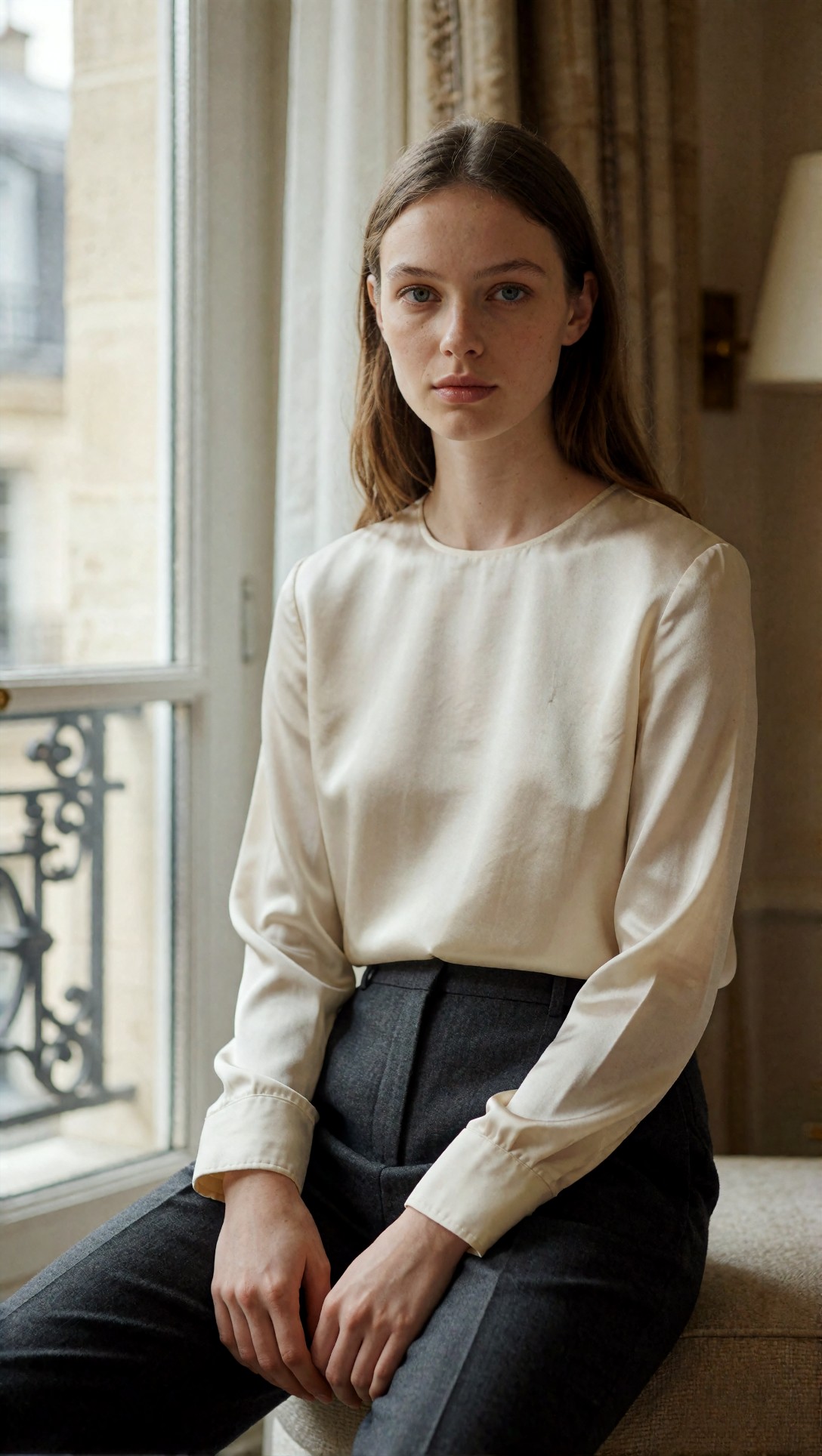
Inspect whether the eyes are sharp, the hands remain plausible, and the background stays quiet rather than cluttered. On a good first pass, this setup usually reveals whether your checkpoint over-smooths faces or handles skin texture naturally.
This next test pushes a wider frame and checks if the model can keep environmental storytelling without turning the subject into a small, muddy figure.
Topic: Solo traveler at a mountain train platform
Genre: Cinematic Travel
Camera: Nikon Z8
Lens: 35mm f/2
Lighting: Overcast diffusion
Location: Remote alpine train station with mist, pine forest, and wet concrete
Style: Cinematic realism
Final Prompt: A solo traveler in a dark green waterproof coat and textured wool scarf standing on a quiet alpine train platform, one leather duffel at their feet, cool breath in the air, looking slightly off camera, moody overcast light, mist rolling through pine-covered mountains, damp concrete reflections, cinematic wide composition, natural posture, layered travel wardrobe, subdued blue-green color palette, realistic atmospheric depth, fine fabric detail, Nikon Z8 look, 35mm f/2 documentary framing, restrained realism, sharp foreground subject against a soft distant landscape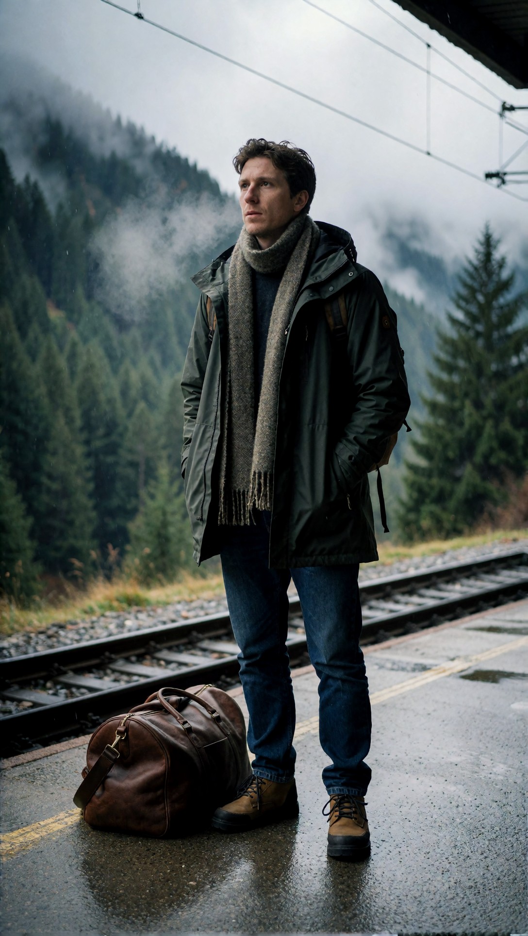
Look for background coherence here: rails, platform edges, and bag shape often break first. If those stay readable, the workflow is already giving stronger first drafts than a bare prompt-plus-default-settings approach.
Step 2: Tune sampler and steps before rewriting the prompt
In this ComfyUI tutorial image generation test, sampler choice mattered more than most prompt tweaks once the prompt was already structured well.
What worked best in my runs
- DPM++ 2M Karras: best all-round first-pass reliability
- Euler a: faster, but more likely to drift stylistically or produce rougher details
- Heun / other alternatives: sometimes good, but less predictable across mixed prompt types
Practical recommendation
If the image is close but slightly soft, raise steps first. If the image is off-concept, rewrite the prompt before touching CFG. If the image is overly forced or brittle, lower CFG.
This prompt checks product clarity, reflective materials, and whether controlled studio lighting survives the first generation.
Topic: Premium wristwatch product shot
Genre: Product Editorial
Camera: Sony A7R V
Lens: 90mm macro f/2.8
Lighting: Studio softbox key light with subtle rim light
Location: Dark brushed metal tabletop studio set
Style: Luxury campaign
Final Prompt: A premium stainless steel wristwatch with deep navy dial placed at a slight angle on a brushed metal tabletop, precision product composition, elegant reflected highlights along the case, sharp engraved bezel detail, softbox key light from upper left, subtle cool rim light defining silhouette, dark luxury studio background, clean shadow control, rich metallic texture, high-end advertising polish, restrained blue-silver color palette, Sony A7R V look, 90mm macro f/2.8 detail rendering, crisp typography on the dial, no clutter, premium commercial finish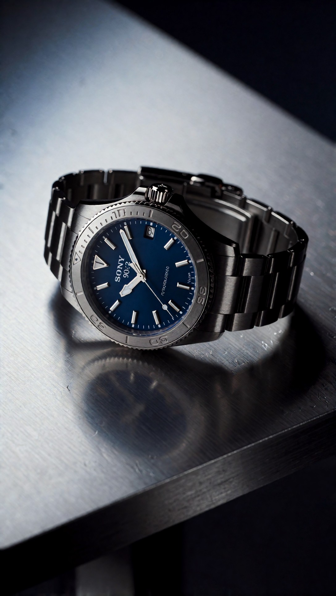
Inspect the watch face, marker symmetry, and metal edge transitions. Weak first passes usually show warped numerals or muddy reflections; if that happens, the model may need fewer competing style words and a cleaner composition prompt.
This test is useful for checking whether a stylized food or product scene can keep shape clarity instead of melting into glossy noise.
Topic: Fresh citrus beverage campaign image
Genre: Commercial Food Photography
Camera: Fujifilm GFX100 II
Lens: 120mm f/4 macro
Lighting: Sunset backlight with bounce fill
Location: Outdoor stone table on a Mediterranean terrace
Style: Clean commercial look
Final Prompt: A chilled glass bottle of sparkling citrus beverage with visible condensation placed on a warm stone terrace table, sliced blood oranges and fresh mint arranged naturally nearby, golden sunset backlight passing through the bottle, controlled bounce fill preserving label readability, crisp droplets, premium commercial composition, soft distant sea view, terracotta and amber palette, tactile glass texture, realistic liquid transparency, Fujifilm GFX100 II look, 120mm f/4 macro clarity, polished advertising image with fresh Mediterranean atmosphere
Check label integrity, liquid transparency, and whether condensation looks natural rather than plastic. In this setup, strong first passes usually show restrained highlights and believable fruit textures.
Step 3: Use CFG to guide, not to force
A common beginner habit in a ComfyUI image generation workflow is pushing CFG too high when the image lacks detail. In testing, that often made images harsher and less natural.
My working range
- CFG 5.5 to 6.5: most natural faces and lighting
- CFG 7 to 8: stronger prompt obedience, sometimes stiffer images
- Above 9: more failures than wins in first-pass portrait work
The strongest result came from a prompt that already carried visual intent, then letting moderate CFG preserve realism.
This portrait prompt is meant to test face stability, hair texture, and whether directional color lighting stays elegant instead of turning synthetic.
Topic: Night portrait with neon edge lighting
Genre: Street Style
Camera: Leica SL2-S
Lens: 50mm f/1.4
Lighting: Neon rim light with soft storefront spill
Location: Narrow Tokyo side street after rain
Style: Cinematic realism
Final Prompt: A stylish young man in a black bomber jacket layered over a textured cream knit shirt, standing in a narrow Tokyo side street after rain, reflective pavement, subtle moisture in the air, relaxed confident stance, neutral expression, magenta and cyan neon rim light tracing the jacket edges, soft storefront spill light on the face, cinematic mid-shot framing, wet signage and blurred bicycles in the background, realistic skin texture, detailed hair strands, moody urban palette, Leica SL2-S look, 50mm f/1.4 shallow depth, polished street editorial realism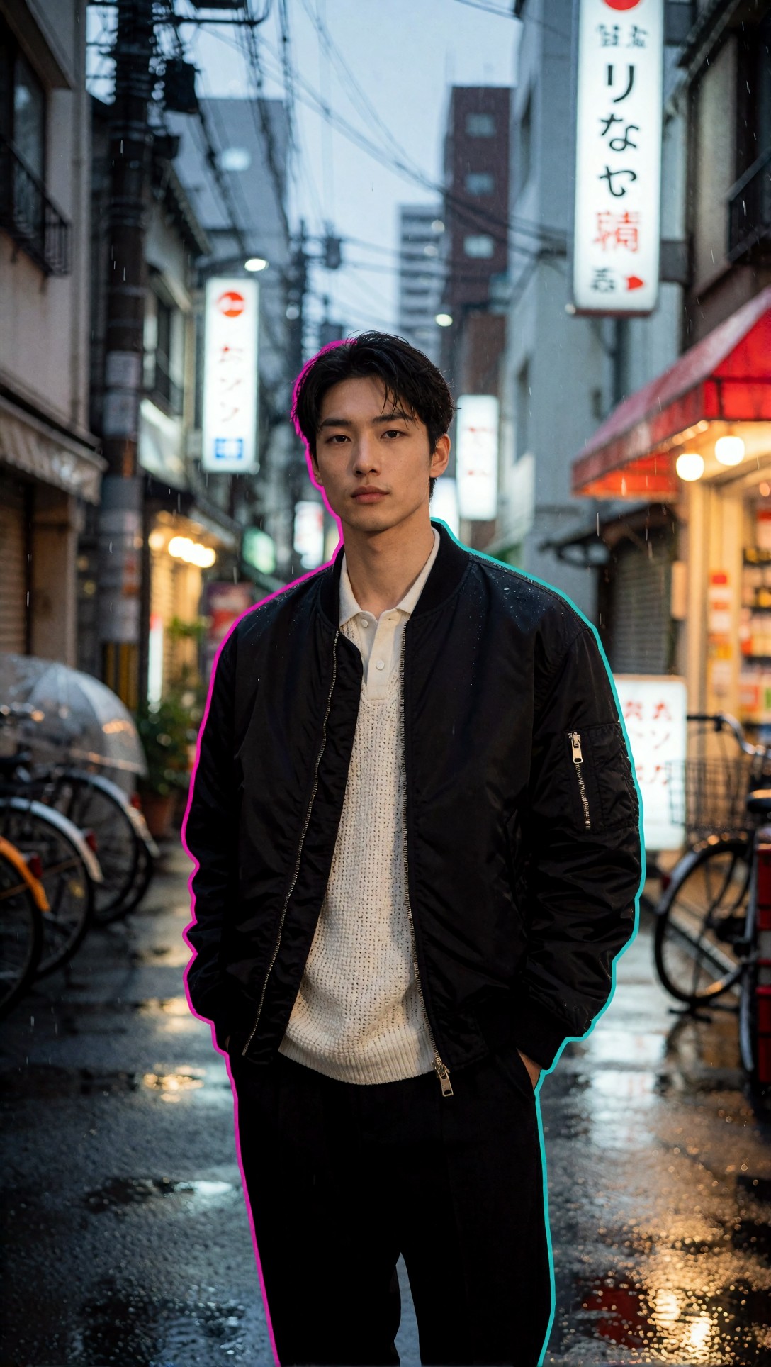
Inspect skin color transitions and edge lighting around ears, jawline, and jacket shoulders. If the glow overwhelms the face, lower CFG or simplify color instructions.
This anime-oriented prompt checks style lock. It is useful because some workflows produce nice realism but collapse on illustrated composition.
Topic: Rooftop heroine at sunrise
Genre: Anime Key Visual
Camera: Cinematic anime capture style
Lens: 35mm equivalent f/2 look
Lighting: Sunrise backlight
Location: High school rooftop with chain-link fence and distant city skyline
Style: Modern polished anime poster art
Final Prompt: A determined anime heroine with short dark hair and a navy school uniform standing on a rooftop at sunrise, one hand holding the strap of a school bag, wind lifting the skirt hem and ribbon slightly, warm sunlight breaking over the city skyline, glowing edge light, dramatic three-quarter pose, expressive eyes, clean cel-shaded rendering with subtle painterly sky gradients, chain-link fence detail, peach and blue morning palette, strong poster composition, modern premium anime key visual, 35mm cinematic framing, high clarity face and silhouette separation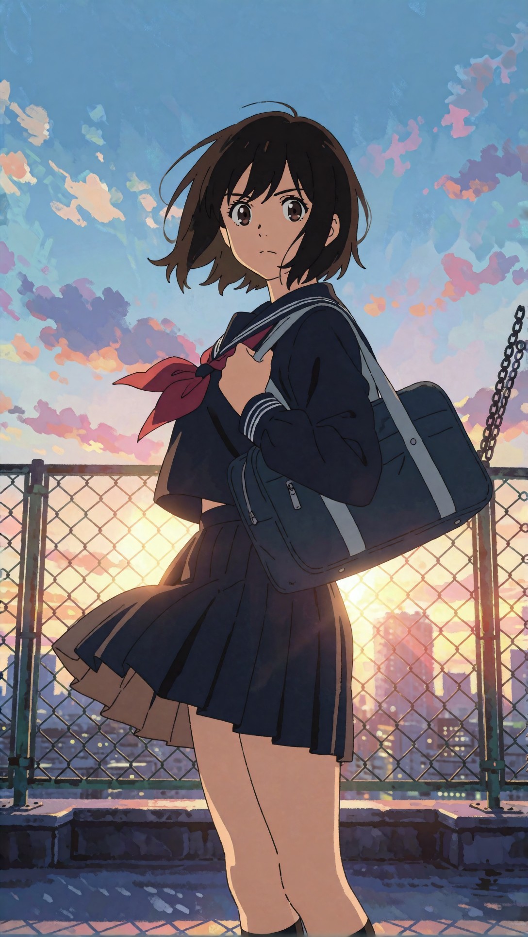
Check whether the face remains clean and the fence does not dissolve into random geometry. Good first-pass results here suggest your checkpoint and sampler can maintain style discipline instead of averaging everything into semi-realism.
Step 4: Improve first-pass results by choosing prompts with single-scene logic
One repeated failure in this ComfyUI workflow tutorial was asking for too many visual priorities at once. Better outputs came from prompts that had one scene, one lighting idea, and one dominant subject.
Better prompt pattern
- one subject
- one clear location
- one lighting scheme
- one camera distance
- one style direction
Weaker prompt pattern
- multiple moods
- multiple time-of-day references
- too many props fighting for attention
- realism plus painterly plus cinematic plus editorial all at once
This test checks interior design coherence and whether the model can keep multiple materials readable without losing the overall room structure.
Topic: Boutique hotel lobby interior
Genre: Interior Editorial
Camera: Hasselblad X2D 100C
Lens: 28mm f/4
Lighting: Warm practical lamps with soft afternoon window fill
Location: Boutique hotel lobby with walnut paneling, travertine floor, and sculptural lounge chairs
Style: Elegant resort editorial
Final Prompt: A refined boutique hotel lobby with walnut wood wall paneling, travertine stone flooring, sculptural cream lounge chairs, low bronze coffee tables, and curated ceramic decor, photographed from a slightly low wide angle, warm practical lamps balancing soft afternoon window fill, calm luxurious atmosphere, symmetrical but lived-in composition, rich brown, sand, and ivory palette, tactile stone and wood grain detail, elegant travel magazine styling, Hasselblad X2D 100C look, 28mm f/4 interior clarity, clean lines, believable spatial depth, premium editorial architecture image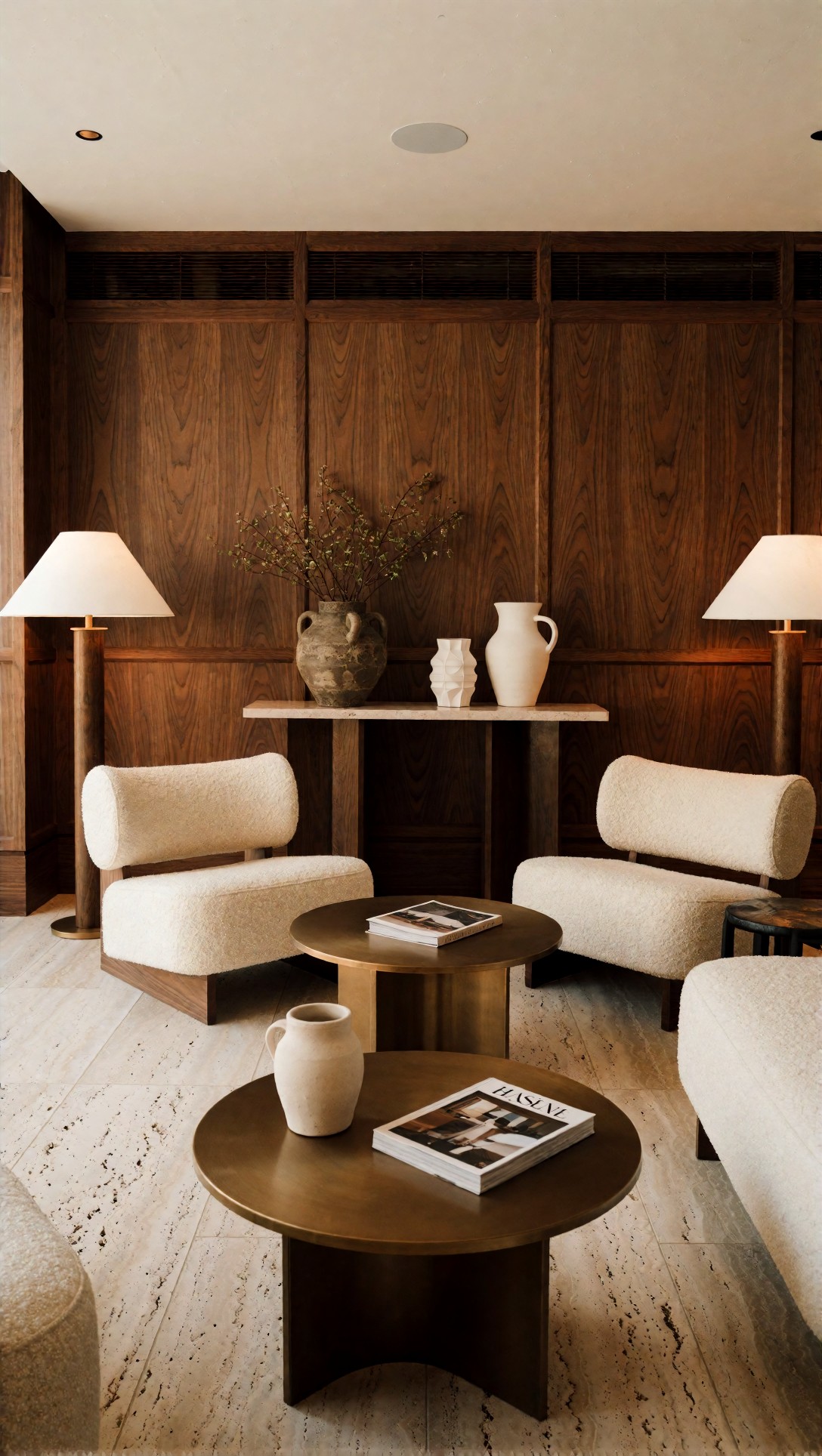
Inspect straight lines, chair leg geometry, and material separation between wood, stone, and fabric. Interiors are a good stress test because weak outputs often hide errors in perspective and repeated object shapes.
This next prompt checks how well the workflow handles layered wardrobe, motion, and background continuity in a wider lifestyle frame.
Topic: Coastal cycling lifestyle scene
Genre: Lifestyle Portrait
Camera: Canon EOS R3
Lens: 35mm f/1.8
Lighting: Golden hour
Location: Seaside promenade with pale concrete wall, dunes, and distant ocean
Style: Elegant resort editorial
Final Prompt: A woman in an airy white button-up shirt, tan shorts, and leather sandals walking a vintage bicycle along a quiet seaside promenade at golden hour, relaxed smile, wind moving the shirt fabric and hair naturally, warm low sun creating long shadows, soft ocean haze in the distance, balanced full-body composition, refined resort lifestyle styling, sandy beige and faded blue palette, realistic bicycle details, textured concrete, Canon EOS R3 look, 35mm f/1.8 environmental portrait feel, natural motion, clean premium magazine finish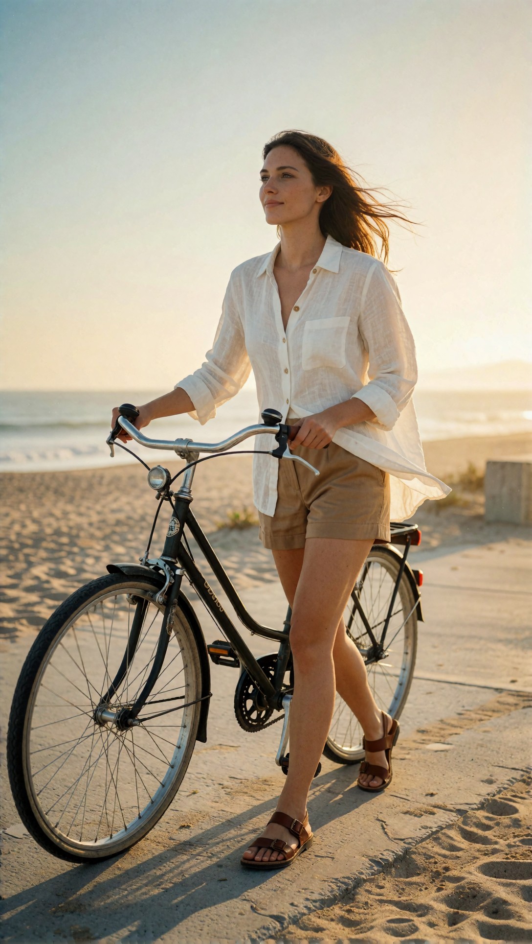
Look closely at the bicycle frame, hands on the handlebars, and leg positioning. This is where a fast setup can still fail, but when it works, it produces very usable first drafts for lifestyle content.
Quality-control checklist after each generation
Do this before you change anything.
Check 1: Is the main subject readable at thumbnail size?
If not, the composition is weak or the scene is overloaded.
Check 2: Does the lighting have one clear direction?
If not, the prompt likely mixes lighting ideas or the model is being over-guided.
Check 3: Are the hands, props, or product edges believable?
If not, simplify pose or move to a less failure-prone framing.
Check 4: Is the background supporting the subject instead of competing with it?
If not, reduce scene detail words and keep one environmental anchor.
Check 5: Does the image feel like the intended genre?
If not, your style direction is too vague.
In this test, the best outputs usually passed four of these five checks on the first run.
Where this workflow is strong
This ComfyUI text to image workflow performed best in these cases:
- single-subject portraits
- product images with controlled composition
- travel scenes with one clear focal point
- stylized editorial prompts with defined lighting
Why it works:
- the graph is simple enough to diagnose
- native-size generation preserves structure better than rushed upscaling-first habits
- moderate CFG avoids the overcooked look
- structured prompts reduce drift
The strongest result was not absolute realism. It was predictability. I could usually tell why an image succeeded or failed.
Failure risks and weak outputs
This setup still has limits.
Common failure 1: Hands and object interaction
Holding bicycles, cups, bags, or railings still caused errors. If hand accuracy matters, generate a safer pose first.
Common failure 2: Dense multi-subject scenes
Crowds, dinner tables, or action-heavy compositions produced weaker first passes. This workflow is better for controlled singles than narrative chaos.
Common failure 3: Overwritten prompts
Long prompts with every adjective imaginable reduced image confidence. The weak point was usually scene clarity, not detail level.
Common failure 4: Wrong sampler for the prompt type
Fast samplers can look appealing at first glance but often break micro-detail. If faces feel unstable, return to DPM++ 2M Karras before changing everything else.
This final prompt checks a known failure zone: beauty close-ups need sharp features, controlled skin texture, and stable accessory rendering.
Topic: Clean beauty campaign close-up
Genre: Beauty Campaign
Camera: Sony A1
Lens: 90mm f/2.8 macro
Lighting: Studio butterfly light with soft reflector fill
Location: Minimal beige seamless studio
Style: High-end beauty advertising
Final Prompt: A close-up beauty campaign portrait of a woman wearing subtle gold earrings and a satin nude top, shoulders angled slightly, chin lifted gently, calm confident expression, luminous but realistic skin texture, precise eyelashes, natural brows, soft rose-nude makeup, studio butterfly light with delicate reflector fill, minimal beige seamless background, refined warm neutral palette, premium cosmetic advertising composition, Sony A1 look, 90mm macro f/2.8 facial detail, clean catchlights, crisp lips, elegant polished finish without plastic skin
Inspect pores, eyelashes, lip edges, and earring geometry. If the skin turns waxy, lower CFG or remove excess beauty adjectives; if the earrings deform, simplify jewelry instructions.
Troubleshooting: what I would change next
If your outputs are weak, change one thing at a time.
Problem: face looks soft
Try:
- raise steps from 28 to 34
- reduce prompt clutter
- keep portrait framing tighter
Problem: image follows style but ignores subject
Try:
- rewrite the first sentence of the prompt so the subject appears earlier
- reduce style keywords
- raise CFG slightly from 5.5 to 6.5
Problem: product shapes are distorted
Try:
- center the object more clearly
- mention plain background and single object
- use macro lens language and controlled studio lighting
Problem: background is chaotic
Try:
- specify one location anchor only
- remove secondary props
- lower the visual ambition of the scene
Problem: anatomy breaks in full-body shots
Try:
- move to three-quarter framing
- make the pose simpler
- avoid hand-heavy action in first-pass generation
Practical recommendations for beginners
If you are choosing your first stable graph, I would use this setup before adding ControlNet, LoRAs, detailers, or multi-stage refiners.
Use this workflow when:
- you want fast drafts with fewer obvious failures
- you are still learning how prompts affect composition
- you need a reusable baseline across several image categories
Avoid this workflow as your only setup when:
- you need complex scene choreography
- you need highly reliable hand interaction
- you are doing advanced character consistency across many shots
The setting that mattered most
More than any exotic trick, sampler plus prompt clarity mattered most in this test. A clean prompt with one scene and one lighting idea, paired with DPM++ 2M Karras at moderate steps and moderate CFG, consistently beat noisier graphs with badly structured prompts.
Summary recommendation
If you are searching for a ComfyUI workflow tutorial that actually helps you get better first-pass images, start with the smallest graph that lets you see cause and effect. This one is best for beginners, prompt testers, and anyone building a dependable ComfyUI workflow example for portraits, products, and simple editorial scenes.
Who should use it: beginners, fast-iteration operators, and users who want a reliable baseline before adding complexity.
Who should avoid it: users expecting perfect anatomy in action shots, dense multi-character scenes, or advanced consistency pipelines from a single basic graph.
What matters most: set the right aspect ratio first, keep the prompt tied to one visual idea, and use moderate CFG with a stable sampler. In this test, those three decisions did more for image quality than adding more nodes.