Editorial Fashion AI Beauty Campaign: Tested Ways to Pair Makeup, Fabric Texture, and Product Styling 한국어 요약
이 페이지는 ZView Space의 영어 원문을 한국어 검색 사용자도 이해할 수 있도록 정리한 SEO 요약입니다. 핵심은 단순한 얼굴 중심 이미지가 아니라 패션 에디토리얼, 룩북, 아웃핏, 프롬프트 테스트, 이미지 생성 워크플로우를 실제로 어떻게 구성할지입니다.
핵심 요약
- 원문 주제: Editorial Fashion AI Beauty Campaign: Tested Ways to Pair Makeup, Fabric Texture, and Product Styling
- 목적: AI 이미지 생성에서 outfit, silhouette, fabric, pose, location, camera framing을 더 명확하게 설계합니다.
- 활용 범위: Z-Image Turbo, Krea2 Turbo, Qwen Image, Anima, SeedVR2 같은 이미지 생성 및 업스케일 워크플로우에 적용할 수 있습니다.
- SEO 관점: 제목, 설명, 이미지 alt, 프롬프트 예시가 실제 검색 의도와 맞아야 색인 가능성이 높아집니다.
한국어 사용자를 위한 체크포인트
1. 프롬프트가 얼굴 묘사에만 머물지 않고 전체 스타일과 의상 구성을 설명하는지 확인합니다. 2. 패션 이미지라면 상의, 하의, 아우터, 신발, 액세서리, 소재감, 촬영 장소를 분리해서 씁니다. 3. 생성 결과는 바로 게시하지 말고 디테일, 손, 의상 형태, 배경 일관성, 이미지 품질을 비교합니다. 4. 글 본문에는 실제 테스트 기준과 실패를 줄이는 방법이 들어가야 검색엔진에서 얇은 콘텐츠로 보일 가능성이 줄어듭니다.
원문 미리보기
This tutorial shows a practical workflow for building an editorial fashion AI beauty campaign where makeup, fabric texture, and product styling support each other instead of competing for attention. In this test, the best outputs came from planning the image l
---
This tutorial shows a practical workflow for building an editorial fashion AI beauty campaign where makeup, fabric texture, and product styling support each other instead of competing for attention. In this test, the best outputs came from planning the image like a fashion editorial first, then using makeup and product placement as secondary anchors. The weak outputs appeared when the prompt over-focused on the face, used vague wardrobe language, or failed to specify how the beauty product should sit inside the styling system.
Quick answer: what to know first
- Start from a fashion shot type before writing any beauty details. This keeps outfit logic visible and prevents the image from collapsing into a generic portrait.
- Treat makeup, fabric, and product as three separate control layers. If two are specific and one is vague, the vague one usually fails first.
- In this test, three-quarter editorial and accessories close-up prompts gave the cleanest product integration. Full-body shots were better for silhouette, but weaker for legible makeup packaging.
- Use fabric words that describe surface behavior, not just material names: liquid satin, dry tweed, brushed wool, lacquered leather, powder-matte knit.
- When quality drops, simplify the scene before changing the aesthetic. Too many props caused more failures than too few details.
Test setup
I tested a repeated prompt structure across fashion-editorial and product-editorial scenes, with the same campaign idea expressed through multiple shot plans: three-quarter outfit editorial, head-to-toe lookbook, garment detail macro, accessories close-up, product flat lay, and storefront display.
What was tested:
- Whether makeup color could stay coherent with garment palette
- Whether fabric texture stayed readable under beauty-led lighting
- Whether a cosmetic product could remain clear without looking pasted into the frame
- Which shot types were most stable for beauty-fashion crossover work
- How much scene complexity the prompt could support before hands, packaging, or accessories broke
For prompt drafting and iterations, the most useful workflow was to write the prompt in layers, then refine variants in [PromptLab](/promptlab). When a promising image had good styling but weak detail, I got the most usable salvage results by sending it through the [Upscaler](/upscaler). For layout references and style matching, [Gallery](/gallery) and [Create](/create) were the easiest places to compare visual direction quickly.
Before you generate: preparation checklist for a beauty fashion campaign
Before writing prompts, define these five items. This prep mattered more than adding extra adjectives later.
1. Pick the campaign anchor
Choose one lead idea:
- lip color launch
- complexion story
- metallic eye campaign
- fragrance-meets-fashion concept
- skin finish matched to textile finish
If the campaign anchor is unclear, the model usually defaults to beauty portrait logic and drops the fashion structure.
2. Lock a fabric behavior map
Do not only write "silk dress" or "wool coat." Use texture language that the model can stage visually.
| Element | Strong prompt language | Weak prompt language | |---|---|---| | Satin | liquid satin, light-catching bias cut satin | satin dress | | Knit | powder-matte rib knit, soft structured knit | knit top | | Leather | lacquered leather, soft-grain leather | leather jacket | | Tweed | dry tweed texture, visible bouclé fleck | tweed outfit | | Organza | translucent organza layering, crisp sheer volume | sheer fabric |
3. Match makeup finish to textile finish
This was one of the most reliable prompt rules in the test.
- glossy lip + liquid satin or patent leather
- velvet matte lip + brushed wool or matte tailoring
- pearlescent eye + metallic jacquard or crystal embellishment
- fresh skin + cotton poplin or minimalist suiting
4. Decide the product role
The product can be:
- hero object in hand
- secondary object on table or vanity
- repeated motif in set design
- color cue only, with no visible package
If you do not define the product role, packaging often becomes misshapen or distracts from styling.
5. Choose shot order in advance
The most stable production sequence was:
1. three-quarter editorial 2. accessories close-up 3. garment detail macro 4. head-to-toe lookbook 5. product flat lay 6. storefront display or mood-board collage
That order helped keep visual direction consistent across assets.
Step-by-step workflow: building the editorial fashion AI setup
Step 1: Start with a three-quarter outfit editorial, not a beauty close-up
This is the strongest entry point for an editorial fashion AI beauty campaign because it balances styling visibility, facial readability, and product placement. In this test, it also gave the best makeup-to-fabric coherence.
This first prompt checks whether the model can hold a complete styling system while still making the beauty direction legible.
Topic: Beauty-led three-quarter fashion editorial with berry lip and liquid satin tailoring
Genre: Fashion Editorial
Camera: Canon EOS R5
Lens: 50mm f/2
Lighting: Large softbox key light with subtle silver bounce and dim studio fill
Location: Minimal Paris editorial studio with pale stone floor and curved cream backdrop
Style: Luxury fashion campaign
Final Prompt: Three-quarter outfit editorial for a beauty-led fashion campaign, model standing with full outfit logic visible from mid-thigh upward, wearing a liquid satin oxblood blazer layered over a soft blush silk camisole, high-waist tailored trousers, pointed leather pumps, slim structured handbag, sculptural gold earrings, styling built around a berry velvet-matte lip and softly diffused plum eye makeup, one hand holding a premium lipstick case near the waist without blocking the garment lines, calm editorial expression, shoulders angled slightly, clean luxury campaign composition, visible satin sheen and tailoring seams, refined neutral set, rich burgundy and blush palette, Canon EOS R5 look, 50mm f/2 natural perspective, crisp fabric texture, realistic product placement, magazine-grade framing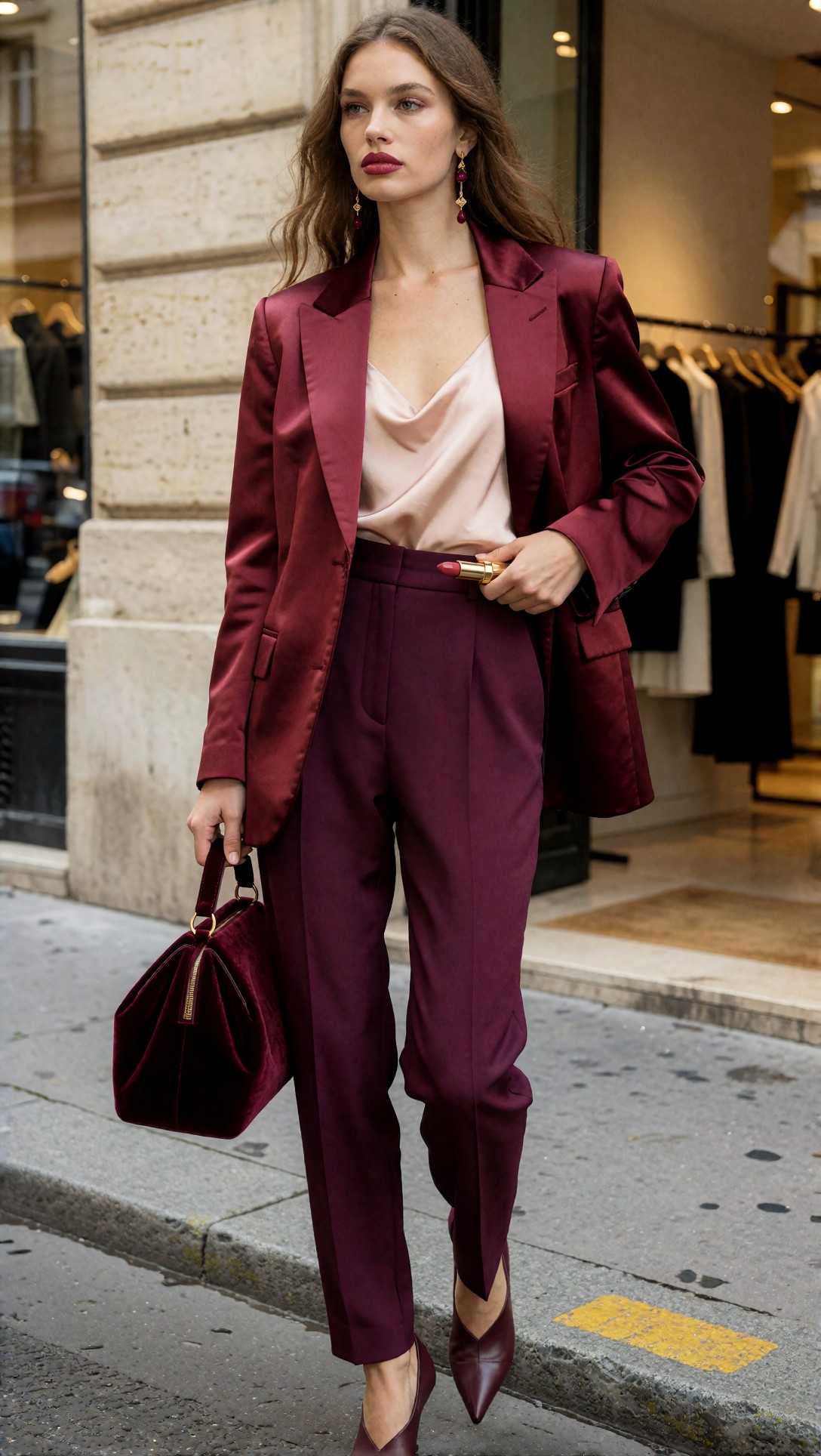
Inspect whether the lipstick case reads as a designed object rather than a random metallic block. Also check if the satin jacket still shows seam lines and surface shine instead of turning into flat red fabric.
Why this setup worked
The strongest result came from putting the product near the waist, not near the face. That left room for the outfit silhouette to stay readable. When the product was raised to cheek level, the model often shifted into ad-portrait mode and cropped too tightly.
Step 2: Test a head-to-toe lookbook version for silhouette control
Once the editorial crop is stable, move to a head-to-toe lookbook prompt. This is less effective for packaging clarity, but better for checking whether makeup still supports the wardrobe from a distance.
This test is useful for verifying whether the beauty concept survives when the frame has to carry shoes, hemline, bag, and overall proportion.
Topic: Head-to-toe lookbook with fresh skin finish and powder-matte knit layering
Genre: Lookbook Photography
Camera: Sony A7R V
Lens: 40mm f/4
Lighting: Bright north-light studio diffusion with soft floor bounce
Location: Clean Scandinavian showroom with chalk walls and pale oak floor
Style: Clean commercial look
Final Prompt: Head-to-toe lookbook image for a beauty fashion campaign, full body visible with complete outfit styling, model wearing a powder-matte rib knit turtleneck under a cropped sand-colored suede jacket, wide-leg ivory trousers, cream leather loafers, compact shoulder bag, minimal silver rings, makeup built around fresh skin, brushed brows, muted rose lip, and soft taupe eye, standing in a calm showroom pose with one foot slightly forward, clean front-facing composition, focus on silhouette balance and texture contrast between matte knit, suede, and fluid trouser fabric, subtle premium cosmetic campaign mood without losing outfit visibility, Sony A7R V rendering, 40mm editorial framing, pale neutral palette, modern retail-ready styling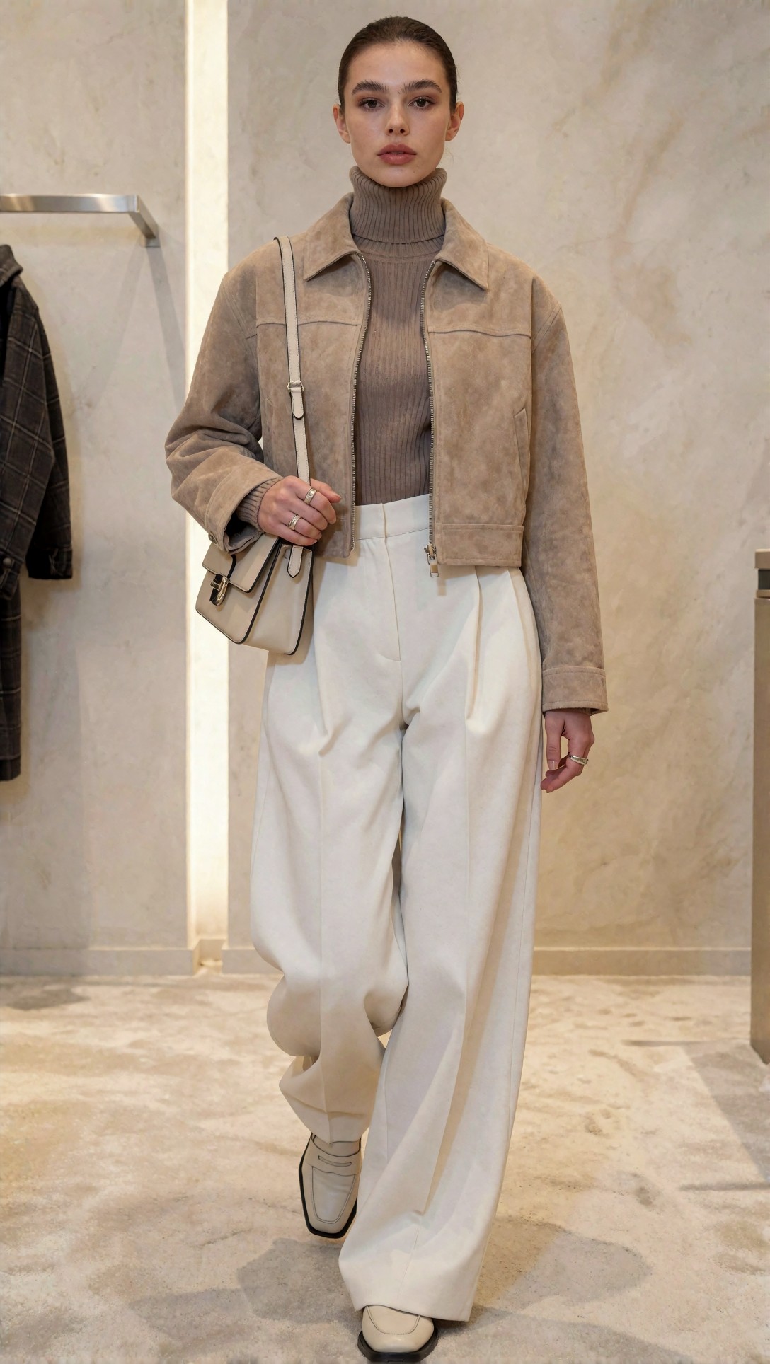
Inspect whether the makeup still feels intentional at full-body distance. If the face turns generic here, that is normal; the goal is to preserve wardrobe hierarchy and keep the beauty direction as a supporting signal.
Tradeoff observed
Head-to-toe prompts were best for fashion logic but weaker for premium beauty-product storytelling. Use them for campaign consistency, not hero cosmetic packaging.
Step 3: Use garment detail macro to tie beauty finish to textile finish
This is where many workflows improve. Instead of asking one frame to do everything, use a detail image to reinforce texture storytelling. In this test, macro garment prompts gave stronger editorial cohesion across the whole campaign set.
This prompt checks texture fidelity and whether a small beauty cue can echo the garment finish without taking over the frame.
Topic: Garment detail macro linking pearlescent eye concept to metallic jacquard texture
Genre: Fashion Detail Editorial
Camera: Nikon Z8
Lens: 85mm f/2.8 macro
Lighting: Narrow strip softbox with controlled specular highlights
Location: Milan studio set with charcoal backdrop and chrome styling rail in soft blur
Style: High-end beauty advertising meets garment study
Final Prompt: Garment detail macro for a fashion beauty editorial, close crop showing upper torso, collarbone, sleeve construction, earring, and edge of face, model wearing a silver-blue metallic jacquard coat over a slate silk top, visible weave structure and crisp lapel line, makeup concept suggested through a soft pearlescent blue-gray eye and neutral lip, no dominant portrait emphasis, composition focused on textile shimmer, seam quality, and accessory finish, one hand lightly touching lapel with elegant finger spacing, cool chrome-toned palette, controlled luxury advertising mood, Nikon Z8 look, 85mm macro precision, rich surface detail, refined shadow falloff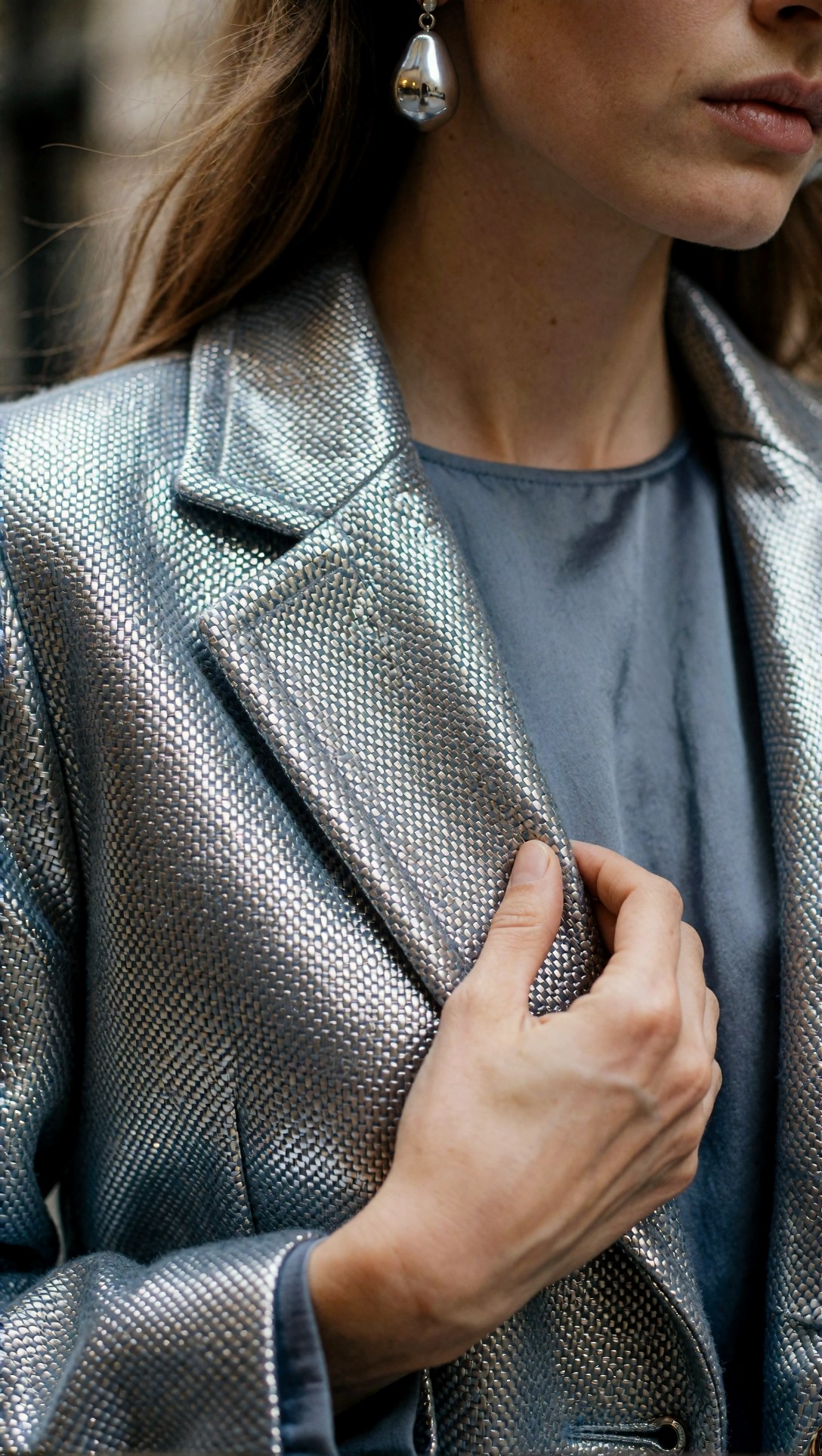
Inspect the hand first. Macro fashion prompts often fail at finger spacing before they fail at cloth detail. Then check whether the jacquard has a woven structure rather than a generic metallic blur.
Why this matters
If the campaign needs to sell a finish story, this image does more work than another face-focused frame. It tells the viewer that the makeup sheen is part of a material world, not an isolated cosmetic effect.
Step 4: Build an accessories close-up for product clarity
Among all shot types tested, accessories close-up delivered the cleanest bridge between fashion styling and beauty packaging. It gives the product enough scale to read, while keeping the image inside an editorial wardrobe context.
This test checks packaging clarity, hand stability, and whether accessories and cosmetics can share the same luxury language.
Topic: Accessories close-up with lipstick packaging, patent leather bag, and glossy beauty styling
Genre: Luxury Campaign
Camera: Fujifilm GFX100 II
Lens: 80mm f/1.7
Lighting: Studio butterfly light with soft front fill and subtle rim highlight
Location: New York editorial set with black lacquer table and smoked mirror panel
Style: High-end accessories and beauty campaign
Final Prompt: Accessories close-up for an editorial fashion AI beauty campaign, frame centered on hands, waist, handbag, and lower face, model wearing a black patent leather mini bag with silver hardware, cream structured blazer, narrow leather belt, stacked cuffs, and satin gloves pulled halfway off, glossy cherry lip visible at edge of frame, one hand presenting a luxury lipstick tube beside the handbag clasp, reflective surfaces controlled and elegant, dramatic black, cream, and silver palette, modern New York campaign mood, Fujifilm GFX100 II quality, 80mm f/1.7 rich compression, premium material rendering, clean logo-free packaging shape, precise manicure, polished luxury composition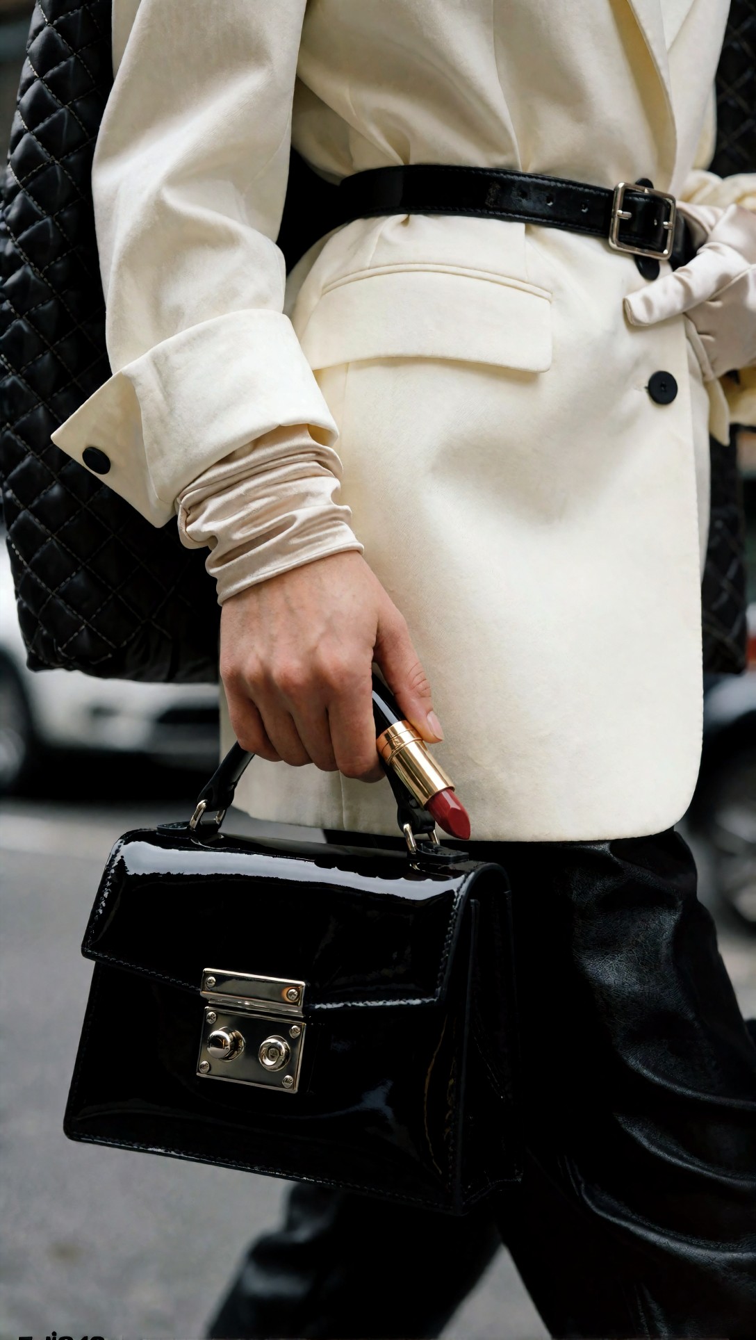
Inspect whether the lipstick tube has coherent geometry and whether hardware reflections remain believable. This setup works when the bag clasp and product cap feel like they belong to the same design family.
Strong point
This was the most reliable format for beauty product styling in fashion-led images. If you need a paid-campaign look, this is the shot type I would prioritize after the initial three-quarter editorial.
Step 5: Add a backstage or runway moment for trend signal
A beauty fashion campaign can look too static if every image is studio-controlled. One runway or backstage frame helps introduce trend context. The risk is reduced detail discipline, so this should support the campaign, not carry it.
This prompt tests motion, background consistency, and whether trend-led styling still keeps the beauty direction readable.
Topic: Runway backstage moment with metallic eye makeup and layered tailoring
Genre: Backstage Fashion Documentary
Camera: Leica SL2-S
Lens: 35mm f/2
Lighting: Mixed backstage practicals with overhead tungsten and soft bounced fill
Location: Milan Fashion Week backstage dressing area with garment racks and makeup stations
Style: Documentary editorial realism
Final Prompt: Runway backstage moment for a beauty-led fashion campaign, three-quarter body framing, model in layered graphite tailoring with elongated blazer, sheer slate turtleneck, pleated charcoal skirt-trouser hybrid, pointed boots, slim shoulder bag, metallic steel-blue eye makeup and soft nude lip, makeup artist finishing a detail near the temple while wardrobe racks and reflective stations blur in the background, visible garment movement and preparation energy, realistic backstage mess kept elegant and controlled, Leica SL2-S documentary look, 35mm natural reportage framing, cool gray palette with warm tungsten highlights, fashion-week realism, clear outfit structure and trend-led editorial atmosphere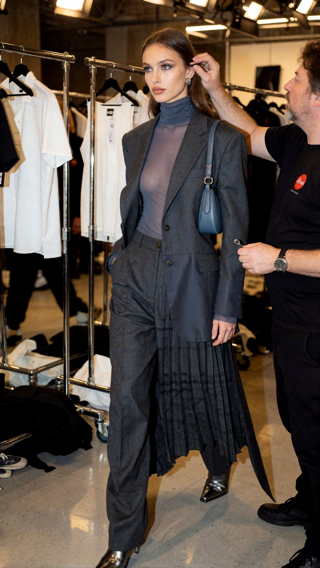
Inspect whether the background remains backstage rather than turning into a random salon. Also check if the outfit layers stay distinct under mixed lighting.
Limitation observed
Backstage prompts added energy but were less consistent for cosmetic packaging and fine textile rendering. Use them to communicate fashion relevance, not to display hero products.
Step 6: Create a product flat lay that borrows the wardrobe palette
Product flat lays became more convincing when they referenced the same fabric and accessory language as the editorial shots. Without that link, the campaign started to feel split into fashion images and separate ecommerce beauty assets.
This test checks whether styling props support the product without overwhelming readability.
Topic: Product flat lay with beauty packaging, satin, jewelry, and fabric swatch styling
Genre: Product Editorial
Camera: Hasselblad X2D 100C
Lens: 55mm f/3.5
Lighting: Overhead diffused studio light with controlled side shadow
Location: Editorial prop table in a London studio with matte stone surface
Style: Refined commercial product styling
Final Prompt: Product flat lay for a fashion-connected beauty campaign, arranged on a pale stone surface with folded oxblood satin, brushed gold earrings, a slim leather card holder, neutral silk ribbon, and a premium lipstick and compact placed as hero objects, styling references the campaign wardrobe palette without showing a person, balanced negative space, careful object spacing, visible contrast between liquid satin shine and matte cosmetic casing, luxury editorial still-life composition, Hasselblad X2D 100C look, 55mm precision, overhead commercial lighting, sophisticated burgundy, blush, cream, and gold palette, clean premium product readability, magazine-quality product styling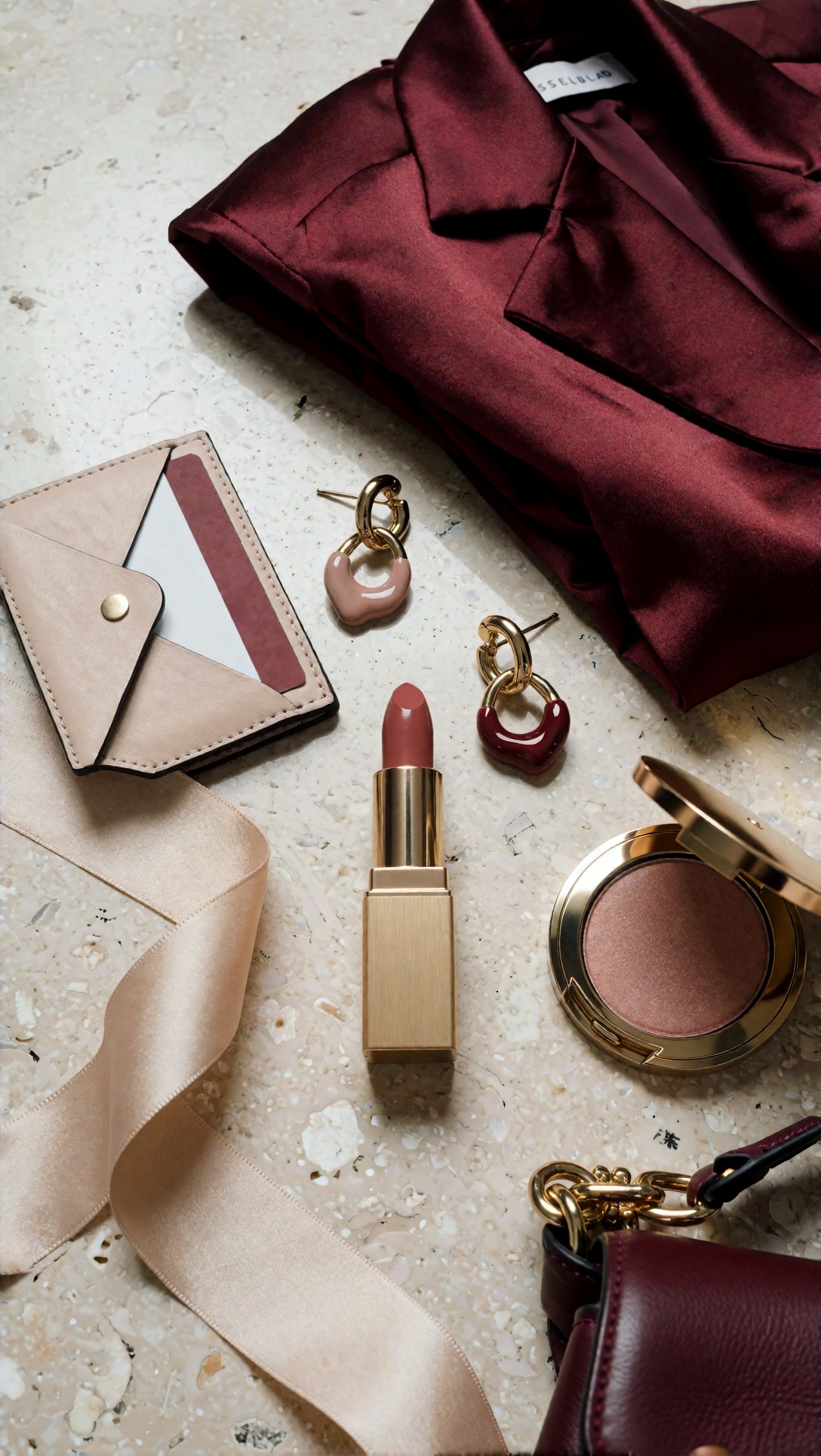
Inspect whether the product edges are clean and if the prop scale feels realistic. The satin should support color and texture, not flood the entire frame with specular glare.
Why this setup worked
The strongest flat lays used one dominant textile and two to three accessory cues. Once I added too many props, the product stopped reading as the hero.
Step 7: Test a storefront display or retail scene for merchandising logic
If the campaign will be used beyond editorial placements, a storefront or retail scene helps test whether the visual system can scale into merchandising. This is useful for beauty-fashion brands that need cross-channel consistency.
This prompt checks scene organization, product repetition, and whether beauty cues still match the fashion direction in a wider retail context.
Topic: Storefront display combining beauty launch colors with fashion merchandising
Genre: Visual Merchandising Editorial
Camera: Panasonic Lumix S1R
Lens: 24-70mm at 35mm f/5.6
Lighting: Early evening window light with soft interior spotlights
Location: Seongsu concept store window with minimalist shelving and editorial mannequins
Style: Trend-led retail campaign display
Final Prompt: Storefront display for an editorial fashion AI beauty campaign, wide window view of a Seongsu concept store, mannequins styled in blush tailoring, oxblood satin separates, cream accessories, polished leather shoes, and compact structured bags, beauty product packaging repeated on minimalist shelves and plinths, oversized campaign visual featuring berry lip and satin texture language in the background, clean Korean-inspired visual merchandising, early evening reflections on glass, balanced interior spotlighting, Panasonic Lumix S1R retail realism, 35mm storefront composition, premium trend-led atmosphere, clear color story, strong outfit silhouettes, elegant cross-merchandising between fashion and beauty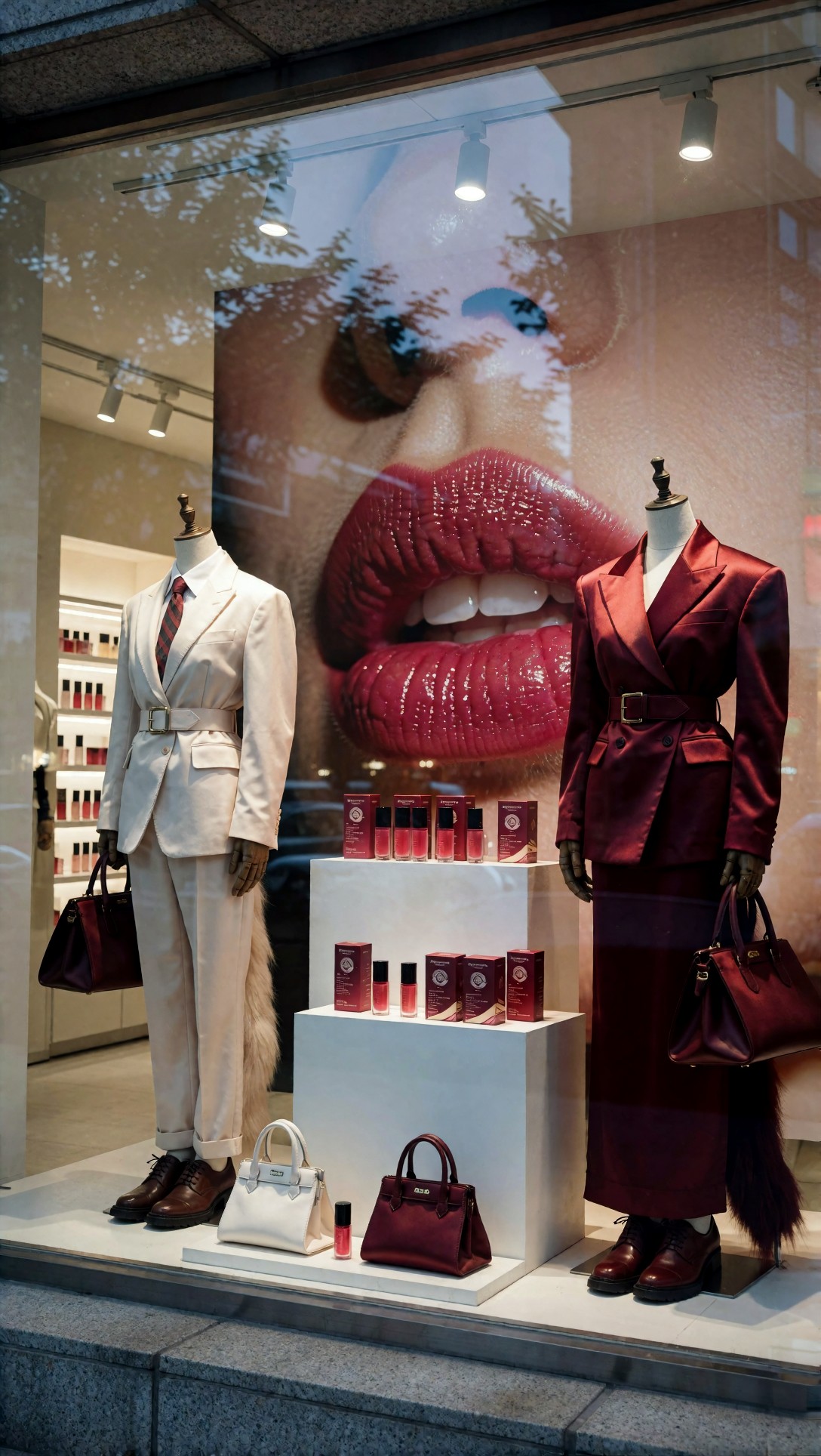
Inspect whether shelf products stay orderly and whether mannequin outfits still read as coherent looks instead of random garments. Wide retail scenes often fail by becoming cluttered too quickly.
Best use case
This is best for campaign system testing, especially if you need visuals for landing pages, banners, or concept decks. It is less useful if your only goal is one hero image.
Step 8: Finish with a mood-board collage to lock campaign language
A collage prompt is not a hero asset, but it is helpful for direction control. In this test, it worked as a calibration step before generating final variants.
This prompt checks style lock: palette, fabric, product shape, and beauty finish all need to feel like one campaign family.
Topic: Mood-board collage for berry lip, satin tailoring, metallic accessories, and retail campaign direction
Genre: Mood Board Collage
Camera: Mixed editorial tear-sheet aesthetic
Lens: Mixed crop simulation
Lighting: Mixed studio and ambient editorial references
Location: Paris and Seoul fashion-beauty reference board
Style: Fashion editor concept board
Final Prompt: Mood-board collage for a beauty-led editorial fashion campaign, assembled editorial board with clipped images of three-quarter satin tailoring, lipstick packaging close-up, metallic jacquard detail, patent leather bag hardware, blush and oxblood swatches, storefront display reference, runway backstage tear sheet, handwritten styling notes, balanced magazine-art-board composition, premium fashion editor aesthetic, cohesive berry, cream, silver, and graphite palette, tactile paper edges, layered reference imagery that emphasizes makeup finish, fabric texture, and product styling as one campaign language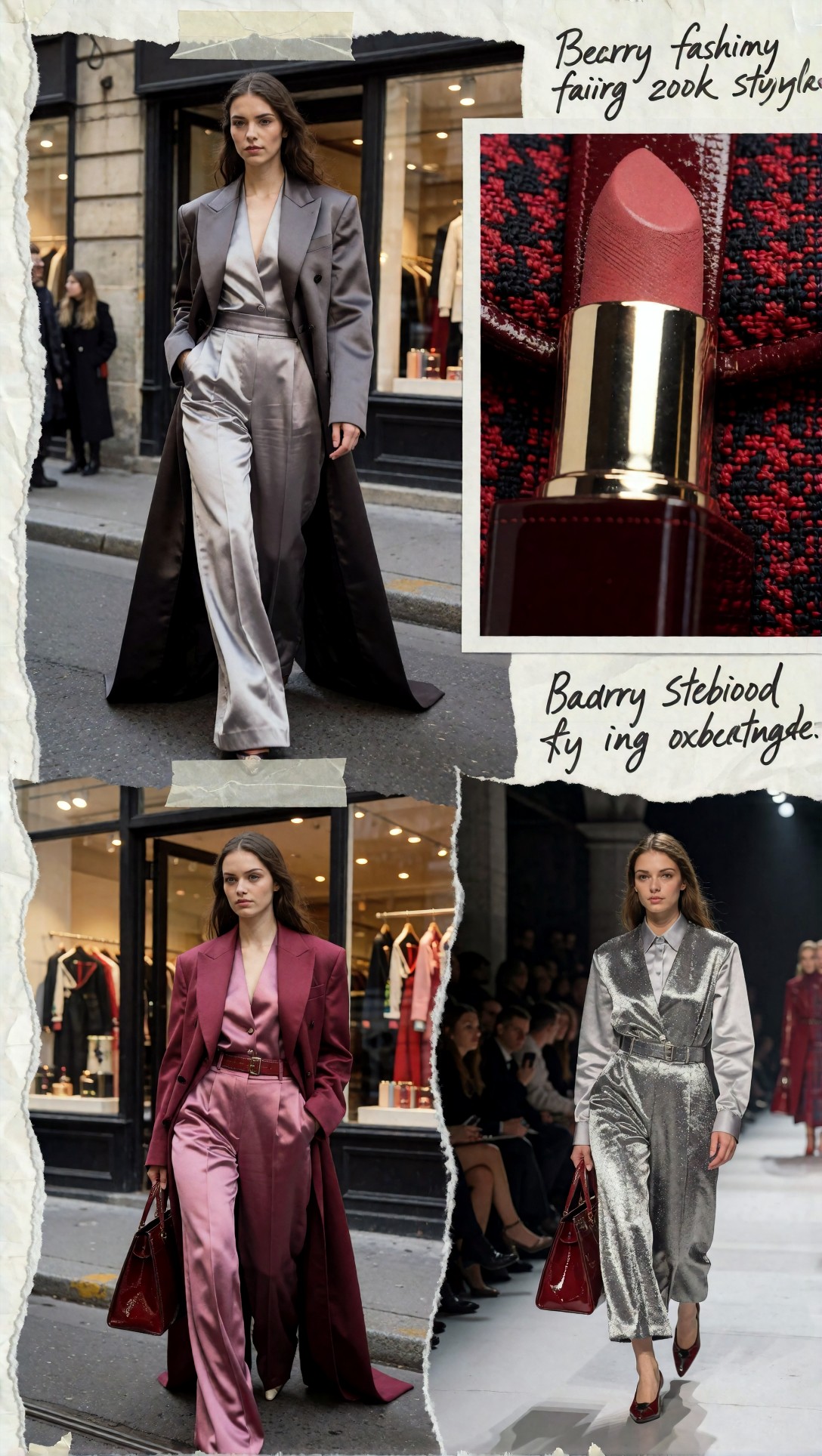
Inspect whether the collage feels curated rather than noisy. This image is useful if you need to brief further generations, especially when moving between [Articles](/articles) references and your own prompt iterations.
Quality-control checklist for AI beauty editorial outputs
Use this checklist after every batch.
Styling system
- Is the full outfit logic visible for the chosen shot type?
- Do shoes, bag, jewelry, and outerwear feel designed together?
- Is the model supporting the styling, rather than replacing it as the main subject?
Makeup direction
- Does the makeup finish match the textile finish?
- Is the lip or eye color intentionally connected to wardrobe palette?
- Does the makeup still read when the frame is wider?
Fabric texture
- Can you identify surface behavior: matte, glossy, sheer, brushed, lacquered?
- Are folds and seam lines believable?
- Is the fabric differentiated from skin and background?
Product styling
- Is packaging geometry clean?
- Is the product placed where it helps composition instead of blocking styling?
- Does the object look premium without requiring a readable brand logo?
Technical risk areas
- Hands and fingers
- Reflections on metallic or patent surfaces
- Eye symmetry under dramatic lighting
- Background clutter in backstage or retail scenes
- Crop errors around bags, shoes, or product edges
Strengths of this workflow
Strongest result: layered hierarchy
The biggest improvement came from treating the campaign in layers:
1. fashion shot type 2. outfit structure 3. makeup finish 4. product role 5. environment
That order produced images that felt like editorial planning, not random beauty portrait generation.
Best shot types by purpose
- Three-quarter editorial: best overall balance
- Accessories close-up: best for product clarity
- Garment detail macro: best for texture storytelling
- Head-to-toe lookbook: best for silhouette consistency
- Backstage/runway: best for trend signal
- Flat lay: best for merchandising support
Limitations and failure risks
When the setup breaks
The weak point was prompt overload. If I asked for strong makeup, strong product hero visibility, complex layered wardrobe, busy set design, and motion in one image, at least one area collapsed.
Most common failures:
- lipstick case morphs into abstract metal object
- satin turns plastic under aggressive lighting language
- outfit layering disappears when the face is over-prioritized
- product in hand breaks finger anatomy
- background props copy themselves in retail scenes
What I would change next
If a generation is 70% right, do not rewrite the entire concept. Keep the shot type and palette, then reduce one complexity variable:
- remove one accessory class
- simplify hand action
- reduce background prop count
- move product from face height to waist or table height
- swap mixed lighting for one clear key setup
Troubleshooting weak outputs
Problem: the image looks like a beauty portrait, not a fashion campaign
Fix:
- begin the prompt with a fashion shot type
- specify outerwear, top, bottom, shoes, bag, and accessories
- state body framing clearly: three-quarter, head-to-toe, waist-up with bag visible
Problem: fabric texture is flat
Fix:
- replace material nouns with surface behavior
- add one lighting note that supports texture
- mention seam lines, folds, weave, or sheen direction
Problem: product packaging looks fake
Fix:
- simplify the product to one hero object
- place it on a flat surface or near the waist
- avoid asking for tiny labels or readable branding
Problem: makeup and wardrobe do not belong together
Fix:
- match finish families: matte with matte, gloss with gloss, metallic with metallic
- repeat one color note between lip, accessory, and textile
- reduce competing hues in the background
Problem: the campaign feels inconsistent across images
Fix:
- reuse the same palette and texture vocabulary
- keep one repeated accessory language
- generate a collage reference first, then branch into individual assets
Practical recommendation: which workflow fits which need
Use this workflow if you need
- a concept-tested AI beauty editorial with fashion-first styling
- multiple campaign asset types from one visual language
- stronger links between textile story and cosmetic finish
- prompt guidance for lookbook, campaign, and product-support images
Avoid this workflow if you need
- close clinical beauty swatches or ingredient visuals
- exact packaging reproduction with legal branding constraints
- highly complex crowd scenes with many products and layered outfits at once
Best starting template
If I had to begin again, I would start with:
1. three-quarter editorial 2. accessories close-up 3. garment detail macro
That combination gave the best evidence on whether the concept was worth scaling.
FAQ
How do I make editorial fashion AI images look more like a beauty campaign?
Start with fashion framing, then add one beauty anchor and one product role. Do not start with portrait language alone. The campaign reads better when wardrobe remains visible.
What is the best shot type for beauty product styling in fashion AI?
In this test, accessories close-up was the most stable. It gave enough space for handbag hardware, cosmetics, and partial facial cues without losing fashion context.
How do I show fabric texture clearly in a makeup editorial photography prompt?
Use texture behavior words such as liquid satin, dry tweed, brushed knit, or lacquered leather, then pair them with lighting that supports those surfaces.
Why do AI beauty editorial prompts often lose the outfit?
Because the prompt overweights face and makeup language. Add full outfit structure, body framing, and scene context early in the prompt.
Should I use full-body or cropped shots for a beauty fashion campaign?
Use both, but for different jobs. Full-body images carry silhouette and styling. Cropped editorial and accessories shots carry beauty-product clarity.
Summary recommendation
For an editorial fashion AI beauty campaign, the most reliable workflow is to build from shot planning and styling hierarchy, not from beauty adjectives. In this test, the strongest results came from three-quarter fashion editorials, accessories close-ups, and garment macros that linked makeup finish to textile finish.
Who should use this workflow: editors, marketers, and prompt operators who need campaign-style image systems rather than one-off portraits. Who should avoid it: anyone needing exact branded packaging reproduction or highly technical cosmetics imagery.
The single prompt detail that mattered most was explicit relationship design: makeup finish matched to fabric behavior, and product placement matched to shot type. When that relationship was clear, the images looked intentional. When it was vague, the model defaulted to generic beauty output.