Global AI Image Generation Use Cases: Where Teams Are Saving the Most Time Right Now 한국어 요약
이 페이지는 ZView Space의 영어 원문을 한국어 검색 사용자도 이해할 수 있도록 정리한 SEO 요약입니다. 핵심은 단순한 얼굴 중심 이미지가 아니라 패션 에디토리얼, 룩북, 아웃핏, 프롬프트 테스트, 이미지 생성 워크플로우를 실제로 어떻게 구성할지입니다.
핵심 요약
- 원문 주제: Global AI Image Generation Use Cases: Where Teams Are Saving the Most Time Right Now
- 목적: AI 이미지 생성에서 outfit, silhouette, fabric, pose, location, camera framing을 더 명확하게 설계합니다.
- 활용 범위: Z-Image Turbo, Krea2 Turbo, Qwen Image, Anima, SeedVR2 같은 이미지 생성 및 업스케일 워크플로우에 적용할 수 있습니다.
- SEO 관점: 제목, 설명, 이미지 alt, 프롬프트 예시가 실제 검색 의도와 맞아야 색인 가능성이 높아집니다.
한국어 사용자를 위한 체크포인트
1. 프롬프트가 얼굴 묘사에만 머물지 않고 전체 스타일과 의상 구성을 설명하는지 확인합니다. 2. 패션 이미지라면 상의, 하의, 아우터, 신발, 액세서리, 소재감, 촬영 장소를 분리해서 씁니다. 3. 생성 결과는 바로 게시하지 말고 디테일, 손, 의상 형태, 배경 일관성, 이미지 품질을 비교합니다. 4. 글 본문에는 실제 테스트 기준과 실패를 줄이는 방법이 들어가야 검색엔진에서 얇은 콘텐츠로 보일 가능성이 줄어듭니다.
원문 미리보기
In this test, I looked at the AI image generation use cases that are actually saving teams time right now, not the ones that sound good in a strategy deck. The pattern was clear: teams benefit most when they use image models for fast visual iteration, internal
---
In this test, I looked at the AI image generation use cases that are actually saving teams time right now, not the ones that sound good in a strategy deck. The pattern was clear: teams benefit most when they use image models for fast visual iteration, internal approvals, and asset expansion around a core concept. They lose time when they expect one-pass perfection, strict brand consistency without reference inputs, or accurate technical detail in complex scenes.
The strongest result was not fully replacing design or photography. It was compressing the slow middle of the workflow: concept exploration, rough campaign visualizing, ad variant creation, storyboarding, packaging mockups, and draft ecommerce scenes. The weak point was consistency across faces, hands, text, and branded product geometry.
Test setup
I reviewed common business uses for text to image AI across marketing, ecommerce, content, product, and creative teams. For each use case, I focused on four practical questions:
- How quickly can a team get to a usable first draft?
- What kinds of errors show up most often?
- When does prompting alone work, and when are references or edits required?
- Is the output good enough for internal review, social publishing, paid creative testing, or final production?
I treated this as an operator workflow test rather than a model leaderboard. The goal was to identify where AI image generation use cases fit best in a real visual pipeline.
Where teams are saving the most time
The biggest time savings showed up in six repeatable categories:
1. Campaign concepting before production 2. Ad creative variation for paid social 3. Ecommerce background and scene generation 4. Blog, newsletter, and editorial support images 5. Storyboard and presentation visuals 6. Product and packaging mockups for internal review
These are all tasks where the image does not need perfect factual accuracy on the first pass. It needs to communicate an idea clearly enough to move work forward.
Use case 1: Campaign concepting for marketing teams
This is where marketing teams save time fastest. Instead of waiting for mood boards, stock pulls, and first-round mockups from multiple people, one operator can generate 20-40 visual directions in under an hour and narrow to 3-5 promising concepts.
When this setup works, the prompt has a clear audience, a defined setting, and strong art direction. Vague prompts produce generic lifestyle imagery. Specific prompts produce concepts a team can actually approve or reject.
The tradeoff is brand lock. If your campaign depends on a known spokesperson, exact packaging, or a tightly defined visual identity, prompting alone drifts too much.
This test checks concept clarity for a marketing campaign visual before any expensive production planning. I chose a commercial editorial structure because it reveals quickly whether composition, audience cues, and brand tone hold together.
Topic: Sustainable skincare launch campaign concept
Genre: Product Editorial
Camera: Canon EOS R5
Lens: 50mm f/1.2
Lighting: Softbox key light with soft fill
Location: Minimal stone vanity in a daylight studio
Style: Clean commercial look
Final Prompt: A premium sustainable skincare launch visual featuring a frosted glass serum bottle and matching cream jar arranged on a pale limestone vanity, clean daylight studio environment, softbox key light with gentle fill, subtle botanical shadows across the background, muted sage and warm ivory color palette, folded linen towel, glass dropper with a small bead of serum, luxury but restrained commercial composition, Canon EOS R5 look, 50mm f/1.2 depth separation, crisp label area without readable text, premium packaging texture, polished skincare ad direction, realistic reflections, high detail, balanced negative space for headline placement
Inspect whether the product hierarchy is obvious in one glance and whether the background supports the concept without distracting from the hero item. The strongest result usually has controlled reflections and believable material separation between glass, stone, and fabric.
This second prompt tests whether a team can visualize a broader campaign mood, not just a packshot. I chose a lifestyle setup because many marketing teams need a concept image that sells feeling before exact SKU details are finalized.
Topic: Remote work software brand campaign concept
Genre: Lifestyle Portrait
Camera: Fujifilm GFX 100S
Lens: 80mm f/1.7
Lighting: Overcast window diffusion
Location: Modern apartment workspace overlooking a rainy city
Style: Editorial tech campaign
Final Prompt: A relaxed professional in their early 30s working from a refined apartment desk setup, laptop open, notebook and coffee nearby, soft overcast window diffusion from the side, rainy city skyline beyond large glass windows, calm focused facial expression, natural seated pose, muted charcoal, blue, and soft beige palette, uncluttered premium workspace, subtle depth layers, editorial technology campaign feel, Fujifilm GFX 100S realism, 80mm f/1.7 shallow depth of field, natural skin texture, believable home office details, composition with clear copy space, polished but lived-in atmosphere
Check whether the image communicates a category-specific mood rather than generic "person at laptop" stock. The weak point here is usually hand placement and fake interface detail, so I would inspect fingers, screen clutter, and desk object realism before using it in a client-facing deck.
Use case 2: Paid social creative variation
This is one of the most practical AI visual workflow examples right now. Teams running ads often need many concept variants fast: different ages, settings, crops, color palettes, emotional tones, and hooks. AI helps generate test directions before committing design time.
The strongest result is speed in exploring angles. The weak point is repeatability. If one ad variant performs well, recreating the same character or exact scene across ten follow-ups can become harder than expected unless you move into reference-driven workflows.
For paid social, I would use AI for angle testing, not for final branded system consistency unless the team has a strong post-production step.
This prompt is meant to test scroll-stopping composition and emotional readability for a paid social fitness ad. I chose a high-contrast setup because weak prompts often flatten active scenes into lifeless catalog imagery.
Topic: Home fitness app paid social ad concept
Genre: Street Style
Camera: Sony A7 IV
Lens: 35mm f/1.8
Lighting: Sunrise window light with practical lamp fill
Location: Compact city apartment living room workout space
Style: Clean commercial look
Final Prompt: A motivated woman mid-workout in a compact but stylish city apartment, athletic set in slate blue and white, yoga mat, resistance bands, and water bottle visible, sunrise window light crossing the room with warm practical lamp fill, dynamic lunge pose, focused expression, modern home fitness atmosphere, neutral wood floor and soft textured rug, tidy but lived-in space, social ad composition with strong central subject and negative space for headline, Sony A7 IV realism, 35mm f/1.8 environmental perspective, crisp apparel detail, healthy skin texture, energetic but believable movement, premium direct-response visual style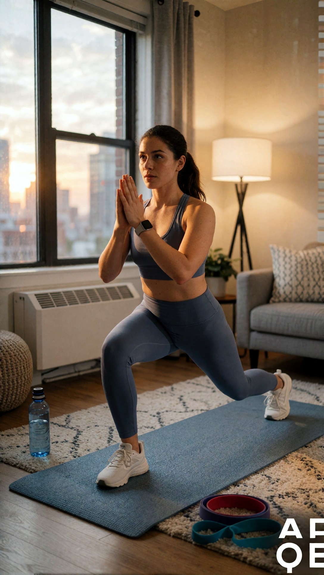
Inspect whether motion feels intentional rather than anatomically odd. In this category, hands, knees, and foot contact with the floor are the first failure points, and they matter because ad viewers notice awkward body mechanics quickly.
This prompt tests whether the model can create a stronger hook through visual contrast and product context. I chose a food-adjacent scene because marketing teams often need variation around a routine or habit.
Topic: Meal planning app ad variation
Genre: Product Editorial
Camera: Nikon Z8
Lens: 28mm f/2.8
Lighting: Bright kitchen daylight with bounce fill
Location: Small contemporary kitchen island
Style: Social-first commercial campaign
Final Prompt: A weekly meal planning scene on a bright contemporary kitchen island, organized containers of colorful prepared food, smartphone beside a handwritten shopping list, fresh vegetables, olive oil bottle, linen napkin, overhead three-quarter composition, bright kitchen daylight with soft bounce fill, inviting but practical mood, clean social-first commercial look, Nikon Z8 clarity, 28mm f/2.8 wide perspective, vibrant natural food color, realistic container textures, efficient healthy routine storytelling, sharp foreground detail with mild background falloff, composition designed for square and vertical crop flexibility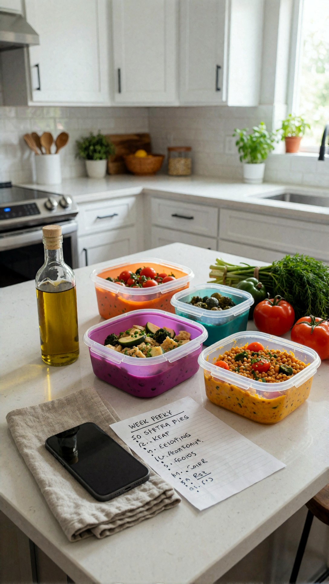
Check whether the scene reads immediately as planning and preparation rather than a random food still life. The strongest result usually has clear visual hierarchy between phone, containers, and ingredients.
Use case 3: Ecommerce scene generation and catalog expansion
This is one of the most requested AI image generation use cases, and it can save real production time if used carefully. Teams use it to place products in seasonal settings, create alternate backgrounds, and expand a catalog with visual variety.
Where it works best:
- non-technical products
- products with simple geometry
- scenes where exact branding text is not required
- internal testing, merchandising, and marketplace variation
Where it breaks:
- reflective packaging
- transparent materials
- exact label reproduction
- products that customers know closely, like beauty packaging or electronics
In this test, simple objects held up much better than branded hero products. If the object is the business, not just a prop, image generation alone is risky.
This prompt tests product clarity in a commerce-friendly scene without overcomplicating the geometry. I chose a footwear setup because soft goods often hold up better than packaged goods.
Topic: Running shoe ecommerce lifestyle scene
Genre: Product Editorial
Camera: Hasselblad X2D 100C
Lens: 65mm f/2.8
Lighting: Soft overcast diffusion
Location: Urban riverside running path after light rain
Style: Premium sports campaign
Final Prompt: A premium running shoe pair displayed on a wet urban riverside path after light rain, one shoe upright and one angled forward, subtle water droplets on the sole and upper mesh, clean grey pavement, blurred greenery and city bridge in the background, soft overcast diffusion for accurate color and texture, cool blue-grey palette with energetic accent color on the shoe, Hasselblad X2D 100C detail rendering, 65mm f/2.8 medium-format realism, sharp knit texture, crisp sole pattern, premium sports campaign composition, believable scale, no extra accessories, polished ecommerce lifestyle scene with clean product dominance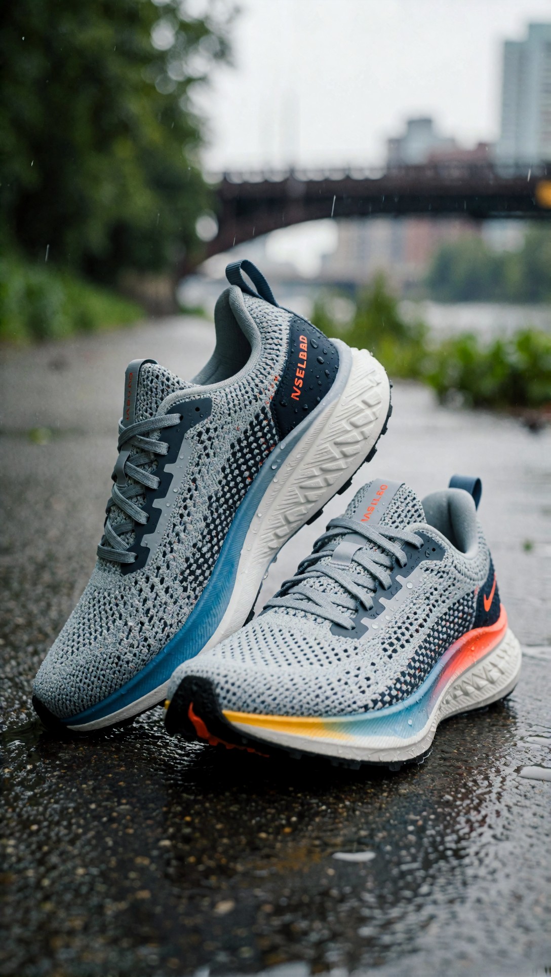
Inspect the sole pattern, lace structure, and material transitions. The weak point is often asymmetry between left and right shoe or invented construction details that would make the product look counterfeit.
This prompt tests home decor scene expansion, which is often more forgiving and therefore more production-friendly. I chose layered textures because decor buyers respond strongly to material cues.
Topic: Ceramic lamp ecommerce room scene
Genre: Interior Editorial
Camera: Leica SL2
Lens: 35mm f/2
Lighting: Warm evening practical lamp glow with subtle ambient fill
Location: Minimal bedroom with oak nightstand and plaster wall
Style: Scandinavian commercial interior
Final Prompt: A handcrafted ceramic bedside lamp as the hero object on an oak nightstand in a minimal bedroom, warm evening practical lamp glow casting soft gradients across a textured plaster wall, linen bedding, a closed book, small glass carafe, calm Scandinavian commercial interior styling, earthy cream, sand, and oak tones, Leica SL2 realism, 35mm f/2 balanced room context, refined material detail in ceramic glaze, fabric weave visible, uncluttered composition with lamp clearly dominant, premium ecommerce room scene, believable shadows, quiet cozy atmosphere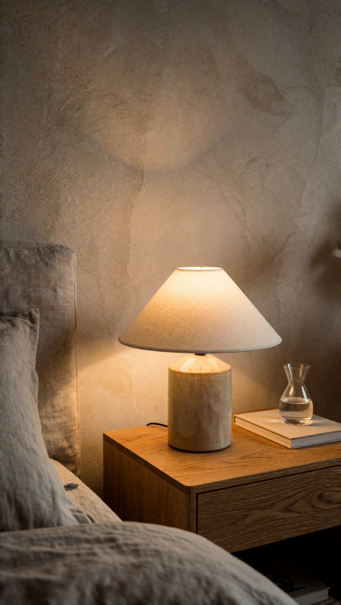
Check whether the lamp remains the hero and whether the practical light behaves believably on nearby surfaces. In this category, the strongest result usually comes from limiting the number of decorative objects.
Use case 4: Editorial and content support images
Content teams are saving time by generating article headers, newsletter visuals, and report images that would otherwise require stock research or custom illustration. This works especially well when the image needs to convey a concept, trend, or atmosphere rather than a factual event.
The tradeoff is sameness. If prompts are not tightly directed, many outputs collapse into glossy but generic visual metaphors. That is why prompt ingredients matter here: they force specificity in scene design, mood, and composition.
This prompt is meant to test whether a B2B content team can produce a visual with clear editorial tone instead of stock-photo emptiness. I chose a cinematic office scene because it exposes whether the model can handle mood without becoming visually noisy.
Topic: Data privacy report cover image
Genre: Cinematic Editorial
Camera: RED Komodo 6K
Lens: 40mm anamorphic at T2.0
Lighting: Neon rim light with dim practical desk light
Location: Night office with glass walls and server reflections
Style: Cinematic realism
Final Prompt: A late-night editorial scene about data privacy, a lone analyst seated at a desk in a glass-walled office, layered reflections of server lights and city glow, dim practical desk lamp, cool cyan neon rim light shaping the silhouette, serious concentrated expression, dark tailored knitwear, monitors softly out of focus without readable interface text, moody blue, graphite, and amber palette, RED Komodo 6K cinematic realism, 40mm anamorphic T2.0 with subtle horizontal flare, structured composition for a report cover, intelligent restrained atmosphere, sharp facial detail, believable corporate environment, premium magazine-grade visual storytelling
Inspect whether the image suggests privacy and analysis without relying on cheesy lock icons or holograms. The stronger outputs communicate the idea through environment and lighting, not symbolic clutter.
Use case 5: Storyboards and internal presentations
This may be the least glamorous but most reliable time saver. Product, sales, and creative teams need visuals for decks, launch plans, and internal proposals. These images do not need final-polish perfection. They need to communicate a direction clearly enough for alignment.
In this test, AI images were especially effective for story moments, rough sequencing, and environment previews. When a meeting would otherwise rely on bullet points, generated frames often reduced confusion.
This prompt checks whether a service team can visualize a customer journey moment for a deck or storyboard. I chose a hospitality scene because it requires body language, environment, and service cues to work together.
Topic: Hotel self check-in storyboard frame
Genre: Lifestyle Portrait
Camera: Panasonic Lumix S1H
Lens: 50mm f/2
Lighting: Soft lobby daylight with warm practical accents
Location: Boutique hotel reception with self check-in kiosk
Style: Travel brand editorial
Final Prompt: A hotel guest arriving at a boutique hotel and using a sleek self check-in kiosk near reception, small rolling suitcase, relaxed curious expression, one hand interacting with the screen, concierge desk visible in the background, soft lobby daylight mixed with warm practical pendant lights, polished stone floor, indoor plants, muted terracotta and cream palette, Panasonic Lumix S1H realism, 50mm f/2 natural perspective, travel brand editorial styling, clear body language, uncluttered composition, believable hospitality environment, storyboard-ready frame that communicates ease and modern service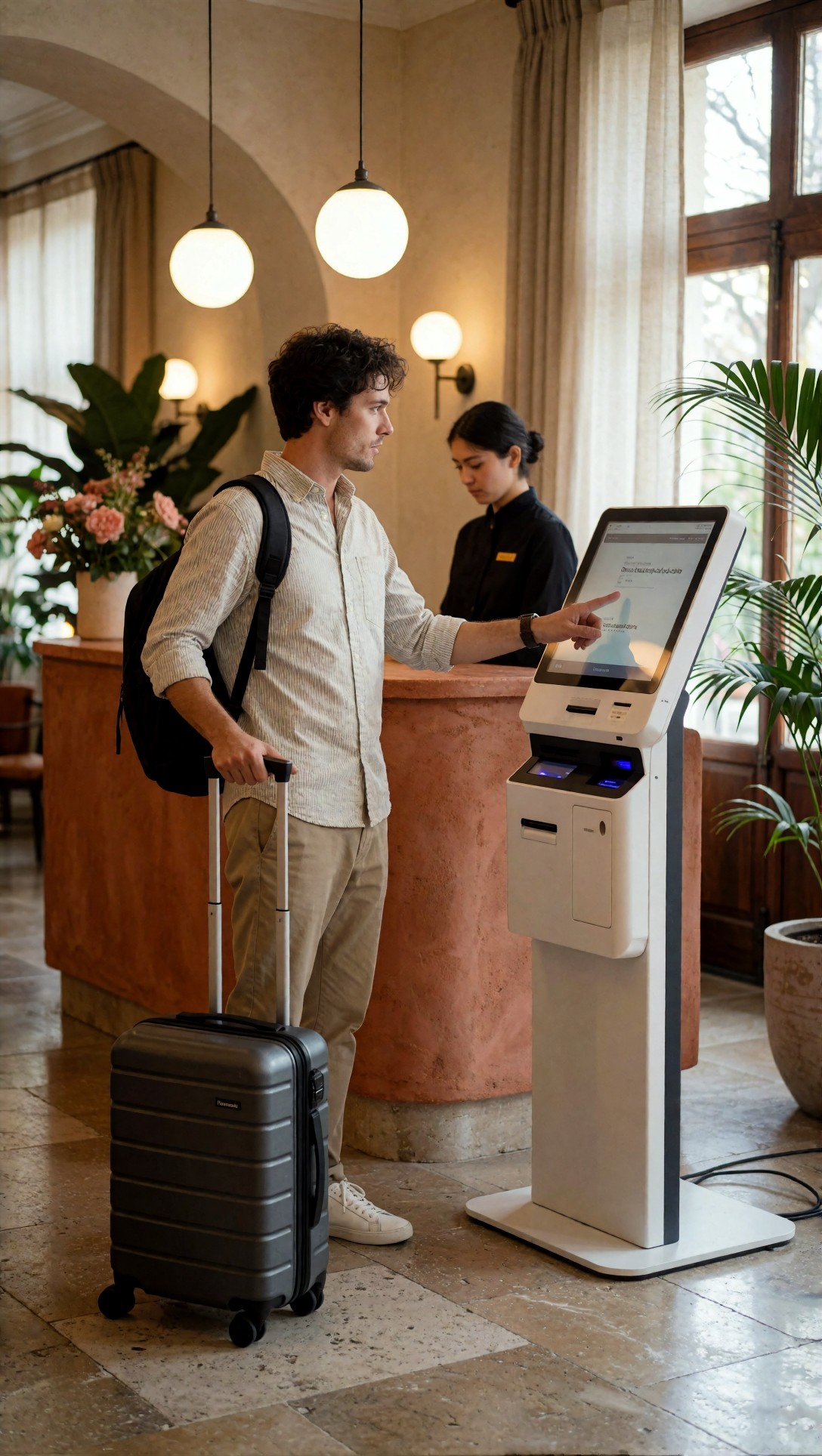
Check whether the body language tells the story without needing captions. The weak point is usually hands touching the kiosk and screen-edge geometry, which often needs cleanup if the image moves beyond internal use.
Use case 6: Packaging, retail, and product concept mockups
This is where AI is useful for discussion but dangerous for final approval. Teams can save time visualizing shelf presence, colorways, and material directions. But if decision-makers mistake generated packaging for manufacturable packaging, time savings disappear later.
When this setup works, the image is treated as a conversation tool, not a spec sheet.
This prompt tests shelf impact and premium signaling for an early packaging concept. I chose a beauty retail context because subtle material and color differences strongly affect perceived quality.
Topic: Vitamin supplement packaging concept on retail shelf
Genre: Luxury Campaign
Camera: Canon EOS R3
Lens: 85mm f/1.4
Lighting: Studio strip light with soft front fill
Location: Premium wellness retail display
Style: High-end beauty advertising
Final Prompt: A premium vitamin supplement packaging concept displayed on a refined wellness retail shelf, matte cylindrical container with metallic accent band, adjacent secondary carton, clean cream and forest green palette, controlled studio strip light with soft front fill, polished acrylic risers, subtle reflections, high-end beauty advertising feel, Canon EOS R3 realism, 85mm f/1.4 selective focus, elegant front-facing composition, premium shelf spacing, believable paper and matte coating texture, aspirational but retail-grounded atmosphere, no readable brand text, clear hierarchy between hero package and surrounding display elements
Inspect whether the container geometry remains plausible from top to bottom and whether the shelf scene supports rather than dilutes the packaging idea. The common failure is invented closure details or warped label surfaces.
Why these prompt ingredients mattered
Across all tests, the best prompts used the same core ingredients for a reason:
- Topic forced a single business use case instead of a vague category image.
- Genre pushed the model toward a recognizable visual language, which helped with layout and audience expectation.
- Camera and lens improved composition control. Wider lenses tended to work better for environmental scenes; longer lenses helped isolate products or faces.
- Lighting had an outsized effect on image quality. Specific light setups reduced flatness and made materials more readable.
- Location prevented generic backgrounds.
- Style kept the output aligned to actual production needs such as commercial, editorial, cinematic, or ecommerce.
- Final Prompt was where wardrobe, pose, color palette, and composition turned a serviceable image into a usable one.
The practical lesson: prompt detail is not decoration. It is the control layer that reduces wasted generations.
Strengths observed across these AI image generation use cases
Fast first drafts
The biggest gain was compressing time to first visual. Teams can get from idea to reviewable concept in minutes rather than days.
Cheaper variation testing
AI is very good at generating alternate moods, settings, and compositions for internal selection. This is especially useful for marketing teams testing multiple campaign directions.
Better alignment in reviews
Generated images make abstract ideas concrete. In this test, the value was often less about the image itself and more about ending vague feedback loops.
Useful for partial workflows
The strongest workflow was not prompt-to-final. It was prompt-to-select-to-edit. Teams that expect some retouching get better outcomes than teams expecting one-click completion.
Limitations and failure risks
Character consistency drops across variants
If a campaign needs the same person across multiple scenes, prompt-only workflows become unstable quickly.
Products drift from reality
Packaging edges warp, label zones deform, and materials sometimes blend unnaturally. This makes AI risky for hero commerce unless the product can be reconstructed or composited later.
Text remains unreliable
For packaging, UI, signage, and on-image messaging, generated text is still a failure zone in many workflows.
Anatomy errors still matter
Hands, feet, and interaction points are easy to miss in thumbnail review and obvious in final use. Fitness, hospitality, and device-use scenes are the highest-risk categories.
Generic outputs waste time
A weak prompt does not save time. It creates more sorting work. If the prompt lacks visual direction, teams often generate dozens of usable-looking but strategically empty images.
Which workflow is best for which team
Marketing teams
Best for campaign concepting, ad variation, and content support visuals. Less suitable for strict brand-campaign finals unless there is a design polish step.
Ecommerce teams
Best for scene expansion around simple products and seasonal merchandising concepts. Avoid pure generation for exact hero products with recognizable packaging.
Content teams
Best for article headers, report covers, and newsletters where conceptual framing matters more than factual photography.
Product and operations teams
Best for storyboards, service walkthroughs, and internal presentations. These teams get value even from imperfect images because clarity beats polish in many planning contexts.
Practical recommendation: how to run this workflow without creating cleanup debt
If I were setting up a team process today, I would use a three-stage workflow:
1. Generate broad directions fast using highly specific prompts. 2. Select one or two viable images early based on composition and message clarity, not tiny details. 3. Polish only shortlisted images through editing, inpainting, compositing, or design overlay.
What I would change next in most teams is prompt discipline. Too many teams start with generic prompts, then blame the model for generic outputs.
Short checklist based on observed output quality
Before approving any AI-generated image for real use, check:
- Does the image communicate the intended message in under two seconds?
- Are hands, feet, and object interactions anatomically believable?
- Does product geometry stay consistent across visible edges?
- Is the lighting consistent with the environment?
- Is there enough negative space for copy if needed?
- Does the image look category-specific rather than generic stock?
- If it includes packaging or UI, is any fake text hidden or replaceable?
- Would a human retouch pass take minutes or hours?
If the answer to the last question is hours, the workflow probably did not save time.
What I would recommend by priority
If a team is just starting with AI image generation for marketing teams or internal creative work, I would prioritize these use cases first:
1. Campaign moodboards and concept frames 2. Paid social visual angle testing 3. Editorial support images for content 4. Storyboards and proposal visuals 5. Simple-product ecommerce scene expansion
I would leave exact packaging, regulated product imagery, and strict brand-character continuity for later, after the team has a stronger reference and editing workflow.
Editorial conclusion
The most useful AI image generation use cases right now are the ones that reduce decision latency, not the ones that promise total automation. In this test, the workflow was strongest for marketing, content, ecommerce, and internal communications teams that need more visual options earlier in the process. It was weakest where exact product fidelity, repeatable characters, readable text, or technical accuracy mattered most.
Who should use this workflow: teams that need fast concept development, ad variations, article visuals, storyboards, and scene mockups with some tolerance for post-editing.
Who should avoid it: teams that need exact brand reproduction, manufacturing-ready packaging visuals, regulated claims imagery, or flawless multi-image consistency from prompt alone.
The setting and prompt detail that mattered most was specific visual intent: a defined subject, real lighting, clear location, and a style tied to the business goal. When that was present, the outputs became useful evidence. When it was missing, the images looked polished but did not save much time.