Hidden ZImage Turbo Techniques for Professional AI Images 한국어 요약
이 페이지는 ZView Space의 영어 원문을 한국어 검색 사용자도 이해할 수 있도록 정리한 SEO 요약입니다. 핵심은 단순한 얼굴 중심 이미지가 아니라 패션 에디토리얼, 룩북, 아웃핏, 프롬프트 테스트, 이미지 생성 워크플로우를 실제로 어떻게 구성할지입니다.
핵심 요약
- 원문 주제: Hidden ZImage Turbo Techniques for Professional AI Images
- 목적: AI 이미지 생성에서 outfit, silhouette, fabric, pose, location, camera framing을 더 명확하게 설계합니다.
- 활용 범위: Z-Image Turbo, Krea2 Turbo, Qwen Image, Anima, SeedVR2 같은 이미지 생성 및 업스케일 워크플로우에 적용할 수 있습니다.
- SEO 관점: 제목, 설명, 이미지 alt, 프롬프트 예시가 실제 검색 의도와 맞아야 색인 가능성이 높아집니다.
한국어 사용자를 위한 체크포인트
1. 프롬프트가 얼굴 묘사에만 머물지 않고 전체 스타일과 의상 구성을 설명하는지 확인합니다. 2. 패션 이미지라면 상의, 하의, 아우터, 신발, 액세서리, 소재감, 촬영 장소를 분리해서 씁니다. 3. 생성 결과는 바로 게시하지 말고 디테일, 손, 의상 형태, 배경 일관성, 이미지 품질을 비교합니다. 4. 글 본문에는 실제 테스트 기준과 실패를 줄이는 방법이 들어가야 검색엔진에서 얇은 콘텐츠로 보일 가능성이 줄어듭니다.
원문 미리보기
ZImage Turbo is useful because it makes iteration cheap. The real advantage is not only speed, but how quickly you can test composition, lighting, surface detail, and visual direction before committing to a final image. Professional results come from controlle
---
ZImage Turbo is useful because it makes iteration cheap. The real advantage is not only speed, but how quickly you can test composition, lighting, surface detail, and visual direction before committing to a final image. Professional results come from controlled prompting, repeatable workflows, and knowing what to simplify.
This guide focuses on practical ZImage Turbo techniques for creating polished AI images for editorial layouts, product mockups, social campaigns, concept art, and visual exploration. The examples are written as production-ready prompts you can adapt directly.
Why ZImage Turbo Needs a Different Prompting Style
Turbo image models reward clarity. Long cinematic prompts can work, but they often introduce visual conflicts: too many subjects, mixed lighting, unclear camera distance, or competing styles. With ZImage Turbo, a better approach is to describe the image as a directed shot.
Think in layers:
- Subject: what must be visible
- Composition: where it sits in the frame
- Lighting: how the image feels
- Materials: what surfaces should look like
- Camera: focal length, angle, depth of field
- Finish: editorial, commercial, documentary, stylized, clean
- Exclusions: what should not appear
The hidden technique is to avoid asking the model to invent the whole scene. Give it a visual hierarchy.
Technique 1: Start With an Intent Stack
An intent stack is a short structure that keeps the prompt aligned. Instead of writing a paragraph of atmosphere first, begin with the image purpose. This helps ZImage Turbo prioritize the right details.
Use this pattern:
1. Image type 2. Main subject 3. Environment 4. Composition 5. Lighting 6. Surface details 7. Style and finish 8. Avoid list
Use case: editorial hero image for an AI tools article
This prompt is designed for a clean article header where the subject must remain readable at small sizes.
Editorial hero image for an article about AI image generation workflows, a sleek workstation with a large monitor showing abstract image thumbnails, notebook and stylus on the desk, centered composition with generous negative space on the right, soft morning window light, clean modern studio, muted graphite blue and warm white palette, realistic materials, shallow depth of field, professional technology magazine style, avoid text, logos, clutter, distorted screens, extra hands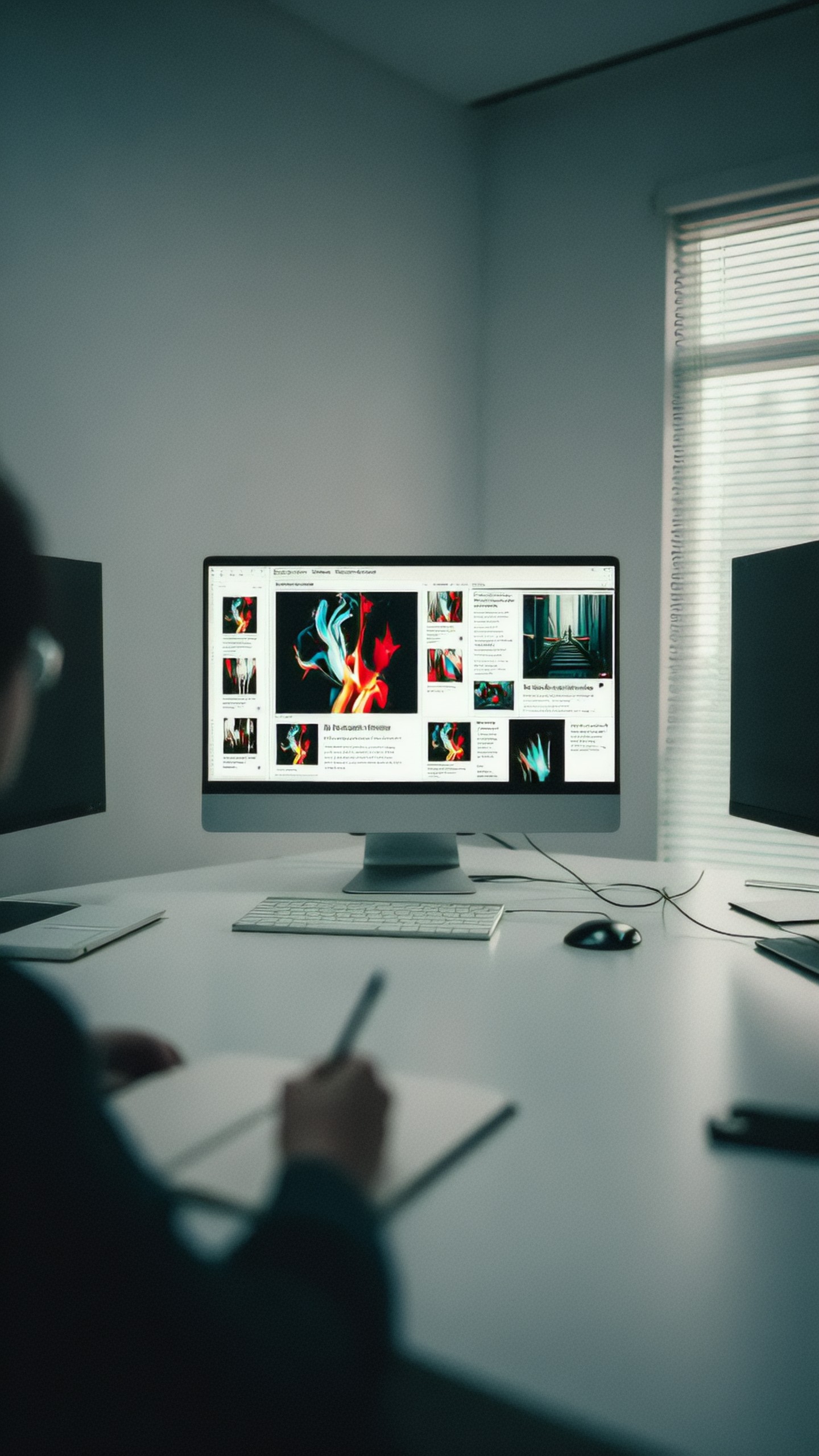
Why it works: the prompt defines the job of the image first. It also leaves negative space for headlines, which is often forgotten in AI image generation.
Technique 2: Use Composition Locks
One of the fastest ways to make ZImage Turbo outputs look more professional is to lock the composition. Terms like centered, symmetrical, three-quarter view, top-down flat lay, low angle, and negative space are more useful than vague style words.
Composition locks are especially helpful for product visuals, thumbnails, and website graphics. They reduce random cropping and keep the subject usable.
Practical composition phrases
Use these phrases when you need reliable framing:
- Centered product shot on seamless background
- Three-quarter view, subject facing left
- Top-down flat lay with balanced spacing
- Wide horizontal frame with empty copy space
- Close-up macro crop, texture fills the frame
- Low-angle heroic perspective
- Isometric view with clean object separation
Use case: premium product mockup
Commercial product photograph of a matte black wireless headphone case, centered on a warm gray seamless background, three-quarter view, softbox reflection along the curved edge, subtle contact shadow, premium minimal composition, 85mm lens look, crisp edges, realistic plastic and metal texture, high-end ecommerce lighting, avoid labels, brand logos, fingerprints, dust, floating objects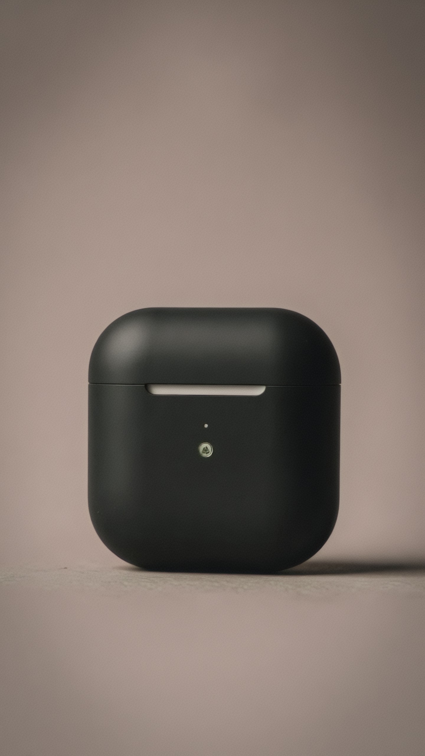
This prompt is useful when you need ecommerce-style images without overdecorated backgrounds. The three-quarter view gives shape, while the seamless background keeps the object clean.
Technique 3: Prompt for Materials, Not Just Style
Many prompts fail because they ask for a style but ignore physical surfaces. Professional AI images often feel convincing because the materials make sense. Instead of saying futuristic or premium, describe brushed aluminum, frosted glass, woven linen, polished ceramic, soft leather, translucent plastic, or wet asphalt.
Material language helps ZImage Turbo generate believable highlights and shadows.
Use case: luxury packaging concept
Luxury skincare packaging concept, frosted glass serum bottle with brushed champagne aluminum cap, placed on smooth travertine stone, beige linen backdrop, soft diffused studio light from upper left, close product crop with elegant negative space, realistic reflections, tactile material detail, refined editorial beauty photography, avoid readable text, brand marks, plastic look, harsh shadows, crowded props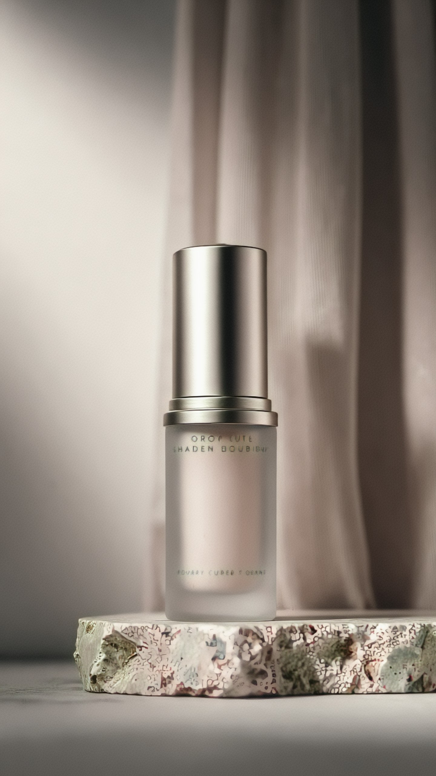
Notice that the prompt does not rely on the word luxury alone. It explains why the scene should feel luxurious through material and light.
Technique 4: Build a Fast Iteration Ladder
ZImage Turbo is strongest when used in stages. Instead of trying to get the final image in one generation, run a quick ladder:
1. Concept pass: test subject and composition 2. Lighting pass: refine mood and direction 3. Detail pass: add materials, props, textures 4. Cleanup pass: remove artifacts and simplify 5. Final pass: upscale or export the best result
For each pass, change only one or two variables. If you change composition, lighting, style, and props at once, you will not know what improved the image.
A simple iteration method
Start broad:
- Minimal studio desk with AI design tools on screen
Then add structure:
- Wide horizontal editorial image, desk on left, empty copy space on right
Then add finish:
- Soft daylight, clean technology magazine style, realistic materials
Then remove problems:
- Avoid text, logos, extra screens, messy cables, distorted keyboard
This workflow is faster than writing one huge prompt and hoping it works.
Technique 5: Use Negative Constraints as Design Direction
Negative prompting is not only for removing bad anatomy. It can protect the image purpose. For professional use, common exclusions include text, logos, watermarks, extra limbs, warped objects, clutter, duplicated products, artificial shine, and messy backgrounds.
Be specific. Avoid bad image is too vague. Use avoid unreadable text, avoid extra product copies, avoid distorted hands.
Use case: social ad visual with room for copy
Vertical social media ad background for a productivity app, calm home office corner with laptop, coffee cup, small plant and soft daylight, subject elements arranged in the lower third, large clean wall area in the upper half for copy, warm neutral color palette, realistic lifestyle photography, gentle shadows, uncluttered scene, avoid readable text, logos, people, messy cables, overexposed windows, duplicate laptops
This is a practical prompt for designers who need a background, not a fully finished ad. The model is guided to preserve empty space.
Technique 6: Control Lighting Like a Photographer
Lighting terms can make or break a ZImage Turbo image. Professional prompts should include direction, softness, color, and source.
Useful lighting phrases:
- Soft window light from the left
- Large diffused softbox overhead
- Golden hour backlight with rim light
- Overcast natural light for low contrast
- Hard sunlight with graphic shadows
- Cool blue ambient light with warm practical lamps
- Controlled studio lighting, subtle contact shadows
Avoid mixing too many light sources unless you want a cinematic scene. A single strong lighting idea is usually better.
Use case: architectural interior visual
Modern reading nook in a compact apartment, built-in wood shelving, cream lounge chair, small round side table, wide-angle interior photography, soft overcast daylight from a large window on the left, natural shadows, warm oak and off-white palette, realistic fabric and wood grain, clean editorial architecture magazine finish, avoid people, text, warped furniture, impossible geometry, clutter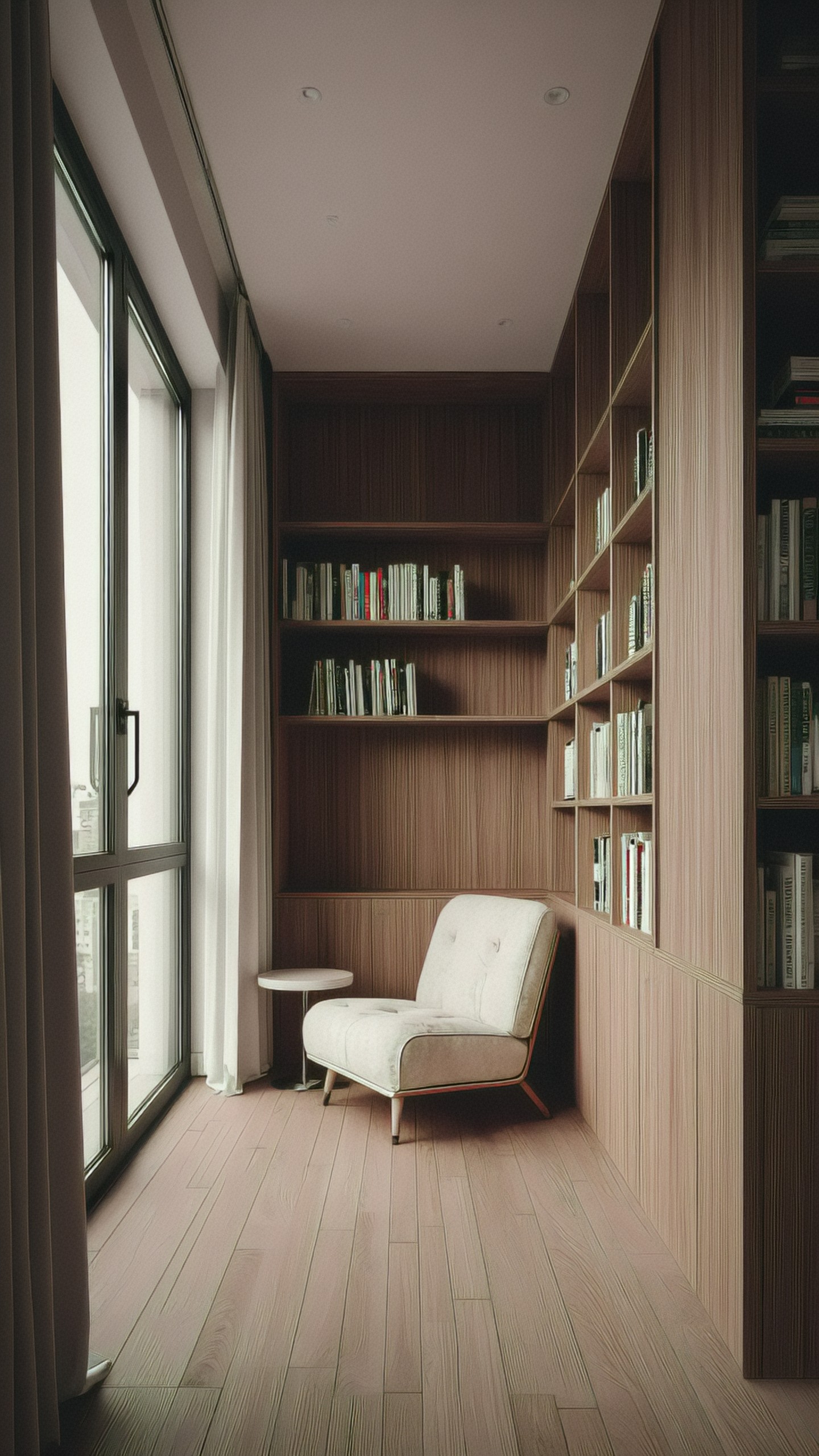
Interior prompts benefit from lighting discipline. Overcast daylight reduces harsh artifacts and makes the room easier to read.
Technique 7: Use Camera Language to Reduce Randomness
Camera terms are not magic, but they help set perspective. ZImage Turbo tends to produce more consistent results when you specify distance and lens feel.
Use camera language when you need a predictable result:
- 35mm lens look for environmental scenes
- 50mm lens look for natural perspective
- 85mm lens look for portraits and products
- Macro lens for close texture detail
- Top-down orthographic view for maps and layouts
- Isometric view for UI and game assets
Do not overload camera specs. One lens cue and one framing cue are enough.
Use case: professional portrait without identity concerns
Studio portrait of a fictional creative director, seated three-quarter pose, neutral gray background, 85mm lens look, soft key light from upper left with subtle fill, natural skin texture, dark navy blazer, calm confident expression, modern editorial portrait photography, clean color grading, avoid celebrity resemblance, exaggerated skin smoothing, distorted eyes, extra fingers, text, logos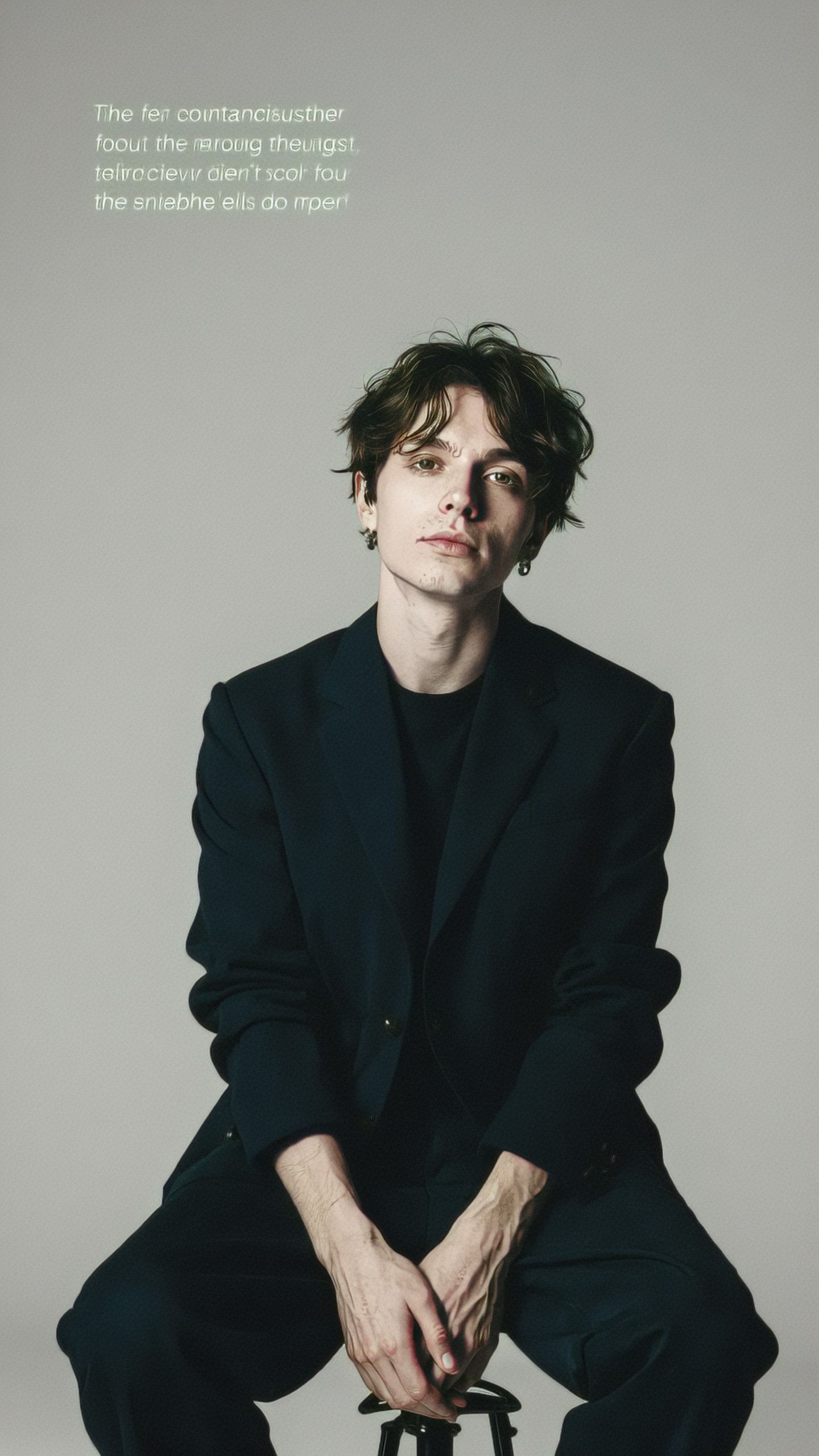
This prompt is suitable for fictional personas, pitch decks, or editorial mockups. The avoid celebrity resemblance phrase is important when you do not want the image to imply a real public figure.
Technique 8: Use Prompt Compression for Cleaner Results
When a prompt becomes too long, the model may average the instructions. Prompt compression means removing decorative words and keeping visual instructions.
Instead of:
- An incredible, stunning, breathtaking, ultra detailed futuristic scene full of imagination
Use:
- Futuristic transit station, glass canopy, brushed steel platforms, cool blue light, wide symmetrical composition, realistic architectural visualization
Professional prompts are usually specific, not dramatic.
Before and after example
Weak version:
A super amazing futuristic city with lots of cool details, cinematic and beautiful, very high quality, dramatic, trending, ultra realistic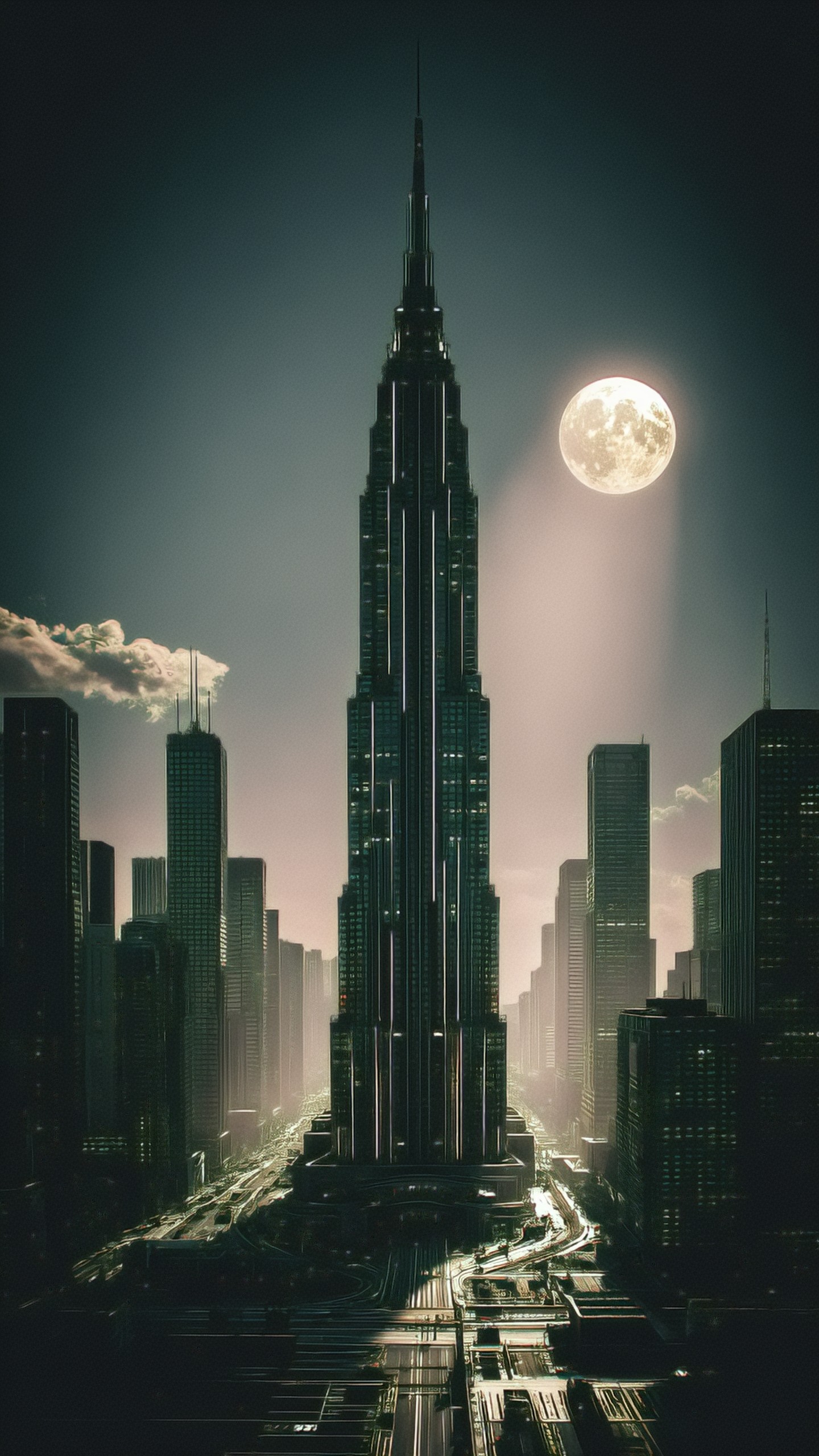
Production version:
Futuristic city transit plaza at dusk, elevated tram line, glass canopy, brushed steel columns, pedestrians as small silhouettes, wide symmetrical composition, cool blue ambient light with warm station lights, realistic architectural visualization, crisp perspective, avoid flying cars, unreadable signs, distorted buildings, excessive fog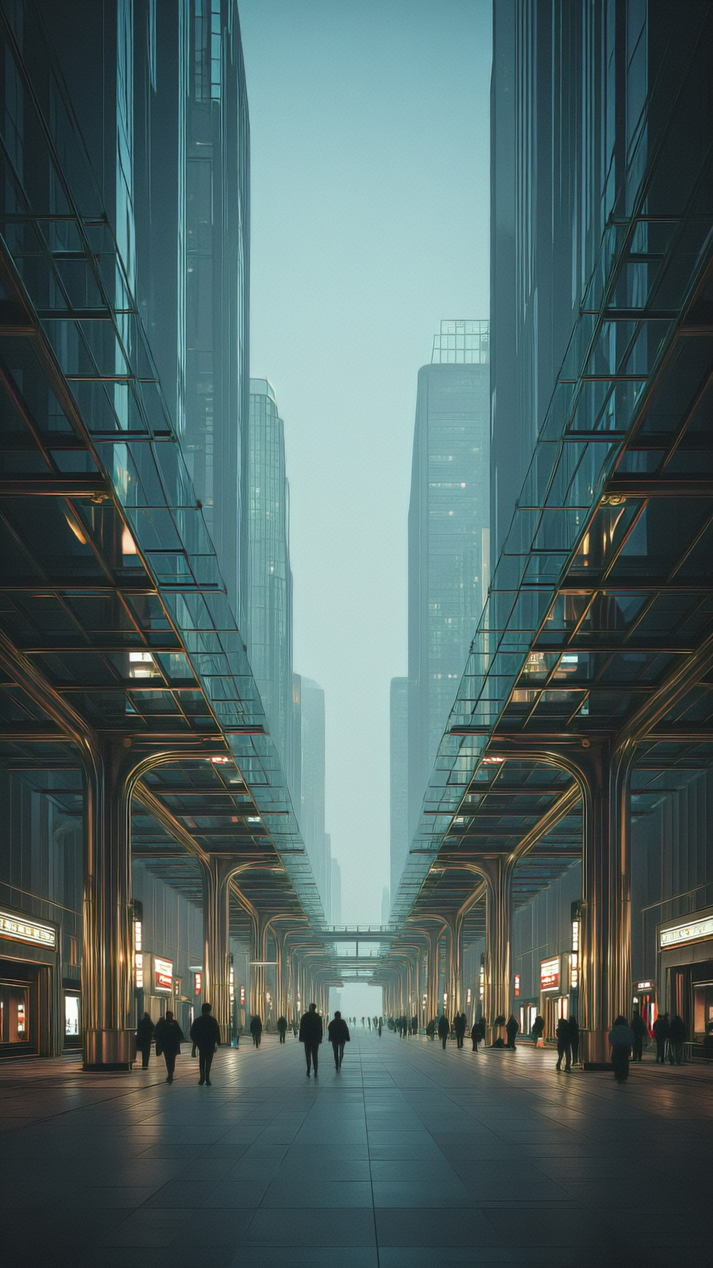
The improved prompt names the subject, environment, light, perspective, and exclusions. It gives ZImage Turbo less room to drift.
Technique 9: Add One Human Action, Not Five
Human scenes often fail when the prompt asks for too many gestures. For professional lifestyle images, use one clear action: typing, sketching, holding a cup, looking at a screen, arranging flowers, opening a package.
If hands are important, describe them simply and avoid complex finger positions. If hands are not important, crop them out or make them secondary.
Use case: creative workflow lifestyle image
Lifestyle photograph of a designer sketching interface ideas in a notebook beside a laptop, hands partially visible with a simple pen grip, top-down desk composition, paper wireframes, color swatches, tablet, soft afternoon window light, organized creative workspace, realistic editorial photography, avoid readable text, distorted fingers, duplicate pens, messy clutter, brand logosThis prompt keeps the human action manageable. The scene feels active without making the model solve a complicated pose.
Technique 10: Create Reusable Prompt Modules
For recurring work, save prompt modules. A module is a phrase you can paste into different prompts to keep a consistent visual identity.
Useful modules for ZImage Turbo
Editorial tech finish:
clean editorial technology magazine style, soft contrast, realistic materials, muted blue gray palette, controlled highlights, uncluttered compositionPremium ecommerce finish:
centered commercial product photography, seamless neutral background, softbox reflections, subtle contact shadow, crisp edges, realistic material textureWarm lifestyle finish:
natural lifestyle photography, warm neutral palette, soft window light, candid but composed, realistic environment, gentle shadows, uncluttered backgroundConcept art finish:
high-quality environment concept art, clear silhouette design, atmospheric depth, readable focal point, balanced color script, painterly but structured detailModules improve consistency across campaigns. They also make collaboration easier because teams can reuse the same visual language.
Technique 11: Balance Detail Density
Professional images need detail in the right places. If every area is highly detailed, the result can feel noisy. Use detail density intentionally:
- High detail on the subject
- Medium detail in supporting props
- Low detail in the background
- Empty or soft areas for text overlays
This is especially important for thumbnails, hero images, and ad backgrounds.
Use case: YouTube thumbnail background
Horizontal YouTube thumbnail background about AI image editing, large glowing tablet screen on the left showing abstract colorful image layers, dark clean studio desk, blurred tools in the background, strong focal point, high detail on tablet and stylus, low detail background, empty dark gradient space on the right for headline text, vibrant cyan and magenta accents, avoid readable text, logos, clutter, extra screensThe prompt directly tells ZImage Turbo where detail should live. That makes the image easier to use in design software.
Technique 12: Use Style References as Direction, Not Dependency
If your ZImage Turbo workflow supports reference images, use them for composition or palette rather than asking the model to copy. If you are working text-only, describe the reference in neutral terms.
Good reference descriptions:
- Inspired by Scandinavian interior photography: natural materials, pale wood, clean daylight
- Inspired by 1970s product catalogs: warm film color, simple studio sets, practical shadows
- Inspired by Japanese stationery photography: careful spacing, paper texture, soft neutral backgrounds
Avoid asking for the style of living artists or direct brand imitation. Describe visual properties instead.
Technique 13: Make Small Series With Anchor Terms
For a campaign, use anchor terms that remain the same across prompts. These may include palette, lighting, background, lens, and finish. Then change the subject.
Example anchor:
- warm gray seamless background
- softbox reflection from upper left
- subtle contact shadow
- premium minimal ecommerce photography
Use this anchor for headphones, smart speakers, bottles, watches, or packaging concepts. The series will feel related even if each object changes.
Use case: consistent icon-like object series
Minimal object render of a translucent blue smart speaker cube, centered on warm gray seamless background, softbox reflection from upper left, subtle contact shadow, three-quarter view, rounded edges, realistic frosted plastic material, premium minimal ecommerce photography, avoid logos, text, extra objects, harsh shadows, distorted geometryChange only the object and material to build a coherent set.
Three Image Prompts for Article Illustrations
Use these prompts to create supporting visuals for this article. They are designed as editorial illustrations rather than generic AI art.
Illustration 1: ZImage Turbo workflow board
Editorial illustration of a professional AI image generation workflow board, prompt cards connected to image thumbnails, laptop and stylus on a clean desk, visual stages labeled only as abstract blocks without readable text, soft blue gray palette, overhead composition, modern creative studio lighting, realistic digital editorial style, avoid logos, readable words, messy clutter, distorted screensIllustration 2: Prompt engineering layers
Conceptual visual of layered prompt engineering for AI images, transparent stacked panels representing subject, composition, lighting, camera and materials, each panel showing simple abstract icons with no readable text, dark neutral background, clean cyan highlights, precise modern 3D editorial render, balanced negative space, avoid brand marks, complex typography, human facesIllustration 3: Fast iteration contact sheet
Magazine-style contact sheet showing multiple AI image variations of the same product scene, small thumbnails arranged in a neat grid, one selected frame highlighted with a subtle border, designer workspace background, realistic screen glow, clean professional editing environment, muted color palette, avoid readable text, logos, chaotic interface, distorted thumbnailsCommon ZImage Turbo Mistakes to Avoid
Mistake: using too many style adjectives
Words like stunning, epic, beautiful, and award-winning do not provide much production value. Replace them with visual instructions.
Mistake: forgetting the final use
A banner, thumbnail, product mockup, and concept art piece need different framing. Always prompt for the destination.
Mistake: overloading the background
Busy backgrounds often make AI images less useful. Use controlled props and leave empty space when the image will receive text or UI overlays.
Mistake: ignoring artifacts until the end
If hands, screens, text, or geometry matter, constrain them from the first pass. Cleanup is easier when the base image is already disciplined.
A Practical ZImage Turbo Workflow for Professionals
Here is a repeatable process for client-ready work:
1. Define the output format: hero image, square post, product shot, thumbnail, interior scene, portrait, or concept frame. 2. Write a short intent stack with subject, composition, lighting, materials, and finish. 3. Generate several fast options with ZImage Turbo. 4. Pick the strongest composition, not the most detailed image. 5. Refine only one variable at a time. 6. Add negative constraints based on visible problems. 7. Create two or three final variations. 8. Upscale, retouch, or composite as needed.
The key is to use ZImage Turbo as a fast visual decision tool. Let speed help you compare ideas, but keep the prompt disciplined.
Final Checklist for Better ZImage Turbo Images
Before you generate, check your prompt:
- Is the image purpose clear?
- Is there one main subject?
- Is the composition locked?
- Is the lighting direction specified?
- Are important materials named?
- Is the camera distance clear?
- Is there enough negative space if needed?
- Are common artifacts excluded?
- Can the prompt be shortened without losing meaning?
Professional AI images usually come from practical constraints, not longer prompts. ZImage Turbo makes it easy to explore quickly, but the best results still depend on visual direction. Start with a strong intent stack, control composition and light, describe materials precisely, and iterate in small steps. That is the difference between a random generated image and an asset you can actually publish.