How to Turn a Simple Idea Into a Professional AI Art Prompt 한국어 요약
이 페이지는 ZView Space의 영어 원문을 한국어 검색 사용자도 이해할 수 있도록 정리한 SEO 요약입니다. 핵심은 단순한 얼굴 중심 이미지가 아니라 패션 에디토리얼, 룩북, 아웃핏, 프롬프트 테스트, 이미지 생성 워크플로우를 실제로 어떻게 구성할지입니다.
핵심 요약
- 원문 주제: How to Turn a Simple Idea Into a Professional AI Art Prompt
- 목적: AI 이미지 생성에서 outfit, silhouette, fabric, pose, location, camera framing을 더 명확하게 설계합니다.
- 활용 범위: Z-Image Turbo, Krea2 Turbo, Qwen Image, Anima, SeedVR2 같은 이미지 생성 및 업스케일 워크플로우에 적용할 수 있습니다.
- SEO 관점: 제목, 설명, 이미지 alt, 프롬프트 예시가 실제 검색 의도와 맞아야 색인 가능성이 높아집니다.
한국어 사용자를 위한 체크포인트
1. 프롬프트가 얼굴 묘사에만 머물지 않고 전체 스타일과 의상 구성을 설명하는지 확인합니다. 2. 패션 이미지라면 상의, 하의, 아우터, 신발, 액세서리, 소재감, 촬영 장소를 분리해서 씁니다. 3. 생성 결과는 바로 게시하지 말고 디테일, 손, 의상 형태, 배경 일관성, 이미지 품질을 비교합니다. 4. 글 본문에는 실제 테스트 기준과 실패를 줄이는 방법이 들어가야 검색엔진에서 얇은 콘텐츠로 보일 가능성이 줄어듭니다.
원문 미리보기
A strong AI art prompt does not need to be long. It needs to be specific in the right places. The goal is to turn a loose idea, such as a rainy street or a futuristic chair, into clear visual instructions a model can interpret consistently. Professional prompt
---
A strong AI art prompt does not need to be long. It needs to be specific in the right places. The goal is to turn a loose idea, such as a rainy street or a futuristic chair, into clear visual instructions a model can interpret consistently.
Professional prompts usually describe four things: what the image is about, how it should look, how it should be composed, and what should be avoided. Once you understand that structure, you can adapt a simple idea for product images, editorial visuals, concept art, social posts, posters, thumbnails, and more.
Start with the plain idea
Begin by writing the idea in ordinary language. Do not worry about style yet.
Example: a ceramic coffee mug on a kitchen counter.
That is enough to identify the subject, but not enough to produce a polished image. A professional prompt adds intent: is this for an online store, a lifestyle ad, a magazine spread, or a cozy social post?
For a product-style image, the prompt should emphasize the object, clean surroundings, controlled light, and commercial usability.
Minimal ceramic coffee mug on a light oak kitchen counter, soft morning window light, subtle steam rising from the mug, neutral Scandinavian interior in the background, clean product photography, centered composition, shallow depth of field, realistic texture, high detail, calm warm color palette, no text, no logo, no hands
Use a reliable prompt structure
A practical prompt can follow this order:
1. Subject 2. Setting or context 3. Composition 4. Lighting 5. Style or medium 6. Mood 7. Technical details 8. Negative constraints
You do not need every part every time, but this structure helps prevent vague results. If the idea is a city at night, the professional version should clarify location, weather, viewpoint, light sources, and intended use.
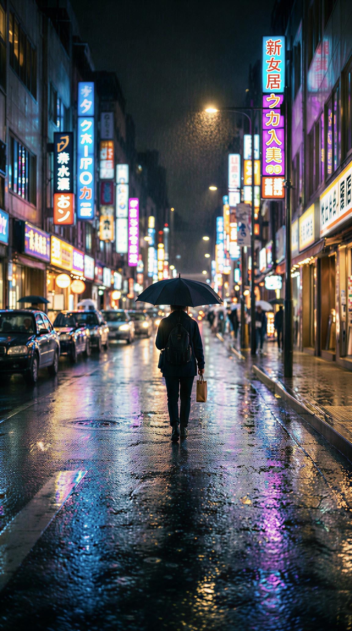
Rainy city street at night viewed from sidewalk level, wet asphalt reflecting neon signs and car headlights, lone pedestrian with umbrella walking away from camera, cinematic urban photography, 35mm lens perspective, high contrast lighting, blue and magenta reflections, realistic atmosphere, detailed storefronts, no readable text, no distorted faces, no extra limbs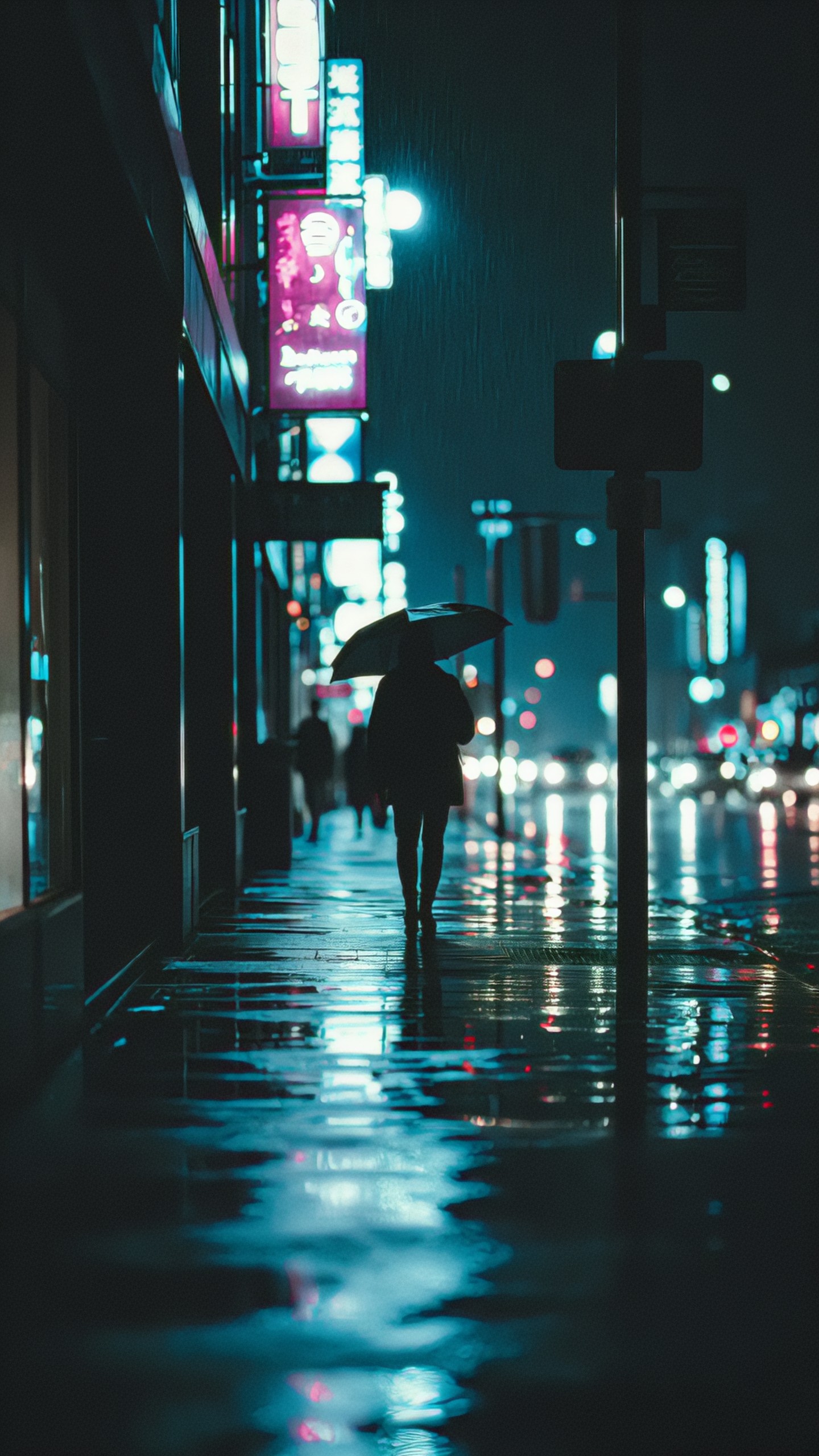
Define the use case before the style
A prompt for a poster is different from a prompt for a website banner. The same idea can change significantly depending on where the image will appear.
For example, a mountain cabin could become a travel ad, a book cover, a game environment, or a calm desktop wallpaper. Before adding visual flourishes, decide what the image must do.
If the use case is a website hero image, leave space for text and avoid clutter.
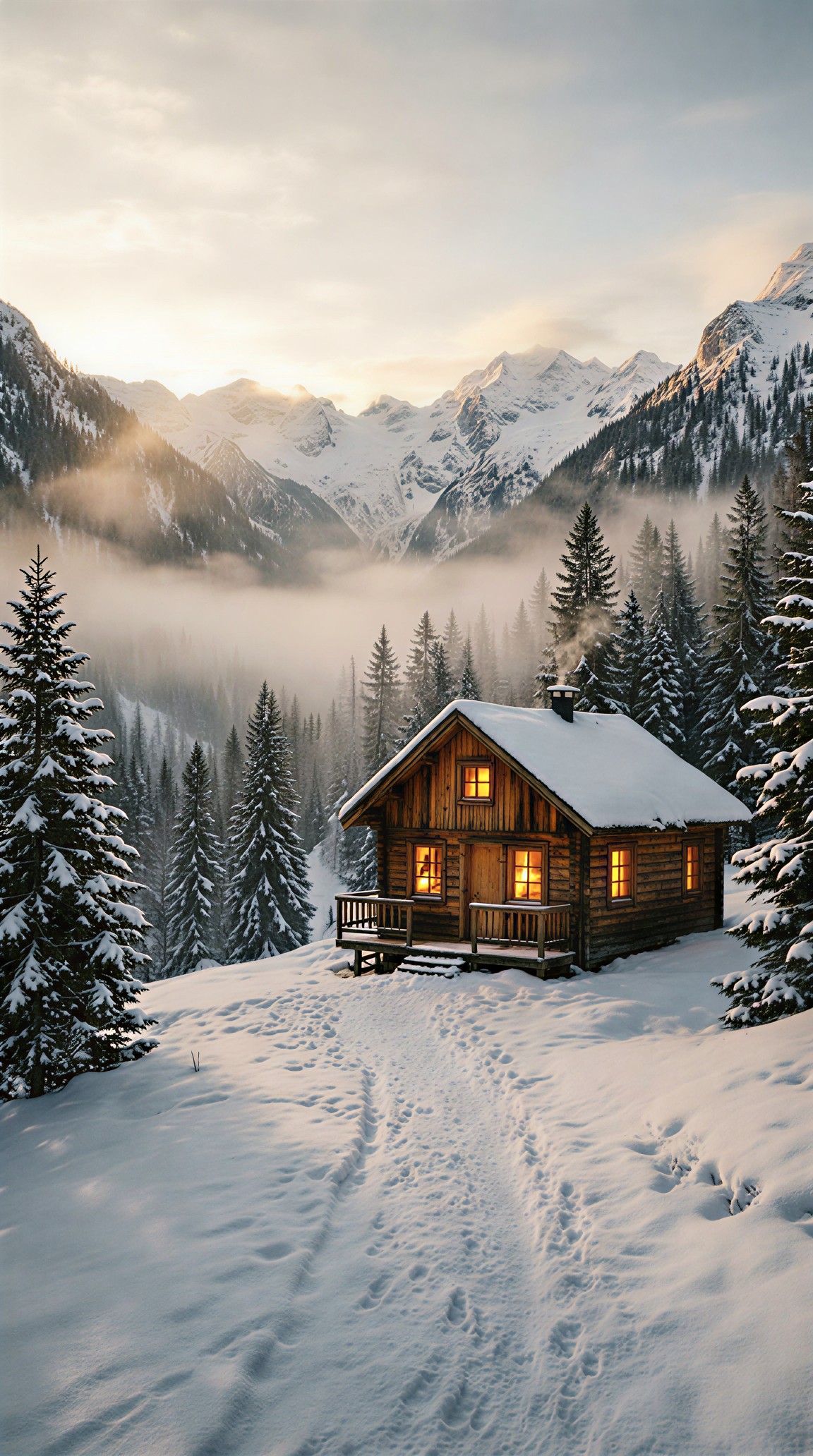
Remote wooden cabin in a snowy mountain valley at sunrise, wide horizontal composition with open negative space on the left for website headline, warm cabin lights glowing through windows, soft mist over pine trees, realistic landscape photography, natural colors, crisp winter atmosphere, ultra clean scene, no people, no text, no watermark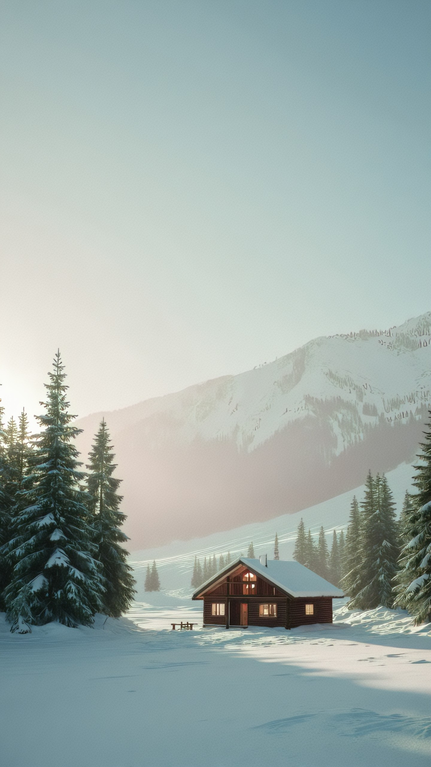
Make the subject visually specific
Simple subjects become stronger when you add material, condition, scale, and defining details. Instead of a robot, specify whether it is small or massive, friendly or industrial, polished or worn.
This is especially useful for concept art, game assets, character design, and storyboarding.
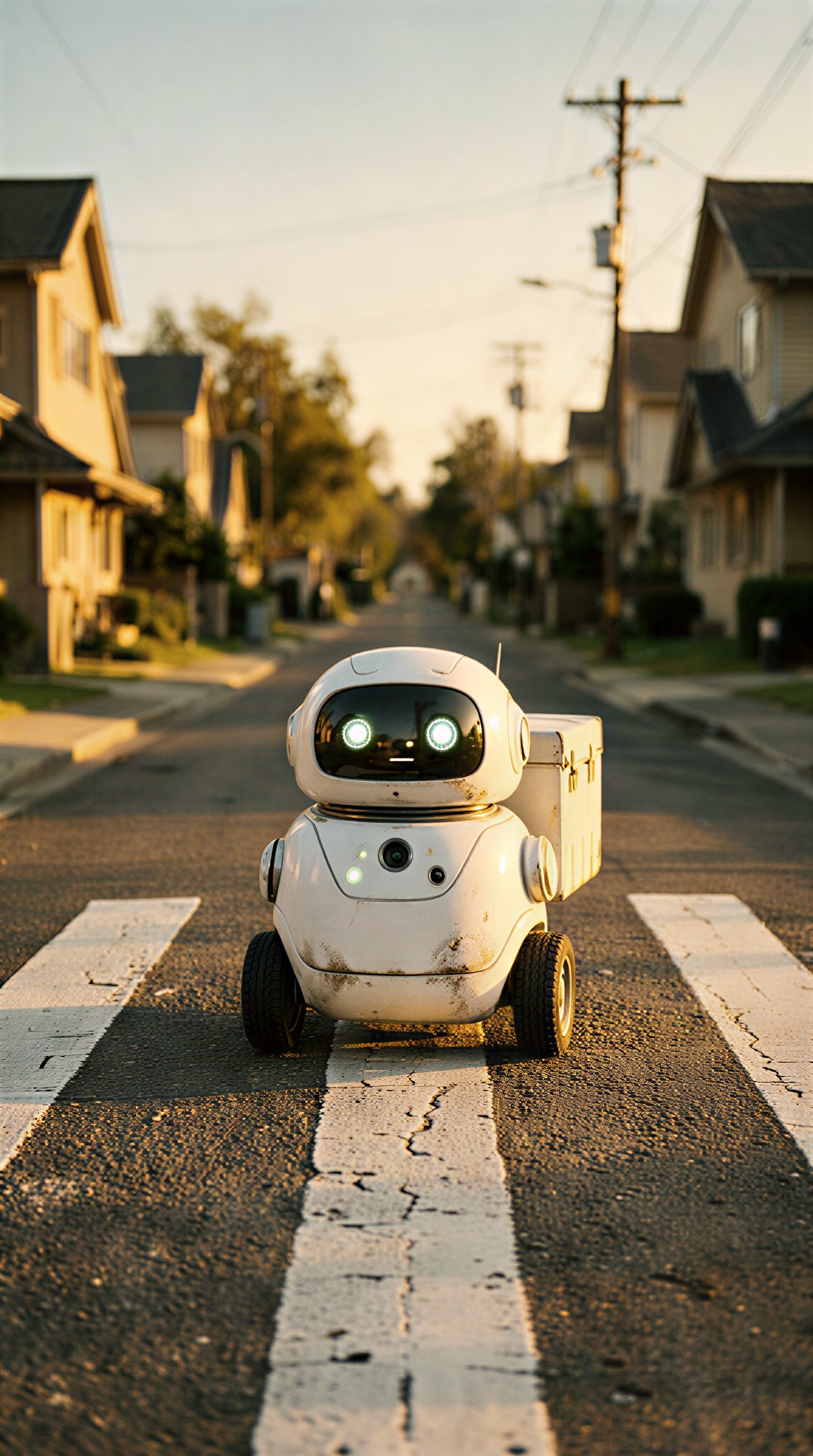
Small friendly delivery robot waiting at a crosswalk in a quiet residential neighborhood, rounded white shell with soft rubber wheels, small sensor lights, compact package compartment, eye-level view, afternoon sunlight, realistic near-future design, believable proportions, subtle wear and street dust, optimistic mood, no weapons, no brand logos, no text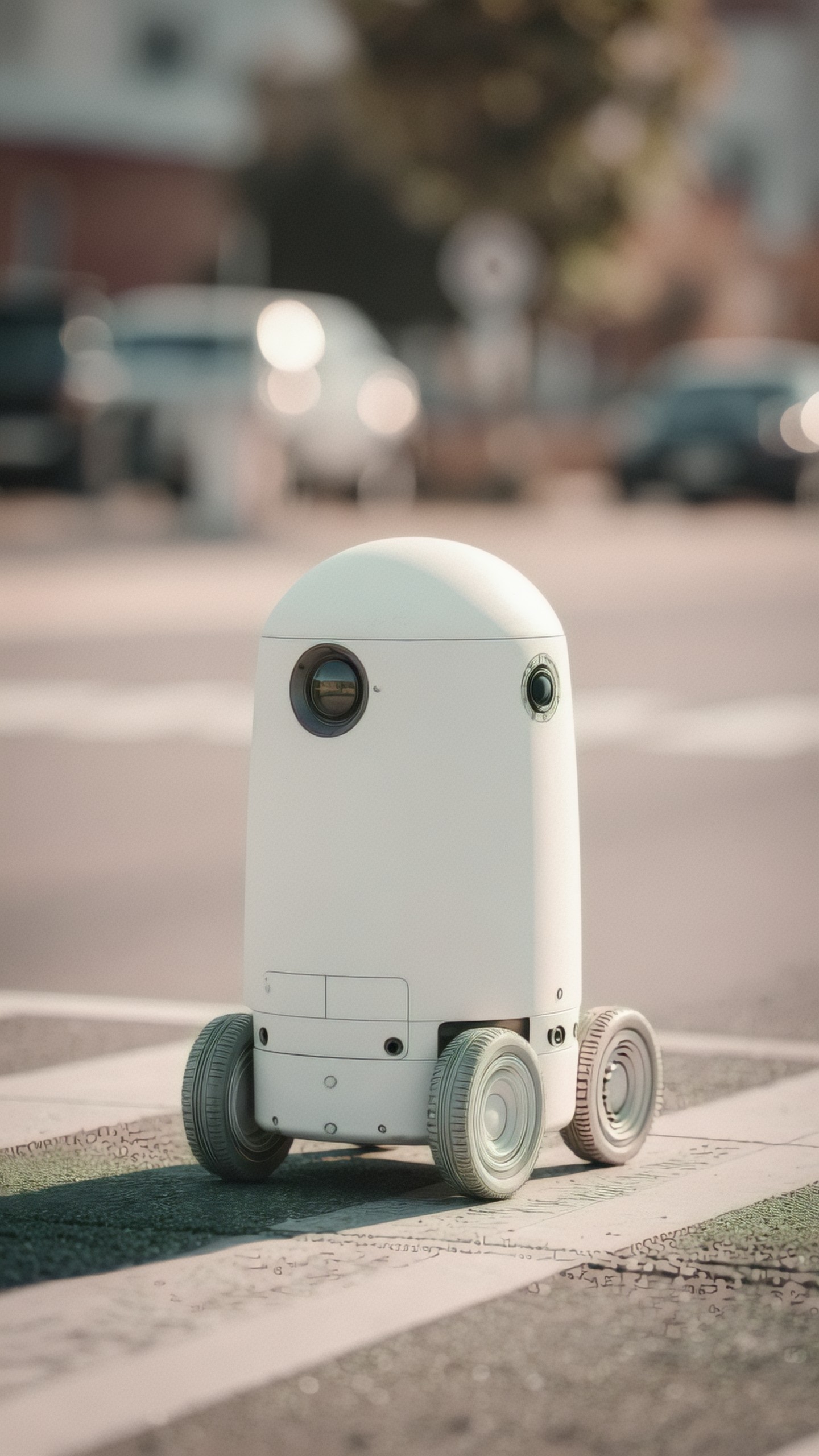
Control composition like an art director
Composition tells the model where to place attention. Useful terms include centered composition, close-up, wide shot, top-down view, rule of thirds, symmetrical framing, negative space, foreground blur, and low-angle view.
For food, beauty, and product images, composition often matters more than complex styling.
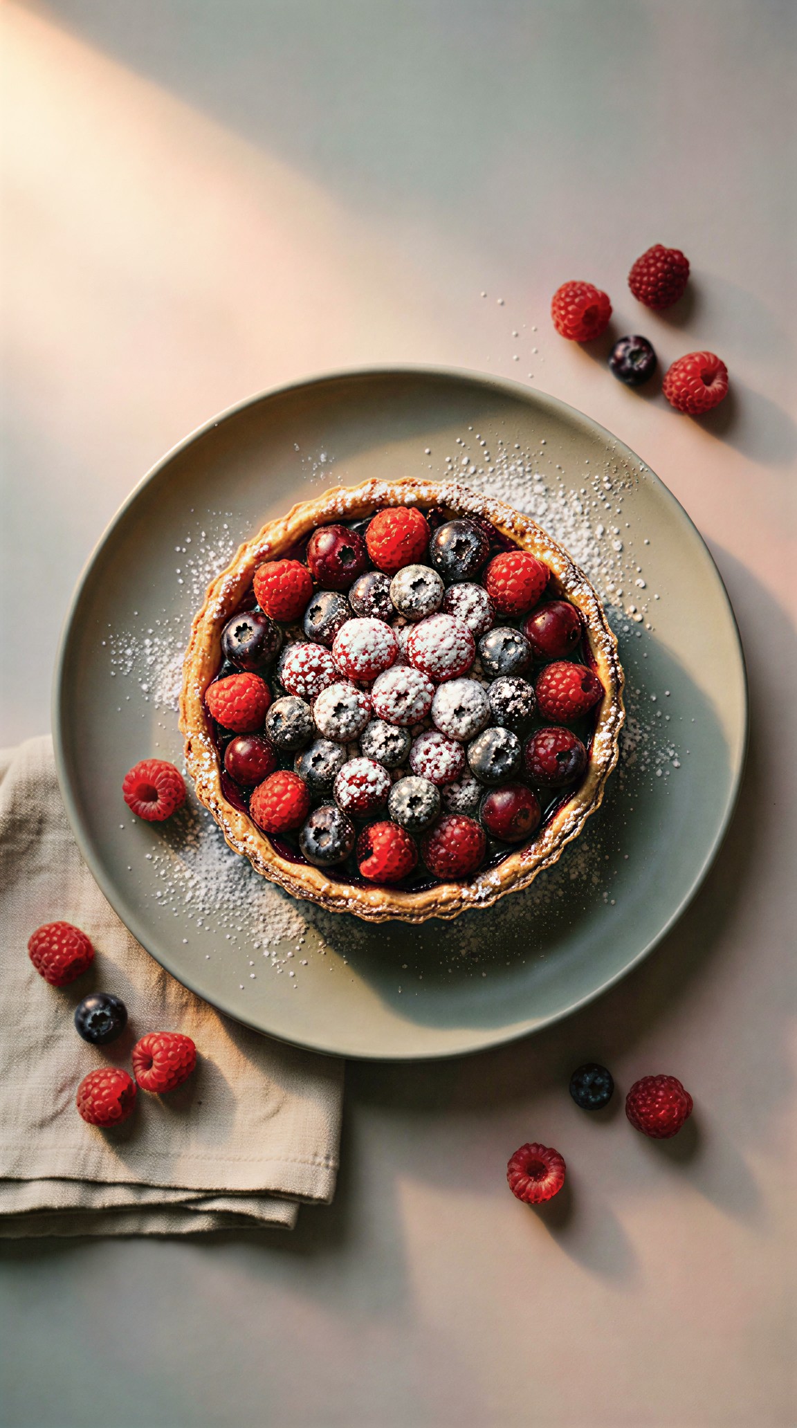
Top-down editorial food photograph of a rustic berry tart on a matte ceramic plate, linen napkin partially visible, scattered fresh berries and powdered sugar, balanced asymmetrical composition, soft diffused daylight from the upper left, natural shadows, muted pastel background, appetizing realistic texture, magazine-quality styling, no utensils crossing the tart, no text
Use style references carefully
Style words are useful, but too many can fight each other. Choose one clear direction: documentary photography, vintage poster, clay render, watercolor illustration, editorial fashion, architectural visualization, or cinematic concept art.
For portraits, combine style with age, wardrobe, expression, setting, and lighting. This gives the model more concrete information than simply asking for a beautiful portrait.
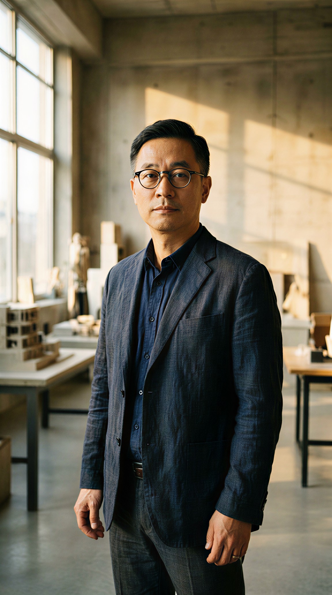
Editorial portrait of a middle-aged architect standing inside a bright concrete studio, wearing a dark linen jacket and round glasses, calm confident expression, architectural models on tables in the blurred background, natural side light from tall windows, realistic magazine photography, 85mm lens look, refined neutral color palette, detailed skin texture, no heavy retouching, no text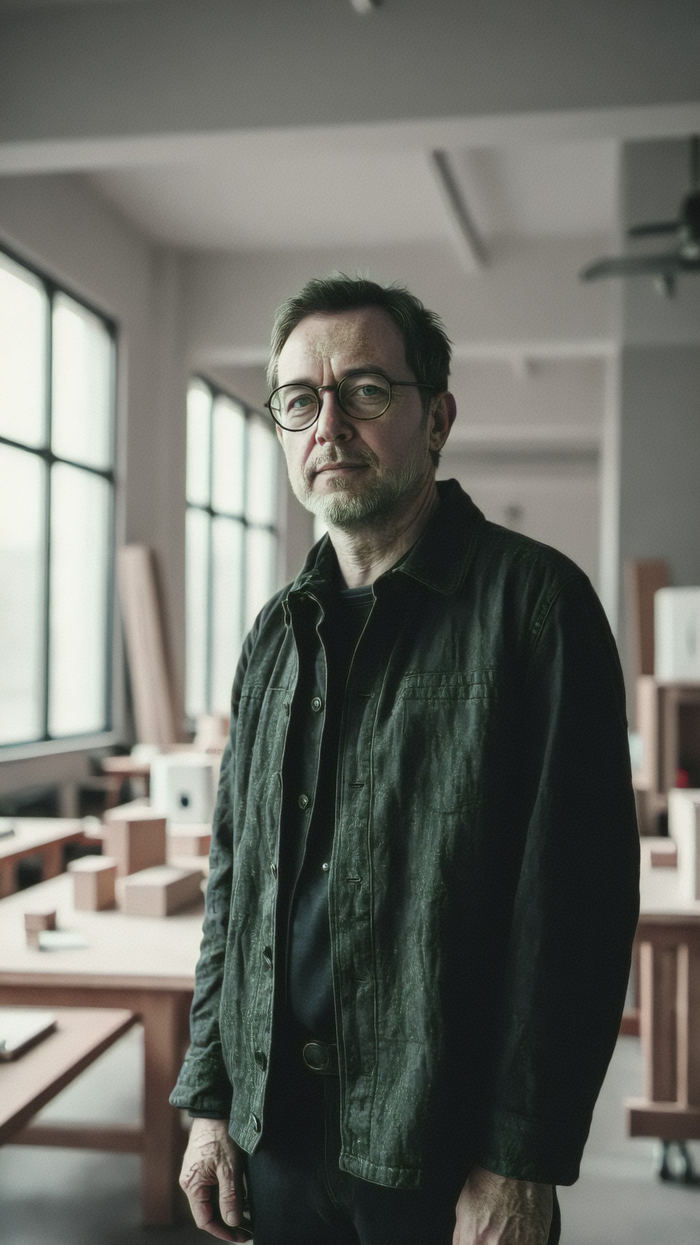
Let lighting carry the mood
Lighting is one of the fastest ways to move from a generic image to a professional one. Specify whether the light is soft, harsh, natural, neon, backlit, golden hour, overcast, studio strobe, candlelit, or moonlit.
For dramatic visuals such as posters or album artwork, lighting can define the entire image.
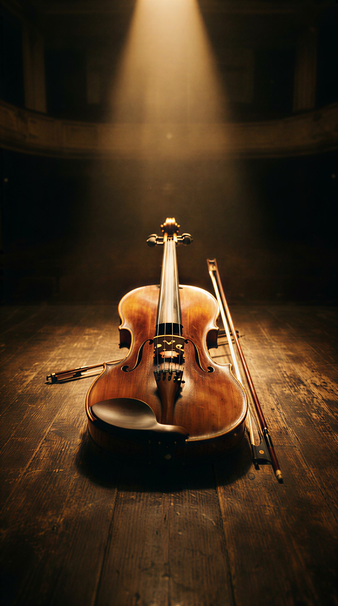
Solitary violin resting on a dark wooden stage after a concert, single warm spotlight from above, deep surrounding shadows, faint dust particles in the light beam, cinematic still life photography, low-key lighting, rich brown and amber tones, close composition, emotional quiet mood, realistic varnished wood texture, no people, no text, no extra instruments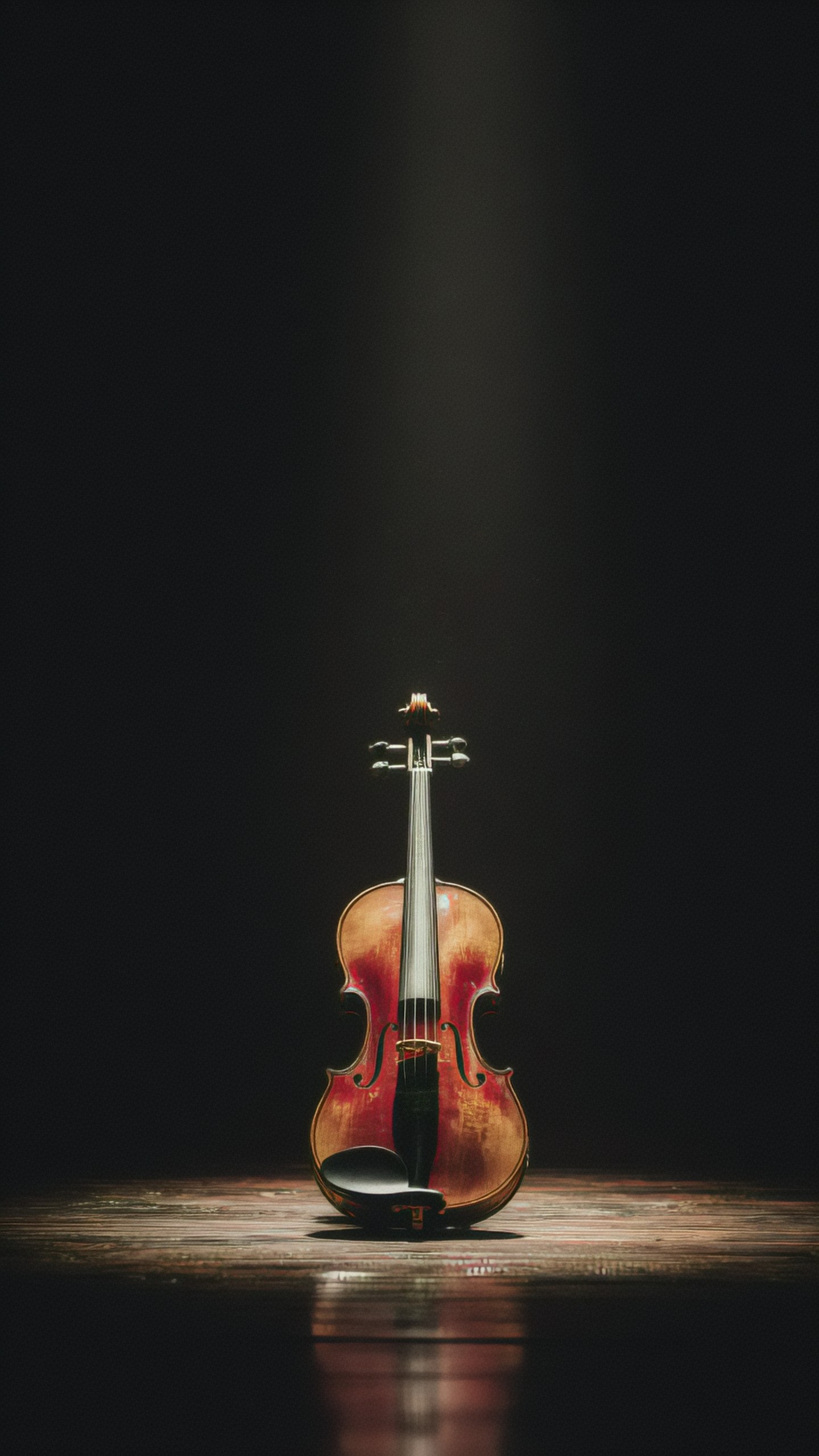
Add constraints to reduce common problems
Negative instructions are not magic, but they help. Use them for things that frequently break the image: text, logos, extra fingers, distorted faces, clutter, unwanted objects, or incorrect format.
Constraints are especially important for commercial images, thumbnails, icons, and clean graphics.
Modern mobile app icon for a habit tracking app, simple abstract checkmark formed from two soft green leaves, rounded square background, clean vector-style design, high contrast at small size, centered symbol, minimal color palette, subtle depth, professional app store presentation, no text, no letters, no watermark, no complex background, no photorealism

Build variations from the same idea
Once a prompt works, do not start over. Change one layer at a time: format, lighting, subject detail, or use case. This lets you compare results and keep control over the direction.
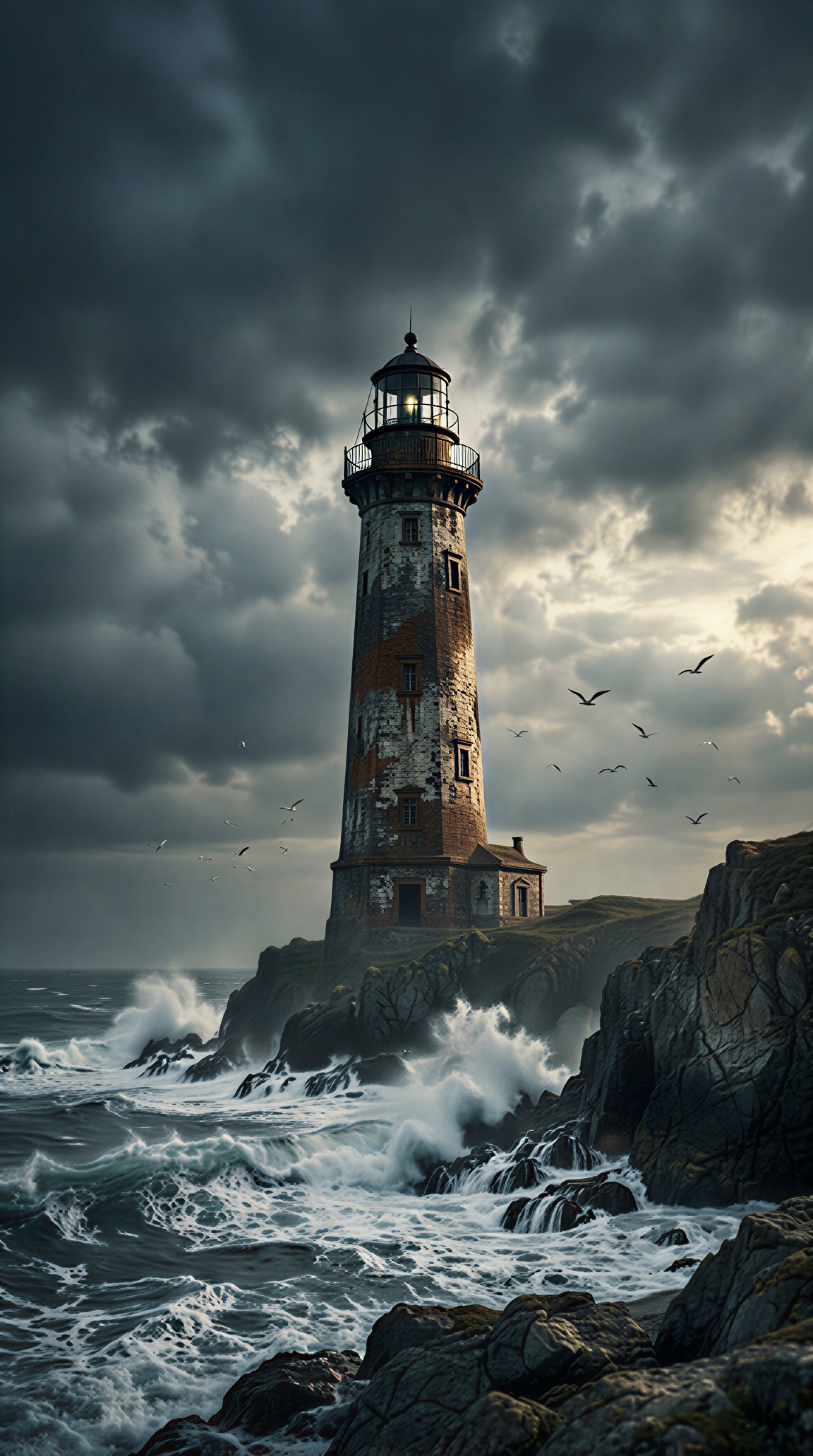
A simple idea like a lighthouse can become a book cover by adding vertical framing, narrative mood, and room for typography.
Tall weathered lighthouse on a rocky coast during an approaching storm, vertical book cover composition with open dark sky at the top for title placement, crashing waves below, distant seabirds, dramatic overcast lighting, moody literary fiction atmosphere, realistic painterly illustration, restrained blue-gray palette, strong silhouette, no text, no people in foreground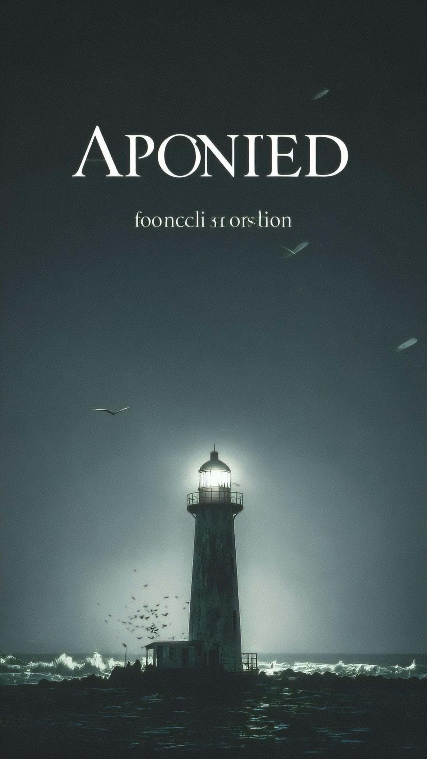
The same basic method works for educational and editorial graphics. Here the goal is clarity, not atmosphere.
Clean educational infographic illustration showing the lifecycle of a sunflower from seed to sprout to full bloom, four stages arranged left to right, simple flat vector style, warm natural colors, white background, clear spacing, botanical accuracy, friendly classroom visual, no labels, no text, no decorative clutter, no photorealistic rendering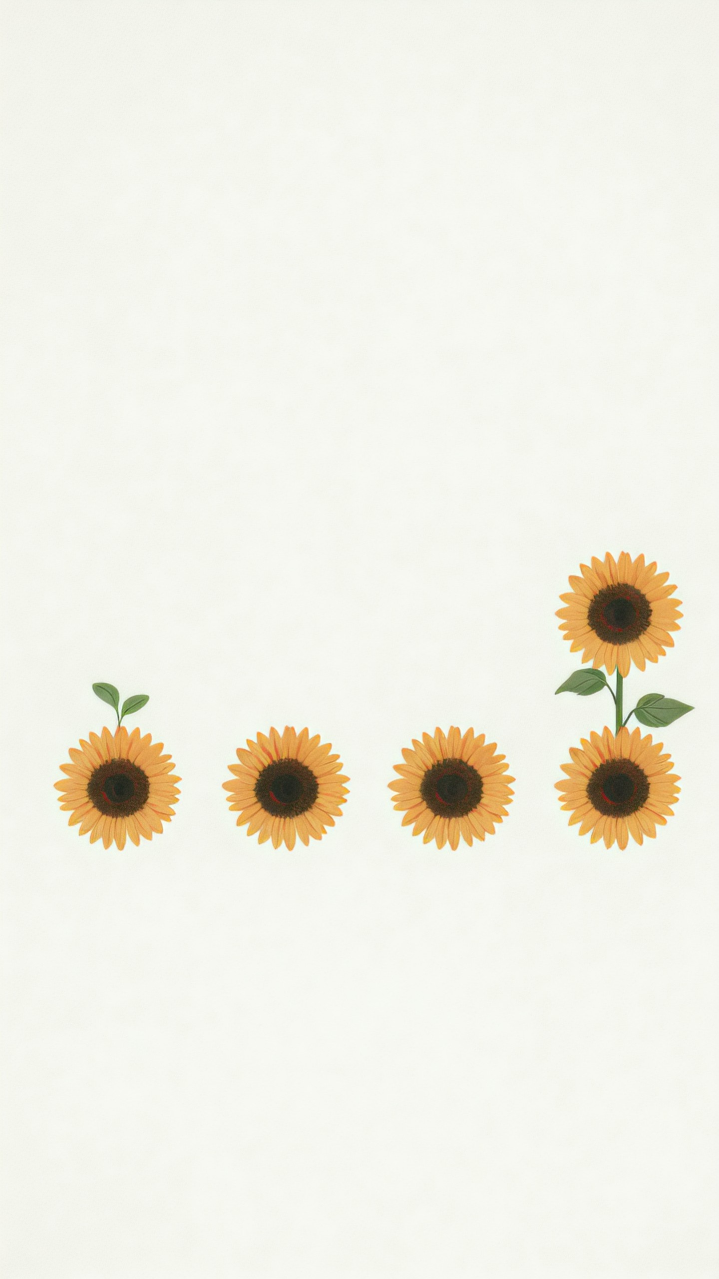

A practical editing checklist
Before generating, read your prompt and check these points:
- Is the subject unmistakable?
- Is the intended use clear?
- Does the prompt specify composition or aspect needs?
- Is the lighting described?
- Is the style focused rather than mixed?
- Are important materials, colors, or details included?
- Are common unwanted elements excluded?
If the result is close but not right, revise one part at a time. Change the camera angle, then the lighting, then the setting. Avoid rewriting everything at once, because you will not know which change improved the image.
The simple-to-professional pattern
The easiest way to improve a prompt is to move from idea to direction:
Simple idea: a chair in a room.
Professional direction: a specific chair, in a specific room, with specific light, composed for a specific purpose, with clear constraints.
That shift is what makes prompts more reliable. You are not trying to write a poetic description. You are giving the model a production brief it can follow.
<!-- zview-hands-on-backfill -->
Practical Test Notes
What this article should verify
- Whether a simple idea becomes more usable after it is expanded into a structured prompt with subject, setting, composition, lighting, style, and negative constraints.
- Whether the added structure improves consistency across common use cases such as product images, editorial scenes, landscapes, and concept-style subjects.
- Whether negative constraints actually reduce predictable generation issues, especially unwanted text, branding, anatomy errors, or cluttered backgrounds.
- Whether composition instructions create clearer commercial intent, such as centered product framing or reserved negative space for headlines.
Result checks
When reviewing the existing examples or any future outputs from this test setup, inspect the image against the prompt in a literal way.
- Subject clarity: the main object or scene should be immediately identifiable, with no confusion about what the image is about.
- Composition control: check whether the framing matches the instruction, such as centered composition, sidewalk-level view, eye-level angle, or open negative space.
- Lighting control: look for stable light direction, believable reflections, and a mood that matches the prompt rather than random contrast shifts.
- Texture quality: inspect surfaces like ceramic, wet asphalt, wood, snow, or painted shells for detail that looks intentional instead of smeared.
- Background consistency: supporting elements should reinforce the scene without stealing focus or changing style.
- Product clarity: for product-style prompts, verify that edges are clean, the object is fully visible, and there is no accidental text or logo.
- Character and anatomy risk: if people or robots appear, inspect faces, hands, limbs, wheels, and proportions closely.
- Style consistency: the final image should not mix photographic realism with unrelated illustration traits unless requested.
Failure risks
This approach can still fail when the prompt becomes too dense, with competing instructions about mood, camera angle, realism, and layout. Broad ideas may remain generic if the subject details are not specific enough. Negative constraints can also be overused; they may reduce errors, but they do not guarantee clean anatomy, readable signage removal, or perfect object geometry. Scenes with pedestrians, hands, small text, reflective storefronts, or complex urban clutter carry higher failure risks.
Practical recommendation
Use this setup if you need predictable prompt building for product visuals, website hero images, concept scenes, or social creatives. Avoid relying on it alone for images that depend on perfect hands, dense crowds, or precise embedded text. The detail that matters most is not prompt length but choosing the right visual specifics for the intended use case.