Image Upscaler AI for Text: Tested Ways to Sharpen Small Graphics Without Haloing 한국어 요약
이 페이지는 ZView Space의 영어 원문을 한국어 검색 사용자도 이해할 수 있도록 정리한 SEO 요약입니다. 핵심은 단순한 얼굴 중심 이미지가 아니라 패션 에디토리얼, 룩북, 아웃핏, 프롬프트 테스트, 이미지 생성 워크플로우를 실제로 어떻게 구성할지입니다.
핵심 요약
- 원문 주제: Image Upscaler AI for Text: Tested Ways to Sharpen Small Graphics Without Haloing
- 목적: AI 이미지 생성에서 outfit, silhouette, fabric, pose, location, camera framing을 더 명확하게 설계합니다.
- 활용 범위: Z-Image Turbo, Krea2 Turbo, Qwen Image, Anima, SeedVR2 같은 이미지 생성 및 업스케일 워크플로우에 적용할 수 있습니다.
- SEO 관점: 제목, 설명, 이미지 alt, 프롬프트 예시가 실제 검색 의도와 맞아야 색인 가능성이 높아집니다.
한국어 사용자를 위한 체크포인트
1. 프롬프트가 얼굴 묘사에만 머물지 않고 전체 스타일과 의상 구성을 설명하는지 확인합니다. 2. 패션 이미지라면 상의, 하의, 아우터, 신발, 액세서리, 소재감, 촬영 장소를 분리해서 씁니다. 3. 생성 결과는 바로 게시하지 말고 디테일, 손, 의상 형태, 배경 일관성, 이미지 품질을 비교합니다. 4. 글 본문에는 실제 테스트 기준과 실패를 줄이는 방법이 들어가야 검색엔진에서 얇은 콘텐츠로 보일 가능성이 줄어듭니다.
원문 미리보기
I ran this test to answer a very specific production question: which image upscaler AI for text workflow actually sharpens small type and logos without adding white halos, edge glow, or plastic smoothing. The session was not about making photos look bigger. It
---
I ran this test to answer a very specific production question: which image upscaler AI for text workflow actually sharpens small type and logos without adding white halos, edge glow, or plastic smoothing. The session was not about making photos look bigger. It was about rescuing tiny wordmarks, UI snippets, labels, and low-resolution logos so they stay readable after scaling.
In this test, the strongest results came from treating text and logos as graphics first, not as photos. The weak point in most AI upscalers was easy to spot: they tried to invent texture around edges, which made letters look thicker, softer, or outlined. The useful workflow was a controlled pass with graphic-safe settings, then a small amount of manual cleanup only where the model failed.
What to know first
- Use a graphics-oriented or low-creativity mode first; photo enhancement modes tend to add halos around letters.
- Upscale in smaller steps when the source is extremely tiny; 2x twice often keeps edges cleaner than one aggressive 4x pass.
- If the logo has flat colors, inspect color bleed at 200% zoom before judging sharpness.
- For thin fonts, edge integrity matters more than apparent crispness; overly sharp previews often hide stroke distortion.
- If the source is under 16 px cap height, AI may guess wrong. At that point, vector redraw is often faster.
Test setup
I tested three source categories:
1. Small black text on white background — export from a low-res screenshot. 2. Flat-color logo with transparent-style edges baked into PNG — common for web assets. 3. Badge-style graphic with text, icon, and thin outline — the hardest case because every failure is visible.
Each file was tested in a graphics-safe upscaling workflow, then compared against a more aggressive AI enhancement pass. I checked results at 100%, 200%, and 400% zoom, plus one practical output check: whether the result still looked clean when dropped into a slide, product mockup, or simple print layout.
For quick experiments, a browser workflow like [zview upscaler](/upscaler) is enough to see if a source is recoverable. For prompt tuning and controlled iterations, I used a repeatable note system in [PromptLab](/promptlab) and stored outputs in [Gallery](/gallery).
A quick checklist: what a good upscale logo online result should pass
| Checkpoint | Good result | Failure sign | What to change | |---|---|---|---| | Letter edges | Clean, even stroke width | White fringe or dark outline | Reduce denoise or switch to graphic mode | | Corners | Sharp but not jagged | Rounded corners on geometric fonts | Lower creativity, use smaller upscale step | | Color blocks | Solid fill, no mottling | Texture or gradient invented in flat areas | Disable texture enhancement | | Transparent edges | Smooth anti-aliasing | Halo against dark background | Test on both light and dark backgrounds | | Thin lines | Continuous line weight | Breaks, wobble, or thickening | Use 2x pass first, then selective sharpen | | Readability | Clear at intended final size | Looks crisp zoomed in but unreadable when placed | Judge at use size, not only at 400% |
What looked good immediately
The best immediate wins came from logos with high contrast and clean separation between foreground and background. Sans-serif text with medium weight responded well. Flat vector-like marks also survived AI enhancement better than distressed or textured branding.
A controlled AI image enhancer for graphics can help most when the file is already structurally correct but too small. In this test, broad shapes, simple curves, and bold counters inside letters like O, P, and R stayed stable. The strongest result was a monochrome wordmark scaled from a small web PNG to presentation size with no visible edge glow.
This first prompt is useful when the source is a simple black-on-white text crop and you want the model to preserve geometry instead of inventing texture.
Topic: small black sans-serif wordmark on white background for clean edge recovery
Genre: Product Editorial
Camera: Phase One XF IQ4
Lens: 120mm macro f/4
Lighting: softbox key light with even studio fill
Location: neutral white tabletop studio
Style: clean commercial look
Final Prompt: ultra-clean small black sans-serif wordmark centered on pure white background, flat print graphic presentation, crisp geometric letterforms, even stroke width, no texture, no embossing, no shadow, no glow, no decorative effects, macro product documentation style, Phase One XF IQ4 look, 120mm macro f/4 precision, uniform studio lighting, neutral tones, edge fidelity, anti-halo clarity, accurate negative space, restrained sharpening, production-proof graphic reproduction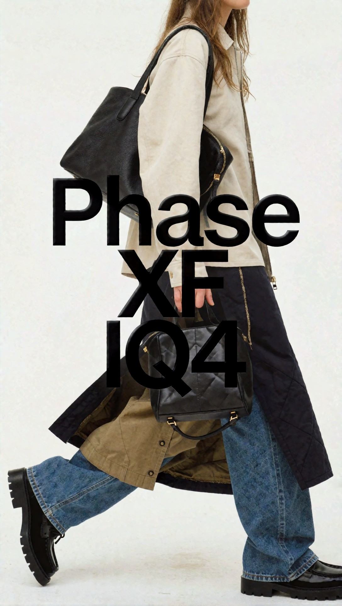
Inspect whether the letter stems stay the same thickness from top to bottom. If the preview looks sharper but counters start to close up, that setup is over-processing.
Another early success case was a single-color icon plus text lockup. The model had less room to hallucinate because there was no photographic texture to chase.
Topic: flat single-color logo lockup with icon and text for clean online upscaling
Genre: Luxury Campaign
Camera: Hasselblad X2D 100C
Lens: 80mm f/1.9
Lighting: large overhead diffusion with soft frontal fill
Location: matte gray studio sweep
Style: minimalist brand identity presentation
Final Prompt: flat single-color logo lockup with simple icon and balanced wordmark, centered on matte neutral background, precise clean edges, solid fill color, no gradients, no bevel, no gloss, no shadow, no texture invention, minimal premium brand identity presentation, Hasselblad X2D 100C clarity, 80mm lens rendering, soft diffused studio light, exact spacing, geometry preserved, anti-aliasing controlled, upscale-safe graphic look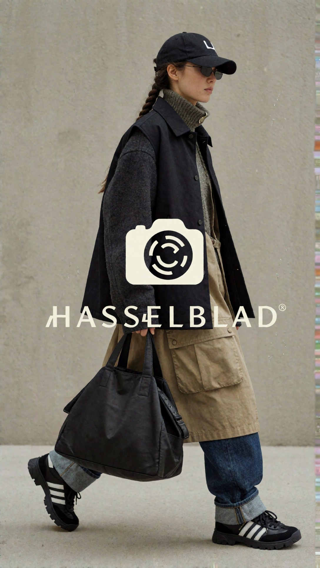
What to inspect here is color stability at the edges. If the fill color starts shifting lighter near the outline, haloing has begun even if it is subtle on white.
What needed correction
The failures were consistent. When the source contained very small serif text, thin outlines, or semi-transparent anti-aliased edges, the AI tried to interpret them as soft texture. That caused three common problems:
- edge glow around letters
- rounded corners on logos that should be rigid
- invented grain inside flat fills
The hardest files were badge graphics exported from social media posts. Compression blur plus tiny text is where sharpen text in image AI tools often become unreliable. They can improve the impression of clarity while quietly changing the shape of letters.
This test prompt is designed for a badge graphic with a ring, icon, and small text, where outline integrity matters more than dramatic sharpness.
Topic: circular badge logo with thin outline and small text requiring shape preservation
Genre: Product Editorial
Camera: Nikon Z9
Lens: 105mm macro f/2.8
Lighting: cross-polarized studio lighting
Location: black acrylic tabletop studio
Style: technical catalog documentation
Final Prompt: circular badge logo with thin outer ring, compact inner icon, and small uppercase text around the perimeter, flat graphic reproduction, precise circular geometry, thin lines remain continuous, no glow, no paint-like texture, no faux depth, no embossing, technical catalog style, Nikon Z9 macro documentation look, 105mm f/2.8, controlled cross-polarized lighting, high micro-contrast without haloing, exact spacing, production inspection clarity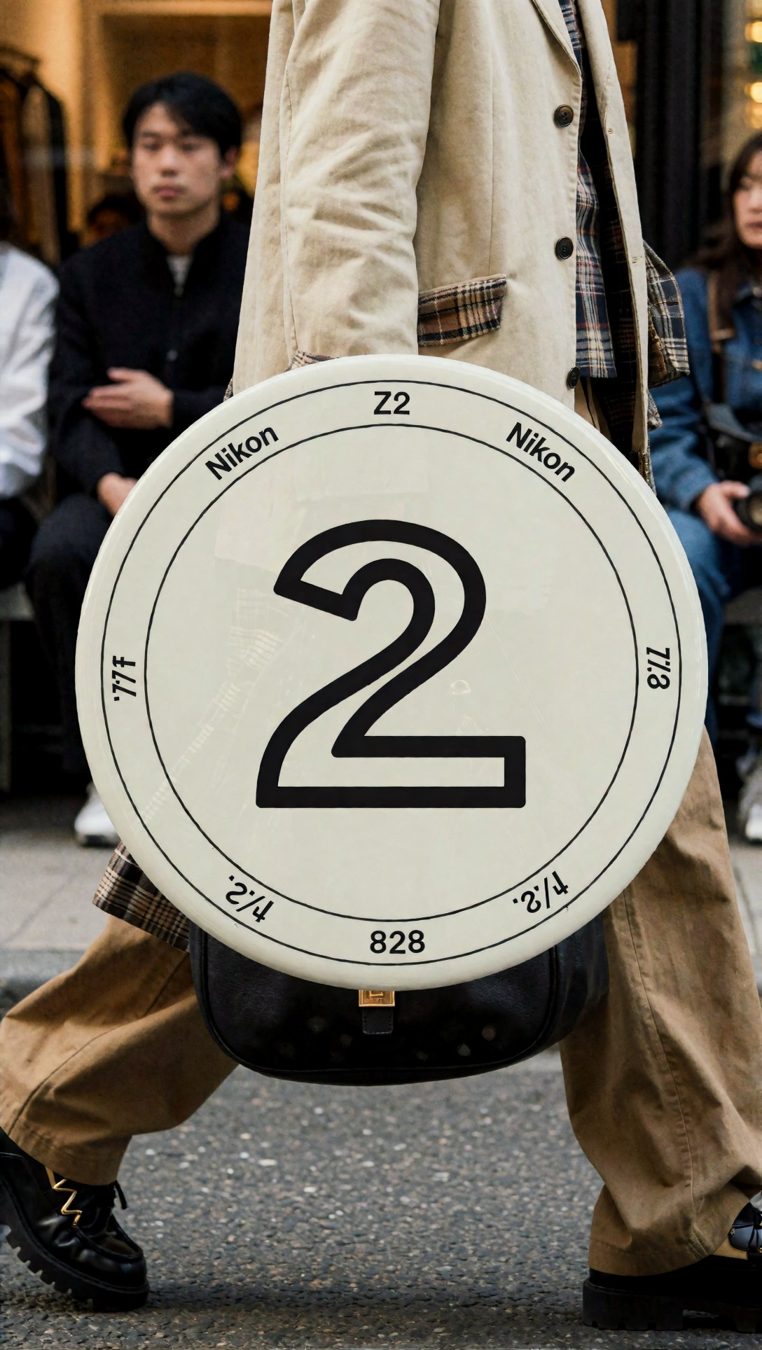
Zoom into the outer ring and the smallest text. If curves start wobbling or the ring thickness varies around the circle, the model is adding detail instead of restoring it.
A second weak point was transparent-background logos exported badly from old design apps. The transparent edge is often already contaminated with a white matte. Upscaling makes that defect louder.
Topic: transparent-style PNG logo with edge contamination for halo detection
Genre: Product Editorial
Camera: Canon EOS R5
Lens: 100mm macro f/2.8
Lighting: neutral overhead soft light
Location: compositing preview studio with light and dark backdrops
Style: prepress quality control
Final Prompt: simple flat-color PNG logo displayed as a compositing proof against both light and dark backgrounds, edge contamination inspection, clean anti-aliased border, no white fringe, no dark outline, no shadow, no texture, no bevel, precise brand mark geometry, Canon EOS R5 macro look, 100mm f/2.8, neutral studio light, prepress quality control aesthetic, crisp edge transition, faithful color fill, graphic-safe enlargement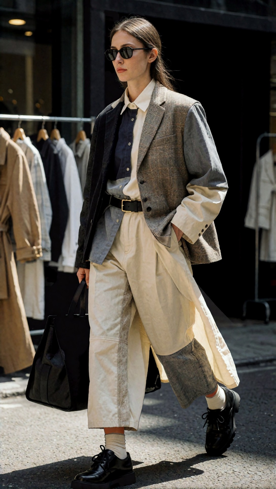
Here the inspection step is simple: place the result on both white and charcoal backgrounds. If a fringe appears only on dark, the upscale preserved or amplified a baked-in matte problem.
The prompt ingredients that actually changed the result
The prompts that helped were not magical. They were specific in ways that limited the model's imagination.
1. Calling the subject a graphic, not an image
When I described the target as a wordmark, logo lockup, badge graphic, or flat print graphic reproduction, the results stayed cleaner. Generic phrasing like “enhance image” pushed the model toward photo behavior.
2. Explicitly forbidding texture and depth
The most useful negatives were conceptual, even when the tool did not have a separate negative prompt field:
n- no embossing
- no texture
- no shadow
- no glow
- no bevel
- solid fill color
- precise geometry
That language reduced fake detail in flat shapes.
3. Macro/product capture framing
Oddly, product-editorial framing helped because it implies precision. Macro lenses, technical catalog style, and prepress inspection language produced outputs with less stylization and more edge discipline.
This next prompt is useful for small UI text or labels inside a product graphic where you need readability without making the entire panel look synthetic.
Topic: compact UI label panel with tiny interface text and simple icons
Genre: Product Editorial
Camera: Fujifilm GFX100 II
Lens: 110mm f/2
Lighting: soft top light with controlled side fill
Location: neutral control-room style studio set
Style: clean technical interface mockup
Final Prompt: compact UI label panel with tiny interface text, simple monochrome icons, thin dividers, and flat background blocks, clean technical interface mockup, highly legible small typography, exact alignment, no texture noise, no screen glare, no bloom, no haloing, Fujifilm GFX100 II precision, 110mm lens clarity, soft controlled studio light, restrained contrast, geometry-first rendering, crisp but natural anti-aliasing, production-ready graphic sharpness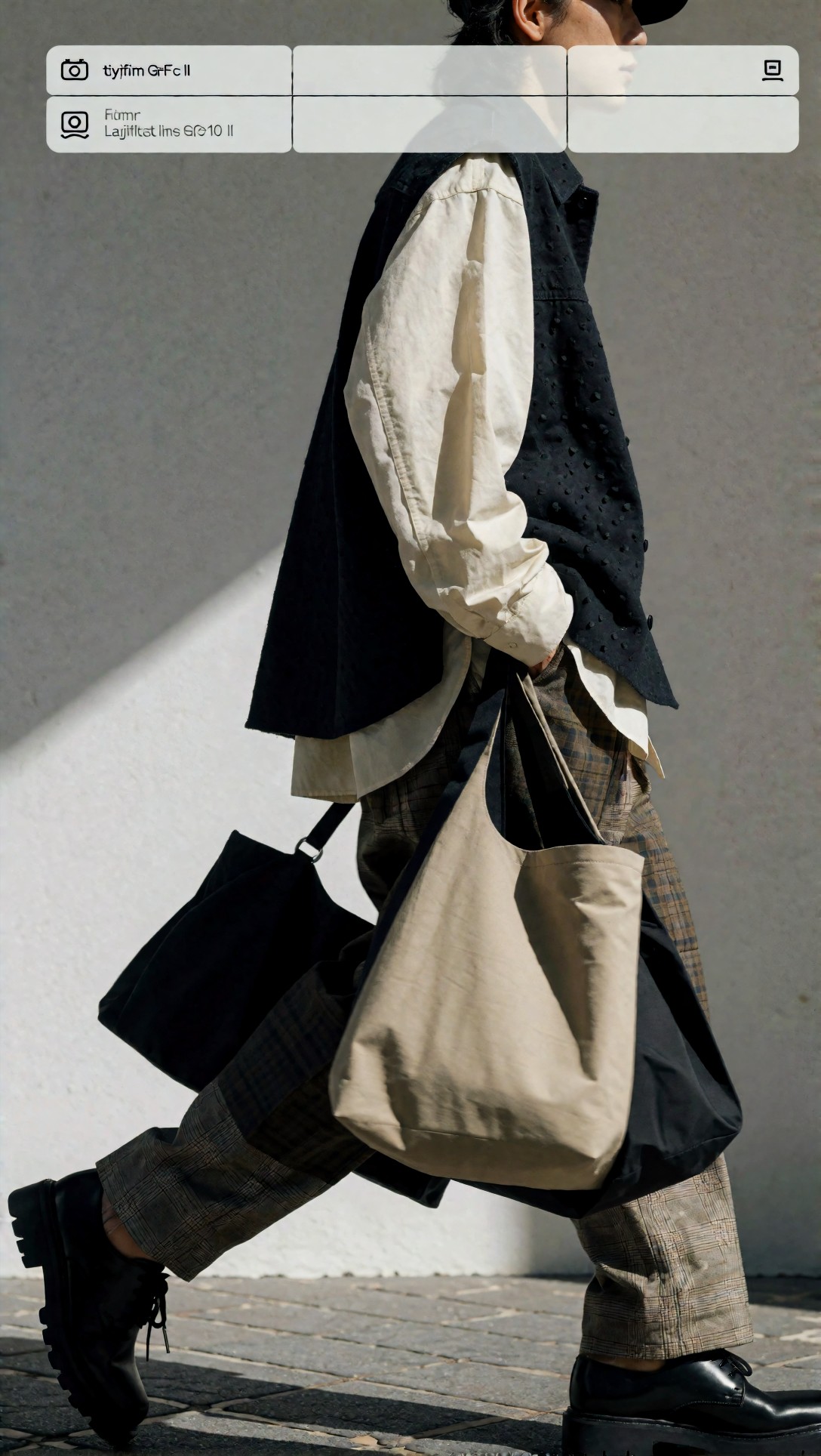
Inspect vertical strokes and divider lines together. If the text improves but the dividers break apart or thicken unevenly, the upscale settings are too aggressive for mixed graphic content.
4. Restrained sharpness language
“Ultra sharp” was usually worse than “restrained sharpening” or “production-proof clarity.” Strong sharpness wording often created bright rims on dark text.
5. Background-aware inspection
A logo can look perfect on white and fail immediately on a dark slide. I started testing every output on both backgrounds before keeping it.
Image test prompts and what I saw
For thin serif text, the safest route was to prioritize character spacing and counter preservation, not edge contrast. This setup is meant to check whether an image upscaler AI for text can recover a formal wordmark without fattening it.
Topic: elegant thin serif wordmark with delicate spacing for readability preservation
Genre: Luxury Campaign
Camera: Leica SL2-S
Lens: APO-Summicron-SL 75mm f/2
Lighting: soft window-style side light with white bounce
Location: calm cream studio wall
Style: premium stationery brand presentation
Final Prompt: elegant thin serif wordmark with refined spacing and delicate letterforms, centered on warm cream background, premium stationery identity presentation, no texture, no metallic foil effect, no embossing, no shadow, no glow, preserve thin strokes and open counters, Leica SL2-S rendering, 75mm APO lens look, soft side light with white bounce, understated luxury, precise print-ready edges, calm neutral palette, faithful typographic geometry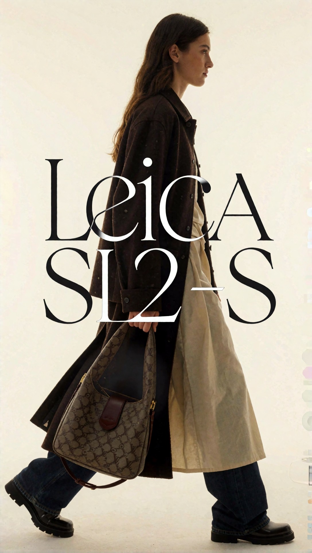
Inspect the inside of letters like e, a, and s. If these counters tighten or the terminals become bulbous, the upscale is making the logo look heavier than the original.
For bold condensed text, the risk is different: the model may over-separate close letters and create jagged inner edges. This prompt checks density control.
Topic: bold condensed uppercase headline text for dense edge control
Genre: Street Style
Camera: Sony A1
Lens: 50mm f/1.2
Lighting: hard frontal light with clean shadow control
Location: urban poster wall mockup
Style: editorial poster graphic
Final Prompt: bold condensed uppercase headline text arranged like a pasted editorial poster, strong vertical strokes, tight kerning, flat ink-like black fill on off-white surface, no paper grain exaggeration, no paint texture, no torn edges, no glow, no blur, Sony A1 clarity, 50mm f/1.2 look, hard frontal light, graphic poster realism with exact letter boundaries, high readability, controlled sharpening for dense typography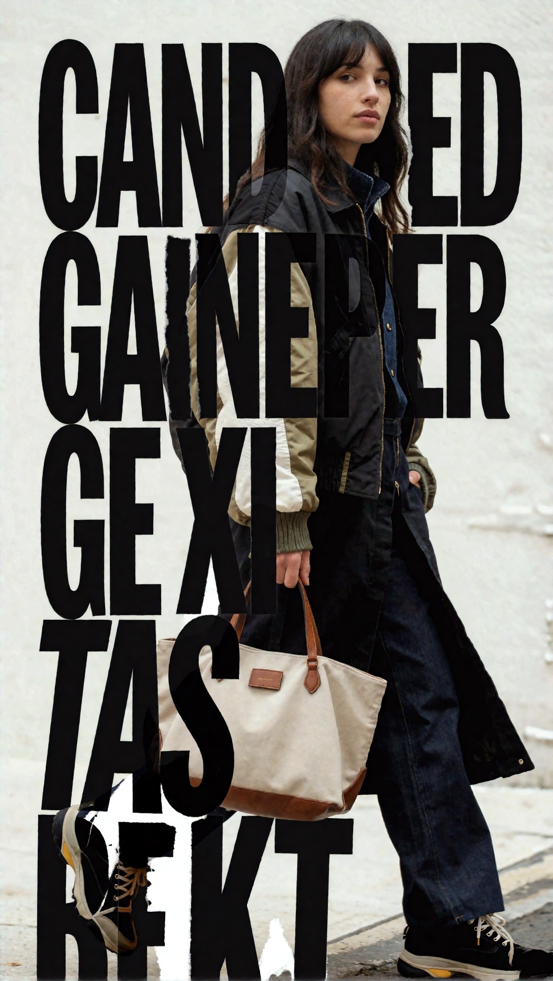
Check the narrow gaps between letters. If they open too much or become irregular, the model is rewriting the typography instead of enlarging it.
For a flat-color app icon with text, AI often over-polishes corners. This setup checks whether rounded geometry remains intentional instead of mushy.
Topic: app icon with adjacent label text for corner and edge fidelity
Genre: Product Editorial
Camera: Panasonic Lumix S1R II
Lens: 90mm macro f/2.8
Lighting: soft frontal diffusion with subtle rim separation
Location: clean mobile UI presentation board
Style: modern software brand showcase
Final Prompt: flat app icon with rounded-square geometry beside a short sans-serif label, clean mobile UI presentation board, solid color blocks, crisp icon silhouette, no gloss, no 3D extrusion, no reflection, no haloing, Panasonic Lumix S1R II detail, 90mm macro precision, soft diffused frontal light, modern software brand style, exact alignment, faithful corner radius, sharp readable label text, graphic-safe enlargement
Inspect the corner radius of the icon and the baseline of the label. If the icon corners look softer than the original while the text gets overly crisp, the workflow is balancing the two elements poorly.
For distressed or textured logos, the model should not clean them up too much. Some “enhancement” modes remove intended roughness and make the asset incorrect.
Topic: intentionally distressed vintage logo needing selective clarity without cleanup
Genre: Cinematic Travel
Camera: Canon EOS R3
Lens: 35mm f/1.4
Lighting: overcast diffusion
Location: weathered painted shop sign facade
Style: heritage brand documentation
Final Prompt: intentionally distressed vintage logo painted on a weathered shop sign, visible age and slight paint wear preserved, readable but authentic lettering, no artificial smoothing, no glossy restoration, no halo glow, no fake texture addition beyond original wear, Canon EOS R3 documentary realism, 35mm f/1.4 environmental framing, overcast diffused light, heritage brand documentation style, balanced clarity, original imperfections retained
What to inspect is whether the model respects the original wear pattern. If chips and breaks become smooth gradients, the tool is correcting something that should stay imperfect.
When to switch models or settings
The practical rule from this session was simple: if the tool starts changing character shapes, stop asking more from the same model.
Use graphics-safe settings when:
- the source is a logo, UI panel, label, or flat illustration
- edges are more important than texture
- the final output will be placed on varied backgrounds
Switch to a different mode when:
- the source mixes photo and text, such as packaging shots
- the text is part of a scene and not the primary subject
- you need texture preserved around the graphic, not just the lettering
Avoid aggressive AI enhancement entirely when:
- the original text height is extremely small
- brand geometry must match exactly
- transparent edges are already damaged
- the logo should really be re-exported or vectorized
This test prompt is meant for packaging-style graphics where text sits beside photographic material, and a pure logo workflow may make the whole image look detached.
Topic: product packaging panel with logo, ingredient text, and subtle material texture
Genre: Beauty Campaign
Camera: Nikon D850
Lens: 60mm macro f/2.8
Lighting: studio butterfly light with soft side fill
Location: clean cosmetic tabletop set
Style: high-end retail packshot
Final Prompt: premium product packaging panel featuring a clean logo, readable ingredient text, and subtle paper or label material texture, high-end retail packshot style, maintain flat printed graphics while preserving realistic package surface, no glowing edges, no over-sharpened print, no fake embossing, Nikon D850 macro look, 60mm f/2.8, studio butterfly light with soft fill, elegant neutral palette, commercial clarity, balanced texture retention, precise typography and logo edges
Inspect whether the printed text and the package material still feel like the same object. If the letters look pasted on top, the graphics treatment is too isolated from the surface texture.
A separate switch point is scale factor. If a 4x result shows halos, I would retry at 2x, then sharpen only lightly. In this test, two conservative passes often beat one large jump.
If you want to compare attempts side by side, it helps to keep versions organized in [Create](/create) or save variants in [Articles](/articles) notes for later review.
A practical workflow for upscale image online for logo jobs
Step 1: classify the asset
Ask: is it pure text, logo plus icon, badge graphic, packaging crop, or text inside a photo?
That classification decides whether you should use a graphic-safe workflow or a mixed-content model.
Step 2: clean the source before AI
If there is obvious JPEG ringing, matte contamination, or background noise, remove that first if possible. AI tends to amplify edge defects.
Step 3: start with the lowest creative interpretation
For upscale logo online tasks, the first pass should preserve shape, not add detail.
Step 4: inspect at use size and at 200%
Do not judge only at 400% zoom. A file can fail technically at pixel level but still pass for slide use, and the opposite also happens.
Step 5: test on dark and light backgrounds
This catches hidden halos fast.
Step 6: stop early if geometry drifts
Once letterforms change, more enhancement rarely fixes them.
Failure risks I would flag before using any AI image enhancer for graphics
The biggest misconception is that more sharpness equals more readability. In this test, some of the “sharpest” previews were the least trustworthy because they narrowed counters, thickened stems, and changed spacing.
Other repeat risks:
- script logos where stroke continuity matters
- outlined fonts with inner and outer edge competition
- colored text over gradient backgrounds
- transparent PNG assets with old white matte contamination
- multilingual text where the model may distort less familiar shapes
This final prompt is useful for script-style marks, which are among the easiest to damage during enhancement.
Topic: handwritten script logo with connected strokes and delicate terminals
Genre: Fashion Editorial
Camera: Pentax 645Z
Lens: 90mm f/2.8
Lighting: soft skylight diffusion
Location: pale textured paper backdrop studio
Style: boutique brand identity presentation
Final Prompt: elegant handwritten script logo with connected flowing strokes, delicate terminals, and smooth baseline rhythm, presented on pale textured paper backdrop, boutique brand identity presentation, preserve natural stroke continuity, no over-thickening, no glow, no faux ink bleed, no metallic effect, Pentax 645Z medium-format clarity, 90mm lens rendering, soft skylight diffusion, refined neutral palette, print-faithful enlargement, subtle texture only in background, exact script character integrity
Inspect every stroke connection. If joins become lumpy or the line weight varies unpredictably, the file is a bad candidate for heavy AI upscaling and should be redrawn.
FAQ
What is the best image upscaler AI for text?
The best one is usually the tool or mode that treats the file as a graphic rather than a photo. In practice, that means restrained sharpening, low texture invention, and strong edge preservation.
Can AI sharpen text in an image without changing the font?
Sometimes, yes, if the source is not too small and the letters are already mostly legible. If the text is extremely tiny or compressed, AI may improve readability while still changing the letter shapes.
Is it better to upscale logo online or redraw it as vector?
If the logo must be brand-accurate, vector redraw is better. Online upscaling is most useful when you need a faster temporary asset for slides, mockups, marketplaces, or internal production.
Why do halos appear around upscaled text?
Halos usually come from over-sharpening, texture enhancement, or a white matte already embedded in the source PNG. They become more visible on dark backgrounds.
How much can I upscale small text realistically?
For practical use, 2x is often safe, and 4x can work if the original edges are clean. Beyond that, results depend heavily on source quality and whether the letters are still structurally readable.
Closing advice from this test
If your job is presentation graphics, marketplace assets, social crops, or basic packaging previews, this workflow is worth using. A careful image upscaler AI for text setup can rescue small graphics surprisingly well when the source already has decent structure.
If your job is strict brand reproduction, legal packaging text, or anything that requires exact typography, avoid leaning on AI too hard. The moment the model starts redesigning stroke width or spacing, you are no longer restoring the image; you are replacing it.
What mattered most in this session was not the scale factor. It was prompt and setting discipline: treat the source as a graphic, forbid texture and glow, inspect on multiple backgrounds, and stop as soon as geometry drifts. That is the difference between a useful upscale and a glossy but unreliable fake.