Korean Magazine Editorial Prompts: Tested Layouts for Fashion Stories, Beauty Pages, and Luxury Product Spreads 한국어 요약
이 페이지는 ZView Space의 영어 원문을 한국어 검색 사용자도 이해할 수 있도록 정리한 SEO 요약입니다. 핵심은 단순한 얼굴 중심 이미지가 아니라 패션 에디토리얼, 룩북, 아웃핏, 프롬프트 테스트, 이미지 생성 워크플로우를 실제로 어떻게 구성할지입니다.
핵심 요약
- 원문 주제: Korean Magazine Editorial Prompts: Tested Layouts for Fashion Stories, Beauty Pages, and Luxury Product Spreads
- 목적: AI 이미지 생성에서 outfit, silhouette, fabric, pose, location, camera framing을 더 명확하게 설계합니다.
- 활용 범위: Z-Image Turbo, Krea2 Turbo, Qwen Image, Anima, SeedVR2 같은 이미지 생성 및 업스케일 워크플로우에 적용할 수 있습니다.
- SEO 관점: 제목, 설명, 이미지 alt, 프롬프트 예시가 실제 검색 의도와 맞아야 색인 가능성이 높아집니다.
한국어 사용자를 위한 체크포인트
1. 프롬프트가 얼굴 묘사에만 머물지 않고 전체 스타일과 의상 구성을 설명하는지 확인합니다. 2. 패션 이미지라면 상의, 하의, 아우터, 신발, 액세서리, 소재감, 촬영 장소를 분리해서 씁니다. 3. 생성 결과는 바로 게시하지 말고 디테일, 손, 의상 형태, 배경 일관성, 이미지 품질을 비교합니다. 4. 글 본문에는 실제 테스트 기준과 실패를 줄이는 방법이 들어가야 검색엔진에서 얇은 콘텐츠로 보일 가능성이 줄어듭니다.
원문 미리보기
I tested a korean magazine editorial workflow across three page types that usually break in different ways: full body fashion stories, beauty pages, and luxury product spreads. The main finding was simple: the most convincing results did not come from one mast
---
I tested a korean magazine editorial workflow across three page types that usually break in different ways: full-body fashion stories, beauty pages, and luxury product spreads. The main finding was simple: the most convincing results did not come from one master prompt. They came from narrowing each prompt to a page role, then controlling lens choice, composition distance, and prop density so the model had fewer layout decisions to invent.
The strongest outputs looked editorial because the prompt described not just clothes or products, but the publishing context: cover-safe negative space, gutter-safe composition, consistent styling systems, and believable Korean fashion-magazine art direction. When I pushed too many ideas into one frame, the results drifted into catalog, beauty ad, or generic lifestyle imagery.
Test setup
In this test, I split the workflow into three editorial buckets:
- Fashion story layouts: full-body and mid-length frames designed for multi-page spreads
- Beauty page layouts: close-up but still styled for magazine use, not e-commerce skincare ads
- Luxury product spreads: object-led compositions with controlled reflections and premium material detail
What I checked in each output:
- silhouette readability
- garment layering accuracy
- accessory placement
- hand stability
- face consistency when visible
- background discipline
- usable negative space for masthead, cover lines, or body copy
- whether the image felt like a Korean editorial page instead of a random fashion portrait
What worked best first
The best result was a full-body fashion editorial prompt with explicit magazine layout constraints. It worked because the prompt told the model what mattered in order: silhouette, styling hierarchy, camera distance, then page behavior. That reduced the common problem where the model over-prioritizes face beauty and under-delivers on garments.
A Korean magazine editorial look often depends on restraint rather than excess. In this test, the strongest pages used:
- clean architectural or studio environments
- one dominant styling idea per frame
- premium but muted color palettes
- controlled pose language
- visible footwear and hemline detail
- space for text without making the frame feel empty
Prompt test 1: full-body fashion opener
This first setup checks whether the model can hold a full silhouette, layered styling, and enough empty space for a cover line block without flattening the outfit.
Topic: Korean magazine editorial opening spread with modern tailored womenswear
Genre: Fashion Editorial
Camera: Canon EOS R5
Lens: 50mm f/2
Lighting: Large softbox key with subtle window fill
Location: Minimal Seoul studio with pale concrete floor and off-white wall panels
Style: Korean magazine cover editorial
Final Prompt: A Korean magazine editorial opening spread featuring a fashion model in modern tailored womenswear, full-body composition, structured charcoal blazer over a fine ribbed knit top, long ivory column skirt with clean drape, pointed black heels, slim leather belt, silver ear cuff, refined understated styling, poised stance with one foot slightly forward, calm confident expression, body angled three-quarters to camera, negative space on the upper left for masthead and cover text, minimal Seoul studio with pale concrete flooring and softly paneled off-white wall, clean premium Korean magazine cover aesthetic, Canon EOS R5 realism, 50mm f/2 perspective, large softbox key with soft window fill, precise textile texture, realistic garment seams, editorial color grading with cool neutrals and gentle skin warmth, sharp silhouette separation, luxury print-magazine composition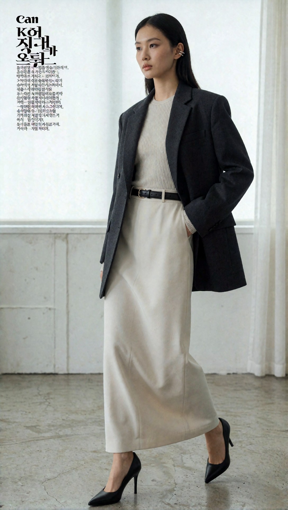
Inspect whether the skirt line stays clean and whether the blazer structure remains believable at the waist and shoulders. Also check if the top-left area stays usable for text instead of being cluttered by invented props or background noise.
Why this one led the pack
This setup produced the most reliable garment read. The 50mm full-body framing avoided the stretched limbs that showed up with wider virtual lenses, and the restrained studio location stopped the model from filling the scene with decorative architecture. It also preserved the quiet, polished feel that reads as Korean editorial rather than Western high-drama campaign imagery.
Fashion story layouts that stayed usable
Once the opener worked, the next issue was spread consistency. A single good hero frame is easy. A believable editorial sequence is harder because AI tends to vary styling logic from image to image unless the prompt keeps one anchor idea.
The anchor that worked best in this test was one styling system per story: same palette family, same accessory language, same garment silhouette logic, different pose and crop.
Prompt test 2: city lookbook spread with movement
This test checks motion, coat shape, and whether a street-location frame still feels premium enough for editorial use rather than casual influencer content.
Topic: Korean city fashion story with long outerwear and directional styling
Genre: Lookbook Photography
Camera: Sony A7R V
Lens: 85mm f/1.8
Lighting: Overcast daylight diffusion
Location: Garosu-gil side street with clean storefront glass and muted stone pavement
Style: Luxury fashion editorial
Final Prompt: Korean city fashion story photographed as a luxury editorial, model walking through a quiet Garosu-gil side street, full-body frame, long sand-colored trench coat moving naturally over a black sleeveless knit dress, knee-high leather boots, structured mini shoulder bag, oversized sunglasses in hand, polished low bun, composed editorial expression, subtle stride captured mid-step, clean storefront reflections, muted stone pavement, restrained Seoul luxury atmosphere, Sony A7R V look, 85mm f/1.8 compressed perspective, overcast daylight for soft tonal control, high-detail textile rendering, realistic coat movement, magazine-spread composition with generous side margin for copy, elegant neutral palette with black accents, premium Korean fashion editorial finish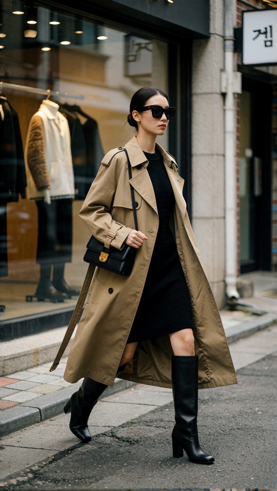
Inspect the hem of the trench and the boot proportions. If the model starts inventing extra pedestrians, bent storefront geometry, or impossible bag straps, the prompt is drifting away from editorial discipline.
Prompt test 3: menswear editorial with seated layout control
This one tests whether seated poses can preserve tailoring lines and accessories without producing broken wrists or collapsed jackets.
Topic: Korean menswear editorial spread with relaxed luxury tailoring
Genre: Fashion Editorial
Camera: Nikon Z8
Lens: 70mm f/2.8
Lighting: Window light with white bounce fill
Location: Boutique hotel lounge in Seoul with walnut paneling and stone side table
Style: Clean commercial luxury editorial
Final Prompt: A Korean menswear editorial spread inside a Seoul boutique hotel lounge, male model seated on a low modern sofa, relaxed luxury tailoring in deep navy double-breasted suit, soft cream silk camp-collar shirt slightly open at the neck, polished loafers, slim watch, no tie, one arm resting naturally on knee, composed gaze slightly off-camera, full look visible from chest to shoes, boutique hotel interior with walnut paneling, brushed brass lamp, stone side table, restrained luxury details, Nikon Z8 realism, 70mm f/2.8, soft window light with white bounce fill, crisp tailoring lines, believable lapel structure, premium Korean magazine layout with balanced negative space and quiet masculine styling, subtle warm-neutral color grading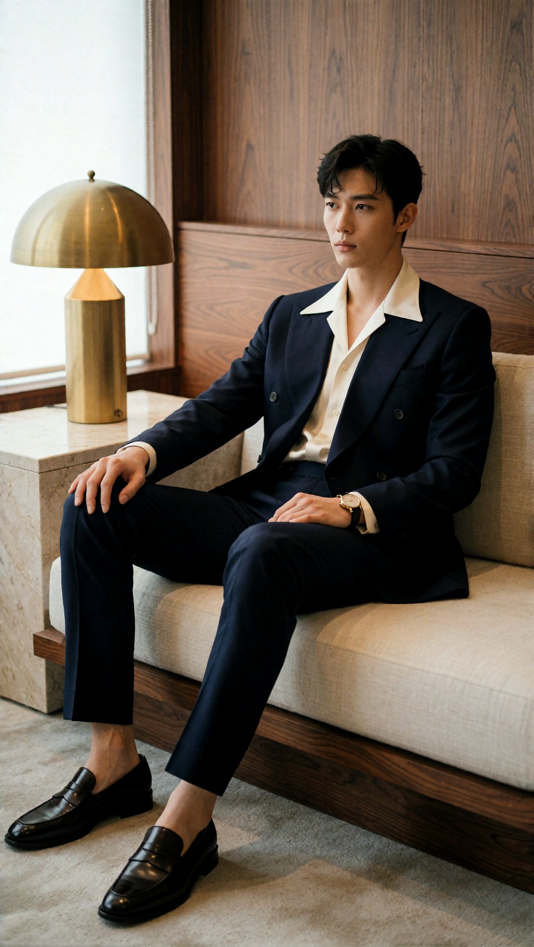
Check the lapel symmetry, hand shape, and whether the loafers remain readable. Seated menswear prompts often fail by bunching the jacket unnaturally or hiding one shoe, which weakens the spread.
What these fashion prompts taught me
The strongest result across fashion stories was not the most dramatic image. It was the image where the wardrobe hierarchy stayed legible:
1. outerwear shape 2. base garment texture 3. footwear 4. one or two accessories
When prompts listed too many jewelry items, mixed prints, or multiple props, the model started trading silhouette clarity for decorative clutter. For a korean magazine editorial look, that usually hurts more than it helps.
Beauty pages: stronger when treated as layout assets, not just close-ups
Beauty pages were the easiest place to lose the magazine feel. A generic beauty prompt often produces ad-like symmetry, glossy skin blur, and a centered composition that leaves no room for copy. In this test, better beauty pages came from asking for editorial asymmetry and visible material styling around the face: hair texture, collar shape, glove, earring, fabric edge.
Prompt test 4: beauty page with copy space and skin texture
This prompt checks if the model can deliver refined skin, controlled makeup, and a composition that still has room for editorial text.
Topic: Korean beauty editorial page with luminous skin and modern styling detail
Genre: Beauty Campaign
Camera: Fujifilm GFX100 II
Lens: 110mm f/2
Lighting: Studio butterfly light with soft silver reflector
Location: Seamless warm-gray beauty set
Style: High-end beauty advertising with Korean editorial restraint
Final Prompt: Korean beauty editorial page featuring a model with luminous natural skin texture, polished straight hair tucked behind one ear, soft taupe eye makeup, muted rose lip, sculptural ivory collar framing the jawline, single pearl-drop earring, close-up portrait cropped from upper torso, head slightly turned, eyes calm and direct, negative space to the right for editorial copy, seamless warm-gray beauty set, refined Korean magazine beauty direction, Fujifilm GFX100 II detail rendering, 110mm f/2 shallow depth of field, studio butterfly light with soft silver reflector, clean catchlights, realistic pores, no plastic skin smoothing, minimal palette of ivory gray rose and pearl, premium print-beauty composition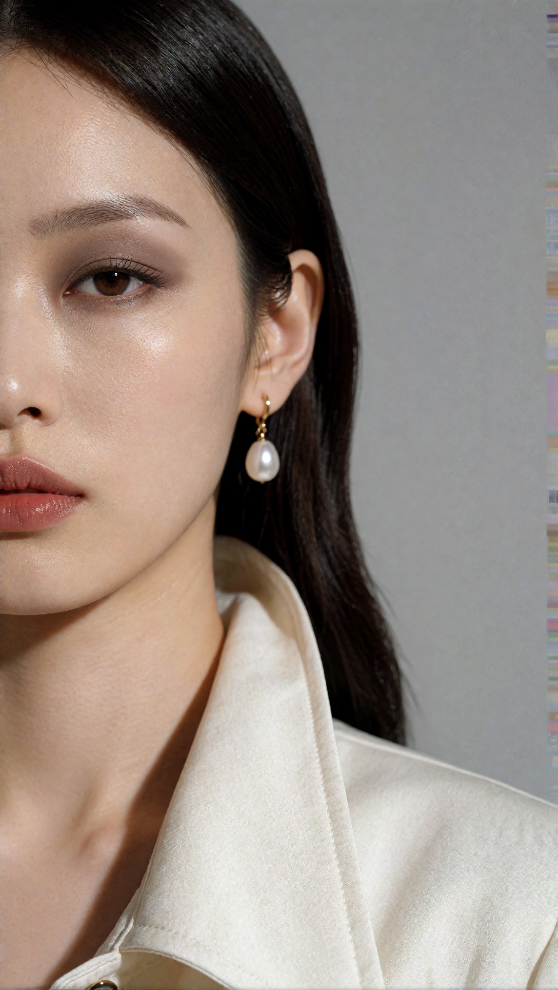
Inspect the skin rendering first, then the ear, earring attachment, and collar edge. If those small structural details are wrong, the image may still look attractive at thumbnail size but will collapse on a magazine page.
Prompt test 5: beauty-fashion hybrid for accessory-led pages
This test is meant to see whether the image can support both makeup storytelling and accessory emphasis without defaulting into jewelry advertising.
Topic: Korean editorial beauty portrait with statement earrings and satin styling
Genre: Fashion Editorial
Camera: Hasselblad X2D 100C
Lens: 90mm f/2.5
Lighting: Soft side key light with gentle shadow falloff
Location: Dusty blush studio backdrop with satin plinth edge visible
Style: Korean magazine beauty-fashion crossover
Final Prompt: Korean editorial beauty portrait for a magazine beauty-fashion page, model framed from waist up, wearing a black satin off-shoulder top and statement sculptural gold earrings, sleek low ponytail, radiant skin with softly defined brows and satin-finish lips, elegant neck extension, one hand lightly touching collarbone, gaze slightly past camera, dusty blush backdrop with a subtle satin plinth edge adding set design context, Hasselblad X2D 100C realism, 90mm f/2.5, soft side key light with gentle shadow falloff, luxurious but restrained Korean editorial styling, balanced composition with negative space at top and left, premium fabric sheen, believable jewelry reflections, quiet upscale color palette of black blush gold and warm skin tones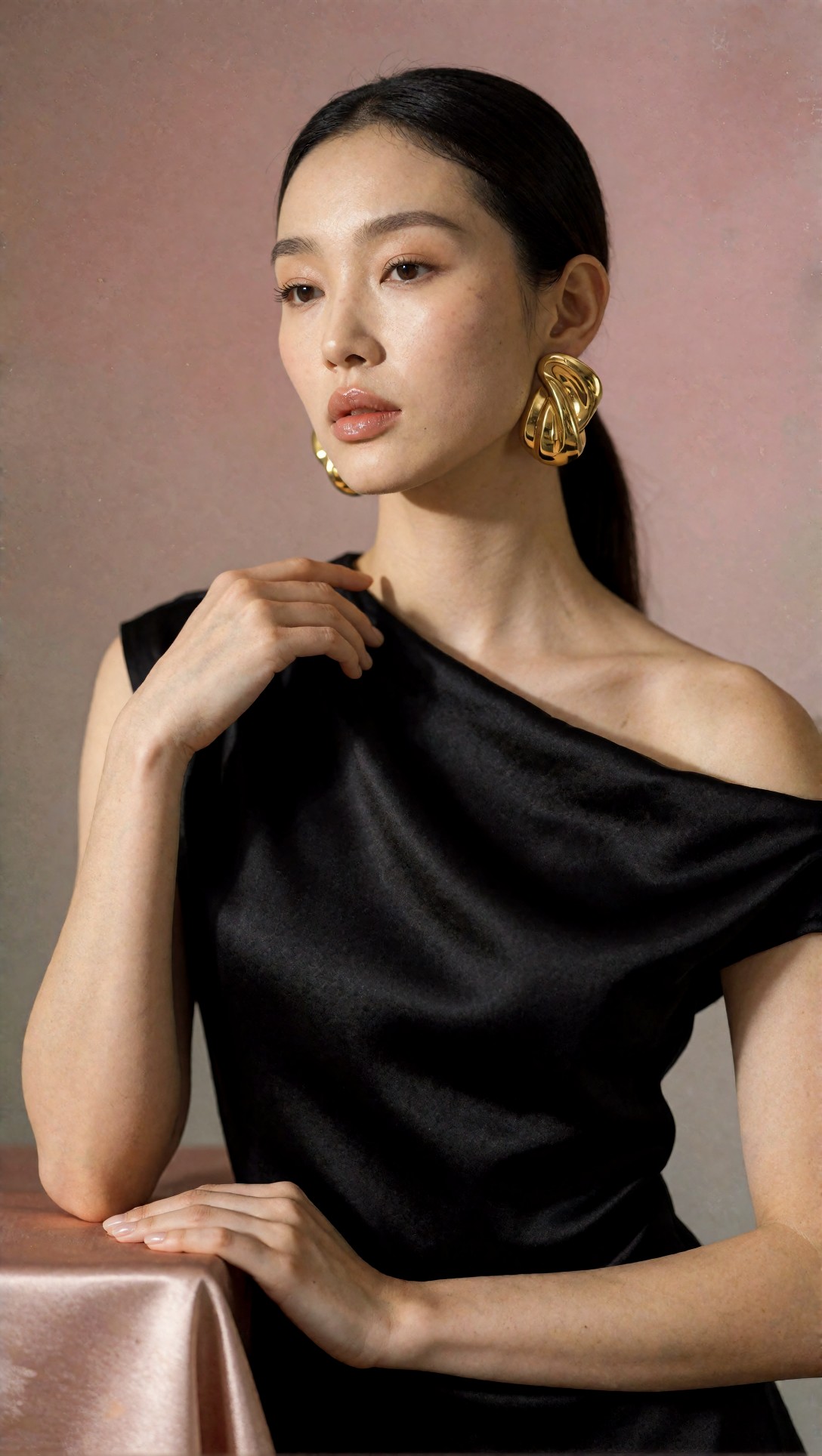
Check for hand tension and whether the earring shape remains consistent on both sides. This kind of image often fails when one accessory mutates or when satin fabric turns into liquid-looking texture.
Why these beauty prompts worked better
In this test, beauty outputs improved when I stopped asking for “perfect skin” and instead asked for realistic skin texture under controlled light. That wording mattered. “Perfect” often triggered waxy smoothing. “Realistic pores” and “luminous natural skin texture” kept the beauty feel premium without becoming synthetic.
The other useful change was adding a styling frame around the face. Collar, top edge, glove, earring, or hair shape gave the page a fashion-editorial identity. Without that, the results skewed toward skincare ad imagery.
Luxury product spreads: easiest to control, hardest to make expensive
Luxury product images were structurally more stable than human subjects, but they had a different weak point: they looked like polished e-commerce unless the prompt explicitly requested editorial staging, layered surfaces, and believable reflection behavior.
The strongest product images used two-material environments instead of one. For example, lacquer plus stone, mirror plus silk, brushed metal plus paper. That gave the spreads depth without making them noisy.
Prompt test 6: fragrance spread with controlled reflections
This setup checks glass edges, liquid realism, reflection control, and whether the set feels like a magazine spread rather than a direct-response product ad.
Topic: Korean luxury fragrance editorial spread with sculptural still life
Genre: Product Editorial
Camera: Phase One XF IQ4
Lens: 120mm macro f/4
Lighting: Narrow strip softbox and diffused top light
Location: Black lacquer surface with pale travertine slab backdrop
Style: Luxury product editorial
Final Prompt: Korean luxury fragrance editorial spread featuring a rectangular glass perfume bottle with smoked amber liquid, brushed silver cap, minimalist Korean label design, arranged on a glossy black lacquer surface beside a pale travertine slab, faint reflection visible but controlled, subtle condensation-free glass clarity, folded charcoal silk ribbon, editorial negative space above and to the right for typography, Phase One XF IQ4 product precision, 120mm macro f/4, narrow strip softbox with diffused top light, sculptural still life composition, premium shadows, realistic specular highlights, no clutter, luxury magazine product-spread styling, palette of black stone silver smoke and amber, hyper-detailed bottle edges and refined print-magazine finish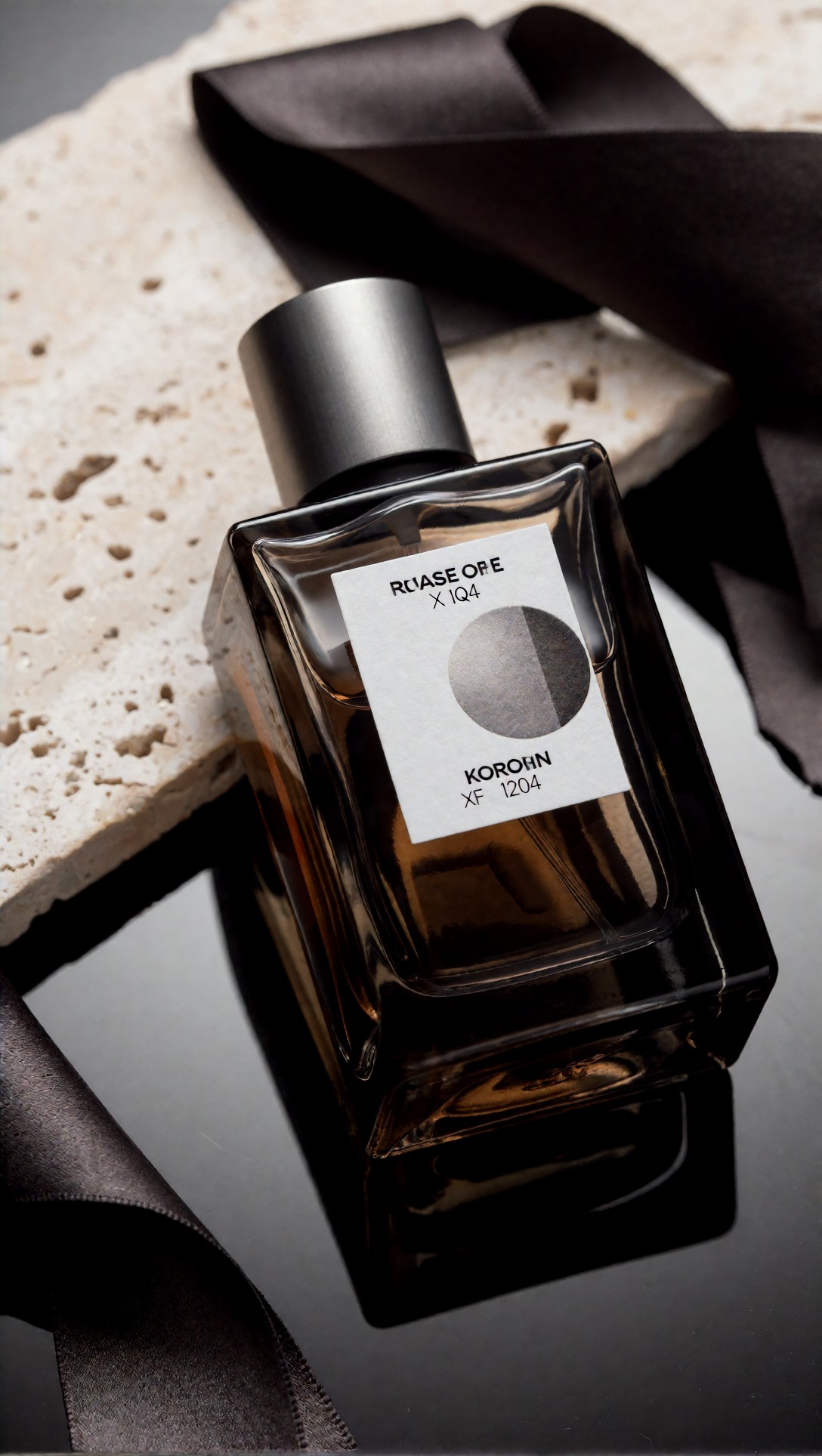
Inspect the bottle corners, label alignment, and reflection length. If the reflection doubles oddly or the label text warps too much, the image will lose the expensive editorial read.
Prompt test 7: handbag spread with tactile material layering
This test focuses on leather grain, hardware reflections, and whether the composition can sell a luxury object without showing a model.
Topic: Korean luxury handbag editorial still life for fashion magazine spread
Genre: Luxury Campaign
Camera: Leica SL2-S
Lens: 75mm f/2
Lighting: Soft directional window light with black flag contrast control
Location: Cream paper backdrop with brushed stainless pedestal and folded oatmeal linen
Style: Clean commercial look with Korean editorial minimalism
Final Prompt: Korean luxury handbag editorial still life designed for a fashion magazine spread, medium-sized structured ivory leather handbag with brushed gold clasp, placed on a brushed stainless pedestal over folded oatmeal linen, cream paper backdrop curving softly behind the set, bag angled three-quarters toward camera, handle upright and symmetrical, subtle shadow pool, editorial negative space on left side for headline placement, Leica SL2-S realism, 75mm f/2, soft directional window light with black flag contrast control, tactile leather grain, believable brushed metal reflections, restrained Korean editorial minimalism, palette of cream oatmeal stainless gold and soft gray, premium luxury campaign quality without storefront styling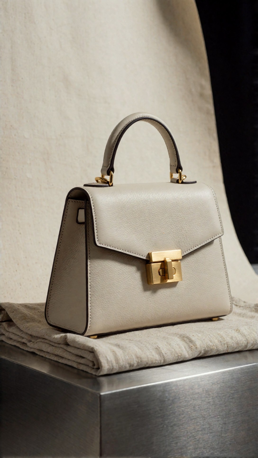
Inspect the bag handle symmetry and clasp geometry first. AI often renders luxury bags attractively at a glance but fails on hardware logic, stitching rhythm, or impossible strap joins.
Prompt test 8: beauty product flat-lay alternative with magazine discipline
This one checks whether a semi-top-down composition can stay editorial and avoid becoming a social-media flat lay.
Topic: Korean skincare editorial layout with premium product arrangement
Genre: Product Editorial
Camera: Canon EOS R3
Lens: 35mm f/4 tilt-shift look
Lighting: Soft overhead diffusion with narrow edge light
Location: Frosted acrylic surface layered with white handmade paper and pale stone tile
Style: Korean beauty campaign editorial
Final Prompt: Korean skincare editorial layout for a magazine beauty page, premium serum bottle and cream jar arranged on frosted acrylic layered with torn white handmade paper and a pale stone tile, semi-top-down composition with disciplined geometry, soft mint glass dropper, white cap, clean Korean packaging style, tiny water droplets placed sparingly, no splash effects, soft shadows and clear object separation, Canon EOS R3 visual character with 35mm f/4 tilt-shift look, soft overhead diffusion with narrow edge light, elegant beauty-campaign editorial direction, generous lower-right negative space for product notes, restrained palette of white pale stone mint and silver, precise material rendering, luxury print-spread finish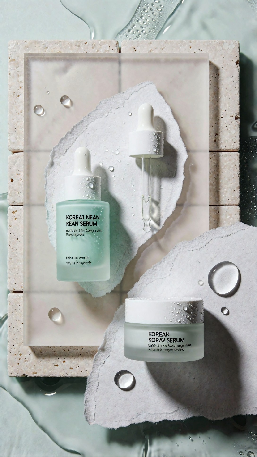
Inspect spacing between objects and the shadow direction. If the droplets multiply, packaging edges soften, or the top-down angle becomes too flat, the image starts reading as social content rather than editorial layout.
Where the output struggled
The weak point across all three categories was layout intelligence. The models could create attractive images, but they did not naturally understand magazine page logic unless it was described.
The recurring failures were:
- face bias in fashion prompts: the crop drifted upward and sacrificed shoes or hemline
- over-smoothing in beauty prompts: skin became plastic when the wording emphasized perfection
- cheap-looking product scenes: too many props, glossy fake reflections, and floating objects
- text-space contamination: the “negative space” area got filled with shadows, decor, or folded garments
- styling inconsistency across a set: a story prompt changed from minimal tailoring to random trend layering between generations
- hand and accessory instability: especially with earrings, bag handles, fingers near the face, and rings
Another issue was regional styling drift. If I only said “fashion editorial” without specifying the Korean magazine context, some generations shifted toward Paris runway drama or US commercial campaign polish. The Korean editorial read became more reliable when I named Seoul locations, controlled palette, clean styling systems, and quieter pose language.
What I would change next
If I were refining this workflow for production, I would make five prompt changes earlier instead of later.
1. Add page role before subject
Use wording like:
- opening spread
- beauty page
- cover-safe portrait
- product spread
- lookbook insert
This helped the model decide composition before decoration.
2. Specify visible garment checkpoints
For fashion frames, include:
- full-body composition
- visible footwear
- hemline clear
- outerwear shape preserved
Without these, the model often “improves” the image by cropping too tightly.
3. Limit prop count in luxury scenes
Two or three support materials were enough. More than that reduced the expensive feel and increased reflection errors.
4. Ask for realistic texture, not idealized perfection
Best phrases in this test:
- realistic skin texture
- precise textile detail
- believable brushed metal reflections
- clear glass edges
- controlled shadow falloff
These consistently outperformed generic quality terms.
5. Lock the palette
A short palette note made the set feel more editorially coherent:
- charcoal, ivory, silver
- black, blush, gold
- cream, oatmeal, stainless, gold
That simple control reduced visual drift more than adding extra style adjectives.
Recommended workflow settings and prompt habits
I would recommend this setup when the goal is editorial usability, not just one attractive image.
For fashion stories
- choose 50mm to 85mm equivalents for cleaner silhouette behavior
- explicitly request full-body or mid-length composition
- keep one clear styling system per story
- ask for side margin or top margin negative space
- avoid combining runway, street style, campaign, and beauty language in one prompt
For beauty pages
- use longer portrait lenses for cleaner facial geometry
- request visible skin texture and one styling frame element
- keep makeup direction specific but short
- prefer asymmetrical composition over centered ad layouts
- inspect ears, jewelry joins, fingers, and collar edges at full size
For product spreads
- use macro or near-macro language for edge precision
- define reflection behavior
- work with two-material sets instead of prop-heavy scenes
- request editorial negative space by location in the frame
- inspect labels, caps, symmetry, and shadow logic before approving
Quick quality checklist based on this test
Before keeping a korean magazine editorial image, I would check:
- Is the page purpose obvious at a glance?
- Can I clearly read the garment silhouette or product form?
- Is there clean, usable space for text?
- Do materials look believable at close inspection?
- Are hands, earrings, straps, and hardware structurally correct?
- Does the palette feel coherent across the set?
- Does the image read as editorial, not e-commerce or influencer content?
- Is the Korean magazine direction visible through restraint, styling, and set control rather than stereotypes?
When this setup works, and when it does not
This approach works best for art directors, prompt operators, fashion marketers, beauty teams, and brand designers who need layout-ready editorial images with a clear publishing role. It is especially useful when building fashion campaign prompt sets, Korean beauty campaign mockups, lookbook photography concepts, or luxury fashion editorial pages that need consistent styling logic across multiple images.
It is less useful if you want highly chaotic runway fantasy, dense avant-garde set design, or image sets that rely on heavy narrative action. In this test, the workflow was strongest when the frame stayed composed and the styling hierarchy stayed readable.
The setting that mattered most was not the camera name or even the lens. It was the prompt detail that told the model what the page is for. Once the image knew it was an opening spread, a beauty page, or a luxury product layout, the rest of the editorial choices became easier to control. If I had to keep only one habit from this test, it would be that: prompt the publishing function first, then the fashion or product details second.