If you are looking for a photo enhancer AI for blurry images, the short version is this: AI can make a blurry photo look cleaner and more usable, but it usually does not restore real focus. In this test, the best results came from tools and workflows that treated blur as a recovery problem first and an upscaling problem second. The weakest results were the ones that added crisp-looking pores, hair strands, bricks, or text edges that were never actually present in the source.
For most users, the practical choice is not "which AI makes blur disappear," but which AI makes the image more readable without inventing too much false detail. That distinction matters a lot for faces, product shots, text, and old phone photos.
Quick answer
- Mild blur can often be improved by AI sharpening plus restrained denoise and a small upscale.
- Heavy motion blur rarely becomes truly sharp; the best tools make it look cleaner, not magically focused.
- Face recovery models help portraits, but they can change identity if pushed too hard.
- If text, logos, or product labels matter, aggressive enhancement often creates fake edges and wrong letters.
- The safest workflow is usually: blur reduction first, then selective upscale, then manual comparison at 100% zoom.
What I tested and how I judged it
I compared two main approaches:
- Option A: all-in-one photo enhancer AI workflow using an enhancer/upscaler style pipeline similar to what people use in an [AI upscaler workflow](/upscaler)
- Option B: controlled recovery workflow with lighter sharpening, selective face recovery, and smaller output changes, similar to testing and iteration workflows in [PromptLab](/promptlab)
I used four image types that usually expose the limits of a fix blurry photo AI tool:
1. A handheld portrait with slight focus miss on the eyes 2. A low-light indoor phone photo with noise and motion blur 3. A product image with small label text and glossy edges 4. A street scene with distant signs, brick texture, and foliage
Comparison criteria
I judged each result on:
| Test criterion | What I checked | Why it matters | |---|---|---| | Real focus recovery | Did edges become genuinely clearer or just more contrasty? | Prevents fake sharpness | | Texture honesty | Did skin, hair, fabric, and walls look plausible? | AI often invents detail here | | Face stability | Did identity stay intact? | Portrait fixes can drift fast | | Text accuracy | Were letters improved or rewritten? | Important for products and documents | | Noise handling | Did cleanup remove blur or just smear it? | Denoise can hide failure | | Output usability | Would I actually publish, print, or share it? | Practical result over demo effect |
The biggest lesson from the test: perceived sharpness and true recovered detail are not the same thing.
The plain-language verdict before the details
Option A gave the most immediate before/after improvement on casual viewing. At phone-screen size, it often looked impressive. Edges popped more, faces looked cleaner, and the image felt "saved."
But at 100% zoom, Option A also produced the most fake detail. Hair split into invented strands, eyelashes became too regular, fabric weave appeared where none existed, and text sometimes turned into confident nonsense.
Option B looked less dramatic at first glance, but it kept more believable structure. It was the stronger choice when I wanted a blurry image to look improved without pretending it had been perfectly focused in-camera.
Option A: when an all-in-one AI image enhancer blur workflow works well
This is the workflow most people try first: upload the image, choose sharpen or enhance, maybe add face recovery, then upscale 2x or 4x.
Its strength is speed. For mild softness, compressed phone photos, or social posting, this kind of enhancer often gives the fastest acceptable result.
Where it performed best
- Slightly soft portraits
- Travel photos that only need cleaner edges for sharing
- Old low-resolution images where "better looking" matters more than forensic accuracy
- Background-heavy scenes where viewers will not inspect every pixel
The strongest result here was a daylight portrait with minor focus miss. Option A improved eye contrast, separated hair from background, and reduced muddy skin transitions. At normal viewing size, it looked like a better-captured photo.
The weak point was fine inspection. The iris detail was partly synthetic, lashes became too graphic, and skin pores appeared more defined than the source justified.
To test whether a portrait enhancer is recovering detail or fabricating it, I used prompts that create delicate eye and hair structure. These are the areas where fake sharpening shows up fastest.
Topic: slightly soft outdoor portrait with natural hair detail
Genre: lifestyle portrait
Camera: Canon EOS R5
Lens: 85mm f/1.8
Lighting: overcast diffusion
Location: quiet city park with pale stone walkway and soft green background
Style: clean commercial look
Final Prompt: a candid outdoor portrait of a woman in a charcoal wool coat and cream knit top, standing on a pale stone walkway in a quiet city park, slight breeze moving loose hair around her face, calm neutral expression, direct eye contact, overcast diffused light, natural skin texture, soft green trees blurred in the background, realistic eyelash detail, subtle flyaway hair, clean commercial portrait composition, Canon EOS R5 look, 85mm f/1.8 depth falloff, muted natural color palette, believable photographic sharpness without overprocessing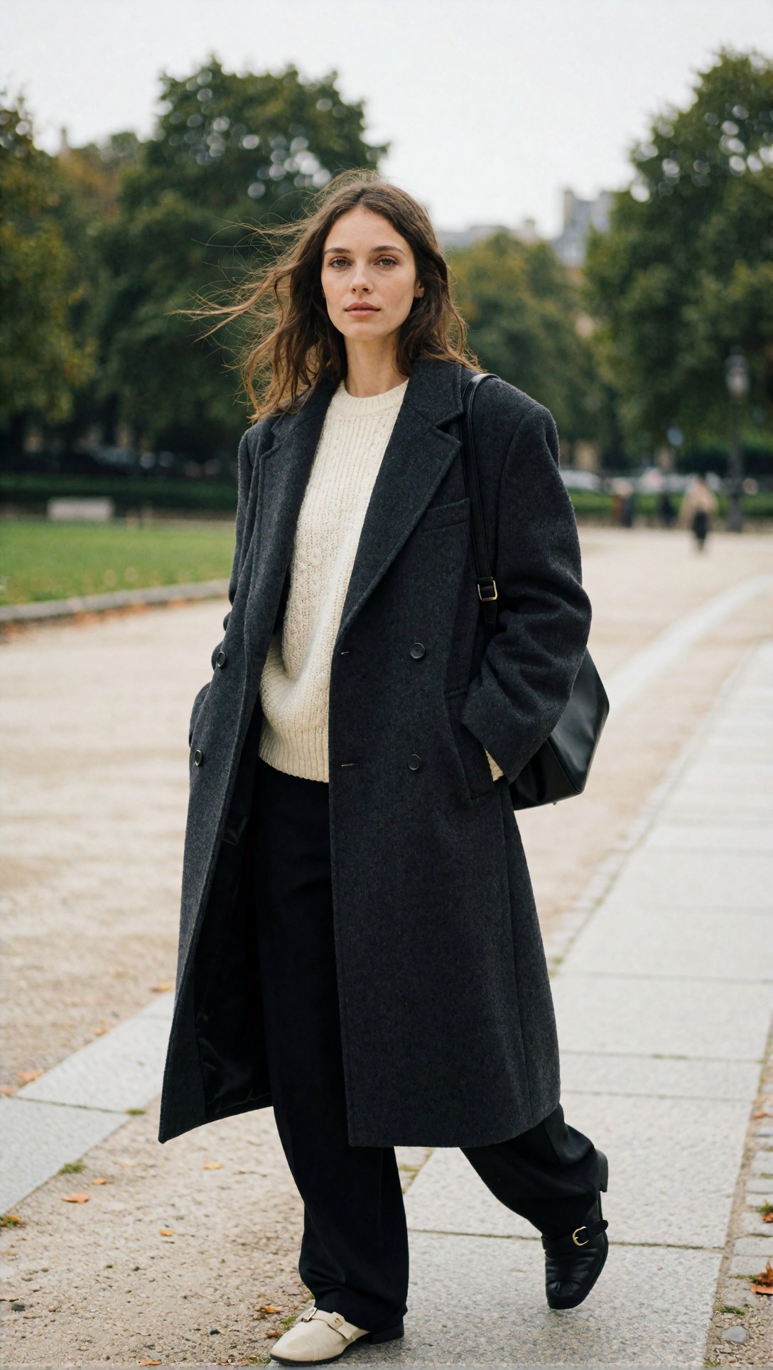
Inspect the eyes, stray hairs, and transitions along the jawline. A weak photo enhancer AI blurry image workflow will often make these areas look etched rather than optically resolved.
For low-light portraits, I also tested how enhancement handled blur mixed with noise. This is where many tools hide blur under aggressive cleanup.
Topic: low-light indoor portrait with slight motion blur risk
Genre: beauty campaign
Camera: Sony A7 IV
Lens: 50mm f/1.4
Lighting: tungsten practicals with softbox fill
Location: small apartment kitchen at night
Style: cinematic realism
Final Prompt: a low-light indoor portrait of a woman leaning against a compact apartment kitchen counter at night, black satin blouse, minimal jewelry, subtle tired expression, warm tungsten practical lights in the background, softbox fill shaping the face, slight handheld realism, reflective kettle and tiled backsplash, natural skin, dark brown hair with gentle texture, cinematic realism, Sony A7 IV look, 50mm f/1.4 shallow depth, warm amber and deep shadow palette, authentic detail retention in low-light conditions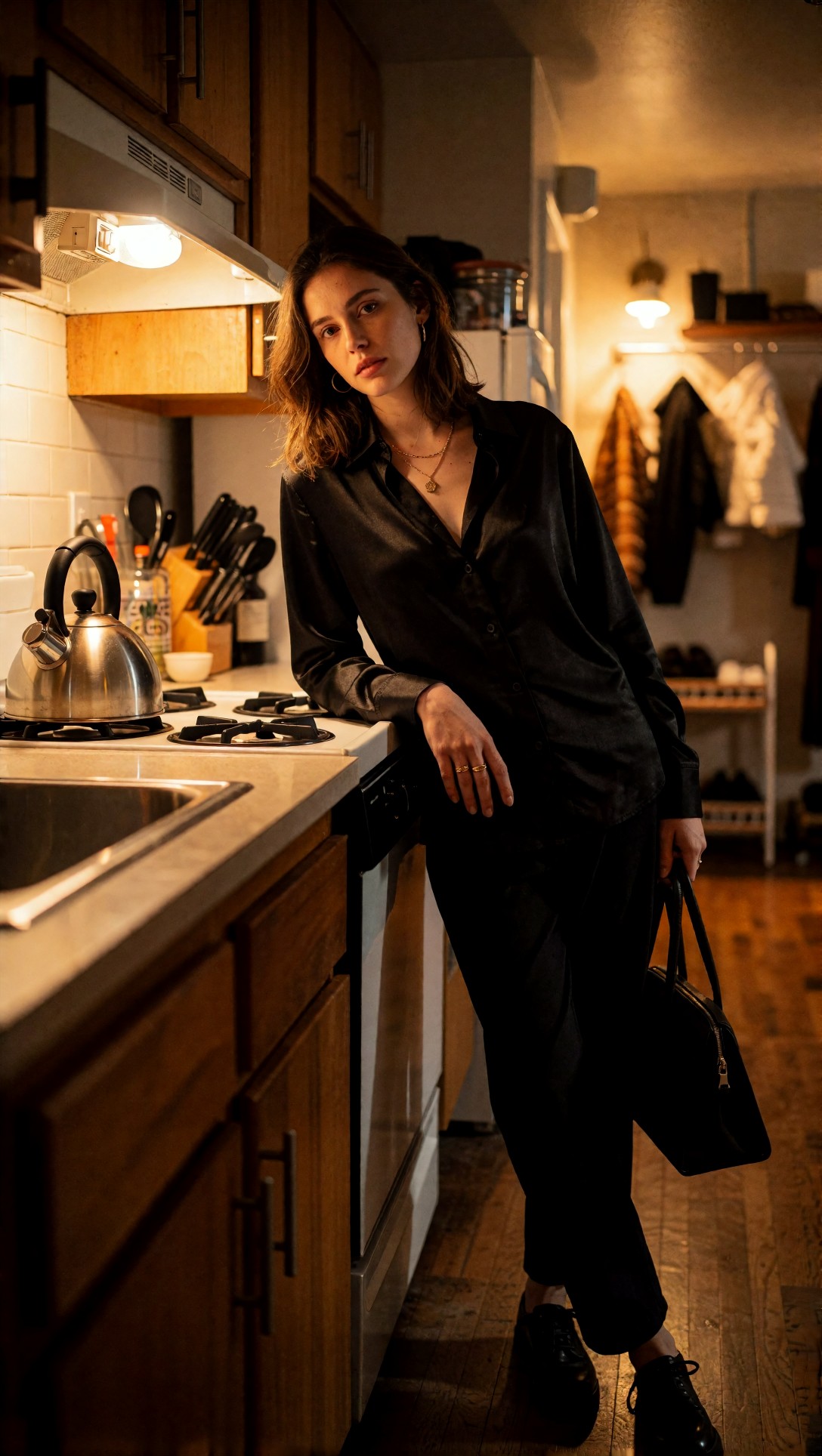
Check whether the enhanced output preserves skin texture and hair direction or replaces them with plastic smoothness plus artificial edge halos. If the face looks cleaner but less human, the tool is faking confidence.
What Option A gets wrong
The main failure mode is confusing sharpness with micro-contrast. Many enhancers darken and brighten tiny edges to create a crisp impression. It looks good from a distance, but it does not mean the image is truly back in focus.
I saw three repeat problems:
1. Hallucinated skin and hair texture on portraits 2. Incorrect lettering on labels and signs 3. Crunchy high-frequency detail in brick, leaves, or fabric
This makes Option A risky for evidence, documentation, resale product photos, or any image where accuracy matters more than visual punch.
Option B: the more controlled fix blurry photo AI workflow
Option B was less flashy, but more reliable. Instead of asking one model to solve everything, I got better output by keeping each step restrained:
1. Mild blur reduction or sharpening 2. Light denoise only if needed 3. Face recovery only on actual portraits 4. Small upscale, usually 2x instead of 4x 5. Manual compare against the original
This workflow is less satisfying in a dramatic slider demo. But in this test, it produced more believable results across mixed subjects.
Where it performed best
- Portraits where identity mattered
- Product images with logos or labels
- Street scenes with architectural lines
- Images that were only moderately blurry, not destroyed
The strongest result was a product shot with slightly soft edges and small printed text. Option B did not fully restore every character, but it improved readability without turning the label into fake typography.
To expose this difference, I used a product prompt with reflective materials, typography, and fine edge transitions.
Topic: slightly blurred cosmetic product with small label text
Genre: product editorial
Camera: Nikon Z7 II
Lens: 105mm macro f/2.8
Lighting: softbox key light with controlled rim light
Location: clean studio tabletop with reflective acrylic base
Style: high-end beauty advertising
Final Prompt: a premium glass serum bottle with a silver cap standing on a reflective acrylic base in a clean studio, pale beige and silver color palette, small printed label text on the bottle, softbox key light from camera left, controlled rim light defining edges, faint reflection below the product, minimal luxury composition, Nikon Z7 II look, 105mm macro f/2.8 precision, realistic glass highlights, crisp but believable typography area, high-end beauty advertising aesthetic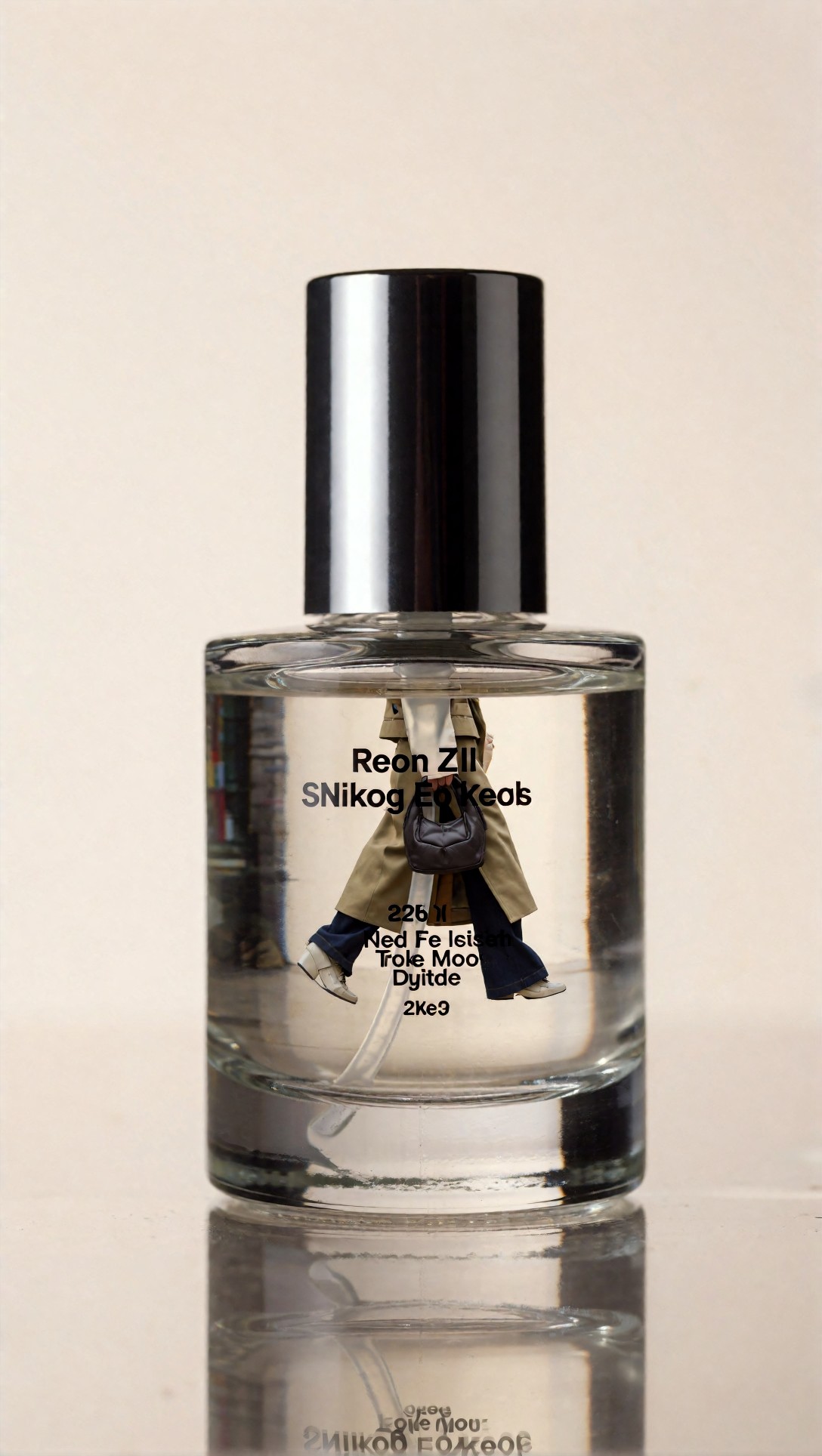
Inspect the bottle edges, cap reflections, and especially the printed label. If an AI image enhancer blur tool "improves" text by inventing cleaner but wrong characters, that is not restoration.
I also tested architectural detail because brick, windows, and signs often trigger false texture. Controlled enhancement stayed softer, but more honest.
Topic: urban street scene with distant signs and brick texture
Genre: cinematic travel
Camera: Fujifilm GFX100S
Lens: 45mm f/2.8
Lighting: cloudy afternoon light
Location: narrow European side street with cafes and old brick facades
Style: documentary realism
Final Prompt: a narrow European side street lined with cafes and old brick facades, pedestrians in coats, distant shop signs, bicycles against walls, wet pavement reflecting soft cloudy afternoon light, documentary realism, balanced composition with deep perspective, Fujifilm GFX100S look, 45mm f/2.8 medium-format rendering, realistic brick texture, legible but not exaggerated signage, muted earth tones and cool grays, natural travel photography atmosphere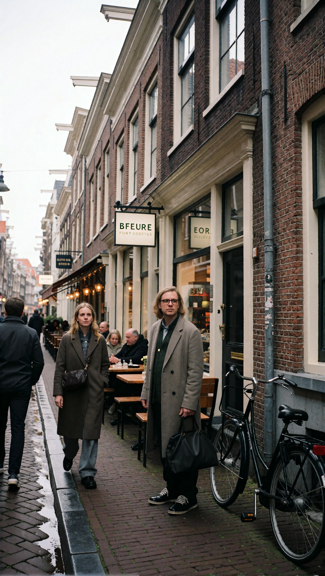
Look closely at the signs, mortar lines, and repeating window details. Fake enhancement often makes these textures too uniform, as if every surface was redrawn with the same pattern.
Why Option B held up better
The controlled approach accepted a basic truth: if the source is badly blurred, the job is not to manufacture certainty. It is to recover enough structure that the photo becomes usable again.
That means some final images still looked a little soft. In this test, that was often the correct result.
Side-by-side tradeoffs: what actually improved vs what just looked sharper
Here is the practical difference I saw repeatedly.
Option A strengths
- Faster one-click improvement
- Better immediate wow factor
- Useful for casual social sharing
- Good for old low-res images where realism is already limited
Option A risks
- Invented eyelashes, pores, hair, foliage, and fabric texture
- Wrong letters on text-heavy images
- Oversharpened halos around edges
- Face drift with strong restoration settings
Option B strengths
- Better texture honesty
- More stable faces
- Safer for products, architecture, and documentary-style images
- Fewer bizarre artifacts when upscaling
Option B risks
- Less dramatic before/after
- Can leave blur partially visible
- Requires more user judgment
- Slower workflow than one-click enhancement
A simple checklist for judging a sharpen blurry image online result
Before you accept an output, zoom in and check these five areas:
- Eyes: are lashes and irises plausible, or too regular?
- Hair: does it follow natural direction, or break into fake strands?
- Text: are letters genuinely clearer, or rewritten?
- Edges: do high-contrast borders show halos?
- Texture: do walls, skin, fabric, and leaves all get the same crunchy treatment?
If three or more of those fail, the image is probably only performing sharpness.
Prompt examples that exposed the difference most clearly
The next tests were useful because they force enhancer models to deal with common blur traps: hands, fabric texture, reflective surfaces, layered depth, and mixed lighting.
For portraits with hands near the face, I wanted to see whether enhancement preserved anatomy and skin texture together. Many systems sharpen fingers into awkward shapes.
Topic: fashion portrait with hand near face and soft fabric detail
Genre: fashion editorial
Camera: Leica SL2-S
Lens: 90mm f/2
Lighting: studio butterfly light with soft fill
Location: seamless warm gray studio backdrop
Style: Korean magazine cover
Final Prompt: a refined fashion portrait of a model wearing a structured ivory blazer over a black silk camisole, one hand gently raised near the cheek, composed expression, studio butterfly light with soft fill, warm gray seamless backdrop, glossy magazine framing, subtle skin texture, realistic finger anatomy, soft fabric folds and lapel detail, Leica SL2-S look, 90mm f/2 portrait compression, polished Korean magazine cover style, controlled neutral palette with elegant contrast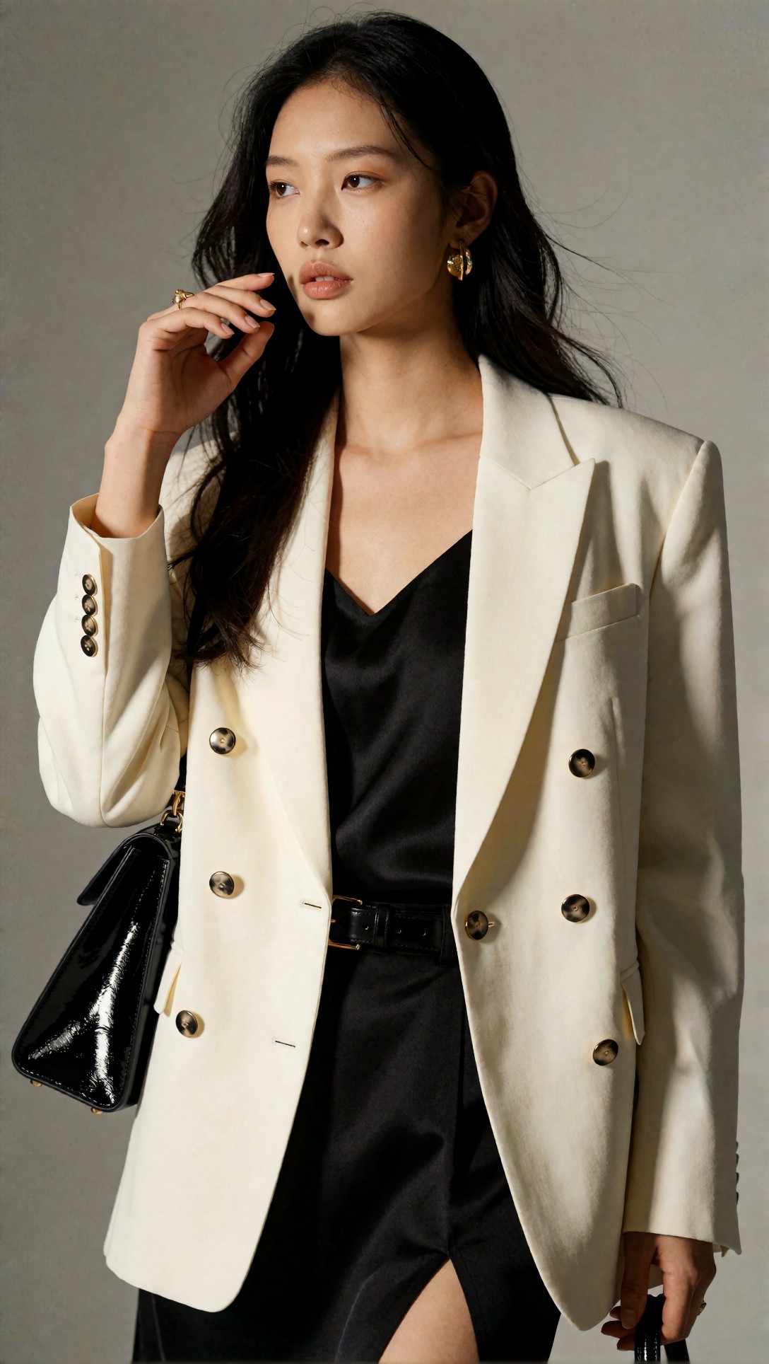
Inspect fingers, knuckles, cheek edge, and blazer texture. The stronger workflow keeps these areas believable rather than turning them into brittle lines.
For layered backgrounds, I used foliage and fencing because AI often sharpens both into repeating texture soup.
Topic: backyard portrait with chain-link fence and leafy background
Genre: street style
Camera: Panasonic Lumix S5II
Lens: 70mm f/2.8
Lighting: late afternoon side light
Location: suburban backyard with chain-link fence and dense summer plants
Style: natural editorial realism
Final Prompt: a casual street-style portrait of a man in a faded denim jacket over a white tee, standing beside a chain-link fence in a suburban backyard, dense summer plants behind him, relaxed posture, thoughtful expression, late afternoon side light, realistic skin and beard texture, visible fence geometry, layered background depth, Panasonic Lumix S5II look, 70mm f/2.8 framing, natural editorial realism, earthy greens and blue denim tones, believable photographic detail without artificial crispness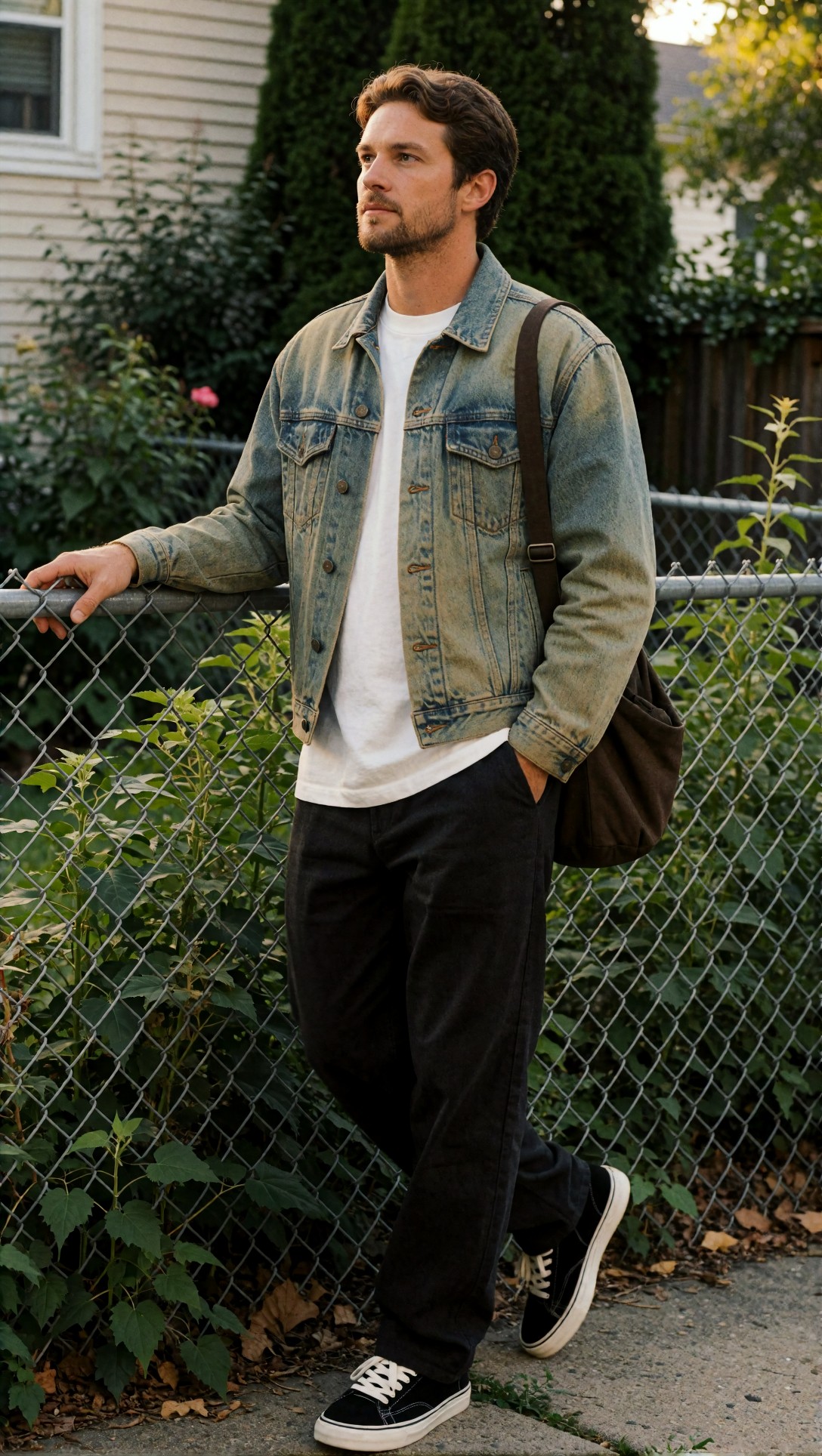
Check the fence pattern and leaf clusters. If they suddenly look uniformly etched, the enhancer is likely inventing texture instead of recovering it.
For indoor scenes, mixed lighting usually reveals whether a tool is truly solving blur or just masking it with denoise and contrast.
Topic: restaurant table scene with glassware and menu text
Genre: lifestyle portrait
Camera: Canon EOS R6 Mark II
Lens: 35mm f/1.8
Lighting: mixed candlelight and window spill
Location: intimate bistro interior
Style: cinematic lifestyle campaign
Final Prompt: a candid restaurant table scene with a woman seated beside glassware, folded menu, and plated pasta, dark green blouse, relaxed half-smile, mixed candlelight and soft window spill shaping the scene, intimate bistro interior with textured walls, shallow depth but realistic object separation, Canon EOS R6 Mark II look, 35mm f/1.8 environmental framing, cinematic lifestyle campaign mood, warm amber highlights and cool shadow balance, believable menu typography area and reflective glass detail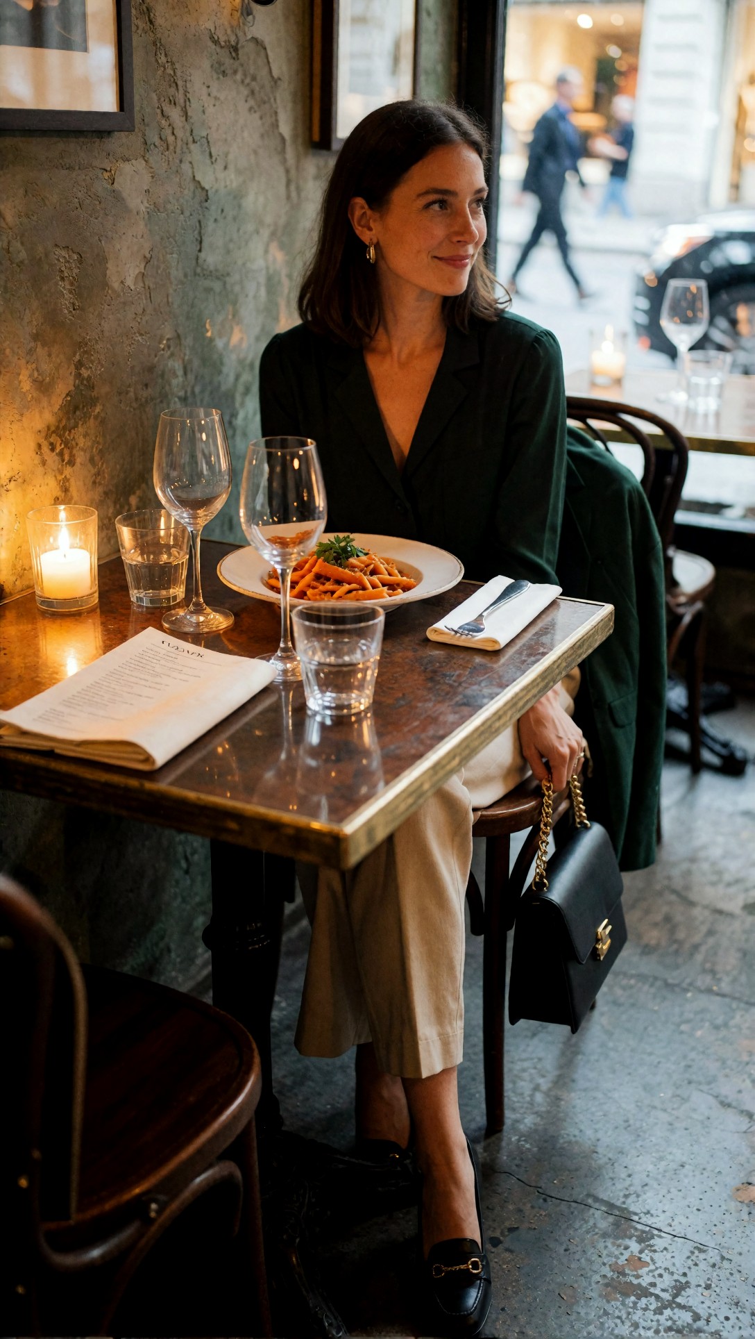
Inspect menu text, glass reflections, and the boundary between shadowed and lit skin. A weak fix blurry photo AI tool often smooths this into a waxy compromise.
For old phone photos, I wanted to see whether the enhancer could improve readability without making the image look synthetic. Family-photo style images are where many people accept some softness if faces stay recognizable.
Topic: old smartphone family snapshot in a living room
Genre: documentary family photo
Camera: iPhone 11 capture style
Lens: 26mm equivalent f/1.8
Lighting: window light with dim interior practicals
Location: small living room with sofa, framed photos, and patterned rug
Style: honest home-photo realism
Final Prompt: an informal family snapshot in a small living room, two adults and a child sitting close together on a sofa, patterned rug, framed photos on the wall, casual sweaters and jeans, natural smiles, soft window light mixed with dim interior practicals, iPhone 11 capture style, 26mm equivalent perspective, honest home-photo realism, natural skin tones, slight smartphone tonal compression, believable household detail and familiar lived-in atmosphere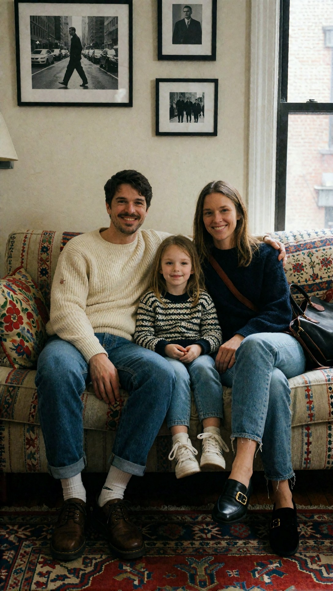
Inspect facial identity and background objects like frames, rug patterns, and fabric edges. The best enhancement keeps the memory intact instead of redrawing everyone into AI versions of themselves.
For texture-heavy clothing, I tested whether enhancement separated garment weave from skin and background correctly. This matters for resale, catalog prep, and editorial fashion crops in the [gallery](/gallery).
Topic: knitwear close portrait with visible textile texture
Genre: fashion editorial
Camera: Hasselblad X2D 100C
Lens: 80mm f/1.9
Lighting: north-window soft light
Location: loft studio with pale plaster wall
Style: luxury campaign
Final Prompt: a close portrait of a model wearing a thick oatmeal cable-knit sweater and small gold hoop earrings, seated near a pale plaster wall in a loft studio, calm expression, hair tucked behind one ear, north-window soft light wrapping across the face and knitwear, Hasselblad X2D 100C look, 80mm f/1.9 medium-format portrait rendering, luxury campaign styling, creamy neutrals and warm skin tones, realistic textile definition, natural pores, elegant depth separation without oversharpening
Look at cable-knit edges, pores, and hairline transitions. If all three gain identical crispness, the tool is applying a generic texture recipe rather than image-specific recovery.
Finally, I tested a difficult night street image because blur, noise, signage, and neon reflections expose almost every weakness at once.
Topic: rainy night street with neon signs and moving pedestrians
Genre: cinematic travel
Camera: Sony A7S III
Lens: 35mm f/1.4
Lighting: neon rim light with wet street reflections
Location: busy alley in Seoul at night
Style: moody cinematic realism
Final Prompt: a rainy night alley in Seoul with neon signs, moving pedestrians carrying umbrellas, wet pavement reflecting magenta, cyan, and amber light, food stalls and narrow storefronts, one subject in a dark trench coat pausing near frame center, moody cinematic realism, Sony A7S III look, 35mm f/1.4 night capture aesthetic, layered reflections, readable but not artificially perfect signage, atmospheric drizzle, realistic noise structure and motion-rich city energy
Check sign edges, puddle reflections, and moving figures. This is where image upscaler AI blurry photos often break down by replacing night texture with glossy invented detail.
What I would choose by use case
Best for casual social photos
Choose Option A, but reduce strength if the tool allows it. Mild enhancement plus 2x upscale is usually enough. Avoid maxed face recovery.
Best for portraits that need to stay true to the person
Choose Option B. Use targeted face recovery carefully and compare against the original. If the eyes start to look like a different person, back off immediately.
Best for products, labels, and listings
Choose Option B every time. Accuracy matters more than dramatic sharpness. If text is still unreadable, do not let AI rewrite it; reshoot if possible.
Best for old family photos
Use a hybrid approach. Start with conservative enhancement, then test a face recovery pass only if the image is a portrait and the subjects remain recognizable. The [tools](/tools) and [create](/create) pages are helpful places to compare outputs side by side.
Best for heavily motion-blurred images
Neither option is magic. If the subject is badly smeared across multiple pixels, AI can improve presentation but not truly recover focus. In this test, the honest result was often a cleaner soft image, not a sharp one.
The main failure risks to watch for
These are the red flags that tell me a photo enhancer AI for blurry images is overreaching:
- Eyes become too symmetrical or glassy
- Hair splits into decorative strands with no natural flow
- Brick walls and foliage get repetitive stamped texture
- Text looks cleaner but spells the wrong thing
- Noise disappears, but so does real tonal variation
- Skin turns smooth while pores appear only on highlighted zones
When this happens, the image may look improved on a feed but fail under inspection.
FAQ
Can AI really fix a blurry photo?
AI can improve mild to moderate blur, especially when the image still contains usable edge information. It cannot reliably restore detail that was never captured, especially in heavy motion blur.
What is the best photo enhancer AI blurry image workflow?
In this test, the safest workflow was: mild blur reduction, restrained denoise, selective face recovery if needed, then a small upscale. Doing everything at maximum strength produced the most fake detail.
Is an AI upscaler the same as a blur fixer?
No. Upscaling increases image size. Blur fixing tries to improve edge definition. Many tools combine both, but upscaling alone often just enlarges softness or invents texture.
Why do faces look strange after AI sharpening?
Face enhancement models often prioritize eyes, skin, and hair too aggressively. That can create a sharper-looking portrait while subtly changing identity.
Should I sharpen blurry image online tools for text or documents?
Only with caution. If exact text matters, many enhancers are risky because they can generate cleaner but incorrect letters.
Editorial conclusion
My conclusion from this comparison is simple: the best photo enhancer AI for blurry images is usually the one that knows when to stop. The strongest result was not the sharpest-looking file. It was the file that improved readability, held onto believable texture, and avoided inventing confidence where the source had none.
Use the fast all-in-one workflow if you want quick social-ready cleanup and the original blur is mild. Avoid it for labels, evidence-style images, and portraits where identity matters. Use the controlled workflow if accuracy matters more than wow factor.
If I had to reduce everything to one setting choice, it would be this: keep enhancement strength lower than you think, and inspect eyes, text, and repeating textures before accepting the result. That one habit separates real recovery from polished fake detail.