Summer Travel Poster Prompts Using Qwen Image 2512 한국어 요약
이 페이지는 ZView Space의 영어 원문을 한국어 검색 사용자도 이해할 수 있도록 정리한 SEO 요약입니다. 핵심은 단순한 얼굴 중심 이미지가 아니라 패션 에디토리얼, 룩북, 아웃핏, 프롬프트 테스트, 이미지 생성 워크플로우를 실제로 어떻게 구성할지입니다.
핵심 요약
- 원문 주제: Summer Travel Poster Prompts Using Qwen Image 2512
- 목적: AI 이미지 생성에서 outfit, silhouette, fabric, pose, location, camera framing을 더 명확하게 설계합니다.
- 활용 범위: Z-Image Turbo, Krea2 Turbo, Qwen Image, Anima, SeedVR2 같은 이미지 생성 및 업스케일 워크플로우에 적용할 수 있습니다.
- SEO 관점: 제목, 설명, 이미지 alt, 프롬프트 예시가 실제 검색 의도와 맞아야 색인 가능성이 높아집니다.
한국어 사용자를 위한 체크포인트
1. 프롬프트가 얼굴 묘사에만 머물지 않고 전체 스타일과 의상 구성을 설명하는지 확인합니다. 2. 패션 이미지라면 상의, 하의, 아우터, 신발, 액세서리, 소재감, 촬영 장소를 분리해서 씁니다. 3. 생성 결과는 바로 게시하지 말고 디테일, 손, 의상 형태, 배경 일관성, 이미지 품질을 비교합니다. 4. 글 본문에는 실제 테스트 기준과 실패를 줄이는 방법이 들어가야 검색엔진에서 얇은 콘텐츠로 보일 가능성이 줄어듭니다.
원문 미리보기
Summer travel posters work well with Qwen Image 2512 because the format benefits from clear art direction: destination, mood, layout space, and a strong seasonal palette. If you want usable results, treat the prompt like a poster brief rather than a generic sc
---
Summer travel posters work well with Qwen Image 2512 because the format benefits from clear art direction: destination, mood, layout space, and a strong seasonal palette. If you want usable results, treat the prompt like a poster brief rather than a generic scenery request.
What makes a good summer travel poster prompt
A strong poster image usually combines five things:
- a specific destination or setting
- a clear travel mood
- room for title text or branding
- distinct seasonal styling
- composition that reads well at a glance
For Qwen Image 2512, it helps to describe both the hero subject and the poster function. That means you should mention details like wide framing, clean negative space, retro typography area, or editorial composition. This prevents the model from generating a nice image that is hard to use in an actual design workflow.
Use cases for this prompt style
These prompts are useful for more than mood boards. You can adapt them for:
- destination marketing concepts
- travel blog header art
- print-on-demand wall posters
- social ads for summer packages
- hotel and resort campaign mockups
- editorial covers about seasonal travel trends
If you plan to add text later in Canva, Photoshop, or Figma, ask for composition with open sky, empty water, clean architecture, or balanced negative space.
Prompt 1: Coastal resort poster with clean luxury appeal
This approach is useful for resort campaigns, premium booking pages, or magazine-style destination ads. The visual goal is bright, inviting, and polished without feeling too busy.
Topic: Mediterranean Summer Resort Travel Poster
Genre: Cinematic Travel
Camera: Canon EOS R5
Lens: 35mm f/2
Lighting: Golden Hour
Location: Amalfi Coast cliffside terrace overlooking the sea
Style: Elegant Resort Editorial
Final Prompt: Mediterranean summer travel poster featuring a stylish woman in a flowing white linen dress and wide-brim straw hat standing on a sunlit Amalfi Coast terrace, relaxed confident pose, soft smile, looking toward the ocean, lemon trees and pastel villa walls framing the scene, turquoise water and small boats below, golden hour sunlight creating warm highlights and long soft shadows, elegant resort editorial direction, Canon EOS R5 look, 35mm f/2 perspective, crisp architectural detail, airy luxury atmosphere, refined blue, white, and citrus-yellow palette, premium fabric texture, balanced poster composition with clean negative space in the upper sky for travel headline text, cinematic realism, polished color grading, high detail, premium summer tourism campaign aesthetic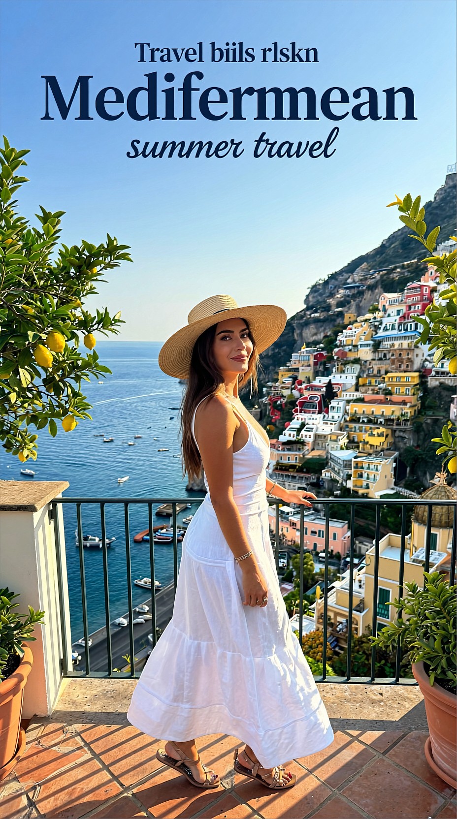
Why this works
The terrace gives you depth, the sea adds instant travel context, and the open sky creates usable space for text. White wardrobe plus citrus accents also keeps the image aligned with summer branding.
Prompt 2: Retro beach city poster for bold seasonal campaigns
Use this style when you want something more graphic and playful. It works well for youth travel content, city guides, and seasonal event posters.
Topic: Retro Summer Beach City Travel Poster
Genre: Street Style
Camera: Fujifilm GFX100S
Lens: 45mm f/2.8
Lighting: Beach Reflection
Location: Miami Beach boardwalk near pastel art deco hotels
Style: Clean Commercial Look
Final Prompt: Summer travel poster set in Miami Beach with a young traveler wearing a bright coral camp shirt, cream shorts, retro sunglasses, and white sneakers walking along the boardwalk, casual energetic stride, slight grin, wind moving the shirt fabric, pastel art deco hotels, palm trees, bicycles, and glimpses of ocean in the background, bright beach reflection lighting with vibrant sunlit surfaces, Fujifilm GFX100S medium format look, 45mm f/2.8, clean commercial framing, saturated aqua, pink, coral, and sand color palette, subtle vintage poster feeling, sharp detail with smooth tonal rolloff, layered depth, strong central subject with open negative space on one side for title placement, crisp summer atmosphere, polished tourism advertising image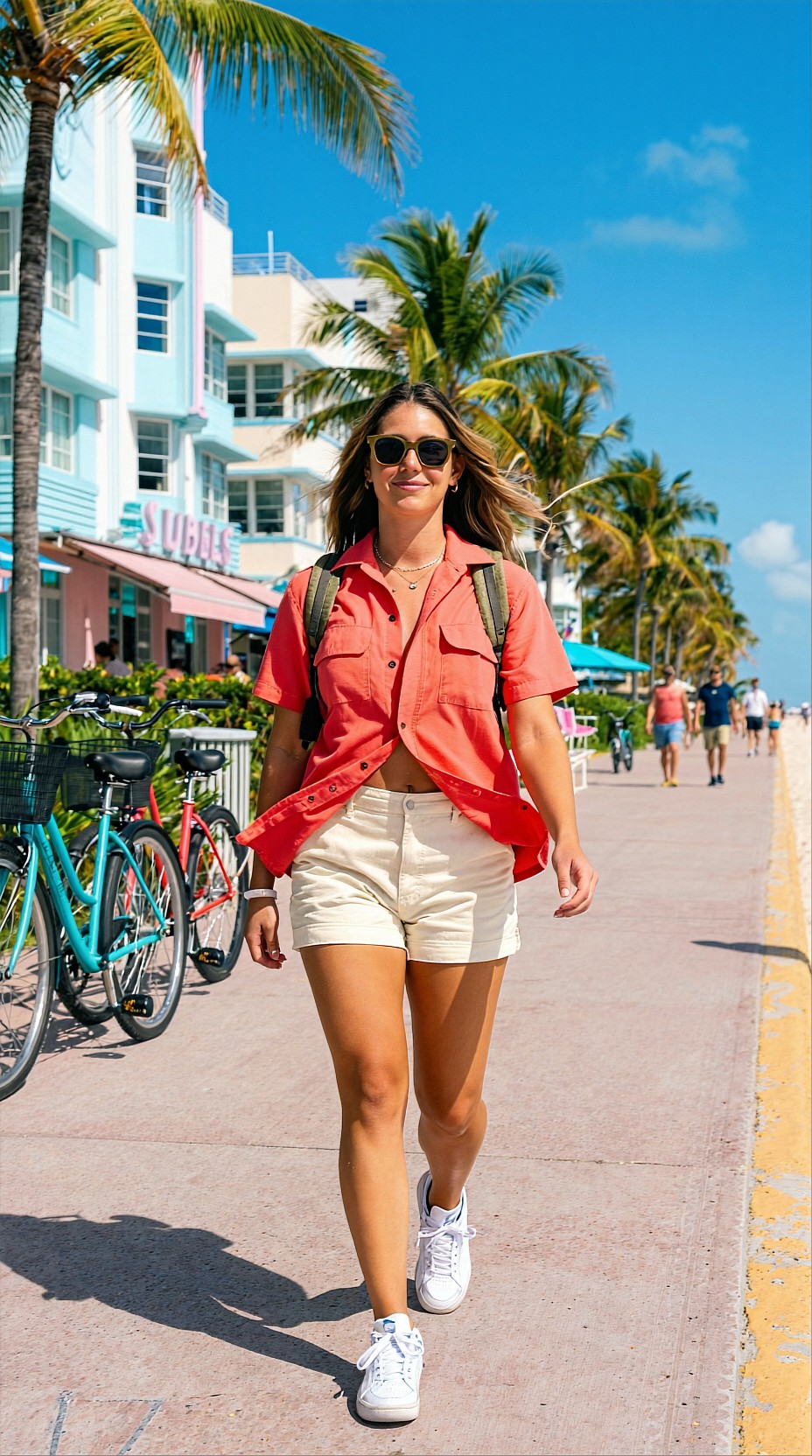
Why this works
This prompt adds motion and stronger color blocking, which helps when the poster needs to stand out on feeds or in print. The boardwalk setting also naturally supports vertical and square crops.
Prompt 3: Scenic rail journey poster with cinematic depth
Not every summer travel poster needs a beach. Scenic transport themes are useful for tour packages, itinerary articles, and destination storytelling.
Topic: Alpine Summer Train Journey Poster
Genre: Lifestyle Portrait
Camera: Nikon Z8
Lens: 50mm f/1.8
Lighting: Overcast Diffusion
Location: Panoramic mountain train window through the Swiss Alps
Style: Cinematic Realism
Final Prompt: Summer travel poster showing a traveler seated beside a large panoramic train window crossing the Swiss Alps, wearing a soft beige trench over a light summer knit and relaxed travel trousers, thoughtful calm expression, one hand resting near the glass, subtle reflection on the window, lush green valleys, wildflower meadows, distant peaks, and small mountain villages passing outside, overcast diffusion creating soft even light and rich landscape color, Nikon Z8 look, 50mm f/1.8 natural perspective, cinematic realism, quiet premium travel mood, cool green and blue palette with warm skin tones, detailed textile texture, elegant composition with the subject off-center and clean window space for poster text, high-end editorial tourism image, immersive atmosphere, realistic depth and clarity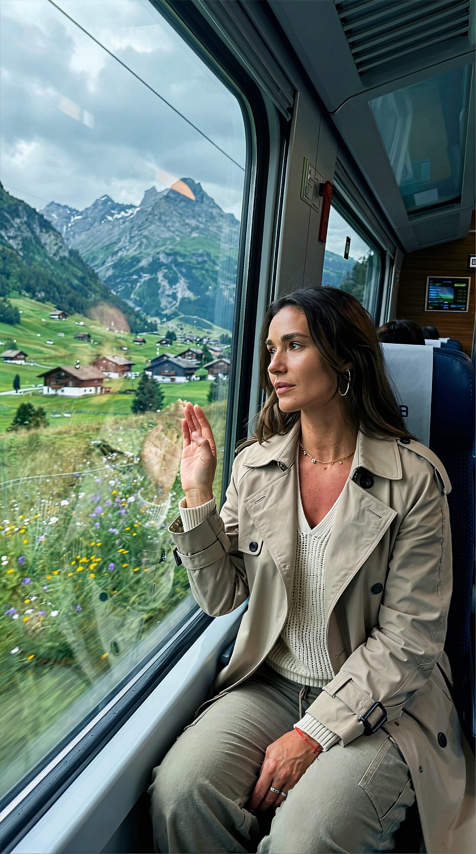
Why this works
The interior framing helps the poster feel curated rather than generic. It also gives you a built-in area for typography on the glass or sky outside the window.
Prompt 4: Sunset island escape poster with aspirational mood
This is a good fit for honeymoon packages, island promotions, and luxury travel visuals where atmosphere matters more than city detail.
Topic: Tropical Island Sunset Travel Poster
Genre: Luxury Campaign
Camera: Sony A7R V
Lens: 85mm f/1.4
Lighting: Sunset Backlight
Location: Maldives overwater villa walkway at dusk
Style: High-End Beauty Advertising
Final Prompt: Luxury summer travel poster featuring a couple on a Maldives overwater villa walkway at sunset, coordinated resort wardrobe in soft ivory and pale seafoam tones, relaxed intimate pose with gentle hand contact, serene expressions, glowing sunset backlight around hair and fabric edges, calm crystal water below reflecting peach, gold, and lavender tones, distant villas and a fading tropical horizon, Sony A7R V look, 85mm f/1.4 shallow depth of field, high-end beauty advertising style, romantic aspirational composition, clean leading lines from the wooden walkway, luminous skin texture, premium resort atmosphere, elegant negative space in the upper background for poster typography, cinematic color separation, polished detail, luxurious yet natural summer destination image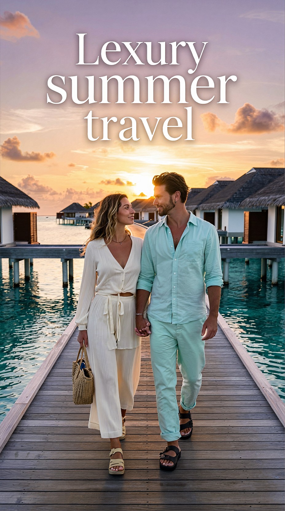
Why this works
The walkway creates strong visual direction, while the sunset palette supports premium travel branding. This kind of image is especially effective for hero banners and vertical promotional posters.
Practical prompt tips for Qwen Image 2512
When building your own summer travel poster prompts, keep these adjustments in mind:
1. Ask for poster composition
Phrases like clean negative space, title area, balanced layout, and editorial framing help the image stay usable for design.
2. Control the seasonal palette
Summer visuals are easier to art direct when you name the color family. Try combinations like:
- turquoise, white, citrus yellow
- coral, aqua, sand beige
- peach, gold, lavender
- pine green, sky blue, stone gray
3. Use wardrobe to sell the season
Light linen, resort wear, sunglasses, sandals, swim cover-ups, straw accessories, and relaxed tailoring make the image feel intentional. This matters as much as the destination itself.
4. Pick one hero idea
Avoid stacking too many landmarks or activities into one prompt. A poster usually works best with one main story:
- rooftop coastal escape
- beach city walk
- mountain train journey
- island sunset couple
Simple workflow for better outputs
A practical workflow is:
1. start with destination + subject + poster intent 2. add camera, lens, and lighting 3. define style and color palette 4. request negative space for text 5. generate variations with different crops
After generation, move the image into your design tool and test headline placement immediately. A beautiful image is not automatically a good poster if there is no room for type.
Final takeaway
For summer travel posters in Qwen Image 2512, specificity matters more than length alone. Give the model a destination, a seasonal mood, a clear subject, and explicit poster-friendly composition. The four prompt patterns above are a strong starting set for beach, city, rail, and luxury resort concepts, and each can be adapted to your own campaign or editorial workflow.
<!-- zview-hands-on-backfill -->
Practical Test Notes
What this article should verify
- Whether this prompt structure reliably produces poster-friendly travel images with intentional negative space for headlines, logos, or campaign text.
- Whether Qwen Image 2512 can keep destination identity, seasonal mood, and subject styling aligned at the same time instead of drifting into generic vacation imagery.
- Whether the model follows art-direction details such as framing, palette, wardrobe, and premium editorial tone across different travel scenarios.
- Whether the setup still works when the scene includes more complex elements like couples, reflections, rail interiors, or sunset backlight.
Result checks
Use the existing images or future generations for result checks. What to inspect:
- Poster composition: clear focal subject, readable layout, and usable open space in sky, water, glass, or architecture for later typography.
- Face stability and pose quality: natural expressions, consistent facial structure, believable gaze direction, and no awkward body twists.
- Hand risk: especially in the Maldives couple image or any pose with visible fingers, check for malformed hands, fused fingers, or unnatural contact.
- Lighting control: golden hour, beach reflection, overcast diffusion, and sunset backlight should look distinct rather than collapsing into the same generic bright look.
- Texture quality: fabric, stone, wood, water, and foliage should hold detail without looking waxy or oversmoothed.
- Background consistency: boats, trains, villas, boardwalk elements, and mountain villages should remain coherent and not turn into noisy filler.
- Style consistency: the final image should still read like a travel poster, not just a portrait or lifestyle photo.
Failure risks
The main failure risks are overcrowded compositions that leave no room for text, or attractive scenery that weakens the poster function. Travel prompts can also drift into stock-photo output if the destination cue is too broad. Multi-subject scenes increase hand and pose errors, while reflective windows and sunset backlight can reduce facial clarity. Strong styling terms such as “luxury,” “editorial,” or “retro” may also compete with location details and produce mixed aesthetics.
Practical recommendation
This test setup is best for creators who need campaign mockups, blog hero art, or poster concepts with controlled composition. It is less suitable if you need documentary realism, exact landmark accuracy, or flawless multi-person anatomy on the first pass. The detail that matters most is explicit poster intent: mention negative space, text placement, framing, and destination-specific cues together, not separately.