Text to Image AI Prompt Structures That Transfer Across Models: A Practical Framework for More Predictable Results 한국어 요약
이 페이지는 ZView Space의 영어 원문을 한국어 검색 사용자도 이해할 수 있도록 정리한 SEO 요약입니다. 핵심은 단순한 얼굴 중심 이미지가 아니라 패션 에디토리얼, 룩북, 아웃핏, 프롬프트 테스트, 이미지 생성 워크플로우를 실제로 어떻게 구성할지입니다.
핵심 요약
- 원문 주제: Text to Image AI Prompt Structures That Transfer Across Models: A Practical Framework for More Predictable Results
- 목적: AI 이미지 생성에서 outfit, silhouette, fabric, pose, location, camera framing을 더 명확하게 설계합니다.
- 활용 범위: Z-Image Turbo, Krea2 Turbo, Qwen Image, Anima, SeedVR2 같은 이미지 생성 및 업스케일 워크플로우에 적용할 수 있습니다.
- SEO 관점: 제목, 설명, 이미지 alt, 프롬프트 예시가 실제 검색 의도와 맞아야 색인 가능성이 높아집니다.
한국어 사용자를 위한 체크포인트
1. 프롬프트가 얼굴 묘사에만 머물지 않고 전체 스타일과 의상 구성을 설명하는지 확인합니다. 2. 패션 이미지라면 상의, 하의, 아우터, 신발, 액세서리, 소재감, 촬영 장소를 분리해서 씁니다. 3. 생성 결과는 바로 게시하지 말고 디테일, 손, 의상 형태, 배경 일관성, 이미지 품질을 비교합니다. 4. 글 본문에는 실제 테스트 기준과 실패를 줄이는 방법이 들어가야 검색엔진에서 얇은 콘텐츠로 보일 가능성이 줄어듭니다.
원문 미리보기
In this test, I focused on a practical question: what kind of text to image AI prompt structure keeps working when you move the same idea across different models. Not perfectly, and not with identical styling, but with enough consistency that you can predict w
---
In this test, I focused on a practical question: what kind of text to image AI prompt structure keeps working when you move the same idea across different models. Not perfectly, and not with identical styling, but with enough consistency that you can predict what is likely to survive the transfer.
The short version is that prompts transfer better when they are built in layers: subject, visual genre, camera logic, lighting, location, style direction, and a final integrated instruction. Models disagree on aesthetics, skin rendering, and how aggressively they stylize, but they respond more consistently when the prompt gives them a clean hierarchy instead of a bag of adjectives.
What follows is not a theory piece. It is a workflow-oriented test report based on repeated prompt adaptation and output comparison. The strongest result came from prompts that described a scene like a shoot brief. The weak point was that some models over-prioritized the last style phrase and ignored earlier composition details. That tradeoff shaped the framework below.
What was tested
I tested a reusable prompt structure intended to work across multiple text-to-image systems with different prompt sensitivities.
Test setup
- Prompt goal: build a universal AI art prompt structure for realistic and semi-stylized image generation
- Main variables: subject clarity, lighting control, composition stability, texture detail, and style retention
- Workflow: start with one visual concept, rewrite it into a layered structure, then compare how much of the scene survives across models
- Evaluation criteria:
- Does the model keep the right subject?
- Does the location remain readable?
- Does lighting stay close to the request?
- Do wardrobe and props survive prompt compression?
- Do hands, text, products, and background details break?
In this test, prompts performed best when the structure separated what the image is about from how the image should look. That sounds obvious, but in practice many prompts fail because subject, style, mood, and camera language are mixed together without order.
The prompt structure that transferred best
The most reliable text to image AI prompt formula I tested had seven parts:
1. Topic — the actual visual subject 2. Genre — the image category the model should aim for 3. Camera — a photographic or cinematic capture cue 4. Lens — framing and depth of field guidance 5. Lighting — the strongest control lever after subject 6. Location — environmental anchors and mood 7. Style — art direction, editorial treatment, finish 8. Final Prompt — one natural-language instruction that merges all of the above
Why these ingredients were chosen:
- Topic reduced drift. If this was vague, the model invented too much.
- Genre helped with composition. “Product editorial” and “lifestyle portrait” do not frame scenes the same way.
- Camera and lens were less about realism for their own sake and more about constraining shot type.
- Lighting had a bigger effect than many style keywords. It often decided whether the image felt controlled or muddy.
- Location improved background consistency, especially in models that otherwise hallucinate generic spaces.
- Style worked best when phrased as a recognizable visual direction rather than a stack of taste words.
- Final Prompt mattered because some models ignore field labels unless you restate them as one coherent prompt.
Why this structure transfers better than keyword piles
A lot of weak prompts fail for the same reason: they read like unordered tags.
For example, a prompt such as “beautiful woman, cinematic, detailed, realistic, golden light, fashion, soft focus, luxury” may produce a decent image in one model, but it transfers poorly because the prompt does not define which details are structural and which are decorative.
By contrast, a layered structure tells the model:
- what to draw first,
- how to frame it,
- what lighting logic should dominate,
- what environment should support it,
- and what finish should unify the shot.
In this test, that order improved cross-model consistency more than adding extra adjectives. The strongest result was not the longest prompt. It was the prompt where each ingredient had a clear job.
A base framework you can reuse
Use this when you want better text to image AI prompts that can be adapted across tools:
Core framework
- Subject first: who or what is in frame
- Scene second: where it is happening
- Shot design third: camera distance, angle, lens behavior
- Lighting fourth: time of day or studio logic
- Surface detail fifth: fabric, skin, material, texture, atmosphere
- Style last: editorial, cinematic, commercial, anime, beauty, etc.
The practical recommendation is simple: if a prompt fails, do not immediately add more descriptive words. First check whether one of those layers is missing.
Test 1: Portrait realism and face stability
This first test checks whether the structure keeps a portrait coherent across models without the face becoming generic or over-airbrushed. I used a beauty-editorial setup because face rendering exposes model weaknesses quickly.
Topic: Contemporary beauty portrait of a woman with minimal jewelry and natural skin texture
Genre: Beauty Campaign
Camera: Canon EOS R5
Lens: 85mm f/1.2
Lighting: Studio butterfly light with soft fill
Location: Seamless warm gray studio backdrop with a quiet editorial mood
Style: High-end beauty advertising
Final Prompt: Contemporary beauty portrait of a woman with minimal gold jewelry, clean pulled-back hair, calm confident expression, direct eye contact, natural skin texture, subtle freckles visible, shot as a high-end beauty campaign in a warm gray seamless studio, studio butterfly light with soft fill shaping the cheekbones, Canon EOS R5 look, 85mm f/1.2 shallow depth of field, close crop from shoulders up, refined neutral makeup, premium skincare sheen not oily, balanced symmetry, elegant composition, muted beige and gold color palette, crisp iris detail, realistic pores, polished magazine retouching without plastic skin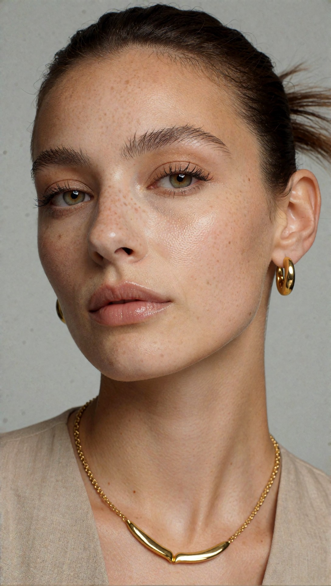
Inspect whether the skin remains textured rather than waxy, and whether the eyes, teeth, and hairline stay believable. In this test, the transfer point to watch is how each model handles “high-end beauty advertising” without flattening the face.
What this revealed
This prompt structure held up well because the topic and lighting were doing the heavy lifting. Even models that stylized aggressively still understood “beauty campaign” as a tight, face-led composition.
The weak point was skin finish. Some models interpreted “polished magazine retouching” too aggressively and removed pores despite the realism cues. What I would change next in that situation is reduce finish language and make texture instructions more explicit.
Test 2: Fashion full-body composition and wardrobe retention
The next test is meant to check full-body stability, garment clarity, and whether location details survive when the model has to manage pose, clothing, and environment at the same time.
Topic: Summer resort fashion portrait with tailored linen styling
Genre: Fashion Editorial
Camera: Sony A7R V
Lens: 50mm f/1.4
Lighting: Golden hour backlight with soft reflected fill
Location: White stone terrace overlooking the sea on a Mediterranean resort hillside
Style: Luxury fashion campaign
Final Prompt: Full-body summer resort fashion portrait of a woman wearing a tailored ivory linen blazer over a silk camisole and wide-leg trousers, standing on a white stone terrace overlooking the sea at a Mediterranean resort hillside, relaxed elegant pose with one hand resting on the railing, soft wind moving the fabric, golden hour backlight with gentle reflected fill, luxury fashion campaign direction, Sony A7R V look, 50mm f/1.4 natural perspective, clean horizon line, warm amber and cream palette, refined sandals, subtle gold accessories, composed editorial framing, natural skin texture, visible linen weave, cinematic but polished color grading, premium travel magazine atmosphere
Check whether the blazer, trousers, and sandals remain distinct rather than merging into a shapeless white outfit. Also inspect horizon straightness and whether the sea-view background stays coherent instead of turning into abstract blur.
Why wardrobe detail often breaks across models
In this test, clothing transfer depended on naming the garments in a hierarchy. “Tailored ivory linen blazer over a silk camisole and wide-leg trousers” worked better than “luxury summer outfit” because each piece gives the model a construction plan.
This is one of the most useful cross model prompt writing tips I can give: when apparel or props matter, describe them as separate objects, not as a general vibe.
Test 3: Product clarity and text-free packaging discipline
Product prompts expose a different failure mode: soft edges, fake label text, and warped geometry. This setup was meant to test packaging clarity and material rendering.
Topic: Premium skincare serum bottle hero shot with clean packaging focus
Genre: Product Editorial
Camera: Nikon Z8
Lens: 105mm macro f/2.8
Lighting: Softbox key light with controlled rim light
Location: Minimal stone vanity surface in a modern bathroom set
Style: Clean commercial look
Final Prompt: Premium skincare serum bottle hero shot placed on a minimal stone vanity surface in a modern bathroom set, frosted glass bottle with matte white cap, label area clean and readable without invented text, a few controlled water droplets on the glass, softbox key light with subtle rim light defining the bottle edges, Nikon Z8 look, 105mm macro f/2.8 product framing, clean commercial look, neutral ivory and pale gray palette, soft reflections, precise geometry, luxury retail photography composition, background gently out of focus, crisp product silhouette, realistic glass thickness, premium surface texture, no clutter, no extra bottles, no distorted cap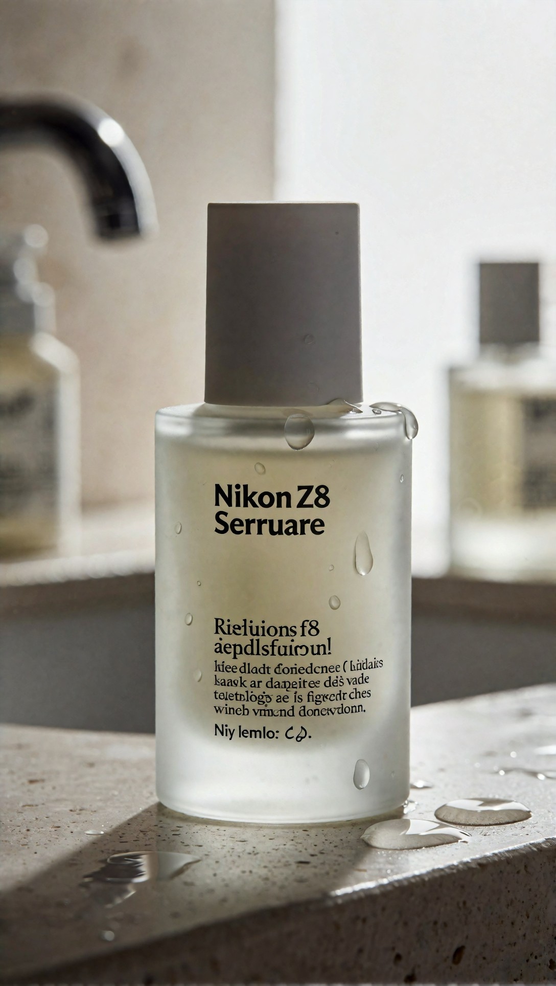
Inspect the bottle neck, cap symmetry, and whether the label stays blank or neatly simplified. The strongest result here is usually edge control; the weak point is that many models still invent pseudo-text if the product area is too large in frame.
Strengths of the framework
After repeating these prompt types, several strengths were consistent.
1. It improves scene anchoring
Location plus lighting creates a believable container for the subject. Without those two fields, models tend to generate generic backgrounds.
2. It makes prompt edits easier
If a result fails, you can revise one layer instead of rewriting everything. In this test, changing lens or lighting produced cleaner corrections than replacing the full prompt.
3. It works across image categories
Portraits, products, street scenes, and interiors all responded to the same overall structure. The wording changed, but the logic held.
4. It reduces style drift
A clear style label near the end helped unify outputs, especially when the prompt also contained material and lighting cues. The best transfer happened when style was specific, such as “clean commercial look” or “cinematic realism,” not vague terms like “beautiful” or “artistic.”
Test 4: Street style with environmental consistency
This test checks background readability and whether a model can keep a candid fashion image from collapsing into random signage, impossible sidewalks, or inconsistent depth.
Topic: Urban street style portrait in layered transitional-season clothing
Genre: Street Style
Camera: Fujifilm GFX100S
Lens: 63mm f/2.8
Lighting: Overcast diffusion
Location: Narrow side street in Seoul with muted storefronts and clean pavement after light rain
Style: Korean magazine cover
Final Prompt: Urban street style portrait of a young woman in layered transitional-season clothing, charcoal trench coat over a cream knit top, pleated skirt, knee-high boots, walking through a narrow side street in Seoul with muted storefronts and clean pavement after light rain, overcast diffusion creating soft shadowless light, Korean magazine cover direction, Fujifilm GFX100S look, 63mm f/2.8 medium-format clarity, natural walking pose with a slight glance toward camera, damp reflections on the pavement, restrained gray, cream, and dusty blue palette, crisp fabric texture, realistic city depth, clean composition, subtle motion in the coat hem, editorial realism without exaggerated neon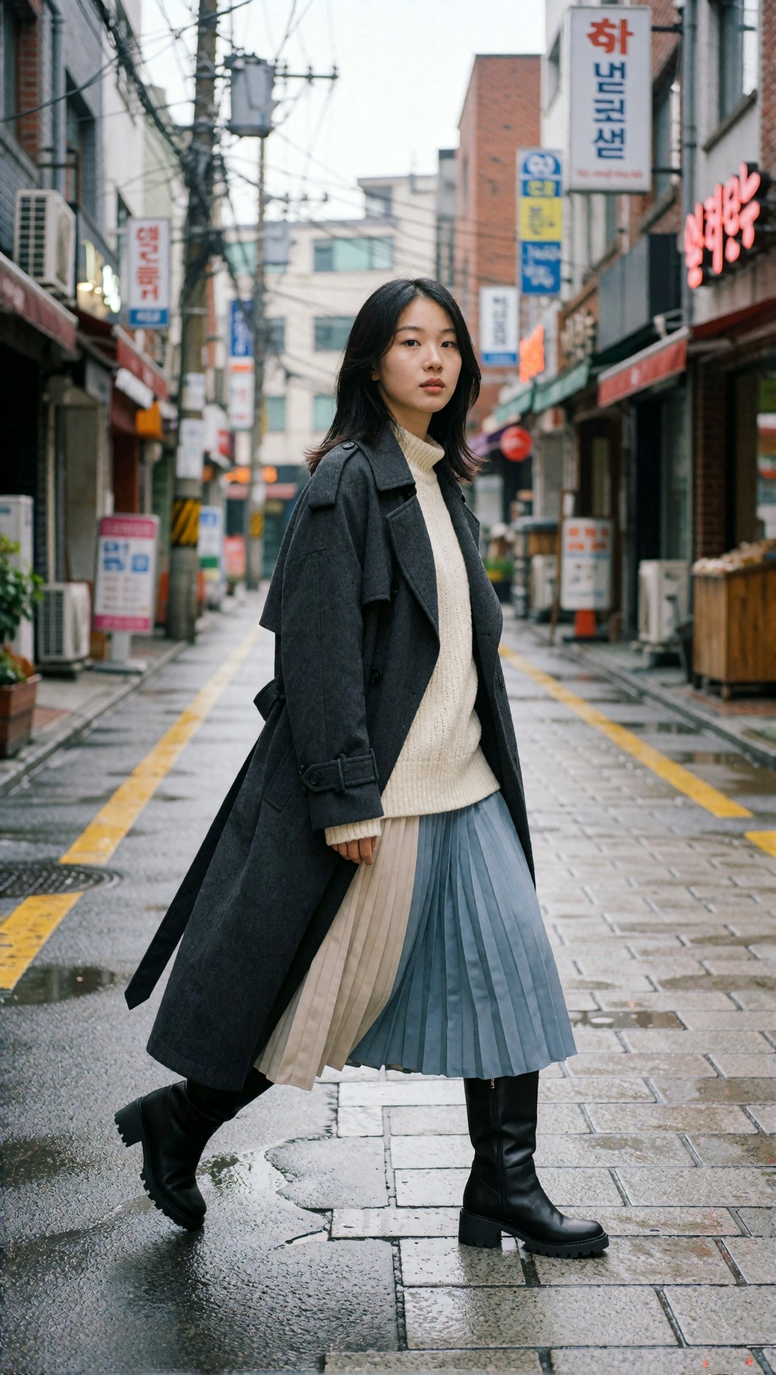
Look for pavement reflections, believable storefront scale, and coat movement that still feels physically plausible. If the street becomes cluttered or the body proportions drift, that usually means the location and pose instructions are fighting for attention.
A practical rule for universal prompts
If you are trying to learn how to write prompts for any AI image model, treat the prompt like a production brief, not a mood board.
A mood board prompt says what you like. A production brief says what must be visible.
The models I tested were much more reliable with the second approach.
Test 5: Cinematic travel scene and depth layering
This prompt is designed to test atmospheric depth, color separation, and whether the model can keep a human subject integrated into a larger environment without making them look pasted in.
Topic: Solo traveler at a mountain railway platform during blue hour
Genre: Cinematic Travel
Camera: RED Komodo 6K
Lens: 35mm T1.5
Lighting: Blue hour ambient light with warm practical station lamps
Location: Quiet alpine railway platform with misty pine hills in the distance
Style: Cinematic realism
Final Prompt: Solo traveler standing on a quiet alpine railway platform during blue hour, wearing a dark wool coat, textured scarf, and leather weekender bag, warm practical station lamps glowing against cool ambient twilight, misty pine hills fading into the distance, cinematic realism, RED Komodo 6K capture feel, 35mm T1.5 cinematic framing, three-quarter body composition, thoughtful expression looking down the tracks, subtle breath in the cold air, wet platform surface catching warm reflections, deep blue and amber color contrast, realistic travel wardrobe detail, layered atmosphere, restrained filmic grain, balanced negative space, emotionally grounded scene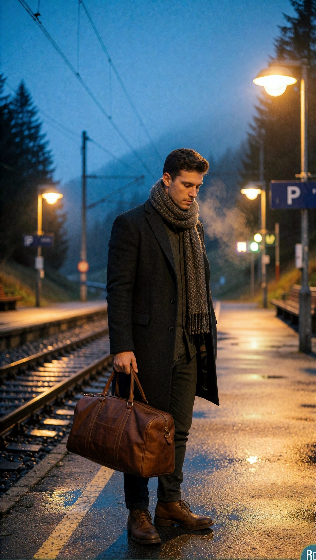
Inspect whether the warm lamps and cool sky stay separated cleanly, and whether the mist adds depth rather than turning into low-contrast mush. A good result should feel spatially layered, not flat.
Limitations and failure risks
This framework is useful, but it is not magic. Several failure patterns showed up repeatedly.
Models still rank instructions differently
Some models obey the first half of a prompt; others respond most strongly to the final style phrase. If your location keeps disappearing, move it earlier into the integrated sentence.
Camera language can be overvalued or ignored
In some systems, “85mm f/1.2” clearly affected crop and depth of field. In others, it mostly acted as a realism token. Do not assume camera specs alone will fix composition.
Overloaded prompts reduce transfer
The biggest mistake I saw was adding too many equal-priority details. Once wardrobe, pose, expression, weather, architecture, props, and color all compete, weaker models start dropping important elements.
Hands, text, and small props remain risk zones
Even with a good structure, hand anatomy and packaging text are still vulnerable. The framework helps, but it does not eliminate model-specific weaknesses.
Test 6: Hand risk in a lifestyle cafe scene
This test is meant to check whether a natural hand interaction survives without obvious finger distortions. I used a simple object interaction because hands often break when the prompt adds cups, phones, or bags.
Topic: Lifestyle portrait of a man holding a ceramic coffee cup by a window
Genre: Lifestyle Portrait
Camera: Leica SL2-S
Lens: 75mm f/2
Lighting: Soft window light on an overcast morning
Location: Quiet cafe corner with walnut table and textured plaster wall
Style: Clean editorial realism
Final Prompt: Lifestyle portrait of a man seated by a cafe window holding a ceramic coffee cup naturally with both hands, soft overcast morning window light shaping the face and fingers, walnut table and textured plaster wall in a quiet cafe corner, clean editorial realism, Leica SL2-S look, 75mm f/2 intimate portrait framing, relaxed posture, thoughtful neutral expression, navy overshirt over a white tee, subtle steam rising from the cup, soft brown and slate color palette, realistic finger placement, believable cup scale, natural skin texture, controlled background blur, candid magazine composition without exaggerated props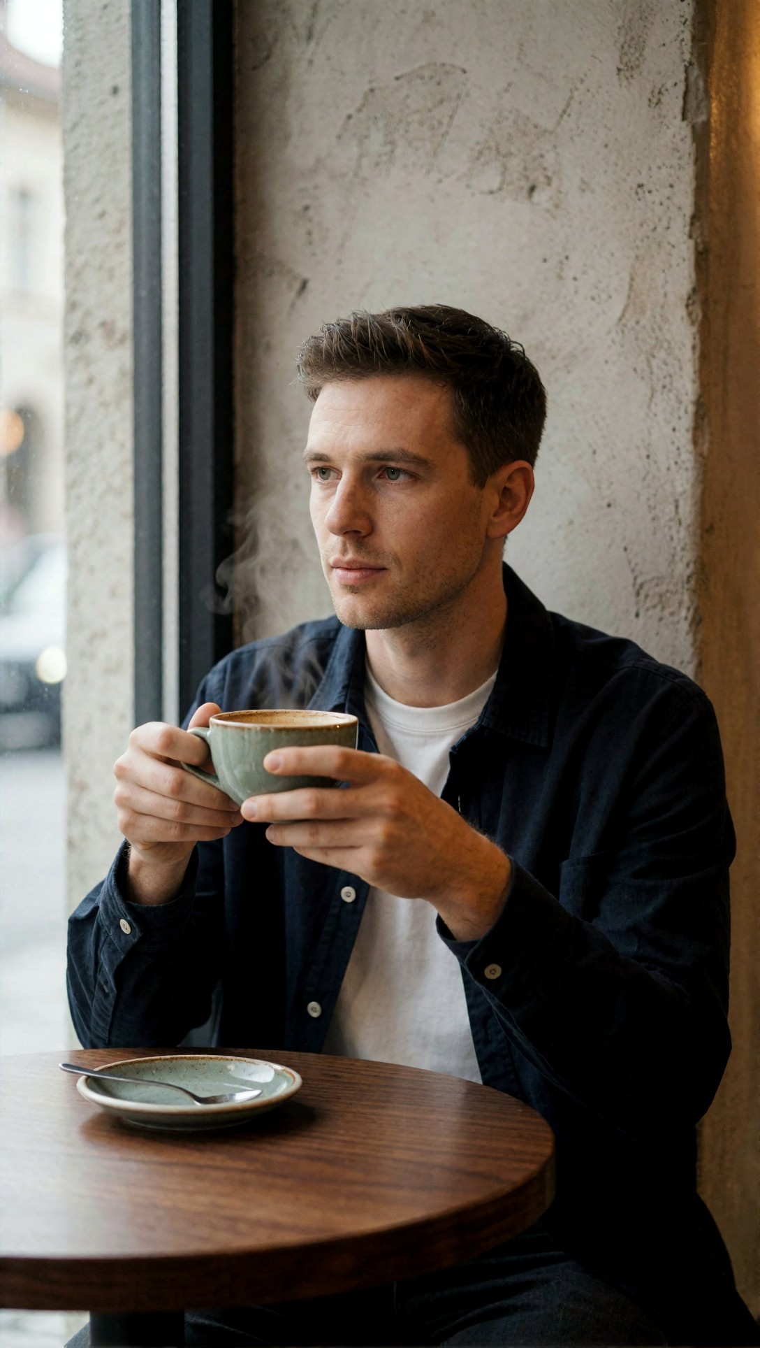
Inspect the grip first: finger count, cup thickness, and whether the wrists bend naturally. In this test, the weak point is usually the lower hand or hidden thumb, so that is where I would look before judging the overall image.
Which situations this workflow is best for
Different use cases benefit from different prompt density.
Best for realistic editorial and commercial images
If you want stable portraits, fashion, beauty, travel, or product scenes, this framework is strong because those categories depend on shot planning.
Good for style transfer with controlled variation
It works well when moving one concept across different models and wanting the same scene logic with slightly different aesthetics.
Less ideal for abstract concept art exploration
If your goal is loose ideation, the structure can feel too restrictive. In those cases, a lighter prompt with a stronger style cue may produce more surprising results.
Best option when comparing models side by side
Because the framework is modular, it makes differences easier to diagnose. If one model fails, you can identify whether it struggles with lighting, anatomy, location reading, or surface texture.
Test 7: Interior design scene with material hierarchy
This prompt checks whether a model can maintain multiple material types while preserving a believable room layout. It is useful for seeing how location and texture cues transfer.
Topic: Minimal living room with natural materials and soft morning light
Genre: Interior Editorial
Camera: Hasselblad X2D 100C
Lens: 38mm f/2.5
Lighting: Soft morning daylight through sheer curtains
Location: Calm apartment living room with oak flooring and limewashed walls
Style: Refined architectural digest look
Final Prompt: Minimal living room interior with oak flooring, limewashed walls, low cream linen sofa, travertine coffee table, hand-thrown ceramic vase, and a textured wool rug, soft morning daylight entering through sheer curtains, calm apartment atmosphere, refined architectural digest look, Hasselblad X2D 100C medium-format feel, 38mm f/2.5 interior framing, balanced composition from seated eye level, warm neutral palette of cream, sand, and pale oak, precise furniture proportions, clean negative space, realistic material separation, subtle shadow gradients, curated but lived-in restraint, no clutter, no warped walls, no duplicate objects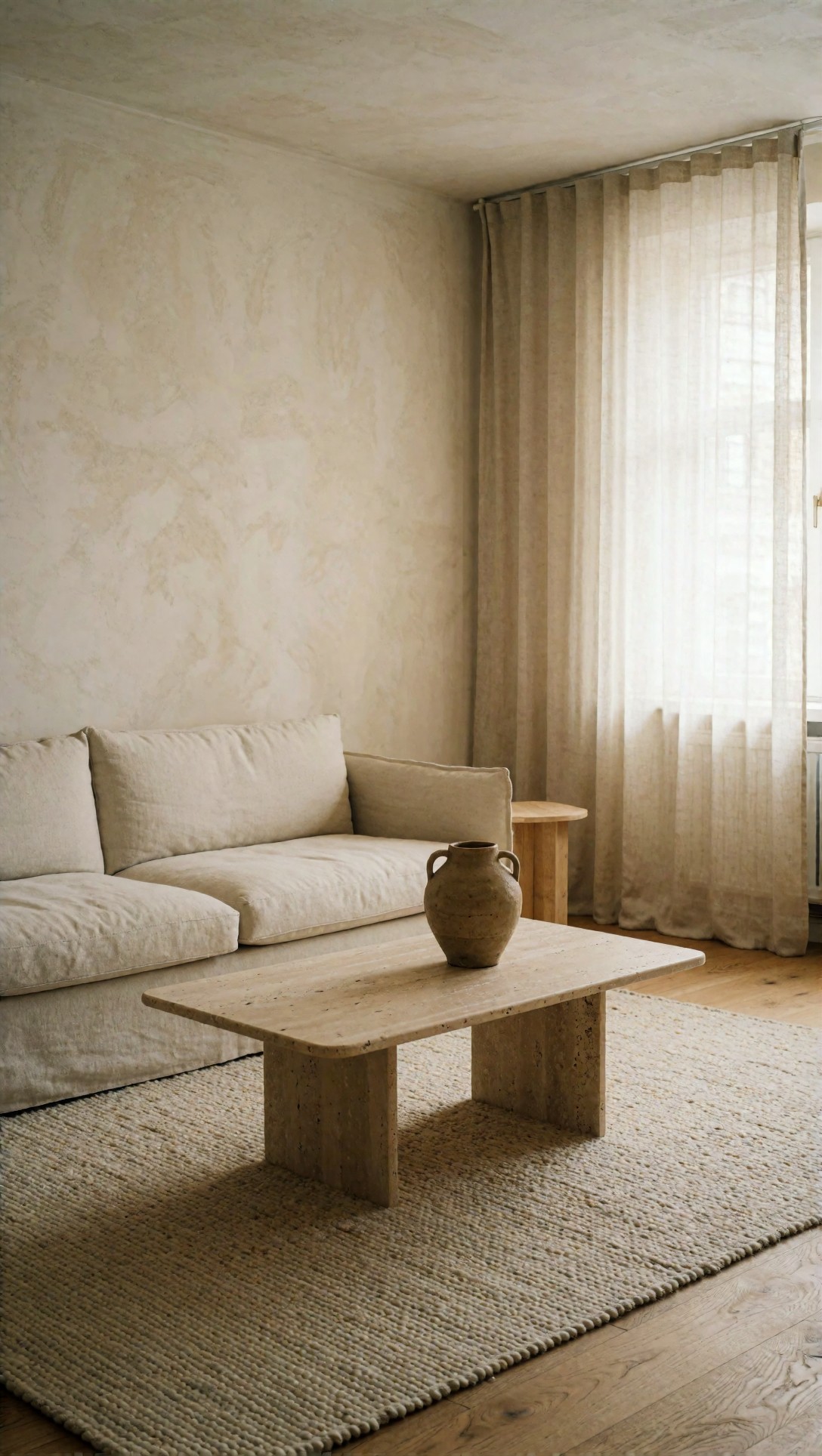
Check wall straightness, table geometry, and whether linen, wool, stone, and wood read as different materials. If the room looks too empty or synthetic, the model is usually underperforming on texture hierarchy.
Practical recommendations from the test
Here is the workflow I would actually use in production.
1. Write the prompt in two passes
First pass: fill the labeled fields. Second pass: rewrite them into one smooth Final Prompt.
This prevents omissions and catches contradictions early.
2. Make lighting do more of the work
When this setup works, lighting is often the feature making the image feel deliberate. If an output looks generic, fix light before adding more style language.
3. Be specific about what must not merge
For clothes, products, interiors, or food, separate key objects explicitly. If a scene contains three important materials, name all three.
4. Keep style direction recognizable
“Luxury fashion campaign” transfers better than “very beautiful premium fashionable image.” Specific image-world labels give the model a more stable target.
5. If a result drifts, simplify before expanding
The instinct is to add more words. In this test, that often made transfer worse. Remove weak adjectives and strengthen structural cues instead.
Test 8: Anime-style prompt with structure lock
I also wanted to see whether the same framework helps in a stylized context. This test checks style lock, silhouette clarity, and environmental readability in a non-photoreal setup.
Topic: School-age heroine waiting under an umbrella at a rainy train stop
Genre: Anime Key Visual
Camera: Cinematic animation frame capture
Lens: 40mm equivalent f/2.0 look
Lighting: Rainy dusk with cool ambient light and warm station glow
Location: Small suburban train stop with wet pavement and hydrangea bushes
Style: Modern anime film poster
Final Prompt: School-age heroine waiting under a transparent umbrella at a small suburban train stop during rainy dusk, neat navy school uniform with a cream cardigan, short dark hair with a few wet strands, reflective wet pavement, hydrangea bushes beside the platform, cool ambient rain light mixed with warm station glow, modern anime film poster style, cinematic animation frame capture, 40mm equivalent perspective, centered three-quarter composition, wistful expression, delicate raindrop detail on the umbrella, soft blue, violet, and warm amber palette, crisp silhouette, layered background depth, polished linework, atmospheric realism within anime styling, no cluttered signage, emotionally quiet scene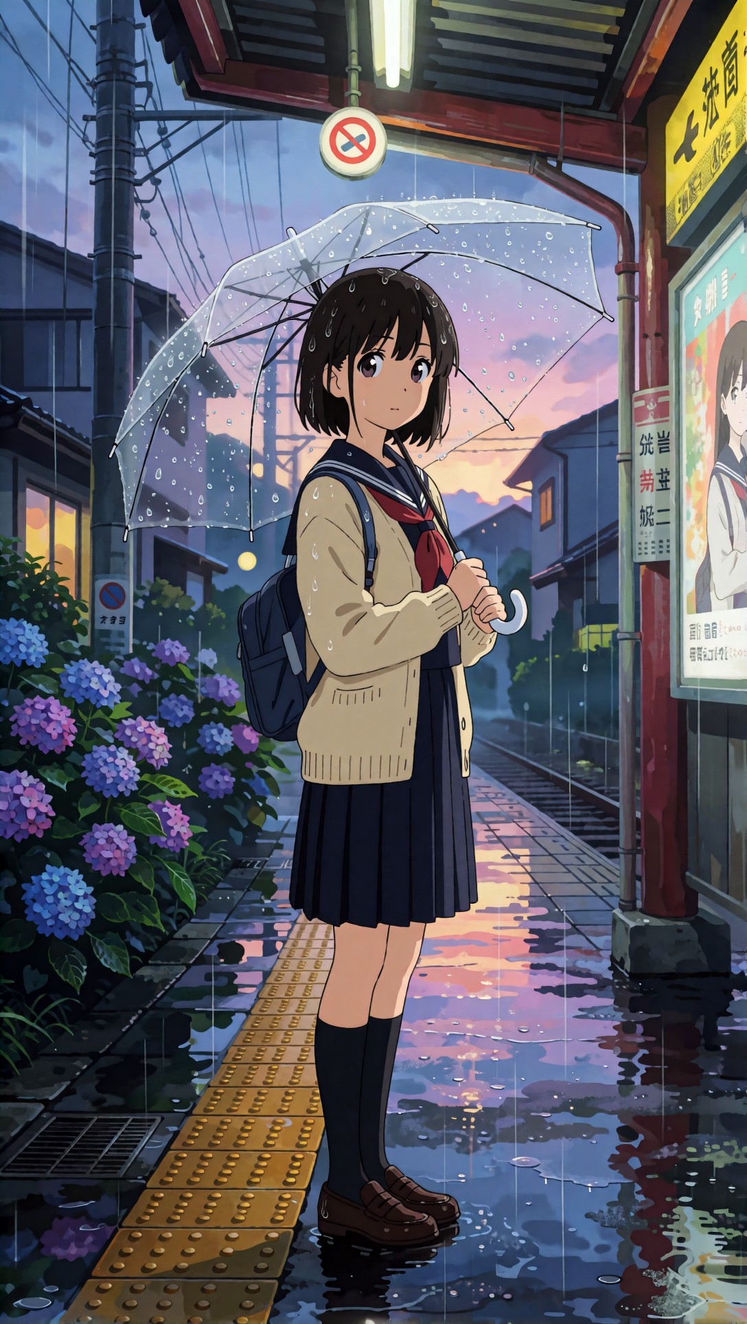
Inspect whether the umbrella remains transparent and readable, and whether the rain atmosphere supports the character rather than obscuring her. The transfer test here is whether the prompt structure still organizes the image even after leaving pure realism.
Output quality checklist
Use this quick checklist when reviewing results from any model:
- Is the subject immediately identifiable?
- Does the genre match the expected composition style?
- Does the lighting dominate the mood clearly?
- Is the location specific, not generic mush?
- Do wardrobe, props, or products stay separate and readable?
- Are the materials believable at close inspection?
- Do hands, eyes, edges, and background perspective hold up?
- Did the model over-prioritize style and ignore structure?
- If something failed, can you trace it to one missing prompt layer?
Common rewrite moves that improved results
A few edits consistently improved weak outputs:
- Replace vague beauty terms with concrete physical detail
- Move location earlier if the background keeps disappearing
- Replace “cinematic” alone with actual lighting conditions
- Trade “detailed” for named textures like linen, matte glass, wet stone, wool, brushed metal
- Reduce competing colors to one intentional palette
- If anatomy fails, simplify the pose before changing the whole scene
These are small changes, but they matter more than adding ten more adjectives.
Final recommendation
If you need a text to image ai prompt structure that works across models, use a layered prompt built like a shoot brief: topic, genre, camera, lens, lighting, location, style, then one integrated final prompt. In this test, that structure produced the most predictable transfer for portraits, fashion, products, interiors, and cinematic travel scenes.
Who should use this workflow: operators comparing models, teams building repeatable image pipelines, and anyone who needs prompts that can be revised systematically.
Who should avoid it: users looking for loose exploratory chaos, abstract surprises, or highly compressed one-line prompts where control does not matter.
The prompt detail that mattered most was lighting, followed closely by clear subject hierarchy. When those two were right, the model usually found the image. When they were vague, no amount of style language saved the result.