Text-to-Image AI vs AI Art Generators: What Has Actually Changed for Everyday Users? 한국어 요약
이 페이지는 ZView Space의 영어 원문을 한국어 검색 사용자도 이해할 수 있도록 정리한 SEO 요약입니다. 핵심은 단순한 얼굴 중심 이미지가 아니라 패션 에디토리얼, 룩북, 아웃핏, 프롬프트 테스트, 이미지 생성 워크플로우를 실제로 어떻게 구성할지입니다.
핵심 요약
- 원문 주제: Text-to-Image AI vs AI Art Generators: What Has Actually Changed for Everyday Users?
- 목적: AI 이미지 생성에서 outfit, silhouette, fabric, pose, location, camera framing을 더 명확하게 설계합니다.
- 활용 범위: Z-Image Turbo, Krea2 Turbo, Qwen Image, Anima, SeedVR2 같은 이미지 생성 및 업스케일 워크플로우에 적용할 수 있습니다.
- SEO 관점: 제목, 설명, 이미지 alt, 프롬프트 예시가 실제 검색 의도와 맞아야 색인 가능성이 높아집니다.
한국어 사용자를 위한 체크포인트
1. 프롬프트가 얼굴 묘사에만 머물지 않고 전체 스타일과 의상 구성을 설명하는지 확인합니다. 2. 패션 이미지라면 상의, 하의, 아우터, 신발, 액세서리, 소재감, 촬영 장소를 분리해서 씁니다. 3. 생성 결과는 바로 게시하지 말고 디테일, 손, 의상 형태, 배경 일관성, 이미지 품질을 비교합니다. 4. 글 본문에는 실제 테스트 기준과 실패를 줄이는 방법이 들어가야 검색엔진에서 얇은 콘텐츠로 보일 가능성이 줄어듭니다.
원문 미리보기
Most users still treat text to image AI and AI art generators as the same thing. In this test, that shortcut breaks down quickly. The newer text first systems are better at following instructions, preserving product structure, and handling commercial image req
---
Most users still treat text-to-image AI and AI art generators as the same thing. In this test, that shortcut breaks down quickly. The newer text-first systems are better at following instructions, preserving product structure, and handling commercial image requests with fewer retries. Traditional AI art generators still matter, but they often feel stronger at mood, stylization, and fast concepting than at precise execution.
For everyday users, the real change is not that images suddenly became perfect. It is that the better tools now fail in more predictable ways. That makes them easier to steer, easier to debug, and more useful for repeatable work.
What was tested
I compared current text-to-image workflows against broader “AI art generator” style workflows across the kinds of tasks normal users actually run:
- portraits with specific styling
- product and commercial scenes
- cinematic travel frames
- text-heavy or layout-sensitive ideas
- hand visibility and pose control
- background consistency
- style lock across multiple generations
- beginner prompt simplicity versus expert prompt depth
Rather than treating categories as branding terms, I used them as workflow types:
- Text-to-image AI = prompt-led systems built to translate structured instructions into controlled visual outputs
- AI art generator = broader creative image tools, often stronger at stylistic invention, looser interpretation, filters, presets, and one-click aesthetics
The strongest result in this test came from using text-to-image models when the image needed clear subject hierarchy, lens-aware composition, and fewer structural mistakes. The weak point was that some text-to-image tools can look technically correct but emotionally flat unless the prompt carries enough art direction.
The practical difference between text-to-image AI and AI art generators
If you search for text to image AI vs AI art generator, the simplest answer is this:
- Text-to-image AI is usually better when you know what you want and need the model to obey.
- AI art generators are often better when you want inspiration, stylistic drift, or quick visual ideation without much prompt discipline.
That distinction matters because everyday users do not just want “good art.” They want a usable image with fewer broken hands, fewer random accessories, less wardrobe drift, and less prompt roulette.
In this test, the difference showed up in four areas:
1. Instruction fidelity
Text-to-image systems were more likely to respect camera, lens, lighting, wardrobe, and scene constraints together. Older-style art generators often picked one or two strong cues and ignored the rest.
2. Commercial usefulness
When generating product photos, business visuals, or thumbnails, the more structured text-to-image tools produced cleaner layouts and more legible focal points.
3. Style volatility
AI art generators often made prettier first impressions, but they also changed styling more dramatically across rerolls. That is useful for exploration and annoying for consistency.
4. Retry cost
With text-to-image workflows, I could usually identify what to change next: pose wording, subject count, lighting conflict, or background complexity. With looser art generators, failures were often less traceable.
Test 1: Portrait control showed the biggest everyday improvement
Portrait prompting is where the category split becomes obvious fastest. I tested a fashion portrait prompt with exact wardrobe, lighting, expression, and framing cues. The better text-to-image tools held onto those constraints more reliably than broad art generators.
This first prompt checks whether the model can follow a structured fashion brief without drifting into random accessories, extra jewelry, or unstable facial features.
Topic: Minimalist fashion portrait for model consistency testing
Genre: Fashion Editorial
Camera: Sony A7R V
Lens: 85mm f/1.4
Lighting: Softbox key light with subtle fill
Location: Neutral gray studio backdrop with clean magazine set feel
Style: Clean commercial look
Final Prompt: A poised female model in a minimalist fashion editorial portrait, wearing a structured ivory blazer over a black silk top, small gold hoop earrings, no necklace, direct eye contact, calm confident expression, upper-body composition, clean posture with one shoulder slightly forward, smooth neutral gray studio backdrop, softbox key light with gentle fill for natural facial shaping, Sony A7R V realism, 85mm f/1.4 depth separation, accurate skin texture, refined fabric detail, controlled black, ivory, and soft beige color palette, premium magazine composition, realistic hands if visible, no extra accessories, no background clutter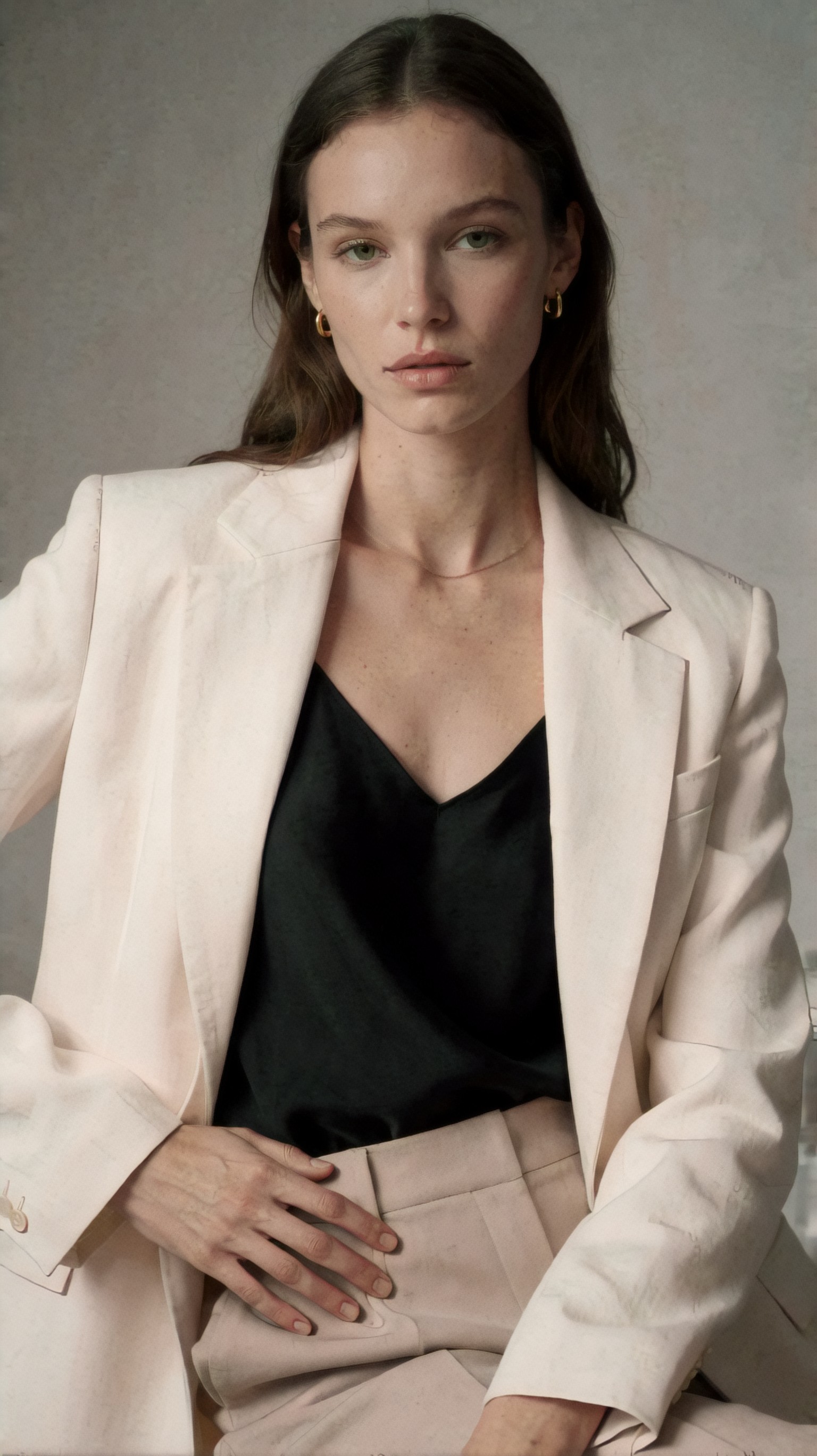
Inspect whether the image adds things you did not request: necklaces, dramatic makeup, or extra hands near the frame edge. The strongest result should keep wardrobe simple, face symmetry stable, and the studio background clean.
The text-to-image systems generally handled this better because the prompt ingredients create hierarchy. Subject first, then wardrobe, then camera and lighting, then restrictions. Many AI art generators still over-prioritize “fashion editorial” as a vibe and under-prioritize the negative specificity hidden inside the request.
Where AI art generators still feel better
This comparison is not one-sided. In this test, AI art generators often delivered more instantly appealing atmosphere on the first pass, especially when the prompt was loose. If the goal is moodboarding rather than precision, that matters.
For cinematic scenes, art-oriented tools sometimes produced more dramatic color storytelling without needing as much instruction. The tradeoff was weaker object logic and more background nonsense on close inspection.
This travel-style prompt tests whether a model can balance atmosphere with scene coherence rather than just applying a cinematic filter.
Topic: Solo traveler at a rain-soaked night market for atmosphere versus scene coherence
Genre: Cinematic Travel
Camera: Canon EOS R5
Lens: 35mm f/1.8
Lighting: Neon rim light with wet-surface reflections
Location: Taipei night market alley after rain
Style: Cinematic realism
Final Prompt: A solo traveler standing beneath a transparent umbrella in a narrow Taipei night market alley after rain, layered streetwear with charcoal trench coat, cream knit top, dark trousers, reflective wet pavement, neon signs in red, teal, and amber, light steam from food stalls, candid three-quarter pose, observant expression, passersby softly blurred in the distance, Canon EOS R5 image character, 35mm f/1.8 environmental perspective, cinematic realism, crisp facial focus with atmospheric background falloff, believable signage glow, detailed textures on umbrella, fabric, and wet ground, rich but controlled night color grading, realistic urban depth, no duplicated people, no warped stall geometry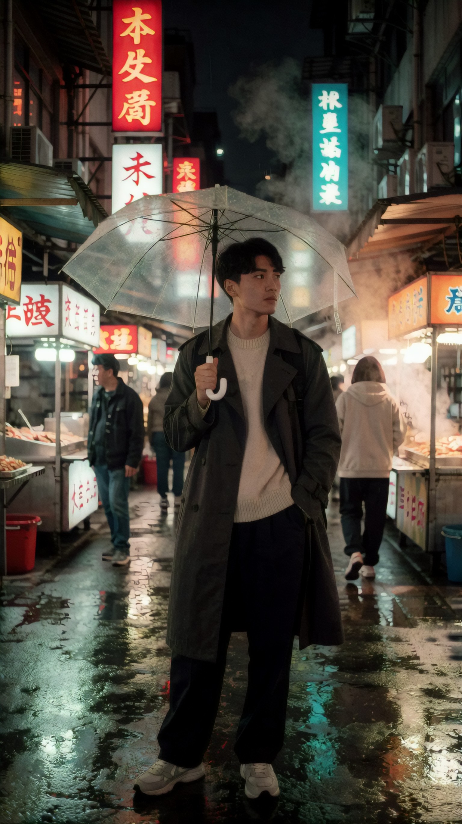
Inspect the stall geometry, background people, and sign structure. AI art generators often nail the mood here, but weaker outputs reveal duplicated figures, fake text clusters, or impossible alley depth.
For users making concept boards, posters, or social visuals where atmosphere beats factual scene logic, AI art generators still have a place. They are not obsolete. They are just less dependable when details matter.
The biggest change for beginners: better results from medium-detail prompts
A few years ago, beginners often had to rely on random luck, style presets, or massive prompt stacks copied from communities. In this test, newer text-to-image systems gave usable outputs from medium-detail prompts, provided the prompt described visual intent clearly.
That is a real everyday shift. You no longer need a chaotic string of quality tokens to get acceptable composition. You do need the right ingredients in the right order.
This beginner-friendly product prompt checks whether simple structure can still produce a commercial-looking image without hidden prompt tricks.
Topic: Skincare bottle hero shot for beginner-friendly product prompting
Genre: Product Editorial
Camera: Nikon Z8
Lens: 105mm macro f/2.8
Lighting: Studio butterfly light with soft side fill
Location: Beige stone pedestal setup in a minimal studio
Style: High-end beauty advertising
Final Prompt: A premium skincare serum bottle displayed on a beige stone pedestal in a minimal studio, frosted glass packaging with silver cap, small water droplets on the bottle surface, soft reflected highlights, controlled butterfly light with subtle side fill, clean shadow falloff, Nikon Z8 commercial sharpness, 105mm macro f/2.8 detail rendering, elegant centered composition with negative space for copy, warm beige, ivory, and soft silver palette, high-end beauty advertising style, crisp label area, realistic glass refraction, luxury texture detail, no extra bottles, no flowers, no clutter, clean premium cosmetic campaign feel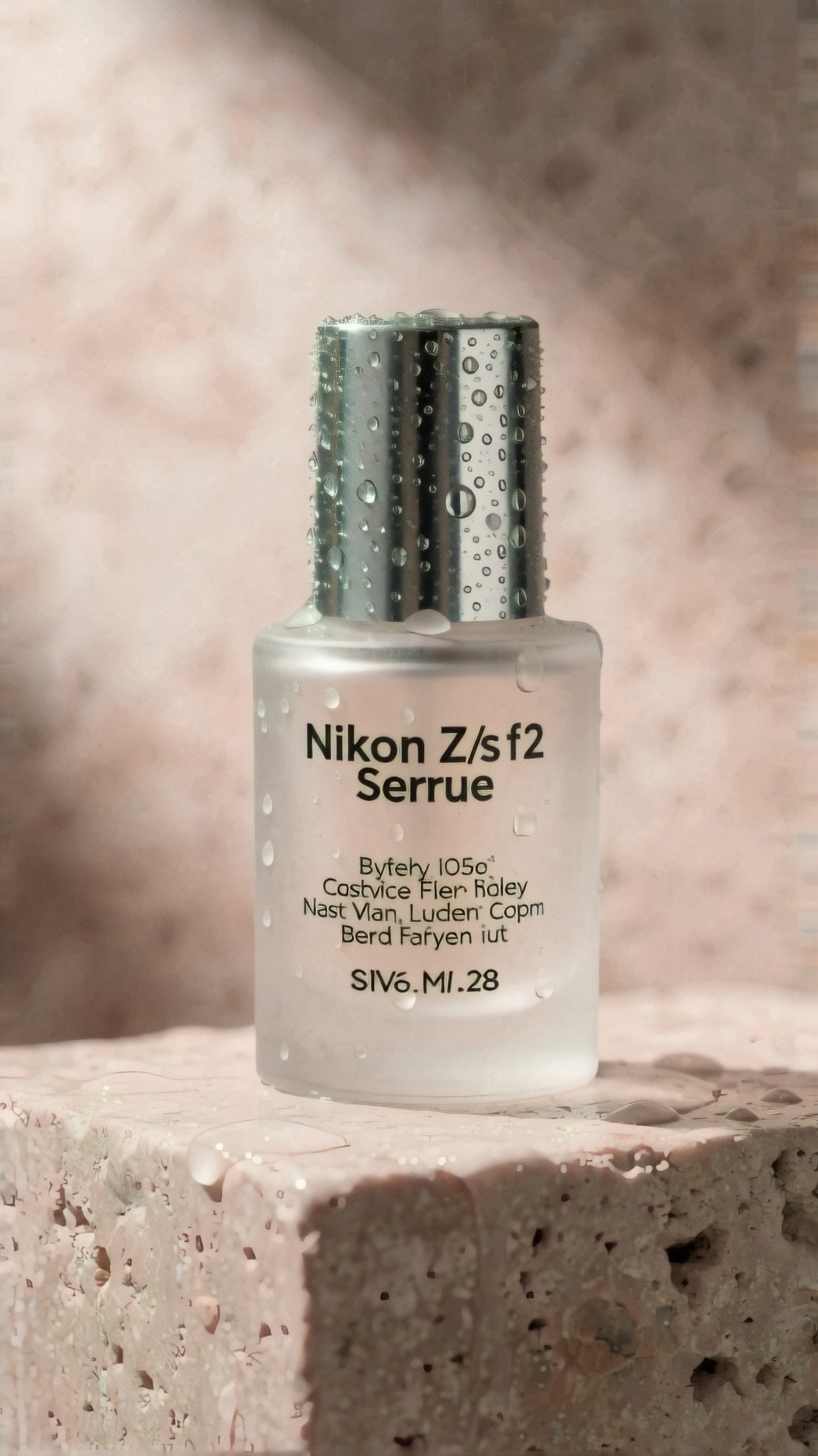
Inspect the label area, cap geometry, and reflections. A strong text-to-image result should keep the bottle shape believable and the scene uncluttered rather than inventing unrelated props.
The practical takeaway: beginners now get more value from learning prompt structure than from chasing model lore. That is one of the clearest changes in the ai art generator comparison space.
Strengths of modern text-to-image AI
Better subject hierarchy
When this setup works, the subject is clearer and less contested by the background. The best models now understand that “product hero shot” means the bottle should dominate the frame, not compete with decorative noise.
Better lighting obedience
Specific lighting requests like overcast diffusion, butterfly light, or golden hour backlight are more likely to produce predictable tonal patterns. They are not always physically perfect, but they are directionally useful.
Better lens behavior
Prompting a 35mm travel frame versus an 85mm portrait now makes a visible difference more often. That was inconsistent in older systems.
Better commercial repeatability
If you need 20 similar outputs to choose from, text-to-image AI is usually less chaotic. That matters for thumbnails, ad concepts, catalog placeholders, or article art.
This next prompt tests style lock and repeatability in beauty imagery, where many tools drift into over-processed skin or unstable makeup details.
Topic: Beauty close-up for skin texture and makeup consistency testing
Genre: Beauty Campaign
Camera: Hasselblad X2D 100C
Lens: 80mm f/1.9
Lighting: Studio butterfly light with silver reflector bounce
Location: Soft beige beauty studio
Style: Korean magazine cover
Final Prompt: Close-up beauty portrait of a woman with luminous natural skin, refined peach-toned makeup, brushed brows, satin nude lips, hair pulled back cleanly to reveal facial structure, subtle pearl earrings, direct but soft gaze, centered head-and-shoulders framing, soft beige beauty studio background, butterfly light with silver reflector bounce for polished cheekbone definition, Hasselblad X2D 100C detail and tonal depth, 80mm f/1.9 shallow separation, Korean magazine cover style, realistic pores and skin texture, elegant retouching without plastic skin, warm beige and soft rose palette, premium cosmetic campaign finish, no extra hair strands across eyes, no exaggerated lashes, no distorted ears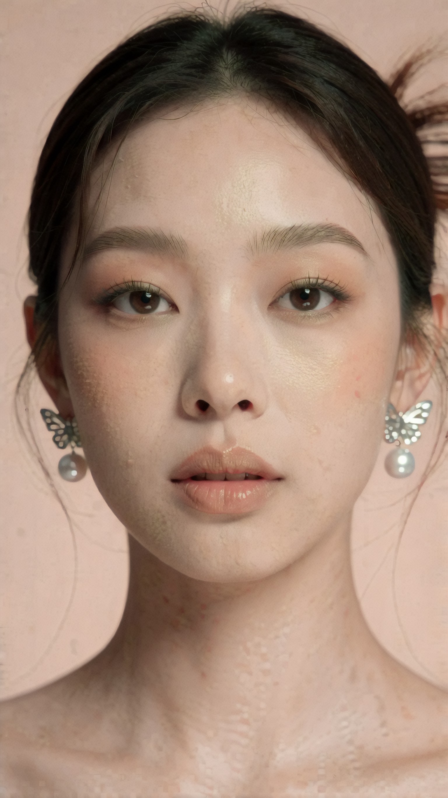
Inspect skin texture, eyebrow symmetry, and the transition from highlights to shadows across the nose and cheeks. The strongest result should look polished without turning into waxy skin blur.
Limitations and failure risks that still matter
The category has improved, but not enough to trust blindly. In this test, the most common failure patterns were still easy to trigger.
1. Hands remain a stress point
If hands are central, visible, and interacting with objects, failure rates still rise. Finger count is not the only issue. Grip logic, knuckle placement, and object contact are frequent weak points.
This prompt tests hand risk directly by forcing visible interaction and a close enough framing to reveal mistakes.
Topic: Coffee shop lifestyle portrait with visible hand interaction
Genre: Lifestyle Portrait
Camera: Fujifilm GFX 100S
Lens: 63mm f/2.8
Lighting: Window light with overcast diffusion
Location: Quiet corner of a modern cafe with wood and concrete textures
Style: Editorial lifestyle realism
Final Prompt: A young professional seated by a cafe window holding a ceramic coffee cup with both hands, relaxed posture, olive trench coat over white shirt, thoughtful expression looking slightly out the window, modern cafe interior with warm wood table and soft concrete wall, overcast daylight entering from the side, Fujifilm GFX 100S realism, 63mm f/2.8 medium-format detail, editorial lifestyle composition with upper torso and hands clearly visible, muted earth-tone palette, realistic skin and fabric texture, authentic coffee steam, clean background separation, believable finger placement around the cup, no extra fingers, no warped mug handle, no duplicated cup edges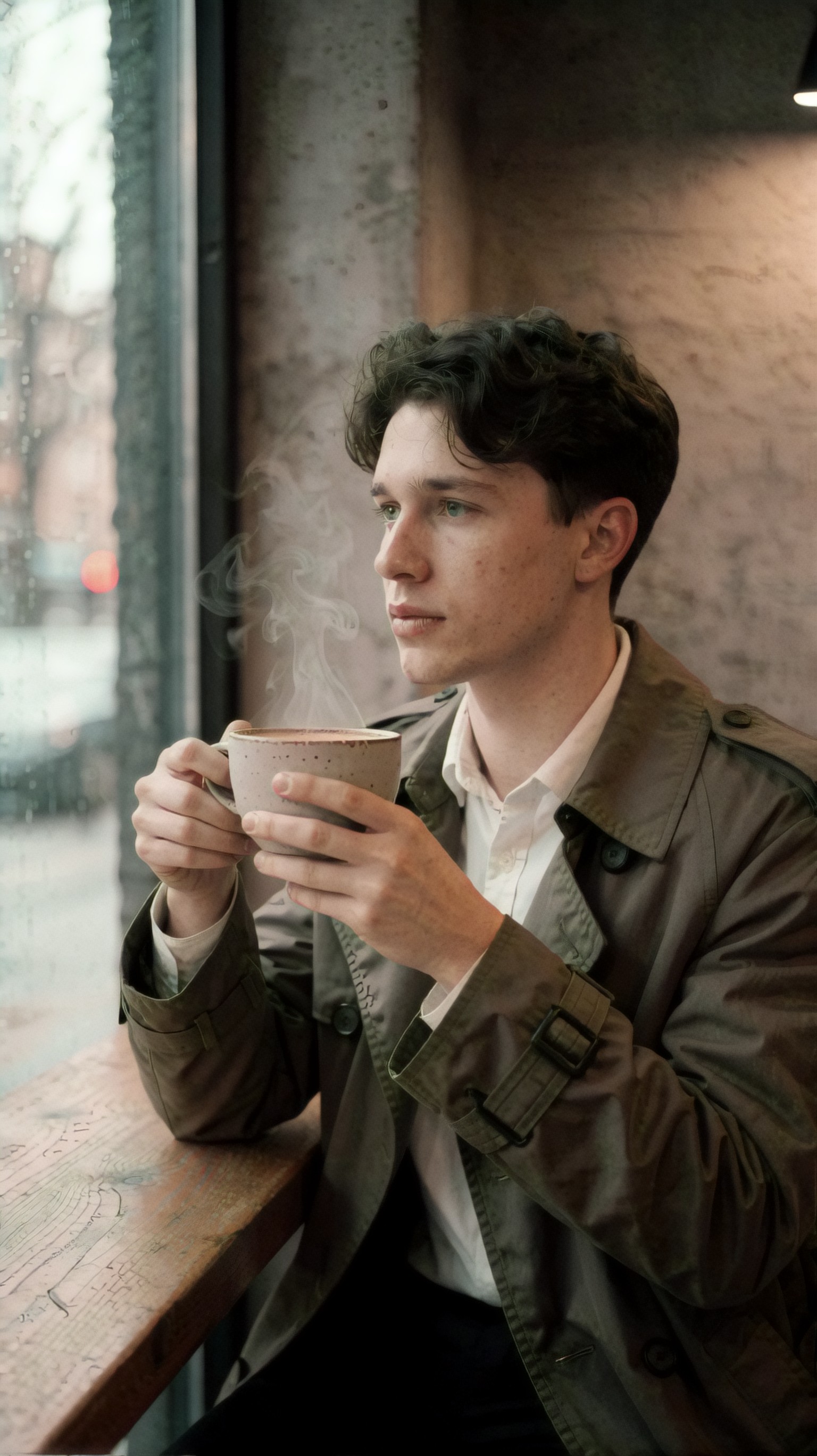
Inspect finger placement around the mug handle and whether the cup keeps its circular form. A weak output may look fine at first glance but falls apart once you check contact points.
2. Text and symbols are still unreliable
Even when image quality improves, embedded text, logos, signage, and UI-like layouts remain unstable in many tools. If your image needs accurate writing, generate the scene and add text later in a design app.
3. More detail can still create conflicts
Prompt quality is not just prompt length. Over-specified prompts can produce contradictory lighting, impossible compositions, or wardrobe confusion. The model may obey everything halfway and resolve nothing well.
4. Style can overpower realism
Some AI art generators still default to “beautiful noise”: dramatic color, cinematic bloom, painterly edges, and emotional depth that hides weak anatomy or implausible objects.
Text-to-image AI is better for products, interiors, and use-case visuals
The more an image depends on object clarity, the more text-to-image tools pull ahead. This was clear in product-led scenes and practical consumer visuals.
This prompt tests whether the system can place a device in a believable real-world context without losing product readability.
Topic: Laptop workspace scene for product clarity and object discipline
Genre: Product Editorial
Camera: Panasonic Lumix S1R
Lens: 50mm f/2
Lighting: Morning window light with soft bounce
Location: Minimal home office desk beside a large window
Style: Clean commercial look
Final Prompt: A slim silver laptop open on a tidy home office desk beside a large window, soft morning daylight across the keyboard, ceramic mug, closed notebook, and one pencil placed with intentional spacing, pale oak desk surface, light gray wall, modern ergonomic chair partially visible, Panasonic Lumix S1R commercial realism, 50mm f/2 natural perspective, clean commercial look, product-led composition with readable keyboard and screen angle, neutral white and soft wood palette, crisp edge detail, realistic metal reflections, subtle depth of field, no extra devices, no floating objects, no warped keyboard rows, uncluttered premium workspace atmosphere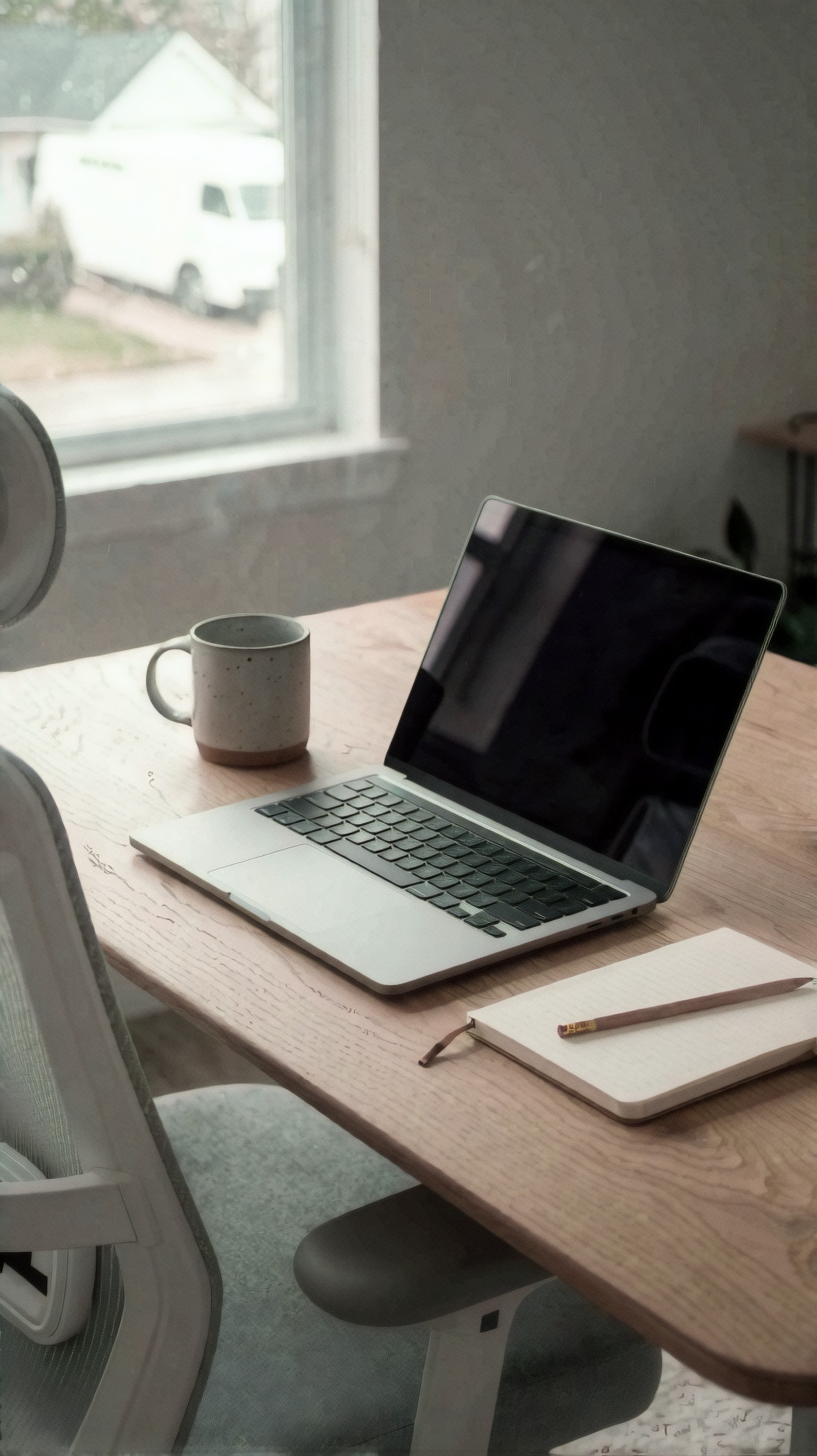
Inspect the keyboard rows, hinge geometry, and spacing of desk objects. AI art generators often create attractive desk scenes, but object discipline is where they start to unravel.
For bloggers, ecommerce sellers, course creators, and small teams, this is a meaningful upgrade. The image does not just need to look cool. It needs to communicate one thing clearly.
AI art generators are still useful for exploration and style discovery
There is a reason broad creative image tools remain popular: they are good at getting you out of literal mode. If your prompt is underdeveloped, an art generator may produce a more interesting starting point than a strict text-to-image tool.
I noticed this most in stylized illustration, anime, and poster-like outputs. The model had more freedom to invent color rhythm, prop variation, and scene drama.
This prompt tests creative stylization, where a more exploratory AI art generator can still compete well.
Topic: Futuristic courier character for stylized concept exploration
Genre: Anime Key Visual
Camera: Cinematic anime cel-shaded capture style
Lens: 28mm equivalent wide-angle composition
Lighting: Neon rim light with dusk ambient fill
Location: Elevated transit platform in a futuristic city
Style: High-energy anime poster art
Final Prompt: A futuristic courier standing on an elevated transit platform above a dense neon city, short wind-swept jacket in cobalt and black, utility belt, compact delivery case, one foot forward in a dynamic ready stance, determined expression, dusk sky fading into electric magenta and blue, trains streaking light in the background, neon rim light outlining the silhouette, cinematic anime key visual framing, wide-angle energy, layered city depth, high-energy poster composition, crisp cel-shaded textures with selective realism in fabric and metal, dramatic atmosphere, controlled color contrast, no extra limbs, no broken perspective lines, no cluttered foreground blocking the character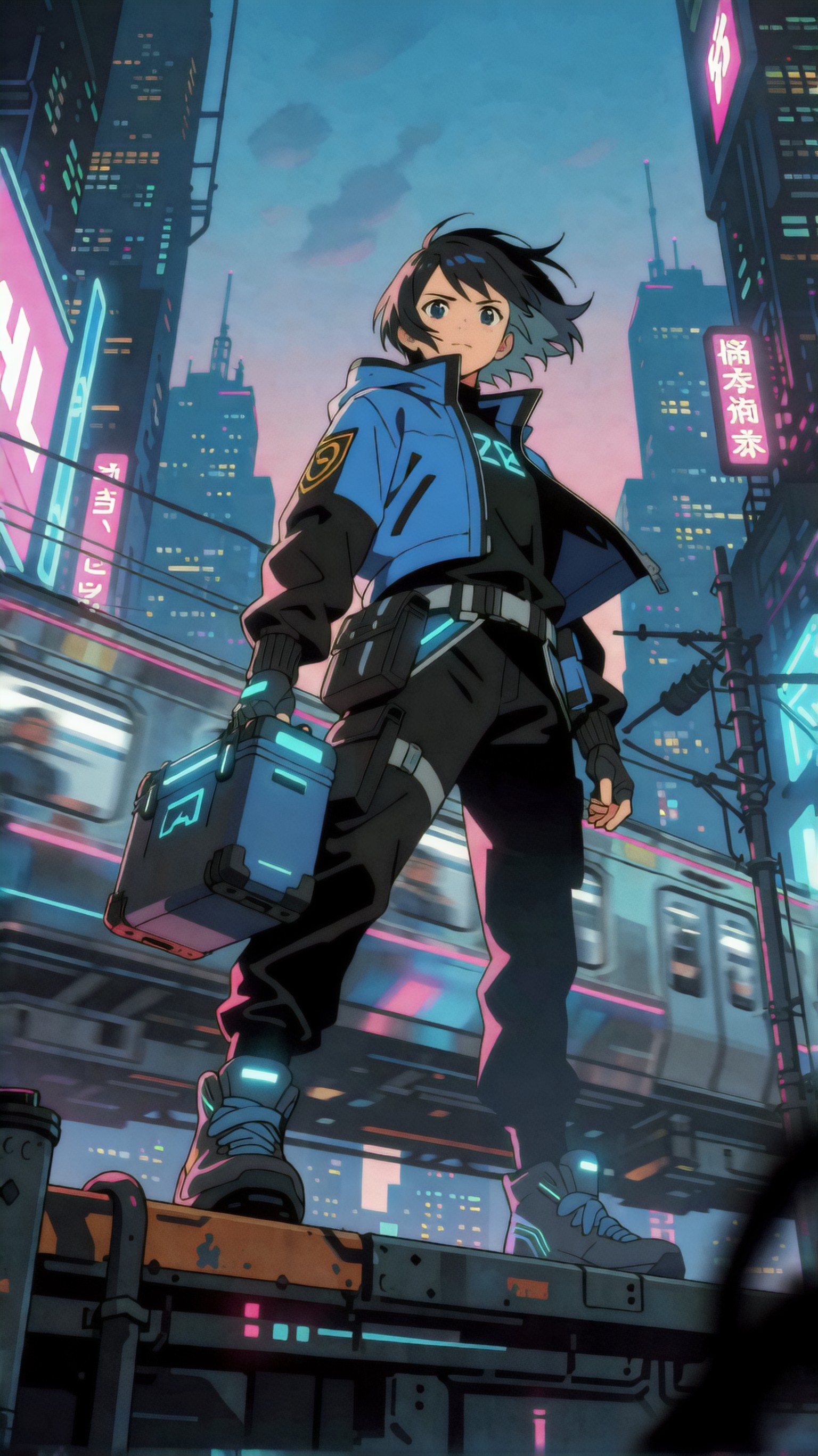
Inspect silhouette readability and whether the scene energy helps or harms the character focus. Here, expressive style can be a strength rather than a liability, provided anatomy and perspective hold together.
So if your goal is concept exploration, visual brainstorming, or rough art direction, a classic AI art generator workflow may still feel faster and more playful.
Which option is best for which user?
Best for beginners
If you want the best ai art generator for beginners, choose the tool that gives good outputs from clear natural-language prompts, not the one with the loudest style presets. In this test, beginners did better with text-to-image systems that respected plain instructions and exposed useful controls like aspect ratio, prompt strength, and image variation.
Beginners usually care about:
- fewer strange body errors
- less prompt complexity
- more predictable retries
- cleaner outputs for social, blog, or shop use
Best for marketers and creators
Use text-to-image AI when you need:
- ad-like product scenes
- article illustrations with one clear subject
- lifestyle composites with controlled framing
- repeatable visual identity across multiple images
Best for artists and moodboard builders
Use AI art generators when you need:
- loose ideation
- style exploration
- poster energy
- expressive color and atmosphere before precision matters
Prompt structure mattered more than model branding
Across the test, the biggest performance swing did not come from switching categories alone. It came from prompt design. Strong prompts gave the model a visual chain of command:
1. subject 2. genre 3. camera and lens 4. lighting 5. location 6. style direction 7. restrictions and quality cues
That is why the prompt enhancer format is useful. It reduces ambiguity without becoming unreadable.
This next prompt tests environmental consistency in an interior scene, where weaker systems often blend architecture styles or break scale relationships.
Topic: Boutique hotel lounge interior for environment consistency testing
Genre: Interior Editorial
Camera: Leica SL2
Lens: 24-70mm at 35mm f/4
Lighting: Late afternoon window light with warm lamp accents
Location: Boutique hotel lounge with curved furniture and stone finishes
Style: Elegant resort editorial
Final Prompt: A refined boutique hotel lounge interior with curved cream sofas, low travertine coffee table, textured plaster walls, bronze floor lamp, and tall linen curtains, late afternoon window light entering from the left with warm practical lamp accents, elegant resort editorial styling, Leica SL2 realism, 35mm interior perspective, balanced wide composition showing seating arrangement and architectural depth, soft sand, cream, and muted terracotta palette, premium fabric and stone texture detail, calm luxurious atmosphere, no duplicated chairs, no impossible table legs, no mixed furniture scale, no warped wall lines, believable interior proportions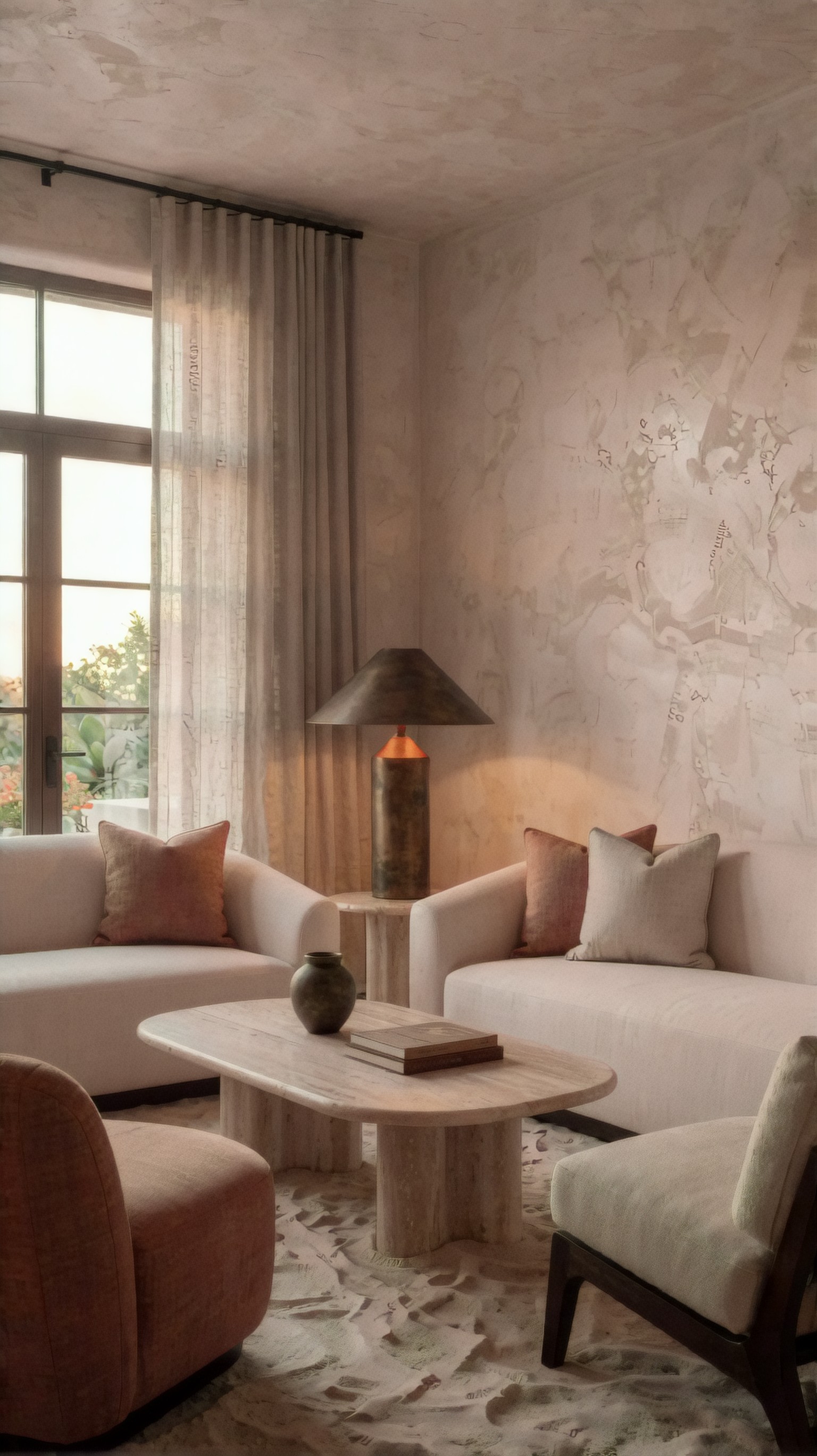
Inspect straight lines, furniture scale, and whether the lighting direction remains coherent across the room. Text-to-image systems now handle this better than before, but interiors still expose perspective errors quickly.
A practical checklist based on observed output quality
When comparing difference between ai image tools, I would use this checklist before declaring any result “good”:
Output quality checklist
- Is the main subject obvious within one second?
- Does the lighting direction make physical sense?
- Are hands, ears, and accessories anatomically believable?
- Is the background helping the subject or competing with it?
- Does the lens feel appropriate to the scene?
- Are product edges, labels, and surfaces clean?
- Do repeated rerolls preserve the same style direction?
- Is there hidden nonsense in reflections, fingers, fabric folds, or object contact points?
- If text appears, is it actually usable?
- Would you spend less time fixing this than sourcing a stock image or photo?
That last question matters. Better generative ai images tools are not just the ones with prettier previews. They are the ones that reduce edit time after generation.
What I would change next in a real workflow
After running these comparisons, I would not ask one tool to do every job. I would split the workflow by output type.
Workflow I would actually use
- Use an AI art generator first for concept mood if the idea is vague.
- Move to text-to-image AI once subject, lighting, and composition need control.
- For product or business visuals, start directly in text-to-image.
- Add real text and layout outside the generator.
- Keep prompts modular so wardrobe, location, and lighting can be swapped without rewriting everything.
This final prompt tests outdoor fashion consistency with enough detail to challenge composition while staying commercially usable.
Topic: Street style fashion shot for wardrobe control and background balance
Genre: Street Style
Camera: Sony A1
Lens: 50mm f/1.2
Lighting: Golden hour backlight with soft front fill
Location: Seoul side street with clean storefronts and muted urban textures
Style: Luxury fashion campaign
Final Prompt: A stylish young woman walking through a clean Seoul side street lined with minimalist storefronts, tailored charcoal blazer over cream knit dress, knee-high black leather boots, structured handbag in one hand, confident mid-step pose with relaxed shoulders, slight smile, golden hour backlight creating a soft rim on hair and fabric, subtle front fill preserving facial detail, Sony A1 realism, 50mm f/1.2 subject isolation, luxury fashion campaign styling, balanced urban background with muted signage and soft reflections in windows, charcoal, cream, black, and warm amber color palette, crisp fabric texture, natural skin detail, elegant motion without blur overload, no extra bags, no warped legs, no random pedestrians blocking the frame
Inspect leg shape during the walking pose, bag structure, and whether storefronts stay clean rather than turning into visual clutter. This is the kind of prompt where text-to-image tools often outperform broader art generators for usable campaign-style outputs.
Final recommendations: when to use each option
If your search is really about text to image ai vs ai art generator, the answer is no longer theoretical. For everyday users, the split is practical.
Use text-to-image AI if you need
- reliable instruction following
- cleaner product and commercial visuals
- more predictable portrait control
- repeatable outputs with lower retry waste
- prompts that map directly to composition decisions
Use AI art generators if you need
- fast inspiration
- looser style exploration
- more expressive first-pass mood
- concept art where precision is secondary
Avoid relying on either alone if you need
- exact typography
- legal brand reproduction
- perfect hands in complex interactions on the first try
- production-ready images without human review
The most important prompt detail in this test was not a magic keyword. It was clear visual hierarchy: subject first, then camera and lighting, then style, then restrictions. That single habit improved outputs more consistently than adding extra adjectives.
Editorial conclusion: everyday users should use modern text-to-image workflows when the image has a job to do, especially for products, portraits, thumbnails, and controlled lifestyle scenes. Users who mainly want inspiration, visual play, or early concept direction should still keep AI art generators in the stack. Avoid both as fully autonomous tools if precision text, exact anatomy, or brand-safe detail is essential. If I had to keep one setting in focus, it would be lighting specificity, because that was the fastest way to separate coherent images from attractive but unusable ones.