If your ZImage Turbo results look generic, the usual fix is not a longer prompt but a more decided one: name the subject's concrete details, say where it is, and state the framing and light you want. The six example pairs below come from generation records of actual ZImage runs, so the comparisons are real, but six images are a small sample. Treat what follows as a method to try, not a guarantee.
Start from what a vague prompt actually produces
The shortest useful experiment is to run a vague prompt and look at what the model filled in on its own. This prompt was run on ZImage on 2026-06-03:
Make something futuristic and cool for a tech brand.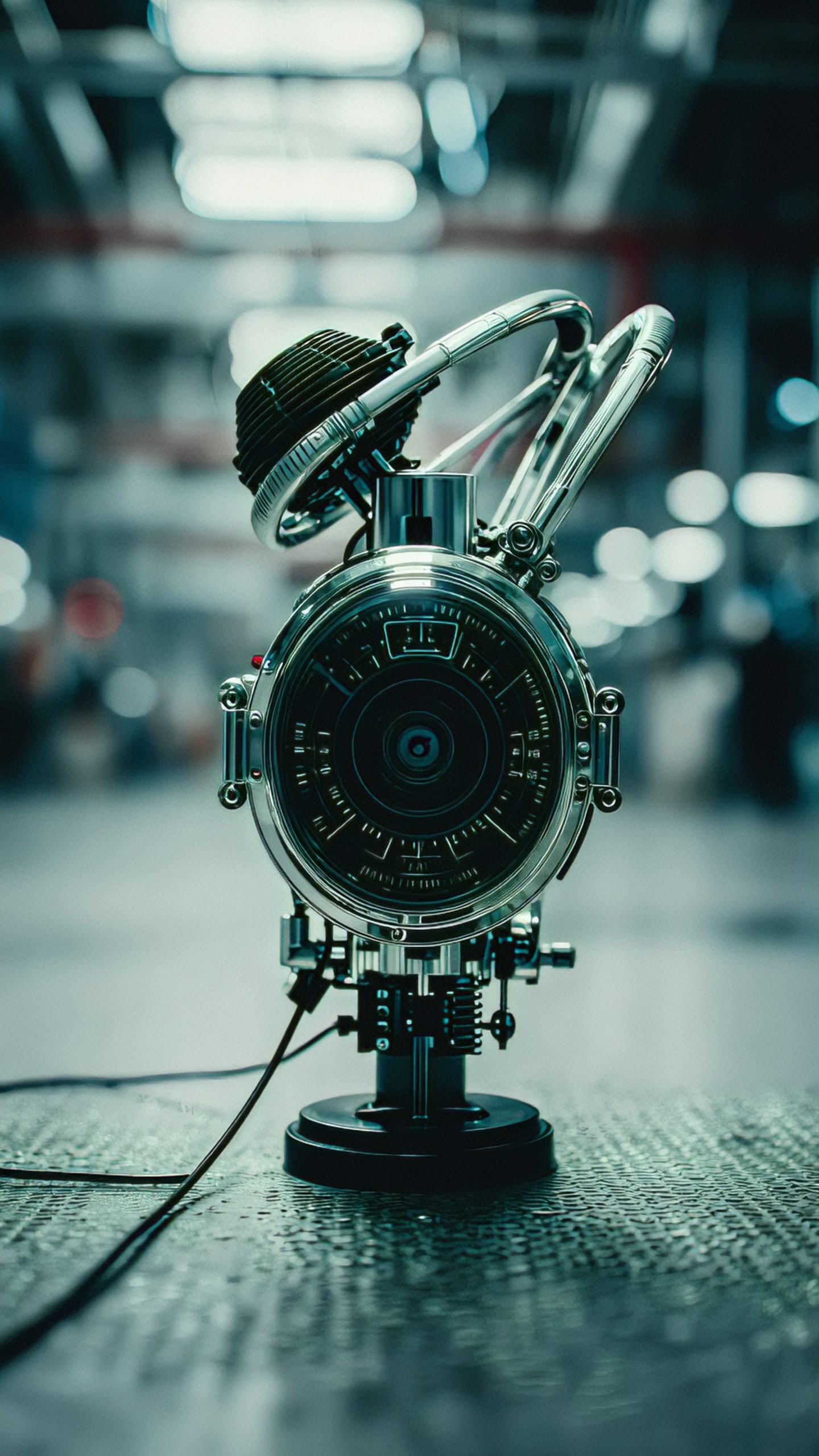
The result is a striking but unidentifiable object: a chrome device with a dial face, looping tubes and a cable, in a teal-graded blurred industrial space. It is not a product a brand could use. The model had to decide what the object is, where it stands and how it is lit, and it decided all of that without you. That is the core problem with vague prompts: the choices still get made, just not by you.
Now the specific version, run shortly afterward:
A sleek black wireless speaker on a brushed aluminum table, soft blue rim light, minimal studio background, high-end product photography, centered composition, shallow depth of field, clean reflections, premium technology brand aesthetic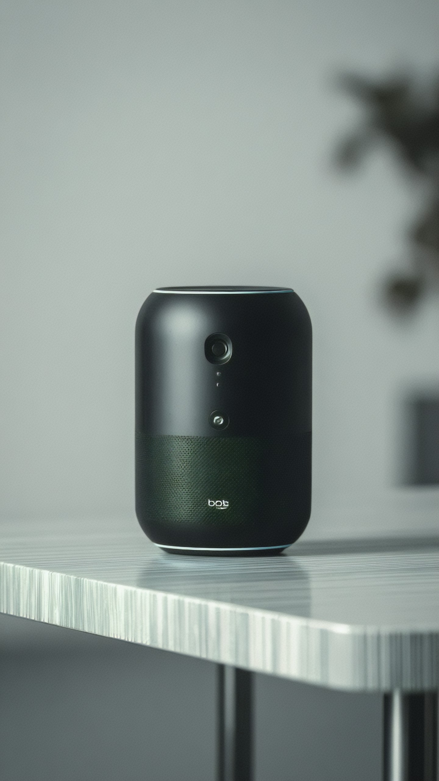
This one is recognizably a speaker, centered, on a pale surface with a soft blurred background, as requested. Two caveats from looking at it closely. The table reads as a pale striped laminate more than brushed aluminum, and a small badge near the bottom of the speaker shows garbled lettering that looks like "bot". The prompt did not forbid a logo, so this is a reminder to add "no text, no logo" when you need a clean product. The blue rim light is also subtle here, only a thin light line around the top and base.
Add detail in steps and watch what each step buys
A second set of three runs isolates how specificity changes a person image. Each prompt adds information to the last.
A person in a city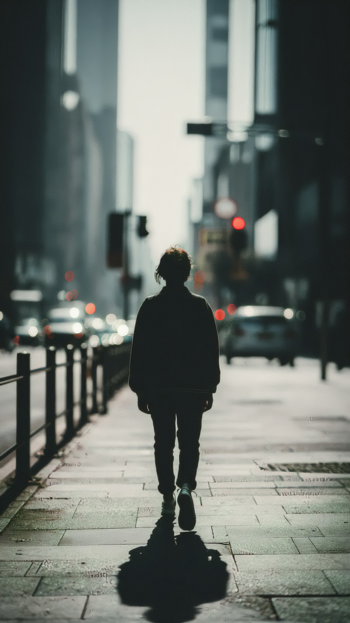
With almost nothing specified, the model chose a backlit silhouette seen from behind. The face is never shown, so this is unusable for any purpose that needs a character. Nothing went wrong technically; the prompt simply gave no reason to show a face.
A young architect holding rolled blueprints on a rainy city sidewalk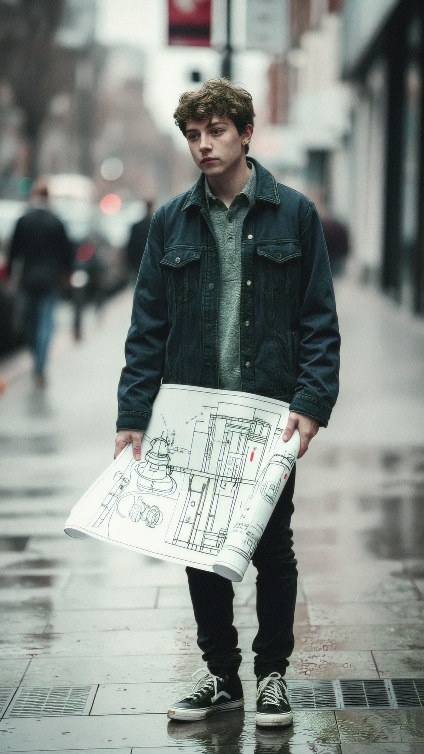
Adding role, prop and weather moves the image to a clear character with a wet street. But the blueprints are not "rolled": the sheet hangs open across his front and the drawing is a cluttered sketch. The model honored "blueprints" and "rainy" and loosened "rolled". Word choice for a prop matters, and small props are where mismatches show.
A young architect in a charcoal wool coat holding rolled blueprints, standing on a rainy city sidewalk outside a glass office tower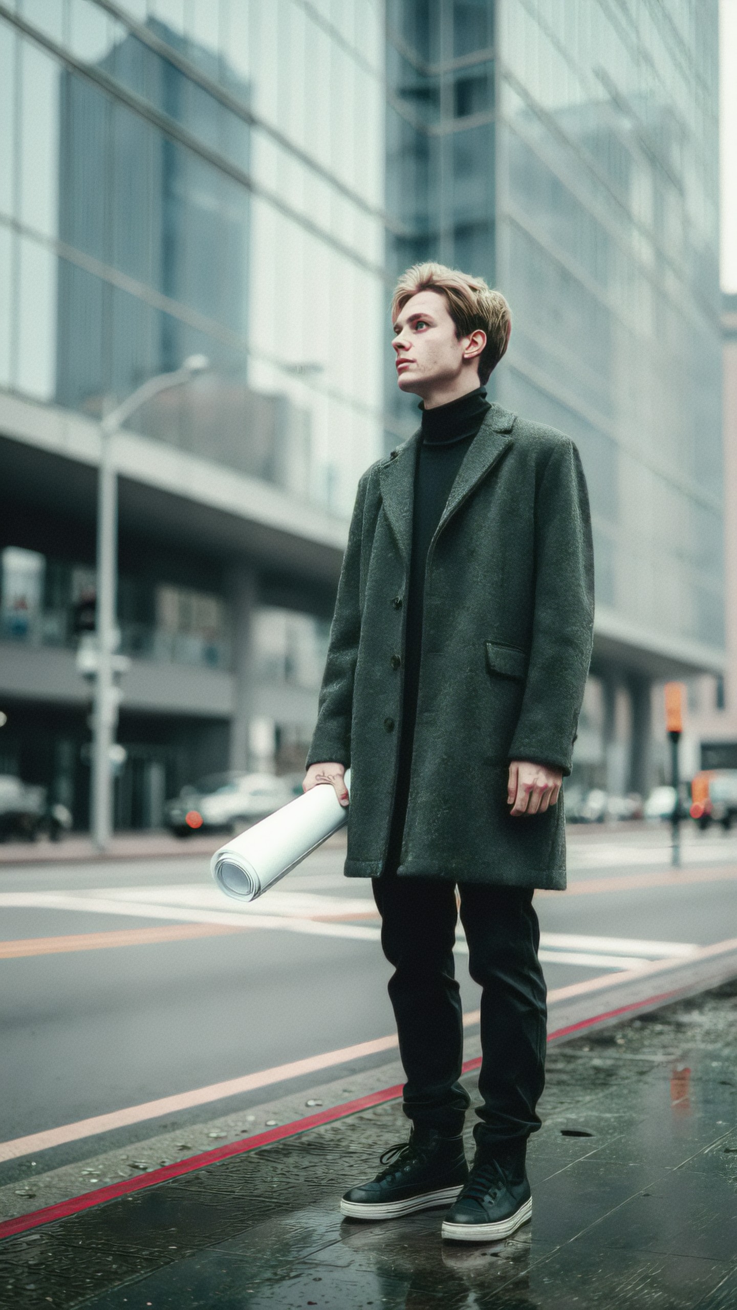
Here the coat, the tightly rolled paper and the glass buildings all appear. The coat reads as dark grey-green rather than strictly charcoal, which is close enough for most uses. The hand holding the roll has some odd marks on the back of it, so check hands at full size before publishing. The takeaway from the three steps: each concrete noun (garment, prop state, background building) removed one decision from the model.
Decide what the image is for before you write the layout
Composition instructions are where a prompt turns into something you can place on a page. This prompt asks for empty space for text:
Overhead flat lay of a travel planning desk, passport, notebook, camera, train tickets, coffee cup, warm morning light, organized composition with negative space on the right for text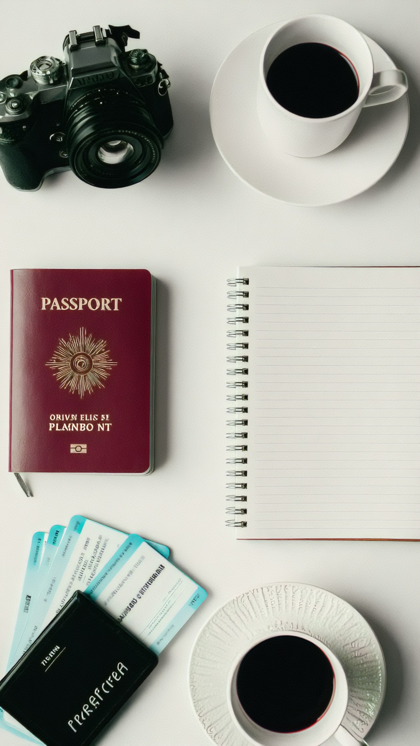
The objects are all present and the overhead angle is followed. The negative space request only partly landed: the right half holds an empty notebook rather than clear background, which may still serve as a place for text, but it is not a clean blank area. The lettering on the passport and tickets is garbled ("PLAMBO NT" under the passport emblem, unreadable ticket text). If readable printed text matters, do not rely on the model to render it; add text in a layout tool afterward. Also note that the "warm morning light" is not obvious in this image, which looks evenly lit and neutral.
A working prompt skeleton
Across the examples above, the prompts that worked best shared an order that moves from what matters most to finishing touches:
[Main subject], [specific details], [environment or context], [composition and camera angle], [lighting], [style or medium], [color palette], [quality constraints]Two practical notes on using it.
- Put the subject first and keep style singular. Conflicting styles (for example, watercolor and 3D render and photo in the same prompt) are a commonly cited cause of muddy output. This is general prompt-writing advice, not something measured in the images above.
- Name the things you will check. If you will check for text, hands and props afterward, say so in constraints (for example "no text, no logo") and then inspect those areas. The speaker badge and the flat-lay lettering above show why.
Use the skeleton as a checklist rather than a rule. The "Subject + context + composition + lighting + style + quality constraints" formula itself was also submitted as a prompt to ZImage, which is a useful reminder that the model treats whatever string you give it as a scene description, not as an instruction to you.
Iterate one variable at a time
General guidance for iterating, which we have not measured here: change one thing per run so you can tell which edit caused the difference. The architect sequence above is a rough example, since each step added several details at once; if the coat had gone wrong, you could not tell whether the coat or the building was responsible. A cleaner approach is to lock the parts that work and alter only one element, such as the prop's state ("tightly rolled" instead of "rolled") or the lighting.
Short fixes commonly suggested for frequent problems (unverified suggestions, try them and compare):
large subject in the foreground, tight cropminimal uncluttered background, simple surfaces, clear focal pointwide composition with empty negative space on the leftNegative prompts, where your interface supports them, are better kept short and targeted. A long list of things to avoid is less reliable than a clear positive description.
Frequently asked questions
Do I need to write long prompts? Not necessarily. The shorter architect prompt already produced a readable character; the longer one fixed specific details. Add length only where an unwanted choice appeared.
Why does my text come out garbled? In the images here, every printed word other than the main "PASSPORT" label was distorted. Plan to add text outside the generator.
Where can I test prompts? Draft and compare variants in the [Prompt Lab](/promptlab/en), generate in [Create](/create/en), and use the [upscaler](/upscaler/en) for final resolution.
> About this article's evidence. Model: ZImage (as recorded in the generation log). Images were generated on 2026-06-03. I viewed six of the sixteen generated images directly (the vague and specific pair, the three-step person sequence, and the flat lay); the other ten were not reviewed and are not discussed. Each compared pair was a single run, so these are examples, not statistics.