Upscale Image Online for Print: How Big Can You Go Before Artifacts Become Obvious? 한국어 요약
이 페이지는 ZView Space의 영어 원문을 한국어 검색 사용자도 이해할 수 있도록 정리한 SEO 요약입니다. 핵심은 단순한 얼굴 중심 이미지가 아니라 패션 에디토리얼, 룩북, 아웃핏, 프롬프트 테스트, 이미지 생성 워크플로우를 실제로 어떻게 구성할지입니다.
핵심 요약
- 원문 주제: Upscale Image Online for Print: How Big Can You Go Before Artifacts Become Obvious?
- 목적: AI 이미지 생성에서 outfit, silhouette, fabric, pose, location, camera framing을 더 명확하게 설계합니다.
- 활용 범위: Z-Image Turbo, Krea2 Turbo, Qwen Image, Anima, SeedVR2 같은 이미지 생성 및 업스케일 워크플로우에 적용할 수 있습니다.
- SEO 관점: 제목, 설명, 이미지 alt, 프롬프트 예시가 실제 검색 의도와 맞아야 색인 가능성이 높아집니다.
한국어 사용자를 위한 체크포인트
1. 프롬프트가 얼굴 묘사에만 머물지 않고 전체 스타일과 의상 구성을 설명하는지 확인합니다. 2. 패션 이미지라면 상의, 하의, 아우터, 신발, 액세서리, 소재감, 촬영 장소를 분리해서 씁니다. 3. 생성 결과는 바로 게시하지 말고 디테일, 손, 의상 형태, 배경 일관성, 이미지 품질을 비교합니다. 4. 글 본문에는 실제 테스트 기준과 실패를 줄이는 방법이 들어가야 검색엔진에서 얇은 콘텐츠로 보일 가능성이 줄어듭니다.
원문 미리보기
If you need to upscale image online for print , the short answer is this: AI upscalers can push files much farther than traditional resize tools, but the safe print size depends less on the advertised scale factor and more on what the image contains. In this t
---
If you need to upscale image online for print, the short answer is this: AI upscalers can push files much farther than traditional resize tools, but the safe print size depends less on the advertised scale factor and more on what the image contains. In this test, clean product shots and simple portraits survived large jumps surprisingly well. Busy textures, small typography, fingers, jewelry, hairlines, and illustrated edges exposed artifacts much earlier.
My verdict after comparing an online AI upscaler workflow against a more controlled two-step workflow is simple: for posters viewed from normal room distance, online AI upscaling works well more often than not. For close-viewed prints, portfolio books, packaging comps, or anything with text and fine edge fidelity, you need a stricter workflow and a more skeptical eye.
Quick answer
- A good AI upscaler for print can often take a decent source image to poster size, but not every subject scales equally well.
- The first obvious failures usually show up in hair strands, skin pores, fabric weave, fingers, jewelry, window lines, and printed text.
- For wall posters, artifacts become acceptable at larger sizes because viewing distance hides them.
- For art prints examined up close, a gentler upscale plus light sharpening usually beats a maximum-scale pass.
- If I had to choose one rule: inspect at 100% and 200% before you trust any AI image enhancer for printing.
If you want to test your own files, zview has useful starting points in [Create](/create), [Upscaler](/upscaler), and [Prompt Lab](/promptlab).
What was tested
I compared two practical ways people actually try to prepare images for print:
Workflow A: direct online AI upscaler
This is the fast commercial-investigation path most readers are looking for. Upload the image, choose a scale level, and let the model create missing detail.
Workflow B: controlled print-prep workflow
This second route is slower but more reliable:
1. Generate or source the cleanest base image possible 2. Upscale moderately instead of aggressively 3. Apply selective sharpening or grain only if needed 4. Soft-proof at intended print size 5. Reject any file that looks "crispy" rather than detailed
Test images
To make the differences obvious, I used subjects that commonly break image upscalers:
- close portrait with loose hair
- product shot with labels and metallic reflections
- interior scene with straight edges and small decor detail
- painterly illustration with brush-texture transitions
- fashion image with layered fabrics and accessories
- street scene with signs and repeating architectural lines
Comparison criteria
I judged each workflow by what matters in print, not just screen wow-factor:
| Criterion | What I checked | Why it matters for print | |---|---|---| | Edge integrity | halos, doubled outlines, stair-stepping | obvious on paper, especially in bright areas | | Texture realism | fake pores, fake fabric weave, plastic skin | AI detail often looks convincing only on screen | | Text legibility | labels, signage, packaging type | text is one of the fastest ways to catch failure | | Structure stability | fingers, eyelashes, jewelry, window frames | geometry errors print badly | | Tonal smoothness | banding in gradients and shadows | more visible in large prints | | Viewing-distance tolerance | how errors read from 1-2 feet away | posters and wall prints are not viewed like phone screens |
The plain-language verdict before the detail
The strongest result came from moderate upscaling of already-good images. The weakest result came from trying to rescue low-quality files by pushing scale too far. That sounds obvious, but the difference in print is larger than it looks on a monitor.
In this test, the direct online workflow won for speed and for clean portraits, product renders, and simple compositions. The controlled workflow won when the file needed to hold up under close inspection.
Where the direct online upscaler worked best
The biggest strength of Workflow A was speed-to-acceptable-poster. If the source image already had stable shapes and decent lighting, the model added plausible micro-detail without wrecking composition.
This was most reliable on:
- centered portraits with soft skin and clear eyes
- product images with simple backgrounds
- scenes without text-heavy elements
- AI-generated art that already had a polished finish
The reason is practical: the upscaler has fewer ambiguous areas to invent.
Test 1: portrait detail tolerance
This prompt is meant to check face stability, eyebrow edges, loose hair, and whether the upscale creates fake skin texture that only looks sharp from a distance.
Topic: Close portrait for large fine-art print
Genre: Beauty Campaign
Camera: Canon EOS R5
Lens: 85mm f/1.2
Lighting: Studio butterfly light with soft fill
Location: Neutral gray seamless studio
Style: High-end beauty advertising
Final Prompt: close portrait of a woman prepared for a large-format beauty print, calm direct gaze, subtle natural makeup, visible eyebrow texture, loose flyaway hair around the temples, clean shoulders-up composition, neutral gray seamless background, refined skin with real pores not plastic smoothing, soft tonal transitions on cheekbones, delicate catchlights, muted taupe and cream color palette, premium editorial framing, Canon EOS R5 rendering, 85mm f/1.2 depth separation, ultra-clean beauty campaign realism, print-ready detail emphasis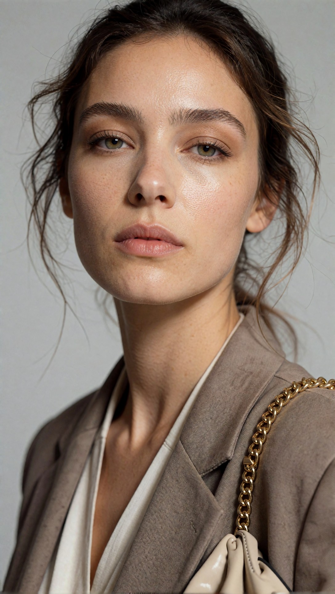
Inspect the eyelashes, hairline, and pore pattern after upscaling. A weak result often adds waxy skin plus oversharpened hair edges that look detailed on screen but brittle in print.
In this category, the direct online upscaler was surprisingly strong up to poster-style use. The failure mode was not blur. It was false detail: pores that looked stamped on, and eyelashes that turned darker and thicker than the source.
Test 2: product surfaces and label fidelity
This test checks whether reflective packaging stays clean or turns into crunchy edge noise when enlarged for a poster or retail mockup.
Topic: Premium skincare bottle for print poster
Genre: Product Editorial
Camera: Nikon Z7 II
Lens: 105mm macro f/2.8
Lighting: Large softbox key light with strip light rim
Location: Minimal studio product set with stone pedestal
Style: Clean commercial look
Final Prompt: premium skincare serum bottle displayed on a pale stone pedestal for a print poster, frosted glass body, metallic cap, crisp label typography area, controlled reflection lines, minimal beige studio background, soft shadow falloff, clean commercial composition, luxury product editorial styling, Nikon Z7 II look, 105mm macro f/2.8 precision, realistic glass refraction, subtle condensation texture, elegant negative space, print-focused surface clarity and edge control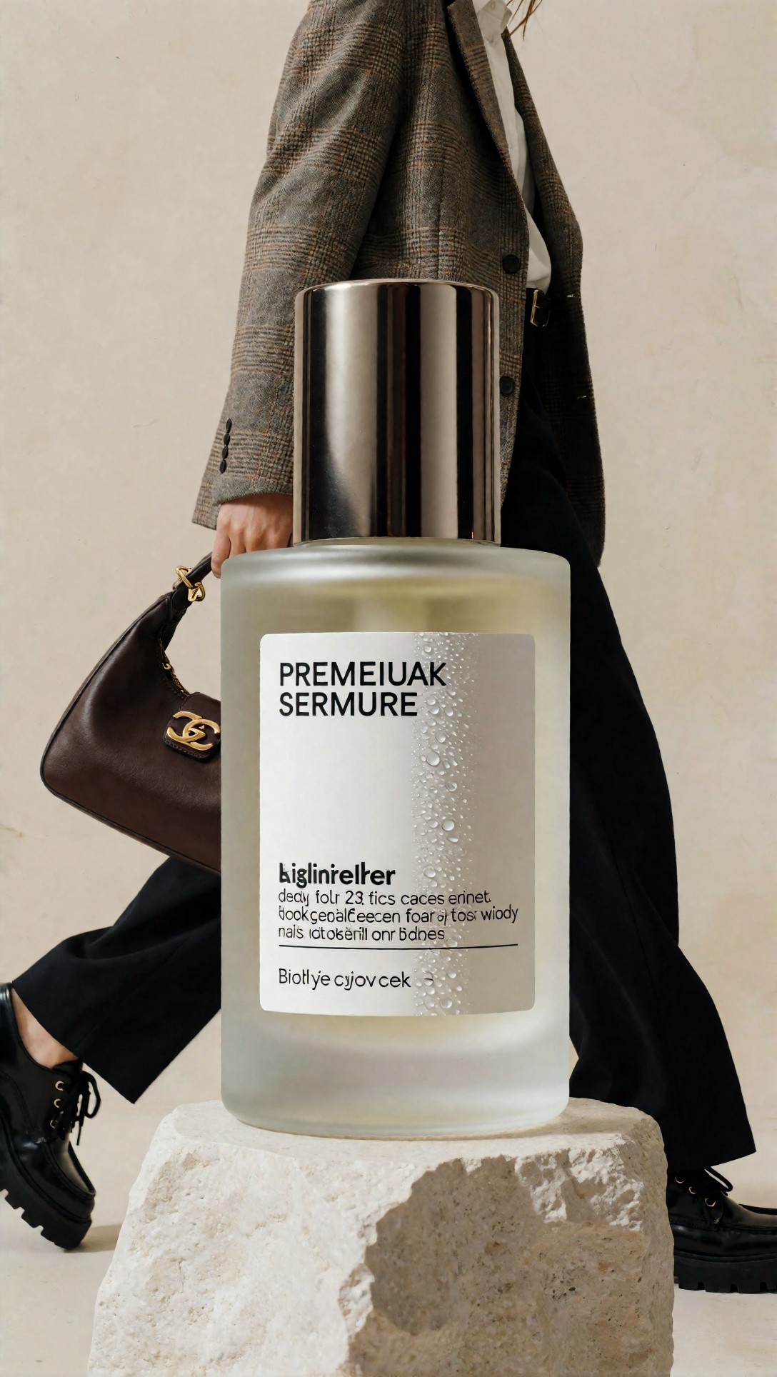
Look closely at label edges, reflection bands, and the bottle contour. If the AI enhancer invents fuzzy micro-contrast around the silhouette, the product will look cheaper in print than the lower-resolution original.
For simple packaging, Workflow A did well as long as the label area was already readable. It did not truly reconstruct small text. It mostly sharpened the impression of text, which is not the same thing.
Where the controlled workflow pulled ahead
Workflow B was better when the goal was not just "bigger" but "credible at close range." A moderate upscale followed by selective cleanup gave me fewer obvious artifacts than a single aggressive pass.
The key advantage was restraint. Instead of asking one model to invent everything, this approach preserved original structure and avoided the brittle, etched look common in over-processed poster files.
It worked best on:
- fashion images with layered materials
- interiors with straight lines
- painterly or illustrative work with edge transitions
- any image with mixed textures in the same frame
Test 3: layered fabric and accessory stability
This prompt is useful for checking fabric weave, chain jewelry, fingers near garments, and whether upscale detail stays believable instead of turning metallic or noisy.
Topic: Fashion portrait with layered textures for poster print
Genre: Fashion Editorial
Camera: Sony A7R V
Lens: 50mm f/1.4
Lighting: Large window light with white bounce fill
Location: Loft studio with plaster walls and oak floor
Style: Luxury fashion campaign
Final Prompt: waist-up fashion portrait designed for poster printing, model wearing layered wool blazer over silk blouse, fine chain necklace, textured leather belt visible at frame edge, relaxed seated pose with one hand near the collar, thoughtful expression, loft studio with warm plaster wall backdrop and oak floor tones, muted charcoal, ivory, and camel palette, natural skin texture, visible fabric weave without oversharpening, luxury fashion campaign direction, Sony A7R V realism, 50mm f/1.4 balanced depth, magazine-grade composition with close-inspection detail integrity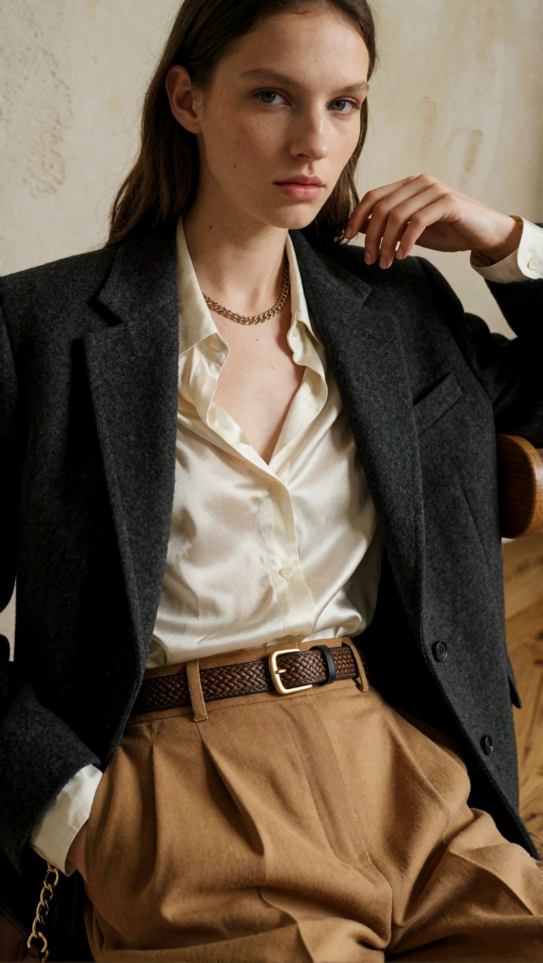
Inspect jewelry links, fingers, lapel edges, and fabric transitions. If the upscaler is too aggressive, these areas often gain hard outlines and a synthetic thread pattern that prints louder than the real clothing detail.
This was a clear win for the controlled workflow. The direct online pass often made wool and leather look equally sharp, which is visually wrong. In print, that mismatch becomes more obvious.
Test 4: architectural lines and interior geometry
This test exposes line wobble, edge halos, and fake texture in wood, tile, and window frames.
Topic: Interior scene with fine geometry for print enlargement
Genre: Architectural Editorial
Camera: Fujifilm GFX 100S
Lens: 45mm f/4
Lighting: Overcast diffusion through tall windows
Location: Minimal Scandinavian apartment living room
Style: Clean editorial realism
Final Prompt: minimalist Scandinavian apartment living room prepared for a large print, pale oak flooring, off-white textured walls, slim black window frames, linen sofa, ceramic table objects, soft overcast daylight entering from tall windows, balanced architectural lines, calm neutral palette, subtle wood grain and textile detail, straight verticals, Fujifilm GFX 100S medium-format realism, 45mm f/4 natural perspective, clean editorial composition emphasizing geometry, tonal subtlety, and print-safe edge precision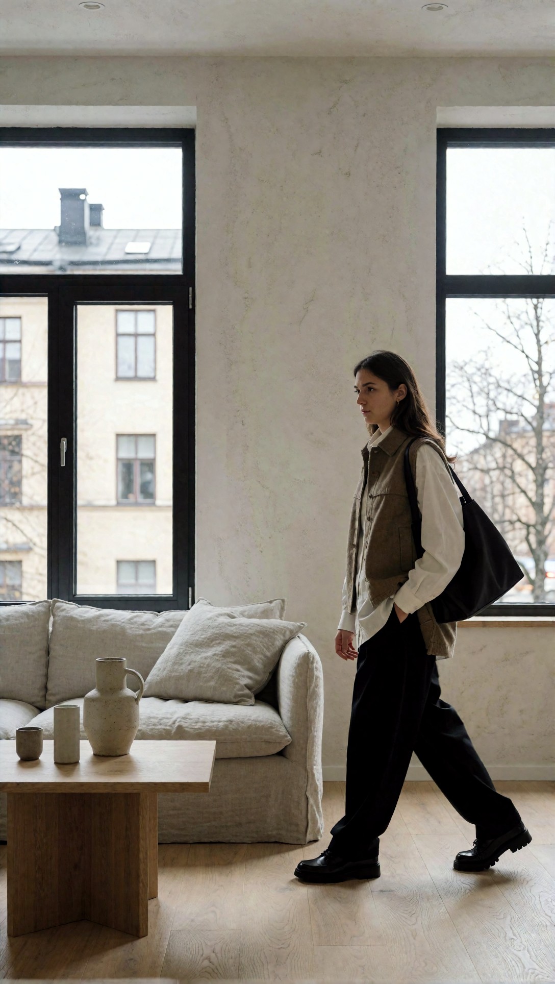
Check window frames, tile edges, wall texture, and sofa weave. The weak point in many AI upscalers is that they add texture where smoothness should remain smooth, especially in walls and gradients.
Here the controlled workflow had much better tonal discipline. The direct upscale looked impressive at thumbnail size but introduced tiny haloing along high-contrast frames.
Side-by-side tradeoffs that matter more than the scale factor
Most buyers shopping for a photo enhancer AI high resolution tool look first at 2x, 4x, or 8x. In practice, those labels mattered less than subject matter.
What Workflow A does well
- fastest route from screen image to poster candidate
- good for portraits with soft transitions
- good for product images without tiny text dependency
- easy for quick concept proofs
- strong convenience for users working entirely online
What Workflow A risks
- false texture that reads as detail only on screen
- halos around edges
- crunchy specular highlights
- text that looks sharper but is still not truly legible
- repeated micro-patterns in hair, fabric, and foliage
What Workflow B does well
- more believable close-view print quality
- fewer hard artifacts on geometry and textiles
- easier to stop before overprocessing
- better for premium prints and client review files
What Workflow B costs
- slower
- requires more judgment
- less satisfying if you want one-click maximal enlargement
- not ideal for bulk batches unless quality control matters
Comparison checklist: when artifacts become obvious
Use this practical checklist before sending any enlarged image to print:
- View the file at 100%: does skin look like skin or sharpened clay?
- View at 200%: do hair strands split naturally or form dark clumps?
- Check any text: is it actually readable or just edge-enhanced?
- Inspect straight lines: do frames and buildings bow or glow?
- Compare smooth areas: are skies and walls clean, or filled with invented grit?
- Step back from the monitor: does the image improve at distance? That usually predicts poster success.
If you want a place to compare outputs visually, [Gallery](/gallery) and [Articles](/articles) are useful references for how different image workflows hold together.
Prompt examples that exposed the difference fastest
The best prompts for testing an image upscaler AI poster workflow are not the prettiest prompts. They are the ones that stress weak areas.
Test 5: painterly illustration edge transitions
This prompt checks whether soft brush transitions survive enlargement or get converted into oversharpened edge maps.
Topic: Painterly fantasy illustration prepared for art print
Genre: Fantasy Art Poster
Camera: digital painting capture style
Lens: simulated 35mm composition
Lighting: moonlit rim light with warm lantern fill
Location: cliffside observatory above a fog valley
Style: cinematic painterly realism
Final Prompt: painterly fantasy scene intended for a large art print, solitary figure in a long coat standing at a cliffside observatory, moonlit fog valley below, warm lantern glow from the stone archway, brushed clouds, layered atmospheric depth, hand-painted texture transitions in rock, fabric, and sky, restrained blue and amber palette, cinematic painterly realism, elegant poster composition, detailed but not hyper-sharp, soft brushwork integrity, print-friendly tonal gradients, immersive fine-art finish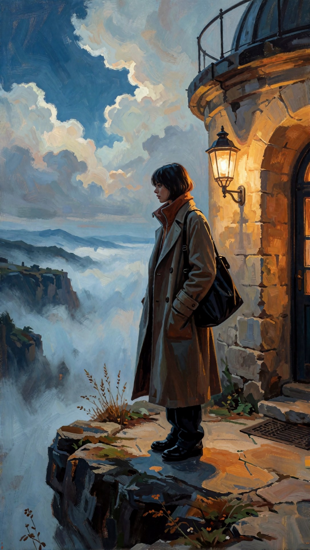
Inspect the fog gradient, cloak edges, and rock texture. A bad upscale often replaces painterly softness with noisy pseudo-detail, which makes the print feel cheaper and less intentional.
Test 6: street scene with repeating signs and distance detail
This is a good stress test for architectural repetition, signage, and small perspective elements.
Topic: Dense street scene for large urban poster
Genre: Cinematic Travel
Camera: Leica SL2
Lens: 35mm f/2
Lighting: rainy evening neon reflections
Location: narrow Tokyo side street with layered shopfronts
Style: cinematic realism
Final Prompt: dense urban side street composed for a large poster print, rainy evening in a narrow Tokyo alley, layered shopfronts, hanging signs, bicycles, reflective pavement, scattered pedestrians in mid-distance, neon red, teal, and amber reflections, cinematic realism, Leica SL2 rendering, 35mm f/2 environmental perspective, crisp architectural repetition, atmospheric mist, wet surface texture, balanced chaos with readable depth, print-focused detail retention in signs, cables, and storefront geometry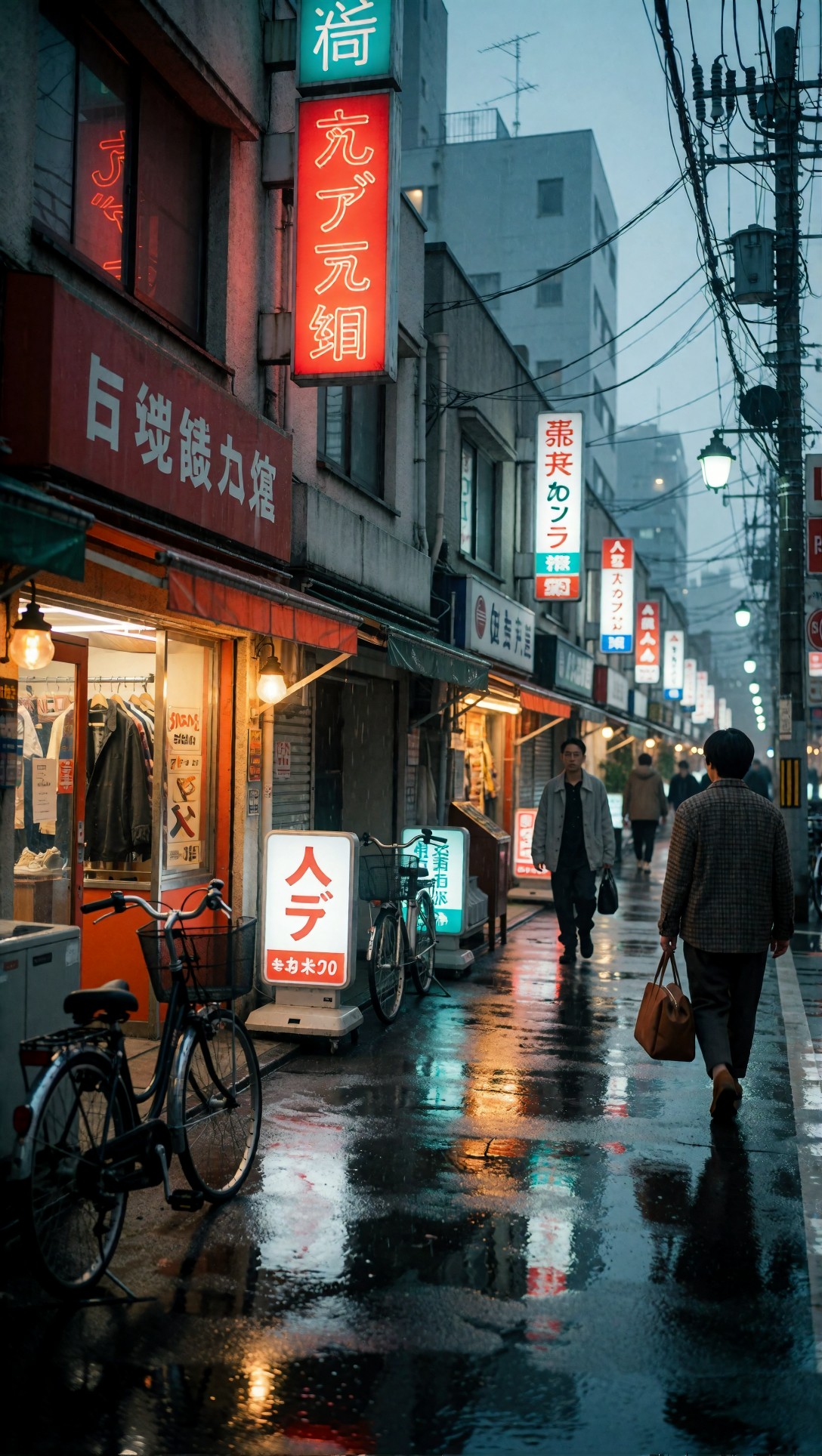
Inspect signs, cables, distant windows, and repeated lines. This is where online upscalers can look brilliant at first glance and then fall apart under close inspection.
In my comparison, Workflow A made this kind of image look more dramatic, but also less trustworthy. Workflow B preserved realism better, even if it looked slightly less sharp on screen.
Test 7: soft gradient background with subject separation
This prompt checks tonal smoothness and whether the subject edge picks up halos against simple backgrounds.
Topic: Minimal poster portrait with smooth backdrop
Genre: Editorial Portrait
Camera: Hasselblad X2D 100C
Lens: 90mm f/2.5
Lighting: softbox key light with feathered fill
Location: seamless paper studio in dusty blue
Style: refined magazine portrait
Final Prompt: refined editorial portrait intended for a clean print poster, half-body subject in structured navy jacket, composed posture, subtle confident expression, dusty blue seamless paper background with smooth gradient falloff, softbox key light feathered across the face, controlled shadow under jawline, Hasselblad X2D 100C medium-format realism, 90mm f/2.5 compression, elegant magazine composition, natural skin texture, smooth background transitions, crisp jacket seam detail, quiet premium color palette, print-safe edge separation without halos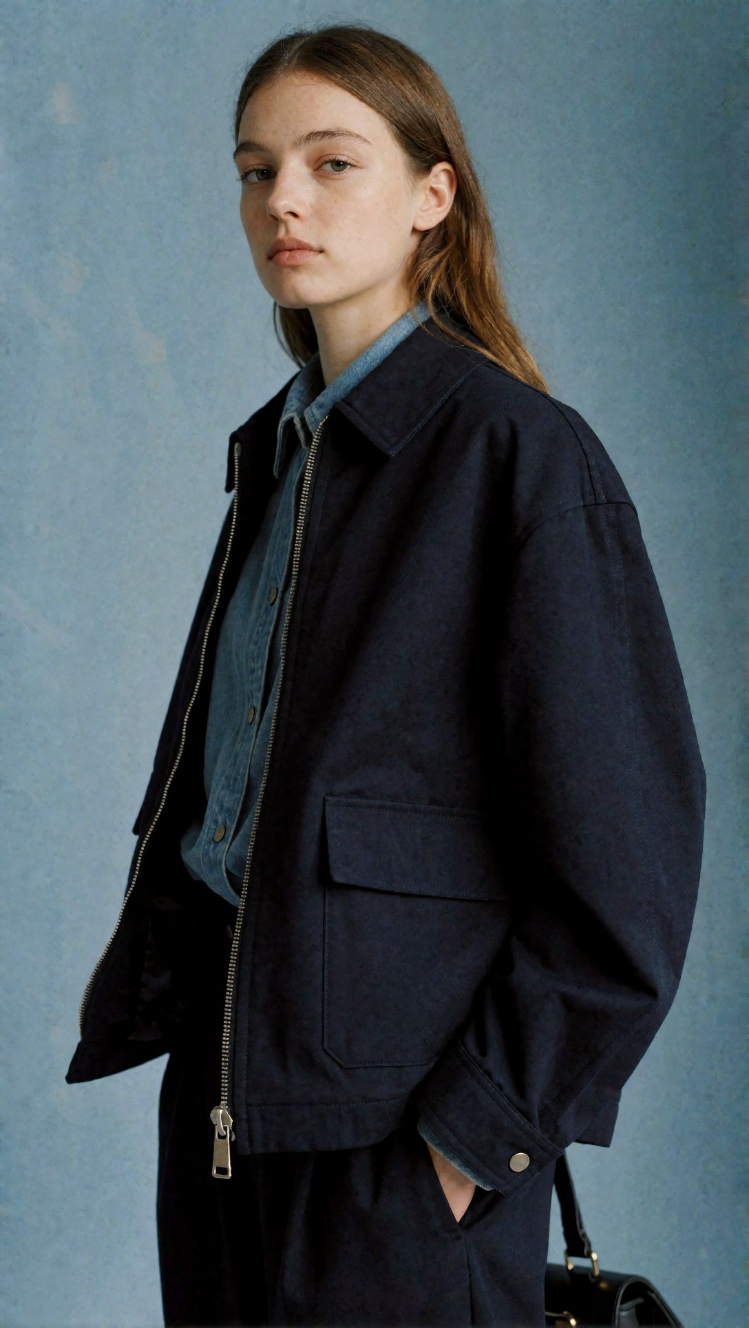
Check the background gradient and shoulder outline first. If the upscaler leaves a glowing rim or granular backdrop, that flaw usually becomes obvious on paper.
Test 8: food/product hybrid with gloss and micro-texture
This final test is useful because glossy surfaces and organic textures often confuse enhancement models in opposite ways.
Topic: Artisan pastry and ceramic cup for menu poster print
Genre: Lifestyle Product Editorial
Camera: Panasonic Lumix S1R
Lens: 70mm f/2.8
Lighting: side-lit morning window light
Location: small café marble table by a fogged window
Style: clean commercial editorial
Final Prompt: artisan pastry and ceramic coffee cup arranged for a menu poster print, flaky laminated pastry with visible layers, matte ceramic cup with soft steam, marble tabletop with restrained veining, fogged café window in the background, side-lit morning daylight, warm neutral palette with buttery gold accents, Panasonic Lumix S1R realism, 70mm f/2.8 close editorial framing, shallow but controlled depth of field, natural crumb texture, realistic glaze reflections, clean commercial styling, premium café atmosphere, print-ready detail without artificial crunch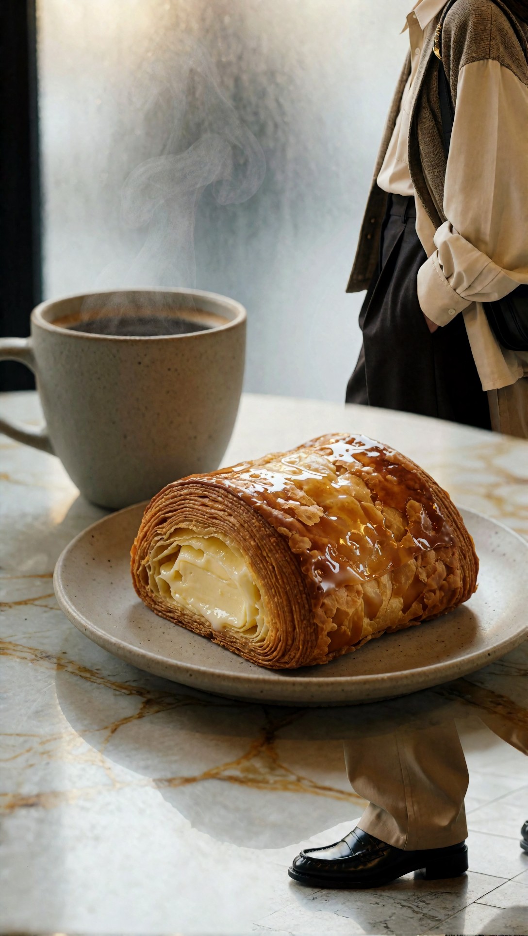
Inspect pastry flakes, steam edges, cup rim, and marble veining. Good upscale behavior keeps each material distinct. Weak behavior makes everything equally sharp and therefore less believable.
Best choice by use case
Here is the practical recommendation after testing both approaches.
Choose a direct online AI upscaler if:
- you need a fast poster mockup
- the source file is already decent
- the print will be viewed from several feet away
- the image is a portrait, product render, or simple composition
- you value convenience more than forensic detail control
For this use case, a tool like an online [Upscaler](/upscaler) makes sense. Just avoid maxing out every enhancement slider.
Choose a controlled workflow if:
- the print will be inspected up close
- you have fabrics, hair, architecture, or illustration edges
- the image includes labels, signs, or small type
- the file is for premium sales, client delivery, or display samples
- you want realism more than dramatic sharpness
A practical rule for print size decisions
What mattered most in this test was not an abstract maximum print size. It was intended viewing distance.
- Poster on a wall: you can go larger before artifacts become obvious.
- Desk print or portfolio page: artifacts show earlier.
- Packaging, signage proof, product sell-sheet: do not trust AI-invented detail without line-by-line inspection.
If the image contains invented details you cannot verify from the original, treat those details as decorative, not factual.
What I would change next time
In this test, the best-looking prints did not come from the most aggressive settings. They came from cleaner source images and more conservative upscaling.
If I were repeating the workflow, I would:
- start with the highest-quality base generation in [Create](/create)
- avoid trying to repair fundamentally weak images through upscaling alone
- test one moderate upscale against one aggressive upscale before committing
- print a small crop section first if the job matters
That last step saved the most uncertainty. A cropped print sample reveals fake texture much faster than screen zooming.
FAQ
Can I upscale image online for print and still get professional results?
Yes, especially for posters and images with stable shapes. But professional results depend on source quality and on whether the print will be viewed from distance or up close.
What is the best AI upscaler for print: maximum sharpness or moderate enhancement?
In this test, moderate enhancement was more reliable. Maximum sharpness often created edge halos and false texture that looked worse on paper.
Does AI upscaling fix blurry images for printing?
Not really. It can make blur look more defined, but it usually invents texture instead of restoring true detail. That is acceptable for some poster use, not for critical print work.
How do I know if an AI image enhancer for printing has gone too far?
Look for dark hair clumps, crunchy skin, glowing edges, noisy walls, fake fabric weave, and text that looks etched instead of readable.
Is an image upscaler AI poster workflow good for AI-generated art?
Usually yes, but illustrations and painterly pieces need extra caution. Many upscalers over-interpret brushwork and flatten intended softness.
Editorial conclusion
If your goal is to upscale image online for print with minimal effort, a direct AI upscaler is the best fit for posters, concept boards, and simple commercial visuals. If your print needs to survive close inspection, especially with text, textiles, architecture, or painterly transitions, use a controlled workflow and stop before the image starts looking aggressively enhanced.
Who should use the fast online route: creators making wall posters, pitch visuals, social-to-print adaptations, and product images with clean surfaces.
Who should avoid it as a one-click solution: anyone printing premium art, packaging comps, close-view portfolio pieces, or images where factual detail matters.
The setting that mattered most in this comparison was not a magic scale number. It was restraint. Moderate upscale, careful inspection, and rejection of fake micro-detail beat a dramatic one-pass enlargement almost every time.